Designing with the Mind in Mind
引言
用户界面设计规则 :从何而来?如何有效使用?
自从人们开始设计交互式计算机系统以来,有些人就试图通过发布用户界面设计指南(也称为设计规则)来推广良好的设计,包括这些早期的指南:
• Cheriton(1976 年)为早期的交互式(分时)计算机系统提出了用户界面设计指南。
• Norman(1983a,b)基于人类认知(包括认知错误),提出了软件用户界面的设计规则。
• Smith 和 Mosier(1986 年)撰写了最全面的一套用户界面设计指南。
•Shneiderman(1987年)在他的书《用户界面设计》的第一版以及所有后续版本中,都包含了“界面设计的八项黄金法则”。
•Brown (1988) 写了一本名为《Human–Computer Interface Design Guidelines》的设计指南书籍。
• Nielsen 和 Molich (1990) 提供了一套用于用户界面启发式评估的设计规则,Nielsen 和 Mack (1994) 对其进行了更新。
•Marcus (1992) 提出了在线文档和用户界面图形设计的指南。
近年来,在 21 世纪,发布了更多用户界面设计指南:
• 多位作者已撰写包含 UI/UX 设计指南的书籍:Stone 等人 (2005),Koyani 等人 (2006),Johnson (2007),Shneiderman 和 Plaisant (2009),以及 Rosenberg (2020)。
•一些组织已发布针对网络的可用性指南:W3C (2016),Yale 大学 (2020)。
•计算机公司已在其平台上发布桌面应用程序设计指南:Microsoft 公司 (2018),Apple 公司 (2020a)。
• 移动应用程序平台提供者也已发布指南,以帮助开发者创建更适用于移动设备的可用应用程序:Oracle 公司 (2017),Google (2019),Apple 公司 (2020b)。
用户界面设计准则的价值有多大?这就取决于将它们应用在设计问题上的人了。
用户界面设计与评估需要理解和经验
遵循用户界面设计准则不像遵循烹饪食谱那么按部就班。设计准则经常描述的是目标而不是操作。它们特意极其概括从而具有更广泛的适用性,但这也意味着,人们对它们准确的意义和在具体设计情境上的适用性经常会做出不同的诠释。
更进一步地,。在这种情况下,适用的设计规则经常冲突:它们建议不同的设计。这要求设计师确定哪个竞争的设计规则更适用于给定的情况并应优先考虑。
更复杂的是,往往会有多个规则似乎都适用于给定的设计情况。这时,这些设计准则经常会相互冲突,即指向不同的设计。这要求设计师确定哪个设计准则更适用于给定的环境,从而优先应用。
即使没有冲突的设计准则,设计问题也常常有多个冲突的目标——例如:
屏幕要明亮,且电池寿命长;
轻便且坚固;
功能多且容易学;
功能强大且系统简单;
分辨率高且加载快;
所见即所得(WYSIWYG),且盲人可用。
要满足这些计算机产品或服务的所有设计目标,通常需要权衡——大量的权衡。在相互冲突的设计准则间找到合适的平衡点需要进一步的权衡。
面对这些复杂情况,技艺娴熟的 UI 设计者或评估者必须更深思熟虑,而不是盲目地应用用户界面设计规则和准则。用户界面设计规则和准则更像法律,而不是生搬硬套的食谱。就像一套法律必须由精通法律的律师和法官来使用和诠释一样,一套用户界面设计准则最好由理解其基本原则并有过应用经验的人来使用和诠释。
遗憾的是,用户界面设计准则通常都是以设计布告的简单列表形式提供的,几乎没有提供任何理论依据或背景。当然有少数例外,比如 Norman(1983 a)。
再者,虽然很多早期用户界面设计和可用性的从业人员拥有认知心理学的知识背景,但大部分新参与的人并没有。这让他们很难理性地应用用户界面设计准则。提供这样的理论依据和背景正是本书的着眼点。
用户界面设计准则的比较
Comparing User-Interface Design Guidelines
表 1.1 并排列出了两大最著名的用户界面设计准则,展示了它们包含的规则类型和相互间的比较(更多的准则可参考附录)。比如,二者的第一条规则都提倡设计的一致性,它们也都包含错误预防的规则。Nielsen-Molich 的规则“帮助用户识别、诊断错误,并从错误中恢复”接近于 Shneiderman-Plaisant 的规则“允许容易的操作反转”,而“用户的控制与自由”则对应“让用户觉得他们在掌控”。这种相似有其原因,而并不是因为后者受到了前者的影响。
表 1.1 两大最著名的用户界面设计准则
| 施耐德曼(1987 年);施耐德曼和普拉尚特(2009 年) | 尼尔森和莫利奇(1990 年) |
| 力求一致性 | 一致性和标准 |
| 服务于普遍可用性 | 系统状态的可见性 |
| 提供信息反馈 | 系统与现实世界的匹配 |
| 设计任务流程以获得完成感 | 用户控制和自由 |
| 防止错误 | 预防错误 |
| 允许轻松撤销操作 | 识别而非记忆 |
| 让用户感觉他们掌控着局面 | 使用灵活高效 |
| 减少短期记忆负担 | 美观简洁的设计 |
| 帮助用户识别、诊断和恢复错误 | |
| 提供在线文档和帮助 |
设计准则从何而来
对当前的讨论而言,这些设计准则的共性—它们的基础和起源,比每套设计准则的具体规则更重要。这些设计准则从何而来?它们的作者只是像时装设计师一样,试图将个人的设计品味强加在计算机和软件业上吗?
如果是这样,这些设计准则会因各自作者追求与众不同而变得非常不一样。实际上,忽略在措辞、强调点以及撰写时计算机技术状态的不同之后,所有这些用户界面设计准则是很相似的。这是为什么呢?
答案在于,所有设计准则都基于人类心理学:人们如何感知、学习、推理、记忆,以及把意图转换为行动。许多设计准则的作者至少有一些心理学背景,应用于计算机系统设计上。
例如,DonNorman 远在开始从事人机交互方面的写作之前,就已经是认知心理学领域的一名教授、研究者和多产作家了。Norman 早期的人机设计准则就基于他本人和其他人在人类认知方面的研究。他特别关注的是人们经常犯的认知性错误,以及计算机系统如何减少或消除这些错误造成的影响。
类似地,其他设计准则的作者,比如 Brown、Shneiderman、Nielsen 和 Molich,也都在应用感知和认知心理学的知识,尝试改进交互系统的设计,使其更具可用性和实用性。
说到底,用户界面设计准则是以人类心理学为基础的。
阅读本书,你将学到用户界面和可用性设计准则背后重要的心理学知识。
读者对象
这本书主要面向需要应用用户界面和交互设计指南的软件设计和开发专业人士。这包括交互设计师、用户界面设计师、用户体验设计师、平面设计师和硬件产品设计师。它还包括可用性测试员和评估员,他们在审查软件或分析观察到的使用问题时经常参考设计启发式方法。
第二个重要的受众是交互设计和人机交互专业的学生。事实上,这本书的第二版已成为大学水平 UI/UX 设计课程的流行教科书。因此,我在更新和完善这本书以制作第三版时,一个目标就是使其成为更好的教科书。
第三个预期的受众是希望了解用户界面设计规则的心理基础的软件开发经理,以便理解和评估他们所管理的人员的工作。
第一章:感知偏差
Chapter 1: Our Perception is Biased
摘要
我们感知到的并非我们环境的准确反映。它至少受到三个因素的影响:过去的经验、当前的环境以及未来的目标。本章将详细讨论这些因素,举例说明它们如何影响感知,并解释它们对设计交互式系统的意义。
关键词
含糊不清;注意力瞬失;偏见;鸡尾酒会效应;环境;框架;目标;习惯化;麦克格鲁效应;缪勒-莱尔错觉;光学错觉;感知;启动效应
我们对周围世界的感知并非对实际情况的真实描绘。我们的感知受到至少三个因素的影响:
• 过去:我们的经验
• 现在:当前环境
• 未来:我们的目标
经验导致感知偏见
经验,即你过去的感知——可以在几种不同的方式上影响你当前的感知。
感知的启动
想象一下,你拥有一家大型保险公司,并将与一位房地产经理开会讨论公司新园区的建设方案。园区有五座建筑排成一排,后两座有给自助餐厅和健身中心采光的 T 字形庭院。如果房地产经理向你展示如图 1-1 所示的地图,你就会看到代表这些建筑物的五个图块。

图 1-1 这是建筑地图还是单词?你看到的取决于别人告诉你看什么
现在想象一下与你见面的不是房地产经理,而是一位广告经理,讨论的是一个将在全国某些市场悬挂的广告牌。广告经理给你看的是同样的图像,但这次是广告牌的略图,由一个单词构成。这次,你清晰无误地看到了一个单词“LIFE”。
当感知系统预先准备看的是建筑物的形状时,你就看到了建筑物的形状,几乎察觉不到建筑物之间的白色区域。当感知系统预先准备去看文字时,你就看到了文字,也几乎注意不到字母间的黑色区域。
先入为主能够影响感知,有个著名的例子是一张素描。这张素描据传由R.C.James 所绘,大部分人对它的第一印象就是随手泼出的墨点。在继续阅读之前,先看看这张素描(见图 1-2)。
图 1.2 展示了先入为主在视觉上的效果。你看到了什么?
只有在告诉你这是一只在树附近嗅着地面的斑点狗之后,你的视觉系统才会把影像组织成一幅完整的画面。不仅如此,一旦你“看到了”这只狗,就很难再回头把这张素描看成随机无序的点。
以上是视觉的例子。经验也会影响其他类型的感知,如对语句的理解。例如,在不久前听说过疫苗污染事故的人与最近听说过利用疫苗成功对抗疾病的人,他们对“新疫苗含有狂犬病毒”这个标题或许就有不同的理解。
熟悉的感知模式或框架
我们生活中大部分时间都在熟悉的环境里度过:家中的房间、花园、上学放学上班下班经过的路线、我们的办公室、小区附近的公园、商店、餐馆等。不断置身的各种环境在我们心智中建立起模式,让我们对不同地方的东西有不同期待。研究者们把这些感知模式称为框架,包括在各个环境下通常遇到的对象和事件。
举个例子,你不需要时常详细检查每一个细节,因为对家里的房间足够熟悉。你知道它们的布局,也知道大多数东西放在什么地方。你或许都能够在全黑的情况下在家中行走。但你对家的经验要比自己的住宅更广泛。除了对自己住宅的了解,你的大脑对家也有一个广泛的模式认知。这个模式影响了你对所有家的认知,不论熟悉的还是陌生的。在厨房,你期待看到灶具和水槽。在浴室,你期待看到马桶、洗手池、淋浴器或者浴缸。
不同场合的心智框架影响人们在各个场合下对期待见到的事物的感知。因为不必不断地详细检视身边环境的每一个细节,这是心智的捷径,能帮助人们应付所处的世界。然而,心智框架也让人们看到其实并不存在的东西。
比如,如果你拜访一个厨房里没有灶具的房子,你事后可能会回忆看到过一个灶具,因为在你对厨房的心智框架里,灶具是厨房的一个重要部分。类似地,去餐馆吃饭的心智框架中一部分是付账单,所以你可能记得自己已经付过钱了而心不在焉直接就走出餐馆。你的大脑对后院、学校、城市街道、办公室、超市、牙医诊所、的士、空中交通等熟悉场合都有各自的心智框架。
任何使用电脑、网站或者智能手机的人对桌面和文件、网页浏览器、网站和各种类型的软件应用和在线服务都有对应的心智框架。比如,当他们访问一个新网站时,有经验的网络用户期待看到网站名字和标志、导航条、一些链接,也许还有一个搜索框。当在线订购机票时,他们期待能够指定行程详细信息,查看搜索结果,选择决定的航班,并且购买机票。
由于软件用户和网站用户感知模式的存在,他们经常不仔细看就点击按钮或链接。他们对控件位置的期望更多来自在当前情况下,他们自己的框架期望他们在屏幕上看见什么。这点有时会让软件设计者觉得挫败,因为设计者期望用户看见屏幕上确实有的东西,但人类的视觉系统却不是这样工作的。
例如,如果在一个多页对话框的最后一页上的“下一步(Next)”和“返回(Back)”按钮交换了位置,许多人就不会立刻注意到(见图 1.3)。前几页上布置一致的按钮麻痹了他们的视觉系统。甚至在无心地返回了几次之后,他们可能仍然觉察不到按钮不在标准位置上。这就是为什么“控件的摆放要一致”是一个常见的用户界面设计准则。
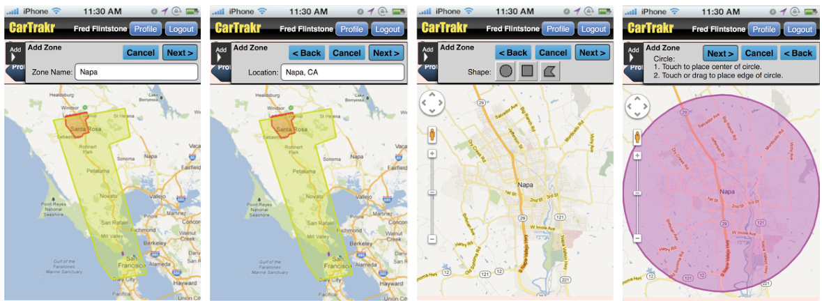
图 1.3 用户可能始终认为下一步按钮在右侧,即使它不在那里。
类似地,在寻找某件东西时,如果它不在老地方或者看起来与往常不同,即使就在眼皮底下我们也可能视而不见。这是因为经验调整我们到期望的地方依据期望的特征去寻找。例如,如果一个网站某个表单上“提交”按钮的形状或者颜色与其他表单上的按钮不同,用户就可能找不到它。本章在关于目标如何影响感知的一节中,会深入讨论这种由预期导致的盲目性。
习惯性
经验影响感知的第三种方式被称为习惯性。重复置身于同样(或者非常类似)的感觉会让感觉系统的敏感度降低。习惯性是人们神经系统在非常低层的一个现象,它发生在神经级别。即使是非常原始的、只具有非常简单神经系统的动物,比如扁形虫和阿米巴虫,也会对重复的刺激(比如轻微的电击或者闪光)产生习惯性。具有复杂神经系统的人类,对一系列事件也会产生习惯性,从低层次(如连续的蜂鸣声)、到中间层次(如网站上闪烁的广告条)再到高层次(比如某人在每次派对上重复说同一个笑话或者某政客的长单调的演讲),都是如此。
在使用电脑时,当“你是否确定”的确认框一次又一次出现,人们也能体验到习惯性。人们最开始会注意到并且或许会做出反应,但最终则会反射般直接忽视并关闭确认框。
在最近被标以“社交媒体倦怠”(Nichols,2013)、“社交媒体疲劳”或者“Facebook 假期”(Rainie 等,2013)的现象中,习惯性也是一个因素。社交网站的新用户一开始对用微博来分享体验的创新感到兴奋,但迟早会感到疲惫不堪,不愿再耗费时间阅读“朋友们”分享的各种琐事,比如,“看!我午饭吃的这份三文鱼沙拉太赞了!”
注意瞬脱
过往经验对低层感知的另一个影响,发生在人们刚刚发现或者听到某件重要的事情之后。在识别之后短暂的 0.15 秒到 0.45 秒之间,即使耳朵和眼睛正常工作,人们也接近于失聪而且无视其他视觉刺激。研究者们把这个现象称为注意瞬脱(Raymond 等,1992,Stafford 和 Webb,2005),认为这是由于大脑的感觉与注意力机制在短时间内完全用于处理第一个识别而产生的。
一个经典的例子:你在一节正在进站的地铁车厢内,计划与两位朋友在地铁站见面。当地铁到达时,你的车厢经过了一位朋友,你透过车窗短暂地看到了他。在下一秒钟,又经过了另一位朋友,但你却没注意到她。这是因为,当她的影像抵达你的视网膜时,你正好因为认出了第一位朋友而处于注意瞬脱中。
当人们使用基于电脑的系统和在线服务时,如果事情连续发生得太快,他们会因为注意瞬脱而错过一些信息或者事件。当下制作纪录影片有一个流行的手段,就是连续快速展示一系列静态照片。这个方式是非常容易产生注意瞬脱的:如果一个图片真的吸引了你的注意力(比如对你有特别的意义),你可能就会错过紧接其后的一两张图片。相比之下,自动播放的幻灯片(比如在网站或者信息资讯机上)中的一张引人注目的图片是不大可能造成注意瞬脱的(即错过下一张图),因为每张图片都一般有几秒钟显示时间。
环境影响感知
Perception Biased by Current Context
当我们试图去理解视觉如何工作时,很容易认为它是一个自下而上的过程,将边、线条、角度、弧线和纹路等基本要素组成图案并最后形成有意义的事物。以阅读为例,你可能假设我们的视觉系统首先识别字母,把它们组合成单词,再将单词组合成句子,如此继续。
但视觉感知,尤其是阅读,不完全是一个自下而上的过程,其中也有自上而下的作用。例如,包含某个字母的单词能够影响我们对这个字母的判断(见图 1-4)。

图 1-4 同样的字符受其附近的字母影响而被感觉成 H 或 A
类似地,对一句话或者一段话完整的理解甚至能够影响我们所看到的单词。例如,同样的字母序列可以因前后段落含义的不同而被理解成不同的单词(见图 1-5)。

图 1-5 同样的短语因其所在的短语组不同而有不同的解读
视觉受环境因素影响的偏差在不仅仅在阅读中出现。Muller-Lyer 错觉就是一个著名的例子(见图 1-6):两条水平线,一条有朝外指向的“翅”,另一条有着朝内指向的“翅”,尽管它们相同长度,但不同的“翅”使得我们的视觉系统觉得上方的线比下方的线更长。这类视错觉(见图 1-7)欺骗了我们,因为我们的视觉系统并不使用精确的、最佳的处理方式来感知世界。视觉系统在进化中发展,这是一个半随机的过程,不断叠加各种应急的,通常非完备且不精确的方案。它在大部分时间里运转正常,但包含许多粗略估计、拼凑、修补和一些在某些情况下彻底导致问题的 bug。
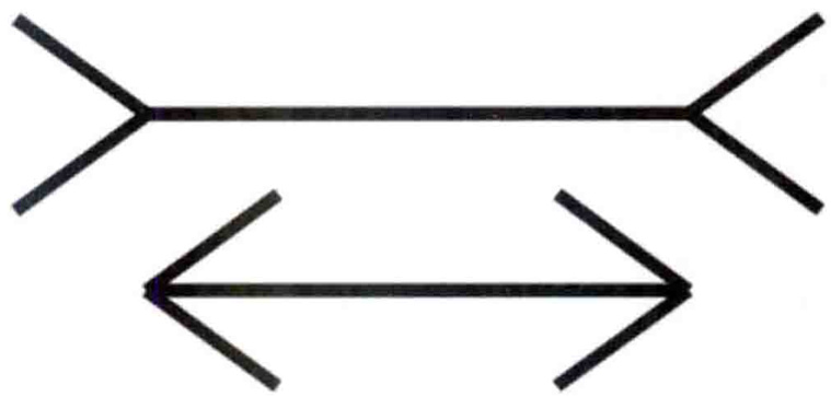
图 1-6 Muller-Lyer 错觉:同样长度的水平线看起来不一样长
图 1-7(A)棋盘中间并未凸起:(B)三角形的边没有弯曲 (C)红色的竖线是平行的
图 1-6 和图 1-7 中的例子显示,视觉被视觉环境所影响。然而,在当前环境下不同感官之间也会有感知的偏差。五官的感觉会同时相互影响。我们的触觉感受可能会被听到的、看到的或者闻到的所影响,视觉会被听觉影响,听觉也会被视觉影响。以下是我们的视觉影响听觉的两个例子。
McGurk 效应
如果你观看一个视频,其中有人说着“吧、吧、吧”,接着“嗒、嗒、嗒”,然后“哇、哇、哇”,但音频一直是“吧、吧、吧”。你将会通过观看说话者的嘴唇运动而不是实际听到的来辨认他说的音节。只有当闭上眼睛或者转移目光,你才能真正听到实际语音发出的音节。我打赌你们不知道自己可以读唇,但事实上人们一天里这么做的次数相当多。
腹语
腹语表演者并不转移自己的声音,他们仅仅是学会了不动嘴说话。观众的大脑感觉是与声音最近的那个动着的嘴在说话,就是腹语者表演用的玩偶的嘴(Eagleman,2012)。
反过来,听觉影响视觉的一个例子是幻觉闪光效果。当屏幕上的某一点短暂地闪了一下,但伴随着两个快速的蜂鸣声,就会看起来像闪了两下。类似地,感觉到的闪光频率也可以随点击鼠标的频率变化(Eagleman,2012)。
后续章节将解释人脑中的视觉感知、阅读和认知功能。现在就简单地表述为:识别一个字母、一个单词、一张脸或者其他任何物体的神经活动,都包含了环境刺激产生的神经信号的输入。这个环境包括感知到的其他邻近对象和事件,甚至由环境激活的、对以往感知到的对象和事件的记忆。
环境不仅影响人的感知,也影响低级动物的感知。一位朋友经常带着她的狗开车出门办事。一天当她开进自家车道时,有一只猫在前院。她的狗看见了就开始叫。我的朋友一打开车门,狗就蹄出去追那只猫,猫立刻转身跳进灌木丛中逃跑了。狗也扎进灌木丛,但没逮到猫。那之后的一段时间里,这条狗就一直很烦躁不安。
之后,在我的朋友住在那里的那段时间,每次她开车带着狗回到家,它就兴奋地叫起来,并在车门打开那一刻跳出去,冲过院子,跃人灌木丛。没有猫在那里,但那并不重要。乘着车回到家对这狗来说已经足够让它看见甚至可能闻到一只猫。然而,如果是走回家,比如每天遛完它后,“猫幻影”就不会发生。
目标导向的感知偏差
Perception Biased by Goals
除了受过去经验和当前情境的影响外,我们的感知还受到我们对未来目标和计划的 影响。具体来说,我们的目标:
• 引导我们的感知器官,让我们从周围的世界中采样我们所需要的信息;
• 过滤我们的感知——与我们的目标无关的事物往往会预先无意识地被过滤掉,也就不会被我们的主观意识注意到。
例如,当人们在软件里或者网站上寻找信息或者某个功能时,他们并不会认真阅读,只是快速而粗略地扫描屏幕上与目标相关的东西。他们不是仅仅忽略掉与目标无关的东西,而是经常根本注意不到它们。
现在就来体会一下。请在图 1-8 中的工具箱里找到剪刀,然后立刻回到这里。
图 1-8 工具箱:这里有剪刀吗
你发现剪刀了吗?现在不去看工具箱,你能说出来那里面有没有螺丝刀吗?
除了视觉,我们的目标还过滤其他感官的感知。一个熟悉的例子是“鸡尾酒会”效应。如果你在一个拥挤的酒会上与某人谈话,你能把大部分注意力放在他说的话上,即使身边还有许多人在对话。你对谈话的兴趣越大就越能过滤掉周围的对话。如果你对谈话内容感到乏味了,多半就会越来越多地听到周围的谈话。
这个效应首次记录于对空中交通管制员的研究中。即使控制室的同一个扩音器传出在同一个频道上同时进行的许多不同对话,空中交通管制员们仍然能够与被指派飞机上的飞行员进行对话(Arons,1992)。研究表明,在多个同时进行的对话中,专注于一个对话的能力不仅取决于对谈话内容感兴趣的程度,也取决于客观因素,如在杂音中熟悉的语音、常见“噪声”的量(如碗碟的碰撞声或者喧闹的音乐)以及能否预见谈话对象要说什么(Arons,1992)。
目标对感知的过滤在成人身上特别可靠,成人比儿童对目标更专注。儿童更容易被刺激驱使,目标较少地过滤他们的感知。这种特点使得他们比成人更容易分心,但也使得他们观察时更不容易产生偏差。
一个客厅游戏展示了年龄差异在感知过滤上的差别。它类似刚才的“工具箱”练习。大多数人的家里都有一个专门放厨房器具或者工具的抽屉。请一个人从客厅到那个抽屉所在的房间,要求他拿来某个工具,比如量勺或者水管扳手。当他带着工具回来时,问他在抽屉里是否有另外某个工具。大部分成人不记得抽屉里还有什么其他东西。但孩子们通常能够告诉你那里面还有什么其他东西,前提是他们完成了任务,而没有被抽屉里其他很酷的玩意彻底吸引。
感知过滤在网站导航中也能观察到。假设我要你去新西兰的坎特伯雷大学(见图 1-9)的主页并找出对计算机科学系研究生提供资助的信息。你会扫视网页并可能很快地点击那些含有与目标相关单词的链接:Departments(“院系”,左上)、Scholarships(“奖学金”,中间),还有 PostgraduateStudents(“研究生”,左下)。如果你是个“搜索型”的人,也许就直接到搜索框(右上)输人与目标相关的单词,然后点击“Go”。

图 1-9 坎特伯雷大学主页:网页导航过程包含感知过滤
不论你是浏览还是搜索,都很可能没注意到自己被随机地挑中赢得 100 美元(右下)而直接离开了主页。为什么?因为那与你的目标无关。
What is the mechanism by which our current goals bias our perception? There are two:
我们当前的目标如何影响我们的感知?机制有两种:
影响我们注意什么
感知是主动的,不是被动的。感知不是对周围事物的简单过滤,而是对世界的体验以及对需要理解的东西的获取。我们始终移动眼睛、耳朵、手、脚、身体和注意力去寻找周围与我们正在做或者正要做的事最相关的东西(Ware,2008)。如果在一个网站上找园区地图,那些能够引导我们去完成目标的对象就会吸引我们的眼睛和控制鼠标的手。我们会或多或少地忽略掉与目标无关的东西。
使我们的感知系统对某些特性敏感
在寻找某件物品时,大脑能预先启动感官,使得它们对要寻找的东西变得非常敏感(Ware,2008)。例如,要在一个大型停车场找一辆红色轿车时,红颜色的车会在我们扫视场地时跃然而出,而其他颜色的车就几乎不会被注意到,即使我们的确“看到”了它们。类似地,当我们试图在一个黑暗拥挤的房间里寻找自己的伴侣时,大脑会对我们的听觉系统进行“编程”,从而对她或他的声音的频率组合非常敏感。
设计时将感知的影响因素考虑在内
这些对感知的影响因素对于用户界面设计有以下三点启发。
避免歧义
避免显示有歧义的信息,并通过测试确认所有用户对信息的理解是一致的。当无法消除歧义时,要么依靠标准或者惯例,要么告知用户用你期望的方式去理解歧义之处。
例如,数字设备上的显示常常给用户界面组件添加阴影,使其看起来相对于背景表面更突出(见图 1.10)。这种显示方式依赖一个大多数有经验的电脑用户都熟悉的惯例一光源在屏幕的左上角。如果一个物体是以光源在不同的位置来渲染的话,用户则无法看出它是凸起还是凹陷。
图 1-10 数字设备屏幕上的组件会添加阴影,使其看起来像是在背景上方漂浮,但这种感知只有在假设模拟光源在左上角时才有用。
保持一致
将信息和控件放置在一致的位置。不同页面上提供的相同功能的控件和数据显示应该摆放在每一页上相同的位置,而且它们还应该有相同的颜色、字体和阴影等。这样的一致性能让用户很快地找到和识别它们。
理解目标
用户去用一个系统是有目标的。设计者应该了解这些目标,要认识到不同用户的目标可能不同,而且他们的目标强烈左右他们能感知到什么。在一次交互的每个点上,确保提供了用户需要的信息,并非常清晰地对应到一个可能的用户目标,使用户能够注意到并使用这些信息。
重要要点
• 人类的感知并不是对“世界”中事物的准确反映。它受到我们的经验、当前环境和我们的目标的影响。
• Past experience can bias our perception by “priming” our perceptual systems to detect certain objects and events as well as “priming” them not to detect other objects and events. Repeated perception of an event over a short interval can cause habituation, increasing the chances that we will miss later occurrences of the event. With long-term experience, we develop frames for familiar situations that make us perceive things that aren’t there or miss things that are.
• 过去的经验可以通过“启动”我们的感知系统来偏置我们的感知,使我们更容易检测到某些物体和事件,同时“启动”它们不去检测其他物体和事件。在短时间内重复感知一个事件会导致习惯化,增加我们错过后来发生的该事件的可能性。长期的经验使我们熟悉的情况形成框架,使我们感知到不存在的事物或错过存在的事物。
• Because our attention has limited capacity, when it is overloaded we can miss other objects and events. This is called attentional blink.
• 由于我们的注意力有限,当注意力超负荷时,我们会错过其他物体和事件。这被称为注意力盲点。
• 感知以两种方式同时运作:• 我们对整体物体和事件的感知基于对部分的感知。• 对部分的感知基于对整体的感知。
• 我们对物体和事件的感知可能受到我们情绪状态的影响。
• 我们的感知系统——尤其是我们的视觉系统——包括进化上的捷径和缺陷,这些会导致我们对某些刺激产生错误的感知。
• 我们的目标和计划强烈影响我们注意什么,因此也影响我们感知什么。
• 通过遵循基于人类感知方式的设计指南,设计师可以创建与将要使用它们的人相匹配的应用程序、网站和设备。
2Multistep screen sequences are called wizards in user-interface design jargon.
2在用户界面设计行话中,多步骤屏幕序列称为向导。
3 Chapter 14 discusses the attentional blink interval along with other perceptual intervals.
3 第 14 章讨论了注意力闪烁间隔以及其他感知间隔。
4For an example, search YouTube for “history of the world in 2 minutes.”
4例如,在 YouTube 上搜索“2 分钟的世界历史”。
5See youtube.com/watch?v
5 查看 youtube.com/watch?v
第二章 :我们的视觉是为了看到结构而优化
Chapter 2: Our Vision is Optimized to See Structure
摘要
本章介绍了描述人类视觉感知的格式塔原则:邻近性、相似性、连续性、闭合性、对称性、图底关系和共同命运,以及每个原则如何影响用户界面设计。例如,邻近性原则是指显示中对象之间的相对距离会影响人们对对象是否以及如何组织成子组的感知;彼此靠近的对象(相对于其他对象)看起来是分组的,而相距较远则不是。
关键词
Ambiguity; Background; Closure; Common fate; Continuity; Displays; Figure-ground; Foreground; Gestalt principles; Grouping; Perception; Proximity; Similarity; Spacing; Symmetry; Vision; Visual; Visual design
两可性;背景;闭合性;共同命运;连续性;显示;图底关系;前景;格式塔原则;分组;感知;邻近性;相似性;间距;对称性;视觉;视觉;视觉设计
20 世纪早期,一个由德国心理学家组成的研究小组试图解释人类视觉的工作原理。他们观察了许多重要的视觉现象并对它们编订了目录。其中最基础的发现是,人类视觉是整体的:我们的视觉系统自动对视觉输入构建结构,并且在神经系统层面上感知形状、图形和物体,而不是只看到互不相连的边、线和区域。“形状”和“图形”在德语中是 Gestalt,因此这些理论也就叫做视觉感知的格式塔(Gestalt)原理。
如今的感知和认知心理学家更多是把格式塔原理视为描述性的框架,而不是解释性和预测性的理论。如今的视觉感知理论更倾向基于眼球、视觉神经和大脑的神经心理学(见第 4 章到第 7 章)。
并不意外,神经心理学家的发现支持了格式塔心理学家的观察结果。我们像其他动物一样,依据整体的对象来感知周围的环境—这是有神经系统基础的(Stafford&Webb,2005;Ware,2008)。因此,格式塔原理虽然不是对视觉感知的基础性解释,但仍然是一个合理的描述框架。格式塔原理也为图形和用户界面设计准则提供了有用的基础(Soegaard,2007)。
对我们当前的讨论,最重要的格式塔原理有:接近性原理、相似性原理、连续性原理、封闭性原理、对称性原理、主体/背景原理和共同命运原理。在后续小节中,我会介绍每个原理,并列举静态图形设计和用户界面设计的例子。
格式塔原理:接近性
接近性原理是指,物体之间的相对距离会影响我们感知它们是否以及如何组织在一起。互相靠近(相对于其他物体)的物体看起来属于一组,而那些距离较远的就不是。
图 2-1 接近性:相互靠近的物体看起来属于一组。A 图为成行的星,B 图为成列的星
在图 2-1 中,左边的星相互之间在水平方向上比在垂直方向上靠得更近,因此我们看到星排成三行;而右边的星在垂直方向上更接近,因此我们看到星排成三列。
虽然图 2.1 中的星星看起来很相似,但当物体彼此靠近时,它们并不一定需要看起来相似才能显得成组。例如,在图 2.2 中,组的定义是由物体之间的距离决定的,而不是它们看起来怎么样。
图 2-2 近似性:即使看起来不相似的物体如果靠得近也会显得成组。
接近性原理在软件、网站和电子设备中布置控制面板或数据表单时非常有用。不知道接近原则的设计师有时会使用分组框和水平或垂直线来分隔控制组和数据显示。
例如,Outlook 的“分发列表成员”对话框使用接近原则将添加…、删除和属性…按钮组合在一起,但随后使用不必要的分组框小部件将其与列表框关联(见图 2.3)。甚至更不必要的是标有“分发列表”的分组框,因为它只包含一个单选框。“围绕单个项目的分组框”是一种常见的 UI 设计错误(Johnson,2007)。

图 2-3 在 Outlook 的分发列表成员的对话框中,操作列表按钮放置在一个分组框里,与窗口控制按钮分开
然而,根据接近性原理,可以通过拉近某些对象之间的距离,拉开与其他对象的距离使它们在视觉上成为一组,而不需要分组框或者可见的边界。此外,邻近性可以分层应用以定义子组的组。
例如,在 Firefox 的键盘文本首选项对话框中,用于控制拼写检查、自动大写和自动添加句号的三个复选框被分组(见图 2.4),并且它们与其他控件以及一个表格控件一起分组。图形设计专家建议使用邻近性来避免视觉杂乱(Mullet 和 Sano,1994),减少添加不用于演示的数据的浪费墨水或像素(Tufte,2001),并减少实现它所需的代码量。
图 2-4 在 Firefox 的键盘文本首选项对话框中,控件使用接近性原则分组,没有使用分组框和边框。
接近性也影响着对控件标签的感知。标签与所标记项目之间的空间过大,人们就不会将标签与项目联系起来。相反,如果标签与另一个项目靠得太近,人们可能会将其与该项目联系起来,而不是预期的项目。例如,Delta.com(2015 年)表单中单选按钮标签的间距不当很容易导致人们选择错误的按钮(见图 2.5A),而 United.com(2020 年)单选按钮标签的间距清楚地显示了哪个标签对应哪个按钮(见图 2.5B)。
图 2-5 单选按钮标签:(A)放置不当;(B)放置良好。
格式塔原理:相似性
格式塔相似性原理指出了影响我们感知分组的另一个因素:如果其他因素相同,那么相似的物体看起来归属于一组。在图 2-6 中,稍微更大、带“空心”的星星被视为一组。

图 2-6 相似性:如果物体看起来相似,就感觉属于一组
Gmail 使用相似性——粗体与非粗体文本——来帮助用户将未读邮件视为一个与已读邮件不同的独立组(见图 2-7 A)。Lyft 的智能手机应用程序使用相似性——汽车形状——让用户一目了然地看到在其潜在乘客附近的可用司机数量(见图 2-7 B)。
图 2-7 相似性被使用: (A) Gmail 用于使未读邮件与已读邮件区分开来,(B) Lyft 用于提供可用行程的快速概览。
MacOS 应用程序中的页面设置对话框同时使用相似性和邻近性来传达分组(见图 2-8)。两个非常相似且紧密排列的方向设置旨在显得分组。这两个菜单虽然不是那么紧密排列,但看起来足够相似,以至于它们显得分组,即使这可能不是有意为之的。取消和确定按钮被放在一起,远离其他所有东西。即使没有分隔线,它们也会显得是一个组。
图 2-8 Mac OS 页面设置对话框。相似性和邻近性用于对设置和控制进行分组。
格式塔原则:连续性
上述两个格式塔原理都与我们试图给对象分组的倾向相关,另外几个格式塔原理则与我们的视觉系统试图解析模糊或者填补遗漏来感知整个物体的倾向相关。第一个是连续性原理:我们的视觉倾向于感知连续的形式而不是离散的碎片。
For example, in Fig. 2.9A, we automatically see two crossing lines —one blue and one orange. We don’t see two separate orange segments and two separate blue ones, and we don’t see a blue-andorange V on top of an upside-down orange-and-blue V. In Fig. 2.9B, due to the vertical alignment of the pieces and the fact that they are spaced to match the curvature of the visible pieces, we see a sea monster in water, not three pieces of one. If we misaligned the pieces or spaced the pieces further than the curvature suggests, the illusion of continuity would disappear.
例如,在图 2-9A 中,我们自动看到了一蓝一橙两条交叉的线。我们看到的不是两段橙色线和两段蓝色线,也不是一个左蓝右橙的 V 形位于一个左橙右蓝的倒 V 形之上。在 B 图中,我们看到的是一只水中的海怪,而不是一只海怪的三段身体。如果我们错位部件或使部件间距大于曲线所暗示的,连续性错觉就会消失。
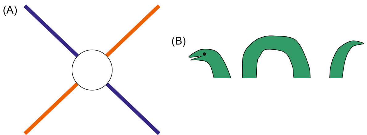
图 2-9 连续性:人类视觉倾向于看到连续的形式,必要时甚至会填补遗漏
在图形设计中,使用了连续性原理的一个广为人知的例子就是 IBM 的标志。它由非连续的蓝色块组成,但一目了然,很容易就能看到三个粗体字母,就像透过百叶窗看到的效果(见图 2-10)。

图 2-10 IBM 公司的标志使用了连续性原理使非连接的色块形成字母
Slider controls are a user-interface example of the Continuity principle. We see a slider as depicting a single range controlled by a handle that appears somewhere on the slider, not as two separate ranges separated by the handle (see Fig. 2.11A). Even displaying different colors on each side of a slider’s handle doesn’t completely “break” our perception of a slider as one continuous object, although ComponentOne’s choice of strongly contrasting colors (gray vs. red) certainly strains that perception a bit (see Fig. 2.11B).
滑动条控件是使用了连续性原理的一个用户界面示例。滑动条表示一个范围,我们看到的是滑动条某个位置上有一个“被控制”的滑块,而不是由滑块分隔成的两个不同区间(见图 2-11A)。即使将滑块的两端的滑动条显示成不同颜色,也不会完全“打破”我们对滑动条是一个连续整体的感知,尽管 ComponentOne 选择使用强烈反差的颜色(灰色与红色)肯定会稍微影响人们连续性的感知(见图 2-11B)。
图 2-11 连续性:我们看到滑块是一个带有手柄的单一插槽,而不是两个由手柄分隔的插槽:(A) Mac OS 和(B) ComponentOne。
格式塔原则:闭合性
与连续性相关的是格式塔的闭合原则:我们的视觉系统会自动尝试闭合开放的图形,使它们被视为整体对象,而不是单独的碎片。因此,我们感知图 2-12A 中的不连贯的弧线为一个圆。
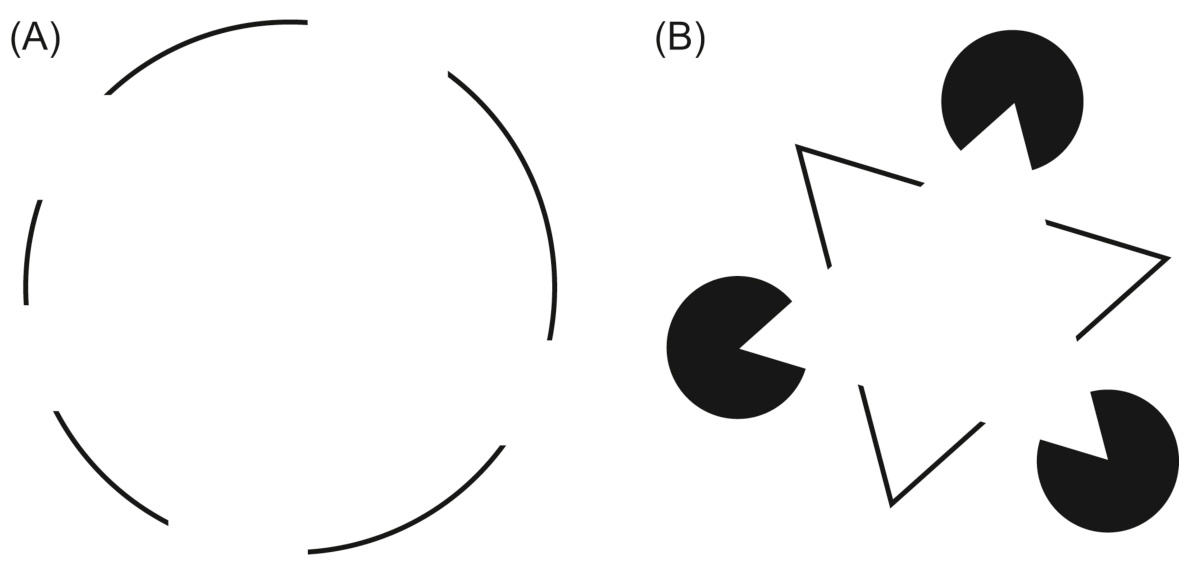
图 2-12 闭合:人类视觉倾向于看到完整的物体,即使它们是不完整的。
我们的视觉系统强烈倾向于看到物体,以至于它能将一个完全空白的区域解析成一个物体。我们能将图 2-12B 中的形状组合感知为一个白色三角形、另一个三角形和三个黑色圆形叠加在一起,即使画面实际上只有三个 V 形和三个黑色的吃豆人。
封闭性原理经常被应用于图形用户界面(GUI)。例如,GUI 经常用叠起的形式表示对象的集合,例如文档或者消息(见图 2.13)。仅仅显示一个完整的对象和其“背后”对象的一角就足以让用户感知到由一叠对象构成的整体。

图 2.13 展示了桌面图标堆叠物体的闭合原则:部分可见的对象被视为整体。
格式塔原则:对称性
关于我们感知物体的第三个事实是格式塔原则,德语中称为“prägnanz”,字面意思是“良好的图形”,但通常翻译为简单或对称。它指出我们倾向于以减少复杂性的方式解析复杂场景。我们视觉场中的数据通常有多种可能的解释,但我们的视觉会自动组织和解释数据以简化它并赋予对称性,使其更容易理解。
For example, we see the complex shape on the far left of Fig. 2.14 as two overlapping diamonds, not as two touching corner bricks or a pinch-waist octahedron with a square in its center. A pair of overlapping diamonds is simpler than the other two interpretations shown on the right—it has fewer sides and more symmetry than the other two interpretations.
例如,我们将图 2.14 最左侧的复杂形状看作两个重叠的菱形,而不是两块顶部对接的隅砖或者一个中心为小四方形的细腰八边形。一对叠加的菱形比其他两个解释更简单,它的边更少并且比另外两个解析更对称。
图 2.14 对称性:人类视觉系统试图将复杂场景解析为简单对称形状的组合。
对称原则也预测我们会看到图 2.15 是五个重叠的圆环,而不是一堆相互连接的弧线。
FIGURE 2.15 Symmetry predicts that people will perceive this figure as five overlapping rings.
图 2.15 对称性预测人们会将这个图形感知为五个重叠的圆环。
我们视觉系统对对称性的依赖可以被用来简化复杂信息的扫描和理解。例如,以表格形式——一种对称的数据呈现方式——呈现信息,可以更容易地提取所需信息(参见表 2.1)。
表 2.1
| Student学生 | Quiz2测验 2 | Quiz 4测验 4 | ||
| Fred (B)弗雷德(B) | 95 | 92 | 98 | 90 |
| Susan H.苏珊·H. | 99 | 98 | 97 | 95 |
| Sergei L. | 83 | 91 | 92 | 88 |
| Hannah N. | 75 | 87 | 92 | 83 |
格式塔原理:主体/背景
下一个描述我们的视觉系统如何组织数据的格式塔原理是主体/背景原理,它指出我们的大脑将视觉区域分为主体和背景。主体包括一个场景中占据我们主要注意力的所有元素,其余的则是背景。
主体/背景原理也说明场景的特点会影响视觉系统对场景中的主体和背景的解析。例如,当一个小物体或者色块与更大的物体或者色块重叠时,我们倾向于认为小的物体是主体而大的物体是背景(见图 2-16)。
图 2-16 主体/背景:当物体重叠时,我们把小的那个看成是背景之上的主体
然而,我们对图形与背景的感知并非完全由场景特征决定。它还取决于观察者的注意力焦点,如图 2.17 所示。这是一个花瓶还是两张脸?
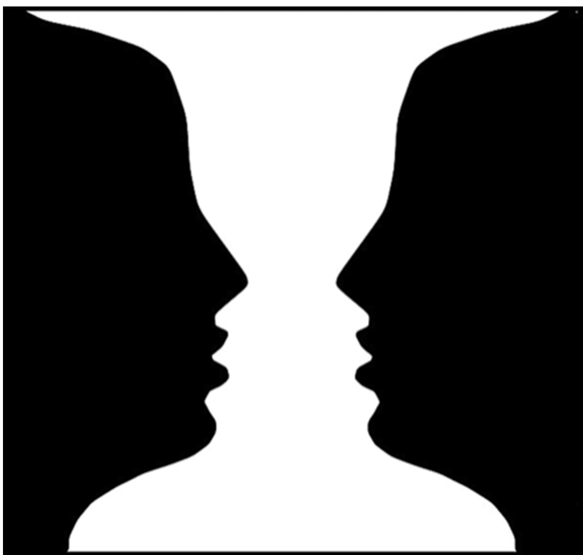
FIGURE 2.17 Vase or faces? Perception of figure versus ground depends on a viewer’s focus of attention.
图 2.17 瓶子还是人脸?图形与背景的感知取决于观察者的注意力焦点。
在用户界面和网页设计中,主体/背景原理经常用来在主要显示内容的“下方”放置印象诱导的背景。背景可以传递信息,例如用户在系统中的位置,就像 Android 桌面在图 2.18 中,或者它可以建议一个主题、品牌或情绪来解释内容。

图 2.18 图形/背景在手机、平板电脑和计算机中用于显示设备的“主页”或“桌面”屏幕。
图形/背景也常用于在其它内容上弹出信息。原本是图形——用户注意力的焦点——暂时成为新信息的背景,新信息短暂地作为新的图形出现(见图 2.19)。这种方法通常比暂时用新信息替换旧信息更好,因为它提供了上下文,有助于人们了解他们在交互中的位置。
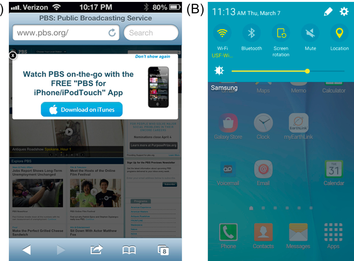
图 2.19 图形/背景可用于显示“覆盖”页面内容的信息:(A)PBS. Org 移动网站的号召性用语和(B)Android 设置下拉菜单。
格式塔原理:共同命运
前面 6 个格式塔原理针对的是静态(非运动)图形和对象,最后一个格式塔原理一共同命运,则涉及运动的物体。共同命运原理与接近性原理和相似性原理相关,都影响我们所感知的物体是否成组。共同命运原理指出一起运动的物体被感知为属于一组或者是彼此相关的。
例如,在数十个五边形中,如果其中 7 个同步地前后摇摆,人们将把它们看成相关的一组,即使这些摇摆的五边形互相之间是分离的,而且看起来与其他的也没什么不同(见图 2.20)。
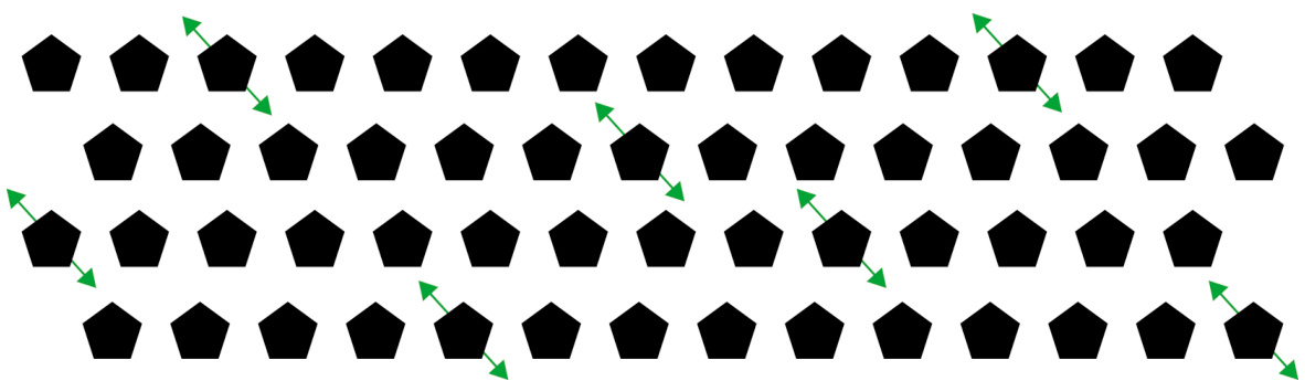
图 2.20 共同命运:一起运动的物体看起来是一组的或者相关的
共同的运动暗示共同的历程,在一些动态模拟中可用以展示不同实体的关系。例如,GapMinder 的图像中代表国家的点模拟经济发展的多个因素随着时间变化而变化,一同运动的国家具有相同的发展历史(见图 2.21)。
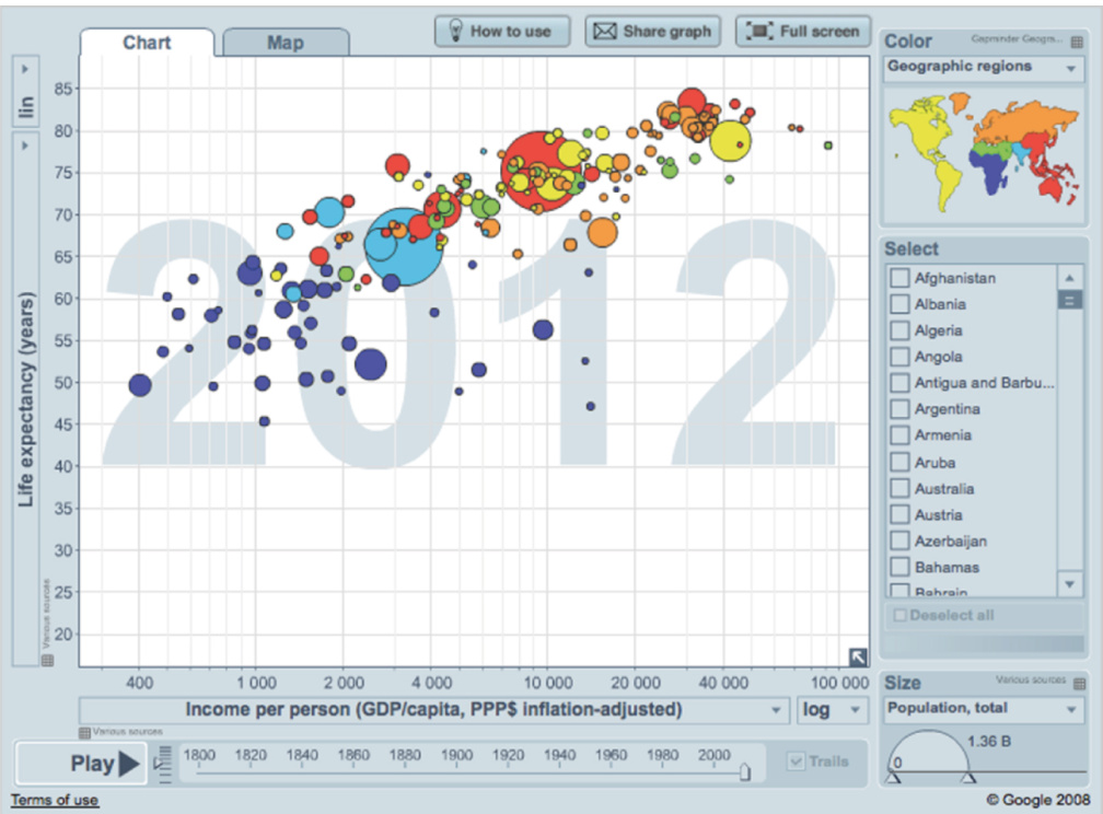
图 2.21 共同命运:GapMinder 动画模拟点显示哪些国家具有相似的发展历史(详情、动画和视频,请访问 Gapminder.org)。
将格式塔原理综合起来
当然,在现实世界的视觉场景中,各种格式塔原理不是孤立的,而是共同起作用的。例如,一个典型的 MacOS 桌面通常可以示范之前提到 7 个原理中的 6 个(除了共同命运原理):接近性原理、相似性原理、连续性原理、封闭性原理、对称性原理以及主体/背景原理(见图 2.22)。在典型的桌面中,当用户一次选取多个文件或者目录并拖曳到新的位置时,就用到了共同命运原理(还有相似性原理)(见图 2.23)。
图 2.22 除了共同命运原理,所有的格式塔原理在 MaCOS 桌面的这一部分都发挥了作用
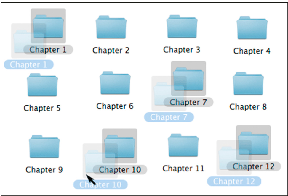
图 2.23 相似性原理和共同命运原理:当用户拖曳选中的文件夹时,共同的高亮和运动使得所有被选中的文件夹看起来是一组的
同时用上所有的格式塔原理时,设计可能会导致无意产生的视觉关系。推荐的办法是,在设计一个显示之后,使用每个格式塔原理(接近性原理、相似性原理、连续性原理、封闭性原理、对称性原理、主体/背景原理以及共同命运原理)来考量各个设计元素之间的关系是否符合设计的初衷。
重要要点
为了方便参考,本章介绍了格式塔视觉感知原则,这些原则与用户界面设计最相关:
• Proximity: Objects near each other (relative to other objects) appear grouped, while those farther apart do not.
• 接近性:彼此靠近的物体(相对于其他物体)看起来是分组的,而彼此距离较远的则不是。
• Similarity: Objects that look similar appear grouped.
• 相似性:看起来相似的物体会被归为一组。
• Continuity: Our visual perception is biased to perceive continuous forms rather than disconnected segments.
• 连续性:我们的视觉感知倾向于感知连续的形态而非分离的片段。
• Closure: Our visual system automatically tries to close figures that are open so they are perceived as whole objects rather than separate pieces.
• 闭合性:我们的视觉系统会自动尝试闭合开放的图形,使它们被视为整体对象而非单独的碎片。
• Symmetry: Our visual system parses complex scenes in a way that reduces their complexity by recognizing symmetries in the scene.
• 对称性:我们的视觉系统通过识别场景中的对称性来解析复杂场景,从而降低其复杂性。
• Figure/Ground: Our mind separates the visual field into the figure (the foreground) and ground (the background). • Common Fate: Objects that move together are perceived as grouped or related.
• 图形/背景:我们的头脑将视觉领域分为图形(前景)和背景(地面)。 • 共命运:一起移动的物体被视为分组或相关。
第三章:我们探索和利用视觉结构
摘要
人们使用视觉结构来帮助他们从所见中提取信息。因此,以结构化方式显示信息的交互式系统使人们更容易、更快地提取所需信息。本章提供了结构化与非结构化信息显示的示例。例如,在呈现信息时,一个重要的目标是提供视觉层次结构——信息的排列方式将其分为不同的部分和子部分,突出显示部分以清楚地标识其内容,并比低级部分更强烈地呈现高级部分。这允许人们在扫描信息时,能立即将与其目标相关的内容与不相关的内容分开,并专注于相关信息。
关键词
Credit card numbers; Online forms; Repetition; Search results; Social security numbers; Tables; Telephone numbers; Visual hierarchy; Visual structure
信用卡号码;在线表单;重复;搜索结果;社会保障号码;表格;电话号码;视觉层次结构;视觉结构
第二章展示了我们的视觉系统如何根据视觉感知的格式塔原则来感知结构。感知环境中的结构有助于我们快速理解物体和事件。第二章还解释了,当人们浏览软件或网站时,他们不会仔细检查屏幕并阅读每个字。他们会快速扫描与他们目标相关的信息。本章(1)表明,当信息以简洁、结构化的方式呈现时,人们更容易扫描和理解,并(2)解释了如何最佳地组织信息。
结构化信息更容易浏览
考虑一下对同一机票预定信息的两种呈现方式:一种是松散无结构的文字,另一种是以概述的形式结构化的文字(见图 3-1)。与用松散文字呈现的信息相比,结构化呈现的订票信息能够被更快地浏览和理解。
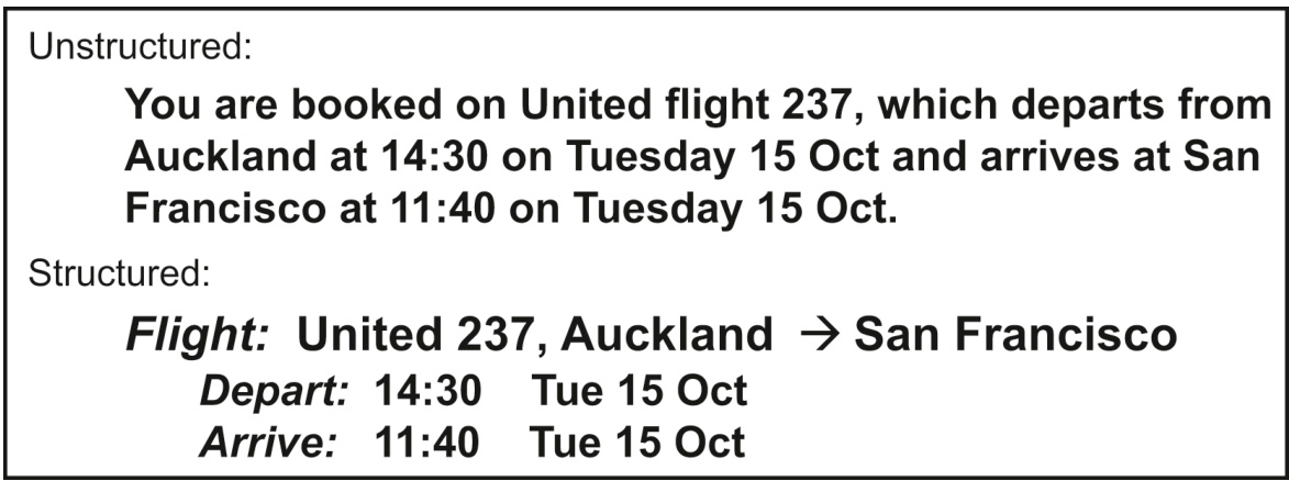
图 3-1 结构化呈现的航班预定信息更容易浏览和理解
接下来,考虑两种展示列表的方式。如上所述,第一种是不结构的散文文本;第二种是使用项目符号(见图 3.2)进行结构化。与散文段落相比,项目符号列表更快地扫描和理解。如果列表是编号的,情况也是如此。
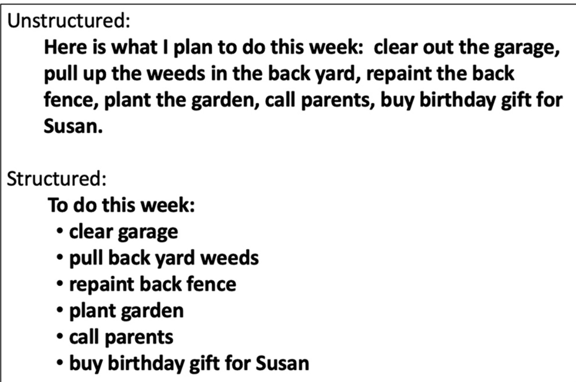
图 3.2 结构化(项目符号)列表更容易扫描。
信息呈现越结构化和简洁,人们就越能快速轻松地扫描和理解它。看看加利福尼亚州机动车管理局的“驾照续期、重复和变更”页面(见图 3.3)。即使有项目符号列表,冗长、重复的链接也会让用户放慢速度,并“隐藏”他们需要看到的重要词语。
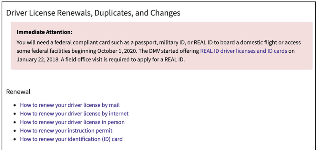
图 3.3 加利福尼亚州机动车管理局网站的内容页面上,重要的信息被掩埋在散乱重复的文字之中
比较一下这种更简洁、结构化的假设设计,它消除了不必要的重复,并且只将代表选项的词语标记为链接(见图 3.4)。修订版提供了与网站实际页面相同的信息和选项,但更容易浏览。
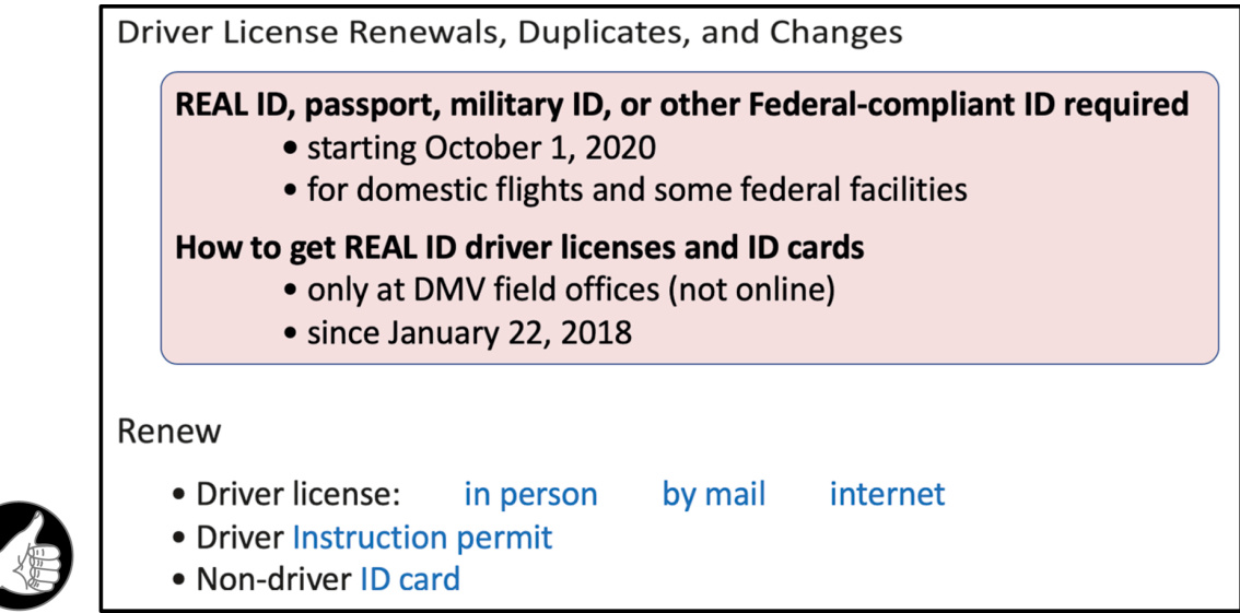
图 3.4 去掉加利福尼亚州机动车管理局网站内容页面上重复的文字,使用更好的视觉结构。
显示搜索结果也是结构化数据并避免重复“噪音”可以提高人们快速浏览并找到他们需要的内容的情况。2006 年,HP.com 的搜索结果包含大量重复的导航数据和每个检索项的元数据,以至于它们毫无用处。最近的 HP 网站消除了重复并结构化结果,使它们更容易浏览且更有用(见图 3.5)。
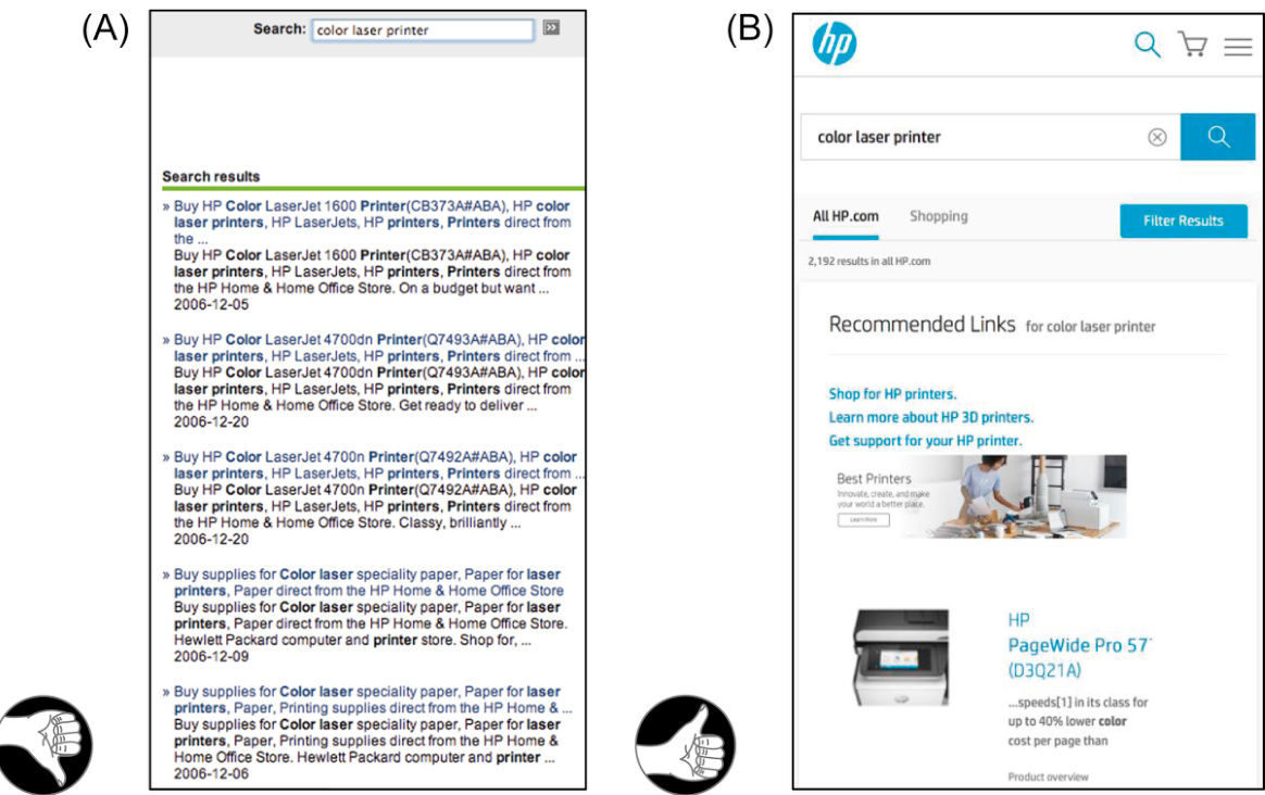
图 3.5 2006 年,HP.com 的站内搜索呈现重复的、高噪声的结果(A),但后来(2019 年)得到了改进(B)。
当然,要让信息能够被快速地浏览,仅仅把它们变得精炼、结构化和不重复还不够,它们还必须遵从图形设计的规则,第 2 章已经介绍了其中的一些。
例如,一个房地产网站上的预览版的按揭计算器将其计算结果用表单的形式展示,就违反了至少两条重要的图形设计的规则(见图 3.6A)。其一,人们在线或离线阅读时通常是从上往下,但计算结果的标签却被放置在其结果值的下方;其二,标签和对应的值与下一个值之间的距离一样近,因此标签与其对应的值不能通过接近性(见第 2 章)被感知到是相关的。用户要理解这张按揭计算表格,就得非常费劲地认真检查,慢慢地搞清楚哪个标签对应哪个值。
相比之下,修订后的设计允许用户无需有意识思考就能感知标签与值的对应关系(见图 3.6B)。
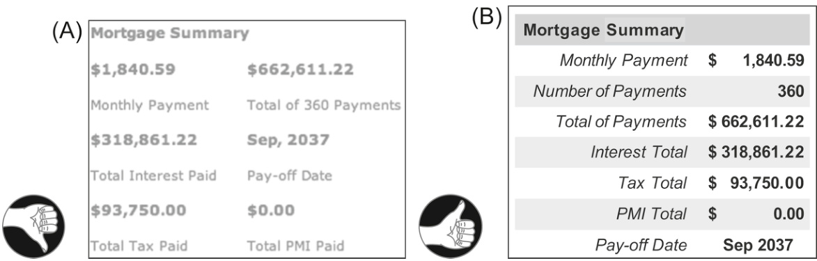
图 3.6 (A)软件抵押贷款计算器展示的抵押摘要;(B)一个改进的设计。
视觉层次结构帮助人们找到相关信息
结构化信息展示最常见的方法之一是提供视觉层次结构——一种安排方式:
• 将信息分成不同的部分,并将大部分分成子部分;
• 醒目地标记每个部分和子部分,以便内容能被清晰识别;
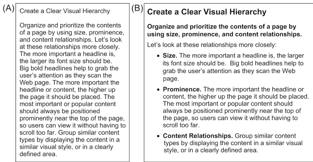
图 3.7 在这些显示中找到关于醒目的建议。散文文本格式(A)迫使用户阅读或浏览所有内容。视觉层次结构(B)让用户跳过不相关的内容,直接找到与他们目标最相关的信息。
将章节和子章节以层次结构呈现,高级别的章节呈现得比低级别的章节更突出。
视觉层次结构使人们在浏览信息时,能够快速区分与目标相关的信息和不相关的信息,并专注于相关信息。他们能更快地找到他们要找的内容,因为他们可以轻松地跳过其他所有内容。
亲自试试。看看图 3.7 中的两个信息显示,找到关于突出显示的信息。在非层次结构显示中,你找到它需要多长时间?
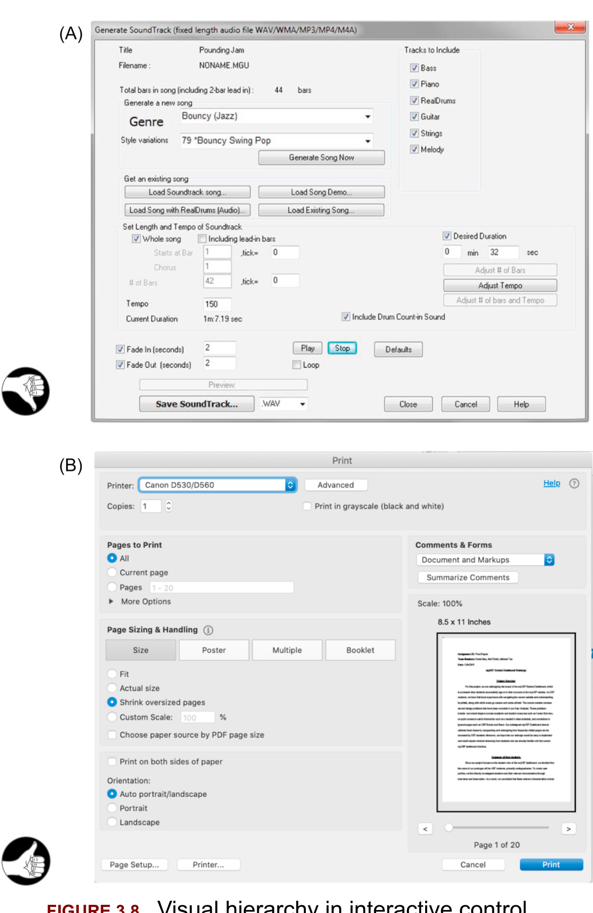
图 3.7 中的示例展示了视觉层次结构在纯文本、只读信息显示中的价值。视觉层次结构在交互式控制面板和表单中同样重要——甚至可能更重要。比较两个不同软件产品的对话框(见图 3.8)。音乐应用 Band-in-a-Box 的“生成音轨”对话框视觉层次结构较差,使用户难以扫描并快速找到设置。相比之下,Adobe Acrobat Pro 的“打印”对话框具有更好的视觉层次结构,因此用户可以快速找到所需的设置。
超越视觉层次结构:信息层次结构
视觉层次结构实际上应该被称为“信息层次结构”,因为其基本设计原则比视觉设计更广泛地适用。使用标题、副标题和其他分组来定义章节和子章节,按层次结构组织信息,甚至可以帮助视障和盲人用户找到他们需要的内容。
panels and forms lets users find settings quickly:
面板和表单使用户可以快速找到设置:
(A) Band-in-a-Box (2017—差) 和 (B) Adobe Acrobat Pro (2019–好)
考虑一个使用屏幕阅读器的盲人用户在图 3.7 中搜索关于“突出性”的信息,或者试图在图 3.8 中显示的对话框中找到特定设置。
对于图 3.7A,盲人用户将不得不指挥他们的屏幕阅读器系统地阅读大部分信息,然后才能到达所需内容,但在图 3.7B 中,信息通过标题分为各个部分,盲人用户可以让他们的屏幕阅读器只读取各个部分的标题,跳过无关部分的内容。这样他们可以更快地找到关于“突出性”的信息。
类似地,使用 Band-in-a-Box 的“生成音轨”对话框(见图 3.8A),视障用户将不得不费力地通过大部分设置来找到他们想要的设置,但使用 Acrobat Pro 的“打印”对话框(见图 3.8B),如果区域标题被标记为标题,他们可以快速找到相关部分,然后在其中查找他们想要的控件。
为了帮助网络开发者和设计师创建可供视障人士使用的信息显示,万维网联盟(W3C)制定了《万维网内容可访问性指南》(WCAG 2.0)(W3C,2008a)。WCAG 2.0 指南建议设计师使用层叠样式表来标记文本部分和子部分,以及屏幕的划分和子划分,并使用适当级别的标题(W3C,2008b)。
“Chunking” Helps People Scan and Enter Data
“信息块化”帮助人们扫描和输入数据
Even small amounts of data can be made easier to scan if they are structured. Two examples are telephone and credit card numbers (see Fig. 3.9). Such numbers should be broken into parts—often called “chunks”—to make them easier to scan and remember. The right size for chunks was determined by psychologists and humanfactors researchers decades ago when telephone numbers and credit card numbers were introduced (e.g., Miller, 1956). It is based on the capacity of human short-term memory (Moran, 2016) (see also Chapter 7).
即使是少量的数据,如果它们结构化,也会更容易扫描。电话号码和信用卡号码就是两个例子(见图 3.9)。这些数字应该被分成几部分——通常称为“块”——以便更容易扫描和记忆。块的大小是由心理学家和人类因素研究人员在几十年前电话号码和信用卡号码被引入时确定的(例如,米勒,1956 年)。这是基于人类短期记忆的容量(莫兰,2016 年)(另见第 7 章)。
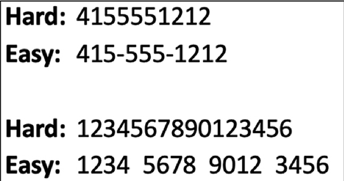
图 3.9 当电话号码和信用卡号码被分成“块”时,它们更容易扫描、理解和记忆。
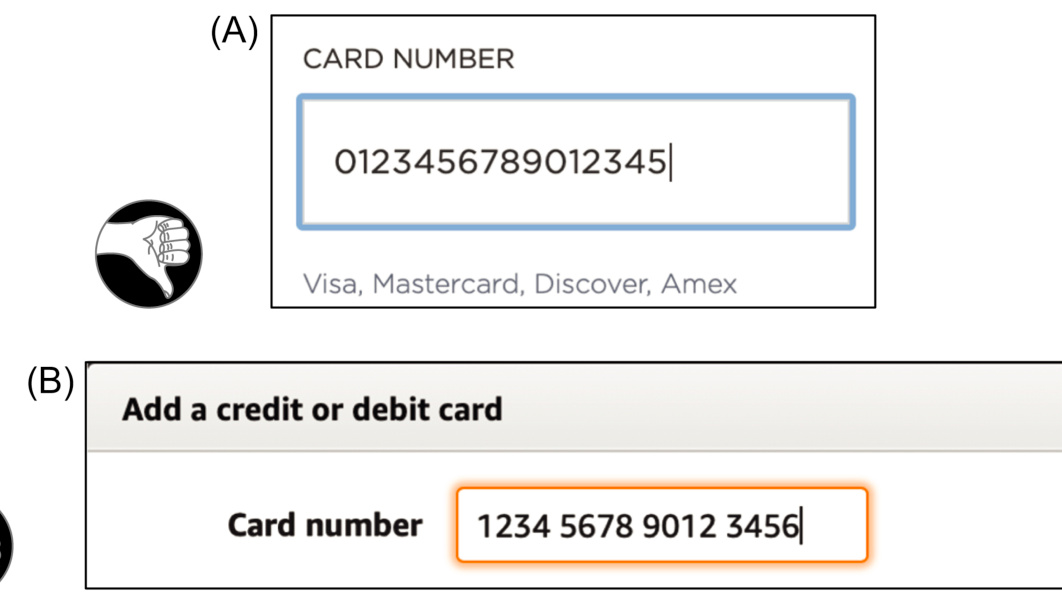
图 3.10 (A) 在 KP.org(2020 年),信用卡号码不能包含空格或其他标点符号,这使得它们难以扫描和验证。(B) 在 Amazon.com(2020 年),当用户输入号码时,会自动添加空格。
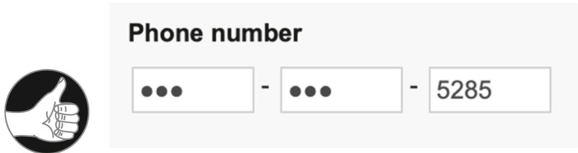
图 3.11 BankOfAmerica.com(2020 年)将电话号码分成三部分,这使得输入格式错误的号码变得不可能。
不幸的是,当今许多数字演示中的电话号码和信用卡号码既不进行分段,也不允许用户插入空格、连字符、括号或其他标点符号(见图 3.10A)。这使得人们更难扫描一个号码或验证他们是否输入正确,因此被认为是一个用户界面设计错误(约翰逊,2007 年)。
为了更加用户友好,用户界面应该支持数字的分段,允许用户使用空格或其他标点符号将它们分开(见图 3.10B)。
或者,设计师可以通过为号码的每个部分提供单独的字段来支持长数字的分段。即使要输入的数据严格来说不是数字,单独的数据字段也可以提供有用的视觉结构。日期和电话号码就是一个例子,其中分段字段可以提高可读性并帮助防止数据输入错误(见图 3.11)。
“分段”数据不仅有助于人们扫描、理解和记忆长数字,还有助于记忆和理解其他类型的数据。它使数据更好地适应人类记忆和注意力的局限性,这些内容将在第 7 章和第 8 章中更详细地讨论。
为输入提供更多结构:数据特定控制
从分段文本字段的结构升级到数据特定控件。设计师可以将文本字段和其他控件组合起来创建混合控件,以获取特定类型的数据。使用数据特定控件,用户无法输入无效数据,因此消除了一种可能的用户错误类型。
例如,如今大多数航空公司使用文本字段和日历控件让客户选择航班日期(见图 3.12)。
结构化的数据特定控件也可以由菜单构建。例如,Southwest.com 使用月份、日期和年份菜单来构建出生日期控件(见图 3.13A)。菜单也可以与文本字段组合,就像 Google 的出生日期控件(见图 3.13B)一样。
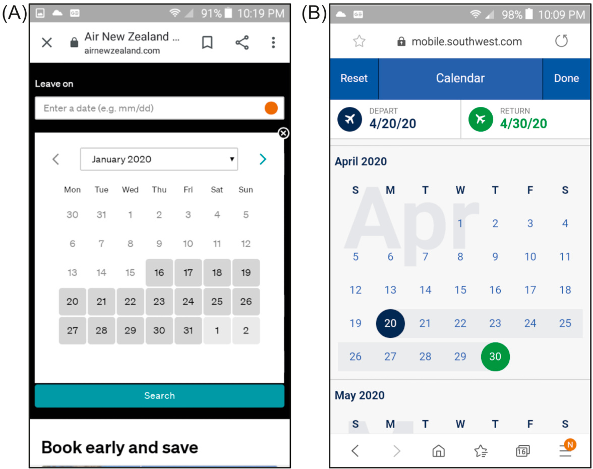
图 3.12 获取航班日期,大多数航空公司使用混合控件:文本字段
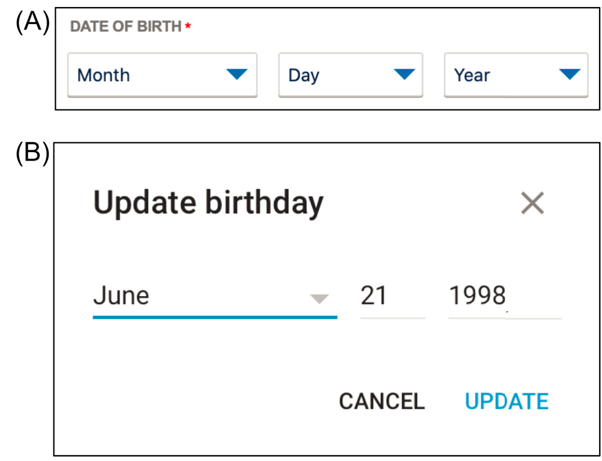
图 3.13 出生日期控制:(A) 2020 年西南航空公司菜单;(B) 2020 年谷歌菜单+文本字段。
重要要点
• 以简洁、结构化的方式呈现信息,使人们更容易浏览、理解和记忆。消除不必要的词语和重复。使用项目符号和编号列表,而不是文本段落。
• 视觉层次结构——将内容分成清晰标记的部分和子部分——是结构化信息的“最佳实践”方法。
• 使用屏幕阅读器可以识别为标题的部分标题和标签来分层信息,有助于视障人士找到他们想要的内容。
• 数据分块——如电话号码、信用卡号码、序列号——有助于人们浏览、输入和记忆。
第四章 :我们的色彩视觉有限
Chapter 4: Our Color Vision is Limited
摘要
这一章从视觉系统神经生理学概述开始,将其与数码相机的工作原理进行比较。然后解释了人类色觉的优缺点:我们可以检测对比度和边缘,但不能检测整体亮度水平;颜色的辨别很大程度上取决于其显示方式和显示类型;人们的颜色辨别能力各不相同。本章解释了色盲是什么,以及它并不意味着无法看到颜色。本章最后提供了设计指南。
关键词
亮度;色盲;色觉错觉;色觉;视锥细胞;对比度;显著颜色;边缘检测;指南;冗余;视网膜;视杆细胞;优点;缺点
色觉是有限的
人类的色彩感知既有优势也有限制,其中不少与用户界面设计相关,例如:
我们的视觉是为检测反差(边缘)优化的,而不是绝对亮度;
我们辨别颜色的能力依赖于颜色的呈现方式;
有些人是色盲;
屏幕和观看条件会影响用户对颜色的感知。
要理解人类色觉的这些特点,我们首先简单描述一下人类视觉系统如何处理环境中的颜色信息。
要理解人类色觉的这些特点,我们首先简单描述一下人类视觉系统如何处理环境中的颜色信息。
色觉是如何工作的
如果你在学校上过心理学或者神经生理学的课程,或许你已经知道了眼睛内的视网膜(也就是眼球里聚焦成像的表面)有两类感光细胞:视杆细胞和视锥细胞。你或许也了解了视杆细胞察觉光线强度但感觉不到颜色,而视锥细胞能察觉颜色。最后,你或许还知道有三类视锥细胞,分别对红色、绿色和蓝色光敏感,这意味着我们的色觉与摄影机和计算机显示器类似,通过红色、绿色和蓝色像素的组合来探测或形成多种颜色。
人们在学校里学到的知识只有一部分是正确的。对于视觉系统正常的人,视网膜上的确有对亮度敏感的视杆细胞和三种对不同频率的光敏感的视锥细胞。然而目前,大部分人在学校里学到的知识与真实的情况存在有一定差距。
首先,处于工业化社会中的我们几乎用不到视杆细胞,它们只在低亮度下工作。在光线很暗的环境中,如 19 世纪前我们祖先所生活的环境中,它们才起作用。今天,我们只有在烛光晚餐、夜里在黑暗屋子周围摸索、夜晚在外宿营等情况下才用到视杆细胞。(见第 5 章。)在明亮的白天和人工照明环境(我们在此打发的时间最多)下,视杆细胞则完全过曝了,不能提供任何有用信息。大部分时间里,我们的视觉完全基于视锥细胞所提供的信息(Ware,2008)。
那么视锥细胞是如何工作的?三种视锥细胞分别对红色、绿色和蓝色光敏感吗?事实上,每种视锥细胞敏感的光谱比你想象的还要广,而且三者的敏感范围是互相重叠的。此外,这三类视锥细胞的敏感度相差非常大(见图 4.1A):
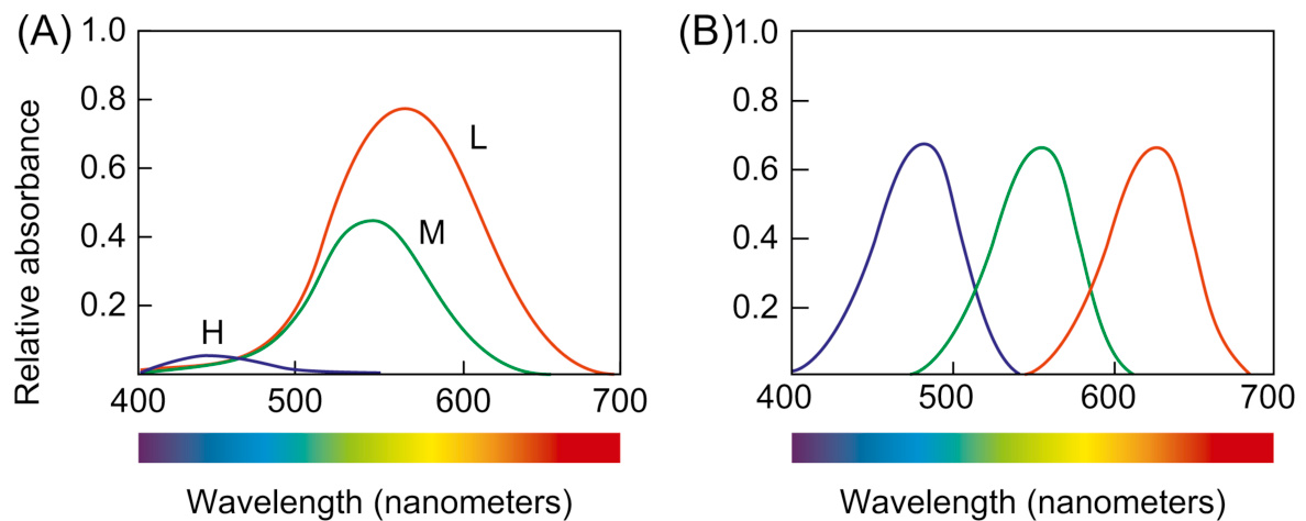
图 4.1 视网膜三类视锥细胞对光的敏感度(A)对比人造红色、绿色和蓝色光感受器对光的敏感度(B)。
- 低频。这些视锥细胞对整个可见光频谱都敏感,但对处于频谱中间的黄色和低频的红色最敏感。
- 中频。这些视锥细胞对从高频的蓝色到中频偏低的黄色和橙色有反应,但在整体上,它们的敏感度低于低频的视锥细胞。
- 高频。这些视锥细胞对可见光的高频部分(紫色和蓝色)最敏感,但对中频(如绿色)的敏感度较低。此类视锥细胞的整体敏感度较前两者都低,数量上也更少。因此,我们的眼睛对蓝色和紫色不如对其他颜色敏感。
比较我们视网膜锥状细胞的光敏感性图(图 4.1A)与如果电气工程师设计我们的视网膜为像相机一样的红、绿、蓝敏感的受体镶嵌图(图 4.1B)可能的样子。
在了解了我们视网膜上的这三类视锥细胞敏感度的奇怪关系后,我们就会对大脑如何综合视锥细胞传来的信号从而看到各种颜色而感到好奇了。
答案就是:做减法。大脑后部视皮层上的神经元将通过视神经传递来的中频和低频视锥细胞的信号去掉,得到一个“红一绿”减影信号通道。另一些神经元将来自高频和低频视锥细胞的信号去掉,得到一个“黄一蓝”减影信号通道。第三组神经元将来自低频和中频视锥细胞的信号相加产生一个整体的亮度(或者叫“黑一白”)信号通道。这三个通道叫做颜色对抗通道。
接下来,大脑对所有颜色对抗通道做更多的减法处理:来自视网膜上某个区域的信号将被来自其附近区域的类似信号减掉。
视觉是为边缘反差而不是为亮度优化的
Vision is Optimized for Detection of Edges, Not Brightness
所有这些减法处理使得我们的视觉系统对颜色和亮度的差别,即对比鲜明的边缘,比对绝对的亮度水平要敏感得多。
为验证这一点,请看图 4-2 中内部的色块。内部色块右边的颜色看上去更深一些,但实际上左右两边的灰度是一样的。我们的视觉系统对差异十分敏感,因为外部矩形块的左边颜色较深,右边颜色较浅,这才使得我们感觉,内部色块的左边较浅,右边较深。

图 4.2 内部色块右边的颜色看上去更深一些,但实际上左右两边的灰度是一样的
视觉系统对对比度敏感而不是对绝对亮度敏感是人类的一个优势,这样我们原始社会的祖先无论是在阳光普照的响午,还是在阴云密布的清晨,都能分辨出躲在附近灌木丛中的豹以及其他类似的危险动物。同样,对颜色对比度而不是对绝对色彩敏感,会让我们觉得阳光下和阴影里的玫瑰花都一样红。
马萨诸塞理工学院的脑研究者爱德华·H·阿德森开发了一个出色的图示,说明了我们的视觉系统对绝对亮度的不敏感性和对对比度的敏感性(见图 4.3)。尽管可能难以置信,棋盘上的方块 A 与方块 B 的色调完全相同。方块 B 看起来是白色,是因为它被描绘在圆柱体的阴影中。
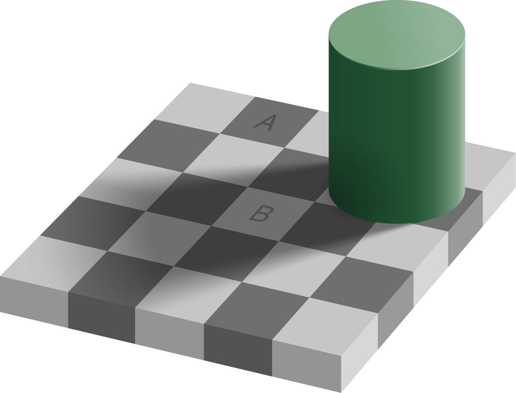
图 4.3 标记的方块 A 和方块 B 是同一种灰色,但我们觉得 B 是白色的,因为它在“影子”里
区别颜色的能力取决于颜色是如何呈现的
我们对颜色之间差别的察觉也是有限的。基于视觉系统运作的方式,有以下三个呈现因素影响了我们区分颜色的能力:
- 深浅度两个颜色越浅(不饱和),就越难将它们区分开(见图 4.4A)。
- 色块的大小对象越小或者越细,就越难辨别它们的颜色(见图 4.4B)。
- 分隔的距离两个色块之间离得越远,就越难区分它们的颜色,尤其是当它们之间的距离大到眼球需要运动时(见图 4.4C)。
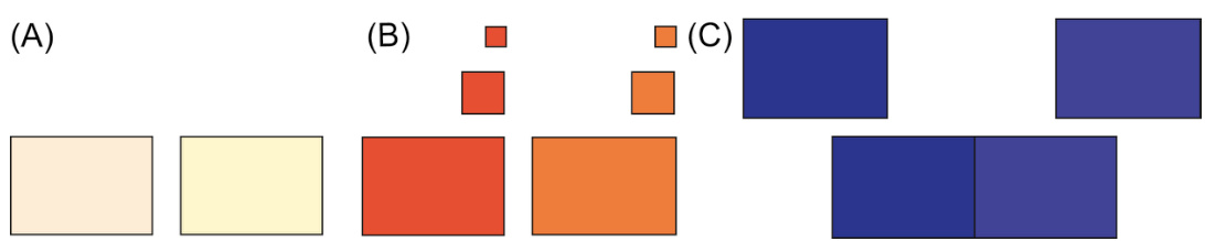
图 4.4 影响区分颜色能力的因素:(A) 肤色、(B) 大小和 (C) 分离。
图 4.5 展示了一个颜色过浅以至于任何设备上的任何人都不容易看到的例子。这是一个模拟的航空公司网站登机步骤指示器。当前步骤在圆圈内仅用浅绿色标记。也许你能区分绿色填充的圆圈和白色圆圈,但如果你有视力障碍或你在灰度屏幕或白平衡问题的数字投影仪上查看,也许你无法区分。

图 4.5 当前步骤仅用浅色标记,这使得一些用户难以看清。
在数据图表中经常能看到小的色块。许多商业制图软件会在图表旁边生成图例,但图例中的色块非常小(见图 4.6)。图例中的色块应该大到能帮助用户辨别不同的颜色(见图 4.7)。
图 4.6 图例中的小色块很难区分。
图 4.7 大色块更容易区分颜色。
网站上常常用颜色来区别访问过和未访问过的链接。在某些网站上,二者的颜色太接近了。明尼阿波利斯市的联邦储备银行的网站(见图 4.8)就有这样的问题。此外,它用的两种颜色是深浅不同的蓝色,而蓝色是人眼最不敏感的颜色。你能找到那两个访问过的链接吗
图 4.8 在MinneapolisFed.org 上,已访问和未访问链接之间的颜色差异过于微弱。
色盲
交互式系统设计原则中影响颜色呈现的第四个因素是颜色是否可以被有常见类型色盲的人区分。除了严重情况外,有色盲并不意味着完全无法看到颜色。这意味着一个视力正常的人的三种类型的色觉锥状细胞受体细胞(见上文“颜色视觉如何工作”部分)并不全部功能,导致难以或不可能区分某些颜色对。大约
图 4.9 红绿色盲的人无法区分(A)深红色和黑色,(B)蓝色和紫色,(C)浅绿色和白色。
家庭金融软件 MoneyDance 提供了家庭支出分解的图表,用不同颜色来标记不同类别的消费(见图 4.10)。不幸的是,其中许多颜色是色盲人士无法区分的色相。例如红绿色盲的人无法区分蓝色和紫色,或者绿色和卡其色。如果你不是色盲,可以将图像转换为灰度图,来了解图上哪些颜色是难以区分的(见图 4.11)但最好像本章节后续内容“使用色彩的准则”中将要提到的那样,用色盲滤镜或模拟器来测试一下图像(见图 4.12)。
图 4.10 Moneydance 的图表使用了某些用户无法区分的颜色。
图 4.11 转换为灰度图后的 MoneyDance 图表
图 4.12 Google 的标志:(A)正常视觉下的观察效果,(B)红绿色盲滤镜下的观察效果
影响我们区分颜色的外部因素
External Factors That Influence Our Ability to Distinguish Colors
外部环境因素也能影响人们分辨色彩的能力,例如以下一些因素:
• 颜色显示的变化。电脑显示屏因各自采用的技术、驱动程序或者色彩设置的不同,在色彩显示上存在差异。即使是采用同样设置的同一型号显示器,在色彩显示上也会有轻微的不同。在一台显示器上看起来是黄色的东西,在另一台上看起来可能就是米黄色。而在一台显示器上看起来明显不同的颜色,在另一台上看起来也许就是相同的。
• 灰度显示。虽然大部分显示器是彩色的,但还是有些设备,尤其是小型手持设备,采用了灰度显示器。图 4.13 展示了在灰度显示器上,一些原本颜色不同的区域看起来是相同的。
• 日间/夜间调整和暗黑模式。大多数现代智能手机、平板电脑和电脑都可以调整它们的色彩平衡,无论是按需调整还是根据一天中的时间进行调整。一些色彩调整是微妙的,例如当设备减少显示器中的蓝色含量,以避免在晚上使用设备后干扰用户的睡眠能力时。 其他颜色调整非常明显,例如切换到“暗黑模式”,它会在深色背景上显示浅色内容(讽刺的是,这就像几十年前大多数电脑终端的样子)。所有这些都会影响用户在用户界面中看到的颜色。
图 4.13 电子书阅读器带灰度屏幕。
显示器角度
一些电脑显示器,尤其是液晶显示器,在直视角度观看要比偏一定角度看时效果好得多。当从一定角度观看液晶屏时,色彩以及色彩之间差别都会发生变化。
环境光线
照射在屏幕上的强光会在将明暗区域的差别“冲洗”掉之前先将色彩“冲洗”掉,将彩色屏变成灰度屏,在阳光直射下使用过银行自动柜员机的人都体会过这种情况。办公室里的眩光和百叶窗的影子都能使颜色看起来不一样。
这些外部因素通常不在软件设计者的控制范围内。因此,设计者们应记住他们并不对用户的观看体验具有完全的控制。在普通办公室照明条件下,用开发环境里的电脑显示器看到的高辨识度的色彩,在软件的其他使用环境里就未必能够分辨得出来。
使用色彩的准则
在依赖颜色来传递信息的交互软件系统中,遵循以下 5 条准则,以保证用户能够获取信息。
使用鲜明的颜色。回忆一下,我们的视觉系统结合视网膜视锥细胞的信号,产生三个颜色对立通道:红-绿、黄-蓝和黑-白(亮度)。人们最容易区分的颜色是那些在一个颜色感知通道上产生强烈信号(正向或负向),而在其他两个通道上产生中性信号的颜色。毫不奇怪,这些颜色是红、绿、黄、蓝、黑和白(见图 4.14)。所有其他颜色都在多个颜色通道上产生信号,因此我们的视觉系统无法像区分这六种颜色那样快速轻松地将其与其他颜色区分开来(Ware,2008)。
分离强烈的对立颜色。将对立颜色紧挨着或放在彼此上面会导致令人不适的闪烁感,因此应避免(见图 4.15)。
通过饱和度、亮度和色调来区分颜色。为了使您的软件使用的颜色对所有有视力的用户都可见,请避免使用微妙的颜色差异。确保颜色之间的对比度足够高(但请参阅指南 5)。一种测试颜色是否足够不同的方法是将其转换为灰度。如果您在灰度渲染时无法区分颜色,则它们的差异不够。
避免使用色盲人士无法区分的颜色组合。此类组合包括深红色与黑色、深红色与深绿色、蓝色与紫色、浅绿色与白色。不要将深红色、蓝色或紫色与任何深色搭配使用。相反,应将深红色、蓝色和紫色与浅黄色和绿色搭配使用。使用在线色盲模拟器 4 检查网页和图像,以查看各种色觉缺陷的人将如何看到它们。

图 4.14 最独特的颜色:黑、白、红、绿、黄和蓝。每种颜色只在一种颜色对立通道上产生强信号。

图 4.15 对抗色直接放在一起,让人崩溃
FIGURE 4.16 Don’t use color alone to convey meaning (A). Use it redundantly with other cues—e.g., shape (B).
不要仅用颜色来传达含义(A)。将其与其他线索一起重复使用——例如,形状(B)。

MinneapolisFed.org 的图表使用了所有视力正常的人在任何显示器上都可见的阴影差异。
将颜色与其他线索一起重复使用。不要仅依赖颜色。如果你用颜色来标记某物,也要用其他方式来标记它。例如,如果绿色表示一种含义,蓝色表示另一种含义,不要显示绿色和蓝色的点;显示一个绿色的三角形与一个蓝色的点,这样形状和颜色都能表示差异(见图 4.16)。
FIGURE 4.18 (A)设计不佳;(B)改进的、更易访问的设计:当前步骤使用加粗和更饱和的颜色重复突出显示。
美联储银行的图表遵循上述第 3 条指南,使用了绿色阴影(见图 4.17)。这是一个设计良好的图表。任何视力正常的人都能读懂它。
现在我们使用上述第 5 条指南来修复之前讨论的设计问题(见图 4.5),其中模拟航空公司登机过程中的当前步骤仅用浅绿色标记(见图 4.18A)。一种简单的纠正方法是,用粗圈标记当前步骤,用粗体步骤编号,在圆圈下方用粗体标签,并增加绿色的饱和度,使其与白色背景形成更强对比(见图 4.18B)。为了使使用屏幕阅读器的视障人士知道他们当前的步骤,还可以将当前步骤的 ALT 文本设置为“当前步骤”来标记它。通过这些改进,当前步骤被冗余地标记,正如第 4 条指南所推荐的。
重要要点
• 拥有正常色觉的人的视网膜中有三种类型的视锥细胞。色盲者只有两种功能类型的视锥细胞——在罕见情况下有一种类型——而一小部分女性有四种类型。
• 人类色觉主要通过减法工作:红减绿和蓝减黄。这使得我们的视觉系统主要对对比度、边缘和快速变化敏感,而对整体亮度水平或绝对颜色相对不敏感。
• 我们区分两块颜色区域的能力取决于:
• 肤色:两块颜色区域越浅,区分它们就越困难。
• 大小:区域越大,我们区分颜色就越容易。分离:它们越近,越容易区分。
• 有一些外部因素会影响我们区分颜色的能力:
• 颜色显示可能会在色彩平衡上有所不同。
• 一些显示器,例如许多电子阅读器上的显示器,是灰度或黑白。
• 许多现代显示器允许用户调整色彩平衡。夜间模式(降低蓝色水平)和暗色模式与亮色模式。
• 观看某些屏幕的角度会影响颜色的呈现。
• 环境光。
• 使用颜色的指南:
• 使用独特的颜色。
• 分离强烈的对手颜色。
• 根据饱和度、亮度和色调来区分颜色。
• 避免色盲人士无法区分的颜色组合。
• 使用颜色与其他线索重复。
1色盲人士可能只有两种或三种视锥细胞类型,而一些女性有四种(Eagleman,2012 年;Macdonald,2016 年)。
2总亮度总和忽略了高频(蓝紫色)视锥细胞的信号。这些视锥细胞非常不敏感,它们对总量的贡献可以忽略不计,因此忽略它们差别不大。
3已经查看了图 4.8 中的链接:已批准的住房单元和房价指数。
4在网络上搜索“色盲过滤器”或“色盲模拟器”。
第五章:我们的边界视觉很糟糕
摘要
人类的视觉在视觉场中央的一个小区域称为中央凹处具有高分辨率,而在其他地方分辨率较低。本章解释了造成这种现象的神经生理因素,例如中央凹和周边区域的视锥细胞密度差异很大。然后讨论了周边视觉的重要功能,例如引导中央凹和夜视。本章的大部分内容讨论了设计视觉用户界面时的重要意义和指南。例如,在人的视觉场周边以柔和颜色呈现的静止物品通常不会被注意到,因此错误消息应以强烈的对比色或短暂振动来吸引注意力。
关键词
注意力;视锥细胞;错误消息;中央凹;运动检测;夜视;周边视觉;分辨率;视网膜;视杆细胞;扫视;视觉皮层;视觉“弹出”;视觉搜索
第四章解释了人类视觉系统与数码相机在检测和处理颜色方面的不同。我们的视觉系统与相机在分辨率上也有差异。在数码相机的感光元件上,感光单元均匀地分布在一个紧密的矩阵中,因此整个图像帧的空间分辨率是恒定的。人类的视觉系统则不是这样的。
本章解释了原因:
• 在人眼视野的周边呈现的、颜色暗淡的静止物体通常不会被注意到。• 周边区域的运动通常会被注意到。
Resolution of the Fovea Compared With the Periphery
视网膜中央凹与周边的分辨率比较
The spatial resolution of the human visual field drops greatly from the center to the edges for three reasons:
人类视野的空间分辨率从中心到边缘会显著下降,原因有三点:
• Pixel density . Each eye has six to seven million retinal cone cells. They are packed much more tightly in the center of our visual field—a small region called the fovea—than at the edges of the retina (see Fig. 5.1). The fovea has about 158,000 cone cells in each square millimeter. The rest of the retina has only 9000 cone cells per square millimeter. • Data compression . Cone cells in the fovea connect 1:1 to the ganglial neuron cells that begin the processing and transmission of visual data, while elsewhere on the retina, multiple photoreceptor cells (cones and rods) connect to each ganglion cell. In technical terms, information from the visual periphery is compressed (with data loss) before transmission to the brain, while information from the fovea is not compressed.
• 像素密度。每只眼睛有六到七百万个视网膜视锥细胞。它们在视觉中心的中央区域——一个称为黄斑的小区域——比在视网膜边缘更紧密地排列(见图 5.1)。黄斑每个平方毫米约有 158,000 个视锥细胞。视网膜的其余部分每个平方毫米只有 9,000 个视锥细胞。• 数据压缩。黄斑中的视锥细胞与开始处理和传输视觉数据的神经节细胞一对一连接,而在视网膜的其他地方,多个感光细胞(视锥细胞和视杆细胞)连接到每个神经节细胞。从技术术语上讲,来自视觉外周的信息在传输到大脑之前会被压缩(并丢失数据),而来自黄斑的信息不会被压缩。
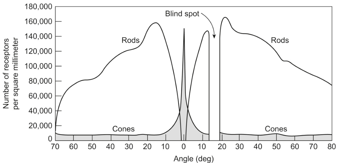
FIGURE 5.1Distribution of photoreceptor cells (cones and rods) across the retina. From Lindsay, P., Norman, D.A., 1972. Human Information Processing. Academic Press, New York and London.
图 5.1 视网膜上感光细胞(视锥细胞和视杆细胞)的分布。引自 Lindsay, P., Norman, D.A., 1972. 人类信息处理。学术出版社,纽约和伦敦。
• Processing resources . The fovea is only about
• 处理资源。中央凹仅占视网膜的
The result is that our vision has much, much greater resolution in the center of our visual field than elsewhere (Lindsay and Norman, 1972). Stated in developer jargon: in the center
结果是,我们的视野中心比其他地方具有更高的分辨率(Lindsay and Norman, 1972)。用开发者术语来说:在视野中心
To visualize how small the fovea is compared with your entire visual field, hold your arm straight out and look at your thumb. Your thumbnail, viewed at arm’s length, corresponds approximately to the fovea (Ware, 2008). While you have your eyes focused on the thumbnail, everything else in your visual field falls outside your fovea.
为了直观地感受中央凹与整个视野相比有多么小,将手臂伸直并注视你的拇指。在手臂的长度上看你的指甲盖,大约相当于中央凹(Ware, 2008)。当你专注于指甲盖时,视野中的其他一切都在你的中央凹之外。
In the fovea, people with normal vision have very high resolution: they can resolve several thousand dots within that region—better resolution than many of today’s pocket digital cameras. Just outside the fovea, the resolution is already down to a few dozen dots per inch viewed at arm’s length. At the edges of our vision, the “pixels” of our visual system are as large as a melon (or human head) at arm’s length (see Fig. 5.2).
在中央凹处,具有正常视力的人具有非常高的分辨率:他们可以在该区域内分辨出数千个点——其分辨率优于当今许多口袋式数码相机。在中央凹处的外围,分辨率已经下降到每英寸几十个点,在手臂长度处观察。在我们视野的边缘,我们视觉系统的“像素”在手臂长度处有 melon(或人头)那么大(见图 5.2)。
Even though our eyes have more rods than cones—125 million versus 6 to 7 million—peripheral vision has much lower resolution than foveal vision. This is because while most of our cone cells are densely packed in the fovea (in
尽管我们的眼睛比视锥细胞多出更多的视杆细胞——1250 万对 6 到 700 万——但周边视力比中央凹视力分辨率低得多。这是因为虽然我们大多数的视锥细胞在中央凹处密集分布(在视网膜的
FIGURE 5.2 The resolution of our visual field is high in the center but much lower at the edges. Right image from Vision Research, vol. 14, 1974. Elsevier.
图 5.2 我们的视野在中心分辨率很高,但在边缘则低得多。右图来自《视觉研究》第 14 卷,1974 年。Elsevier。
The resolution in your peripheral vision is roughly equivalent to looking through a frosted shower door, and yet you enjoy the illusion of seeing the periphery clearly.… Wherever you cast your eyes appears to be in sharp focus, and therefore you assume the whole visual world is in focus.
你的周边视觉分辨率大致相当于透过磨砂淋浴门看东西,但你仍然享受看到周边清晰的错觉……无论你把目光投向哪里,似乎都是清晰的焦点,因此你假设整个视觉世界都是清晰的。
If our peripheral vision has such low resolution, one might wonder why we don’t see the world in a kind of tunnel vision where everything is out of focus except what we are directly looking at now. Instead, we seem to see our surroundings sharply and clearly all around us. We experience this illusion because our eyes move rapidly and constantly about three times per second even when we don’t realize it, focusing our fovea on selected pieces of our environment. Our brain fills in the rest in a gross, impressionistic way based on what we know and expect. 1 Our brain does not have to maintain a high-resolution mental model of our environment because it can order the eyes to sample and resample details in the environment as needed (Clark, 1998).
如果我们的周边视觉分辨率这么低,人们可能会想为什么我们不会看到隧道视野,除了我们现在直接看着的东西,其他一切都模糊不清。相反,我们似乎能清晰地看到我们周围的周围。我们体验这种错觉是因为我们的眼睛即使在没意识到的情况下也会快速不断地移动,每秒大约移动三次,把我们的中央凹聚焦在我们环境中的选定部分。我们的大脑以粗略、写意的方式填充剩余部分,根据我们所知和所期望的。1 我们的大脑不必保持环境的高分辨率心理模型,因为它可以命令眼睛根据需要采样和重新采样环境中的细节(Clark,1998)。
For example, as you read this page, your eyes dart around, scanning and reading. No matter where on the page your eyes are focused, you have the impression of viewing a complete page of text because, of course, you are.
例如,当你阅读这一页时,你的眼睛四处扫视,扫读。无论你的眼睛聚焦在页面的哪个位置,你都有观看完整文本页面的印象,因为当然你是在看。
But now imagine this: you are viewing the page on a computer screen. The computer is tracking your eyes and knows where your fovea is focused. The computer shows the correct text for that spot, but everywhere else the computer shows random meaningless text. As your fovea zips around the page, the computer instantly updates each area where your fovea pauses to show the correct text there, while the previous position of your fovea returns to textual noise. Amazingly, experiments have shown that people rarely notice this: not only can they read, they believe that they are viewing a full page of meaningful text (Clark, 1998). However, it does slow people’s reading even if they don’t realize it (Larson, 2004).
但现在想象一下:你在电脑屏幕上查看页面。电脑正在追踪你的眼睛,知道你的视锥细胞聚焦在哪里。电脑显示该位置的正确文本,但在其他地方显示随机无意义的文本。当你的视锥细胞在页面上快速移动时,电脑会立即更新你视锥细胞暂停的位置以显示正确文本,而之前视锥细胞的位置则返回到文本噪音。令人惊讶的是,实验表明人们很少注意到这一点:他们不仅能阅读,还相信他们正在观看一整页有意义的文本(Clark,1998)。然而,即使他们没有意识到,这也确实会减慢人们的阅读速度(Larson,2004)。
Perhaps the best demonstration that our peripheral vision does not see as much detail as our foveal vision is Ninio’s Extinction Illusion (see Fig. 5.3). Try to count the dots. Only dots that are in the center of your visual field are visible even though the entire grid appears to be in sharp focus. This shows that what we perceive as high-resolution peripheral vision is actually an artificial construction of our visual system filling in what it expects to be there.
也许,我们周边视觉并不像中心视觉那样能看清细节的最佳证明是尼尼奥的消逝错觉(见图 5.3)。试着数一下点。只有位于你视野中心的点才是可见的,尽管整个网格看起来都很清晰。这表明我们感知为高分辨率周边视觉实际上是我们视觉系统的一种人为构造,它填补了它预期存在的地方。
The fact that retinal cone cells are distributed tightly in and near the fovea, and sparsely in the periphery of the retina, affects not only spatial resolution but also color resolution. We can discriminate colors better in the center of our visual field than at the edges.
视网膜中心凹附近的视锥细胞密集分布,而视网膜周边稀疏分布,这不仅影响空间分辨率,也影响颜色分辨率。我们在视野中心比在边缘更能区分颜色。
Another interesting fact about our visual field is that it has a gap— a small area (blind spot) in which we see nothing. The gap corresponds to the spot on our retina where the optic nerve and blood vessels exit the back of the eye (see Fig. 5.1). There are no retinal rod or cone cells at that spot, so when the image of an object in our visual field happens to fall on that part of the retina, we don’t see it. We usually don’t notice this hole in our vision because our brain fills it in with the surrounding content, like a graphic artist using Photoshop to fill in a blemish on a photograph by copying nearby background pixels.
关于我们的视觉场,一个有趣的事实是它有一个缺口——一个小区域(盲点),我们在这个区域什么也看不见。这个缺口对应着我们视网膜上视神经和血管从眼睛后部出来的地方(见图 5.1)。在这个点上没有视网膜视杆或视锥细胞,所以当我们在视觉场中的物体图像恰好落在视网膜的这个部分时,我们就看不见它。我们通常不会注意到我们视野中的这个洞,因为大脑会用周围的内容来填补它,就像一位图形艺术家使用 Photoshop 通过复制附近的背景像素来填补照片上的瑕疵一样。
People sometimes experience the blind spot when they gaze at stars. As you look at one star, a nearby star may disappear briefly into the blind spot until you shift your gaze. You can also observe the gap by trying the exercise in Fig. 5.4. Some people have other gaps resulting from imperfections on the retina, retinal damage, or brain strokes that affect the visual cortex, 2 but the optic nerve gap is an imperfection everyone shares.
人们有时在凝视星星时会体验到盲点。当你看着一颗星星时,一颗附近的星星可能会暂时消失在盲点中,直到你转移视线。你也可以通过尝试图 5.4 中的练习来观察这个缺口。有些人有其他缺口,这是由于视网膜上的缺陷、视网膜损伤或影响视觉皮层的脑卒中造成的,但视神经缺口是每个人都会有的缺陷。
Is the Visual Periphery Good for Anything?
视觉周边区域有什么用?
It seems that the fovea is better than the periphery at just about everything. One might wonder why we have peripheral vision. What is it good for? Our peripheral vision serves three important functions: it guides our fovea toward objects and events that match our goals, it detects motion and guides our fovea there, and it lets us see better in the dark.
看起来,中央凹在几乎所有方面都比周边视觉更好。人们可能会想,我们为什么有周边视觉?它有什么用?我们的周边视觉有三个重要作用:它引导中央凹朝向与我们的目标相匹配的物体和事件,它检测运动并引导中央凹到那里,它还让我们在黑暗中看得更清楚。
Function 1: guides fovea toward objects matching goals
功能 1:引导视网膜中央凹朝向与目标匹配的物体
Remember what Chapter 1 explained: our perception is biased by our goals. Peripheral vision provides low-resolution cues to guide our eye movements so that our fovea visits the interesting and crucial parts of our visual field. Our eyes don’t scan our environment randomly. They move so as to focus our fovea on important things—things related to our goals and to possible threats —the most important ones (usually) first. Think of peripheral vision as our visual system’s “forward patrol,” primed to notice important things and report them to “central command.” Thus, the fuzzy cues in the periphery of our visual field provide the data that helps our brain plan where to move our eyes and attention.
记住第一章所解释的:我们的感知受到我们目标的影响。周边视觉提供低分辨率的线索来引导眼球运动,以便中央凹访问我们视觉场中有趣和关键的部分。我们的眼睛不会随机扫描环境。它们移动是为了将中央凹聚焦在重要的事情上——与我们的目标和可能的威胁相关的事情——通常是首先关注最重要的事情。把周边视觉想象成我们视觉系统的“前沿巡逻队”,随时准备注意到重要的事情并向“中央指挥官”报告。因此,我们视觉场周边的模糊线索为我们的大脑提供了数据,帮助大脑计划眼球和注意力的移动位置。
For example, when we scan a medicine label for a “use by” date, a fuzzy blob in the periphery with the vague form of a date is enough to cause an eye movement that lands the fovea there to allow us to check it. If we are browsing a produce market looking for strawberries, a blurry reddish patch at the edge of our visual field draws our eyes and our attention, even though sometimes it will be radishes instead of strawberries. If we hear an animal growl nearby, a fuzzy animal-like shape in the corner of our eye will be enough to zip our eyes in that direction, especially if the shape is moving toward us (see Fig. 5.5). And as shown in Chapter 1, where we look on a web page or app screen depends on what on the display matches our goals.
例如,当我们扫描药品标签上的“有效期”时,外围模糊不清、形状模糊的日期足以引起眼球运动,使我们的视锥细胞聚焦在那里以进行检查。如果我们正在逛农产品市场寻找草莓,视野边缘模糊的红色斑块会吸引我们的眼球和注意力,即使有时那其实是小萝卜而不是草莓。如果我们听到附近有动物低吼,视野角落里模糊的动物形状就足以让我们的眼睛迅速转向那个方向,特别是当那个形状向我们移动时(见图 5.5)。正如第一章所示,我们在网页或应用程序屏幕上注视哪里取决于显示内容与我们的目标是否匹配。

FIGURE 5.5A moving shape at the edge of our vision draws our eye: it could be food, or it might consider us food.
图 5.5 视野边缘的移动形状会吸引我们的眼球:它可能是食物,也可能把我们当作食物。
How peripheral vision guides and augments central, foveal vision is discussed more in the “Visual Search is Linear Unless Targets ‘Pop’ in the Periphery” section later in this chapter.
外围视觉如何引导和增强中心视锥细胞视觉将在本章后面的“视觉搜索是线性的,除非目标在边缘‘突出’”部分进行更详细的讨论。
Function 2: detects motion
功能 2:检测运动
A related guiding function of peripheral vision is that it is good at detecting motion. Anything that moves in our visual periphery, even slightly, is likely to draw our attention—and hence our fovea— toward it. The reason for this phenomenon is that our ancestors— including prehuman ones—were selected for their ability to spot food and avoid predators. As a result, even though we can move our eyes under conscious, intentional control, some of the mechanisms that control where our eyes look are preconscious, involuntary, and very fast.
边缘视觉的一个相关引导功能是它擅长检测运动。我们视野边缘的任何移动,即使是轻微的,也可能会吸引我们的注意力——进而吸引我们的中央凹。这种现象的原因是,我们的祖先——包括类人祖先——被选择出来是因为他们能够发现食物和躲避捕食者。因此,尽管我们可以通过有意识、有目的的控制来移动眼睛,但控制眼睛看向哪里的某些机制是前意识的、无意识的,而且非常快。
What if we have no reason to expect that there might be anything interesting in a certain spot in the periphery, 3 and nothing in that spot attracts our attention? Our eyes may never move our fovea to that spot, so we may never see what is there.
如果我们没有任何理由期待某个视野边缘的特定位置可能有什么有趣的东西,3 并且那个位置没有任何东西吸引我们的注意力呢?我们的眼睛可能永远不会移动中央凹到那个位置,因此我们可能永远不会看到那里有什么。
Function 3: lets us see better in the dark
功能 3:让我们在黑暗中看得更清楚
A third function of peripheral vision is to allow us to see in low-light conditions—for example, on starlit nights, in caves, around campfires, etc. These were conditions under which vision evolved and in which people—like the animals that preceded them on Earth —spent much of their time until the invention of the electric light bulb in the 1800s.
边缘视觉的第三个功能是让我们能够在低光照条件下看东西——例如,在星光璀璨的夜晚、洞穴中、篝火周围等。这些是视觉进化的环境,也是人类——以及他们在地球上的前驱动物——在发明电灯泡之前的很长时间里花费大量时间的环境。
Just as the rods are less functional in well-lighted conditions (see Chapter 4), the cones don’t function very well in low light, so our rods take over. Low-light, rods-only vision is called scotopic vision. An interesting fact is that because there are no rods in the fovea, you can see objects better in low-light conditions (e.g., faint stars) if you don’t look directly at them.
正如棒状体在强光条件下功能较弱(见第 4 章),视锥细胞在弱光下也不太起作用,因此我们的棒状体会接管工作。弱光下仅由棒状体负责的视觉称为暗视觉。一个有趣的事实是,由于中央凹处没有棒状体,如果你不直接盯着看,在弱光条件下(例如微弱的星星)你能看得更清楚。
Examples From Computer User Interfaces
来自计算机用户界面的例子
The low acuity of our peripheral vision explains why users of software and websites fail to notice error messages in some applications and websites. When someone clicks a button or link, that is usually where his or her fovea is positioned. Everything on the screen not within 1–2 cm of the click location (assuming a normal computer viewing distance) is in peripheral vision, where resolution is low. If after the click, an error message appears in the periphery, it should not be surprising if the person does not notice it.
我们周边视觉的分辨率较低解释了为什么软件和网站的用户有时会忽略某些应用程序和网站中的错误消息。当某人点击按钮或链接时,他的或她的中央凹通常位于那里。屏幕上距离点击位置 1-2 厘米以外的所有内容(假设正常的计算机观看距离)都在周边视觉中,分辨率较低。如果在点击后,错误消息出现在周边视觉中,如果用户没有注意到它,也就不足为奇了。
For example, at Informaworld.com, the former online publication website of Informa Healthcare, if a user entered an incorrect username or password and clicked “Sign In,” an error message appeared in a “message bar” far away from where the users’ eyes were most likely focused (see Fig. 5.6). The red word “Error” might appear in the user’s peripheral vision as a small reddish blob, which would help draw the eyes in that direction. However, the red blob might fall into a gap in the viewer’s visual field and not be noticed at all.
例如,在 Informaworld.com 上,即前 Informaworld Healthcare 的在线出版物网站,如果用户输入了错误的用户名或密码并点击“登录”,错误消息会出现在远离用户最可能注视位置的“消息栏”(见图 5.6)。红色的“错误”字样可能会出现在用户的周边视觉中,形成一个微小的红色光斑,从而吸引视线朝那个方向看。然而,这个红色光斑可能会落在观察者视野的间隙中,完全不被注意到。
An alert message displayed by Delta Airlines’ (2017) website is similarly easy to miss (see Fig. 5.7). Customers sometimes encountered it when clicking through seat-selection steps of the flight check-in process. Users’ attention almost certainly would be focused on the Previous Flight/First Flight buttons at the lower right of the screen. The alert message is not as far from where site visitors would be looking as for the one at Informaworld.com, but it is tiny and insufficiently highlighted.
灰度航空公司(2017)网站显示的警告消息同样容易被忽略(见图 5.7)。顾客有时在点击航班登机过程的座位选择步骤时会遇到它。用户的注意力几乎肯定会集中在屏幕右下角的“上一个航班/第一个航班”按钮上。与 Informaworld.com 上的警告消息相比,这个警告消息离网站访客注视的位置没有那么远,但它太小且不够突出。
Consider the sequence of events from a user’s point of view. The user enters a username and password and then clicks “Sign In.” The page redisplays with blank fields. The user thinks “Huh? I gave it my login information and hit ‘Sign In,’ didn’t I? Did I hit the wrong button?” The user reenters the username and password and clicks “Sign In” again. The page redisplays with empty fields again. Now the user is really confused. The user sighs (or curses), sits back in his chair, and lets his eyes scan the screen. Suddenly noticing the error message, the user says “A-ha! Has that error message been there all along?”
从用户的角度来看,考虑事件序列。用户输入用户名和密码,然后点击“登录”。页面重新显示空白字段。用户想:“哈?我输入了登录信息并点击了‘登录’,对吧?我是否按错了按钮?”用户再次输入用户名和密码,然后再次点击“登录”。页面再次重新显示空白字段。现在用户真的困惑了。用户叹了口气(或者诅咒),坐在椅子上,让他的眼睛扫过屏幕。突然注意到错误消息,用户说:“啊哈!这个错误消息一直都在吗?”
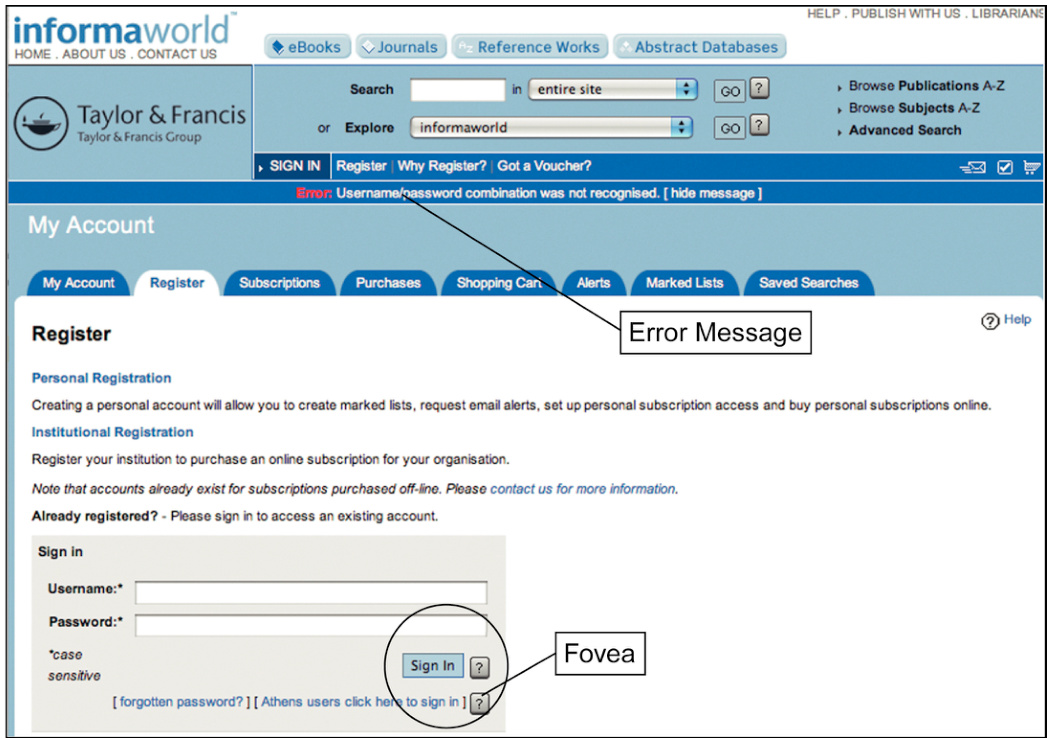
FIGURE 5.6The error message from the former Taylor & Francis Informaworld website (2010) for a faulty login appeared in peripheral vision, where most users would probably not see it.
图 5.6 显示了前 Taylor & Francis Informaworld 网站在 2010 年针对登录错误的错误消息,它出现在大多数用户可能不会看到的外围视觉中。
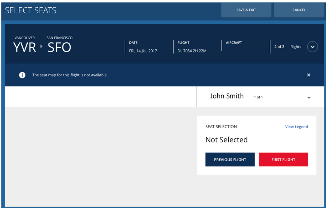
FIGURE 5.7 Error message at Delta.com (2017). Can you spot it?
图 5.7 Delta.com(2017 年)的错误消息。你能找到它吗?
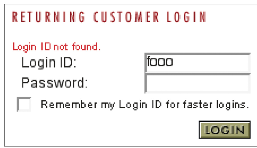
FIGURE 5.8 This error message for an invalid login was easy to miss even though it is not far from the “Login” button. Why?
图 5.8 这个无效登录的错误消息很容易被忽略,尽管它离“登录”按钮不远。为什么?
FIGURE 5.9Simulation of a user’s visual field while the fovea is fixed on the “Login” button.
图 5.9 模拟用户在视锥固定于“登录”按钮时的视野。
Even when an error message is placed nearer to the center of the viewer’s visual field than in the preceding examples, other factors can diminish its visibility. For example, from about 2003 to2008, 4 the website of Airborne Express (now part of DHL) signaled a login failure by displaying an error message in red just above the Login ID field (see Fig. 5.8). The error message was entirely in red and fairly near the “Login” button where a user’s eyes and attention would be focused. Can you think of any reasons people might not initially see it?
即使错误信息放置在比前述例子更靠近观众视野中心的位置,其他因素也可能降低其可见性。例如,从 2003 年到 2008 年,4 Airborne Express(现已成为 DHL 的一部分)的网站通过在登录 ID 字段上方以红色显示错误信息来指示登录失败(见图 5.8)。错误信息完全是红色的,并且靠近“登录”按钮,用户的眼睛和注意力会集中在那里。你能想到人们可能最初看不到它的任何原因吗?
One reason is that the error message was still in peripheral vision, not the fovea. The fovea is small: just a centimeter or two on a computer screen, assuming the user is a normal distance from the screen.
一个原因是错误信息仍然在周边视觉中,而不是在视锥中。视锥很小:在计算机屏幕上只有一厘米或两厘米,假设用户与屏幕的距离是正常的。
A second reason is that the error message was not the only red thing near the top of the page. The page title was also red. Resolution in the periphery is very low. When the error message appeared, a user’s peripheral vision might not register any change— there was a red blotch there before, and with the error message, there still was (see Fig. 5.9).
第二个原因是,页面顶部附近的红色东西不只是错误消息。页面标题也是红色的。周边视觉的分辨率非常低。当错误消息出现时,用户的周边视觉可能不会察觉到任何变化——之前那里有一个红色污点,出现错误消息后仍然如此(见图 5.9)。
If the page title were black or any other color besides red, the red error message would be more likely to be noticed, even though it appeared in the periphery of the user’s visual field.
如果页面标题是黑色或其他颜色而不是红色,即使错误消息出现在用户视觉场的周边,也更有可能被注意到。
Common Methods of Making Messages Visible
使信息可见的常用方法
Several common and well-known methods can ensure that error messages are seen:
有几种常见且众所周知的方法可以确保错误消息被看到:
• Put it where users are looking . People focus on predictable places when interacting with graphical user interfaces. In Western societies, people tend to traverse forms and control panels from upper left to lower right. While moving the screen pointer, people usually look either at where it is or where they are moving it to. When people click a button or link, they can usually be assumed to be looking directly at it, at least for a few moments afterward. Designers can use this predictability to position error messages near where they expect users to be looking.
• 放置在用户注视的地方。人们在交互图形用户界面时,会集中在可预测的地方。在西方社会,人们倾向于从左上角到右下角浏览表单和控制面板。当移动屏幕指针时,人们通常会看着指针所在的位置或将要移动的位置。当人们点击按钮或链接时,通常可以假设他们直接看着它,至少在之后的一段时间内是这样。设计师可以利用这种可预测性来定位错误消息在他们预期用户会注视的地方。
• Mark the error . Somehow, mark the error prominently to indicate clearly that something is wrong. Often this can be done by simply placing the error message near what it refers to, unless that would place the message too far from where users are likely to be looking.
• 标记错误。以某种方式突出显示错误,清楚地表明存在问题。通常可以通过将错误消息放置在它所引用的内容附近来完成,除非这样做会将消息放置在用户不太可能查看的位置。
• Use an error symbol . Make errors or error messages more visible by marking them with an error symbol, such as ,
• 使用错误符号。通过使用错误符号(如)使错误或错误消息更加醒目。
• Reserve red for errors . By convention, interactive computer systems use the color red to connote alert, danger, error, etc. Using red for any other information on a computer display risks misinterpretation. But suppose you are designing a website for Stanford University, which has red as its school color. Or suppose you are designing for a Chinese market, where red is considered an auspicious, positive color. What do you do? Use another color for errors, mark them with error symbols, or use stronger methods (see the next section).
• 将红色保留用于错误。根据惯例,交互式计算机系统使用红色来表示警报、危险、错误等。在计算机显示器上使用红色用于任何其他信息可能会导致误解。但假设您正在为斯坦福大学设计网站,红色是其学校颜色。或者假设您正在为中国市场设计,在那里红色被视为吉祥、积极的颜色。您该怎么办?为错误使用另一种颜色,使用错误符号,或使用更强的方法(见下一节)。
The most recent Taylor & Francis login error screen uses several of these techniques (see Fig. 5.10). Compare it with their earlier website (see Fig. 5.6). A bigger, bolder font for the error message and an error symbol would improve this, but it is much better than in the 2010 site.
最新的 Taylor & Francis 登录错误屏幕使用了这些技术中的几种(见图 5.10)。将其与他们的早期网站(见图 5.6)进行比较。更大的、更粗的字体用于错误消息和错误符号将改进这一点,但比 2010 年的网站好得多。
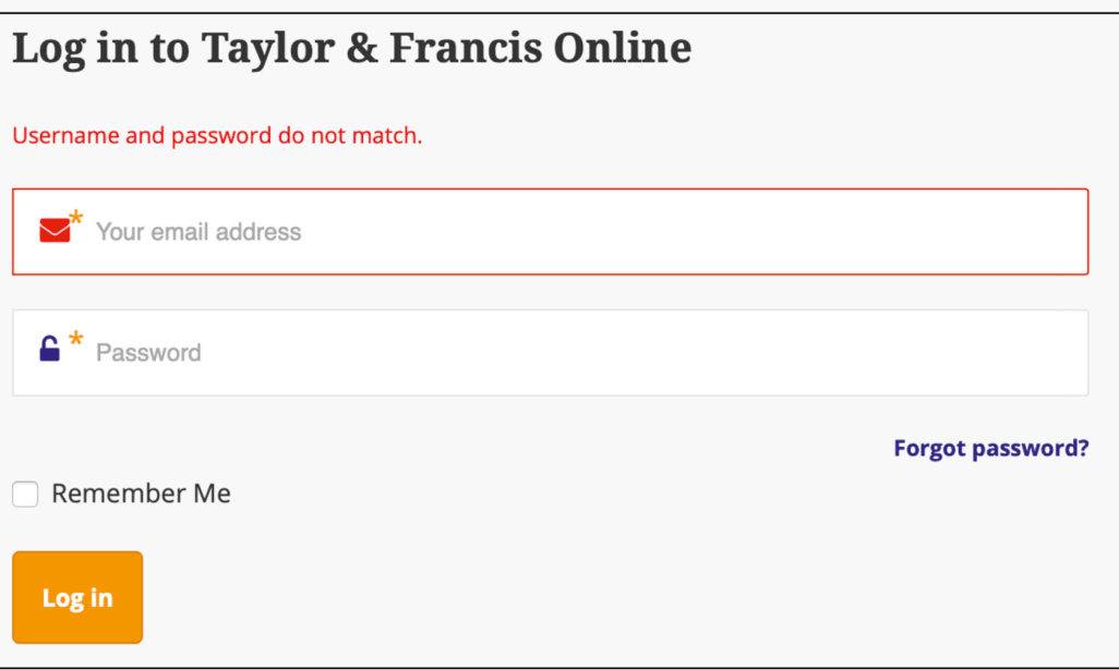
FIGURE 5.10 In the latest Taylor & Francis website (2020), the error message for a faulty login is displayed near where users will be looking, and both the error message and the login field are highlighted in red (compare with Fig. 5.6).
图 5.10 在最新的 Taylor & Francis 网站(2020 年),故障登录的错误消息显示在用户将查看的位置附近,并且错误消息和登录字段都标红(与图 5.6 比较)。
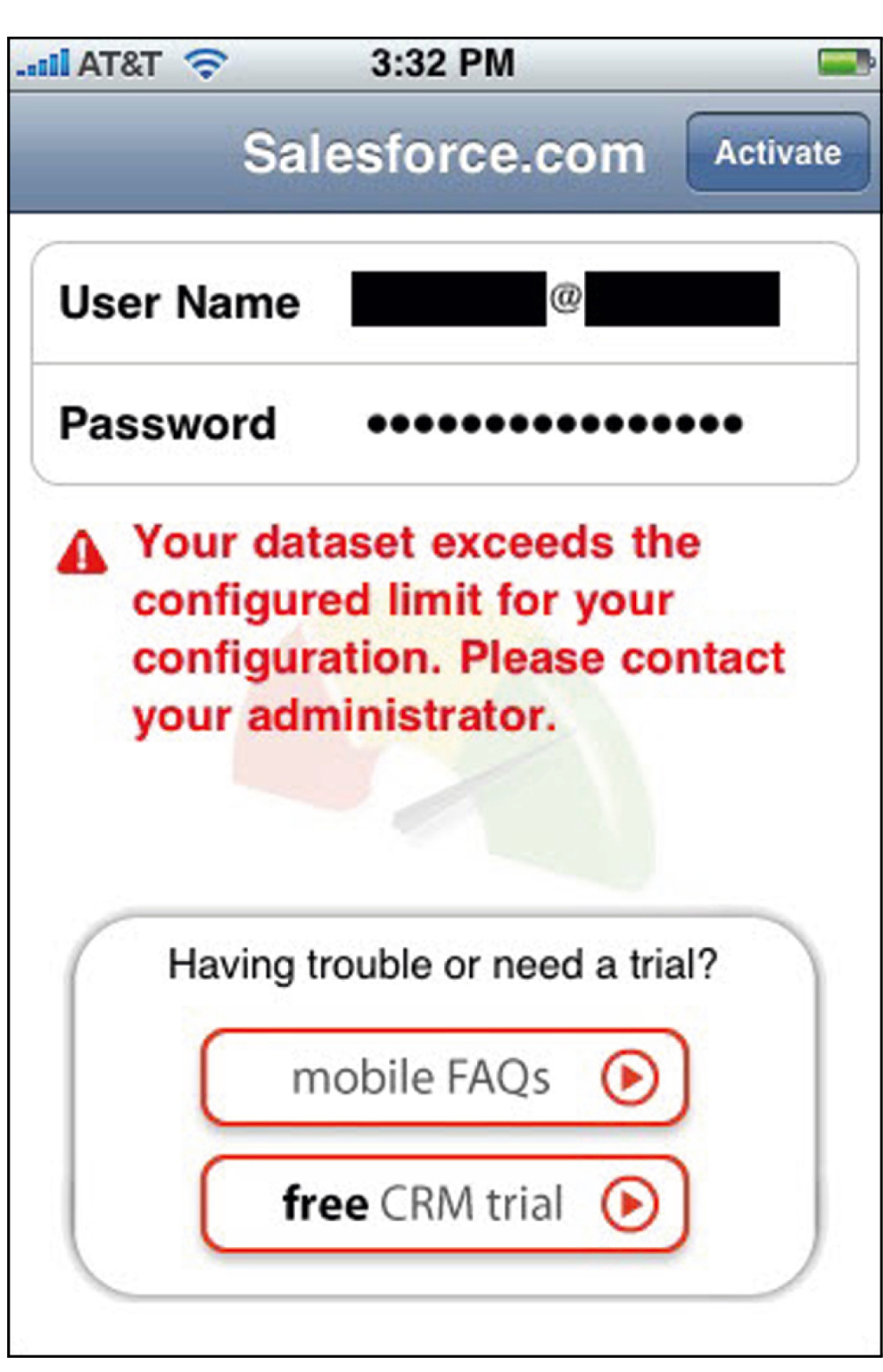
FIGURE 5.11Salesforce.com’s mobile site displays error messages prominently, midscreen.
图 5.11 Salesforce.com 的移动网站突出显示错误消息,屏幕中间。
Salesforce.com’s mobile app displays error messages in a way that makes them hard to miss (see Fig. 5.11). They are marked with an error symbol and displayed in red in the middle of the screen.
Salesforce.com 的移动应用程序以难以忽视的方式显示错误消息(见图 5.11)。它们带有错误符号,并以红色显示在屏幕中央。
Heavy Artillery for Making Users Notice Messages
用于让用户注意信息的重火力
If the common, conventional methods of making users notice messages are not enough, three stronger methods are available to user-interface designers: a pop-up message in an error dialogue box, use sound (e.g., a beep), and wiggle or blink briefly. However, these methods, while very effective, have significant negative effects, so they should be used sparingly and with great care.
如果使用户注意到消息的常用、常规方法不够,用户界面设计师可以采用三种更强的方法:在错误对话框中显示弹出消息、使用声音(例如,发出哔哔声),以及短暂地抖动或闪烁。然而,虽然这些方法非常有效,但它们有显著的负面影响,因此应该谨慎地少量使用。
Method 1: a pop-up message in an error dialogue box
方法 1:在错误对话框中显示弹出消息
Displaying an error message in a dialogue box sticks it right in the user’s face, making it hard to miss. Error dialogue boxes interrupt the user’s work and demand immediate attention. That is good if the error message signals a critical condition, but it can annoy people if such an approach is used for a minor message, such as confirming the execution of a user-requested action.
在对话框中显示错误消息会直接出现在用户面前,很难被忽略。错误对话框会中断用户的工作并要求立即注意。如果错误消息表示关键情况,这是好的,但如果这种做法用于确认用户请求执行的小消息,则可能会让人烦恼。
The annoyance of pop-up messages rises with the degree of modality. Nonmodal pop-ups allow users to ignore them and continue working. Application-modal pop-ups block any further work in the application that displayed the error but allow users to interact with other software on their computer. System-modal pop-ups block any user action until the dialogue has been dismissed.
弹出消息的烦恼程度随着模态度的增加而增加。非模态弹出消息允许用户忽略它们并继续工作。应用程序模态弹出消息会阻止在显示错误的应用程序中的任何进一步工作,但允许用户与计算机上的其他软件交互。系统模态弹出消息会阻止任何用户操作,直到对话框被关闭。
Application-modal pop-ups should be used sparingly—for example, only when application data may be lost if the user doesn’t attend to the error. System-modal pop-ups should be used extremely rarely—basically only when the system is about to crash, taking hours of work with it, or if people will die if the user misses the error message.
应用程序模态弹窗应谨慎使用——例如,仅在用户未注意错误可能导致应用程序数据丢失时使用。系统模态弹窗应极其罕见地使用——基本上仅在系统即将崩溃,导致数小时的工作丢失,或者如果用户错过错误信息会导致人员伤亡时使用。
On the Web, an additional reason to avoid pop-up error dialogue boxes is that some people set their browsers to block all pop-up windows. If your website relies on pop-up error messages, some users may never see them.
在网页上,避免使用弹窗错误对话框的另一个原因是,有些人将他们的浏览器设置为阻止所有弹窗窗口。如果你的网站依赖于弹窗错误消息,一些用户可能永远不会看到它们。
REI.com has an example of a pop-up dialogue being used to display an error message. The message is displayed when someone who is registering as a new customer omits any required field in the form (see Fig. 5.12). Is this an appropriate use of a pop-up dialogue? The improved Taylor & Francis error message display (see Fig. 5.10) shows that data entry errors can be signaled well without pop-up dialogues, so REI.com’s use of them seems a bit heavy-handed.
REI.com 有一个使用弹窗对话框显示错误消息的例子。当新客户在注册表单中遗漏任何必填字段时,会显示该消息(见图 5.12)。这是使用弹窗对话框的适当用法吗?改进的 Taylor & Francis 错误消息显示(见图 5.10)表明,无需弹窗对话框就可以很好地指示数据输入错误,因此 REI.com 对它们的使用似乎有点过于强硬。
Examples of more appropriate use of error dialogue boxes come from Microsoft Excel (see Fig. 5.13A) and Adobe InDesign (see Fig. 5.13B). In both cases, loss of data is at stake.
更适当的错误对话框使用例子来自 Microsoft Excel(见图 5.13A)和 Adobe InDesign(见图 5.13B)。在这两种情况下,都涉及数据丢失的风险。
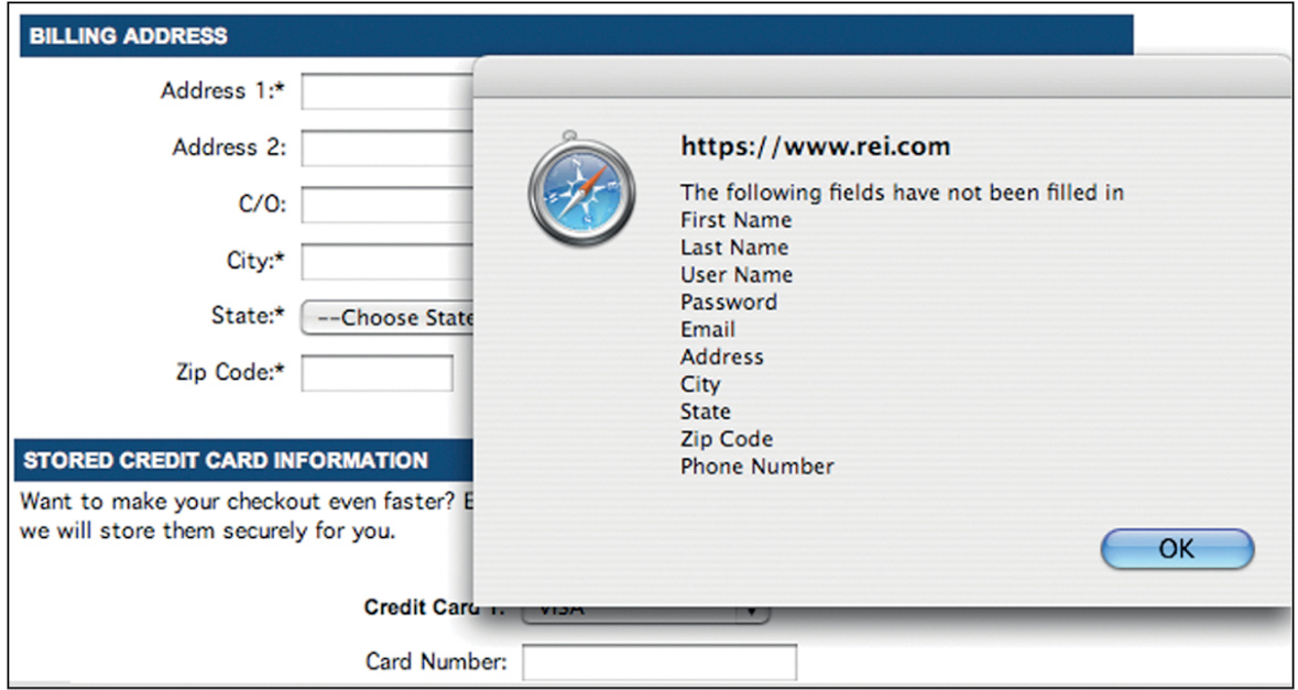
FIGURE 5.12 REI.com’s pop-up dialogue box signals required data that was omitted. It is hard to miss, but perhaps overkill.
图 5.12 REI.com 的弹出对话框提示遗漏了必要数据。它很难被忽视,但也许过于夸张。
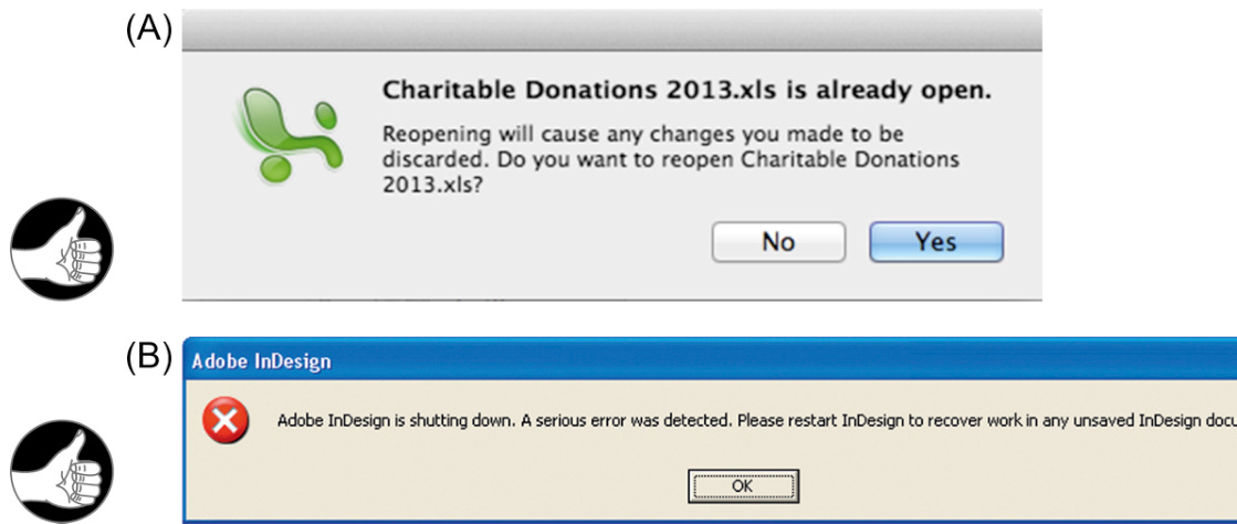
FIGURE 5.13 Appropriate pop-up error dialogues: (A) Microsoft Excel and (B) Adobe InDesign.
图 5.13 适当的弹出错误对话框:(A) Microsoft Excel 和 (B) Adobe InDesign。
Method 2: use sound (e.g., a beep)
方法 2:使用声音(例如,蜂鸣声)
When a computer beeps, it tells its user something has happened that requires attention. The person’s eyes reflexively begin scanning the screen for whatever caused the beep. This can allow users to notice an error message someplace other than where they were just looking, such as in a standard error message box on the display. That is the value of beeping.
当计算机发出哔哔声时,它告诉用户发生了需要关注的事情。人们的眼睛会反射性地开始扫描屏幕,寻找发出哔哔声的原因。这可以让用户注意到错误消息,而不仅仅是在他们刚刚看的地方,比如显示器上的标准错误消息框。这就是哔哔声的价值。
However, imagine many people in a cubicle work environment or a classroom, all using an application that signals all errors and warnings by beeping. Such a workplace would be very annoying to say the least. Worse, people would not be able to tell whether their own computer or someone else’s was beeping.
然而,想象一下在隔间工作环境或教室里,许多人都在使用一个通过哔哔声来表示所有错误和警告的应用程序。这样的工作场所至少会非常烦人。更糟糕的是,人们将无法分辨是自己的计算机还是别人的计算机在哔哔。
The opposite situation is noisy work environments (e.g., factories or computer server rooms), where auditory signals emitted by an application might be masked by ambient noise. Even in nonnoisy environments, some computer users simply prefer quiet and mute the sound on their computers or turn it way down.
相反的情况是嘈杂的工作环境(例如工厂或计算机服务器室),其中应用程序发出的声音信号可能会被环境噪音所掩盖。即使在非嘈杂的环境中,一些计算机用户也简单地更喜欢安静,并在他们的计算机上关闭声音或将音量调得很低。
For these reasons, signaling errors and other conditions with sound are remedies that can be used only in very special, controlled situations.
由于这些原因,使用声音来指示错误和其他情况是只有在非常特殊、受控的情况下才能使用的补救措施。
Computer games often use sound to signal events and conditions. In games, sound isn’t annoying; it is expected. Its use in games is widespread, even in game arcades where dozens of machines are all banging, roaring, buzzing, clanging, beeping, and playing music at once. (Well, it is annoying to parents who have to go into the arcades and endure all the screeching and booming to retrieve their kids, but the games aren’t designed for them.)
计算机游戏经常使用声音来指示事件和情况。在游戏中,声音并不烦人;它是意料之中的。游戏中的使用非常普遍,即使在游戏厅中,几十台机器同时发出砰砰声、轰鸣声、嗡嗡声、哐当声、哔哔声和播放音乐。 (嗯,这对必须进入游戏厅并忍受所有尖叫声和轰鸣声来接孩子的父母来说很烦人,但游戏并不是为他们设计的。)
Method 3: wiggle or blink briefly
方法 3:短暂地抖动或闪烁
As described earlier in this chapter, our peripheral vision is good at detecting motion, and motion in the periphery causes reflexive eye movements that bring the motion into the fovea. User-interface designers can make use of this by wiggling or flashing messages briefly when they want to ensure that users see them. It does not take much motion to trigger eye movement toward it. Just a tiny bit of motion is enough to make a viewer’s eyes zip over in that direction. Millions of years of evolution have had quite an effect.
如本章前面所述,我们的周边视觉在检测运动方面表现良好,而周边的运动会引起反射性的眼球运动,将运动物体带到中央凹。用户界面设计师可以利用这一点,在需要确保用户看到消息时,短暂地晃动或闪烁消息。只需一点运动就能触发眼球朝向它移动。只需微小的运动就足以让观看者的眼睛迅速移向那个方向。数百万年的进化产生了相当大的影响。
As an example of using motion to attract users’ eye attention, Apple’s iCloud online service briefly shakes the entire dialogue box horizontally when a user enters an invalid username or password (see Fig. 5.14). In addition to clearly indicating “No” (like a person shaking his head), this attracts the users’ eyeballs, guaranteed. Because after all, the motion in the corner of your eye might be a leopard.
以运动吸引用户注意力的一个例子是,当用户输入无效的用户名或密码时,Apple 的 iCloud 在线服务会短暂地水平晃动整个对话框(见图 5.14)。除了明确地表示“不”(就像一个人摇着头一样),这还能吸引用户的注意力。毕竟,眼角的运动可能是一只豹子。
The most common use of blinking in computer user interfaces (other than advertisements) is in menu bars. When an action (e.g., Edit or Copy) is selected from a menu, it usually blinks once before the menu closes to confirm that the system “got” the command— that is, that the user didn’t miss the menu item. This use of blinking is very common. It is so quick that most computer users aren’t even aware of it, but if menu items didn’t blink once, we would have less confidence that we actually selected them.
计算机用户界面中最常见的闪烁用途(除广告外)是在菜单栏中。当从菜单中选择一个操作(例如,编辑或复制)时,它通常在菜单关闭之前闪烁一次,以确认系统“收到了”该命令——也就是说,用户没有错过菜单项。这种闪烁的使用非常普遍。它非常快,以至于大多数计算机用户甚至没有意识到它的存在,但如果菜单项不闪烁一次,我们就不会那么确信自己确实选择了它们。
Motion and blinking, like pop-up dialogue boxes and beeping, must be used sparingly. Most experienced computer users consider wiggling, blinking objects on-screen to be annoying. Most of us have learned to ignore displays that blink because many such displays are advertisements. Conversely, a few computer users have attentional impairments that make it difficult for them to ignore something blinking or wiggling.
动画和闪烁,就像弹出对话框和哔哔声一样,必须谨慎使用。大多数有经验的计算机用户认为屏幕上闪烁、晃动的物体很烦人。我们大多数人已经学会了忽略闪烁的显示器,因为许多这样的显示器都是广告。相反,一些计算机用户有注意力障碍,这使得他们难以忽略闪烁或晃动的东西。
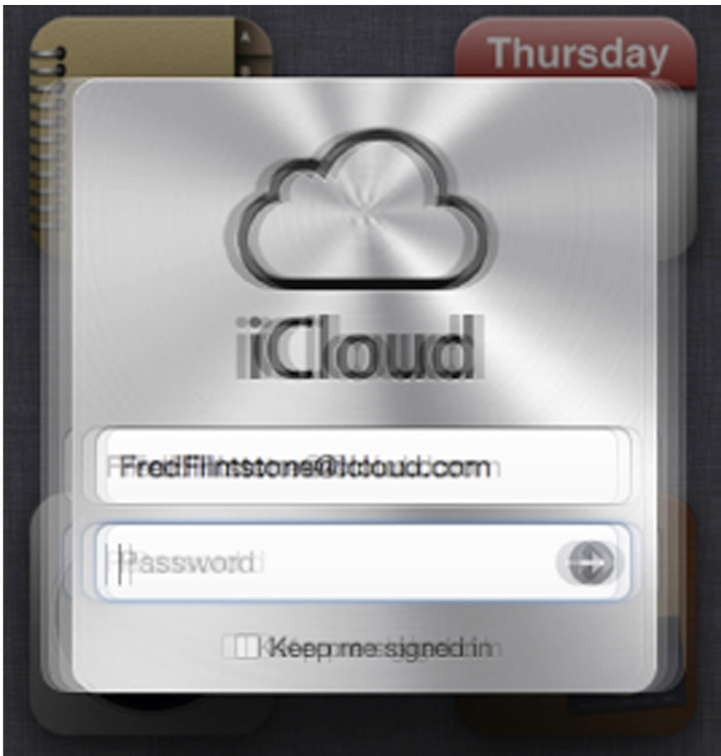
FIGURE 5.14Apple’s iCloud shakes the dialogue box briefly on login errors to attract a user’s fovea toward it.
图 5.14 苹果的 iCloud 在登录错误时短暂地晃动对话框,以吸引用户的中央视觉区域注意到它。
Therefore, if wiggling or blinking is used, it should be brief—it should last about a quarter- to a half-second, no longer. Otherwise, it quickly goes from an unconscious attention-grabber to a conscious annoyance.
因此,如果使用晃动或闪烁,应该简短——大约持续四分之一到半秒,不能更长。否则,它会迅速从无意识的注意力吸引者变成有意识的烦扰。
Use heavy-artillery methods sparingly to avoid habituating your users
应谨慎使用重型武器方法,以避免用户习惯化
There is one final reason to use the preceding heavy-artillery methods sparingly (i.e., only for critical messages): to avoid habituating your users. When pop-ups, sound, motion, and blinking are used too often to attract users’ attention, a psychological phenomenon called habituation sets in (see Chapter 1). Our brain pays less and less attention to any stimulus that occurs frequently.
还有最后一个原因要谨慎使用前面提到的重炮方法(即,仅用于关键信息):避免让你的用户习惯化。当弹窗、声音、动画和闪烁过于频繁地用来吸引用户的注意力时,就会产生一种心理现象,称为习惯化(见第一章)。我们的大脑对频繁出现的任何刺激的关注会越来越少。
It is like the old fable of the boy who cried “Wolf!” too often. Eventually, the villagers learned to ignore his cries, so when a wolf actually did come, his cries went unheeded. Overuse of strong attention-getting methods can cause important messages to be blocked by habituation.
这就像古老的“狼来了”寓言。如果男孩喊“狼来了”的次数太多,最终村民们学会了忽视他的喊叫,所以当狼真的来了时,他的喊叫无人理会。过度使用强烈的注意力吸引方法会导致重要信息因习惯化而被屏蔽。
Visual Search is Linear Unless Targets “Pop” in the Periphery
视觉搜索是线性的,除非目标在周边“弹出”
As explained earlier, one function of peripheral vision is to drive our eyes to focus the fovea on important things—those that match our goals or that might be a threat. For example, objects moving in our peripheral vision fairly reliably “pull” our eyes and attention toward them. Similarly, fuzzy, blurred images related to our current goals also attract our attention. This is why our perception—in this case our visual perception—is biased by our goals (see Chapter 1).
如前所述,周边视觉的一个功能是驱动我们的眼睛将焦点对准重要的事物——那些符合我们的目标或可能构成威胁的事物。例如,我们周边视觉中移动的物体相当可靠地“吸引”我们的眼睛和注意力朝向它们。同样,与我们的当前目标相关的模糊、模糊的图像也会吸引我们的注意力。这就是为什么我们的感知——在这种情况下是我们的视觉感知——会受到我们目标的影响(参见第一章)。
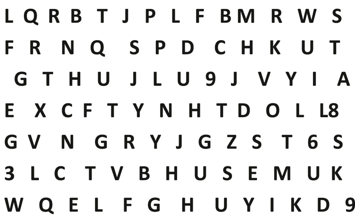
FIGURE 5.15 Finding the Z requires scanning carefully through the characters.
图 5.15 寻找 Z 需要仔细扫描这些字符。
Peripheral vision is a crucial component in visual search despite its low spatial and color resolution. When we are looking for an object, our entire visual system, including the periphery, primes itself to detect that object. It does so by sensitizing neural networks running from the retina to the visual cortex of the brain. The neural networks are sensitized to detect features of the sought object (Treisman and Gelade, 1980; Wolfe, 1994; Wolfe and Gray, 2007).
尽管空间和颜色分辨率较低,但周边视觉是视觉搜索的一个关键组成部分。当我们寻找一个物体时,我们整个视觉系统,包括周边视觉,都会自行准备检测该物体。它通过使从视网膜到大脑视觉皮层的神经网络的敏感性得到提高来实现这一点。这些神经网络被敏化以检测所寻物体的特征(Treisman 和 Gelade,1980 年;Wolfe,1994 年;Wolfe 和 Gray,2007 年)。
However, how helpful the periphery is in aiding visual search depends strongly on the identifying features of the sought object and how distinct those features are from the features of other objects in our visual field. Look quickly at Fig. 5.15 and find the Z.
然而,周边视觉在辅助视觉搜索中的帮助程度,很大程度上取决于所寻目标对象的识别特征,以及这些特征与视野中其他对象特征的差异程度。快速看一下图 5.15,找到字母 Z。
To find the
要找到
Now look quickly at Fig. 5.16 and find the bold character.
现在快速看一下图 5.16,找到粗体字符。
That was much easier (i.e., faster), wasn’t it? You did not have to scan your fovea carefully through all the characters. Your periphery quickly detected the boldness and determined its location, and because that is what you were seeking, your visual system moved your fovea there. Your periphery could not determine exactly what was bold—that is beyond its resolution and abilities—but it did locate the boldness. In vision-researcher lingo, the periphery was primed to look for boldness in parallel over its entire area, and boldness is a distinctive feature of the target, so searching for a bold target is nonlinear. In designer lingo, we say that boldness “pops” in the periphery, assuming that only the target is bold.
那样就简单多了(也就是说更快了),不是吗?你不必仔细扫描你的中央凹。你的周边视觉很快检测到加粗并确定其位置,因为那正是你在寻找的,你的视觉系统将你的中央凹移到了那里。你的周边视觉无法精确确定什么是加粗——那就是它的分辨率和能力所不及的——但它确实找到了加粗。在视觉研究者的行话中,周边视觉已经准备好在整个区域并行地寻找加粗,而加粗是目标的一个显著特征,所以寻找一个加粗的目标是非线性的。在设计师的行话中,我们说加粗在周边视觉中“跳”出来,假设只有目标是加粗的。
Color “pops” even more strongly. Compare counting the L’s in Fig. 5.17 with counting the red characters in Fig. 5.18.
颜色“跳”得更加明显。比较在图 5.17 中数 L 和在图 5.18 中数红色字符。
FIGURE 5.16 Finding the bold letter does not require scanning through everything.
图 5.16 找到加粗字母不需要扫描所有内容。
FIGURE 5.17 Counting L’s is hard—letter shape doesn’t “pop” among characters.
图 5.17 数 L 很困难——字母形状在字符中不“跳”出来。
FIGURE 5.18 Counting red characters is easy because color “pops.”
计算红色字符很容易,因为颜色“突出”。
What else makes things “pop” in the periphery? As described earlier, the periphery easily detects motion, so motion “pops.”
还有什么能让事物在周边“突出”?如前所述,周边很容易检测到运动,所以运动“突出”。
Generalizing from boldness, we also can say that font weight “pops,” because if all but one of the characters on a display were bold, the nonbold character would stand out. In general, a visual target will “pop out” in your periphery if it differs from surrounding objects in features that the low-resolution peripheral vision can detect. The more distinctive the features of the target, the more it “pops,” assuming the periphery can detect those features.
从粗体中推广,我们也可以说字体粗细“突出”,因为如果显示器上的所有字符除了一个都是粗体,那么非粗体字符就会突出。一般来说,如果目标在低分辨率的周边视觉可以检测到的特征上与周围物体不同,那么视觉目标会在你的周边“突出”。目标特征越独特,它就越“突出”,假设周边可以检测到这些特征。
Using peripheral “pop” in design
在设计中使用周边“弹出”
Designers use peripheral “pop” to focus the attention of a product’s users as well as to allow users to find information faster. Chapter 3 described how visual hierarchy—titles, headings, boldness, bullets, and indenting—can make it easier for users to spot and extract the information they need from text. Glance back at Fig. 3.7B in Chapter 3 and see how the headings and bullets make the topics and subtopics “pop” so readers can go right to them.
设计师利用周边“突出”来吸引产品用户的注意力,以及让用户更快地找到信息。第三章描述了如何通过视觉层次——标题、副标题、粗体、项目符号和缩进——使用户更容易从文本中找到并提取他们需要的信息。回顾一下第三章中的图 3.7B,看看标题和项目符号如何使主题和子主题“突出”,以便读者可以直接找到它们。
Many interactive systems use color to indicate status, usually reserving red for problems. Online maps and most vehicle GPS devices mark traffic jams with red so they stand out (see Fig. 5.19). Systems for controlling air traffic mark potential collisions in red (see Fig. 5.20). Applications for monitoring servers and networks use color to show the health status of assets or groups of them (see Fig. 5.21).
许多交互式系统使用颜色来指示状态,通常将红色保留用于问题。在线地图和大多数车辆 GPS 设备用红色标记交通拥堵,以便突出显示(见图 5.19)。空中交通控制系统用红色标记潜在的碰撞(见图 5.20)。用于监控服务器和网络的应用程序使用颜色来显示资产或资产组的健康状况(见图 5.21)。
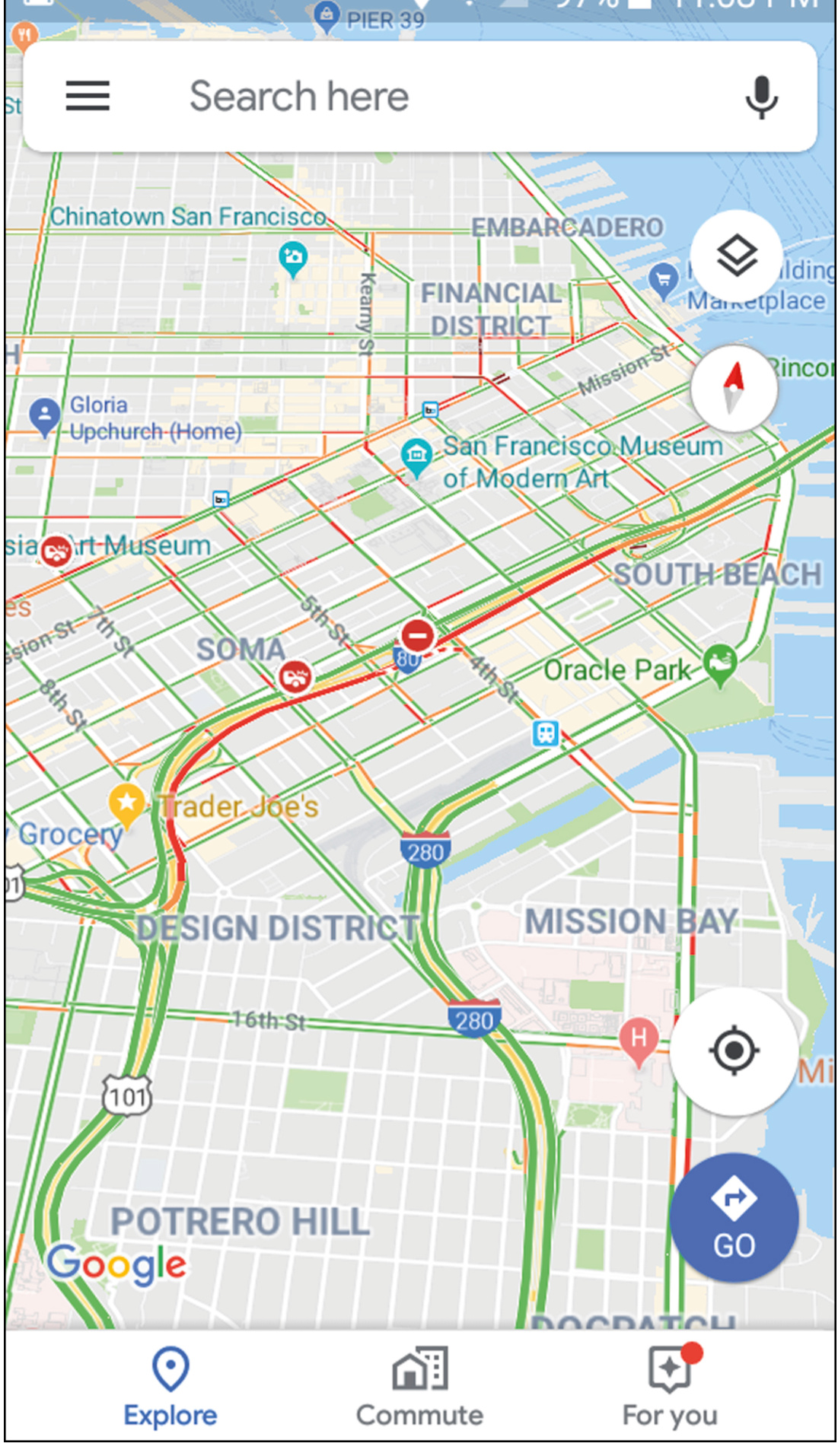
FIGURE 5.19 Google Maps uses color to show traffic conditions. Red indicates traffic jams.
图 5.19 Google 地图使用颜色显示交通状况。红色表示交通拥堵。
FIGURE 5.20Air traffic control systems often use red to make potential collisions “pop” out.
图 5.20 空中交通管制系统通常使用红色使潜在的碰撞“突出”。
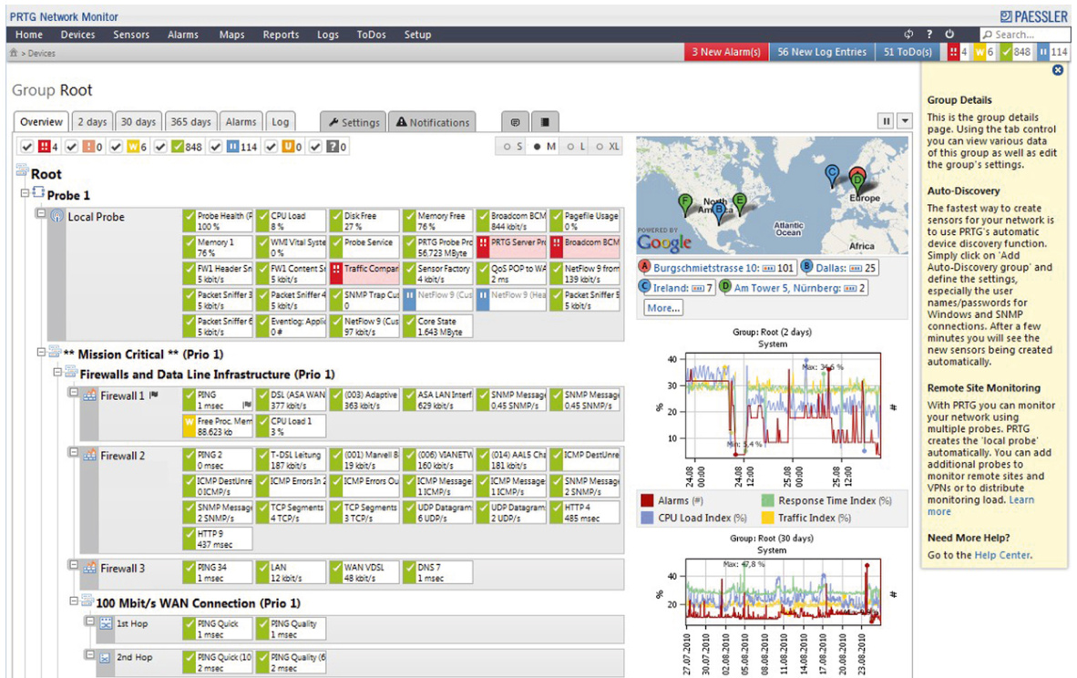
FIGURE 5.21Paessler’s monitoring tool uses color to show the health of network components.
图 5.21 Paessler 的监控工具使用颜色显示网络组件的健康状况。
These are all uses of peripheral “pop” to make important information stand out and visual search nonlinear.
这些都是使用“弹出”效果来突出重要信息,并使视觉搜索非线性的用法。
When there are many possible targets
当有多个可能的目标时
Sometimes in displays of many items, any of them could be what the user wants. Examples include command menus (see Fig. 5.22A) and app pallets (see Fig. 5.22B). Assume that the application cannot anticipate which item or items a user is likely to want and highlight them. That is a fair assumption for today’s applications. 5 Are users doomed to have to search linearly through such displays for the item they want?
在显示许多项目时,任何一个都可能是用户想要的项目。例如命令菜单(见图 5.22A)和应用程序面板(见图 5.22B)。假设应用程序无法预知用户可能想要哪个项目或哪些项目并突出显示它们。这对于当今的应用程序来说是一个合理的假设。5 用户是否注定要在这种显示中线性地搜索他们想要的项目?
| Tools Table Window Spelling and Grammar工具表窗口拼写和语法 |
| Thesaurus... >;#R Hyphenation... Smart Lookup... >;#L Language...同义词库... >;#R 断言... 智能查找... >;#L 语言... |
| Word Count... AutoCorrect...自动更正...字数统计... |
| Check Accessibility检查可访问性 |
| Track Changes Combine Documents...跟踪修订合并文档... |
| Block Authors Unblock All My Blocked Areas Protect Document...屏蔽作者解除所有屏蔽区域保护文档... |
| Envelopes... Labels...信封...标签... |
| Macro Templates and Add-ins... Customize Keyboard...宏模板和插件...自定义键盘... |
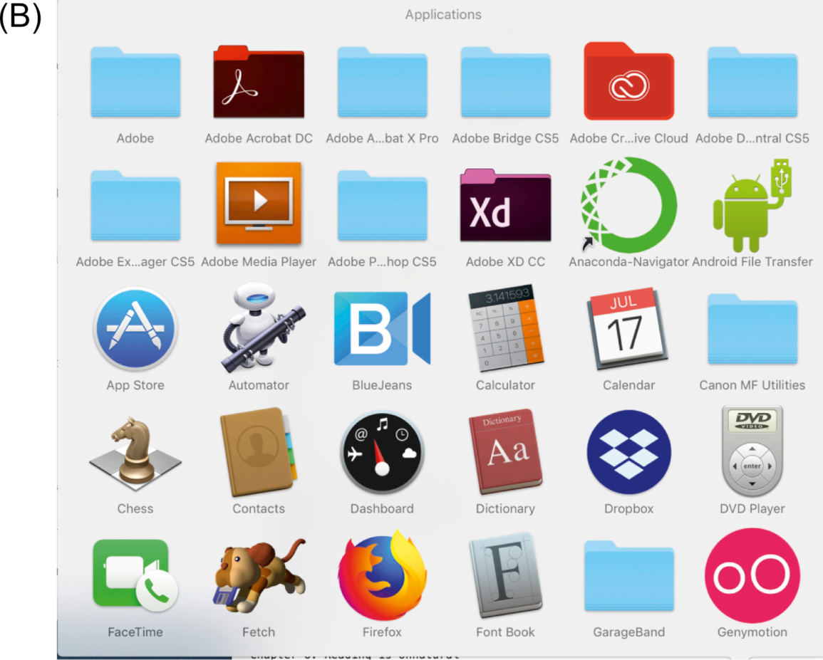
That depends. Designers can try to make each item so distinctive that when a specific one is the user’s target, the user’s peripheral vision will spot it among all the other items. Designing distinctive sets of icons is hard—especially when the set is large—but it can be done (see Johnson et al., 1989). Designing sets of icons so distinctive that they can be distinguished in peripheral vision is very hard, but not impossible. For example, if a user goes to the macOS application pallet to open his or her calendar, a white rectangular blob in the periphery with something black in the middle is more likely to attract the user’s eye than a blue circular blob (see Fig. 5.22B). The trick is to not get too fancy and detailed with the icons—give each a distinctive color and gross shape.
这取决于。设计师可以尝试让每个项目都足够独特,以至于当用户的目标是特定项目时,用户的周边视觉能在所有其他项目中识别出它。设计独特的一组图标很困难——尤其是当这组很大时——但它可以完成(参见 Johnson 等人,1989 年)。设计一组能在周边视觉中区分的图标非常困难,但并非不可能。例如,如果用户去 macOS 应用程序面板打开他们的日历,一个在周边视觉中呈白色矩形块,中间有黑色东西,比一个蓝色圆形块更有可能吸引用户的眼睛(参见图 5.22B)。诀窍是不要让图标太花哨和详细——给每个图标一个独特的颜色和大致形状。
On the other hand, if the potential targets are all words, as in command menus (see Fig. 5.22A), visual distinctiveness is not an option. In textual menus and lists, visual search will be linear, at least at first. With practice, users learn the positions of frequently used items in menus, lists, and pallets, so searching for particular items is no longer linear.
另一方面,如果潜在目标都是单词,例如在命令菜单(见图 5.22A)中,视觉区分度不是一个选项。在文本菜单和列表中,视觉搜索将是线性的,至少一开始是这样。通过练习,用户学会了菜单、列表和调色板中常用项目的位置,因此查找特定项目不再是线性的。
That is why applications should never move items around in menus, lists, or pallets. Doing that prevents users from learning item positions, thereby dooming them to search linearly forever. Therefore, the use of “dynamic menus” is considered a major userinterface design mistake (Johnson, 2007).
正是如此,应用程序绝不应该在菜单、列表或面板中移动项目。这样做会阻止用户学习项目位置,从而注定他们永远线性搜索。因此,使用“动态菜单”被认为是主要的用户界面设计错误(约翰逊,2007 年)。
Important Takeaways
重要要点
• Unlike digital cameras, the resolution of human vision is much higher in a small area in the middle of our visual field than it is everywhere else. The small area is called the fovea, and it makes up only about
• 与数码相机不同,人类视觉在视野中央的小区域内的分辨率远高于其他地方。这个小区域称为中央凹,它只占我们视野的约
• Peripheral vision guides our eyes and attention toward bjects and events that either match our goals or represent possible threats. Peripheral vision can detect motion and ends to move our eyes toward whatever is moving even hough it cannot identify what is moving. eripheral vision is good in low-light situations. ome visual features “pop out” in peripheral vision, and ome do not. Font weight pops. Color pops. Motion pops. etter shape does not pop.
• 周边视觉引导我们的眼睛和注意力朝向符合我们的目标或代表可能威胁的物体和事件。周边视觉可以检测运动,并使我们的眼睛朝向移动的东西,即使它无法识别正在移动的是什么。周边视觉在低光情况下表现良好。一些视觉特征在周边视觉中会“突出”,而另一些则不会。字体粗细会突出。颜色会突出。运动会突出。形状不会突出。
• Designing based on the strengths and weaknesses of eripheral vision: • Place new, important, or changed information where users will be looking—in or near where their fovea is positioned. Information placed elsewhere may not be noticed. • Use color, motion, a distinctive shape, etc. to make important information “pop” in peripheral vision to attract users’ fovea and attention. Red is commonly used to attract attention to error messages. • Overuse of any stimulus causes people to habituate to it, diminishing its ability to attract attention. Pop-up messages can in principle force users to attend to them, but they are often overused, and therefore many experienced users of digital technology have learned to ignore them. • Sound can attract a user’s attention, but it can also be annoying, especially in environments shared with other people.
• 基于周边视觉的优势和劣势进行设计:• 将新的、重要的或更改的信息放置在用户注视的位置——即他们的黄斑所在位置。放置在其他位置的信息可能不会被注意到。• 使用颜色、运动、独特的形状等,使重要信息在周边视觉中“突出”,以吸引用户的黄斑和注意力。红色通常用于吸引对错误消息的注意。• 过度使用任何刺激会导致人们习惯于它,从而降低其吸引注意力的能力。弹窗消息原则上可以迫使用户注意它们,但它们通常被过度使用,因此许多有经验的数字技术用户已经学会了忽略它们。• 声音可以吸引用户的注意力,但它也可能令人烦恼,尤其是在与他人共享的环境中。
1Our brains also fill in perceptual gaps that occur during rapid (saccadic) eye movements, when vision is suppressed (see Chapter 14).
1我们的大脑也会填补快速(扫视)眼动期间出现的感知间隙,此时视觉被抑制(见第 14 章)。
4Although this example is old, it is still the best example of this issue I have found.
4尽管这个例子很旧,但它仍然是我找到的最佳例子。
5But in the not-too-distant future it might not be.
5但在不久的将来,情况可能就不是这样了。
Chapter 6: Reading is Unnatural
第六章:阅读是不自然的
Abstract
摘要
Humans are “prewired” to learn a spoken language but not to learn to read. This chapter reviews current research findings on how people read and learn to read, including how our eyes move as we read, how reading is primarily a function of fovea vision with a little help from peripheral vision, and whether reading is mainly a top-down or bottom-up process. It then shows that poor display of information can disrupt reading and that many user interfaces can be improved by reducing the reading required.
人类天生就适合学习口语,但不适合学习阅读。本章回顾了关于人们如何阅读和学习阅读的当前研究成果,包括阅读时眼睛的运动方式,阅读主要是 fovea 视觉功能,并辅以一点周边视觉,以及阅读主要是自上而下还是自下而上的过程。然后,它表明信息的展示不佳会干扰阅读,并且许多用户界面可以通过减少阅读量来改进。
Keywords
关键词
Background; Bottom-up; Broca’s area; Context; Contrast; Font size; Fovea; Jargon; Language; Patterns; Perifovea; Reading; Saccade; Temporal lobe; Top-down; Typefaces; Vocabulary; Wernicke’s area; Word frequency
背景;自下而上;布罗卡区;上下文;对比度;字体大小;fovea;术语;语言;模式;周边视觉;阅读;跳跃;颞叶;自上而下;字体类型;词汇;韦尼克区;词频
Most people in industrialized nations grow up in households and school districts that promote education and reading. They learn to read as young children and become good readers by adolescence. As adults, most of our activities during a normal day involve reading. Reading is for most educated adults automatic, leaving our conscious minds free to ponder the meaning and implications of what we are reading. Because of this background, it is common for good readers to consider reading a “natural” human activity, like speaking.
工业化国家的大多数人成长在重视教育和阅读的家庭和学区。他们从小就学会阅读,并在青少年时期成为优秀的读者。成年后,我们正常一天中的大多数活动都涉及阅读。对于大多数受过教育的成年人来说,阅读是自动的,这使我们的意识能够自由地思考我们正在阅读的内容的意义和影响。由于这种背景,对于优秀的读者来说,将阅读视为一种“自然”的人类活动,就像说话一样,是很常见的。
We are Wired for Language but Not for Reading
我们为语言而造,却非为阅读而造
Speaking and understanding spoken language is a natural human ability, but reading is not. Over hundreds of thousands—perhaps millions—of years, the human brain evolved the neural structures necessary to support spoken language. Normal humans are born with an innate ability to learn, with no systematic training, whatever language they are exposed to. After early childhood, this ability decreases significantly. For example, newborn babies can hear and distinguish all the sounds of all languages, but as they learn the language of their home environment, they lose the ability to distinguish sounds that are not distinguished in that language (Eagleman, 2015). By adolescence, learning a new language is the same as learning any other skill: it requires instruction and practice, and the learning and processing are handled by different brain areas from those that handled it in early childhood (Sousa, 2005).
说话和理解口语是人类的一种自然能力,但阅读不是。在数十万——也许是数百万——年的时间里,人类的大脑进化出了支持口语的神经结构。正常的人类天生就具有学习能力,无论他们接触到哪种语言,都不需要系统的训练。在幼儿时期之后,这种能力会显著下降。例如,新生儿可以听到并区分所有语言的声音,但当他们学习家乡的语言时,他们会失去区分在该语言中没有被区分的声音的能力(Eagleman,2015)。到青春期,学习一种新语言就像学习任何其他技能一样:它需要指导和练习,学习和处理是由大脑中不同的区域来处理的,这些区域与幼儿时期处理这些任务的区域不同(Sousa,2005)。
In contrast, writing and reading did not exist until a few thousand years BCE and did not become common until only 4 or 5 centuries ago—long after the human brain had evolved into its modern state. At no time during childhood do our brains show any special innate ability to learn to read. Instead, reading is an artificial skill that we learn by systematic instruction and practice, like playing a violin, juggling, or reading music (Sousa, 2005).
相比之下,写作和阅读直到公元前几千年才出现,直到大约 4 或 5 个世纪前才变得普遍——这远远晚于人类大脑进化到现代状态的时候。在儿童时期的任何时候,我们的大脑都没有显示出任何学习阅读的特殊先天能力。相反,阅读是一种人工技能,我们需要通过系统的指导和练习来学习,就像拉小提琴、杂耍或阅读乐谱一样(Sousa,2005)。
FIGURE 6.1To see how it feels to be illiterate, look at text printed in a foreign script: (A) Amharic and (B) Tibetan.
图 6.1 要感受不识字的感觉,看看用外文印刷的文字: (A) 阿姆哈拉文和 (B) 藏文。
Many people never learn to read well, or at all
很多人从来没有学会好好读书,甚至完全不会
Because people are not innately “wired” to learn to read, children who either lack caregivers who read to them or receive inadequate reading instruction in school may never learn to read. There are a great many such people, especially in the developing world. By comparison, very few people never learn a spoken language.
因为人们并非天生“被设定”来学习阅读,所以那些缺乏阅读给他们讲故事的长辈或在学校接受不足阅读指导的儿童可能永远学不会阅读。这样的人很多,尤其是在发展中国家。相比之下,几乎没有人从未学会口语。
Some people who learn to read never become good at it. Perhaps their parents did not value and promote reading. Perhaps they attended substandard schools or did not attend school at all. Perhaps they learned a second language but never learned to read well in that language. People who have cognitive or perceptual impairments such as dyslexia may never read easily.
有些人学习阅读后仍然不擅长阅读。也许他们的父母不重视和推广阅读。也许他们去了条件差的学校或者根本没有上学。也许他们学会了第二语言,但从未在那门语言中读得好。患有认知或感知障碍的人,如阅读障碍者,可能永远不会轻松阅读。
A person’s ability to read is specific to a language and script (a system of writing). To see what text looks like to someone who cannot read, look at a paragraph printed in a language and script that you do not know (see Fig. 6.1).
一个人阅读的能力是针对特定语言和文字(一种书写系统)的。要看看一个不识字的人看到的文本是什么样的,可以看一段你不知道的语言和文字(参见图 6.1)。
Alternatively, you can approximate the feeling of illiteracy by taking a page written in a familiar script and language—such as a page of this book—and turning it upside down. Turn this book upside down and try reading the next few paragraphs. This exercise only approximates the feeling of illiteracy. You will discover that the inverted text appears foreign and illegible at first, but after a minute you will be able to read it, albeit slowly and laboriously.
或者,你可以通过拿一页用熟悉的文字和语言写成的纸——比如这本书的一页——把它翻过来。把这本书翻过来,试着读接下来的几段。这个练习只是近似地模拟了不识字的感受。你会发现,倒置的文本一开始看起来很陌生且难以辨认,但过了一分钟,你将能够读它,尽管会慢而费力。
Learning to read training our visual system
学会读书是训练我们的视觉系统
Learning to read involves training our visual system to recognize patterns—the patterns exhibited by text. These patterns run the gamut from low level to high level:
学习阅读涉及训练我们的视觉系统来识别模式——文字所展现的模式。这些模式从低级到高级应有尽有:
• Lines, contours, and shapes are basic visual features that our brain recognizes innately. We don’t have to learn to recognize them.
• 线条、轮廓和形状是我们大脑天生就能识别的基本视觉特征。我们不必学习去识别它们。
• Basic features combine to form patterns that we learn to identify as characters—letters, numeric digits, and other standard symbols. In ideographic scripts, such as Chinese, symbols represent entire words or concepts.
• 基本特征组合成模式,我们学习将其识别为字符——字母、数字和其他标准符号。在表意文字中,例如中文,符号代表整个单词或概念。
• In alphabetic scripts, patterns of characters form morphemes, which we learn to recognize as packets of meaning—for example, “farm,” “tax,” “-ed,” and “-ing” are morphemes in English.
• 在字母文字中,字符的模式形成词素,我们学习将其识别为意义包——例如,“农场”、“税”、“-ed”和“-ing”是英语中的词素。
• Morphemes combine to form patterns that we recognize as words—for example, “farm,” “tax,” “-ed,” and “-ing” can be combined to form the words “farm,” “farmed,” “farming,” “tax,” “taxed,” and “taxing.”
• 语素组合成我们能够识别的模式,例如,“农场”、“税”、“-ed”和“-ing”可以组合成“农场”、“农场了”、“农场中”、“税”、“征税”和“征税中”。
• Words combine to form patterns that we learn to recognize as phrases, idiomatic expressions, and sentences.
• 单词组合成我们学习识别的短语、习语和句子。
• Sentences combine to form paragraphs.
• 句子组合成段落。
Actually, only part of our visual system is trained to recognize textual patterns involved in reading: the fovea and a small area immediately surrounding it (known as the perifovea), and the downstream neural networks running through the optic nerve to the visual cortex and into various parts of our brain. The neural
实际上,我们视觉系统中只有一部分被训练来识别阅读中涉及的文本模式:中央凹和其周围的小区域(称为周边凹),以及通过视神经延伸到视觉皮层并进入我们大脑各个部分的下游神经网络。神经
networks starting elsewhere in our retinas do not get trained to read.
我们视网膜上其他起始的网络并没有被训练来阅读。
More about this is explained later in the chapter.
关于这一点,本章后面有更详细的解释。
Learning to read also involves training the brain’s systems that control eye movement to move our eyes in a specific way over text. The main direction of eye movement depends on the direction in which the language we are reading is written: European language scripts are read left to right, many middle Eastern language scripts are read right to left, and some language scripts are read top to bottom. Beyond that, the precise eye movements differ depending on whether we are reading, skimming for overall meaning, or scanning for specific words.
学习阅读也涉及到训练大脑控制眼球运动的系统,使我们的眼睛以特定方式在文本上移动。眼球运动的主要方向取决于我们阅读的语言的书写方向:欧洲语言脚本从左到右阅读,许多中东语言脚本从右到左阅读,而一些语言脚本则从上到下阅读。除此之外,精确的眼球运动取决于我们是阅读、浏览以获取整体意义,还是扫描以寻找特定单词。
How we read
我们是如何阅读的
Assuming our visual system and brain have successfully been trained, reading becomes semiautomatic or fully automatic—both eye movement and processing.
假设我们的视觉系统和大脑已经成功训练,阅读就会变得半自动或完全自动——包括眼球运动和处理。
As explained earlier, the center of our visual field—the fovea and perifovea—is the only part of our visual field that is trained to read. All text that we read enters our visual system after being scanned by the central area, which means that reading requires a lot of eye movement.
如前所述,我们视野的中心——中央凹和周边凹——是我们视野中唯一经过训练以阅读的部分。所有我们阅读的文字在被视野中心扫描后进入我们的视觉系统,这意味着阅读需要大量的眼球运动。
As explained in Chapter 5 on the discussion of peripheral vision, our eyes constantly jump around, several times a second. Each of these movements, called saccades, lasts about 0.1 second. Saccades are ballistic, like firing a shell from a cannon. Their end point is determined when they are triggered, and once triggered, they always execute to completion. As described in earlier chapters, the destinations of saccadic eye movements are programmed by the brain from a combination of our goals, events in the visual periphery, events detected and localized by other perceptual senses, and past history including training.
如第五章中关于周边视觉的讨论所述,我们的眼睛不断跳动,每秒几次。每一次这样的运动,称为扫视,持续约 0.1 秒。扫视是弹道式的,就像从大炮中发射炮弹一样。它们的终点在触发时确定,一旦触发,它们总是执行到完成。如前几章所述,扫视眼动的目的地由大脑根据我们的目标、视觉周边的事件、其他感知感官检测和定位的事件以及包括训练在内的过去历史组合编程。
When we read, we may feel that our eyes scan smoothly across the lines of text, but that feeling is incorrect. In reality, our eyes continue with saccades during reading, but the movements generally follow the line of text. They fix our fovea on a word, pause there for a fraction of a second to allow basic patterns to be captured and transmitted to the brain for further analysis, then jump to the next important word (Larson, 2004). Eye fixations while reading always land on words, usually near the center, never on word boundaries (see Fig. 6.2). Very common small connector and function words like “a,” “and,” “the,” “or,” “is,” and “but” are usually skipped over, their presence either detected in perifoveal vision or simply assumed. Most of the saccades during reading are in the text’s normal reading direction, but a few—about
当我们阅读时,我们可能会觉得我们的眼睛在文本的行之间流畅地扫过,但这种感觉是不正确的。实际上,我们的眼睛在阅读过程中会继续进行跳跃运动,但这些运动通常沿着文本的行进行。它们将我们的中央凹固定在一个单词上,在那里停留几分之一秒,以允许基本模式被捕获并传输到大脑以进行进一步分析,然后跳到下一个重要的单词(Larson,2004)。阅读时的眼睛注视总是落在单词上,通常在中心附近,永远不会落在单词边界上(见图 6.2)。非常常见的小连接词和功能词,如“a”、“and”、“the”、“or”、“is”和“but”,通常会被跳过,它们的存在要么通过周边视觉被检测到,要么只是被假定。阅读期间的大部分跳跃运动都沿着文本的正常阅读方向进行,但有一些——大约
How much can we take in during each eye fixation during reading? For reading European-language scripts at normal reading distances and text font sizes, the fovea clearly sees three to four characters on either side of the fixation point. The perifovea sees out about 15–20 characters from the fixation point, but not very clearly (see Fig. 6.3). According to reading researcher Kevin Larson (2004), the reading area in and around the fovea consists of three distinct zones (for European-language scripts):
在阅读时,每次注视中我们可以接收多少信息?对于正常阅读距离和文本字体大小下的欧洲语言文字,黄斑区域可以清晰地看到注视点两侧的三到四个字符。周边黄斑区域可以看到注视点两侧大约 15 到 20 个字符,但不是很清晰(见图 6.3)。根据阅读研究专家凯文·拉森(2004 年)的研究,黄斑区域及其周围的阅读区域对于欧洲语言文字来说,由三个不同的区域组成:
Closest to the fixation point is where word recognition takes place. This zone is usually large enough to capture the word being fixated, and often includes smaller function words directly to the right of the fixated word. The next zone extends a few letters past the word recognition zone, and readers gather preliminary information about the next letters in this zone. The final zone extends out to 15 letters past the fixation point. Information gathered out this far is used to identify the length of upcoming words and to identify the best location for the next fixation point.
最靠近注视点的是进行单词识别的区域。这个区域通常足够大,可以捕捉到被注视的单词,并且经常包括被注视单词右侧的一些较小的功能词。下一个区域延伸到单词识别区域几字母之外,读者在这个区域收集关于下一个字母的初步信息。最后一个区域延伸到注视点后 15 个字母的位置。收集到的信息用于识别即将到来的单词的长度,并确定下一个注视点的最佳位置。
Due to how our visual system has been trained to read, perception around the fixation point is asymmetrical; it is more sensitive to characters in the reading direction than in the other direction. For European-language scripts, this is toward the right. That makes sense because characters to the left of the fixation point have usually already been read.
由于我们的视觉系统被训练成这样来阅读,围绕注视点的感知是不对称的;它对阅读方向的字符比其他方向的字符更敏感。对于欧洲语言文字,这是向右。这很合理,因为注视点左侧的字符通常已经被阅读了。
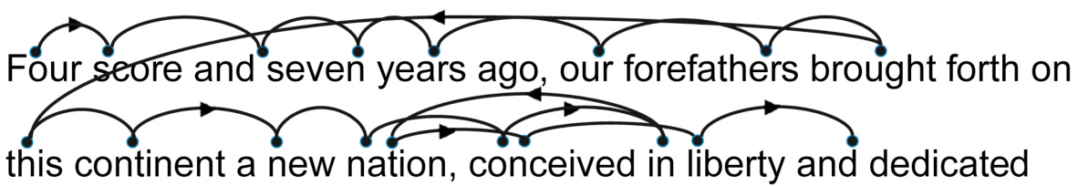
FIGURE 6.2Saccadic eye movements during reading jump between important words.
图 6.2阅读时眼球跳跃式运动在重要单词之间跳跃。
feer sere andseven years ago, our forefathers brought forth on
七年前,我们的祖先带来了“feer sere andseven”。
FIGURE 6.3Visibility of words in a line of text, with fovea fixed on the word “years.”
图 6.3文本行中单词的可见性,fovea 固定在单词“years”上。
Is Reading Feature-Driven or ContextDriven?
阅读是特征驱动还是上下文驱动?
As explained earlier, reading involves recognizing features and patterns. Pattern recognition, and therefore reading, can be either a bottom-up, feature-driven process, or a top-down, context-driven process.
如前所述,阅读涉及识别特征和模式。模式识别,因此也是阅读,可以是一个自下而上、特征驱动的过程,或是一个自上而下、上下文驱动的过程。
In feature-driven reading, the visual system starts by identifying simple features—line segments in a certain orientation or curves of a certain radius—on a page or display and then combines them into more complex features, such as angles, multiple curves, shapes, and patterns. Then the brain recognizes certain shapes as characters or symbols representing letters, numbers, or for ideographic scripts, words. In alphabetic scripts, groups of letters are perceived as morphemes and words. In all types of scripts, sequences of words are parsed into phrases, sentences, and paragraphs that have meaning.
在特征驱动的阅读中,视觉系统首先在页面或显示器上识别简单的特征——特定方向上的线段或特定半径的曲线——然后将它们组合成更复杂的特征,如角度、多个曲线、形状和模式。接着,大脑将某些形状识别为字符或符号,代表字母、数字,对于表意文字,则是单词。在字母文字中,字母组合被感知为词素和单词。在所有类型的文字中,单词序列被解析为具有意义的短语、句子和段落。
Feature-driven reading is sometimes referred to as “bottom-up” or “context-free.” The brain’s ability to recognize basic features—lines, edges, angles, etc.—is built in and therefore automatic from birth. In contrast, recognition of morphemes, words, and phrases has to be learned. It starts out as a nonautomatic, conscious process requiring conscious analysis of letters, morphemes, and words, but with enough practice it becomes automatic (Sousa, 2005). Obviously, the more common a morpheme, word, or phrase, the more likely that recognition of it will become automatic. With ideographic or pictographic scripts such as Chinese, which have many times more symbols than alphabetic scripts do, people typically take many years longer to become skilled readers.
基于特征的阅读有时被称为“自下而上”或“无上下文”。大脑识别基本特征(线条、边缘、角度等)的能力是与生俱来的,因此从出生起就是自动的。相比之下,识别词素、单词和短语则需要学习。它最初是一种非自动的、有意识的进程,需要有意识地分析字母、词素和单词,但随着足够的练习,它会变得自动(Sousa,2005)。显然,一个词素、单词或短语越常见,它被识别为自动的可能性就越大。对于象形文字或图画文字(如中文)这样的文字,它们拥有的符号数量远多于字母文字,人们通常需要多花很多年来成为熟练的读者。
Context-driven or top-down reading operates in parallel with feature-driven reading but works the opposite way: from whole sentences or the gist of a paragraph down to the words and characters. The visual system starts by recognizing high-level patterns like words, phrases, and sentences or by knowing the text’s meaning in advance. It then uses that knowledge to figure out—or guess—what the lower-level components of the high-level pattern must be (Boulton, 2009). Context-driven reading is less likely to become fully automatic, because most phrase-level and sentencelevel patterns and contexts don’t occur frequently enough to allow their recognition to become burned into neural firing patterns. But there are exceptions, such as idiomatic expressions.
以情境驱动或自上而下的阅读方式与特征驱动阅读并行工作,但运作方式相反:从整个句子或段落的要义逐级向下到单词和字符。视觉系统首先识别高级模式,如单词、短语和句子,或者提前了解文本的含义。然后利用这些知识来推断或猜测高级模式中较低级组成部分应该是什么(Boulton,2009 年)。情境驱动阅读不太可能完全自动化,因为大多数短语级和句子级的模式和上下文出现频率不够高,无法让它们的识别被烧录到神经放电模式中。但也有一些例外,比如习语表达。
To experience context-driven reading, glance quickly at Fig. 6.4, then immediately direct your eyes back here and finish reading this paragraph. Try it now. What did the text say?
要体验情境驱动阅读,快速扫视图 6.4,然后立即将目光转回这里,继续读完这段文字。现在试试看。这段文字说了什么?
Now look at the same sentence again more carefully. Do you read it the same way now?
现在再仔细看这个句子一次。你现在读它的方式和之前一样吗?
Also, based on what we have already read and our knowledge of the world, our brains can sometimes predict text that the fovea has not yet read (or its meaning), allowing us to skip reading it. For example, if at the end of a page we read “It was a dark and stormy,” we would expect the first word on the next page to be “night.” We would be surprised if it was some other word (e.g., “cow”).
此外,根据我们已有的阅读内容和我们对世界的了解,我们的大脑有时可以预测到 fovea 尚未阅读的文本(或其含义),使我们能够跳过阅读。例如,如果我们读到一页的结尾是“它是一个黑暗而暴风雨的”,我们会预期下一页的第一个词是“夜晚”。如果我们读到的是其他词(例如,“牛”),我们会感到惊讶。
The rain in Spain falls manly in the the plain
西班牙的雨主要落在平原上
Feature-driven, bottom-up reading dominates; context assists
以功能为导向的自下而上的阅读占主导地位;上下文辅助
It has been known for decades that reading involves both featuredriven (bottom-up) and context-driven (top-down) processing. In addition to being able to figure out the meaning of a sentence by analyzing the letters and words in it, people can determine the words of a sentence by knowing the sentence’s meaning or the letters in a word by knowing what word it is (see Fig. 6.5). The question is: Is skilled reading primarily bottom-up or top-down, or is neither mode dominant?
已知几十年来,阅读既涉及基于特征的(自下而上)处理,也涉及基于上下文的(自上而下)处理。除了能够通过分析句子中的字母和单词来理解句子的意思外,人们还可以通过了解句子的意思来确定句子的单词,或者通过了解一个词来确定其中的字母(见图 6.5)。问题是:熟练阅读主要是自下而上还是自上而下,或者两者都不是主导?
Early scientific studies of reading—from the late 1800s through about 1980—seemed to show that people recognize words first, and from that they determine what letters are present. The theory of reading that emerged from those findings was that our visual system recognizes words primarily from their overall shape. This theory failed to account for certain experimental results and so was controversial among researchers, but it nonetheless gained wide acceptance among nonresearchers, especially in the graphic design field (Larson, 2004; Herrmann, 2011).
早期的阅读科学研究——从 19 世纪末到大约 1980 年——似乎表明人们首先识别单词,然后根据这些单词确定其中包含的字母。根据这些发现形成的阅读理论认为,我们的视觉系统主要通过单词的整体形状来识别单词。这一理论未能解释某些实验结果,因此在研究人员中存在争议,但它仍然在非研究人员中获得了广泛的接受,尤其是在平面设计领域(Larson,2004 年;Herrmann,2011 年)。
Similarly, educational researchers in the 1970s applied information theory to reading and assumed that because of redundancies in written language, top-down, context-driven reading would be faster than bottom-up, feature-driven reading. This assumption led them to hypothesize that reading for highly skilled (fast) readers would be dominated by context-driven (top-down) processing. This theory was probably responsible for many speed-reading methods of the 1970s and 1980s, which supposedly trained people to read fast by taking in whole phrases and sentences at a time.
类似地,20 世纪 70 年代的教育研究人员将信息论应用于阅读,并假设由于书面语言的冗余性,自上而下、基于上下文的阅读比自下而上、基于特征的阅读更快。这一假设使他们假设,对于高度熟练(快速)的读者来说,阅读将主要受基于上下文(自上而下)的处理支配。这一理论可能是 20 世纪 70 年代和 80 年代许多快速阅读方法的原因,这些方法据称通过一次摄入整个短语和句子来训练人们快速阅读。
(A) Mray had a Itilte Imab, its feclee was withe as sown. And ervey wehre taht Mray wnet, the lmab was srue to go.
(A) Mray 有 一 只 羊,它的 脸 是 白色的。并且 无论 Mray 去哪里,那只羊都会跟着去。
(B)Twinkle, twinklelittle star, how I wonder what you are
(B) 闪烁,闪烁 小星星,我多么想知道 你是什么。
However, empirical studies of readers conducted since then have demonstrated conclusively that those early theories were wrong. Summing up the research are statements from reading researchers Kevin Larson (2004) and Keith Stanovich (Boulton, 2009), respectively:
然而,自那时以来对读者进行的经验研究已经明确地证明那些早期的理论是错误的。总结这些研究的有阅读研究人员 Kevin Larson(2004)和 Keith Stanovich(Boulton,2009)的陈述,分别:
Word shape is no longer a viable model of word recognition. The bulk of scientific evidence says that we recognize a word’s component letters, then use that visual information to recognize a word.
字形不再是一种可行的单词识别模型。大部分科学证据表明,我们识别一个单词的组成部分字母,然后使用这些视觉信息来识别单词。
Context [is] important, but it’s a more important aid for the poorer reader who doesn’t have automatic context-free recognition instantiated.
上下文很重要,但对那些没有自动无上下文识别能力的读者来说,它更是重要的辅助。
In other words, reading consists mainly of context-free, bottomup, feature-driven processes. In skilled readers, these processes are well learned to the point of being automatic. Context-driven reading today is considered mainly a backup method that, although it operates in parallel with feature-based reading, is only relevant when feature-driven reading is difficult or insufficiently automatic.
换句话说,阅读主要是由无上下文、自下而上、特征驱动的过程组成。在熟练的读者中,这些过程被学习得很好,以至于达到了自动化的程度。如今,基于上下文的阅读被认为主要是备用方法,尽管它与基于特征的阅读并行运行,但当基于特征的阅读困难或不充分自动化时才相关。
Skilled readers may resort to context-based reading when featurebased reading is disrupted by poor presentation of information (see examples later in this chapter). Also, in the race between contextbased and feature-based reading to decipher the text we see, contextual cues sometimes win out over features. As an example of context-based reading, Americans visiting England sometimes misread “to let” signs as “toilet,” because in the United States they see the word “toilet” often, but they almost never see the phrase “to let”—Americans use “for rent” instead.
熟练的读者在信息呈现不佳时可能会采用基于上下文的阅读(见本章后面的示例)。此外,在基于上下文和基于特征的阅读之间争夺解读我们看到文本的过程中,上下文线索有时会胜过特征。例如,访问英格兰的美国人有时会将“to let”的标志误读为“toilet”,因为在美国他们经常看到“toilet”这个词,但几乎从不看到“to let”这个短语——美国人用“for rent”代替。
In less-skilled readers, feature-based reading is not automatic; it is conscious and laborious. Therefore, more of their reading is contextbased. Their involuntary use of context-based reading and nonautomatic feature-based reading consumes short-term cognitive capacity, leaving little for comprehension. 2 They have to focus on deciphering the stream of words, leaving no capacity for constructing the meaning of sentences and paragraphs. That is why poor readers can read a passage aloud but afterward have no idea what they just read.
在阅读能力较弱的读者中,基于特征的阅读不是自动的;它是自觉且费力的。因此,他们更多的阅读是基于上下文的。他们无意识的运用基于上下文的阅读和非自动的基于特征的阅读消耗了短期认知能力,留下很少的空间用于理解。2 他们必须专注于解读文字流,没有能力去构建句子和段落的含义。这就是为什么差劲的读者可以朗读一段文字,但过后却不知道他们刚刚读了什么。
Why is context-free (bottom-up) reading not automatic in some adults? Lack of training is a reason: some people don’t get enough experience reading as young children for the feature-driven recognition processes to become automatic. As they grow up, they find reading mentally taxing, so they avoid it, which perpetuates and compounds their deficit (Boulton, 2009).
为什么在一些成年人中,无上下文(自下而上)的阅读不是自动的?缺乏训练是一个原因:有些人小时候没有得到足够的阅读经验,使得基于特征的识别过程无法自动化。随着年龄的增长,他们发现阅读精神上很累,所以他们会避免阅读,这会加剧和扩大他们的缺陷(Boulton,2009)。
Skilled and Unskilled Reading Use Different Areas of the Brain
精通阅读和粗略阅读使用大脑的不同区域
Before the 1980s, researchers who wanted to understand which parts of the brain are involved in language and reading were limited mainly to studying people who had suffered brain injuries. For example, in the mid-19th century, doctors found that people with brain damage near the left temple—an area now called Broca’s area after the doctor who discovered it—can understand speech but have trouble speaking, and that people with brain damage near the left ear—now called Wernicke’s area—cannot understand speech (Sousa, 2005) (see Fig. 6.6).
1980 年之前,研究人员想要了解大脑中哪些部分与语言和阅读有关,主要局限于研究那些遭受过脑损伤的人。例如,在 19 世纪中期,医生发现左颞叶附近受损的人——这个区域现在以发现它的医生的姓名称为布罗卡区——能够理解语言但有说话困难,而左耳附近受损的人——现在称为韦尼克区——则无法理解语言(Sousa,2005)(见图 6.6)。
In recent decades, new methods of observing the operation of functioning brains in living people have been developed: electroencephalography, functional magnetic resonance imaging, and functional magnetic resonance spectroscopy. These methods allow researchers to watch the responses in different areas of a person’s brain—including the sequence in which they respond—as the person perceives various stimuli or performs specific tasks (Minnery and Fine, 2009).
在最近几十年中,已经发展出新的观察活人脑功能运行的方法:脑电图、功能性磁共振成像和功能性磁共振波谱。这些方法允许研究人员观察一个人大脑不同区域的反应——包括它们反应的顺序——当这个人感知各种刺激或执行特定任务时(Minnery 和 Fine,2009)。
Using these methods, researchers have discovered that the neural pathways involved in reading differ for novice versus skilled readers. Of course, the first area to respond during reading is the occipital (or visual) cortex at the back of the brain. That is the same regardless of a person’s reading skill. After that, the pathways diverge (Sousa, 2005):
通过这些方法,研究人员发现,新手和熟练读者的阅读所涉及的神经通路是不同的。当然,阅读时首先响应的是大脑后部的枕叶(或视觉皮层)。这一点无论一个人的阅读技能如何都是一样的。之后,通路开始分叉(Sousa,2005):
• Novice . First an area of the brain just above and behind Wernicke’s area becomes active. Researchers have come to view this as the area where, at least with alphabetic scripts such as English and German, words are “sounded out” and assembled—that is, letters are analyzed and matched with their corresponding sounds. The word-analysis area then communicates with Broca’s area and the frontal lobe, where morphemes and words—units of meaning—are recognized and overall meaning is extracted. For ideographic languages, where symbols represent whole words and often have a graphical correspondence to their meaning, sounding out of words is not part of reading.
• 新手。首先,大脑中位于韦尼克区上方和后面的一个区域变得活跃。研究人员逐渐认为,至少对于英语和德语等字母文字,这个区域是“拼读”和组装单词的地方——也就是说,字母被分析和与相应的声音匹配。然后,单词分析区域与布罗卡区和额叶进行通信,在那里识别词素和单词——即意义的单位——并提取整体意义。对于表意文字,符号代表整个单词,并且通常与其意义有图形对应关系,拼读单词不是阅读的一部分。
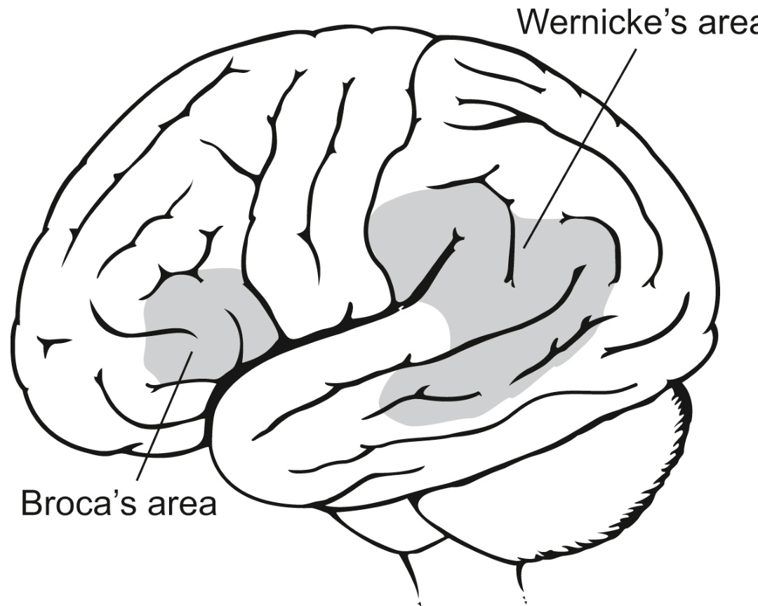
FIGURE 6.6The human brain, showing Broca’s and Wernicke’s areas.
图 6.6 人脑,显示布罗卡区和韦尼克区。
• Advanced . The word-analysis area is skipped. Instead the occipitotemporal area (behind the ear, not far from the visual cortex) becomes active. The prevailing view is that this area recognizes words without sounding them out, then that activity activates pathways toward the front of the brain that correspond to the word’s meaning and mental image.
• 高级。词分析区域被跳过。取而代之的是,位于耳朵后面、靠近视觉皮层的枕颞叶区域变得活跃。普遍的观点是,该区域在不发出声音的情况下识别单词,然后该活动激活通往大脑前部的通路,这些通路与单词的意义和 mental image 相对应。
Broca’s area is only slightly involved.
布罗卡区仅轻微涉及。
Findings from brain scan methods of course don’t indicate exactly what processes are being used, but they support the theory that advanced readers use different processes from those used by novice readers.
大脑扫描方法的结果当然不能精确指示正在使用的过程,但它们支持这样一种理论,即高级读者使用的过程与新手读者使用的过程不同。
Poor Information Design Can Disrupt Reading
信息设计差会破坏阅读
Careless writing or presentation of text can reduce skilled readers’ automatic, context-free reading to conscious, context-based reading, burdening working memory and thereby decreasing speed and comprehension. In unskilled readers, poor text presentation can block reading altogether. Poor text presentation can take several forms, including the following.
粗心的书写或文本呈现可以降低熟练读者的自动、无上下文的阅读,使其变为有意识的、基于上下文的阅读,从而负担工作记忆,并降低速度和理解能力。在缺乏技巧的读者中,糟糕的文本呈现可能会完全阻止阅读。糟糕的文本呈现可以有多种形式,包括以下几种。
Uncommon or unfamiliar vocabulary
不常见或不熟悉的词汇
Software often disrupts reading by using unfamiliar vocabulary— words the intended readers don’t know very well or at all.
软件常常通过使用读者不熟悉或不了解的词汇来干扰阅读。
One type of unfamiliar terminology is computer jargon, sometimes known as “geek speak.” For example, an intranet application displayed the following error message if a user tried to use the application after more than 15 minutes of letting it sit idle:
一种不熟悉的术语是计算机行话,有时也被称为“技术术语”。例如,一个内部网应用程序在用户在应用程序闲置超过 15 分钟后尝试使用它时显示了以下错误消息:
Your session has expired. Please reauthenticate.
您的会话已过期。请重新验证。
The application was for finding resources—rooms, equipment, etc. —within the company. Its users included receptionists, accountants, and managers as well as engineers. Most nontechnical users would not understand the word “reauthenticate,” so they would drop out of automatic reading mode into conscious wondering about the message’s meaning. To avoid disrupting reading, the application’s developers could have used the more familiar instruction, “Login again.” For a discussion of how “geek speak” in computer-based systems affects learning, see Chapter 11.
该应用程序用于在公司内部查找资源——房间、设备等。——其用户包括接待员、会计和经理以及工程师。大多数非技术用户不会理解“重新验证”这个词,因此他们会从自动阅读模式中退出,开始有意识地思考消息的含义。为了避免干扰阅读,该应用程序的开发人员可以使用更熟悉的指示,“再次登录”。有关计算机系统中的“技术术语”如何影响学习的讨论,请参见第 11 章。
Reading can also be disrupted by uncommon terms even when they are not computer technology terms. Here are some rare English words, including many that appear mainly in contracts, privacy statements, or other legal documents:
阅读也可能因不常见的术语而中断,即使这些术语不是计算机技术术语。这里有一些罕见的英语单词,包括许多主要出现在合同、隐私声明或其他法律文件中的单词:
• Aforementioned : mentioned previously
• 前述的:之前提到的
• Bailiwick : the region in which a sheriff has legal powers; more generally, domain of control
• 地方:治安官拥有法律权力的地区;更一般地说,控制领域
• Disclaim : renounce any claim to or connection with; disown; repudiate
• 免责声明:放弃任何主张或联系;不认;否认
• Heretofore : up to the present time; before now
• 迄今:到目前为止;在此之前
• Jurisprudence : the principles and theories on which a legal system is based
• 法学:法律体系的基础原则和理论
• Obfuscate : make something difficult to perceive or understand
• 混淆:使某事难以感知或理解
• Penultimate : next to the last, as in “the next to the last chapter of a book”
• 倒数第二:例如“一本书倒数第二章”
When readers—even skilled ones—encounter such a word, their automatic reading processes probably won’t recognize it. Instead, their brain uses less automatic processes, such as sounding out the word’s parts and using them to figure out its meaning, figuring out the meaning from the context in which the word appears, or looking the word up in a dictionary.
当读者——即使是熟练的读者——遇到这样的词时,他们的自动阅读过程可能不会识别它。相反,他们的大脑会使用一些不太自动的过程,例如拼读这个词的各个部分并利用它们来推断其含义,根据这个词出现的上下文来推断其含义,或者在字典中查找这个词。
Difficult scripts and typefaces
难懂的脚本和字体
Even when the vocabulary is familiar, automatic reading can be disrupted by typefaces with unfamiliar or hard-to-distinguish shapes. Context-free, automatic reading is based on recognizing letters and words bottom-up from their lower-level visual features. Our visual system is quite literally a neural network that must be trained to recognize certain combinations of shapes as characters. Therefore, a typeface with difficult-to-recognize features and shapes will be hard to read. For example, try to read Abraham Lincoln’s Gettysburg Address in an outline typeface in ALL CAPS (see Fig. 6.7).
即使词汇是熟悉的,自动阅读也可能被形状不熟悉或难以区分的字体所中断。无上下文的自动阅读是基于从较低级别的视觉特征自下而上识别字母和单词。我们的视觉系统实际上是一个神经网络,必须经过训练才能识别某些形状组合为字符。因此,具有难以识别的特征和形状的字体将很难阅读。例如,试着在一个轮廓字体中阅读亚伯拉罕·林肯的《葛底斯堡演说》,全部大写(见图 6.7)。
Comparison studies show that skilled readers read uppercase text
对比研究表明,熟练的读者阅读大写文本比阅读小写文本要慢。当代研究人员认为这种差异主要归因于缺乏练习阅读大写文本,而不是大写文本本身的可识别性较低(Larson,2004 年)。尽管如此,设计师应该记住,由于人们缺乏练习阅读全大写文本,因此阅读起来更困难(Herrmann,2011 年)。
Tiny fonts
微型字体
Another way to make text hard to read in software applications, websites, and electronic appliances is to use fonts too small for their intended readers’ visual system to resolve. For example, try to read the first paragraph of the US Constitution in a seven-point font (see Fig. 6.8).
另一种使软件应用程序、网站和电子设备中的文本难以阅读的方法是使用字体太小,以至于其预期的读者无法用视觉系统分辨。例如,尝试用七号字体阅读美国宪法的第一段(见图 6.8)。
Developers sometimes use tiny fonts because they have a lot of text to display in a small amount of space. But if the intended users of the system cannot read the text or can read it only laboriously, the text might as well not be there.
开发人员有时使用小字体,因为他们需要在较小的空间内显示大量文本。但如果系统的预期用户无法阅读文本或只能费力地阅读,那么这些文本可能根本就不存在。
| ABRAHAMLINCOLN'SGETTYSBURGADDRESS亚伯拉罕·林肯的葛底斯堡演说 |
| FOUR SCORE AND SEVEN YEARS AGO OUR FATHERS BROUGHT FORTH ON THIS CONTINENT,A NEW NATION, CONCEIVED IN LIBERTY,AND DEDICATED TO THE PROPOSITION THAT ALL MENARECREATEDEOUAL. NOW WE ARE ENGAGED IN A GREAT CIVIL WAR, TESTING WHETHER THAT NATION, OR ANY八十多年前,我们的先辈在这片大陆上创立了一个新国家,这个国家孕育于自由,致力于“人人生而平等”这一主张。如今,我们正经历一场伟大的内战,考验这个国家,或任何一个如此孕育和如此奉献的国家,能否长久存在。我们来到这个战争的一个伟大战场。我们来到这里,是为了将这片战场的一部分作为那些为这个国家献出生命的人的最终安息之地。我们这样做是完全恰当和合适的。但是,从更广泛的意义上说,我们不能奉献——我们不能使神圣——我们不能使这片土地神圣化。那些在这里战斗过的勇敢的男人们,生者与死者,已经使这片土地神圣化了,这远远超出了我们微薄的力量所能增添或减损的。世界不会太注意,也不会长久记住我们在这里所说的话,但它永远不会忘记他们在这里所做的一切。对于我们这些活着的人来说,我们更应该在这里致力于他们为之战斗的未竟事业,他们迄今为止已经如此英勇地为之奋斗。 |
| NATION SO CONCEIVED AND SO DEDICATED,CAN LONG ENDURE.WE ARE MET ONA GREAT BATTLE-FIELD OF THAT WAR. WE HAVE COME TO DEDICATE A PORTION OF THAT FIELD,AS A FINAL RESTINGPLACEFOR THOSE WHO HEREGAVETHEIRLIVES THAT THAT NATION我们来到这个战争的一个伟大战场。我们来到这里,是为了将这片战场的一部分作为那些为这个国家献出生命的人的最终安息之地。我们这样做是完全恰当和合适的。但是,从更广泛的意义上说,我们不能奉献——我们不能使神圣——我们不能使这片土地神圣化。那些在这里战斗过的勇敢的男人们,生者与死者,已经使这片土地神圣化了,这远远超出了我们微薄的力量所能增添或减损的。世界不会太注意,也不会长久记住我们在这里所说的话,但它永远不会忘记他们在这里所做的一切。对于我们这些活着的人来说,我们更应该在这里致力于他们为之战斗的未竟事业,他们迄今为止已经如此英勇地为之奋斗。 |
| MIGHT LIVE. IT IS ALTOGETHER FITTING AND PROPER THAT WE SHOULD DO THIS. BUT,IN A LARGER SENSE,WE CAN NOT DEDICATE--WE CAN NOT CONSECRATE -- WE CAN NOT HALLOW -- THIS GROUND. THE BRAVE MEN, LIVING AND DEAD, WHO STRUGGLED HERE,但是,从更广泛的意义上说,我们不能奉献——我们不能使神圣——我们不能使这片土地神圣化。那些在这里战斗过的勇敢的男人们,生者与死者,已经使这片土地神圣化了,这远远超出了我们微薄的力量所能增添或减损的。世界不会太注意,也不会长久记住我们在这里所说的话,但它永远不会忘记他们在这里所做的一切。对于我们这些活着的人来说,我们更应该在这里致力于他们为之战斗的未竟事业,他们迄今为止已经如此英勇地为之奋斗。 |
| HAVECONSECRATED IT,FAR ABOVE OUR POOR POWER TO ADD OR DETRACT. THE WORLD WILL LITTLE NOTE,NORLONG REMEMBER WHAT WE SAY HERE,BUT IT CAN NEVER FORGET WHAT THEY DID HERE.IT IS FOR US THE LIVING, RATHER, TO BE DEDICATED HERE TO THE UNFINISHED WORK WHICH THEY WHO FOUGHT HERE HAVE THUS FAR SO NOBLY那些在这里战斗过的勇敢的男人们,生者与死者,已经使这片土地神圣化了,这远远超出了我们微薄的力量所能增添或减损的。世界不会太注意,也不会长久记住我们在这里所说的话,但它永远不会忘记他们在这里所做的一切。对于我们这些活着的人来说,我们更应该在这里致力于他们为之战斗的未竟事业,他们迄今为止已经如此英勇地为之奋斗。 |
FIGURE 6.7Text in ALL CAPS is harder to read because we are not practiced at doing it. Outline typefaces complicate feature recognition. This example demonstrates both.
图 6.7 全大写的文本更难阅读,因为我们不习惯这样写。轮廓字体使特征识别复杂化。这个例子展示了这两点。
Text on noisy background
噪声背景上的文字
Visual noise in and around text can disrupt recognition of features, characters, and words and therefore drop reading out of automatic feature-based mode into a more conscious and context-based mode. In software user interfaces and websites, visual noise often results from designers’ placing text over a patterned background or displaying text in colors that contrast poorly with the background, as an example from uscpfa-sbay.blogspot.com shows (see Fig. 6.9).
文本周围和内部的视觉噪音会干扰对特征、字符和单词的识别,因此会从自动基于特征的模式掉入更自觉和基于上下文的模式。在软件用户界面和网站上,视觉噪音通常是由设计师将文本放置在图案背景上或以与背景对比度差的色彩显示文本造成的,例如 uscpfa-sbay.blogspot.com 上的一个例子(见图 6.9)。
There are situations in which designers intend to make text hard to read. For example, a common security measure on the Web is to ask site users to identify distorted words as proof that they are a live human beings and not an Internet “‘bot.” This relies on the fact that most people can read text that Internet ‘bots cannot currently read. Text displayed as a challenge to test a registrant’s humanity is called a captcha 3 (see Fig. 6.10).
有时设计师故意让文本难以阅读。例如,Web 上的一种常见安全措施是要求网站用户识别扭曲的单词,以证明他们是活生生的人类而不是互联网“‘机器人’”。这依赖于这样一个事实:大多数人可以阅读互联网“‘机器人’”目前无法阅读的文本。作为测试注册者人性的一种挑战显示的文本称为验证码 3(见图 6.10)。
Of course, textual captchas should be clear enough for people to read; otherwise it defeats the purpose of having them. In case a user cannot see what is in a captcha, it should be possible for the user to ask for another one, or even a different—e.g., nonvisual—challenge.
当然,文本验证码应该足够清晰,以便人们能够阅读;否则,它就失去了存在的意义。如果用户无法看到验证码中的内容,应该允许用户请求另一个,甚至不同——例如,非视觉——的挑战。
FIGURE 6.9 The blog uscpfa-sbay.blogspot.com uses text on a noisy background and poor color contrast.
图 6.9。博客 uscpfa-sbay.blogspot.com 在嘈杂的背景上使用文本,并且颜色对比度差。
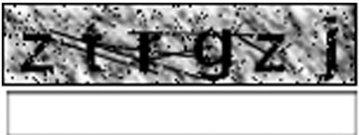
FIGURE 6.10Text that is intentionally displayed with noise so that web-crawling software cannot read it is called a captcha.
图 6.10。故意显示带有噪声的文本,以便网络爬虫软件无法读取,这被称为验证码。
Type the characters you see in the picture above.
上面的图片中输入你看到的字符。
Text contrasts poorly with background
文字与背景对比度差
Even when text is displayed on a nonpatterned background, the text can be hard to read if it contrasts poorly with the background. For example, Apple Computer’s App Store (July 2019) showed the expected duration of an app download in gray text on a gray background, with contrast so low that it was almost impossible to see, much less read (see Fig. 6.11, below progress bar).
即使文本显示在无图案的背景上,如果它与背景对比度差,文本也可能难以阅读。例如,苹果公司的 App 商店(2019 年 7 月)显示了应用程序下载的预期持续时间,使用灰色文本在灰色背景上,对比度如此之低,以至于几乎无法看到,更不用说阅读了(见图 6.11,在进度条下方)。
Low-contrast text is especially difficult for many adults older than 50 to read due to common age-related changes in the human visual system (Johnson and Finn, 2017). Like text in tiny fonts, text that contrasts poorly with the background is, for practical purposes, not there. For ease of reading by all sighted users, the contrast between text and background should be at least 4.5:1.
由于人类视觉系统常见的年龄相关变化,50 岁以上的许多成年人阅读低对比度文本尤其困难(约翰逊和芬恩,2017 年)。与字体极小的文本一样,与背景对比度差的文本实际上是不存在的。为了方便所有视力正常的用户阅读,文本和背景之间的对比度至少应为 4.5:1。

FIGURE 6.11Apple’s App Store displayed the expected download time (bottom center, below progress bar) in gray text on a gray background, making it very hard to read.
图 6.11 苹果应用商店在灰色背景上以灰色文本显示了预期的下载时间(底部中心,进度条下方),这使得阅读非常困难。
Information buried in repetition
信息隐藏在重复中
Visual noise can also come from the text itself. If successive lines of text contain a lot of repetition, readers receive poor feedback about which line they are focused on, plus it is hard to pick out the important information. For example, recall the example from the California Department of Motor Vehicles website in Chapter 3 (see Fig. 3.3).
视觉噪音也可能来自文本本身。如果连续的文本行包含大量重复内容,读者无法获得关于他们当前关注哪一行的良好反馈,而且很难挑出重要信息。例如,回想一下第 3 章中加州机动车管理局网站上的示例(见图 3.3)。
Another example of repetition that creates noise is the computer store on Apple.com. The pages for ordering a laptop computer list different keyboard options for a computer in a very repetitive way, making it hard to see that the essential difference between the keyboards is the language they support (see Fig. 6.12).
另一个通过重复产生噪音的例子是 Apple.com 上的电脑商店。在订购笔记本电脑的页面上,电脑键盘选项被以非常重复的方式列出,使得很难看出这些键盘之间的重要区别在于它们支持的语言(见图 6.12)。
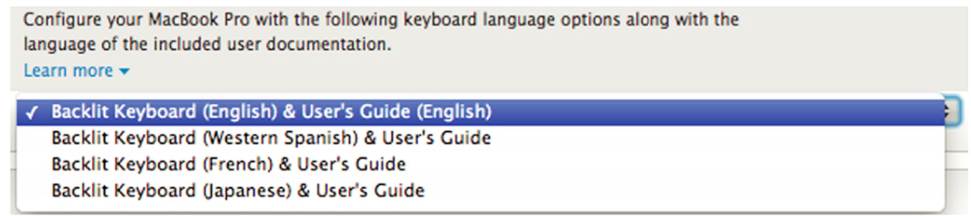
FIGURE 6.12Apple.com’s “Buy Computer” page lists options in which the important information (keyboard language compatibility) is buried in repetition.
图 6.12 Apple.com 的“购买电脑”页面列出了选项,其中重要信息(键盘语言兼容性)被埋没在重复中。
Centered text (or text aligned with a ragged start)
居中文字(或与参差不齐的开头对齐的文字)
One aspect of reading that is highly automatic in most skilled readers is eye movement. In automatic (fast) reading, our eyes are trained to go back to the same horizontal position and down one line. If text is centered or otherwise aligned so that each line starts in a different horizontal position, 4 automatic eye movements take our eyes back to the wrong place, so we must consciously adjust our gaze to the actual start of each line. This drops us out of automatic mode and slows us down. With poetry and wedding invitations that may be okay, but with any other type of text it is undesirable. Try reading the left side of Fig. 6.13 quickly, and compare that with reading the right side. Can you tell that your eyes move less efficiently when reading the left side?
阅读的一个方面在大多数熟练的读者中是高度自动化的,那就是眼球运动。在自动(快速)阅读中,我们的眼睛被训练回同一水平位置并向下移动一行。如果文本居中或以其他方式排列,使得每一行从不同的水平位置开始,那么 4 次自动眼球运动就会让我们的眼睛回到错误的位置,因此我们必须有意识地调整我们的视线到每一行的实际起始位置。这会使我们脱离自动模式并减慢速度。对于诗歌和婚礼请柬来说这可能没问题,但对于任何其他类型的文本则是不理想的。试着快速阅读图 6.13 的左侧,并将其与阅读右侧进行比较。你能感觉到阅读左侧时你的眼睛移动效率较低吗?
Fourscore and seven years
八十又七年
ago, our forefathers
前,我们的祖先
brought forth on this
在此带来了
continent a new nation,
大陆一个新国家,
conceived in liberty and
奉献自由和
dedicated to the
致力于
proposition that all men are
所有人生而平等
created equal. Fourscore and seven years ago, our forefathers
生而平等。一百年前,我们的先辈在这片大陆上创立了一个新国家,
brought forth on this
在这里孕育,
continent a new nation,
这个国家孕育自由和
conceived in liberty and
独立。
dedicated to the
致力于
proposition that all men are created equal.
提出所有人生而平等的观点。
FIGURE 6.13 Compare reading the text on the left versus the right. Centered paragraph text thwarts automatic eye movement patterns, resulting in slower reading speed.
图 6.13 比较阅读左侧和右侧的文本。居中的段落文本会破坏自动的眼动模式,导致阅读速度变慢。
Fig. 6.14 shows an example of centered paragraphs of text from the homepage of Valco Tronics Inc. (valcoelectronics.com). Not only does the page center paragraphs of text, it also uses a blurry whiteon-black typeface (see Fig. 6.14), diminishing legibility even more.
图 6.14 展示了 Valco Tronics Inc.(valcoelectronics.com)主页上居中段落文本的一个例子。该页面不仅居中段落文本,还使用了模糊的白色在黑色背景上的字体(见图 6.14),进一步降低了可读性。
UX designers should avoid centering multiline paragraphs of text (Nielsen, 2008b; Trevellyan, 2017). However, when a page includes separate elements that are not multiline sentences or paragraphs of text, centering them can be OK (see Fig. 6.15).
用户体验设计师应避免将多行文本段落居中(尼尔森,2008b;特雷维利安,2017)。然而,当页面包含单独的元素,这些元素不是多行句子或文本段落时,居中它们可能是可以接受的(见图 6.15)。
Design implications: don’t disrupt reading; support it!
设计影响:不要打断阅读;支持它!
Obviously, a designer’s goal should be to support reading, not disrupt it. Skilled (fast) reading is mostly automatic and based on feature, character, and word recognition. The easier the recognition, the easier and faster the reading. Less-skilled reading, by contrast, is greatly assisted by contextual cues.
显然,设计师的目标应该是支持阅读,而不是破坏它。熟练(快速)阅读主要基于特征、字符和单词识别。识别越容易,阅读就越容易、越快。相比之下,阅读能力较差的人则 greatly assisted by contextual cues。
Designers of interactive systems can support both reading methods by following these guidelines:
交互式系统的设计师可以通过遵循这些指南来支持这两种阅读方式:

FIGURE 6.14 Centered paragraphs of text on the homepage of valcoelectronics.com.
图 6.14 valcoelectronics.com 主页上的居中文本段落。
FIGURE 6.15 Centering of separate elements is OK; it does not disrupt reading.
图 6.15 分离元素的居中是允许的;它不会破坏阅读。
(1) Ensure that text in user interfaces allows feature-based automatic processes to function effectively by avoiding the disruptive flaws described earlier: difficult or tiny fonts, patterned backgrounds, centering, etc.
(1)确保用户界面中的文本允许基于功能的自动过程有效运行,方法是避免前面描述的破坏性缺陷:难以阅读或字体过小的字体、图案背景、居中等。
FIGURE 6.16Microsoft Word’s “Help” home page is easy to scan and read.
图 6.16 Microsoft Word 的“帮助”主页易于扫描和阅读。
(2) Use restricted, highly consistent vocabularies—sometimes referred to in the industry as plain language 5 —or simplified language (Redish, 2007). (3) Format text to create a visual hierarchy (see Chapter 3) to facilitate easy scanning: use headings, bulleted lists, tables, and visually emphasized words (see Fig. 6.16).
(2)使用受限的、高度一致的词汇表——行业有时称之为平实语言 5 ——或简化语言(Redish,2007)。 (3)格式化文本以创建视觉层次结构(见第 3 章)以促进轻松扫描:使用标题、项目符号列表、表格和视觉强调的词语(见图 6.16)。
Experienced information architects, content editors, and graphic designers can be very useful in ensuring that text is presented to support easy scanning and reading.
拥有丰富经验的信息架构师、内容编辑和图形设计师对于确保文本呈现方式便于快速扫描和阅读非常有帮助。
People Don’t Read When Using Software and the Web; They Scan
人们使用软件和网页时不阅读;他们扫描
As explained in Chapter 1, when people are using an app or a website, they focus on their goal and mostly ignore everything else. When an app or website presents text, we usually read as little of it as absolutely necessary to achieve our goal. This is often summarized as “people don’t read in apps and the Web; they scan.” (Nielsen, 1999, 2008a; Johnson, 2007; Krug, 2014). For example, look at the medical service Web page in Fig. 6.17, then look back here. Did you notice anything unusual? Now look at Fig. 6.18, in which some of the text on the page is marked. Did you miss those the first time?
正如第一章所述,当人们使用应用程序或网站时,他们会专注于他们的目标,并且通常会忽略其他所有内容。当应用程序或网站呈现文本时,我们通常只阅读绝对必要的最少内容来实现我们的目标。这通常被总结为“在应用程序和网络上,人们不阅读;他们扫描。”(尼尔森,1999 年,2008a 年;约翰逊,2007 年;克鲁格,2014 年)。例如,看看图 6.17 中的医疗服务网页,然后回来看这里。你注意到什么不寻常的地方了吗?现在看看图 6.18,其中页面上的部分文本被标记了。你第一次有没有错过它们?
It is actually an oversimplification to say “people don’t read text in apps and on the Web.” When people find the content—online books, articles, blog posts, poems, comments—that they want, they do read. But even then, unless they really enjoy the author’s writing for its own sake, they only read as much as necessary to get the information they need.
说“在应用程序和网络上,人们不阅读文本”实际上是一种过度简化。当人们找到他们想要的内容——在线书籍、文章、博客文章、诗歌、评论时,他们会阅读。但即使在这种情况下,除非他们真的喜欢作者的写作本身,否则他们只阅读必要的内容来获取他们需要的信息。
LMC MyChart- Now Available
LMC MyChart- 现已可用
SignupforelectronichealthrecordsandasubscriptiontoTheNewYorkerifyouwanttolooksmart.
如果你想看起来很聪明,请注册电子健康记录并订阅《纽约客》。

Focused on putting our patients first and bringing patient needs to the core of health care.
我们以患者为中心,将患者需求置于医疗保健的核心。
(803) 957-8400
9Find us.
找我们。

Make an appointment. Pay your bill.
预约。支付账单。
Now accepting presents!
现在接收礼物!
LMC MyChart.
LMC 我的图表。
MON-FRl:8:00a.m.-5:00 p.m SAT: 9:00 a.m. - 2:00 p.m. SUN: 1:00 p.m. - 3:00 p.m
周一至周五:上午 8:00 至下午 5:00,周六:上午 9:00 至下午 2:00,周日:下午 1:00 至下午 3:00
(803) 957-8400
PatientForms
就医表格
Bring your first-born child and a stack of rubies to your appointment.
带上你的长子和一个红宝石堆到你的预约。
Pay Online
在线支付
PaybyPhone (803)791-2300 or (877)835-0975 Monday- Friday, at the witching hour
PaybyPhone (803)791-2300 或(877)835-0975 周一至周五,在女巫的小时
We accept most major insurance. Call us if you have a question about whether we acceptyouasyouare
我们接受大多数主要保险。如果您对我们的保险范围有疑问,请致电我们。
ViewYourMedical Records Seeyour horoscope andpay bills online.
查看您的医疗记录,在线查看您的星座并支付账单。
Get Some Lunch
吃点午餐
Look for the activation code on your bill or call us at you are so not reading this.
在您的账单上查找激活码,或者如果您不阅读此内容,请致电我们。
Log In
登录
FIGURE 6.17 Simulated medical company web page. Image courtesy of trumatter.
图 6.17 模拟医疗公司网页。图片由 trumatter 提供。
Much of the Text in Apps and Websites is Unnecessary
应用和网站中的大部分文本都是不必要的
In addition to committing design mistakes that disrupt reading, many software user interfaces simply present too much text, requiring users to read more than is necessary. Software designers often justify lengthy instructions by arguing, “We need all that text to explain clearly to users what to do.” However, instructions can often be shortened with no loss of clarity. Let’s examine how the
除了提交破坏阅读的设计错误之外,许多软件用户界面简单地呈现过多文本,要求用户阅读比必要更多的内容。软件设计师经常用“我们需要所有这些文本来向用户清楚地解释该做什么”来证明冗长说明的必要性。然而,说明通常可以缩短而不损失清晰度。让我们来看看
Jeep company, between 2002 and 2007, shortened its instructions for finding a local Jeep dealer (see Fig. 6.19):
吉普公司,在 2002 年至 2007 年期间,缩短了寻找当地吉普经销商的说明(见图 6.19):
• 2002 : The “Find a Dealer” page displayed a large paragraph of prose text, with numbered instructions buried in it, and a form asking for more information than needed to find a dealer near the user.
• 2002: “查找经销商”页面显示了一个大段散文文本,编号说明隐藏在其中,还有一个要求用户提供比找到用户附近经销商所需更多信息的长表单。

FIGURE 6.18 Simulated medical company web page with additions marked. Did you notice all of these in Fig. 6.17? Image courtesy of trumatter.
图 6.18 模拟的医疗公司网页,已标记添加的部分。你注意到了图 6.17 中的所有这些吗?图片由 trumatter 提供。
• 2003 : The instructions on the “Find a Dealer” page had been boiled down to three bullet points, and the form required
• 2003 年:“寻找经销商”页面上的说明已简化为三点,表单所需信息更少。
less information.
信息更少。
• 2007 : “Find a Dealer” was cut to one field (zip code) and a “Go” button and left that way for years. That’s about as much as it can be cut, right? Wrong!
• 2007 年:“寻找经销商”被简化为一个字段(邮政编码)和一个“开始”按钮,并保持这种状态多年。那差不多是它所能简化的程度了,对吧?错了!
• 2020 : No need for a text-entry field or a “Go” button. Smartphones and computers can identify the user’s location automatically (assuming Location is enabled), so Jeep cut “Find a Dealer” down to one button. Just click it to see local dealers.
• 2020 年:无需文本输入字段或“开始”按钮。智能手机和电脑可以自动识别用户的位置(假设位置功能已开启),因此 Jeep 将“查找经销商”简化为一个按钮。只需点击它即可查看当地经销商。
What’s next? No need for any button at all. Just speak and ask Jeep for nearby dealers.
接下来会怎样?完全不需要任何按钮。只需向 Jeep 语音询问附近的经销商。
Even when text describes products rather than explaining instructions, it is counterproductive to put all a vendor wants to say about a product into a lengthy prose description that people have to read from start to end. Most potential customers cannot or will not read it. Fig. 6.20 shows the reduction in the amount of text in Costco.com’s displays of laptop computers between 2007 and 2009, and Fig. 6.21 shows that their 2019 website displayed laptop computers with very little text.
即使文本描述的是产品而不是解释说明,将所有供应商想说的关于产品的内容都放入需要从头到尾阅读的长篇散文描述中也是适得其反的。大多数潜在客户无法或不愿阅读它。图 6.20 显示了 Costco.com 在 2007 年至 2009 年间笔记本电脑展示中文字的减少,图 6.21 显示他们的 2019 年网站展示的笔记本电脑文字非常少。
Jeep.
吉普车。
It's easy to locate a dealer. 1. Click and hold box number 1 to select your search by Zip Code,City,Dealership Name or State.2.Enter the Zip Code, City,or Dealership Name in the box marked number 2. 3. If searching by State only, select the state from the pull-down menu in box number 3.**If choosing to search by city or state, type the city in box 2 then select a state in the box marked number 3 to make your search complete.4. Once finished, simply click the"Search"button.
很容易找到经销商。1. 点击并按住编号为 1 的框以按邮编、城市、经销商名称或州进行搜索。2. 在编号为 2 的框中输入邮编、城市或经销商名称。3. 如果仅按州搜索,请从编号为 3 的下拉菜单中选择州。**如果选择按城市或州搜索,请在编号为 2 的框中输入城市,然后在编号为 3 的框中选择一个州以完成搜索。4. 完成后,只需点击“搜索”按钮。
Jeep
吉普车
It's easy to locate a Jeep Dealer near you.
很容易找到您附近的 Jeep 经销商。
Select Zipcode, City or Dealership Name
选择邮编、城市或经销商名称
(If you choose to search by city, you will be prompted to provide the state.)
(如果您选择按城市搜索,系统将提示您提供州。)
Provide the Zip Code,City or Dealership Name
提供邮编、城市或经销商名称
Click on Search
点击搜索
FIGURE 6.19 Over the years, Jeep.com reduced the reading and data-entry required to find a dealer.
图 6.19 多年来,Jeep.com 减少了查找经销商所需的阅读和数据输入。
FIGURE 6.20 Between 2007 and 2009, Costco.com reduced the text in product descriptions.
图 6.20 在 2007 年至 2009 年期间,Costco.com 减少了产品描述中的文字。
Design implications: cut unnecessary text— minimize the need for reading
设计影响:删减不必要的文字—减少阅读需求
Needless text is bad anytime (Strunk and White, 1999) but is especially bad in software and websites. First of all, if users encounter lots of text on the way to their goals, they simply will ignore most of it. So if you spend time and money writing a lot of text, at best you are wasting your time and your money.
无用的文字在任何时候都是不好的(斯特兰克和怀特,1999 年),但在软件和网站上尤其如此。首先,如果用户在实现目标的过程中遇到大量文字,他们很可能会忽略大部分。所以,如果你花费时间和金钱写了很多文字,那么你最多是在浪费你的时间和金钱。
Too much text in a user interface loses poor readers, who unfortunately are a significant percentage of the population. Too much text even alienates good readers; it turns using an interactive system into an intimidating amount of work.
用户界面中的过多文字会使阅读能力较差的人失去兴趣,而这些人不幸的是占人口的一个显著比例。过多的文字甚至会使优秀的读者感到疏远;它把使用交互式系统变成了一项令人望而生畏的工作。
FIGURE 6.21 In 2019, Costco.com displayed laptop computers with no sentences or paragraphs of text.
图表 6.21 在 2019 年,Costco.com 展示了没有句子或段落的文本的笔记本电脑。
Minimize the amount of prose text in a user interface; don’t present users with long blocks of prose text to read. Don’t have paragraphs welcoming people to your website. In instructions, use the least amount of text that gets most users to their intended goals. In product descriptions, provide a brief overview of the product and let users request more detail if desired. Before releasing an app or a website, go through every screen and cut the amount of text by at least half. Then go through the screens again and cut another
最小化用户界面中的散文文本量;不要向用户展示长块的散文文本来阅读。不要有欢迎人们访问你网站的段落。在说明中,使用最少的文本来帮助大多数用户实现他们的目标。在产品描述中,提供产品的简要概述,并允许用户在需要时请求更多详细信息。在发布应用程序或网站之前,通读每一屏,并将文本量至少减少一半。然后再次通读屏幕,再减少一半。
According to UX design guru Steve Krug (2014), that should leave you with about the right amount of text. Consider how much text Jeep cut over many years. It should not have taken them almost 2 decades to do it.
根据 UX 设计专家 Steve Krug(2014 年)的观点,这应该会给你留下适量的文本。考虑一下 Jeep 多年来删减了多少文本。他们不应该花将近 20 年才完成这件事。
Technical writers and content editors can assist greatly in cutting the amount of text in a user interface. For additional advice on how to eliminate unnecessary text, see Ginny Redish’s book Letting Go of the Words (2007).
技术作家和内容编辑可以在减少用户界面中的文本方面提供很大帮助。有关如何消除不必要文本的更多建议,请参阅 Ginny Redish 的书籍《放手文字》(2007 年)。
Test on Real Users
在真实用户上测试
Finally, designers should test their designs on the intended user population to be confident that users can read all essential text quickly and effortlessly. Some testing can be done early using prototypes and partial implementations, but it should also be done just before release. Fortunately, last-minute changes to text are usually easy to make.
最后,设计师应该在目标用户群体上测试他们的设计,以确保用户能够快速轻松地阅读所有重要文本。一些测试可以在早期使用原型和部分实现来完成,但它也应该在发布前进行。幸运的是,最后时刻对文本的更改通常很容易做出。
Important Takeaways
重要要点
• Humans are “prewired” to learn a spoken language but not to learn to read. Learning to read is like learning any nonlanguage skill, such as how to ride a bicycle, play a guitar, or execute a kung fu move. Almost everyone learns a language, but many people never learn to read. • Learning to read requires training the neural networks in our eyes and brains to recognize and understand characters, words, sentences, and paragraphs. Only the neural networks that start in the fovea—a small area in the center of our visual field—are involved in reading. The rest of our visual field cannot read, but it does influence where our eyes jump while reading. • As a form of perception, reading is both a bottom-up, feature-driven process and a top-down, context-driven
• 人类天生就“预设”了学习口语的能力,但没有学习阅读的能力。学习阅读就像学习任何非语言技能一样,比如如何骑自行车、弹吉他或执行武功招式。几乎每个人都学会了语言,但很多人从未学会阅读。• 学习阅读需要训练我们眼睛和大脑中的神经网络,以识别和理解字符、单词、句子和段落。只有从我们视野中心的小区域——中央凹开始的神经网络——才参与阅读。我们视野的其余部分不能阅读,但它确实会影响我们在阅读时眼睛跳跃的位置。• 作为一种感知形式,阅读既是一个自下而上、特征驱动的过程,也是一个自上而下、上下文驱动的
process. Bottom-up, feature-driven reading—shapes to letters to words to sentences to paragraphs—is the dominant process in skilled readers, and top-down, context-driven reading assists. In less-skilled readers, top-down reading plays a larger role. • Skilled and unskilled reading use different areas of the brain. In less-skilled readers, processing a word includes areas of the brain that “sound out” words to help recognize them. In skilled readers, the “sounding out” areas of the brain are skipped; processing goes straight from visual perception to extracting meaning. • Poor information presentation can disrupt reading. It can temporarily reduce skilled readers to the level of unskilled readers, and it can block reading for unskilled readers. Poor information presentation includes: • use of rare or jargon words unfamiliar to readers • unusual scripts and typefaces, including ALL CAPS (because people are not trained in reading them) • tiny fonts • text on noisy backgrounds • text that contrasts poorly with background • information buried in repetition • centered text • People don’t read when using software and the Web. They
自下而上、特征驱动的阅读——从形状到字母到单词到句子再到段落——是熟练读者主导的过程,而自上而下、上下文驱动的阅读则提供辅助。在阅读能力较弱的读者中,自上而下的阅读起着更大的作用。• 熟练的阅读和阅读能力较弱的阅读使用大脑的不同区域。在阅读能力较弱的读者中,处理一个单词包括大脑中“拼读”单词以帮助识别它们的区域。在熟练的读者中,“拼读”的大脑区域被跳过;处理直接从视觉感知到提取意义。• 信息呈现不佳会干扰阅读。它可以暂时将熟练读者的水平降低到阅读能力较弱的读者水平,并且可以阻止阅读能力较弱的读者阅读。信息呈现不佳包括:• 使用读者不熟悉的罕见或术语词汇• 不寻常的脚本和字体,包括 ALL CAPS(因为人们没有接受过阅读它们的训练)• 微型字体• 在嘈杂的背景下有文本• 文本与背景对比不佳• 重复中隐藏的信息• 居中文本• 人们在使用软件和网页时不会阅读。他们会
scan until they find the content they are looking for—e.g., a news article. Even then, they continue to scan if all they want from the content is specific information.
扫描直到他们找到他们正在寻找的内容——例如,一篇新闻文章。即使他们从内容中只需要特定信息,他们仍然会继续扫描。
• Much of the text in apps and websites is unnecessary and should be cut out. For the broadest appeal of your software, minimize the need for users to read.
• 应用程序和网站中的许多文本是不必要的,应该被删减。为了使您的软件具有最广泛的吸引力,尽量减少用户阅读的需求。
• Test on real users to see if they can understand all the text in your software, and eliminate, rewrite, radically shorten, or replace with graphics any text that is unclear to most of them.
• 在真实用户上测试,看看他们是否能够理解您的软件中的所有文本,并消除、重写、大幅缩短或用图形替换任何对他们来说不清楚的文本。
1Later we will see that centered text disrupts the brain’s guess about where the next line starts.
1稍后我们将看到,居中的文本会破坏大脑对下一行开始位置的猜测。
2 Chapter 10 describes the differences between automatic and controlled cognitive processing. Here, we will simply say that controlled processes burden working memory, while automatic processes do not.
2 第十章描述了自动和受控认知处理之间的区别。在这里,我们将简单地说,受控过程会负担工作记忆,而自动过程不会。
3The term originally comes from the word “capture,” but it is also said to be an acronym for “Completely Automated Public Turing test to tell Computers and Humans Apart.”
3该术语最初来自单词“捕获”,但也据说是一个首字母缩略词,代表“完全自动化的公共图灵测试,用于区分计算机和人类”。
4Right-aligned for left-to-right scripts; left-aligned for right-to-left scripts.
4对于从左到右的文字脚本,文本右对齐;对于从右到左的文字脚本,文本左对齐。
5For more information on plain language see the U.S. government website, www.plainlanguage.gov.
5 有关平实语言的更多信息,请访问美国政府的网站,www.plainlanguage.gov。
Chapter 7: Our Attention is Limited; Our Memory is Imperfect
第七章:我们的注意力有限;我们的记忆不完美
Abstract
摘要
Human attention and memory, like vision, have strengths and weaknesses. This chapter describes some of those strengths and weaknesses as the background for understanding how we can design interactive systems to support and augment attention and memory. It begins with an overview of how memory works and is related to attention. It includes implications of memory characteristics for user-interface design and quick tests of shortand long-term memory.
人类的注意力和记忆力,就像视觉一样,有优势和劣势。本章描述了其中一些优势和劣势,作为理解我们如何设计交互式系统来支持和增强注意力和记忆力的背景。它从记忆如何工作及其与注意力的关系开始概述。它包括记忆特征对用户界面设计的启示以及短期和长期记忆的快速测试。
Keywords
关键词
Activation; Attention; Capacity; Features; Forgetting; Long-term memory; Memory; Mode errors; Modes; Short-term memory; Working memory
激活;注意力;容量;特征;遗忘;长期记忆;记忆;模式错误;模式;短期记忆;工作记忆
Using an app, website, or digital appliance requires controlling and focusing our attention and using our memory.
使用应用程序、网站或数字设备需要控制和集中我们的注意力,并使用我们的记忆力。
We focus attention on what we are trying to achieve. As we work, the app, website, or appliance produces results—visual, tactile, audible—that (hopefully) capture our attention and allow us to determine whether we have achieved or are approaching our goal.
我们将注意力集中在我们试图实现的目标上。在我们工作时,应用程序、网站或设备会产生结果——视觉的、触觉的、听觉的——(希望)吸引我们的注意力,并允许我们确定我们是否已经实现或正在接近目标。
Our memory comes into play in several ways. First, it allows us to learn to use the technology: every time we use a digital product or service, we apply what we remember from previous experience, reading instructions, or what another person told us, and we store new information. Our memory allows us to retain the knowledge of how to use the technology from one session to the next, and it allows us to increase our knowledge over time. In addition, our memory— augmented by feedback from the app, website, or appliance—allows us to keep track of our goal and what we have already done.
我们的记忆以多种方式发挥作用。首先,它使我们能够学会使用技术:每当我们使用数字产品或服务时,我们会应用我们从以往经验、阅读说明或他人告知中记住的内容,并存储新信息。我们的记忆使我们能够保留从一次会话到下一次会话的技术使用知识,并允许我们随着时间的推移增加知识。此外,我们的记忆——通过应用程序、网站或设备的反馈得到增强——使我们能够跟踪我们的目标和已经完成的事项。
Because memory and attention are crucial components in people’s use of digital technology, it is important for designers of digital products and services to know something about them. That is what this chapter is about.
由于记忆和注意力是人们使用数字技术的重要组成部分,因此数字产品和服务的设计者需要了解一些关于它们的知识。这就是本章的内容。
Just as the human visual system has strengths and weaknesses, so do human attention and memory. This chapter describes some of those strengths and weaknesses as the background for understanding how to design interactive systems to support and augment attention and memory rather than burdening or confusing them. We will start with an overview of how memory works and how it is related to attention.
正如人类的视觉系统有优点和缺点一样,人类的注意力和记忆力也是如此。本章描述了一些这些优点和缺点,作为理解如何设计交互式系统来支持和增强注意力和记忆力的背景,而不是负担或使它们感到困惑。我们将从记忆如何工作以及它与注意力如何相关联的概述开始。
Short- Versus Long-Term Memory
短时与长时记忆
Psychologists historically have distinguished short-term memory from long-term memory. Short-term memory covers situations in which information is retained for intervals ranging from a fraction of a second to a few minutes. Long-term memory covers situations in which information is retained over longer periods (e.g., hours, days, years, or even lifetimes).
历史上,心理学家将短期记忆与长期记忆区分开来。短期记忆涵盖信息保留时间从几分之一秒到几分钟的情况。长期记忆涵盖信息保留时间更长的情况(例如,小时、天、年,甚至一生)。
FIGURE 7.1 Traditional (antiquated) view of shortterm versus long-term memory.
图 7.1 传统(过时)的短期记忆与长期记忆观点。
It is tempting to think of short- and long-term memory as separate memory stores. Indeed, some theories of memory have considered them separate. After all, in a digital computer, the short-term memory stores (central processing unit data registers) are separate from the long-term memory stores (random-access memory, hard disk, flash memory, CD-ROM, etc.). More direct evidence comes from findings that damage to certain parts of the human brain results in short-term but not long-term memory deficits, or vice versa. Finally, the speed with which information or plans can disappear from our immediate awareness contrasts sharply with the seeming permanence of our memory of important events in our lives, faces of significant people, activities we have practiced, and information we have studied. These phenomena led many researchers to theorize that short-term memory is a separate store in the brain where information is held temporarily after entering through our perceptual senses (e.g., visual or auditory) or after being retrieved from long-term memory (see Fig. 7.1).
人们很自然地会将短期记忆和长期记忆视为独立的记忆存储。确实,一些记忆理论也将它们视为独立的。毕竟,在数字计算机中,短期记忆存储(中央处理单元数据寄存器)与长期记忆存储(随机存取存储器、硬盘、闪存、CD-ROM 等)是分开的。更直接的证据来自研究发现,人类大脑某些部位的损伤会导致短期记忆缺陷,但长期记忆不受影响,反之亦然。最后,信息或计划从我们即时意识中消失的速度,与我们对生活中重要事件、重要人物的面容、我们练习过的活动以及我们学习过的信息的记忆的看似永久性形成了鲜明对比。这些现象使许多研究人员推测,短期记忆是大脑中一个独立的存储区域,信息通过我们的感知感官(例如视觉或听觉)进入后,或从长期记忆中检索出来后,会暂时存储在那里(见图 7.1)。
A Modern View of Memory
现代记忆观
Recent research on memory and brain function indicates that shortand long-term memory are functions of a single memory system— one more closely linked with perception than previously thought (Jonides et al., 2008).
近期关于记忆和大脑功能的研究表明,短期记忆和长期记忆是单一记忆系统的功能——这个系统与感知的联系比以前认为的更紧密(Jonides 等人,2008)。
Long-term memory
长时记忆
Perceptions enter through the visual, auditory, olfactory, gustatory, or tactile sensory systems and trigger responses starting in areas of the brain dedicated to each sense (e.g., visual cortex, auditory cortex), then spread into other areas of the brain not specific to any particular sensory modality. The sensory modality-specific areas of the brain detect only simple features of the data, such as a dark/light edge, diagonal line, high-pitched tone, sour taste, red color, or rightward motion. Downstream areas of the brain combine low-level features to detect higher-level features of the input, such as animal, the word “duck,” Uncle Kevin, minor key, threat, or fairness.
感知通过视觉、听觉、嗅觉、味觉或触觉感觉系统进入,并触发从大脑中专门用于每种感觉的区域开始的反应(例如,视觉皮层、听觉皮层),然后扩散到大脑中其他不特定于任何特定感觉模态的区域。大脑的感觉模态特定区域只检测数据的简单特征,例如暗/亮边缘、斜线、高音调、酸味、红色或向右运动。大脑的下游区域将低级特征组合起来以检测输入的高级特征,例如动物、单词“鸭子”、“Kevin 叔叔”、小调、威胁或公平。
As described in Chapter 1, the set of neurons activated by a perceived stimulus depends on both the features and the context of the stimulus. Context is as important as features in determining what neural patterns are activated. For example, a dog barking near you when you are walking in your neighborhood activates a different pattern of neural activity in your brain than the same sound heard when you are listening to a recording. The more similar that two perceptual stimuli are—that is, the more features and contextual elements they share—the more overlap there is between the sets of neurons that fire in response to them.
如第一章所述,感知刺激所激活的神经元集合取决于刺激的特征和上下文。上下文与特征一样重要,决定了哪些神经模式被激活。例如,当你走在自己的社区时,附近一只狗的吠叫声会激活你大脑中不同的神经活动模式,而当你听到同样的声音时,如果是在听录音,则激活的模式不同。两个感知刺激越相似——也就是说,它们共享的特征和上下文元素越多——它们所激活的神经元集合之间的重叠就越多。
The initial strength of a perception depends on how much it is amplified or dampened by other brain activity. All perceptions create some kind of trace, but some are so weak that they can be considered not registered: the pattern was activated once but never again.
感知的初始强度取决于它被其他脑活动放大或减弱的程度。所有感知都会留下某种痕迹,但有些痕迹如此微弱,以至于可以认为它们没有被注册:该模式被激活了一次,但再没有被激活。
Memory formation consists of changes in the neurons involved in a neural activity pattern that make the pattern easier to reactivate in the future. 1 Some such changes result from chemicals released near neural endings that boost or inhibit their sensitivity to stimulation. These changes last only until the chemicals dissipate or are neutralized by other chemicals. More permanent changes occur when neurons grow and branch, forming new connections with others.
记忆形成涉及参与神经活动模式的神经元的改变,这些改变使该模式在未来更容易被重新激活。1 其中一些改变源于神经末梢附近释放的化学物质,这些化学物质增强或抑制其对外界刺激的敏感性。这些改变仅持续到化学物质消散或被其他化学物质中和。更持久的改变发生在神经元生长和分支时,与其他神经元形成新的连接。
Activating a memory consists of reactivating the same pattern of neural activity that occurred when the memory was formed. Somehow the brain distinguishes initial activations of neural patterns from reactivations—perhaps by measuring the relative ease with which the pattern was reactivated. New perceptions very similar to the original ones reactivate the same patterns of neurons, resulting in recognition if the reactivated perception reaches awareness. In the absence of a similar perception, stimulation from activity in other parts of the brain can also reactivate a pattern of neural activity, which if it reaches awareness results in recall.
激活记忆包括重新激活记忆形成时发生的相同神经活动模式。大脑以某种方式区分神经模式的初始激活和重新激活——也许是通过测量该模式重新激活的相对容易程度。与原始感知非常相似的新感知会重新激活相同的神经元模式,如果重新激活的感知达到意识,就会产生识别。在没有相似感知的情况下,大脑其他部位的活动刺激也可以重新激活神经活动模式,如果它达到意识,就会产生回忆。
The more often a neural memory pattern is reactivated, the stronger it becomes—that is, the easier it is to reactivate—which in turn means that the perception it corresponds to is easier to recognize and recall. Neural memory patterns can also be strengthened or weakened by excitatory or inhibitory signals from other parts of the brain.
神经记忆模式越频繁地被激活,它就越强大——也就是说,越容易再次激活——这意味着与它对应的感觉就越容易识别和回忆。神经记忆模式也可以通过大脑其他部分的兴奋性或抑制性信号而得到加强或减弱。
A particular memory is not located in any specific spot in the brain. The neural activity pattern comprised in a memory involves a network of millions of neurons extending over a wide area. Activity patterns for different memories overlap depending on which features they share. Removing, damaging, or inhibiting neurons in a particular part of the brain typically does not completely wipe out memories that involve those neurons but rather just reduces the detail or accuracy of the memory by deleting features. 2 However, some areas in a neural activity pattern may be critical pathways, so removing, damaging, or inhibiting them may prevent most of the pattern from activating, thereby effectively eliminating the corresponding memory.
特定的记忆并不位于大脑的任何特定位置。一个记忆所包含的神经活动模式涉及数百万个神经元组成的广泛网络。不同记忆的活动模式会根据它们共享的特征而重叠。在大脑的特定部分移除、损坏或抑制神经元通常不会完全消除涉及这些神经元的记忆,而是通过删除特征来减少记忆的细节或准确性。然而,神经活动模式中的一些区域可能是关键通路,因此移除、损坏或抑制它们可能会阻止大部分模式的激活,从而有效地消除相应的记忆。
For example, researchers have long known that the hippocampus, twin seahorse-shaped neural clusters near the base of the brain, plays an important role in storing long-term memories. The modern view is that the hippocampus is a controlling mechanism that directs neural rewiring to “burn” memories into the brain’s wiring. The amygdala, two jellybean-shaped clusters on the frontal tips of the hippocampus, has a similar role, but it specializes in storing memories of emotionally intense, threatening situations (Eagleman, 2012).
例如,研究人员早已知道,大脑基底附近的一对海马形神经簇——海马体,在储存长期记忆方面发挥着重要作用。现代观点认为,海马体是一个控制机制,它指导神经重新连接,将记忆“烧录”到大脑的连接线路中。杏仁核,位于海马体前部的一对果冻豆形神经簇,具有类似的作用,但它专门负责储存情绪强烈、具有威胁性的情境记忆(Eagleman,2012)。
Cognitive psychologists view human long-term memory as consisting of three distinct functions:
认知心理学家认为,人类的长期记忆由三种不同的功能组成:
• Semantic long-term memory stores facts and relationships, such as “Germany is in Europe,” “Berlin is the capital of Germany,” “dogs are mammals,” and “2 + 2 = 4.” • Episodic long-term memory records past events, such as the time you hit a baseball through a neighbor’s window, the time you met your spouse, or yesterday’s dinner. • Procedural long-term memory remembers action sequences, such as how to tie your shoes, execute a karate move, or play
• 语义长期记忆储存事实和关系,例如“德国在欧洲”、“柏林是德国的首都”、“狗是哺乳动物”和“2 + 2 = 4”。• 事件长期记忆记录过去的事件,例如你打棒球砸穿邻居窗户的时间、你结婚的时间或昨天的晚餐。• 程序性长期记忆记得动作序列,例如如何系鞋带、执行一套空手道动作或在吉他上演奏一首歌。
a song on your guitar.
一个歌曲。
Everything we do, including using digital technology, uses all three types of long-term memory. For example, when you text a friend on your smartphone, you use semantic memory to generate what you want to say, episodic memory to recall what you and your friends did yesterday, and procedural memory to guide your hands in tapping out the text of your message and sending it. Furthermore, your phone’s texting app supports all three types of memory. It supports semantic memory by helping you keep track of your friends and their likes and dislikes and by sending you facts to add to your knowledge; it supports episodic memory by showing you texts you have sent and received as well as by providing news about events, and it supports procedural memory—or perhaps hampers it —by autocompleting many of the words you type.
我们所做的一切,包括使用数字技术,都使用三种类型的长期记忆。例如,当你用智能手机给朋友发短信时,你使用语义记忆来生成你想说的话,情景记忆来回忆你和朋友昨天做了什么,以及程序记忆来指导你的双手在打出短信内容并发送它。此外,你手机的短信应用程序支持所有三种类型的记忆。它通过帮助你记住朋友及其喜好和不喜欢来支持语义记忆,并通过发送事实来增加你的知识;它通过向你展示你发送和收到的短信以及提供有关事件的消息来支持情景记忆;它通过自动补全你输入的许多单词来支持程序记忆——或者也许会妨碍它。
Short-term memory
短时记忆
So far, we’ve discussed long-term memory. What about short-term memory? What psychologists call short-term memory is actually a combination of phenomena involving perception, attention, and retrieval from long-term memory.
到目前为止,我们已经讨论了长期记忆。那么,短期记忆呢?心理学家所说的短期记忆实际上是涉及感知、注意力和从长期记忆中检索的现象的组合。
One component of short-term memory is perceptual. Each of our perceptual senses has its own very brief short-term “memory” resulting from residual neural activity after a perceptual stimulus ceases, like a bell that rings briefly after it is struck. Until they fade away, these residual perceptions are available as possible input to our brain’s attention and memory-storage mechanisms, which integrate input from our various perceptual systems, focus our awareness on some of that input, and store some of it in long-term memory. These sensory-specific residual perceptions together make up a minor component of short-term memory. Here, we are only interested in them as potential inputs to working memory.
短时记忆的一个组成部分是感知。我们每一种感知觉都有其自身非常短暂的短时“记忆”,这是在感知刺激停止后残留在神经活动中的结果,就像敲击后短暂回响的钟声。在这些残留感知消失之前,它们可以作为我们大脑注意力和记忆存储机制的可能输入,这些机制整合来自我们各种感知系统的输入,将我们的注意力集中在其中一些输入上,并将其中一些存储在长期记忆中。这些特定于感官的残留感知共同构成了短时记忆的一个小部分。在这里,我们只对它们作为工作记忆的潜在输入感兴趣。
Also available as potential input to working memory are longterm memories reactivated through recognition or recall. As explained earlier, each long-term memory corresponds to a specific pattern of neural activity distributed across our brain. While activated, a memory pattern is a candidate for our attention and therefore potential input for working memory.
也可以作为工作记忆的潜在输入的是通过识别或回忆重新激活的长期记忆。如前所述,每个长期记忆对应于我们大脑中分布的一种特定神经活动模式。当被激活时,记忆模式是我们注意力的候选对象,因此也是工作记忆的潜在输入。
The human brain has multiple attention mechanisms, some voluntary and some involuntary. They focus our awareness on a very small subset of perceptions and activated long-term memories while ignoring everything else. The tiny subset of all available information from our perceptual systems and long-term memories that we are aware of right now is the main component of our shortterm memory, the part that cognitive scientists often call working memory. It integrates information from all our sensory modalities and long-term memory. Henceforth, we will restrict our discussion of short-term memory to working memory.
人类大脑拥有多种注意力机制,有些是自愿的,有些是无意识的。它们将我们的意识集中在感知和长期记忆的一小部分上,而忽略其他所有事物。我们当前意识到的所有可用信息和长期记忆中的微小子集是我们短期记忆的主要组成部分,认知科学家通常称之为工作记忆。它整合了我们所有感觉模态和长期记忆中的信息。从现在起,我们将短期记忆的讨论限制在工作记忆上。
So what is working memory? First, here is what it is not: it is not a store—it is not a place in the brain where memories and perceptions go to be worked on. And it is nothing like accumulators or fast random-access memory in digital computers.
那么,工作记忆是什么?首先,这里有一些它不是的东西:它不是一个存储器——它不是大脑中用于处理记忆和感知的地方。它也和数字计算机中的累加器或快速随机存取存储器没有任何相似之处。
Instead, working memory is the combined focus of our attention: everything that we are conscious of at a given time. More precisely, it is a few perceptions and long-term memories that are activated enough that we remain aware of them over a short period. Psychologists also view working memory as including an executive function—based mainly in the frontal cerebral cortex—that manipulates items we are attending to, and if needed refreshes their activation so they remain in our awareness (Baddeley, 2012).
相反,工作记忆是我们注意力的集中焦点:在任何特定时间我们意识到的所有内容。更精确地说,它是一系列被激活到足以让我们在短时间内保持意识的感觉和长期记忆。心理学家还将工作记忆视为包括一项执行功能——主要基于前额叶皮层——该功能操作我们正在注意的项目,并在需要时刷新它们的激活状态,以便它们保持在我们意识中(Baddeley,2012)。
A useful—if oversimplified—analogy for memory is a huge, dark, musty warehouse. The warehouse is full of long-term memories piled haphazardly (not stacked neatly), intermingled and tangled, and mostly covered with dust and cobwebs. Doors along the walls represent our perceptual senses: sight, hearing, smell, taste, touch. They open briefly to let perceptions in. As perceptions enter, they are briefly illuminated by light coming in from outside, but they quickly are pushed (by more entering perceptions) into the dark tangled piles of old memories.
关于记忆的一个有用的——如果过于简化的话——类比是一个巨大、黑暗、发霉的仓库。仓库里堆满了杂乱无章(没有整齐堆放)的长期记忆,它们相互交错、缠绕,并且大部分覆盖着灰尘和蛛网。墙上的门代表我们的感知感官:视觉、听觉、嗅觉、味觉、触觉。它们会短暂地打开,让感知进入。当感知进入时,它们会被从外面进入的光短暂照亮,但很快会被更多的进入感知推入黑暗交错的老旧记忆堆中。
In the ceiling of the warehouse are a small fixed number of searchlights controlled by the attention mechanism’s executive function (Baddeley, 2012). They swing around and focus on items in the memory piles, illuminating them for a while until they swing away to focus elsewhere. Sometimes one or two searchlights focus on new items after they enter through the doors. When a searchlight moves to focus on something new, whatever it had been focusing on is plunged into darkness.
在仓库的天花板上固定安装着少量探照灯,由注意力机制的执行功能控制(Baddeley,2012 年)。它们来回摆动,聚焦在记忆堆中的物品上,照亮它们一段时间,然后移开焦点去照亮其他地方。有时,一个或两个探照灯会聚焦在新进入门口的物品上。当探照灯移到聚焦新事物时,它之前聚焦的物品就会陷入黑暗。
The small fixed number of searchlights represents the limited capacity of working memory. What is illuminated by them (and briefly through the open doors) represents the contents of working memory—out of the vast warehouse’s entire contents, the few items we are attending to at any moment (see Fig. 7.2).
少量固定的探照灯代表了工作记忆的有限容量。它们照亮的(以及通过敞开的门短暂照亮的)代表了工作记忆的内容——在仓库庞大的一切物品中,我们任何时刻都在关注的少数物品(见图 7.2)。
The warehouse analogy is too simple and should not be taken too seriously. As Chapter 1 explained, our senses are not just passive doorways into our brains through which our environment “pushes” perceptions. Rather, our brain actively and continually seeks out important events and features in our environment and “pulls” perceptions in as needed (Ware, 2008). Furthermore, the brain is buzzing with activity most of the time, and its internal activity is only modulated—not determined—by sensory input (Eagleman, 2012). Also, as described earlier, memories are embodied as networks of neurons distributed around the brain, not as objects in a specific location. Finally, activating a memory in the brain can activate related ones; our warehouse-with-searchlights analogy doesn’t represent that.
仓库类比过于简单,不应过于认真对待。正如第一章所述,我们的感官并非仅仅是环境向大脑“灌输”感知的通道。相反,大脑会主动且持续地寻找环境中重要的事件和特征,并根据需要“拉取”感知(Ware,2008)。此外,大脑大部分时间都充满活动,其内部活动仅受感觉输入的调节——而非决定(Eagleman,2012)。另外,如前所述,记忆以神经元网络的形式体现,分布在大脑各处,而非特定位置的对象。最后,在大脑中激活一个记忆可能会激活相关的记忆;我们的仓库与探照灯类比并不能体现这一点。
FIGURE 7.2Modern view of memory: a dark warehouse full of stuff (long-term memory) with searchlights focused on a few items (short-term memory).
图 7.2 现代记忆观:一个充满物品(长期记忆)的黑暗仓库,探照灯聚焦于少数几件物品(短期记忆)。
Nonetheless, the analogy—especially the part about the searchlights—illustrates that working memory is a combination of several foci of attention (the currently activated neural patterns of which we are aware), its capacity is extremely limited, and its content at any given moment is very volatile.
然而,这个类比——尤其是关于探照灯的部分——说明工作记忆是多个注意力焦点的组合(我们意识到的当前激活的神经模式),其容量极其有限,并且其内容在任何给定时刻都非常不稳定。
What about the earlier finding that damage to some parts of the brain causes short-term memory deficits, while other types of brain damage cause long-term memory deficits? The current interpretation is that some types of damage decrease or eliminate the brain’s ability to focus attention on specific objects and events, while other types of damage harm the brain’s ability to store or retrieve long-term memories.
那么关于早期发现的部分,即大脑某些部分的损伤会导致短期记忆缺陷,而其他类型的脑损伤会导致长期记忆缺陷呢?目前的解释是,某些类型的损伤会降低或消除大脑专注于特定对象和事件的能力,而其他类型的损伤会损害大脑存储或检索长期记忆的能力。
Characteristics of Attention and Working Memory
注意力和工作记忆的特征
As noted, working memory is equal to the focus of our attention.
如前所述,工作记忆等于我们的注意力焦点。
Whatever is in that focus is what we are conscious of at any moment.
凡是在那个焦点中的内容,就是我们任何时刻意识到的。
But what determines what we attend to and how much we can attend to at any given time?
但是什么决定了我们在任何给定时间关注什么以及能关注多少?
Attention is highly focused and selective
注意力高度集中和选择性
Most of what is going on around you at this moment you are unaware of. Your perceptual system and brain sample very selectively from your surroundings because they don’t have the capacity to process everything.
你此刻周围发生的大多数事情你都意识不到。你的感知系统和大脑会非常选择性地从周围环境中采样,因为它们没有处理所有事物的能力。
Right now you are conscious of the last few words and ideas you have read but probably not the color of the wall in front of you. But now that I have shifted your attention, you are conscious of the wall’s color and may have forgotten some of the ideas you read on the previous page.
此刻你意识到了你最后读到的几个字和想法,但可能没有注意到你面前的墙壁颜色。但现在我已经转移了你的注意力,你意识到了墙壁的颜色,并且可能忘记了之前页面上读到的某些想法。
Chapter 1 described how our perception is filtered and biased by our goals. For example, if you are looking for your friend in a crowded shopping mall, your visual system “primes” itself to notice people who look like your friend (including how he or she is dressed), and barely notice everything else. Simultaneously, your auditory system primes itself to notice voices that sound like your friend’s voice and even footsteps that sound like those of your friend. Human-shaped blobs in your peripheral vision and sounds localized by your auditory system that match those of your friend snap your eyes and head toward them. While you look, anyone looking or sounding similar to your friend attracts your attention, and you won’t notice other people or events that would normally have interested you.
第一章描述了我们的感知是如何被我们的目标过滤和偏见的。例如,如果你在拥挤的购物中心里找朋友,你的视觉系统会“启动”自己去注意看起来像你朋友的人(包括他们的穿着),而几乎注意不到其他东西。同时,你的听觉系统会“启动”自己去注意听起来像你朋友的声音,甚至听起来像你朋友脚步声的声音。你视野边缘的人形模糊物和你听觉系统定位的与你朋友匹配的声音会让你的眼睛和头转向它们。当你看的时候,任何看起来或听起来像你朋友的人都会吸引你的注意力,而你会注意不到其他通常会让你感兴趣的人或事件。
Besides focusing on objects and events related to our current goals, our attention is drawn to:
除了专注于与我们现在目标相关的物体和事件,我们的注意力还会被吸引到:
• Movement, especially movement near or toward us . For example, something jumps at you while you walk on a street, or something swings toward your head in a haunted house ride at an amusement park, or a car in an adjacent lane suddenly swerves toward your lane (see the discussion of the flinch reflex in Chapter 14).
• 运动,尤其是靠近我们或朝我们运动的情况。例如,当你在街上行走时,有东西突然朝你跳来,或者在游乐园的鬼屋游乐设施中,有东西朝你的头挥舞,或者相邻车道的汽车突然向你的车道变道(参见第 14 章关于缩手反射的讨论)。
• Threats . Anything that signals or portends danger to us or people in our care.
• 威胁。任何向我们或我们照顾的人发出危险信号或预示危险的事物。
• Faces of other people . We are primed from birth to notice faces more than other objects in our environment.
• 其他人的脸。我们从出生起就经过训练,比环境中其他物体更容易注意到脸。
• Sex and food . Even if we are happily married and well fed, these things attract our attention. Even the mere words probably got your attention.
• 性和食物。即使我们已婚且吃饱,这些事物也会吸引我们的注意力。仅仅是这些词语可能已经吸引了你的注意力。
These things, along with our current goals, draw our attention involuntarily. We don’t become aware of something in our environment and then orient ourselves toward it. It is the other way around: our perceptual system detects something attention-worthy and orients us toward it preconsciously, and only afterward do we become aware of it. 3
这些事情,连同我们当前的目标,都无意识地吸引着我们的注意力。我们不是先意识到环境中的某件事,然后才将其作为目标。恰恰相反:是我们的感知系统预先无意识地让我们朝向值得注意的事物,然后我们才意识到它。3
Working memory (aka attention) is limited
工作记忆(又名注意力)是有限的
The primary characteristics of working memory are its low capacity and volatility. But what is that capacity? In terms of the warehouse analogy presented earlier, what is the small fixed number of searchlights?
工作记忆的主要特征是其低容量和易变性。但容量是什么?在之前提到的仓库类比中,那少数几个固定的探照灯是什么?
Many college-educated people have read about “the magical number seven, plus or minus two” proposed by cognitive psychologist George Miller in 1956 as the limit on the number of simultaneous unrelated items in human working memory (Miller, 1956).
许多受过高等教育的人读过认知心理学家乔治·米勒在 1956 年提出的“神奇的数字七,加减二”,他认为这是人类工作记忆中同时处理无关项数量的上限(米勒,1956)。
Miller’s characterization of the working-memory limit naturally raises several questions:
米勒对工作记忆限制的描述自然引发了许多问题:
• What are the items in working memory? They are current perceptions and retrieved memories. They are goals, numbers, words, names, sounds, images, odors—anything one can be aware of. In the brain, they are patterns of neural activity. • Why must items be unrelated? Because if two items are related, they correspond to one big neural activity pattern— one set of features—and hence one item, not two.
• 工作记忆中的项目是什么?它们是当前感知和检索的记忆。它们是目标、数字、单词、名称、声音、图像、气味——任何可以感知的东西。在大脑中,它们是神经活动的模式。• 为什么项目必须不相关?因为如果两个项目相关,它们对应一个大的神经活动模式——一组特征——因此是一个项目,而不是两个。
• Why the fudge factor of plus or minus two? Because researchers cannot measure with perfect accuracy how much people can keep track of as well as individual differences in working-memory capacity.
• 为什么有加减二这个修正值?因为研究人员无法精确测量人们能跟踪多少以及工作记忆容量的个体差异。
Later research in the 1960s and 1970s found Miller’s estimate to be too high. In the experiments Miller considered, some of the items presented to people to remember could be “chunked” (i.e., considered related), making it appear that people’s working memories were holding more items than they actually were. Furthermore, all the subjects in Miller’s experiments were college students. Working-memory capacity varies within the general population. When the experiments were revised to disallow unintended chunking and include noncollege students as subjects, the average capacity of working memory was shown to be more like four plus or minus one—that is, three to five items (Broadbent, 1975; Mastin, 2010). Thus, in our warehouse analogy, there would be only four searchlights.
后续研究在 20 世纪 60 年代和 70 年代发现米勒的估计过高。在米勒考虑的实验中,向人们展示以供记忆的一些项目可以被“分块”(即,被认为相关),这使得人们的工作记忆看起来比实际容纳的项目更多。此外,米勒的所有实验对象都是大学生。工作记忆容量在总人口中有所不同。当实验修订以禁止无意分块并将非大学生作为受试者时,工作记忆的平均容量显示为大约四加减一——即三到五项(Broadbent,1975;Mastin,2010)。因此,在我们的仓库类比中,将只有四个探照灯。
More recent research has cast doubt on the idea that the capacity of working memory should be measured in whole items or “chunks.” It turns out that in early working-memory experiments, people were asked to briefly remember items (e.g., words or images) that were quite different from each other—that is, they had very few features in common. In such a situation, people don’t have to remember every feature of an item to recall it a few seconds later; remembering some of its features is enough. So people appeared to recall items as a whole, and therefore working-memory capacity seemed measurable in whole items.
近期研究对工作记忆容量应以完整项目或“块”来衡量的观点提出了质疑。结果表明,在早期工作记忆实验中,人们被要求短暂记住彼此差异很大的项目(例如,单词或图像),也就是说,它们共同的特征非常少。在这种情况下,人们不必记住项目的所有特征就能在几秒钟后回忆起它;记住其部分特征就足够了。因此,人们似乎以整体方式回忆项目,所以工作记忆容量似乎可以以完整项目来衡量。
Recent experiments have given people items to remember that are similar—that is, they share many features. In that situation, to recall an item and not confuse it with other items, people must remember more of its features. In these experiments, researchers found that people remember more details (i.e., features) of some items than of others, and the items they remember in greater detail are the ones they paid more attention to (Bays and Husain, 2008). This suggests that the unit of attention—and therefore the capacity of working memory—is best measured in item features rather than whole items or “chunks” (Cowan et al., 2004). This jibes with the modern view of the brain as a feature-recognition device, but it is controversial among memory researchers, some of whom argue that the basic capacity of human working memory is three to five whole items but is reduced when people attend to a large number of the details (i.e., features) of items (Alvarez and Cavanagh, 2004).
近期实验中,人们获得了许多相似的记忆项目——也就是说,它们共享许多特征。在这种情况下,为了回忆一个项目而不与其他项目混淆,人们必须记住更多关于它的特征。在这些实验中,研究人员发现人们记住某些项目的细节(即特征)比其他项目更多,而他们记得更详细的那些项目正是他们更注意的项目(Bays 和 Husain,2008)。这表明注意力的单位——因此也是工作记忆的容量——最好用项目特征来衡量,而不是整个项目或“块”(Cowan 等人,2004)。这与现代关于大脑是特征识别设备的观点一致,但在记忆研究人员中存在争议,其中一些人认为人类工作记忆的基本容量是三到五个整个项目,但在人们注意到项目的大量细节(即特征)时,这种容量会减少(Alvarez 和 Cavanagh,2004)。
Bottom line: The true capacity of human working memory is still a research topic.
简而言之:人类工作记忆的真实容量仍然是一个研究课题。
The second important characteristic of working memory is how volatile it is. Cognitive psychologists used to say that new items arriving in working memory often bump old ones out, but that way of describing the volatility is based on the view of working memory as a temporary storage place for information. The modern view of working memory as the current focus of attention makes it even clearer: focusing attention on new information turns it away from some of what it was focusing on. That is why the searchlight analogy is useful.
工作记忆的第二个重要特征是其易变性。认知心理学家过去常说,新项目进入工作记忆时往往会挤走旧项目,但这种描述易变性的方式是基于将工作记忆视为信息临时存储空间的观点。现代观点将工作记忆视为当前注意力的焦点,这使得其易变性更加明显:将注意力集中在新信息上会使注意力从之前关注的一些内容上移开。这就是为什么搜索灯类比是有用的。
However we describe it, information can easily be lost from working memory. If items in working memory don’t get combined or rehearsed, they are at risk of having the focus shifted away from them. This volatility applies to goals as well as to the details of objects. Losing items from working memory corresponds to forgetting or losing track of something you were doing. We have all had such experiences, for example:
无论我们如何描述,信息都很容易从工作记忆中丢失。如果工作记忆中的项目没有被组合或复述,它们就有失去注意力的风险。这种易变性适用于目标,也适用于对象的细节。从工作记忆中丢失项目相当于忘记或失去你正在做的事情。我们都有过这样的经历,例如:
• Going to another room for something, but once there we cannot remember why we came.
• 去另一个房间找东西,但到了那里却记不起为什么来了。
• Taking a phone call and afterward not remembering what we were doing before the call.
• 接一个电话后,不记得打电话前我们在做什么。
• Something yanks our attention away from a conversation and then we can’t remember what we were talking about.
• 有件事会让我们把注意力从谈话中移开,然后我们就记不起我们之前在谈论什么了。
• In the middle of adding a long list of numbers, something distracts us, so we have to start over.
• 在我们正在加一长串数字时,有件事分散了我们的注意力,所以我们不得不从头开始。
Working Memory Test
工作记忆测试
To test your working memory, copy these instructions onto a separate sheet of paper, get a pen or pencil and two blank sheets paper, and follow these instructions:
要测试你的工作记忆,请将这些说明复制到另一张纸上,拿上一支笔或铅笔和两张空白纸,然后按照这些说明操作:
1.Flip to the next page of the book but don’t look at it. Cover it with a blank sheet of paper.
翻到书的一页,但不要看它。用一张空白纸盖住它。
2.Pull the paper cover down a little, read the black numbers at the top for a few seconds, then slide the blank sheet back up to cover the book page again. Don’t peek ahead at other numbers on that page unless you want to ruin the test. Look back at these instructions.
把纸封面往下拉一点,看顶部的黑数字几秒钟,然后滑空白纸回到书页上盖住。除非你想毁掉考试,否则不要看那页上的其他数字。回头再看这些说明。
3.Say your phone number backward, out loud.
把你的电话号码倒着说,大声地。
4.Now write down the black numbers from memory … now check the black numbers again. Did you get all of them?
现在凭记忆写下黑数字……然后再次核对黑数字。你全部写对了吗?
5.Pull the cover down a bit more, read the red numbers (under the black ones), and look back at these instructions.
把封面再往下拉一点,看黑数字下面的红数字,然后回头再看这些说明。
6.Write down the numbers from memory. These would be easier to recall than the first ones if you noticed that they are the first seven digits of
将数字从记忆中写下来。如果你注意到它们是
7.Return to the book page, read the green numbers for 3 seconds, then look back here.
回到书页上,看绿色数字 3 秒钟,然后看回来。
8.Write down the numbers you remember. If you noticed that they are odd numbers from 1 to 13, they will be easier to recall because you only need to remember three chunks (“odds, 1 to
写下你记住的数字。如果你注意到它们是 1 到 13 的奇数,它们会更容易回忆起来,因为你只需要记住三个部分(“奇数, 1 到
9.Return to the book page, read the orange words for 3 seconds, then look back here.
回到书页上,看橙色文字 3 秒钟,然后看回来。
10.Write down the words from memory … could you recall them all?
从记忆中写下单词……你能全部回忆起来吗?
11.Return to the book page, read the blue words for 3 seconds, then look back here.
回到书页上,看蓝色文字 3 秒钟,然后看向这里。
12.Write down the words from memory … it was a lot easier to recall them because they form a sentence, so they could be stored as one sentence rather than seven words.
从记忆中写下单词……因为它们组成了一句话,所以回忆起来要容易得多,可以作为一个句子而不是七个单词来存储。
Implications of Working-Memory Characteristics for User-Interface Design
工作记忆特征对用户界面设计的影响
The capacity and volatility of working memory have many implications for the design of interactive computer systems. The basic implication is that user interfaces should help people remember essential information from one moment to the next. Don’t require people to remember system status or what they have done, because their attention is focused on their primary goal and progress toward it. Specific examples follow.
工作记忆的容量和波动性对交互式计算机系统的设计有许多影响。基本影响是用户界面应该帮助人们记住从这一刻到下一刻的重要信息。不要要求人们记住系统状态或他们已经做过的事情,因为他们的注意力集中在他们的主要目标和向其进展上。以下是一些具体的例子。
Voice user interfaces
语音用户界面
Voice user interfaces (VUIs) place a higher load on short-term memory than graphical user interfaces do (Pearl, 2018a). The most obvious design implication of the limited capacity of human working memory is that computer systems that present information via speech output should limit how much information they provide at once so they don’t overload users’ short-term memory. This includes telephone voice-response systems like those that companies provide to help you before they let you speak with a real person. It also includes personal digital assistants like Siri, Alexa, Google Assistant, and Cortana.
语音用户界面(VUI)对短期记忆的负担比图形用户界面更大(Pearl,2018a)。人类工作记忆容量有限的最明显的设计启示是,通过语音输出呈现信息的计算机系统应该限制一次提供的信息量,以免超载用户的短期记忆。这包括公司在让你与真人交谈之前提供的电话语音响应系统。它还包括 Siri、Alexa、Google Assistant 和 Cortana 等个人数字助理。
For example, VUIs should not issue long instructions in a single long utterance. Bad: “Welcome to ACME travel service, your gateway to anywhere. I can help you with flight reservations, hotel bookings, or car rentals. Just tell me which one you want. If you need help, say ‘help’. Unfortunately, our car rental service is not available now. What would you like?” Few people will be able to remember all of that. Instead, get rid of nonessential text and break the interaction up into short segments. Better: “ACME travel. Say ‘flight reservation’, ‘book hotel’, or ‘rent car’.” (User says “rent car.”) “OK, you want to rent a car. In what city?” (etc.)
例如,语音用户界面(VUI)不应在单个长话语中发出长指令。差: “欢迎来到 ACME 旅行服务,您到任何地方的门户。我可以帮助您预订航班、酒店或租车。告诉我您想要哪一个。如果您需要帮助,说‘帮助’。不幸的是,我们目前的租车服务不可用。您想要什么?” 很少有人能记住所有这些。相反,去掉非必要的文本,并将交互分成短段。更好:“ACME 旅行。说‘航班预订’、‘预订酒店’或‘租车’。”(用户说“租车。”)“好的,您想租车。在哪个城市?”(等等。)
A related VUI design guideline is that verbal lists of options or search results should not be longer than four or five items. People can’t remember more than that (Budiu and Laubheimer, 2018) unless the items are familiar, such as close friends, family members, or favorite restaurants (Pearl, 2018b).
一个相关的 VUI 设计指南是,口头选项列表或搜索结果不应超过四或五个项目。人们记不住更多(Budiu 和 Laubheimer,2018),除非这些项目是熟悉的,例如亲密的朋友、家人或喜欢的餐厅(Pearl,2018b)。
Some VUIs run on devices that also have screens, such as smartphones, tablets, laptop computers, and some smart speakers. In such cases, the VUI can supplement its verbal output by displaying information on the screen, thus reducing what it needs to say and thereby decreasing the burden on users’ short-term memory (Pearl, 2018a).
一些 VUI 运行在带有屏幕的设备上,例如智能手机、平板电脑、笔记本电脑和一些智能音箱。在这种情况下,VUI 可以通过屏幕显示信息来补充其口头输出,从而减少需要说的话,并降低用户短期记忆的负担(Pearl,2018a)。
Modes
模式
The limited capacity and volatility of working memory is one reason user-interface design guidelines often say to either avoid designs that have modes or provide adequate mode feedback. In a moded user interface, some user actions have different effects depending on what mode the system is in. For example:
工作记忆的有限容量和波动性是用户界面设计指南通常建议避免具有模式的设计或提供足够的模式反馈的原因之一。在一个模式化的用户界面中,某些用户操作的效果取决于系统处于什么模式。例如:
• In a car, pressing the accelerator pedal can move the car either forward, backward, or not at all depending on whether the transmission is in drive, reverse, or neutral. The transmission sets a mode in the car’s user interface.
• 在汽车中,踩油门踏板可以使汽车前进、后退或不移动,这取决于变速箱是处于前进、倒车还是空挡模式。变速箱在汽车的用户界面中设置了一个模式。
• In many digital cameras, pressing the shutter button can either snap a photo or start a video recording depending on which mode is selected.
• 在许多数码相机中,按下快门按钮可以拍照或开始录像,这取决于选择的模式。
• In a drawing program, clicking and dragging normally selects one or more graphic objects on the drawing, but when the software is in “draw rectangle” mode, clicking and dragging adds a rectangle to the drawing and stretches it to the desired size.
在绘图程序中,点击并拖动通常选择一个或多个图形对象,但当软件处于“绘制矩形”模式时,点击并拖动会在绘图中添加一个矩形并将其拉伸到所需大小。
Moded user interfaces have advantages; that is why many interactive systems have them. Modes allow a device to have more functions than controls: the same control provides different functions in different modes. Modes allow an interactive system to assign different meanings to the same gestures to reduce the number of gestures users must learn.
模式化用户界面具有优势;这就是为什么许多交互式系统都采用它们。模式使设备能够拥有比控件更多的功能:同一个控件在不同的模式下提供不同的功能。模式允许交互式系统将不同的含义分配给相同的手势,以减少用户必须学习的手势数量。
However, one well-known disadvantage of modes is that people often make mode errors: they forget what mode the system is in and do the wrong thing by mistake (Johnson, 1990). This is especially true in systems that give poor feedback about what mode the system is in. Because of the problem of mode errors, many user-interface design guidelines say to either avoid modes or provide strong feedback about which mode is the current one. Working memory is too unreliable for designers to assume that users can, without clear, continuous feedback, keep track of what mode the system is in, even when the users are the ones changing modes.
然而,模式的一个众所周知缺点是人们经常犯模式错误:他们忘记系统处于什么模式,并因此犯错(Johnson,1990)。这在那些对系统处于什么模式提供反馈较差的系统中尤其如此。由于模式错误的问题,许多用户界面设计指南建议要么避免使用模式,要么提供强有力的反馈来表明当前的模式。工作记忆对于设计者来说太不可靠了,以至于不能假设用户能够在没有清晰、持续的反馈的情况下,跟踪系统处于什么模式,即使模式是由用户改变的。
Search results
搜索结果
When people use a search function on a computer to find information, they enter the search terms, start the search, and then review the results. Evaluating the results often requires knowing what the search terms were. If working memory were less limited, people would always remember, when browsing the results, what they had entered as search terms just a few seconds earlier. But as we have seen, working memory is very limited. When the results appear, a person’s attention naturally turns away from what he or she entered and toward the results. Therefore, it should be no surprise that people viewing search results often do not remember the search terms they just typed.
当人们使用计算机上的搜索功能查找信息时,他们会输入搜索词,开始搜索,然后查看结果。评估结果通常需要知道搜索词是什么。如果工作记忆不那么有限,人们在浏览结果时总会记得几秒钟前输入的搜索词。但正如我们所见,工作记忆非常有限。当结果出现时,人们的注意力自然会从他们输入的内容转向结果。因此,人们查看搜索结果时常常不记得他们刚刚输入的搜索词也就不足为奇了。
Unfortunately, some designers of online search functions don’t understand that. Search results sometimes do not show the search terms that generated the results. For example, in 2006, the search results page at Slate.com provided search fields so users could search again, but didn’t show what a user had searched for (see Fig. 7.3A). The 2020 version of the site shows the user’s search terms (see Fig. 7.3B), reducing the burden on user working memory.
不幸的是,一些在线搜索功能的设计者并不理解这一点。搜索结果有时不显示产生这些结果的搜索词。例如,在 2006 年,Slate.com 的搜索结果页面提供了搜索字段,让用户可以再次搜索,但没有显示用户搜索了什么(见图 7.3A)。该网站的 2020 年版本显示了用户的搜索词(见图 7.3B),减轻了用户工作记忆的负担。
Calls to action
行动号召
A well-known “netiquette” guideline for writing email messages, especially messages that require responses or ask the recipients to do something, is to restrict each message to one topic. If a message contains multiple topics or requests, its recipients may focus on one of them (usually the first one), get engrossed in responding to that, and forget to respond to the rest of the email. The guideline to put different topics or requests into separate emails is a direct result of the limited capacity of human attention.
在撰写电子邮件时,尤其是那些需要回复或要求收件人采取行动的消息,一个众所周知的“网络礼仪”指南是每个消息只涉及一个主题。如果一条消息包含多个主题或请求,收件人可能会专注于其中一个(通常是第一个),全神贯注地回复该主题,而忘记回复邮件的其余部分。将不同主题或请求放入单独的邮件中这一指南,是人类注意力有限性的直接结果。
Web designers are familiar with a similar guideline: avoid putting competing calls to action on a page. Each page should have only one dominant call to action—or one for each possible user goal—to not overwhelm users’ attention capacity and cause them go down paths that don’t achieve their (or the site owner’s) goals. A related guideline: once users have specified their goal, don’t distract them from accomplishing it by displaying extraneous links and calls to action. Instead, guide them to the goal by using a design pattern called the process funnel (van Duyne etal., 2002; see also Johnson, 2007).
网页设计师们熟悉一个类似的指南:避免在一页上放置竞争性的行动号召。每一页应该只有一个主要的行动号召——或者为每个可能的用户目标有一个——以不分散用户的注意力,避免他们走向无法实现其(或网站所有者的)目标的路径。一个相关的指南:一旦用户明确了他们的目标,不要通过显示多余的链接和行动号召来分散他们完成目标的注意力。相反,应使用一种称为“过程漏斗”的设计模式(van Duyne 等人,2002 年;另见 Johnson,2007 年)来引导他们实现目标。
Navigation depth
导航深度
Using a software product, digital device, phone menu system, or website often involves navigating to the user’s desired information or goal. It is well established that broad, shallow navigation hierarchies are easier for most people—especially those who are nontechnical—to find their way around in than narrow, deep hierarchies (Cooper, 1999). This applies to hierarchies of application windows and dialogue boxes as well as to menu hierarchies (Johnson, 2007).
使用软件产品、数字设备、手机菜单系统或网站通常涉及导航到用户想要的信息或目标。众所周知,对于大多数人——尤其是非技术人员来说,宽泛、浅层的导航层次结构比狭窄、深层的层次结构更容易找到方向(Cooper,1999 年)。这适用于应用程序窗口和对话框的层次结构,也适用于菜单层次结构(Johnson,2007 年)。
A related guideline: in hierarchies deeper than two levels, provide navigation “bread crumb” paths to constantly remind users where they are (Nielsen, 1999; van Duyne et al., 2002).
相关的指导原则:在超过两个层次的层次结构中,提供导航“面包屑”路径,以不断提醒用户他们所在的位置(Nielsen,1999 年;van Duyne 等人,2002 年)。
These guidelines, like those mentioned earlier, are based on the limited capacity of human working memory. Requiring a user to drill down through eight levels of dialogue boxes, web pages, menus, or tables—especially with no visible reminders of their location—will probably exceed the user’s working-memory capacity, thereby causing him or her to forget where he or she came from or what his or her overall goals were.
这些指南,如前面提到的,是基于人类工作记忆的有限容量。要求用户通过八个层次的对话框、网页、菜单或表格进行深入挖掘——尤其是在没有可见位置提示的情况下——可能会超出用户的工作记忆容量,从而导致他们忘记自己来自哪里或他们的总体目标是什么。
(A)
(A)
(B)
(B)
democratic candidates
民主党候选人
About 12,700 results (0.25 seconds) Sort by:Relevance
约 12,700 个结果(0.25 秒)按:相关性排序
Just tuning into the 2020 Democratic primary? Start here
刚开始关注 2020 年民主党初选?从这里开始
Follow complete coverage with updates from across The Post—all in one place. Here's what you need to know about the 2020 election. Posting since 1877.
关注完整的报道,获取来自《华盛顿邮报》各地的更新——所有内容都在一个地方。以下是关于 2020 年选举你需要知道的事情。自 1877 年以来一直在发布。
VisitWebsite
访问网站
Democratic candidates threaten to skip debate over labor
民主党候选人威胁因劳资纠纷而跳过辩论
dispute.
争议。
https://slate.com/.../democratic-candidates-threaten-skip-debate-labor-dispu te.html
Dec 14, 2019 ... All seven Democratic candidates who have qualified for next week's debate threatened to skip it while they expressed support for workers ...
2019 年 12 月 14 日 ... 所有七位获得资格参加下周辩论的民主党候选人威胁要缺席,同时表达了对工人的支持...
Democratic debate: The candidates moved to the center. https://slate.com/.../democratic-debate-center-warren-buttigieg-klobuchar. ht ml
民主党辩论:候选人向中间靠拢。https://slate.com/.../democratic-debate-center-warren-buttigieg-klobuchar. ht ml
Characteristics of Long-Term Memory
长时记忆的特征
Long-term memory differs from working memory in many respects.
长时记忆与工作记忆在很多方面有所不同。
Unlike working memory, it actually is a memory store.
与工作记忆不同,它实际上是一个记忆存储库。
However, specific memories are not stored in any one neuron or location in the brain. As described earlier, memories, like perceptions, consist of activation patterns of large sets of neurons, with subsets of neurons and individual neurons in each pattern encoding specific features of the memory. Related memories correspond to overlapping patterns of activated neurons, because similar memories share details—i.e., features. For example, my tablet computer is different from my smartphone, but my memories of how to read and send email on the two devices share features because the devices and the email apps on them are similar, so the neural firing patterns that encode both memories overlap quite a lot. Every memory is stored in a distributed fashion, spread among many parts of the brain. In this way, long-term memory in the brain is similar to holographic light images.
然而,特定的记忆并没有存储在任何单个神经元或大脑的特定位置。正如前面所描述的,记忆,就像感知一样,由大量神经元的激活模式组成,每个模式中的子集神经元和单个神经元编码记忆的特定特征。相关的记忆对应于激活神经元模式的重叠,因为相似的记忆共享细节——即特征。例如,我的平板电脑与我的智能手机不同,但我在两个设备上阅读和发送电子邮件的记忆共享特征,因为这两个设备和它们上的电子邮件应用程序是相似的,因此编码这两个记忆的神经放电模式重叠得相当多。每个记忆都以分布式的方式存储,分散在大脑的许多部分。这样,大脑中的长时记忆类似于全息光图像。
Long-term memory evolved to serve our ancestors and us very well in getting around in our world. However, it has many weaknesses: it is error-prone, impressionist, free-associative, idiosyncratic, retroactively alterable, and easily biased by a variety of factors at the time of recording or retrieval. Let’s examine some of these weaknesses.
长时记忆为了使我们的祖先和我们能够在我们的世界中生存而进化得非常好。然而,它有许多弱点:它容易出错,印象主义,联想自由,怪癖,可以事后改变,并且容易受到记录或检索时各种因素的影响。
We will begin our examination of long-term memory weaknesses by considering the capacity of human long-term memory. Unlike working memory, the capacity of human long-term memory seems almost unlimited. No human has ever run out of “memory space.” Why?
我们将从考虑人类长时记忆的容量开始对长时记忆的弱点进行考察。与工作记忆不同,人类长时记忆的容量似乎几乎是无限的。没有人曾经用完“记忆空间”。为什么?
Before we answer that question, let’s estimate how much information a human brain can hold. Adult human brains each contain about 86 billion neurons (Herculano-Houzel, 2009). If each neuron encodes 1 bit of memory, that suggests that the information capacity of the human brain is about 86 gigabits, which is 10.75 gigabytes. By that reckoning, the human brain has less memory than most mobile phones.
在我们回答这个问题之前,让我们估计一下人脑可以容纳多少信息。成年人大脑每个大约包含 860 亿个神经元(Herculano-Houzel,2009 年)。如果每个神经元编码 1 比特的记忆,那么人脑的信息容量大约是 860 吉比特,即 10.75 吉字节。按这个计算,人脑的记忆容量比大多数手机还要小。
But wait: neurons can vary their firing rate, so maybe a neuron can represent several bits, which suggests a larger total information capacity. On the other hand, not all neurons in the brain are involved in storing memories, suggesting a lower total capacity. However, as described earlier, individual neurons do not store memories; memories are encoded by networks of neurons acting together. Even if only some of the brain’s neurons are involved in memory, the large number of those neurons and the fact that each one can participate in many neural networks allows for an astronomical number of combinations of neurons into networks, with each network potentially encoding a different memory. By that reckoning, the maximum memory-capacity of the human brain is much, much greater than what we estimated above—perhaps terabytes. The overall result is that researchers have not yet measured or even provided a plausible estimate of the maximum information capacity of the human brain. 4
但是:神经元可以改变它们的放电率,所以也许一个神经元可以表示几个比特,这表明总信息容量可能更大。另一方面,大脑中并非所有神经元都参与存储记忆,这表明总容量可能较低。然而,如前所述,单个神经元并不存储记忆;记忆是由共同作用的神经元网络编码的。即使只有大脑中的一部分神经元参与记忆,这些神经元的数量庞大,并且每个神经元可以参与许多神经网络,这使得神经元组合成网络的可能性数量庞大,每个网络都可能编码不同的记忆。据此计算,人类大脑的最大记忆容量远远大于我们之前估计的——也许是太字节。总体结果是,研究人员还没有测量或甚至提供一个合理估计的人类大脑的最大信息容量。4
However, for practical purposes it doesn’t matter what the maximum information capacity of the human brain may be at any instant in time, because the brain does not store information like a digital computer. New memories “steal” neurons from old memories (Eagleman, 2015). A new experience is never totally new; it shares features with prior experiences, so the network it activates shares neurons with the networks that encode those older experiences. Over time, a new memory is strengthened by repeated experience or practice, while related older memories lose details—researchers say that old memories lose resolution.
然而,从实际角度来看,人类大脑在任何时刻的最大信息容量是多少并不重要,因为大脑不像数字计算机那样存储信息。新记忆会“窃取”旧记忆的神经元(Eagleman,2015 年)。新的经历永远不会完全新鲜;它与先前的经历有相似之处,因此它激活的网络与编码那些旧经历的网络的共享神经元。随着时间的推移,新记忆通过重复的经验或练习得到加强,而相关的旧记忆则失去细节——研究人员说旧记忆失去了分辨率。
For example, if you don’t see someone you know for months or years, your memory of their face slowly loses details—features—as your brain reuses some of the neurons that encode that memory to encode new face-memories. Similarly, as you learn to use a new computer or smartphone app, you will forget details of how to use related apps if you don’t practice using them too. To paraphrase an old saying: “Old memories don’t disappear; they just lose details.”
例如,如果你几个月或几年没见到一个认识你的人,你对他们的脸的记忆会逐渐失去细节——特征——因为你的大脑会重用一些编码该记忆的神经元来编码新的脸记忆。同样,当你学习使用新的电脑或智能手机应用时,如果你不练习使用相关的应用,你会忘记如何使用它们。用一句老话说: “旧记忆不会消失;它们只是失去了细节。”
Bottom line: nearly everything we’ve ever experienced is stored in our long-term memory but at different degrees of detail, and the detail of each memory can increase with practice and decrease with disuse.
概括来说:我们曾经经历的一切几乎都储存在我们的长期记忆中,但详细程度不同,并且每个记忆的详细程度可以通过练习增加,通过遗忘减少。
Error-prone
容易出错
Long-term memory is not an accurate, high-resolution recording of our experiences. In terms familiar to computer engineers, one could characterize long-term memory as using heavy compression methods that drop a great deal of information. Images, concepts, events, sensations, actions—all are reduced to combinations of features. Different memories are stored at different levels of detail— that is, with more or fewer features. Also, memories in the human brain can be changed by the retrieval process; that is, reading a memory also writes into it. That is very unlike memory in digital computers, in which reading and writing are distinct operations.
长期记忆并不是我们经历的一种精确、高分辨率的记录。用计算机工程师熟悉的方式来形容,长期记忆可以被视为使用高度压缩方法,丢弃了大量信息。图像、概念、事件、感觉、行为——所有这些都减少为特征组合。不同的记忆以不同的详细程度存储——也就是说,有更多的或更少的特征。此外,人脑中的记忆可以通过检索过程而改变;也就是说,阅读记忆也会写入它。这与数字计算机中的记忆非常不同,在数字计算机中,读取和写入是不同的操作。
For example, the face of a man you met briefly who is not important to you might be stored simply as an average Caucasian male face with a beard with no other details—a whole face reduced to three features. If you were asked later to describe the man in his absence, the most you could honestly say was that he was a “white guy with a beard.” You would not be able to pick him out of a police lineup of other Caucasian men with beards. In contrast, your memory of your best friend’s face includes many more features, allowing you to give a more detailed description and pick your friend out of any police lineup. Nonetheless, it is still a set of features, not anything like a bitmap image.
例如,你偶然遇到的一个并不重要的人的面容,可能仅仅被存储为一个普通的白人男性面容,留着胡子,没有任何其他细节——整个面容被简化为三个特征。如果你后来被要求在他不在的时候描述这个人,你最多只能诚实地说他是“一个留着胡子的白人”。你将无法在警方的白人男性留胡子的队列中把他认出来。相比之下,你对最好朋友的面容的记忆包含许多更多特征,使你能够给出更详细的描述,并且从任何警方的队列中认出你的朋友。尽管如此,它仍然是一组特征,而不是任何位图图像。
As another example, I have a vivid childhood memory of being run over by a plow and badly cut, but my father claimed that it happened to my brother. One of us is wrong.
作为另一个例子,我有一个清晰的童年记忆,记得自己被犁车撞过,伤得很重,但我的父亲声称那是我哥哥发生的。我们中有一个是错的。
In the realm of human–computer interaction, a Microsoft Word user may remember that there is a command to insert a page number but may not remember which menu the command is in. That specific feature may not have been recorded when the user learned how to insert page numbers. Alternatively, perhaps the menulocation feature was recorded but just does not reactivate with the rest of the memory pattern when the user tries to recall how to insert a page number.
在人机交互领域,一位 Microsoft Word 用户可能会记得有一个插入页码的命令,但可能不记得该命令在哪个菜单中。这个特定功能可能在其学习如何插入页码时没有被记录下来。或者,也许菜单位置功能被记录下来了,但在用户尝试回忆如何插入页码时,它并没有与其他记忆模式重新激活。
Weighted by emotions
按情绪加权
Chapter 1 described a dog that remembered seeing a cat in his front yard every time he returned home in the family car. The dog was excited when he first saw the cat, so his memory of it was strong and vivid.
第一章描述了一只狗,每次它坐家车回家时都会记得在前院看到一只猫。当狗第一次看到猫时,它很兴奋,所以它的记忆非常强烈和生动。
A comparable human example would be that an adult could easily have strong memories of her first day at nursery school but probably not of her tenth. On the first day, she was probably upset about being left at the school by her parents, whereas by the 10th day, being left there was nothing unusual.
一个类似的人类例子是,一个成年人可能很容易记住她上幼儿园的第一天,但可能记不起她的第十天。第一天,她可能因为父母把她留在学校而感到难过,而到了第十天,被留在那里已经没什么不寻常的了。
Retroactively alterable
可追溯修改
Suppose that while you are on an ocean cruise with your family, you see a whale shark. Years later, when you and your family are discussing the trip, you might remember seeing a whale, and one of your relatives might recall seeing a shark. For both of you, some details in long-term memory were dropped because they did not fit a common concept.
假设你和家人正在海上邮轮旅行时,看到了鲸鲨。多年后,当你和家人讨论这次旅行时,你可能会记得看到鲸鱼,而你的亲戚可能会记得看到鲨鱼。对于你们两个人来说,长期记忆中的一些细节因为不符合一个常见概念而被遗漏了。
A true example comes from 1983, when the late President Ronald Reagan was speaking with Jewish leaders during his first term as president. He spoke about being in Europe during World War II and helping to liberate Jews from the Nazi concentration camps. The trouble was, he was never in Europe during World War II. When he was an actor, he was in a movie about World War II, made entirely in
一个真实的例子来自 1983 年,当时已故总统罗纳德·里根在与犹太领袖讨论他担任总统第一任期时的事。他谈到了自己在第二次世界大战期间在欧洲的经历,以及如何帮助犹太人从纳粹集中营解放出来。麻烦在于,他从未在第二次世界大战期间去过欧洲。当他是一名演员时,他参演了一部关于第二次世界大战的电影,这部电影完全是在
Hollywood. That important detail had been dropped from his memory.
好莱坞。那个重要的细节已经从他的记忆中消失了。
A Long-Term Memory Test
长期记忆测试
Test your long-term memory by answering the following questions:
测试你的长期记忆,通过回答以下问题:
1.Was there a roll of tape in the toolbox in Chapter 1?
第一章的工具箱里有一卷胶带吗?
2.What was your previous phone number?
你之前的电话号码是什么?
3.Which of these words were not in the list presented in the working-memory test earlier in this chapter: city, stream, corn, auto, twine, spade?
在本章前面进行的工作记忆测试中,下列哪些单词不在所提供的列表中:城市、溪流、玉米、汽车、麻绳、铁锹?
4.What was your first-grade teacher’s name? Second grade? Third grade?
你的小学一年级老师叫什么名字?二年级呢?三年级呢?
5.What website was presented earlier that does not show search terms when it displays search results?
之前展示的哪个网站在显示搜索结果时不会显示搜索词?
Regarding question 3: When words are memorized, often what is retained is the concept rather than the exact word presented. For example, one could hear the word “town” and later recall it as “city.”
关于问题 3:当单词被记忆时,通常保留的是概念而不是呈现的确切单词。例如,一个人可以听到单词“城镇”,后来回忆起它时却称之为“城市”。
Implications of Long-Term Memory Characteristics for User-Interface Design
长期记忆特征对用户界面设计的影响
The main thing that the characteristics of long-term memory imply is that people need tools to augment it. Since prehistoric times, people have invented technologies to help them remember things over long periods: notched sticks, knotted ropes, mnemonics, verbal stories and histories retold around campfires, writing, scrolls, books, number systems, shopping lists, checklists, phone directories, datebooks, accounting ledgers, oven timers, computers, portable digital assistants (PDAs), online shared calendars, etc.
长时记忆的特征主要表明人们需要工具来增强它。从史前时代起,人们就发明了技术来帮助他们长时间记住事情:刻痕的棍子、打结的绳索、助记术、篝火旁讲述的口头故事和历史、书写、卷轴、书籍、数字系统、购物清单、检查清单、电话目录、日历、会计账簿、烤箱定时器、计算机、便携式数字助理(PDA)、在线共享日历等。
Given that humankind has a need for technologies that augment memory, it seems clear that software designers should try to provide software that fulfills that need. At the very least, designers should avoid developing systems that burden long-term memory. Yet that is exactly what many interactive systems do.
既然人类需要增强记忆的技术,那么软件设计者应该努力提供满足这种需求的软件。至少,设计者应该避免开发给长时记忆带来负担的系统。然而,许多交互式系统恰恰就是这样做的。
Authentication is one functional area in which many software systems place burdensome demands on users’ long-term memory. For example, a web application developed a few years ago told users to change their personal identification number (PIN) “to a number that is easy to remember” but then imposed restrictions that made it impossible to do so (see Fig. 7.4). Whoever wrote those instructions seems to have realized that the PIN requirements were unreasonable, because the instructions end by advising users to write down their PIN! Never mind that writing a PIN down creates a security risk and adds yet another memory task: users must remember where they hid their written-down PIN.
身份验证是许多软件系统对用户长期记忆提出沉重负担的一个功能领域。例如,几年前开发的一个网络应用程序告诉用户将他们的个人识别号码(PIN)“改为一个容易记住的数字”,但随后又施加了限制,使其不可能这样做(见图 7.4)。编写这些说明的人似乎意识到 PIN 要求是不合理的,因为说明最后建议用户写下他们的 PIN!别管写下 PIN 会产生安全风险,并增加又一个记忆任务:用户必须记住他们藏起来的写下的 PIN 在哪里。
A contrasting example of burdening people’s long-term memory for the sake of security comes from United.com. To make flight reservations, visitors must register. The site requires users to select a security question from a menu (see Fig. 7.5). What if you can’t answer any of the questions in a unique way that you will recall when the site challenges you? What if you don’t recall your childhood favorite fruit or vegetable, your favorite subject in school, the color of your childhood home, or the answers to the other questions?
以安全为名,给人们长期记忆带来负担的一个对比性例子来自 United.com。为了进行航班预订,访问者必须注册。该网站要求用户从菜单中选择一个安全问题(见图 7.5)。如果你无法以一种独特且能记住的方式来回答网站向你提出的问题怎么办?如果你记不起你童年最喜欢的水果或蔬菜、你在学校最喜欢的科目、你童年家园的颜色,或者其他问题的答案怎么办?
FIGURE 7.4Instructions tell users to create an easy-to-remember PIN, but the restrictions make that impossible.
图 7.4 指令告诉用户创建一个容易记住的 PIN,但限制使得这不可能。
Set security questions
设置安全问题
Your account must include five security questions. We may use these questions to verify your identity password.We provide predefined questions and answers because we've found that the majority of se that record typing, and using predefined answers protects against this type of intrusion.
你的账户必须包括五个安全问题。我们可能会使用这些问题来验证你的身份密码。我们提供预定义的问题和答案,因为我们发现大多数记录键盘输入的服务器,使用预定义的答案可以防止这种类型的入侵。
Please select security questions and answers from the dropdown menus.
请从下拉菜单中选择安全问题及答案。
Question 1 of 5
第 1 题,共 5 题
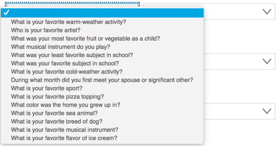
FIGURE 7.5United.com’s registration (2019) burdens long-term memory: a user may not have a unique, memorable answer for any security question.
图 7.5 United.com 的注册(2019)给长期记忆带来负担:用户可能没有独特、容易记住的答案来回答任何安全问题。
But that isn’t where the memory burden ends. Some questions could have several possible answers. Many people had several favorite subjects, childhood homes, or cold-weather activities. To register, they must choose a question and then remember which answer they gave to United.com. How? Probably by writing it down somewhere. Then, when United.com asks them the security question, they have to remember where they put the answer. Why burden people’s memory, when it would be easy to let users make up a security question for which they can easily recall the one possible answer?
但记忆负担并未结束。有些问题可能有多个可能的答案。许多人有几个喜欢的科目、童年家园或寒冷天气的活动。为了注册,他们必须选择一个问题,然后记住他们给 United.com 的答案。怎么?可能通过在某处写下来。然后,当 United.com 问他们安全问题时,他们必须记住他们把答案放在哪里。为什么给人们记忆带来负担,而让用户编造一个他们可以轻松回忆起唯一可能答案的安全问题要容易得多?
FIGURE 7.6 NetworkSolutions.com lets users create a security question if none on the menu work for them.
图 7.6 NetworkSolutions.com 允许用户如果菜单上的问题都不适合他们,则创建一个安全问题。
Such unreasonable demands on people’s long-term memory counteract the security and productivity that computer-based applications supposedly provide (Schrage, 2005), as users:
对人们长期记忆的这种不合理要求抵消了计算机应用程序据称提供的 security 和 productivity (Schrage, 2005),因为用户:
• place sticky notes on or near computers or “hide” them in desk drawers;
• 在电脑上或附近贴便利贴,或者把它们藏在抽屉里;
• contact customer support to recover passwords they cannot recall;
• 联系客户支持以恢复他们记不起来的密码;
• use passwords that are easy for others to guess;
• 使用容易让别人猜到的密码;
• set up systems with no login requirements at all or with one shared login and password.
• 设置无需登录的系统,或者使用一个共享的登录名和密码。
The registration form at NetworkSolutions.com represents a small step toward more useable security. Like United.com, it offers a choice of security questions, but it also allows users to create their own security question—one for which they can more easily remember the answer (see Fig. 7.6).
NetworkSolutions.com 上的注册表单是迈向更实用安全的一小步。与 United.com 一样,它提供了安全问题的选择,但也允许用户创建自己的安全问题——一个他们更容易记住答案的问题(见图 7.6)。
Another implication of long-term memory characteristics for interactive systems is that learning and long-term retention are enhanced by user-interface consistency.
长期记忆特征对交互式系统的另一个影响是,用户界面的一致性可以增强学习和长期记忆。
The more consistent the operation of different functions, or the more consistent the actions on different types of objects, the less users have to learn. User interfaces that have many exceptions and little consistency from one function or object to another require users to store in their long-term memory many features about each function or object and its correct usage context. The need to encode more features makes such user interfaces harder to learn. It also makes it more likely that a user’s memory will drop essential features during storage or retrieval, increasing the chances that the user will fail to remember, misremember, or make other memory errors.
不同功能或不同类型对象上的操作越一致,用户需要学习的内容就越少。具有许多例外且从一个功能或对象到另一个功能或对象缺乏一致性的用户界面要求用户将每个功能或对象及其正确使用上下文中的许多特征存储在长期记忆中。编码更多特征的需要使得此类用户界面更难学习。它还增加了用户在存储或检索时遗漏重要特征的可能性,从而增加了用户忘记、误记或其他记忆错误的机会。
Even though some have criticized the concept of consistency as ill defined and easy to apply badly (Grudin, 1989), the fact is that consistency in a user interface greatly reduces the burden on users’ long-term memory. Mark Twain once wrote, “If you tell the truth, you never have to remember anything.” One could also say, “If everything worked the same way, you would not have to remember much.” We will return to the issue of user-interface consistency in Chapter 11.
尽管有些人批评一致性概念定义不清且容易应用不当(Grudin,1989),但事实是,用户界面的连贯性大大减轻了用户长期记忆的负担。马克·吐温曾写道,“如果你说真话,你就不必记住任何事情。”也可以说,“如果一切运作方式都一样,你就不必记住太多事情。”我们将在第 11 章回到用户界面连贯性的问题上。
Important Takeaways
重要要点
• Human attention and memory have strengths and weaknesses. By understanding those strengths and weaknesses, we can design interactive systems to support and augment attention and memory rather than burdening them.
• 人类的注意力和记忆有优点和缺点。通过了解这些优点和缺点,我们可以设计交互式系统来支持和增强注意力和记忆,而不是负担它们。
• For the purpose of user-interface design, the most important type of short-term memory is what psychologists call “working memory.” It is not a separate memory store but rather everything we are paying attention to at a given time. The capacity of working memory—the number of concepts or ideas that we can attend to simultaneously—is five plus or minus one. Think of it as a small set of searchlights illuminating—a few at a time—ideas and concepts in a vast warehouse representing long-term memory.
• 从用户界面设计的角度来看,最重要的短期记忆类型是心理学家所说的“工作记忆”。它不是一个独立的记忆存储,而是我们在特定时间所关注的一切。工作记忆的容量——即我们能够同时关注的概念或想法的数量——是五个加减一。把它想象成一组小探照灯,一次照亮——几个——代表长期记忆的巨大仓库中的想法和概念。
• Working memory has severely limited capacity, so our
• 工作记忆的容量严重有限,因此我们的
attention is highly focused and selective. We miss most of
注意力高度集中和选择性强。我们因为这一点而错过了
what occurs around us because of this.
周围的大部分事情。
• Long-term memories record our experiences and thoughts. Thoughts and experiences trigger large patterns of neurons throughout the brain based on features. A memory is recorded as a collection of neurons that tend to fire in concert when stimulated by perceptions or thoughts. Psychologists divide long-term memory into semantic, episodic, and procedural.
• 长期记忆记录了我们的经历和想法。想法和经历根据特征触发大脑中大量神经元的模式。记忆被记录为一组在感知或想法的刺激下倾向于同时放电的神经元。心理学家将长期记忆分为语义、情景和程序性。
• Unlike computer memory, reading information from human long-term memory can change it. It is also influenced by emotions. These factors make it error prone; it can easily lose or add details.
• 与计算机内存不同,从人类长期记忆中读取信息可能会改变它。它还受到情绪的影响。这些因素使其容易出错;它很容易丢失或添加细节。
• VUIs spread information out over time, so they place a higher load on short-term memory than graphical user interfaces do.
• 语音用户界面将信息分散在一段时间内,因此它们比图形用户界面给短期记忆带来更高的负荷。
• A user interface has modes if a control or user-action has different effects in different contexts. User interfaces that have modes burden working memory by requiring users to mentally keep track of what mode the system is in.
• 如果一个控制或用户操作在不同的上下文中具有不同的效果,则用户界面具有模式。具有模式的用户界面通过要求用户在心理上跟踪系统处于何种模式而给工作记忆带来负担。
• Implications of memory and attention limitations for userinterface design: • Keep voice output brief so as not to overburden users’ working memory. Augmenting voice output with screen output or indicator lights can reduce demands on working memory. • Avoid moded user-interface designs where possible. • Minimize the number of calls to action on a page or screen. Avoid competing calls to action. • Don’t expect people to remember arbitrary facts or procedures over long periods. Provide memory aids and tools. • Design user interfaces to attract users’ attention where needed.
• 记忆和注意力限制对用户界面设计的启示: • 保持语音输出简短,以免过度负担用户的工作记忆。通过屏幕输出或指示灯增强语音输出可以减少对工作记忆的需求。 • 尽可能避免具有模式的用户界面设计。 • 最小化页面或屏幕上的操作调用数量。避免竞争性的操作调用。 • 不要期望人们长时间记住任意的事实或程序。提供记忆辅助工具。 • 设计用户界面以在需要时吸引用户的注意力。
1There is evidence that the long-term neural changes associated with learning occur mainly during sleep, suggesting that separating learning experiences by periods of sleep facilitates learning (Stafford and Webb, 2005).
1有证据表明,与学习相关的长期神经变化主要发生在睡眠期间,这表明通过睡眠间隔来分隔学习体验有助于学习(Stafford 和 Webb,2005)。
2This is similar to the effect of cutting pieces out of a holographic image: it reduces the overall resolution of the image, rather than removing areas of it as with an ordinary photograph.
2这类似于从全息图像中切割出部分的效果:它降低了图像的整体分辨率,而不是像普通照片那样移除图像的某些区域。
3Exactly how long afterward is discussed in Chapter 14.
3具体多久之后将在第 14 章讨论。
4The closest researchers have come is Landauer’s (1986) use of the average human learning rate to calculate the amount of information a person can learn in the average lifetime:
4 研究人员目前最接近的是兰道尔(1986 年)使用平均人类学习率来计算一个人在平均一生中可以学习的信息量:
Chapter 8: Limits on Attention Shape Our Thought and Action
第八章:注意力限制塑造我们的思维和行动
Abstract
摘要
When people interact purposefully with the world around them, including computer systems, some aspects of their behavior follow predictable patterns that result from the limited capacities of attention and short-term memory. This chapter describes these patterns and explains how interactive systems can support them by following certain design guidelines.
当人们有目的地与世界互动,包括计算机系统时,他们的一些行为遵循可预测的模式,这些模式源于注意力和短期记忆的有限能力。本章描述了这些模式,并解释了交互式系统如何通过遵循某些设计指南来支持它们。
Keywords
关键词
Attention; Awareness; Behavior patterns; Change blindness; Detection; External aids; Goals; Inattention blindness; Information "scent";Familiarity; Modes; Short-term memory; Tools; Working memory
注意力;意识;行为模式;变化盲点;检测;外部辅助工具;目标;注意力盲点;信息“气味”;熟悉度;模式;短期记忆;工具;工作记忆
When people interact purposefully with the world around them, including computer systems, some aspects of their behavior follow predictable patterns, some of which result from the limited capacity of attention and short-term memory. When interactive systems are designed to recognize and support those patterns, they fit better with the way people operate. Some user-interface design rules, then, are based directly on the patterns and thus indirectly on the limits of short-term memory and attention. This chapter describes seven important patterns.
当人们有目的地与世界互动,包括计算机系统时,他们的一些行为遵循可预测的模式,其中一些模式源于注意力和短期记忆的有限能力。当交互式系统被设计用来识别和支持这些模式时,它们就更好地符合人们的操作方式。因此,一些用户界面设计规则直接基于这些模式,从而间接基于短期记忆和注意力的限制。本章描述了七个重要的模式。
We Focus on Our Goals and Pay Little Attention to Our Tools
我们专注于目标,很少关注我们的工具
As Chapter 7 explained, our attention has very limited capacity. When people are doing a task—trying to accomplish a goal—most of their attention is focused on the goals and data related to that task. Normally, people devote very little attention to the tools they are using to perform a task, whether they are using computer applications, online services, or interactive appliances. Instead, people think about their tools only superficially, and then only when necessary.
如第七章所述,我们的注意力非常有限。当人们执行一项任务——试图实现一个目标时——他们的注意力大部分都集中在与该任务相关的目标和数据上。通常,人们很少关注他们用来执行任务的工具,无论是使用计算机应用程序、在线服务还是交互式设备。相反,人们只在必要时才会肤浅地思考他们的工具。
We are, of course, capable of attending to our tools. However, attention (i.e., short-term memory) is limited in capacity. When people refocus their attention on their tools, it is pulled away from the details of the task. This shift increases the chances of users losing track of what they were doing or exactly where they were in doing it.
当然,我们能够关注我们的工具。然而,注意力(即短期记忆)的容量是有限的。当人们将注意力重新集中在他们的工具上时,注意力就会从任务的细节中转移开。这种转移增加了用户失去对所做事情的了解或确切位置的机会。
For example, if your lawn mower stops running while you are mowing your lawn, you will immediately stop and focus on the mower. Restarting the mower becomes your primary task, with the mower itself as the focus. You pay little attention to any tools you use to restart the mower, just as you paid little attention to the mower when your primary focus was the lawn. After you restart the mower and resume mowing the lawn, you probably won’t remember where you were in mowing the lawn except that the lawn itself shows you.
例如,如果你的割草机在割草时突然停机,你会立即停止并专注于割草机。重新启动割草机成为你的首要任务,割草机本身成为焦点。你很少注意到用来重新启动割草机的任何工具,就像你专注于草地时很少注意到割草机一样。重新启动割草机并继续割草后,你可能不会记得你在割草时的位置,除了草地本身会告诉你。
Other tasks—for example, reading a document, measuring a table, counting goldfish in a fish tank—might not provide such a clear reminder of your interrupted task and position in it. You might have to start over from the beginning. You might even forget what you were doing altogether and go off to do something else.
其他任务——例如,阅读文件、测量桌子、数鱼缸里的金鱼——可能不会如此清楚地提醒你中断的任务和你在其中的位置。你可能不得不从头开始。你甚至可能完全忘记你在做什么,然后去做别的事情。
That is why most software design guidelines state that software applications and most websites should not call attention to themselves; they should fade into the background and allow users to focus on their own goals. That design guideline is even the title of a popular Web design book: Don’t Make Me Think (Krug, 2014). That is, if your software or website makes me think about it rather than what I am trying to do, you’ve lost me.
正是因此,大多数软件设计指南都指出,软件应用程序和大多数网站不应引起注意;它们应该融入背景,让用户能够专注于自己的目标。这一设计指南甚至成为了一本流行网页设计书的标题:《别让我思考》(Krug,2014)。也就是说,如果你的软件或网站让我思考它本身,而不是我正在做的事情,你就失去我了。
We Notice Things More When They are Related to Our Goals
当事物与我们的目标相关时,我们更容易注意到它们
Chapter 1 described how our immediate goals filter and bias our perception. Chapter 7 discussed the connections between attention and memory. This chapter provides examples showing that perceptual filtering and biasing, attention, and memory are all closely related.
第一章描述了我们即时目标如何过滤和偏袒我们的感知。第七章讨论了注意力和记忆之间的联系。本章提供了例子,表明感知过滤和偏袒、注意力和记忆都是密切相关的。
Our environment is full of perceptual details and events. Obviously, we cannot notice and keep track of everything that happens around us. Nonetheless, it is surprising to most people how little we notice of what goes on around us. Because of our extremely limited short-term memory and attention, we don’t waste those resources. When an event happens, the few details about it that we notice and remember later are usually those that were important for our goals at the time of the event. This is demonstrated by two related psychological phenomena: inattentional blindness and change blindness.
我们的环境充满了感知细节和事件。显然,我们无法注意到并记住周围发生的一切。然而,对大多数人来说,我们注意到周围发生的事情却如此之少,这令人惊讶。由于我们的短期记忆和注意力极其有限,我们不会浪费这些资源。当事件发生时,我们注意到并记住的关于它的少数细节通常是那些在事件发生时对我们目标重要的细节。这由两个相关的心理现象所证明:注意力盲点和变化盲点。
Inattentional blindness
注意力盲点
When our mind is intensely occupied with a task, goal, or emotion, we sometimes fail to notice objects and events in our environment that we otherwise would have noticed and remembered. This phenomenon has been heavily studied by psychologists and labeled inattentional blindness (Simons and Chabris, 1999; Simons, 2007).
当我们的注意力高度集中在任务、目标或情感上时,我们有时会注意不到环境中本来可以注意到并记住的物体和事件。这种现象已被心理学家广泛研究,并被称为注意力盲点(Simons 和 Chabris,1999 年;Simons,2007 年)。
A clear demonstration of inattentional blindness is an experiment in which human subjects watched a video of two basketball teams passing a ball from one player to another. Subjects were told to count the number of times the white-suited team passed the ball. While they watched the video and counted the ball passes, a person in a gorilla suit sauntered onto the basketball court, thumped his chest, and then walked out of view (see Fig. 8.1). Afterward, subjects were asked what they remembered from the video. Surprisingly, about half of them did not notice the gorilla. Their attention was fully occupied with the task (Simons and Chabris, 1999). 1
一个清晰的注意力盲点演示实验是让人类受试者观看两个篮球队在场上传球给另一个队员的视频。受试者被告知要数一数白队传球的次数。当他们在视频中数传球次数时,一个穿着 gorilla 服装的人慢悠悠地走上篮球场,捶了捶胸膛,然后走出视线(见图 8.1)。之后,受试者被问及他们从视频中记住了什么。令人惊讶的是,大约有一半的人没有注意到 gorilla。他们的注意力完全被任务占据了(西蒙斯和查布里斯,1999)。1
FIGURE 8.1 Scene from video used in the “invisible gorilla” study. For more information about the study and to see the video, go to theinvisiblegorilla.com. Figure provided by Daniel Simons.
图 8.1 “看不见的 gorilla”研究中所使用的视频场景。有关该研究和观看视频的更多信息,请访问 theinvisiblegorilla.com。图由丹尼尔·西蒙斯提供。
Change blindness
变化盲点
Another way researchers have shown that our goals strongly focus our attention and memory is by showing people a picture, then showing them an altered version of the same picture and asking them how the two pictures differ. What is surprising is that the second picture can differ from the first in fairly clear ways without people noticing. The reason is that people’s attentions were captured by features in the image other than those that changed, and human attention can only keep track of a few features at a time. This is a type of inattentional blindness, but it is so common that it has its own name: change blindness (Angier, 2008).
另一种研究人员展示我们的目标如何强烈地集中我们的注意力和记忆的方法是,向人们展示一张图片,然后展示同一张图片的修改版本,并询问两张图片有何不同。令人惊讶的是,第二张图片与第一张图片在相当明显的方式上不同,而人们却未察觉。原因是人们的注意力被图像中除变化之外的其他特征所吸引,而人类的注意力一次只能跟踪少数几个特征。这是一种不注意盲点,但由于它非常普遍,因此它有自己的名字:变化盲点(Angier,2008)。
Look at Fig. 8.2, then look at Fig. 8.3. Flip back and forth a few times. What is different about the two pictures?
看图 8.2,然后看图 8.3。来回切换几次。两张图片有什么不同?
Even if you noticed that the tree branch at the top of Fig. 8.2 is missing in Fig. 8.3, you may have missed the fact that the person on the far left in Fig. 8.2 is missing in Fig. 8.3. If so, it was probably because your attention was captured by the globe, water, clouds, building, etc.
即使你注意到图 8.2 顶部树枝在图 8.3 中不见了,你也可能错过了图 8.2 最左边的人也在图 8.3 中不见了的事实。如果是这样,那可能是因为你的注意力被地球仪、水、云、建筑物等吸引。
To explore further, researchers gave people questions to answer about the first picture, which affected their goals in looking at it and therefore what features they paid attention to. The result: people tend to miss changes in features other than those their goals made them pay attention to. So for example, if I showed you Fig. 8.2 and asked you to notice any people in it, then showed you Fig. 8.3 and asked what was different, you would certainly notice the absence of the man.
为了进一步研究,研究人员向人们提出了关于第一张图片的问题,这影响了他们观察图片的目标,从而也影响了他们关注哪些特征。结果:人们往往会忽略那些他们目标没有让他们关注到的特征的变化。例如,如果我给你展示图 8.2 并让你注意其中是否有任何人,然后给你展示图 8.3 并问你有什么不同,你肯定会注意到男人的缺席。
A striking example of change blindness comes from experiments in which researchers holding city maps posed as lost tourists and asked local passersby for directions. When the local person focused on the tourist’s map to find the best route, two workmen—actually, more researchers—walked between the tourist and the local person carrying a large door, and a new researcher-tourist replaced the first one. After the door passed, over half the people continued helping the “tourist” without noticing any change, even when the two “tourists” differed in hair color or whether they had a beard (Simons and Levin, 1998). 2 Some people even failed to notice changes in gender. The researchers’ explanation: people focus attention on the tourist only enough to decide if he or she is a threat or worth helping, mentally record only that the person is a tourist needing help, and then focus on the map and the task of giving directions.
一个关于改变盲点的引人注目的例子来自研究人员手持城市地图,伪装成迷路的游客,向当地路人问路。当当地人专注于游客的地图寻找最佳路线时,两名工人——实际上是更多研究人员——在游客和当地人之间走过,并携带一个大门,一名新的研究人员-游客替换了第一人。当门通过后,超过一半的人继续帮助“游客”,而没有注意到任何变化,即使两个“游客”在发色或是否有胡子方面有所不同(西蒙斯和利文,1998)。有些人甚至没有注意到性别的变化。研究人员解释说:人们只关注游客足够长的时间来判断他或她是否构成威胁或值得帮助,只在大脑中记录这个人是一个需要帮助的游客,然后专注于地图和给方向的任务。
FIGURE 8.2Look at this image, then at Fig. 8.3. What is different? Credit: Wikipedia article on “Change Blindness.”
图 8.2 看这张图片,然后看图 8.3。有什么不同?来源:维基百科“改变盲点”文章。
FIGURE 8.3 Look at this image, then at Fig. 8.2. What is different? Credit: Wikipedia article on “Change Blindness.”
图 8.3 看这张图片,然后看图 8.2。有什么不同?来源:维基百科“改变盲点”文章。

FIGURE 8.4 Users of RoadScholar.org may not notice that when they change the date of a trip (bottom center), the price changes (middle right).
使用 RoadScholar.org 的用户可能不会注意到,当他们更改行程日期(底部中心)时,价格会发生变化(中间右侧)。
When people interact with software, electronic appliances, or online services, it is not uncommon for them to fail to notice important changes in what is displayed. For example, in a study of older adults using travel websites, some participants exhibited change blindness; when they changed trip options (e.g., departure date or city), they did not notice that the price changed (Finn and Johnson, 2013) (see Fig. 8.4).
当人们与软件、电子设备或在线服务交互时,他们通常不会注意到显示内容中的重要变化。例如,在一项关于老年人使用旅游网站的研究中,一些参与者表现出变化盲点;当他们更改行程选项(例如,出发日期或城市)时,他们没有注意到价格发生了变化(Finn 和 Johnson,2013)(见图 8.4)。
The user-interface design guideline that follows from such findings is to make important changes highly salient—so obvious that they are hard to miss—and take steps to draw users’ attention to the change. For example, a way to draw users’ attention to a new error message is to vibrate it briefly when it first appears (see Chapter 6) or highlight it briefly before it reverts to a “normal” appearance.
基于这些发现,用户界面设计指南是使重要变化非常显眼——明显到难以错过——并采取措施吸引用户的注意力。例如,吸引用户注意新错误信息的一种方法是在其首次出现时短暂振动(见第 6 章)或在它恢复“正常”外观之前短暂突出显示它。
What happens in our brains
我们的大脑中发生了什么
Using functional magnetic resonance imagery and electrical encephalography, researchers have studied the effect of attention on how our brains respond to objects displayed on a computer screen.
研究人员使用功能性磁共振成像和脑电图研究了注意力对大脑如何响应计算机屏幕上显示的对象的影响。
When people passively watch a computer display with objects appearing, moving around, and disappearing, the visual cortex of their brains registers a certain activity level. When people are told to look for (i.e., pay attention to) certain objects, the activity level of their visual cortex increases significantly. When they are told to ignore certain objects, the neural activity level in their visual cortex actually drops when those objects appear. Later, their memory for which objects they saw and didn’t see correlates with the degree of attention they paid to them and the level of brain activity (Gazzaley, 2009).
当人们被动地观看电脑显示屏上出现、移动和消失的物体时,他们大脑的视觉皮层会记录一定的活动水平。当人们被告知要寻找(即关注)某些物体时,他们视觉皮层的活动水平会显著增加。当他们被告知忽略某些物体时,当这些物体出现时,他们视觉皮层的神经活动水平实际上会下降。后来,他们对所看到和未看到的物体的记忆与他们对这些物体所支付的注意程度和大脑活动水平相关(Gazzaley,2009)。
We Use External Memory Aids to Keep Track of What We are Doing
我们使用外部记忆辅助工具来跟踪我们正在做什么
Because our short-term memory and attention are so limited, we learn not to rely on them. Instead, we mark up our environment to show us where we are in a task. Examples include:
由于我们的短期记忆和注意力非常有限,我们学会了不依赖它们。相反,我们通过标记环境来指示我们在任务中的位置。例如:
• Counting objects . If possible, we move already counted objects into a different pile to indicate which objects have already been counted. If we cannot move an object, we point to the last object counted. To keep track of the number we are on, we count on our fingers, draw marks, or write numbers.
• 数物体。如果可能的话,我们将已经数过的物体移到不同的堆里,以表示哪些物体已经被数过了。如果我们不能移动一个物体,我们就指向最后一个数过的物体。为了跟踪我们数到的数字,我们在手指上数数、画记号或写数字。
FIGURE 8.5 The macOS software update shows which updates are done (green check) versus which are in progress (rotating circle).
图 8.5 macOS 软件更新显示已完成(绿色对勾)和进行中(旋转圆圈)的更新。
• Reading books . When we stop reading, we insert bookmarks to show what page we were on.
• 阅读书籍。当我们停止阅读时,我们会插入书签来显示我们在哪一页。
• Arithmetic . We learn methods of doing arithmetic on paper, or we use a calculator.
• 算术。我们学习在纸上做算术的方法,或者使用计算器。
• Checklists . We use checklists to aid both our long- and short-term memory. In critical or rarely performed tasks, checklists help us remember everything that needs to be done. In that way, they augment our faulty long-term memory. While doing the task, we check off items as we
• 清单。我们使用清单来帮助我们长期和短期的记忆。在关键或很少执行的任务中,清单帮助我们记住需要完成的每一项。以这种方式,它们增强了我们有缺陷的长期记忆。在执行任务时,我们勾选项目。
complete them. That is a short-term memory aid. A checklist that we cannot mark up is hard to use, so we copy it and mark the copy. • Editing documents . People often keep to-be-edited documents, documents that are currently being edited, and already edited documents in separate folders.
完成它们。这是一个短期记忆辅助工具。无法标记的检查清单很难使用,所以我们复制它并标记副本。• 编辑文档。人们通常将待编辑文档、正在编辑的文档和已编辑文档保存在不同的文件夹中。
One implication of this pattern is that interactive systems should indicate what users have done versus what they have not yet done. Most email and texting apps do this by marking already-read versus unread messages, most websites do it by marking visited versus unvisited links, and many applications do it by marking completed steps of a multipart task (see Fig. 8.5).
这种模式的一个含义是,交互式系统应指示用户已完成的操作与尚未完成的操作。大多数电子邮件和短信应用程序通过标记已读和未读消息来实现这一点,大多数网站通过标记已访问和未访问的链接来实现这一点,许多应用程序通过标记多步骤任务中已完成的步骤(见图 8.5)来实现这一点。
A second design implication is that interactive systems should allow users to mark or move objects to indicate which ones they have worked on versus which ones they have not. MacOS lets users assign colors to files. Like moving files between folders, this technique can be used to keep track of where one is in a task (see Fig. 8.6).
第二个设计含义是,交互式系统应允许用户标记或移动对象,以指示哪些对象他们已经处理过,哪些还没有。MacOS 允许用户为文件分配颜色。像在文件夹之间移动文件一样,这种技术可以用来跟踪任务的进度(见图 8.6)。
FIGURE 8.6 The macOS lets users assign colors to files or folders; users can use the colors to track their work.
图 8.6 macOS 允许用户为文件或文件夹分配颜色;用户可以使用颜色来跟踪他们的工作。
Used by permission, OK/Cancel.com.
经授权使用,OK/Cancel.com。
We Follow Information “Scent” Toward Our Goal
我们遵循信息“气味”走向目标
Focusing our attention on the things relevant to our goals makes us interpret what we see on a display or hear in a telephone menu in a very literal way. People don’t think deeply about instructions, command names, option labels, icons, navigation bar items, or any other aspect of the user interface of computer-based tools. If the goal in their head is to make a flight reservation, their attention will be attracted by words like “buy,” “flight,” “ticket,” or “reservation” or symbols depicting money, tickets, or flights. Other items a designer or marketer might hope will attract customers, such as “bargain hotels,” will not attract the attention of people who are trying to book a flight, although they might be noticed by people who are seeking bargains.
将注意力集中在与我们的目标相关的事物上,使我们以非常字面的方式解释我们在显示屏上看到或电话菜单中听到的内容。人们不会深入思考指令、命令名称、选项标签、图标、导航栏项目或计算机工具的用户界面的任何其他方面。如果他们脑海中的目标是预订航班,他们的注意力会被“购买”、“航班”、“票务”或“预订”等词语,或表示金钱、票务或航班的符号所吸引。设计师或营销人员可能希望吸引顾客的其他项目,例如“廉价酒店”,虽然不会吸引试图预订航班的人的注意,但可能会吸引寻找折扣的人的注意。
For each task below, what on the screen would attract your attention?
对于下面的每个任务,屏幕上什么会吸引你的注意力?
FIGURE 8.7ATM screen—our attention is drawn toward items that match our task and goal.
图 8.7 ATM 屏幕—我们的注意力被与任务和目标匹配的项目所吸引。
·Pay a bill
付账单
· Transfer money to your savings account
将钱转入您的储蓄账户
· Pay your dentist by funds transfer
通过资金转账支付您的牙医费用
· Change your PIN
更改您的 PIN 码
·Open a new account
·开立新账户
·Purchase travelers' cheques
·购买旅行支票
This tendency of people to notice only things on a computer screen that match their goal, and the literal thinking that people exhibit when performing a task on a computer, has been called “following the scent of information toward the goal” (Chi et al., 2001; Nielsen, 2003). Consider the ATM display shown in Fig. 8.7. What is the first thing on the screen that gets your attention when you are trying to do each of the tasks listed?
人们注意到电脑屏幕上与他们的目标匹配的事物,以及在进行计算机任务时表现出的字面思维,被称为“跟随信息气味走向目标”(Chi 等人,2001 年;Nielsen,2003 年)。考虑图 8.7 中显示的 ATM 显示屏。当你尝试执行列表中列出的每个任务时,屏幕上首先吸引你注意力的东西是什么?
You probably noticed that some of the tasks direct your attention initially to the wrong option. Is “Pay your dentist by funds transfer” under “Payment” or “Transfer”? “Open a new account” probably sent your eyes briefly to “Open-End Fund” even though it is actually under “Other Service.” Did the task “Purchase travelers’ cheques” make you glance at “Request Cheque Book” because of the word they share?
你可能注意到,一些任务最初将你的注意力引向了错误选项。“通过资金转账支付牙医”是在“支付”下还是在“转账”下?“开立新账户”可能让你的眼睛短暂地看向“开放式基金”,尽管它实际上在“其他服务”下。任务“购买旅行支票”是否因为共享词语而让你瞥了一眼“申请支票簿”?
The goal-seeking strategy of following the information scent, observed across a wide variety of situations and systems, suggests that interactive systems should be designed so that the scent is strong and really leads users to their goals. To do that, designers need to understand likely user goals at each decision point in a task and ensure that each choice point in the software provides options for every important user goal and clearly indicates which option leads to which goal. Analyzing software in this way is useful, and is called a cognitive walkthrough (Wharton et al., 1994).
追踪信息气味的寻踪策略,在各种情况和系统中都有观察到的现象,表明交互式系统应该被设计得让气味足够强烈,并真正引导用户到达他们的目标。要做到这一点,设计师需要理解任务中每个决策点的可能用户目标,并确保软件中的每个选择点为每个重要的用户目标提供选项,并清楚地指示哪个选项会引导到哪个目标。以这种方式分析软件是有用的,这被称为认知漫游(Wharton 等人,1994 年)。
For example, imagine that you want to cancel a reservation you made or payment you scheduled. You tell the system to cancel it, and a confirmation dialogue box appears asking if you really want to do that. How should the options be labeled? Given that people interpret words literally in following the information scent toward their goal, the standard confirmation button labels “OK” (for yes) and “Cancel” (for no) would give a misleading scent. If we compare a cancellation confirmation dialogue box from Marriott.com with one from Bank of New Zealand, we see that Marriott.com’s labeling provides a clear scent, while Bank of New Zealand’s button-labels would mislead users into clicking on the wrong buttons (see Fig. 8.8).
例如,假设你想取消你已做的预订或已安排的付款。你告诉系统取消,然后会出现一个确认对话框,询问你是否真的要这样做。选项应该如何标记?鉴于人们在遵循信息线索向目标前进时会对词语进行字面理解,标准的确认按钮标签“确定”(表示是)和“取消”(表示否)会给出误导性的线索。如果我们比较 Marriott.com 的取消预订确认对话框与新西兰银行的取消转账确认对话框,我们会看到 Marriott.com 的标签提供了清晰的信息线索,而新西兰银行的按钮标签会误导用户点击错误的按钮(见图 8.8)。
Are you sure you want to cancel this reservation?
你确定要取消这个预订吗?
FIGURE 8.8 The button labels on Marriott’s reservation cancellation confirmation dialogue (A) provide a clear information “scent” leading users toward their goal, while Bank of New Zealand’s wire-transfer confirmation dialogue (B), in which “OK” cancels the transaction and “Cancel” cancels the cancellation, does not.
图 8.8 马 riott 的预订取消确认对话框(A)上的按钮标签提供了清晰的信息线索,引导用户向目标前进,而新西兰银行的转账确认对话框(B)中,“确定”取消交易,“取消”取消取消,则没有这样做。
We Prefer Familiar Paths
我们更喜欢熟悉的路径
People know that their attention is limited, and they act accordingly. While pursuing a goal, they take familiar paths whenever possible rather than exploring new ones, especially when working under deadlines. As explained more fully in Chapter 10, exploring new paths is problem-solving, which severely taxes our attention and short-term memory. In contrast, taking familiar, well-learned routes can be done fairly automatically and does not consume much attention and short-term memory.
人们知道自己的注意力是有限的,并据此行事。在追求目标时,他们尽可能走熟悉的路径,而不是探索新的路径,尤其是在有截止日期的情况下。正如第 10 章中更详细解释的那样,探索新路径是解决问题,这会严重消耗我们的注意力和短期记忆。相比之下,走熟悉、熟练掌握的路线可以相当自动地进行,并且不会消耗太多的注意力和短期记忆。
Years ago, in a usability test session, a test participant in the middle of a task said to me:
多年前,在一次可用性测试中,一个正在执行任务的测试参与者对我说:
I’m in a hurry, so I’ll do it the long way.
我很赶,所以我要走绕远路。
He knew there probably was a more efficient way to do what he was doing, but he also knew that learning the shorter way would require time and thought that he was unwilling to spend.
他知道可能有一种更有效的方法来做他正在做的事情,但他也知道学习更短的方法需要时间和思考,而他不愿意花这些时间和思考。
Once we learn one way to perform a certain task using a software application, we may continue to do it that way and never discover a more efficient way. Even if we discover or are told that there is a “better” way, we may stick with the old way because it is familiar, comfortable, and most important, requires little thought. Avoiding thought when using computers is important. People are willing to type more to think less.
一旦我们学会使用某个软件应用程序来完成某项任务,我们可能会继续用这种方法,而永远不会发现一种更有效的方法。即使我们发现或被告知有“更好”的方法,我们也可能坚持旧方法,因为它是熟悉的、舒适的,最重要的是,它不需要太多思考。在使用计算机时避免思考很重要。人们愿意多打字以减少思考。
Why is that? Are we mentally lazy? Usually, yes. Conscious thought is slow, strains working memory, and consumes much energy. We essentially run on batteries—the food we eat—so energy conservation is an important feature of our makeup. Operating via automatic processes is fast, doesn’t strain working memory, and conserves energy. So the brain tries to run on automatic as much as possible (Kahneman, 2011; Eagleman, 2012, 2015).
为什么会这样呢?我们是精神上懒惰吗?通常是的。有意识的思考是缓慢的,会消耗工作记忆,并且消耗大量的能量。我们基本上是靠电池——我们吃的食物——运行的,所以能量节约是我们构成的重要特征。通过自动过程运行是快速的,不会消耗工作记忆,并且节约能量。因此,大脑尽可能多地运行在自动模式下(卡尼曼,2011 年;伊格尔曼,2012 年,2015 年)。
The human preference for familiar, mindless paths and “nobrainer” decisions has several design implications for interactive systems:
人类对熟悉、无意识的路径和“不费脑”决策的偏好对交互系统有几个设计启示:
• Sometimes mindlessness trumps keystrokes . With software intended for casual or infrequent use, such as bank ATMs or
• 有时无意识会胜过按键。对于那些用于随意或偶尔使用的软件,例如银行自动提款机或
household accounting applications, allowing users to become productive quickly and reducing their need to problem-solve while working is more important than saving keystrokes. Such software simply isn’t used enough for the number of keystrokes per task to matter much. On the other hand, in software used all day in intensive work environments by highly trained users, such as airline telephone reservations operators, unnecessary keystrokes required to perform a task are very costly.
家庭会计应用程序,让用户能够快速变得高效,减少他们在工作时解决问题的需求,这比节省按键次数更重要。这种软件使用得不够多,以至于每项任务所需的按键次数并不重要。另一方面,在高度专业化的用户全天使用的密集工作环境中使用的软件,例如航空公司电话预订操作员,执行任务所需的不必要按键次数非常昂贵。
• Guide users to the best paths . From its first screen or home page, software should show users the way to their goals. This is basically the guideline that software should provide a clear information scent.
• 引导用户找到最佳路径。从其第一个屏幕或主页开始,软件应该向用户展示他们目标的路径。这基本上是软件应该提供清晰信息气味的指南。
• Help experienced users speed up . Make it easy for users to switch to faster paths after they have gained experience. The slower paths for newcomers should show users faster paths if there are any. This is why most applications show keyboard accelerators for frequently used functions in their menu-bar menus.
• 帮助有经验的用户加快速度。让有经验的用户能够轻松切换到更快的路径。新手的较慢路径应该如果存在的话向用户展示更快的路径。这就是为什么大多数应用程序在其菜单栏菜单中显示键盘加速器来执行常用功能的原因。
Our Thought Cycle: Goal, Execute, Evaluate
我们的思维循环:目标、执行、评估
Over many decades, researchers studying human behavior have found a cyclical pattern that seems to hold across a wide variety of activities. Cognitive scientist Don Norman (1988) named the pattern the “human action cycle”:
在过去的几十年里,研究人类行为的研究者们发现了一种循环模式,这种模式似乎在各种活动中都普遍存在。认知科学家唐纳德·诺曼(1988 年)将这种模式命名为“人类行为周期”:
• Form a goal (e.g., open a bank account, make dinner, or revise a document).
• 设定目标(例如,开设银行账户、做晚饭或修改文件)。
• Choose and execute actions to try to make progress toward the goal. • Translate goal into an unordered collection of tasks (e.g., make main course, make salad, make dessert). • Order the tasks into an action sequence (i.e., a plan) that moves toward the goal. • Execute the action sequence.
• 选择并执行行动以尝试向目标前进。• 将目标转化为一个无序的任务集合(例如,做主菜、做沙拉、做甜点)。• 将任务排序成一个行动序列(即计划),该序列朝着目标前进。• 执行行动序列。
• Evaluate whether the actions worked—that is, whether the goal has been reached or is nearer than before.
• 评估行动是否有效——也就是说,目标是否已经达成或比之前更近。
• Check the results of executing the action sequence. • Compare the results with the expected results. • Determine whether at the goal or closer to the goal than before.
• 检查执行动作序列的结果。 • 将结果与预期结果进行比较。 • 判断是否达到目标或比之前更接近目标。
• Repeat until the goal is reached (or appears unreachable).
• 重复直到达到目标(或看起来无法达到)。
People cycle through this pattern constantly (Card etal., 1983; Norman, 1988). In fact, we run through it at many different levels simultaneously. For example, we might be trying to insert a picture into a document, which is part of the higher-level task of writing a term paper, which is part of the higher-level task of passing a history course, which is part of the higher-level task of completing college, which is part of the higher-level goal of getting a good job, in order to achieve our top-level goal of having a comfortable life.
人们不断循环这个模式(Card 等人,1983;Norman,1988)。事实上,我们同时在许多不同的层面上运行它。例如,我们可能试图将一张图片插入到文档中,这属于更高层次的任务——撰写学期论文,而撰写学期论文又是通过历史课程这个更高层次的任务的一部分,通过历史课程又是完成大学学业这个更高层次任务的一部分,完成大学学业又是实现获得好工作这个更高层次目标的一部分,最终是为了实现我们最顶层的目标——过上舒适的生活。
As an example, let’s run through the cycle for a typical computer task—buying an airline ticket online. The person first forms the primary goal of the task and then begins to break that down into actions that appear to lead toward the goal. Promising actions are selected for execution, executed, and then evaluated to determine whether they have moved the person closer to the goal.
举个例子,让我们通过一个典型的计算机任务——在线购买机票——来运行这个循环。首先,人们形成任务的主要目标,然后开始将这个目标分解为看似能导向目标的动作。有希望的动作用户会被选择执行,执行后进行评估,以确定它们是否让用户更接近目标。
• Goal : Buy airline ticket to Berlin using your favorite travel website.
• 目标:使用你喜欢的旅行网站购买前往柏林的机票。
• Step
• 第 0 步:进入旅行网站。你离目标还很远。
• Step 2 : Search for suitable flights. This is a very normal, predictable step at travel websites.
• 第 2 步:搜索合适的航班。这是旅行网站上的一个非常正常、可预测的步骤。
• Step 3 : Look at search results. Choose a flight from those listed. If no flights on the results list are suitable, return to Step 2 with new search criteria. You are not at the goal yet, but you feel confident of getting there.
• 第 3 步:查看搜索结果。从列出的航班中选择一个。如果搜索结果列表中没有合适的航班,请返回第 2 步并使用新的搜索条件。你还没有达到目标,但你感觉一定能实现。
• Step
• 第 0 步进行结账。现在你离目标如此之近,几乎可以闻到它的味道了。
• Step 5 : Confirm flight details. Check it—all correct? If no, back up; otherwise, proceed. Almost done.
• 第 5 步:确认航班详情。检查一下——都正确吗?如果不,返回上一步;否则,继续。几乎完成了。
• Step 6 : Purchase ticket with credit card. Check credit card information. Everything look okay?
• 第 6 步:用信用卡购买机票。检查信用卡信息。一切看起来都好吗?
• Step 7 : Save or print e-ticket. Goal achieved. Add departure time and date to your calendar.
• 第 7 步:保存或打印电子机票。目标达成。将出发时间和日期添加到你的日历中。
To keep the airline ticket example brief, we didn’t get into the details of each step. If we had, we would have seen substeps that followed the same goal–execute–evaluate cycle.
为了使航空机票的例子保持简洁,我们没有深入探讨每个步骤的细节。如果我们深入探讨,我们会看到遵循相同的目标——执行——评估循环的子步骤。
Let’s try another example, this time examining the details of some of the higher-level steps. This time the task is sending flowers to a friend. If we simply look at the top level, we see the task like this:
让我们再举一个例子,这次检查一些高级步骤的细节。这次的任务是给朋友送花。如果我们只看顶层,我们会看到任务如下:
Send flowers to friend.
给朋友送花。
If we want to examine the goal–execute–evaluate cycle for this task, we must break it down a bit. We must ask, How do we send flowers to a friend? To do that, we break the top-level task down into subtasks:
如果我们要检查这个任务的目标——执行——评估循环,我们必须稍微分解一下。我们必须问,我们如何给朋友送花?为了做到这一点,我们将顶层任务分解为子任务:
Send flowers to friend. Find flower delivery website. Order flowers to be delivered to friend.
给朋友送花。寻找花店配送网站。订购要送给朋友的花。
For many purposes, the two steps we have identified are enough detail. After we execute each step, we evaluate whether we are closer to our goal. But how is each step executed? To see that, we have to treat each major step as a subgoal and break it down into substeps:
对于许多目的,我们已确定的两个步骤已经足够详细。在我们执行每一步之后,我们会评估我们是否更接近目标。但是每一步是如何执行的?要看到这一点,我们必须将每个主要步骤视为一个子目标,并将其分解为子步骤:
Send flowers to friend. Find flower delivery website. Open Web browser. Go to Web search page (e.g., Google). Type “flower delivery” into search-text box. Scan the first page of search results. Visit some of the listed links. Choose a flower delivery service. Order flowers to be delivered to friend.
给朋友送花。寻找花店配送网站。打开网络浏览器。进入网络搜索页面(例如,谷歌)。在搜索文本框中输入“花店配送”。扫描搜索结果的第一个页面。访问列出的链接中的一些。选择一家花店配送服务。订购要送给朋友的花。
Review service’s flower selection.
审查花店的花卉选择。
Choose flowers.
选择鲜花。
Specify delivery address and date.
指定送货地址和日期。
Pay for flowers and delivery.
支付鲜花和送货费用。
After each substep is executed, we evaluate to see if it is getting us closer to the subgoal of which it is part. If we want to examine how a substep is executed and evaluated, we have to treat it as a subsubgoal and break it into its component steps:
在每个子步骤执行后,我们评估它是否更接近它所属的子目标。如果我们想检查一个子步骤是如何执行和评估的,我们必须将其视为一个子子目标,并将其分解为其组成部分步骤:
Send flowers to friend. Find flower delivery website. pen Web browser. • Click browser icon on taskbar, startup menu, desktop. Go to Web search page (e.g., Google). • If search site isn’t browser’s starting page, choose it from favorites list. • If search site is not on favorites list, type its address (e.g., “Google.com’) into browser’s address box. Type “flower delivery” into search-text box. • Set text-insertion point in search-text box. • Type the text. • Correct typo: “floowers” to “flowers.” isit some of the resulting links. • Move screen pointer to link. • Click on link. • Look at resulting Web page. hoose a flower delivery service. • Enter chosen service’s URL into browser.
给朋友送花。查找花店配送网站。打开网络浏览器。• 点击任务栏、启动菜单或桌面上的浏览器图标。进入网络搜索页面(例如,谷歌)。• 如果搜索网站不是浏览器的起始页面,从收藏夹列表中选择它。• 如果搜索网站不在收藏夹列表中,将它的地址(例如,“Google.com”)输入浏览器的地址栏。在搜索文本框中输入“花店配送”。• 在搜索文本框中设置文本插入点。• 输入文本。• 修正拼写错误:“floowers”改为“flowers。”浏览一些结果链接。• 将屏幕指针移动到链接上。• 点击链接。• 查看结果网页。选择一个花店配送服务。• 将所选服务的网址输入浏览器。
You get the idea. We could keep expanding down to the level of individual keystrokes and pointer movements, but we rarely need that level of detail to be able to understand the task well enough to design software to fit its steps and the goal–execute–evaluate cycle applied to each step.
你明白这个意思了。我们可以继续扩展到单个按键和指针移动的级别,但我们很少需要这种级别的细节来充分理解任务,以便设计适合其步骤和应用于每个步骤的目标-执行-评估循环的软件。
How can software support users in carrying out the goal–execute– evaluate cycle? Any of these ways:
软件如何支持用户执行目标-执行-评估循环?这些方法都可以:
• Goal . Provide clear paths—including initial steps—for the user goals that the software is intended to support. • Execute . Software concepts (objects and actions) should be based on task rather than implementation (see Chapter 11). Don’t force users to figure out how the software’s objects and actions map to those of the task. Provide a clear information scent at choice points to guide users to their goals. Don’t make them choose actions that seem to take them away from their goal to achieve it. • Evaluate . Provide feedback and status information to show users their progress toward the goal. Allow users to back out of tasks that didn’t take them toward their goal.
• 目标。为用户支持的目标软件提供清晰路径——包括初始步骤。 • 执行。软件概念(对象和操作)应基于任务而不是实现(见第 11 章)。不要强迫用户弄清楚软件的对象和操作如何映射到任务上。在选择的节点提供清晰的信息线索,引导用户实现目标。不要让他们选择看似偏离目标但最终能实现目标的操作。 • 评估。提供反馈和状态信息,以显示用户实现目标的进度。允许用户退出那些未能引导他们实现目标的任务。
Fig. 8.9A shows a progress indicator that provides clear feedback about the user’s progress through a series of steps. The indicator in Fig. 8.9B shows even more clearly where the user is in the sequence. Either design provides input for the Evaluate part of the action cycle. By the way, does Fig. 8.9A seem familiar? If so, it is because you saw it in Chapter 4 (see Fig. 4.17), and your brain recognized it.
图 8.9A 显示了一个进度指示器,它提供了关于用户在一系列步骤中进度的清晰反馈。图 8.9B 中的指示器甚至更清楚地显示了用户在序列中的位置。这两种设计都为行动周期中的“评估”部分提供了输入。顺便说一句,图 8.9A 看起来熟悉吗?如果熟悉,那是因为你在第 4 章中见过它(见图 4.17),你的大脑识别了它。
FIGURE 8.9 Indicators showing progress through a series of steps. (A) Good; (B) best.
图 8.9 显示一系列步骤的进度指示器。(A)好;(B)最好。
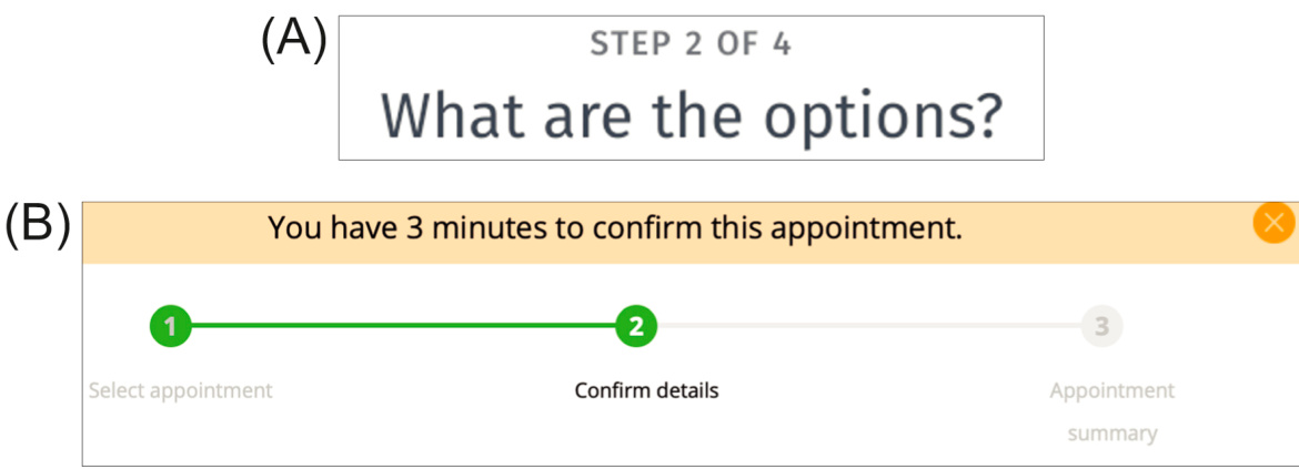
FIGURE 8.10 Progress indicators on mobile websites: (A) doodle.com; (B) kp.org.
图 8.10 移动网站上的进度指示器:(A) doodle.com;(B) kp.org。
FIGURE 8.11Password strength indicators show users how close they are to the goal.
图 8.11 密码强度指示器显示用户距离目标有多近。
Real examples of progress indicators can be seen on the websites of the Doodle scheduling service (doodle.com) and Kaiser Permanente (kp.org). Doodle’s poll-creation function simply shows users what step number they are on out of the total number of steps (see Fig. 8.10A). That is better than no indication, but it is better to show the steps visually, as KP.org’s appointment function does (see Fig. 8.10B).
可以在 Doodle 安排服务(doodle.com)和 Kaiser Permanente(kp.org)的网站上看到进度指示器的实际例子。Doodle 的投票创建功能简单地显示用户当前处于总步骤中的哪一步(见图 8.10A)。这比没有指示要好,但最好像 KP.org 的预约功能那样直观地显示步骤(见图 8.10B)。
Even when progress toward a goal is not measured by its location in a predefined series of steps, designers can provide feedback to help users see how close they are to the goal. Password strength indicators are a good example (see Fig. 8.11).
即使向目标的进度不是通过其在预定义步骤系列中的位置来衡量,设计师也可以提供反馈,以帮助用户了解他们距离目标有多近。密码强度指示器就是一个很好的例子(见图 8.11)。
After We Achieve a Task’s Primary Goal, We Often Forget Cleanup Steps
在我们完成一项任务的主要目标后,我们经常忘记清理步骤
The goal–execute–evaluate cycle interacts strongly with short-term memory. This interaction makes perfect sense: short-term memory is really just the focus of attention at any given moment. Part of the focus of attention is our current goal. The rest of our attentional resources are directed toward obtaining the information needed to achieve our current goal. The focus shifts as tasks are executed and the current goal shifts from high-level goals to lower-level ones before returning to the next high-level goal.
目标—执行—评估循环与短期记忆密切相关。这种关联非常合理:短期记忆实际上就是任何时刻注意力的焦点。注意力的一个部分是我们当前的目标。其余的注意力资源则用于获取实现当前目标所需的信息。随着任务的执行,注意力焦点会转移,当前目标会从高级目标转变为低级目标,然后再转向下一个高级目标。
Attention is a very scarce resource. Our brain does not waste it by keeping it focused on anything that is no longer important. Therefore, when we complete a task, the attentional resources focused on that task’s main goal are freed to be refocused on other things that are now more important. The impression we get is that once we achieve a goal, everything related to it often immediately “falls out” of our short-term memory—that is, we forget about it.
注意力是一种非常稀缺的资源。大脑不会将注意力浪费在不再重要的事情上。因此,当我们完成一项任务时,集中在该任务主要目标上的注意力资源就会被释放出来,重新聚焦于现在更重要的事情。我们得到的印象是,一旦我们实现了一个目标,与之相关的一切往往会立即“从我们的短期记忆中消失”——也就是说,我们会忘记它。
One result is that people often forget loose ends of tasks. For example, people often forget to do these things:
一个结果是,人们常常忘记任务的未完成部分。例如,人们常常忘记去做这些事情:
• Turn car headlights off after arrival.
• 到达后关闭汽车车灯。
• Remove the last pages of documents from copiers and scanners.
• 从复印机和扫描仪中取出文档的最后几页。
• Turn stove burners and ovens off after use.
• 使用后关闭炉灶旋钮和烤箱。
• Add closing parentheses and quotation marks after typing text passages.
• 输入文本段落后添加闭合括号和引号。
• Turn off turn signals after completing turns.
• 完成转弯后关闭转向信号灯。
• Take books they were reading on a flight with them when they exit the plane.
• 他们在下飞机时带着在航班上阅读的书籍。
• Log out of public computers when finished using them.
• 使用公共计算机后注销。
• Set devices and software back to normal mode after putting them into a special mode.
• 将设备和软件从特殊模式恢复到正常模式。
These end-of-task short-term memory lapses are completely predictable and avoidable. When they happen to us, we call ourselves “absent-minded,” but they are the result of how the brain works (or doesn’t) combined with a lack of support from our devices.
这些任务结束时的短期记忆失误是完全可预测和可避免的。当它们发生时,我们称之为“粗心”,但它们是大脑工作方式(或无法工作)的结果,加上我们设备的支持不足。
To avoid such lapses, which are called “closure slips” (see Chapter 15), interactive systems can and should be designed to remind people that loose-end steps remain. In some cases, it may even be possible for the system to complete the task itself. For example:
为了避免这种被称为“关闭失误”(见第 15 章)的情况,交互式系统可以也应该设计为提醒人们还有未完成的步骤。在某些情况下,系统甚至可以自行完成任务。例如:
• Cars already turn off turn signals after a turn.
• 汽车在转弯后会自动关闭转向灯。
• Cars should (and now do) turn off headlights automatically when the car is no longer in use or at least remind drivers that the lights are still on.
• 汽车应该(现在也确实会)在车辆不再使用时自动关闭 headlights(车灯)或至少提醒驾驶员车灯还亮着。
• Copiers and scanners should automatically eject all documents when tasks are finished or at least signal that a page has been left behind.
• 复印机和扫描仪在任务完成后应自动弹出所有文档或至少提示有一页遗落。
• Stoves should signal when a burner is left on with no pot present for longer than some suitable interval, and ovens should do likewise when left on with nothing in them.
• 炉灶应在没有锅的情况下,超过某个合适的时间间隔时发出信号,烤箱也应如此,当里面空着时还开着。
• Computers should issue warnings if users try to power them down or put them to sleep before the computer has finished a background task (e.g., saving files or sending a document to a printer).
• 计算机应在计算机完成后台任务(例如保存文件或将文档发送到打印机)之前,如果用户尝试关机或使其进入睡眠状态时发出警告。
• Special software modes should revert to “normal” automatically, either by timing out—as some appliances do —or through the use of spring-loaded mode controls that must be physically held while in the nonnormal state and that revert to normal when released (Johnson, 1990).
• 特殊软件模式应自动恢复到“正常”状态,可以通过超时——就像一些电器那样——或通过使用弹簧加载模式控制,这种控制必须在非正常状态下物理上保持住,并在释放时恢复到正常状态(Johnson,1990)。
Software designers should consider whether the tasks supported by a system they are designing have cleanup steps that users are likely to forget, and if so, they should design the system either to help users remember or eliminate the need for users to remember. See Chapter 15 for more about designing to decrease the likelihood of closure slips and other user errors.
软件设计者应考虑他们正在设计的系统所支持的任务是否有用户可能忘记的清理步骤,如果是,他们应设计系统以帮助用户记住或消除用户记住的需要。有关如何设计以减少关闭错误和其他用户错误的可能性,请参阅第 15 章。
Important Takeaways
重要要点
People do the following when using digital tools and services:
人们在使用数字工具和服务时通常会这样做:
• Focus on our goals and pay little attention to our tools due to the limited capacity of working memory and attention. Design to let users do that. Design so your software fades into the background.
• 由于工作记忆和注意力的有限容量,我们专注于目标而很少关注工具。设计要让用户能够这样做。设计要让你的软件淡出背景。
• Notice things more when they are related to our goals. We often miss events, changes, and objects that are right in front of us if they aren’t relevant to our goals.
• 当事情与我们的目标相关时,我们更容易注意到它们。如果我们不认为它们与目标相关,我们经常会忽略就在我们面前的活动、变化和物体。
• Use external memory aids to keep track of what we are doing. Design software to show users what they have already done. For example, mark visited links, messages read, steps completed.
• 使用外部记忆辅助工具来跟踪我们正在做什么。设计软件以向用户展示他们已经完成的内容。例如,标记已访问的链接、已读消息、已完成的步骤。
• Follow information “scent” toward our goal. When designing a digital product or service, analyze users’ likely goals, and for each user goal, make sure every page or screen includes clues indicating which action will lead toward that goal.
• 遵循“气味”信息朝目标前进。在设计和开发数字产品或服务时,分析用户可能的目標,并确保每个页面或屏幕都包含提示,指示用户将采取哪些行动才能朝着目标前进。
• Prefer familiar paths. Users tend to stick to what they know because they usually prefer to run on autopilot. Design so users can, after some experience, fall into automatic habits.
• 倾向于熟悉路径。用户倾向于坚持他们所熟悉的事物,因为他们通常更喜欢自动驾驶。设计应使用户在有一定经验后能够养成自动习惯。
• Achieve goals via a constant thought cycle: goal, execute, evaluate. Design to support this cycle.
• 通过持续的思想循环实现目标:目标、执行、评估。设计应支持这个循环。
• Often forget cleanup steps. User interfaces should remind users of anything left undone after the goal is achieved.
• 常常忘记清理步骤。用户界面应在目标实现后提醒用户还有任何未完成的事项。
1For more information and videos, search the Web or YouTube for “inattentional blindness.”
1更多信息,请搜索网络或 YouTube 上的“注意力盲点”。
2For demonstrations of change blindness, search YouTube for those words, or for “door study” or “person swap.”
2搜索 YouTube,可以找到关于“变化盲点”的演示,或者搜索“门口研究”或“人物交换”。
Chapter 9: Recognition is Easy; Recall is Hard
第 9 章:识别容易;回忆困难
Abstract
摘要
This chapter describes important differences between recognition and recall, mainly that recognition is easy for the human brain and recall is hard. It describes how recognition and recall work in the brain. Patterns of neural activity, which is what memories are, can be activated in two different ways: by more perceptions coming in from the senses and by other brain activity. The former is recognition; the latter is recall. It then discusses the resulting guidelines for user-interface design, with examples.
本章描述了识别和回忆之间的重要区别,主要在于识别对人类大脑来说很容易,而回忆则很难。它还描述了识别和回忆在脑中的工作原理。记忆是神经活动模式,这些模式可以通过两种不同的方式被激活:一是来自感官的更多感知输入,二是其他脑部活动。前者是识别,后者是回忆。然后,它讨论了用户界面设计的相关指南,并附有实例。
Keywords
关键词
Command-line user interface; Face recognition; Graphical user interface (GUI); Icon; Memory; Menu-based user interface; Neural patterns; Recall; Recognition; Thumbnail image
命令行用户界面;人脸识别;图形用户界面(GUI);图标;记忆;菜单式用户界面;神经模式;回忆;识别;缩略图
Chapter 7 described the strengths and limitations of long-term memory and their implications for the design of interactive systems. This chapter extends that discussion by describing important differences between two functions of long-term memory: recognition and recall.
第 7 章描述了长期记忆的优势和局限性及其对交互系统设计的启示。本章通过描述长期记忆的两个功能——识别和回忆——之间的重要区别来扩展这一讨论。
Recognition is Easy
识别容易
The human brain was “designed,” through millions of years of natural selection and evolution, to recognize things quickly. By contrast, recalling memories—that is, retrieving them without perceptual support—must not have been as crucial for survival, because our brains are much worse at that.
人类大脑通过数百万年的自然选择和进化被“设计”用来快速识别事物。相比之下,回忆记忆——即在没有感知支持的情况下检索它们——可能并不是生存的关键,因为我们的大脑在这方面要差得多。
Remember how our long-term memory works (see Chapter 7): Perceptions enter through our sensory systems, and their signals, when they reach the brain, cause complex patterns of neural activity. The neural pattern resulting from a perception is determined not only by the features of the perception but also by the context in which it occurs. Similar perceptions in similar contexts cause similar patterns of neural activity. Repeated activation of a particular neural pattern makes that pattern easier to reactivate in the future. Over time, connections between neural patterns develop in such a way that activating one pattern activates the other. Roughly speaking, each pattern of neural activity constitutes a different memory.
回忆一下我们长期记忆是如何工作的(见第 7 章):感知通过我们的感觉系统进入,当它们的信号到达大脑时,会引起复杂的神经活动模式。由感知产生的神经模式不仅由感知的特征决定,还由其发生的环境决定。相似的感知在相似的环境中会引起相似的神经活动模式。特定神经模式的重复激活使该模式在未来更容易被重新激活。随着时间的推移,神经模式之间的连接以某种方式发展,以至于激活一个模式会激活另一个模式。大致来说,每种神经活动模式构成一种不同的记忆。
Patterns of neural activity, which is what memories are, can be activated in two different ways:
神经活动模式,即记忆是什么,可以通过两种不同的方式被激活:
1.By more perceptions coming in from the senses
通过更多的感知从感官中进入
2.By other brain activity
通过其他大脑活动
If a perception comes in that is similar to an earlier one and the context is close enough, it easily stimulates a similar pattern of neural activity, resulting in a sense of recognition. Recognition is essentially perception and long-term memory working in concert.
如果一个感知与之前的感知相似,并且上下文足够接近,它很容易刺激相似的神经活动模式,从而产生一种识别感。识别本质上是感知和长期记忆协同工作的结果。
As a result, we assess situations very quickly. Our distant ancestors on the East African savannah had only a second or two to decide whether an animal emerging from the tall grasses was something they would regard as food or something that would regard them as food (see Fig. 9.1). Their survival depended on it.
因此,我们评估情况非常迅速。我们在东非草原上的祖先只有一秒或两秒的时间来决定从高草中出来的动物是他们会认为是食物的东西,还是他们会认为是食物的东西(见图 9.1)。他们的生存取决于这一点。
Similarly, people recognize human faces very quickly—usually in a fraction of a second (see Fig. 9.2). Until recently, the workings of this process were a mystery. However, that was when scientists assumed recognition was a process in which perceived faces were stored in separate short-term memory and compared with those in long-term memory. Because of the speed with which the brain recognizes faces, cognitive scientists assumed that the brain must search many parts of long-term memory simultaneously via what computer scientists call parallel processing. However, even a massively parallel search process could not account for the astounding rapidity of facial recognition.
同样地,人们识别人脸非常快——通常在几分之一秒内(见图 9.2)。直到最近,这个过程的运作机制仍是一个谜。然而,那时科学家们认为识别是一个过程,感知到的人脸被存储在短时记忆中,并与长时记忆中的那些进行比较。由于大脑识别人脸的速度,认知科学家假设大脑必须通过计算机科学家所说的并行处理同时搜索长时记忆的许多部分。然而,即使是一个大规模的并行搜索过程也无法解释人脸识别的惊人速度。
FIGURE 9.1 Early humans had to recognize quickly whether animals they saw were prey or predators.
图 9.1 早期人类必须快速识别他们看到的动物是猎物还是捕食者。
FIGURE 9.2How long did it take you to recognize these faces? 1
图 9.2 你花了多长时间来识别这些脸?1
Nowadays, perception and long-term memory are considered closely linked, which demystifies the speed of facial recognition somewhat. A perceived face stimulates activity in millions of neurons in distinct patterns. Individual neurons and groups of neurons that make up the pattern respond to specific features of the face and the context in which the face is perceived. Different faces stimulate different patterns of neural response. If a face was perceived previously, its corresponding neural pattern will already have been activated. The same face perceived again reactivates the same pattern of neural activity, only more easily than before. That is the recognition. There is no need to search long-term memory—the new perception reactivates the same pattern of neural activity, more or less, as the previous one. Reactivation of a pattern is the reactivation of the corresponding long-term memory.
如今,感知和长期记忆被认为是紧密相连的,这在一定程度上揭开了人脸识别速度的谜团。感知到的脸会刺激数百万个神经元以不同的模式活动。构成模式的单个神经元和神经元群会对人脸的特定特征以及感知人脸的背景做出反应。不同的脸会刺激不同的神经反应模式。如果之前感知过一张脸,其对应的神经模式就已经被激活了。再次感知同样的脸会更容易地重新激活相同的神经活动模式。这就是识别。没有必要搜索长期记忆——新的感知重新激活了与之前几乎相同的神经活动模式。模式的重新激活就是相应长期记忆的重新激活。
In computer jargon, we could say that the information in human long-term memory is addressed by its content, but the word “addressed” wrongly suggests that each memory is located at a specific spot in the brain. In fact, each memory corresponds to a pattern of neural activity extending over a wide area of the brain.
在计算机术语中,我们可以说人类长期记忆中的信息是通过其内容来寻址的,但“寻址”这个词错误地暗示了每个记忆都位于大脑的特定位置。事实上,每个记忆都对应着大脑广泛区域的一种神经活动模式。
That explains why, when presented with faces we have not seen before and asked if they are familiar, we don’t spend a long time searching through our memories to try to see if that face is stored in there somewhere (see Fig. 9.3). There is no search. A new face stimulates a pattern of neural activity that has not been activated before, so no sense of recognition results. Of course, a new face may be so similar to a face we have seen that it triggers a misrecognition, or it may be just similar enough that the neural pattern it activates triggers a familiar pattern, causing a feeling that the new face reminds us of someone we know.
这解释了为什么,当我们被展示出从未见过的面孔,并被问及是否熟悉时,我们不会花费很长时间搜索我们的记忆,试图看看那个面孔是否存储在那里(见图 9.3)。没有搜索。一个新的面孔刺激了一种以前从未被激活过的神经活动模式,因此没有产生识别感。当然,一个新的面孔可能与我们已经见过的面孔非常相似,从而引发错误识别,或者它可能相似到足以使它激活的神经模式触发一个熟悉模式,导致我们觉得新的面孔让我们想起了我们认识的人。
FIGURE 9.3How long did it take you to realize that you do not recognize this face? 2
图 9.3 你花了多长时间才意识到你不认识这张脸?2
FIGURE 9.4 We can recognize complex patterns quickly.
图 9.4 我们可以快速识别复杂的模式。
An interesting aside is that face recognition is a special type of recognition. It has its own dedicated mechanisms in our brains, hardwired in by evolution; we do not have to learn to recognize human faces (Eagleman, 2012, 2015).
一个有趣的观点是,人脸识别是一种特殊的识别方式。我们的大脑中对此有专门的机制,这些机制是由进化硬连线的;我们不必学习如何识别人脸(Eagleman,2012,2015)。
Similar mechanisms make our visual system fast at recognizing complex patterns, although unlike face recognition, they develop largely through experience rather than being wired in from birth. Anyone with at least a high school education quickly and easily recognizes a map of Europe and a chessboard (see Fig. 9.4). Chess masters who have studied chess history may even recognize the chess position as Kasparov versus Karpov, 1986.
类似的机制使我们的视觉系统在识别复杂图案时非常迅速,尽管与人脸识别不同,它们主要是在经验中发展起来的,而不是从出生时就硬连线。任何受过高中教育的人都能快速轻松地认出欧洲地图和国际象棋棋盘(见图 9.4)。甚至研究过国际象棋历史的大师们也能认出 1986 年卡斯帕罗夫对阵卡波夫的国际象棋局面。
Recall is Hard
回忆很困难
In contrast, recall is long-term memory reactivating old neural patterns without immediate similar perceptual input. That is much harder than reactivating a neural pattern with the same or similar perceptions. People can recall memories, so it obviously is possible for activity in other neural patterns or input from other areas of the brain to reactivate a pattern of neural activity corresponding to a memory. However, the coordination and timing required to recall a memory increase the likelihood that the wrong pattern or only a subset of the right pattern will be activated, resulting in a failure to recall.
相比之下,回忆是长期记忆重新激活旧的神经模式,而不需要立即相似的感知输入。这比用相同或相似的感知重新激活一个神经模式要困难得多。人们可以回忆记忆,所以显然其他神经模式的活动或大脑其他区域的输入可以重新激活与记忆对应的神经活动模式。然而,回忆记忆所需的协调和时间增加了错误模式或只有正确模式一部分被激活的可能性,从而导致回忆失败。
Whatever the evolutionary reasons, our brain did not evolve to recall facts. Many schoolchildren dislike history class because it demands that they remember facts, such as the year the English Magna Carta was signed, the capital city of Argentina, and the names of all 50 US states. Their dislike is not surprising; the human brain is not well suited for that sort of task.
无论进化上的原因是什么,我们的大脑并没有进化到用来回忆事实。许多小学生不喜欢历史课,因为它要求他们记住事实,比如英国《大宪章》签署的年份、阿根廷的首都以及所有 50 个美国州的名字。他们的不喜欢并不令人惊讶;人脑并不适合做那种任务。
Because people are bad at recall, they develop methods and technologies to help them remember facts and procedures (see Chapter 7). Orators in ancient Greece used the method of loci to memorize the main points of long speeches. They imagined a large building or plaza and mentally placed their talking points in spots around it. When presenting the speech, they mentally “walked” through the site, picking up their talking points as they passed.
因为人们记性不好,他们发展了方法和技术来帮助他们记住事实和程序(见第 7 章)。古希腊的演说家使用位置记忆法来记住长篇演讲的要点。他们想象一个大型建筑或广场,并在脑海中将其要点放置在周围的各个位置。在发表演讲时,他们会在脑海中“走过”这个场所,在经过时“拾取”他们的演讲要点。
Today we rely more on external recall aids than on internal methods. Modern-day speakers remember their talking points by writing them down on paper or displaying them in overhead slides or presentation software. Businesses keep track of how much money they have, owe, or are owed by keeping account books. To remember contact information of friends and relatives, we use address books. To remember appointments, birthdays, anniversaries, and other events, we use calendars and alarm clocks. Electronic calendars are best for remembering appointments, because they actively remind us; we don’t have to remember to look at them.
如今我们更依赖外部记忆辅助工具而不是内部方法。现代演讲者通过在纸上写下或通过投影幻灯片或演示软件展示来记住他们的演讲要点。企业通过记账簿来跟踪他们有多少钱、欠多少或应得多少。为了记住朋友和亲戚的联系信息,我们使用地址簿。为了记住约会、生日、纪念日和其他事件,我们使用日历和闹钟。电子日历最适合记住约会,因为它们会主动提醒我们;我们不必记得去看它们。
Recognition Versus Recall: Implications for User-Interface Design
识别与回忆:对用户界面设计的启示
The relative ease with which we recognize things rather than recall them is the basis of the graphical user interface (GUI) (Johnson et al., 1989). The GUI is based on two well-known user-interface design rules:
我们相对容易识别事物而不是回忆它们是图形用户界面(GUI)的基础(Johnson 等人,1989 年)。GUI 基于两个著名的用户界面设计规则:
• See and choose—or hear and choose—is easier than recall and type . Show or tell users their options and let them choose rather than force them to recall the options and tell the computer what they want. This rule is the reason GUIs have almost replaced command-line user interfaces (CLIs) in personal computers (see Fig. 9.5), and CLIs are absent in tablets and smartphones. “Recognition rather than recall” is one of Nielsen and Molich’s (1990) widely used heuristics for evaluating user interfaces. By contrast, using language to control a software application sometimes allows more expressiveness and efficiency than a GUI would. Thus, recall and type remains a useful approach, especially in cases where users can easily recall what to type, such as when entering target keywords into a search box.
• 看和选择——或者听和选择——比回忆和输入更容易。向用户展示或告知他们的选项并让他们选择,而不是强迫他们回忆选项并告诉计算机他们想要什么。这个规则是 GUI 几乎取代了个人电脑中的命令行用户界面(CLI)的原因(见图 9.5),并且 CLI 在平板电脑和智能手机中不存在。“识别而不是回忆”是 Nielsen 和 Molich(1990 年)广泛使用的用于评估用户界面的启发式方法。相比之下,使用语言来控制软件应用程序有时比 GUI 更具有表现力和效率。因此,回忆和输入仍然是一种有用的方法,尤其是在用户可以轻松回忆要输入的内容的情况下,例如在搜索框中输入目标关键词时。
• Use pictures where possible to convey function . People recognize pictures very quickly, which also stimulates the recall of associated information. For this reason, today’s user interfaces often convey function through pictures (see Figs. 9.6 and 9.7), such as desktop or toolbar icons, error symbols, and graphically depicted choices. Pictures that people recognize from the physical world are useful because they can be recognized without needing to be taught. This recognition is good as long as the familiar meaning matches the intended meaning in the computer system (Johnson, 1987). However, using familiar pictures from the physical world is not absolutely crucial. Computer users can learn to associate new icons and symbols with their intended meaning if these graphics are well designed. Memorable icons and symbols hint at their meaning, are distinguishable from others, and are used consistently to mean the same thing even across applications.
• 尽可能使用图片来传达功能。人们识别图片非常快,这也刺激了相关信息的回忆。因此,当今的用户界面通常通过图片来传达功能(参见图 9.6 和 9.7),例如桌面或工具栏图标、错误符号以及图形化的选择。人们从物理世界中熟悉的图片很有用,因为它们无需教学即可被识别。只要熟悉的含义与计算机系统中的预期含义相匹配,这种识别就是好的(Johnson,1987)。然而,使用来自物理世界的熟悉图片并不绝对关键。计算机用户可以学会将新的图标和符号与其预期含义联系起来,如果这些图形设计良好。令人难忘的图标和符号暗示其含义,彼此区分开来,并且在不同的应用程序中始终如一地表示相同的意思。
Remember and type:
记住并输入:
See and choose
查看并选择
| Edit View编辑视图 | Insert Format插入格式 |
| Can't Undo Repeat Insert Clip Art无法撤销重复插入剪贴画 | #Y |
| Cut剪切 | #X |
| Copy Paste复制粘贴 | #C #V |
| Paste Special... Paste as Hyperlink粘贴特殊... 粘贴为超链接 | |
| Clear清除 | |
| Select All全选 | Rec #A记录 A |
| Duplicate Delete Slide删除重复幻灯片 | #D |
FIGURE 9.5The main design rule behind GUIs: “See and choose is easier than remember and type.”
图 9.5 GUI 的主要设计规则:“看到并选择比记住并输入更容易。”
FIGURE 9.6 Wordpress.com uses symbols plus text to label functional pages on the dashboard.
图 9.6 WordPress.com 使用符号加文字来标记仪表盘上的功能页面。
The GUI originated in the mid-1970s and became widespread in the 1980s and 1990s. Since then, additional design rules have arisen based on human perception in general and on recognition and recall in particular. The following sections outline a few of these newer rules.
图形用户界面(GUI)起源于 20 世纪 70 年代中期,并在 80 年代和 90 年代变得普及。从那时起,基于人类感知的一般性以及特别是识别和回忆,已经出现了更多的设计规则。以下几节概述了其中一些较新的规则。

Use thumbnail images to depict full-sized images compactly
使用缩略图来紧凑地描绘全尺寸图像
Recognition is fairly insensitive to the size at which objects and events are displayed. After all, we are able to recognize objects regardless of their distance from us. What is important are features: as long as most of the same features are present in the new picture that were in the original one, the new perception stimulates the same neural pattern, resulting in recognition.
识别对显示对象和事件的大小并不敏感。毕竟,我们能够识别对象,无论它们离我们有多远。重要的是特征:只要新图片中包含的大部分特征与原始图片中的特征相同,新的感知就会刺激相同的神经模式,从而产生识别。
Therefore, a great way to display pictures people have already seen is to present them as thumbnail images. The more familiar a picture, the smaller the thumbnails of it can be and still be recognizable. Displaying thumbnails instead of full-sized images allows people to see more of their options, data, history, etc. at once.
因此,向人们展示他们已经看过的图片的一个好方法是将其呈现为缩略图。图片越熟悉,其缩略图可以越小,仍然可以被识别。显示缩略图而不是全尺寸图片允许人们同时看到更多的选项、数据、历史记录等。
FIGURE 9.7 Desktop icons convey function via recognition—by analogy with physical objects or by experience.
图 9.7 桌面图标通过识别功能——通过类比物理对象或通过经验。
FIGURE 9.8 Microsoft PowerPoint can show slides as thumbnails, providing an overview based on recognition.
图 9.8 微软 PowerPoint 可以显示幻灯片缩略图,提供基于识别的概览。

FIGURE 9.9 The Mozilla Firefox Web browser lists logos of frequently visited sites for quick recognition and choice.
图 9.9 莫扎瑞 Firefox 网络浏览器列出经常访问的网站标志,以便快速识别和选择。
Photo management and presentation applications use thumbnail images to give users an overview of their images or slides (see Fig. 9.8). Web browsers use website logos to show sites a user has frequently visited (see Fig. 9.9).
照片管理和演示应用程序使用缩略图来向用户提供其图像或幻灯片的概览(见图 9.8)。网络浏览器使用网站标志来显示用户经常访问的网站(见图 9.9)。
The larger the number of people who will use a function, the more visible the function should be
越多人会使用一个功能,这个功能就应该越明显
For the reasons described before, recall often fails. If a software application hides its functionality and requires its users to recall what to do, some percentage of users will fail at doing so. If the software has many users, that percentage who fail to recall—even if it is small—adds up to a significant number. Software designers obviously don’t want a significant number of users to fail in using their product.
如前所述的原因,回忆经常失败。如果一个软件应用程序隐藏其功能,并要求用户回忆该做什么,那么一定百分比的用户会失败。如果该软件有大量用户,那么即使这个百分比很小,加起来的数量也是相当可观的。显然,软件设计者不希望大量用户在使用他们的产品时失败。
The solution is to make the functions that many people need highly visible so users see and recognize their options rather than having to recall them. By contrast, functionality that few people will use—especially when those few people are highly trained—can be hidden, for example, behind “Details” panels, in right-click menus, or via special key combinations.
解决方法是让许多人需要的功能高度可见,这样用户就能看到并识别他们的选项,而不是需要回忆它们。相比之下,很少人使用的功能——尤其是当这些少数人受过高度训练时——可以被隐藏,例如,在“详细信息”面板中,在右键菜单中,或通过特殊的键盘组合。
Provide cues to let users recognize where they are
提供提示,让用户知道他们所在的位置
Visual recognition is fast and reliable, so designers can use visual cues to show users instantly where they are. For example, it is a well-known Web design rule that all pages in a website should have a common distinctive visual style so people can easily tell whether they are still on the site or have gone to a different one. Slight but systematic variations of a site’s visual style can show users which section of the site they are in.
视觉识别快速可靠,因此设计师可以使用视觉提示让用户立即知道他们所在的位置。例如,众所周知,网站的所有页面都应该有一个共同的独特视觉风格,这样人们就可以轻松地判断他们是否仍然在网站上,还是已经去了别的地方。网站视觉风格的细微但系统的变化可以告诉用户他们位于网站的哪个部分。
Some desktop operating systems allow users to set up multiple desktops (“rooms” or “workspaces”) as locations for different categories of work. Each has its own background graphic to help users recognize where they are.
一些桌面操作系统允许用户设置多个桌面(“房间”或“工作空间”),作为不同工作类别的位置。每个都有自己的背景图形,以帮助用户识别他们所在的位置。
Avoid changing prominent visual cues on a given page needlessly—it can disorient users
避免在页面上无谓地更改显眼的视觉提示,这会让用户感到迷失方向
Since visual cues help indicate where users are in an information space, extraneous changes of visual cues can mislead users into thinking they have moved to a new screen or page. If a prominent image or color on an app screen or Web page changes without warning, some users, especially older adults, may mistakenly believe they are on a different page (Finn and Johnson, 2013; Johnson and Finn, 2017) (see Fig. 9.10).
由于视觉提示有助于指示用户在信息空间中的位置,视觉提示的额外变化可能会误导用户,让他们以为他们已经移动到了新的屏幕或页面。如果一个应用程序屏幕或网页上的突出图像或颜色在没有警告的情况下发生变化,一些用户,尤其是老年人,可能会错误地认为他们位于不同的页面(Finn 和 Johnson,2013;Johnson 和 Finn,2017)(见图 9.10)。

FIGURE 9.10GrandCircleTravel.com’s homepage has large images that change automatically, causing some visitors—especially older adults— to think they are on a different page.
图 9.10 GrandCircleTravel.com 的首页有自动更换的大图像,导致一些访客——尤其是老年人——误以为他们到了不同的页面。
Make authentication information easy to recall
使认证信息易于记忆
People know it is hard to recall arbitrary facts, words, and sequences of letters or digits. That is why they often write passwords and challenge-question answers down and keep the information in places that are easy to reach and thus insecure. Or they base passwords on their children’s initials, their birthdates, their street address, and other information they know they can recall. Unfortunately, such passwords are often too easy for other people to guess (Schrage, 2005). How can designers help users avoid such unsafe behavior?
人们知道回忆任意事实、单词以及字母或数字序列是很困难的。这就是为什么他们经常写下密码和挑战题答案,并把这些信息保存在容易拿到的地方,从而变得不安全。或者他们根据自己能够回忆起的孩子姓名首字母、出生日期、街道地址和其他信息来设置密码。不幸的是,这种密码往往很容易被其他人猜到(Schrage,2005)。设计师如何帮助用户避免这种不安全的行为?
We can at least not make it hard for people to recall their login information, like the systems cited in Chapter 7 that impose burdensome password restrictions or offer a limited choice of challenge questions.
我们至少可以不让人回忆他们的登录信息变得困难,比如第 7 章中提到的那些实施繁重密码限制或提供有限挑战题选择系统。
Instead, we can give users the freedom to create passwords they can remember and challenge questions for which they can remember the correct response. We can also let users supply password hints that the system can present to them, under the assumption that users can devise hints that will serve as a recall probe for them but not identify the password to third parties.
相反,我们可以让用户创建他们能够记住的密码和挑战问题,他们也能记住正确的答案。我们还可以让用户提供密码提示,系统可以向他们展示,假设用户可以设计出对他们来说能作为回忆探针的提示,但不会向第三方识别密码。
Authentication methods that do not rely on users to recall the authentication data would seem to be a solution. Biometric authentication methods, such as iris scans, digital fingerprint scans, and voice identification, fall into this category. However, many people regard these methods as privacy threats because they require the collection and storage of individuals’ biometric data, creating the potential for information leaks and abuse. Therefore, while biometric authentication does not burden a user’s memory, it would have to be implemented in a way that meets stringent privacy requirements to be widely accepted.
不依赖于用户回忆认证数据的认证方法似乎是一个解决方案。生物识别认证方法,如虹膜扫描、数字指纹扫描和语音识别,属于此类。然而,许多人认为这些方法是隐私威胁,因为它们需要收集和存储个人的生物识别数据,从而产生信息泄露和滥用的潜在风险。因此,虽然生物识别认证不会给用户的记忆带来负担,但它必须在满足严格隐私要求的方式下实施,才能被广泛接受。
Important Takeaways
重要要点
• The human brain is basically a recognition engine. Similar perceptions in similar contexts activate similar patterns of neural activity. That is recognition. It occurs very quickly, without what computer scientists would regard as searching. Recognition—or nonrecognition—of human faces is especially fast.
• 人类大脑基本上是一个识别引擎。在相似情境中相似的感知会激活相似的神经活动模式。这就是识别。它发生得非常快,没有计算机科学家所认为的搜索过程。识别——或非识别——人脸尤其迅速。
• Recall requires reactivating a neural pattern when the original stimulus is absent. The stimulus comes from within the brain—from other neural activity. The brain is not as good at recall as at recognition. Therefore, people throughout history have invented methods and tools to help them recall information, such as writing, books, printing, calendars, grocery lists, alarm clocks, computers, smartphones, and slide presentations.
• 回忆需要在原始刺激消失时重新激活神经模式。刺激来自大脑内部——来自其他神经活动。大脑在回忆方面的能力不如识别强。因此,纵观历史,人们发明了各种方法和工具来帮助他们回忆信息,例如书写、书籍、印刷、日历、购物清单、闹钟、计算机、智能手机和幻灯片演示。
• Recognition versus recall—implications for UI design: • See and choose—or hear and choose—is easier than recall and type. Design to let people perceive their options rather than requiring users to recall their options.
• 识别与回忆——对界面设计的启示:• 看到(或听到)并选择——比回忆并输入——更容易。设计应让用户感知他们的选项,而不是要求用户回忆他们的选项。
• Use pictures where possible to convey function: desktop icons, toolbar symbols, error symbols, etc.
• 尽可能使用图片来传达功能:桌面图标、工具栏符号、错误符号等。
• Use thumbnail images to depict full-size images compactly. Once someone has seen a full-sized picture, thumbnail images are usually enough to spark recognition. Using small thumbnails let people see more of their data at once.
• 使用缩略图来紧凑地展示全尺寸图像。一旦有人见过全尺寸的图片,缩略图通常就足以引发识别。使用小缩略图可以让人们一次性看到更多的数据。
• The larger the number of people who will use a function, the more visible it should be. If many people will use a function, it should be highly visible. If only a few highly trained people will use a function, it can be hidden, requiring extra steps to get to it.
• 一个功能的使用者越多,它就应该越明显。如果很多人会使用一个功能,它就应该非常显眼。如果只有少数经过高度培训的人会使用一个功能,它可以是隐藏的,需要额外的步骤才能访问它。
• Provide cues to let users recognize where they are. Avoid changing prominent visual cues on a page needlessly—it can disorient users.
• 提供提示,让用户知道他们当前的位置。避免不必要地改变页面上的突出视觉提示——这可能会让用户感到迷失方向。
• Make authentication information easy to recall. Don’t force users to devise passwords they cannot recall. Provide support for managing, recovering, and changing passwords. Transition to biometric authentication, but keep users’ data secure.
• 让认证信息易于记忆。不要强迫用户创建他们无法记住的密码。提供管理、恢复和更改密码的支持。过渡到生物识别认证,但确保用户数据的安全。
Chapter 10: Learning From Experience and Performing Learned Actions are Easy; Novel Actions, Problem-Solving, and Calculation are Hard
第 10 章:从经验中学习并执行已学动作很容易;新动作、解决问题和计算很难
Abstract
摘要
Human brains consist of two main structures that evolved at vastly different times, serve different functions, and operate at different rates: the old brain and the new brain. The result is that our brain operates in two different ways: automatic and controlled. Most of our behavior is automatic. The automatic system is faster and dominant; it helps keep us alive. The automatic system easily learns from experience and executes learned actions. However, the controlled system believes it is in charge, because it is the only one with consciousness. It is only used when novel action is required, such as solving problems and performing calculation, but it operates slowly. The chapter ends with implications for interaction design.
人类大脑由两个主要结构组成,这些结构在不同的时间进化,执行不同的功能,并以不同的速率运作:旧脑和新脑。其结果是,我们的大脑以两种不同的方式运作:自动和受控。我们的大多数行为都是自动的。自动系统更快且占主导地位;它帮助我们生存。自动系统易于从经验中学习并执行已学习的动作。然而,受控系统认为自己负责,因为它是有意识性的唯一系统。它仅在需要新动作时使用,例如解决问题和进行计算,但它运作缓慢。本章最后讨论了与交互设计的启示。
Keywords
关键词
Automatic; Bias; Calculation; Cognition; Conscious; Consciousness; Controlled; Cortex; Experience; Generalizing; Learned actions; New brain; Novel actions; Old brain; Problem-solving; System one; System two; Unconscious
自动;偏见;计算;认知;意识;有意识;受控;皮层;经验;泛化;已学习的动作;新脑;新动作;旧脑;问题解决;系统一;系统二;无意识
As we saw in Chapter 9’s comparison of recognition and recall, the human brain is good at some tasks and not so good at others. In this chapter, we compare several additional functions of the brain to show those it is good at and those it is bad at as well as to see how to design computer systems to support human activity. But first, a bit more about the brain and mind.
如我们在第 9 章中比较识别和召回时所看到的,人脑在某些任务上表现良好,而在其他任务上则不然。在这一章中,我们将比较大脑的几项其他功能,以展示它在哪些方面表现良好,哪些方面表现不佳,以及如何设计计算机系统来支持人类活动。但首先,让我们再多了解一些关于大脑和心智的事情。
We Have Two Brains
我们有两个大脑
The human brain has many component parts. Each part consists of neurons and supporting tissue: glial (glue) cells, blood vessels, etc. The parts interconnect and interact to a great degree, but each plays a role—in some cases multiple roles—in making us a fully functioning human being. Brain researchers organize the brain’s components differently depending on whether they are interested in the brain’s anatomy (physical structure) or physiology (function), but for our purposes we will consider the human brain as consisting of two main groups of components: “old brain” components and “new brain” components.
人脑有许多组成部分。每个部分都由神经元和支持组织组成:胶质细胞(粘合细胞)、血管等。这些部分在很大程度上相互连接和相互作用,但每个部分都扮演着角色——在某些情况下是多个角色——使我们成为功能完善的人类。脑研究人员根据他们是否对大脑的解剖学(物理结构)或生理学(功能)感兴趣,以不同的方式组织大脑的组成部分,但为了我们的目的,我们将把人脑视为由两组主要组成部分组成:“旧脑”组成部分和“新脑”组成部分。
The old brain
老大脑
The old brain is called “old” because its components evolved millions of years ago. Most were present in ancestors of today’s vertebrates: amphibians, reptiles, birds, and mammals. 1 The components that together comprise the old brain are:
老脑之所以被称为“老”,是因为其组成部分在数百万年前进化而来。大多数组成部分都存在于当今脊椎动物的祖先中:两栖动物、爬行动物、鸟类和哺乳动物。1 老脑的组成部分包括:
• Brain stem: It starts where the spinal cord enters the skull and consists of the medulla, pons, midbrain, and reticular formation. It regulates autonomic behavior: breathing, heart rate, and automatic physical movements like standing and walking. The brain stem also regulates sensory input coming through the spinal cord from the body and relays it to other parts of the brain.
• 脑干:它始于脊髓进入头骨的地方,由延髓、脑桥、中脑和网状结构组成。它调节自主行为:呼吸、心率以及像站立和行走这样的自动身体运动。脑干还调节通过脊髓从身体传入的感觉输入,并将其传递到大脑的其他部分。
• Hypothalamus: Its name means “below the thalamus.” It regulates hunger, thirst, sexual behavior, and other functions and links to the pituitary gland (part of the endocrine system).
• 下丘脑:它的名字意思是“丘脑下方”。它调节饥饿、口渴、性行为和其他功能,并与垂体腺(内分泌系统的一部分)相连。
• Thalamus: Positioned at the top of the brain stem, it regulates two-way communication between the new brain and the brain stem, including blocking sensory input while we sleep.
• 丘脑:位于脑干顶部,它调节新脑和脑干之间的双向通信,包括在睡眠时阻断感觉输入。
• Cerebellum: Its name means “little brain” because it consists of two wrinkled balls behind the brain stem. Its main function is to coordinate voluntary movement, but it also is involved in emotions, distinguishing sounds and textures, and learning (Bower and Parsons, 2003).
• 小脑:它的名字意为“小脑”,因为它由脑干后面的两个褶皱球组成。其主要功能是协调自主运动,但它也参与情绪、辨别声音和纹理以及学习(Bower 和 Parsons,2003 年)。
• Amygdala: It is two almond-shaped neuron clusters near the top of the brain stem. It is heavily involved in our perception and memory of events that induce aggression and fear and helps regulate our reactions to such events.
• 杏仁核:它是靠近脑干顶部的两个杏仁形神经元簇。它在感知和记忆引发攻击和恐惧的事件中起着重要作用,并有助于调节我们对这些事件的反应。
• Hippocampus: This is two horn-shaped bodies behind the amygdala that wrap around the thalamus. Researchers are still learning about the hippocampus, but its primary function seems to be regulating the storage of our experiences into long-term memory.
• 海马体:这是位于杏仁核后面、环绕丘脑的两个角形结构。研究人员仍在学习海马体的功能,但其主要功能似乎是调节我们的经历转化为长期记忆。
Considered as a whole, the old brain’s main role seems to be to govern our automatic behavior—the things we do without conscious thought. However, that is an oversimplification since (1) many parts of the old brain connect to the new brain and help it do what it does and (2) parts of the new brain also govern automatic behavior. Researchers are constantly discovering new functions of each of the old brain’s components. 2
从整体上看,旧脑的主要作用似乎是控制我们的自动行为——那些我们无需意识思考就能做的事情。然而,这是一种过于简化的说法,因为(1)旧脑的许多部分与新脑相连,并帮助新脑完成其功能,以及(2)新脑的某些部分也控制自动行为。研究人员不断发现旧脑每个组成部分的新功能。
The new brain
新大脑
It is called “new” because it appeared relatively recently in the evolution of animal species. Its formal name is the cerebrum. All modern vertebrates—animals with backbones—have it, but it is nearly unnoticeable in fish, lizards, and birds. 3 Only in mammals is it prominent. The components of the new brain (cerebrum) are:
它被称为“新”是因为它在动物物种的进化中相对较新出现。它的正式名称是大脑皮层。所有现代脊椎动物——即有脊椎的动物——都有它,但在鱼类、蜥蜴和鸟类中几乎看不见。只有在哺乳动物中它才突出。新大脑(大脑皮层)的组成部分有:
Cerebral cortex: This is a layer of neurons covering the cerebrum about 2–4 mm thick. In lower mammals, such as rats, it is smooth, but in higher animals, such as apes, cetaceans, and humans, it is convoluted, allowing a large surface area to fit inside the skull. The cortex is divided down the middle into left and right hemispheres, with each hemisphere controlling the opposite side of the body. Each hemisphere consists of four lobes. Starting from the rear of the brain, the occipital lobe’s main role is to process visual input. The parietal lobe (top rear) processes sensations of touch, temperature, and taste and integrates them with inputs from vision and hearing. The temporal lobe (sides) processes auditory and olfactory inputs, integrates vision with language (e.g., connects objects and faces with their names), and helps form long-term memories. The frontal lobe initiates and controls voluntary movements (while the cerebellum coordinates them), processes short-term memories, and is involved in storing long-term episodic memories, such as memories of your last birthday party or of a recent trip to a museum, and long-term semantic memories, such as the meaning of the word “government.” A small area of the frontal lobe—the prefrontal cortex—seems to be involved with conscious thought and decisions, inhibiting undesirable behavior, and creating a sense of self versus others.
大脑皮层:这是覆盖大脑皮层的一层神经元,厚度约为 2-4 毫米。在较低等的哺乳动物中,如老鼠,它是光滑的,但在较高等的动物中,如猿类、鲸类和人类,它是折叠的,允许在一个头骨内容纳大面积。皮层被分成两半,即左半球和右半球,每个半球控制身体的相反一侧。每个半球由四个脑叶组成。从大脑的后部开始,枕叶的主要作用是处理视觉输入。顶叶(后部顶部)处理触觉、温度和味觉的感觉,并将它们与来自视觉和听觉的输入结合起来。颞叶(两侧)处理听觉和嗅觉输入,将视觉与语言(例如,将物体和面部与其名称联系起来)结合起来,并有助于形成长期记忆。 前额叶皮层发起和控制自主运动(而小脑协调这些运动),处理短期记忆,并参与存储长期情景记忆,例如你上次生日派对的记忆或最近去博物馆的记忆,以及长期语义记忆,例如“政府”这个词的含义。前额叶皮层的一个小区域——前额叶皮层——似乎与有意识的思维和决策、抑制不良行为以及创造自我与他人之间的感觉有关。
• Corpus callosum: Its name means “hard body.” It is a curved bar of neurons connecting the left and right hemispheres of the cerebrum. That seems to be its main role—to be the main communications channel between the hemispheres.
• 脑干:它的名字意思是“硬体”。它是一条弯曲的神经元条带,连接大脑皮层的左右半球。这似乎是其主要作用——作为两半球之间主要的通讯渠道。
• Basal ganglia: This is a pair of tadpole-shaped neuron clusters that loop around the corpus callosum and thalamus, one in each hemisphere. Functionally the basal ganglia seem to be involved in the formation of long-term procedural memories, such as how to tie a shoe, ride a bike, play a tune, or drag an app’s icon to the trash.
• 基底神经节:这是一对蝌蚪形状的神经元簇,环绕着脑干和丘脑,每半球一个。从功能上看,基底神经节似乎与长期程序记忆的形成有关,例如如何系鞋带、骑自行车、演奏乐曲或将应用程序图标拖到废纸篓。
In primates, including humans, the new brain accounts for most of the brain’s size, weight, and energy consumption. Overall, human brains consume about
在灵长类动物中,包括人类在内,新大脑占据了大脑的大部分体积、重量和能量消耗。总的来说,人类大脑消耗了我们摄入的约
We Have Two Minds
我们有两个大脑
Cognitive psychologists view the human mind as consisting of two distinct “minds”: an unconscious, automatic mind operating largely in the old brain and most of the new brain, and a conscious, monitored mind operating mainly in the frontal cortex of the new brain, specifically in the very front—an area called the prefrontal cortex. Psychologists often call the unconscious, automatic mind system one because it evolved first and is the main controller of our perception and behavior. They refer to the conscious, monitored mind as system two because (1) it came into existence very recently in evolutionary time frames—perhaps only within the last few million years—and (2) it usually takes a back seat in controlling human perception and behavior (Kahneman, 2011).
认知心理学家认为人类心智由两个不同的“心智”组成:一个无意识、自动的心智主要在旧大脑和大部分新大脑中运行,而一个有意识、受监控的心智主要在新大脑的前额叶皮层中运行,特别是在最前方——这个区域被称为前额叶皮层。心理学家通常将无意识、自动的心智系统称为系统一,因为它进化得最早,是我们感知和行为的主要控制器。他们将有意识、受监控的心智称为系统二,因为(1)它在进化时间尺度上出现得非常晚——可能仅在过去的几百万年内——以及(2)它通常在控制人类感知和行为时处于次要地位(Kahneman,2011)。
One noteworthy fact about our conscious, rational, monitored mind (system two) is that it is us—it is where our consciousness and self-awareness are. Of course, it thinks it is in charge of our behavior. It believes it runs the show because it is the only one of the two minds that has consciousness and a sense of self. But in fact system two is rarely in charge (Kahneman, 2011; Eagleman, 2012, 2015).
关于我们有意识、理性、受监控的大脑(系统二),一个值得注意的事实是它就是“我们”——它是我们意识和自我意识所在的地方。当然,它认为自己控制着我们的行为。它认为自己掌控全局,因为它是有意识且具有自我意识的两个大脑中唯一一个。但实际上系统二很少掌权(卡尼曼,2011 年;伊格尔曼,2012 年,2015 年)。
System one (the unconscious, automatic mind) operates quickly compared with system two—10 to 100 times as fast—but it does so by operating based on intuition, guesses, and shortcuts, which makes everything it does an approximation. For example, consider this math problem (adapted from Kahneman, 2011):
与系统二相比,系统一(无意识、自动的大脑)运行速度更快——快 10 到 100 倍,但它这样做是基于直觉、猜测和捷径,这使得它所做的一切都只是近似值。例如,考虑这个数学问题(改编自卡尼曼,2011 年):
A baseball and a bat together cost \120$. The bat costs$100 more than the ball. How much does the ball cost?
一个棒球和一把球棒一起比球贵 120 元。球多少钱?
Most likely, your system one instantly gave you (i.e., your system two) the answer: \10
很可能,你的系统一立刻给了你(即你的系统二)答案:10 元 100 元 110 元 120 元。正确答案是什么?你必须调动你的系统二才能算出来。
System one is also easily biased. The perceptual biases described and illustrated in Chapter 1 are biases of system one. Look at Fig. 10.1. System one sees the dogs getting larger as you go upward and to the right (i.e., toward the back in system one’s view), but in fact they are the same size. Even after your system two knows this, it is hard to override system one.
系统一也很容易被偏见影响。第一章中描述和说明的感知偏见就是系统一的偏见。看看图 10.1。系统一把向上和向右(即系统一视角中的向后)的狗看成是越来越大的,但实际上它们的大小是一样的。即使你的系统二知道了这一点,也很难改变系统一。
FIGURE 10.1The three dogs are the same size, but the converging lines bias system one to see them as arranged in three dimensions and successively larger.
图 10.1 三个狗的大小相同,但汇聚的线条使系统一把它们看成是三维排列的,并且依次变大。
System one has several other characteristics:
系统一还有其他一些特点:
• When it encounters a problem it can’t solve, it substitutes an easier problem and solves that. For example, accurately answering the question “Is asparagus a popular vegetable?” requires engaging system two and either conducting a survey or looking up and reading survey results, which takes time and effort. System one just tosses that question out and quickly answers the question “Do I like asparagus?” • It bases judgments only on what it perceives; it doesn’t care that other important (potentially conflicting) information might exist. If such data is not present, it doesn’t exist. • It filters perceptions based on goals and beliefs given to it by system two; information that doesn’t match is filtered out before reaching system two.
当它遇到无法解决的问题时,它会用一个更容易的问题来替代,并解决那个问题。例如,准确回答“芦笋是一种流行的蔬菜吗?”这个问题需要启动系统二,并进行调查或查找并阅读调查结果,这需要时间和精力。系统一只是把这个问题抛在一边,并快速回答“我喜欢芦笋吗?”它只根据它所感知的内容做出判断;它不在乎可能存在其他重要(可能相互冲突)的信息。如果这些数据不存在,它就不存在。它根据系统二赋予它的目标和信念来过滤感知;与匹配的信息在到达系统二之前就被过滤掉了。
We all have both system one and system two, 5 but system two is often lazy: it accepts the quick estimates and judgments of system one even though they are often inaccurate. Why? Because the perceptions and judgments of system one come quickly and are usually good enough to allow us to get by in most situations. Also, operating system two requires conscious will and mental effort, while system one is always running in the background and requires no conscious effort. Thirdly, system two is more expensive to operate; it consumes more energy (calories) than system one, so the brain avoids activating it unless the situation requires it. It prefers to rely on automatic processes (system one) whenever possible (Eagleman, 2015).
我们都有系统一和系统二,但系统二常常懒惰:它接受系统一快速估计和判断,即使它们经常不准确。为什么?因为系统一的感知和判断来得快,通常足够好,让我们在大多数情况下都能应付。此外,运行系统二需要意志力和精神努力,而系统一总是在后台运行,不需要意志力。第三,系统二运行成本更高;它消耗的能量(卡路里)比系统一多,所以大脑除非情况需要,否则会避免激活它。它尽可能依赖自动过程(系统一)(Eagleman,2015)。
So why do we have a system two? Human behavior, like that of other animals, is run mainly by unconscious processes 6 —system one. But a fully automatic brain would be inflexible: it couldn’t switch goals in midaction, quickly adjust its response to rapidly changing situations, or resolve conflicts when more than one automatic response could apply. To counter this, people—and perhaps a few other animals—also have a small conscious “CEO”
那为什么我们会有系统二?人类行为,和其他动物一样,主要由无意识过程——系统一驱动。但一个完全自动的大脑会缺乏灵活性:它不能在行动中途切换目标,快速调整对快速变化情况的反应,或在多个自动反应可以适用时解决冲突。为了应对这种情况,人类——或许还有少数其他动物——也拥有一个小的意识“CEO”
process that can oversee and guide the operation of system one: set high-level goals, perform exact calculations, inhibit ill-advised actions, etc. Usually it isn’t needed, so it “sleeps.” But when needed, it wakes up and tries to assume control, sometimes successfully (Eagleman, 2015).
一种可以监督和指导系统一运行的程序:设定高层目标,执行精确计算,抑制不明智的行为等。通常它是不必要的,所以它“睡觉”。但当需要时,它会醒来并试图控制,有时成功(Eagleman,2015)。
When is system two needed? When our goals require getting something not just sort of right but exactly right, when we are in situations system one does not recognize and therefore has no automatic response, when system one has multiple conflicting responses and no quick-and-dirty way to resolve them, or when system one is about to make us do something that would be detrimental to us in the long run.
什么时候需要系统二?当我们的目标不仅要求大致正确,而是要求完全正确时,当我们在系统一无法识别且因此没有自动反应的情况下,当系统一有多个冲突反应且没有快速简便的方法来解决它们时,或者当系统一即将让我们做一些从长远来看对我们不利的事情时。
Because system one is the primary controller of human perception and behavior, with system two intervening only as necessary, the human mind is not fully rational and conscious—it isn’t even mostly rational and conscious. When we perceive something—an object or event—both minds react and contribute to our thought and behavior. Since system one reacts faster than system two, we sometimes act based on what it tells us before we (i.e., our system two) can reach a conscious decision or are even aware that action is required.
因为系统一是人类感知和行为的主要控制器,系统二只在必要时介入,所以人类的大脑并不完全理性,也不完全有意识——甚至大部分都不理性也不有意识。当我们感知到某物——一个物体或事件——两个系统都会做出反应,并共同影响我们的思想和行为。由于系统一的反应比系统二快,我们有时会根据它的指示行动,而此时我们(即我们的系统二)还没有做出有意识的决定,甚至还没有意识到需要采取行动。
Learning From Experience is (Usually) Easy
从经验中学习(通常是)容易
People are pretty good at generalizing from specific experiences and observations to extract conclusions. We generalize constantly throughout our lives.
人们在从具体经验和观察中总结出结论方面相当擅长。我们一生中都在不断地进行概括。
The neural basis of learning is not as well understood as that of recognition and recall (Liang etal., 2007). However, people learn from their experiences constantly and often automatically. Most people, given the necessary experience, easily learn such lessons as:
学习的神经基础不如识别和回忆的神经基础理解得那么好(Liang 等人,2007 年)。然而,人们从他们的经验中不断学习,并且通常是自动的。大多数人,只要有必要的经验,就能很容易地学会这样的教训:
• Stay away from leopards.
• 远离豹子。
• Don’t eat bad-smelling food.
• 不要吃有异味的食物。
• Wait a day before replying to an email that makes you mad.
• 在回复让你生气的邮件前等一天。
• Don’t open attachments from unfamiliar senders.
• 不要打开来自陌生发件人的附件。
• LinkedIn is useful, but Facebook is a waste of time (or vice versa, depending on your experience). • Before asking Siri, Alexa, Cortana, or Google Assistant a question, think about how to phrase the question.
• 领英很有用,但脸书是浪费时间(或者反之,取决于你的经验)。• 在问 Siri、Alexa、Cortana 或 Google Assistant 问题之前,先考虑如何措辞。
In fact, learning from experience and adjusting our behavior accordingly does not require our awareness that we are learning and adjusting. System one can do it alone without system two’s involvement.
事实上,从经验中学习并根据情况调整我们的行为并不需要我们意识到自己在学习和调整。系统一可以独立完成,无需系统二的参与。
For example, imagine that you are in a casino playing two slot machines next to each other. Unbeknownst to you, the machines are rigged so one pays out slightly more often than the other. After you’ve played hundreds of times, you may be able to identify the “good” machine. That is system two talking. But if we measure your galvanic skin response (GSR, a measure of anxiety), we would see that after only a few dozen trials, your system one has already identified the “bad” machine: whenever you reach for it, your GSR jumps. System one might even make you start to avoid that slot machine unless overridden by your still-clueless system two.
例如,想象一下你在赌场玩两个挨着的自动售货机。你不知道的是,这些机器被调校过,其中一个比另一个支付得更频繁。在你玩了数百次之后,你可能会能够识别出“好”的机器。这就是系统二在起作用。但是,如果我们测量你的皮肤电反应(GSR,一种焦虑的指标),我们会看到,在几十次试验之后,你的系统一就已经识别出了“坏”的机器:每当你伸手去拿它时,你的 GSR 就会上升。系统一甚至可能让你开始避开那台自动售货机,除非被仍然一无所知的系统二所覆盖。
However, our ability to learn from experience is limited in several ways. First, complex situations involving many variables or subject to a wide variety of forces are difficult for people to predict, learn from, and generalize about. For example:
然而,我们从经验中学习的能力在几个方面受到限制。首先,涉及许多变量或受多种力量影响的复杂情况对人们来说很难预测、学习和概括。例如:
• People who have lived in Denver, Colorado, for decades still have trouble predicting the weather there. • Even experienced stock market investors cannot predict with certainty which stocks will rise or fall on a given day. • Even highly experienced network engineers have trouble diagnosing some network bottlenecks or outages.
• 在科罗拉多州的丹佛市生活了几十年的人仍然难以预测那里的天气。 • 即使是经验丰富的股票市场投资者也无法确定某一天哪些股票会上涨或下跌。 • 即使是经验非常丰富的网络工程师也难以诊断某些网络瓶颈或故障。
Second, experiences from our own lives or those of relatives and friends influence our conclusions more than experiences we read or hear about. For example, we may have read and seen reports, consumer reviews, and statistics indicating that the Toyota Prius is a great car, but if our Uncle Charlie had a bad experience with one, we will probably have a negative assessment of it. We do this because our system one considers family members as like us and therefore more trustworthy than data about thousands of anonymous car buyers, even though from a rational standpoint those statistics are more reliable (Weinschenk, 2009; Kahneman, 2011; Eagleman, 2012, 2015).
其次,我们自己的生活经历或亲戚朋友的经历比我们读到的或听到的经历对我们的结论影响更大。例如,我们可能读过并看到了关于丰田普锐斯是一款好车的报告、消费者评论和统计数据,但如果我们的查理叔叔开过一辆并且有过不好的经历,我们可能会对它做出负面评价。我们这样做是因为我们的系统一认为家庭成员和我们相似,因此比成千上万匿名购车者的数据更值得信赖,尽管从理性的角度来看,那些统计数据更可靠(Weinschenk,2009;Kahneman,2011;Eagleman,2012,2015)。
Third, when people make a mistake (see Chapter 15), they don’t always learn the right lesson from it. By the time they realize they are in a bad situation, they may not remember their recent actions well enough to be able to connect their situation with the true cause or causes.
第三,当人们犯错时(参见第 15 章),他们并不总能从错误中吸取正确的教训。当他们意识到自己处于不利境地时,可能已经记不清最近的行动,无法将他们的处境与真正的原因或原因联系起来。
A fourth problem people have in learning from experience is that they often overgeneralize—that is, make generalizations based on incomplete data. As explained earlier, this is a characteristic of system one. For example, many people assume all crows are black because all the crows they have seen are black. In fact, some crows are not black (see Fig. 10.2).
人们从经验中学习时遇到的第四个问题是他们经常过度概括——也就是说,基于不完整的数据进行概括。如前所述,这是系统一的特征。例如,许多人认为所有的乌鸦都是黑色的,因为他们所看到的乌鸦都是黑色的。事实上,有些乌鸦不是黑色的(参见图 10.2)。
However, it can be argued that overgeneralizing isn’t a problem— it’s a feature. It is rare that one can see all possible examples of something. For example, a person can never see all crows, but it may still be useful in daily life (although not in scientific research) to assume that the many crows one has seen are enough evidence to conclude that all crows are black. Overgeneralization, therefore, seems like a necessary adaptation for life in the real world. It is primarily when we overgeneralize in extreme ways—for example, on the basis of few or atypical examples—that we get ourselves into trouble.
然而,有人认为过度概括并非问题——它是一种特性。一个人很少能见到所有可能的例子。例如,一个人永远无法见到所有乌鸦,但在日常生活中(尽管不是在科学研究中)假设自己见过的许多乌鸦足以证明所有乌鸦都是黑色的,这可能仍然是有用的。因此,过度概括似乎是在现实生活中生存的必要适应。主要是在我们以很少或不典型的例子为基础进行过度概括时,我们才会陷入麻烦。
For example, some people may avoid all apps from a certain software company because they previously had trouble with one or more of that company’s apps. The company’s other apps may be quite fine and the company may have improved its old apps, but some former customers will never know that because they have overgeneralized, ruling out ever buying anything from that company again. Furthermore, those customers can share their overgeneralization through online ratings, comments, and tweets, causing others to make the same overgeneralization. Overgeneralization can also work in a company’s favor if a person likes one of its products and shares their enthusiasm via social media.
例如,有些人可能会因为之前与某软件公司的一个或多个应用程序遇到过问题而避免使用该公司的所有应用程序。该公司的其他应用程序可能相当不错,公司也可能改进了旧应用程序,但一些前客户永远不会知道,因为他们过度概括,永远不会再购买该公司的任何产品。此外,这些客户可以通过在线评分、评论和推文分享他们的过度概括,导致其他人也做出同样的过度概括。如果一个人喜欢该公司的某个产品并通过社交媒体分享他们的热情,过度概括也可能对公司有利。
FIGURE 10.2The common belief that all crows are black is false: (A) African pied crow and (B) white (nonalbino) crow, Ohio. (A) Photograph by Thomas Schoch.
图 10.2所有乌鸦都是黑色的普遍信念是错误的:(A)非洲斑鸦和(B)白色(非白化)的乌鸦,俄亥俄州。(A)托马斯·朔克摄影。
The ability to learn from experience has a long evolutionary history. A creature does not need a cerebral cortex to be able to do it. Even insects, mollusks, and worms, without even an old brain—just a few neuron clusters—can learn from experience. However, only creatures with a cortex can learn from the experiences of others. 7 A cortex is certainly necessary to be aware that one has learned from experience, and only creatures with the largest prefrontal cortex (relative to body size)—possibly only humans—can articulate what they have learned from experience.
从经验中学习的能力有着悠久的进化历史。生物不需要大脑皮层也能做到这一点。即使是昆虫、软体动物和蠕虫,甚至没有旧脑——只有一些神经元集群——也能从经验中学习。然而,只有拥有大脑皮层的生物才能从他人的经验中学习。7 拥有大脑皮层当然是意识到自己从经验中学习所必需的,而只有拥有最大前额叶皮层(相对于体型而言)的生物——可能只有人类——才能表达他们从经验中学到的东西。
Bottom line: Even though there are limits on how well we learn from direct experience and the experiences of others, learning and generalizing from experience are relatively easy for the human mind.
简而言之:尽管我们从直接经验和他人经验中学习的能力有限,但对于人类的大脑来说,从经验中学习和泛化相对容易。
Performing Learned Actions is Easy
执行已学习的行为很容易
When we go somewhere we have been many times before or do something we have done many times before, we do it almost automatically without much conscious thought. The route, the routine, the recipe, the procedure, the action, has become semiautomatic or fully automatic. We are mainly using system one. Here are some examples:
当我们去了很多次的地方或做了很多次的事情时,我们几乎不需要太多的有意识思考就能自动完成。路线、例行公事、食谱、程序、动作,已经成为半自动或全自动的。我们主要使用系统一。这里有一些例子:
• Riding a bicycle after many years of practice.
• 经过多年练习后骑自行车。
• Backing out of your driveway and driving to work for the 300th time.
• 每天第三次从车库里倒车去上班。
• Playing a tune that you have played hundreds of times on a musical instrument.
• 在你熟悉的乐器上弹奏一首你已经弹奏了数百次的曲子。
• Scrolling a display on a touch screen by swiping your finger.
• 用手指在触摸屏上滑动浏览显示。
• Entering a banking transaction into your online bank account app.
• 在你的网上银行账户应用中输入一笔银行交易。
• Checking your email and replying to some of your messages.
• 检查你的电子邮件并回复一些消息。
• Reading and then deleting a text message from your longtime mobile phone.
• 阅读并删除你从长时间使用的手机收到的短信。
In fact, “automatic” is how cognitive psychologists refer to routine, well-learned behavior (Schneider and Shiffrin, 1977). Researchers have determined that performing this type of action consumes few or no conscious cognitive resources—that is, it is not subject to the limits of attention and short-term memory described in Chapter 7. It also consumes relatively little energy compared with that of conscious cognition (Eagleman, 2015).
实际上,“自动”是指认知心理学家所指的常规、熟练的行为(Schneider 和 Shiffrin,1977 年)。研究人员已经确定,执行这种类型的动作会消耗很少或没有有意识的认知资源——也就是说,它不受第 7 章中描述的注意力和短期记忆的限制。与有意识认知相比,它消耗的能量也相对较少(Eagleman,2015 年)。
Automatic activities can even be done (by system one) in parallel with other activities. Thus, you can tap your foot while humming a familiar song while beating an egg, while still leaving your conscious mind (system two) “free” to keep an eye on your children or plan your upcoming vacation.
自动活动甚至可以(由系统一)与其他活动并行进行。因此,你可以在哼唱一首熟悉的歌曲时跺脚,在打鸡蛋时,同时让你的意识(系统二)“自由”地照看你的孩子或计划你的即将到来的假期。
How does an activity become automatic? The same way you get to Carnegie Hall (as the old joke goes): practice, practice, practice. Practicing an activity “burns” it into system one so it becomes increasingly more automatic. It is ironic that people, as a species, usually consider conscious, intentional, planned activity the most exalted type of activity—proof of our “superiority” over other animals—yet we spend most of our lives trying to move most of what we do out of system two into system one so we can do it easily, without thinking.
一个活动是如何变得自动化的?就像那个老笑话说的,要到达卡内基音乐厅:练习,练习,再练习。练习一个活动会把它“刻”进系统一,让它变得越来越自动化。人们通常认为有意识、有意向、有计划的活动的最崇高,是我们“优越性”的证明超过其他动物——然而我们却花大部分时间试图把大部分活动从系统二转移到系统一,这样我们就可以轻松地做,不用思考。
Performing Novel Actions is Hard
执行新动作很困难
When a person first tries to drive a car, every part of the activity requires conscious attention (i.e., the engagement of system two). Am I in the right gear? Which foot do I use to press the accelerator pedal and brake pedal? How hard should I press on each pedal? Which pedal am I pressing now? Which way am I headed? How fast am I going? What is ahead of me, behind me, beside me? Where are the mirrors I should be checking? Is that my street coming up ahead? “Objects in mirror are closer than they appear”—what does that mean? And what is that light blinking on the dashboard?
当一个人第一次尝试开车时,活动的每个部分都需要有意识的关注(即系统二的参与)。我档位对不对?我该用哪个脚踩油门踏板和刹车踏板?我应该踩每个踏板的力度是多少?我现在踩的是哪个踏板?我要往哪个方向走?我开得多快?我前面和后面有什么?我该检查哪个镜子?那是我前面的街道吗?“镜子里的物体比实际更近”——这是什么意思?还有,仪表盘上那个闪烁的灯是什么灯?
When everything involved in driving a car is still conscious, keeping track of it all far exceeds our attention capacity—remember, that capacity is four items, plus or minus one (see Chapter 7). People who are still learning to drive often feel overwhelmed. That is why they often practice driving in parking lots, parks, rural areas, and quiet neighborhoods, where traffic is light—to reduce the number of things they have to attend to.
当驾驶汽车所涉及的一切仍然保持清醒时,记住所有这些事情远远超出了我们的注意力容量——记住,这种容量是四项,加减一项(见第 7 章)。那些还在学习开车的人常常感到不知所措。这就是为什么他们经常在停车场、公园、农村地区和安静的街区练习开车,那里的交通很轻——以减少他们必须关注的事情数量。
After much practice, slowly, one by one, the actions involved in driving a car become automatic; they are taken over by system one. They no longer compete for attention and recede from consciousness. We may not even be fully aware of doing them. For example, which foot do you use to push the accelerator pedal? To remember, you probably had to pump your feet briefly.
经过大量练习,慢慢地,一项一项地,驾驶汽车所涉及的行动变得自动化;它们被系统一接管。它们不再争夺注意力,并从意识中淡出。我们甚至可能没有完全意识到自己在做它们。例如,你用哪只脚踩油门踏板?要记住,你可能不得不短暂地踩动双脚。
Similarly, when music teachers teach students to play a musical instrument, they don’t make students monitor and control every aspect of their playing at once. That would overwhelm the students’ attention capacity. Instead, teachers focus students’ attention narrowly on one or two aspects of their playing: the correct notes, rhythm, tone, articulation, or tempo. Only after students learn to control some aspects of their playing without thinking about them do music teachers require their students to control more aspects simultaneously.
同样地,当音乐老师教学生演奏乐器时,他们不会让学生同时监控和控制演奏的每一个方面。那样会让学生们的注意力超负荷。相反,老师会让学生们的注意力集中在一两个演奏的方面:正确的音符、节奏、音调、发音或速度。只有当学生们学会在不思考的情况下控制演奏的一些方面后,音乐老师才会要求他们的学生同时控制更多方面。
To demonstrate to yourself the difference in conscious attention required by well-learned (automatic) versus novel (controlled) tasks, try these:
为了让你自己体验到熟练(自动)的任务与新颖(控制)的任务所需的意识注意力的不同,可以尝试以下方法:
• Recite the letters of the alphabet from A to M. Then recite the letters of the alphabet from M to A.
• 从 A 到 M 背诵字母表。然后从 M 到 A 背诵字母表。
• Drive to work using your normal route. The next day, use a different, unfamiliar route.
• 用你平常的路线开车去上班。第二天,使用一条不同且不熟悉的路线。
• Hum the first measure of the song “Twinkle, Twinkle, Little Star.” Then hum it backward.
• 哼唱歌曲《小星星》的第一个小节。然后反向哼唱。
• Enter your phone number using a standard 12-key telephone pad. Then enter your phone number using the number keys at the top of your computer keyboard.
• 使用标准 12 键电话键盘输入你的电话号码。然后使用电脑键盘顶部的数字键输入你的电话号码。
• Type your full name on a computer keyboard. Then cross your hands over the keyboard and type your full name again.
• 在电脑键盘上输入你的全名。然后交叉双手放在键盘上,再次输入你的全名。
• Schedule an online video call using your favorite video calling app. Then schedule one using a video calling app you have never used before.
• 使用你最喜欢的视频通话应用安排一次在线视频通话。然后使用一个你以前从未使用过的视频通话应用安排一次。
Most real-world tasks have a mixture of automatic and controlled components. Driving to work along your usual route is largely automatic, allowing you to focus your attention on radio news or think about your evening dinner plans. Even your initial reaction to looming dangers, like a car suddenly merging into your lane or a child running out in front of your car, is automatic. But if you encounter an unexpected roadblock or traffic jam, your system two engages and your attention will be yanked back to the task of driving—specifically, figuring out an alternate route.
大多数现实中的任务都包含自动和受控的成分。沿着你熟悉的路线开车去上班主要是自动的,让你可以专注于收听广播新闻或考虑晚上的晚餐计划。即使你对迫在眉睫的危险做出最初反应,比如一辆车突然并入你的车道或一个孩子跑到你的车前,也是自动的。但如果你遇到意外的道路障碍或交通堵塞,你的系统二就会启动,你的注意力会被拉回到驾驶任务上——具体来说,是找出替代路线。
Similarly, if you check your email using your usual email program, the way you retrieve and view that email is well practiced and mostly automatic, and reading text is well practiced and automatic (see Chapter 6), but the content of any newly arrived email messages is new and therefore requires your conscious attention. If while on vacation you go into a hotel’s business center and try to check your email using an unfamiliar computer, operating system, or email program, less of the task will be automatic, so it will require more conscious thought, take more time, and be more prone to error.
类似地,如果你使用你常用的电子邮件程序检查电子邮件,获取和查看电子邮件的方式是熟练的并且大部分是自动的,阅读文本也是熟练的并且自动的(见第 6 章),但任何新到达的电子邮件的内容是新的,因此需要你的注意力。如果你在度假时进入酒店的商业中心,并尝试使用不熟悉的计算机、操作系统或电子邮件程序检查电子邮件,任务中自动的部分会减少,因此它将需要更多的有意识思考,花费更多时间,并且更容易出错。
When people want to get something done—as opposed to challenging themselves mentally—they prefer to use methods that are automatic or at least semiautomatic to save time, mental effort, and energy and to reduce the chance of error. If you are in a hurry to pick up your child from school, you take your tried-and-true route even if your neighbor told you just yesterday about a faster route. Remember what the usability test subject said (see Chapter 8):
当人们想要完成某件事——与挑战自己精神相比——他们更倾向于使用自动或至少半自动的方法来节省时间、精力和减少错误的机会。如果你急着去学校接孩子,即使你的邻居昨天刚告诉你一条更快的路线,你也会走你那条屡试不爽的路线。记住可用性测试对象所说的(见第 8 章):
I’m in a hurry, so I’ll do it the long way.
我很赶,所以我走远路。
How can designers of interactive systems make the tasks that they support faster, easier, and less error-prone? By designing them so they can be handled by the automatic functions of system one or quickly become so. How does one do that? Chapter 11 describes some of the ways.
交互式系统的设计者如何使他们支持的任务更快、更容易、更不容易出错?通过设计它们以便可以由系统一的自动功能处理或快速变得如此。如何做到这一点?第 11 章描述了一些方法。
Problem-Solving and Calculation are Hard
解决问题和计算很难
Reptiles, amphibians, and most birds get along in their world quite well with just a system one. 8 Insects, spiders, and mollusks survive in their environments with even less. Animals without a cortex can learn from experience, but they can only learn minor adjustments to their behavior. Most of their behavior is stereotyped, repetitive, and predictable once we understand the demands of their environment (Simon, 1969). That may be just fine when their environment requires only the behaviors they already have automated.
爬行动物、两栖动物和大多数鸟类在其世界中仅凭一个系统就能相处得很好。8 昆虫、蜘蛛和软体动物甚至以更少的方式在环境中生存。没有皮质层的动物可以从经验中学习,但它们只能学习对其行为的小幅调整。一旦我们理解了它们环境的要求,它们的大部分行为就是模式化的、重复的和可预测的(西蒙,1969 年)。当他们的环境只需要他们已经自动化的行为时,这可能很好。
But what if the environment throws a curve ball—it requires new behavior, and requires it right now? What if a creature faces a situation it has never encountered before and may never encounter again? In short, what if it is faced with a problem? In such cases, creatures without a cortex cannot cope.
但如果环境抛出了曲线球——它需要新的行为,并且需要立即需要它?如果一种生物面临它从未遇到过的,可能永远不会再遇到的情况?简而言之,如果它面临一个问题?在这种情况下,没有皮质的生物无法应对。
Having a cerebral cortex (new brain) frees creatures from relying solely on instinctive, reactive, automatic, well-practiced behaviors. The cortex is where conscious reasoning happens in people (Monti etal., 2007). In current cognitive theory, it is largely where system two resides. Generally speaking, the larger a creature’s cerebral cortex—specifically the prefrontal lobe of the cortex—relative to the rest of its brain, the greater its ability to interpret and analyze situations on the fly, plan or find strategies and procedures to cope with those situations, execute those strategies and procedures, and monitor their progress.
拥有一个大脑皮层(新大脑)使生物摆脱了对纯粹本能、反应式、自动、熟练行为的依赖。大脑皮层是人类进行有意识推理的地方(Monti 等人,2007 年)。在当前的认知理论中,它主要是系统二所在的地方。一般来说,一个生物的大脑皮层——特别是大脑皮层的前额叶——相对于其大脑的其他部分越大,它就越能够即时地解释和分析情况,计划或找到应对这些情况的策略和程序,执行这些策略和程序,并监控其进展。
Expressed in computer jargon, having a system two gives us the ability to devise programs for ourselves on the fly and run them in an emulated, highly monitored mode rather than a compiled or native mode. That is essentially what we are doing when we are following a cooking recipe, playing bridge, calculating income taxes, following instructions in a software manual, or figuring out why no sound is coming out of the computer when we play a video.
用计算机术语来说,拥有系统二使我们能够即时地为自己编写程序,并在模拟、高度监控的模式下运行它们,而不是在编译或原生模式下运行。这就是我们在遵循烹饪食谱、玩桥牌、计算所得税、遵循软件手册中的说明,或弄清楚为什么在播放视频时电脑没有声音时所做的。
The New Brain Also Acts as a Brake on Impulsive Behavior
新大脑也充当抑制冲动行为的制动器
The new brain—specifically the frontal cortex—also acts to inhibit reflexive and impulsive behavior coming from the old brain that could interfere with the execution of the new brain’s carefully worked-out plans (Sapolsky, 2002). It keeps us from jumping up and getting off of a subway car when a smelly person boards, because after all, we do have to get to work on time. It keeps us sitting quietly in our seats at classical music concerts but lets us stand up and hoot and holler at rock concerts. It helps keep us out of fights (usually). It tries to stop us from buying that red sports car, because preserving our marriage is a higher goal than having the car. And whereas the old brain is tempted by the email that proposes a “BUSINESS OPPORTUNITY WORTH \12.5$ MILLION DOLLARS,” the new brain stops us from clicking, saying, “It’s a spammer and a scammer; you know that, don’t you?”
新的大脑——特别是前额叶皮层——也起到抑制旧大脑的反射性和冲动性行为的作用,这些行为可能会干扰新大脑精心制定的计划(Sapolsky,2002 年)。它阻止我们在有异味的人上车时跳起来下车,毕竟,我们还是要准时上班。它让我们在古典音乐会时安静地坐在座位上,但在摇滚音乐会上却让我们站起来欢呼。它帮助我们避免打架(通常情况下)。它试图阻止我们购买那辆红色的跑车,因为维护婚姻比拥有汽车更重要。而旧大脑会被提议“价值 1250 万美元的商业机会”的电子邮件所诱惑,而新大脑则阻止我们点击,说:“这是个垃圾邮件发送者和诈骗犯;你知道的,对吧?”
Although having a large new brain gives us the flexibility to deal with problems on short notice, that flexibility has a price. Learning from experience and performing well-learned actions are easy largely because they don’t require constant awareness or focused attention and can occur in parallel. In contrast, controlled processing —including problem-solving and calculation—requires focused attention and constant conscious monitoring, and executes relatively slowly and serially (Schneider and Shiffrin, 1977). It strains the limits of our short-term memory because all the chunks of information needed to execute a given procedure compete with each other for scarce attention resources. It requires conscious mental effort, as you saw when you tried to recite the alphabet backward from M to A.
虽然拥有一个庞大而新的大脑使我们能够灵活地应对突发问题,但这种灵活性是有代价的。从经验中学习以及执行熟练的动作之所以容易,主要是因为它们不需要持续的警觉或专注的注意力,并且可以并行发生。相比之下,受控处理——包括问题解决和计算——需要专注的注意力和持续的 conscious monitoring,并且执行速度相对较慢且按顺序进行(Schneider 和 Shiffrin,1977 年)。它超出了我们短期记忆的限制,因为执行给定程序所需的所有信息块都在争夺稀缺的注意力资源。它需要有意识的 mental effort,就像你尝试从 M 到 A 倒着背诵字母表时所看到的那样。
In computer jargon, the human mind has only one serial processor for emulation mode, or controlled execution of processes—system two. System two is severely limited in its temporary storage capacity, and its clock is between one and two orders of magnitude slower than that of the brain’s highly parallelized and compiled automatic processing (i.e., system one).
在计算机术语中,人脑只有一个用于模拟模式或受控执行过程的串行处理器——系统二。系统二在临时存储容量方面严重受限,并且其时钟速度比大脑高度并行化和编译的自动处理(即系统一)慢一到两个数量级。
Modern humans evolved from earlier people between 200,000 and 50,000 years ago, but numbers and numerical calculation did not exist until about 3400 BCE, when people in Mesopotamia (modernday Iraq) invented and started using a number system in commerce. By then, the human brain was more or less as it is today. Since the modern human brain evolved before numerical calculation existed, it is not optimized for calculation.
现代人类在 20 万至 5 万年前从早期人类进化而来,但数字和计算直到大约公元前 3400 年才出现,当时美索不达米亚(今伊拉克)的人们发明并开始使用数字系统进行商业活动。到那时,人类的大脑已经基本和现在一样了。由于现代人类的大脑在计算出现之前就进化了,因此它并不是为计算而优化的。
Calculation is done mainly in system two, the brain’s controlled, monitored mode. It consumes scarce resources of attention and short-term memory, so when we try to perform calculations entirely in our heads, we have trouble. The exception is that some steps in a calculation may be memorized and therefore are automatic. For example, the overall process of multiplying 479 × 832 is controlled, but certain substeps of the process may be automatic if we have memorized the multiplication tables for single-digit numbers.
计算主要在系统二中进行,即大脑的受控、监控模式。它消耗有限的注意力和短期记忆资源,因此当我们试图完全在脑海中计算时,我们会遇到困难。例外情况是,计算中的某些步骤可以被记忆并因此变得自动化。例如,乘法 479 × 832 的整体过程是受控的,但如果我们记住了单位数乘法表,那么该过程中的某些子步骤可能是自动化的。
Problems and calculations that involve only one or two steps, in which some steps are memorized (automatic) or don’t involve much information, or for which all relevant information is immediately available—and therefore need not be kept in short-term memory— are easy for most people to work out in their heads. For example:
仅涉及一步或两步的问题和计算,其中某些步骤是记忆(自动)的,或者不涉及太多信息,或者所有相关信息都是立即可用的——因此不需要保持在短期记忆中——对大多数人来说,在脑海中解决起来很容易。例如:
• 9 × 10 = ?
• I need to move the washing machine out of the garage, but the car is in the way and my car keys are in my pocket. What to do?
• 我需要把洗衣机从车库搬出来,但车挡住了,我的车钥匙在我口袋里。怎么办?
• My girlfriend has two brothers, Bob and Fred. I have met Fred, and the one here now isn’t Fred, so it must be Bob.
• 我女朋友有两个兄弟,鲍勃和弗雷德。我见过弗雷德,现在在这里的不是弗雷德,所以一定是鲍勃。
However, our brains strain to solve problems that require the engagement of system two, especially problems that exceed our short-term memory limits, require certain information to be retrieved from long-term memory, or in which we encounter distractions. For example:
然而,我们的大脑努力解决需要系统二参与的难题,尤其是那些超出我们短期记忆限制、需要从长期记忆中检索某些信息,或在我们遇到干扰时的问题。例如:
• I need to move the washing machine out of the garage, but the car is in the way, and my car keys are … hmmm they’re not in my pocket. Where are they? … [Search car.] They’re not in the car. Maybe I left them in my jacket.… Now where did I leave my jacket? [Search house; eventually find jacket in bedroom; check jacket pockets.] Okay, found the keys … Boy is this bedroom messy—must clean it before wife gets home.… Hmmm. Why did I need the car keys? [Return to garage, see washer.]
• 我需要把洗衣机从车库里搬出来,但车挡住了,而且我的车钥匙……嗯,它们不在我的口袋里。它们在哪里?……[在车里找.] 它们不在车里。也许我把它们落在夹克里了。……现在我把夹克放在哪里了?[在房子里找;最终在卧室里找到夹克;检查夹克口袋.] 好的,找到钥匙了……这卧室真乱——必须在妻子回家前打扫一下。……嗯。我为什么需要车钥匙?[回到车库,看到洗衣机.]
a cat that is yellow and likes milk. Whose cat is it? 9(The negations create more chunks of information than most people’s short-term memory can hold at once.)
一只黄色的猫喜欢喝牛奶。这是谁家的猫?9(否定词会让人产生比大多数人短时记忆能一次处理的信息更多的信息块。)
• A man built a four-sided house. All four walls faced south. A bear walked by. What color was the bear? (Requires deduction and knowing and retrieving specific facts about the world and its wildlife.)
• 一个人建了一个四面的房子。四面墙都朝南。一只熊路过。熊是什么颜色的?(需要推理并知道并回忆关于世界及其野生动物的特定事实。)
• If five factory workers can assemble five cars in 5 hours, how long does it take 100 factory workers to assemble 100 cars? (System one offers a quick guess that system two is tempted to accept, but finding the correct answer requires rejecting that guess and engaging system two.)
• 如果五个工厂工人可以在 5 小时内组装五辆车,那么一百个工厂工人组装一百辆车需要多长时间?(系统一提供了一个快速猜测,系统二想接受它,但找到正确答案需要拒绝这个猜测并运用系统二。)
• Fred likes classic cars. He doesn’t care much about the environment but wants to reduce his gasoline costs. He replaces his ‘56 Cadillac (12 mpg) with a ‘57 Chevy (14 mpg). Susan is an environmental activist. She decides to replace her Honda Fit (30 mpg) with a Toyota Prius (40 mpg). If they each drive 10,000 miles over the next year, who saves the most gas? (Same as previous problem.)
• 弗雷德喜欢经典汽车。他对环境不太关心,但想减少汽油费用。他用一辆 1956 年的凯迪拉克(12 英里每加仑)换了一辆 1957 年的雪佛兰(14 英里每加仑)。苏珊是一位环保活动家。她决定把她的小型本田(30 英里每加仑)换成了丰田普锐斯(40 英里每加仑)。如果他们每个人在接下来的一年里开车 10000 英里,谁节省的汽油最多?(与之前的问题相同。)
• You have to measure exactly 4 L of water, but you only have a 3 L bottle and 5 L bottle. How do you do it? (Requires engaging system two to mentally simulate a series of pours until the right series is found, straining short-term memory and perhaps exceeding mental simulation abilities.)
• 你必须精确测量 4 升水,但你只有一个小 3 升瓶子和一个大 5 升瓶子。你该如何操作?(这需要调动系统二在脑海中模拟一系列倾倒过程,直到找到正确的顺序,这会消耗短期记忆,甚至可能超出你的心理模拟能力。)
When solving such problems, people often use external memory aids, such as writing down interim results, sketching diagrams, and manipulating models of the problem. Such tools augment our limited short-term memory and limited ability to imagine manipulating problem elements. In using such tools, we are distributing the “thinking,” off-loading some of it to tools and methods outside of ourselves that are better at certain aspects of cognition than our brains are.
在解决这类问题时,人们常常使用外部记忆辅助工具,例如写下中间结果、绘制图表以及操作问题的模型。这些工具增强了我们有限的短期记忆和有限的想象操作问题元素的能力。在使用这些工具时,我们正在分配“思考”,将其中一部分卸载到我们自身之外的工具和方法上,这些工具和方法在某些认知方面比我们的大脑更擅长。
Problem-solving and calculation are also difficult if they require a cognitive strategy, solution method, or procedure that we don’t know and cannot devise or find. For example:
如果解决问题和计算需要我们不知道且无法设计或找到的认知策略、解决方案方法或程序,它们也会变得困难。例如:
• 93.3 × 102.1 = ? (Requires arithmetic that exceeds shortterm memory capacity so must be done with a calculator or on paper. The latter requires knowing how to multiply multidigit decimal numbers on paper.)
• 93.3 × 102.1 = ?(这需要超出短期记忆容量的算术,因此必须使用计算器或纸笔来完成。后者需要知道如何在纸上进行多位小数乘法。)
• A farmer has cows and chickens—30 animals total. The animals have a total of 74 legs. How many of each animal does the farmer have? (Requires translation to two equations and then solving using algebra.)
• 一个农场主有牛和鸡——总共 30 只动物。这些动物总共有 74 条腿。农场主有多少头牛和多少只鸡?(需要将其转化为两个方程,然后使用代数方法求解。)
• A Zen master blindfolded three of his students. He told them that he would paint either a red or blue dot on each one’s forehead. In fact, he painted a red dot on all three foreheads. Then he said, “In a minute I will remove your blindfolds. When I do, look at each other and if you see at least one red dot, raise your hand. Then guess which color your own dot is.” Then he removed the blindfolds. The three students looked at each other, then all three raised a hand. After a minute, one of the students said, “My dot is red.” How did she know? (Requires reasoning by contradiction, a specialized method taught in logic and mathematics.)
• 一个禅宗大师给他的三个学生蒙上了眼睛。他告诉他们,他会在每个人的额头上画一个红色或蓝色的点。事实上,他在每个人的额头上都画了一个红色的点。然后他说:“一分钟后我会摘下你们的眼睛。当摘下眼睛时,看看彼此,如果你看到至少一个红色的点,就举手。然后猜猜你自己的点的颜色。”然后他摘下了眼睛。三个学生互相看了看,然后都举起了手。一分钟后,一个学生说:“我的点是红色的。”她是怎么知道的?(需要使用反证法进行推理,这是一种在逻辑和数学中教授的特殊方法。)
• You play a YouTube video on your computer, but there is no sound even though you can see people speaking. Is the problem with the video, video player, computer, speaker cables, or speakers? (Requires devising and executing a series of diagnostic tests that successively narrow the possible causes of the problem, which requires computer and electronics domain knowledge.)
• 你在电脑上播放一个 YouTube 视频,但即使能看见人们在说话,也没有声音。问题是出在视频本身、视频播放器、电脑、音箱线缆还是音箱上?(这需要制定并执行一系列逐步缩小问题可能原因的诊断测试,这需要计算机和电子领域的知识。)
These made-up examples demonstrate that certain problems and calculations require training that many people do not have. The sidebar on the next page gives real examples of people being unable to resolve technical problems because they lack training in effective diagnosis in the technical problem domain and are not interested in learning how to do it.
这些虚构的例子表明,某些问题和计算需要许多人没有的培训。下一页的侧栏给出了因缺乏在技术问题领域进行有效诊断的培训,并且不感兴趣学习如何进行诊断而导致无法解决技术问题的真实例子。
Solving Technical Problems Requires Technical Interest and Training
解决技术问题需要技术兴趣和培训
Software engineers are trained to do systematic diagnoses of problems. It is part of their job to know how to devise and execute a series of tests to eliminate possible causes of a fault until they find the cause. Engineers often design technology-based products as if the intended users of the technology were just as skilled as engineers in technical problem diagnosis. However, most people who are not software engineers have not been trained in that sort of problem diagnosis and therefore cannot do it effectively. Here are true examples of nontechnical people facing problems they could not solve without help:
软件工程师接受过系统诊断问题的训练。了解如何设计和执行一系列测试以排除故障的可能原因,直到找到原因,是他们的工作的一部分。工程师们常常设计技术产品,就好像产品的预期用户和他们在技术问题诊断方面的技能一样熟练。然而,大多数不是软件工程师的人没有接受过这种问题诊断的训练,因此无法有效地进行。这里有一些非技术人员遇到的问题的真实例子,如果没有帮助他们就无法解决:
• A friend wanted to book a flight but couldn’t because the airline website wouldn’t let her. It demanded a password but she didn’t have one. She called a software engineer friend, who asked several questions to learn her situation. It turned out that the website assumed she was her husband, because he had previously bought tickets from that airline on that computer. The site wanted his login and password. She didn’t know his password and he was out of town. The engineer told her to log out of the website, then return as a new customer and create her own account.
• 一个朋友想订机票,但因为航空公司网站不允许她订。网站要求输入密码,但她没有密码。她联系了一个软件工程师朋友,工程师问了几个问题来了解她的情况。结果,网站假设她是她丈夫,因为他在那台电脑上之前从那家航空公司买过票。网站想要他的登录名和密码。她不知道他的密码,而且他不在城里。工程师告诉她退出网站,然后以新客户的身份返回并创建她自己的账户。
• San Francisco’s Freecycle Network uses a Yahoo Group. Some people try to join but fail because they cannot figure out how to complete the registration process. Therefore, they cannot participate in the group.
• 旧金山 Freecycle 网络使用雅虎群组。有些人尝试加入但失败了,因为他们不知道如何完成注册过程。因此,他们无法参与该群组。
• At a church, one of two stage-monitor speakers in the audio system stopped working. The assistant music director assumed one of the speakers had failed and said he would
• 在一个教堂里,音频系统中的两个舞台监视音箱中有一个停止工作了。助理音乐总监假设其中一个音箱坏了,并表示他会
replace it. A musician who also is an engineer wasn’t sure the speaker was bad, so he swapped the two monitor speaker cables at the speaker end. Now the “bad” speaker worked and the “good” one didn’t, showing that the problem was not a bad speaker. The assistant music director concluded that one speaker cable was bad and said he would buy a new one. Before he did, the engineer-musician swapped the monitor cables where they connected to the Left and Right outputs of the amplifier, and now the original “bad” speaker again didn’t produce sound. The problem was a loose connection in the monitor amplifier output jack.
更换它。一位既是音乐家又是工程师的人不确定音箱是否坏了,所以在音箱端交换了两个监视音箱的电缆。现在“坏的”音箱可以工作了,而“好的”音箱不能,这表明问题不是音箱本身。助理音乐总监得出结论,说一个音箱电缆坏了,并表示他会买一个新的。但在他这样做之前,这位音乐家兼工程师交换了连接到放大器左右输出的监视电缆,现在原来的“坏的”音箱又没有发出声音。问题是在监视放大器输出插孔中松动的连接。
Even when people know they could solve a problem or perform a calculation if they put effort into it, sometimes they don’t because they don’t consider the potential reward worth the effort. This response is especially common when solving a problem is not required by one’s job or otherwise. Some real examples:
即使人们知道如果他们付出努力就能解决问题或进行计算,有时他们也不会这样做,因为他们认为潜在回报不值得付出。这种反应在解决问题不是工作要求或其他情况下尤其常见。一些真实例子:
• A posting on San Francisco Freecycle Network: “Free: Epson Stylus C86 printer. Was working fine, then suddenly it couldn’t recognize the new full ink cartridge. Not sure if it’s the cartridge or the printer. So I bought a new printer and am giving the old one away.”
• 旧金山 Freecycle 网络上的一个帖子:“免费:Epson Stylus C86 打印机。工作一直很好,然后突然无法识别新的全墨盒。不确定是墨盒还是打印机的问题。所以我买了新的打印机,正在赠送旧的。”
• Fred and Alice, a schoolteacher and a nurse who are married, never install or update software on their home computer. They don’t know how, and they don’t want to know. They use only the software that came with the computer. If their computer says updates are available, they ignore it. If an application (e.g., a web browser) stops working because it is outdated, they stop using it. When necessary, they buy a new computer.
• 弗雷德和爱丽丝,一位学校教师和一位护士,结婚后从未在家中计算机上安装或更新软件。他们不知道怎么做,也不想知道。他们只使用计算机自带的软件。如果他们的计算机提示有更新,他们会忽略它。如果应用程序(例如网络浏览器)因为过时而停止工作,他们会停止使用它。必要时,他们购买新计算机。
• A 55-year-old woman in the United States has an iPhone. She texts and FaceTimes with her adult son, who lives in England, at least once a day. She took a photo and wanted to send it to her son, but didn’t know how. A local friend tried to show her how to attach the photo to a text or an email, but she
• 美国一位 55 岁的女性拥有一部 iPhone。她每天至少和住在英国的成年儿子发短信和视频通话。她拍了一张照片,想发给她儿子,但不知道怎么操作。一位当地朋友试图教她如何将照片附加在短信或电子邮件中,但她
considered it too complicated and said she would just wait until the next time her son visited and show him the photo then.
认为这太复杂了,并表示她将等到儿子下次来访时再给他看照片。
The nontechnical people in these examples are not stupid. Most have college degrees, putting them in the top
这些例子中的非技术人员并不笨。他们大多数人拥有大学学位,在美国属于教育程度最高的群体。有些人甚至接受过在不同领域(例如医学)诊断问题的培训。他们只是没有接受过解决技术问题的训练和/或没有兴趣。
As mentioned above, human cognition is not all in our heads. It is distributed, or more accurately, we distribute our cognition. Throughout human history, people have used objects in their environment—sometimes inventing them—to assist in all sorts of cognitive tasks: remembering things, calculating things, and figuring things out. For example:
正如上面提到的,人类的认知并不完全存在于我们的头脑中。它是分布式的,或者更准确地说,我们分布我们的认知。在人类历史上,人们一直利用他们周围的环境中的物体——有时甚至会发明它们——来协助各种认知任务:记忆事情、计算事情和解决问题。例如:
• counting and recording by making marks with a stick on the ground, with a pen on paper, or with a keyboard on a computer screen;
• 通过在地上用棍子、在纸上用笔或用键盘在电脑屏幕上做标记来进行计数和记录;
• inventing arithmetic and mathematics to allow us to calculate accurately;
• 发明算术和数学,以便我们能够准确计算;
• inventing alphabets and writing, then the printing press, and later the Internet and Web to allow information to be shared more widely;
• 发明字母和文字,然后是印刷机,后来是互联网和万维网,以便更广泛地共享信息;
• creating social networks to facilitate communicating with other people 10 ;
• 创建社交网络,以促进与其他人的交流;
• inventing calculators and computers as tools for performing calculations, supporting decision making, and solving problems that humans cannot easily, reliably, or accurately solve on their own;
• 发明计算器和计算机作为执行计算、支持决策和解决人类难以、可靠或准确自行解决的问题的工具;
• designing software applications that support people in performing specific tasks.
• 设计支持人们执行特定任务的应用程序。
Distributing human cognition using external tools can make us more effective thinkers, assuming the tools are well designed. The challenge for designers is to create digital products and services that really support and augment human cognition rather than hindering or burdening it.
使用外部工具分配人类认知可以使我们更有效的思考,假设这些工具设计良好。设计者的挑战是创建真正支持和增强人类认知的数字产品和服务,而不是阻碍或负担它。
Important Takeaways: Implications for UserInterface Design
重要启示:对用户界面设计的意义
People often intentionally challenge and entertain themselves by creating or solving puzzles that strain—or “exercise”—their minds (see Fig. 10.3). However, that does not imply that people will happily accept mind-straining problems foisted on them by someone or something else. People have their own goals. They use digital products and services to help them achieve a goal. They want—and need—to focus their attention on that goal. Interactive systems—and designers of them—should respect that and not distract users by imposing technical problems and goals that users don’t want.
人们经常通过创建或解决挑战思维(参见图 10.3)的谜题来故意挑战和娱乐自己。然而,这并不意味着人们会欣然接受某人或某物强加给他们的思维挑战性问题。他们有自己的目标。他们使用数字产品和服务来帮助他们实现目标。他们想要——并且需要——将注意力集中在该目标上。交互式系统——以及它们的设计者——应该尊重这一点,不要通过强加用户不想要的技术问题和目标来分散用户的注意力。
FIGURE 10.3We challenge ourselves by creating and solving puzzles that tax our mental abilities.
图 10.3 我们通过创建和解决挑战我们思维能力的谜题来挑战自己。
Here are some examples of technical problems that computers and web services impose on their users:
这里是一些计算机和网络服务对其用户提出的技术问题示例:
• “It wants my ‘member ID.’ Is that the same as my ‘username’? It must be.” (Requires reasoning by process of elimination.) • “Huh? This website charged me the full price! It didn’t give me my discount. What now?” (Requires backtracking through
• “它想要我的‘会员 ID’。这是我的‘用户名’吗?必须是。”(需要通过排除法进行推理。) • “哈?这个网站收了我的全价!它没有给我折扣。现在怎么办?”(需要回溯)
the purchase process to try to figure out what happened.) • “I want page numbers in the chapter to start at 23 instead of 1, but I don’t see a command to do that. I’ve tried Page Setup, Document Layout, and View Header and Footer, but it isn’t there. All that’s left is this Insert Page Numbers command. But I don’t want to insert page numbers—the chapter already has page numbers. I just want to change the starting number.” (Requires searching methodically through the application’s menus and dialogue boxes for a way to change the starting page number, and if it isn’t found, deciding by process of elimination that the Insert Page Numbers command must be the way.) • “Hmmm. This checkbox is labeled ‘Align icons horizontally.’ I wonder what happens if I uncheck it. Will my icons be aligned vertically, or will they simply not be aligned?” (Requires setting the property to ON to see what will happen.) Interactive systems should minimize the amount of attention users must devote to operating them (Krug, 2014), because that pulls a person’s limited cognitive resources away from the task that user came to the computer to perform. Here are some design rules:
购买流程试图弄清楚发生了什么。)•“我希望章节的页码从 23 开始而不是 1,但我看不到一个命令来做到这一点。我试过页面设置、文档布局和查看页眉页脚,但那里没有。剩下的就是这个插入页码命令。但我不想插入页码——章节已经有了页码。我只想改变起始编号。”(需要系统地搜索应用程序的菜单和对话框,以找到更改起始页码的方法,如果没有找到,则通过排除法决定插入页码命令必须是方法。)•“嗯。这个复选框标记为“水平对齐图标”。我想知道如果我不勾选它会发生什么。我的图标会垂直对齐,还是会简单地不对齐?”(需要将属性设置为开以查看会发生什么。)交互式系统应尽量减少用户操作时需要投入的注意力量(Krug,2014),因为那样会分散个人有限的认知资源,使其无法专注于用户使用计算机来执行的任务。这里有一些设计规则:
• Prominently indicate system status and users’ progress toward their goals . If users can always check their status easily by direct perception, using the system will not strain their attention and short-term memory.
• 突出显示系统状态和用户实现目标的进度。如果用户可以通过直接感知轻松检查自己的状态,使用系统将不会分散他们的注意力和短期记忆。
• Guide users toward their goals . Designers can do this implicitly by making sure every choice-point provides a clear information “scent” that leads users toward their goal, or explicitly by using a wizard (multistep dialogue box). Don’t just display a bunch of options that appear equally likely and expect users to know how to start toward and get to their goal, especially if they won’t perform the task very often.
• 引导用户实现目标。设计师可以通过确保每个选择点都提供清晰的信息“气味”来引导用户实现目标,或者通过使用向导(多步骤对话框)来显式地实现这一点。不要只是显示一堆看起来同等可能的选项,并期望用户知道如何开始并达到目标,特别是如果他们不会经常执行该任务。
• Tell users explicitly and exactly what they need to know . Don’t expect them to deduce information. Don’t require them to figure things out by a process of elimination.
• 明确且具体地告诉用户他们需要知道的信息。不要期望他们推断信息。不要要求他们通过排除法来弄清楚事情。
• Don’t make users diagnose system problems . For example, a user shouldn’t have to diagnose a faulty network connection. Such diagnosis requires technical training that most users don’t have.
• 不要让用户诊断系统问题。例如,用户不应该需要诊断有故障的网络连接。这种诊断需要技术培训,而大多数用户都没有。
• Minimize the number and complexity of settings . Don’t expect people to optimize combinations of many interacting settings or parameters. People are really bad at that.
• 尽量减少设置的数量和复杂性。不要期望人们优化许多相互作用的设置或参数的组合。人们在这方面真的不擅长。
• Let people use perception rather than calculation . Some problems that might seem to require calculation can be represented graphically, allowing people to achieve their goals with quick perceptual estimates instead of calculation (see Chapter 12). A simple example: Suppose you want to go to the middle of a document. Document-editing software of the early 1980s forced you to see how many pages the document had, divide that number in half, and issue a command to go to the middle page number. With modernday document-editing software, you just scroll down until the scrollbar “elevator” is in the middle of the bar, and you are there. Similarly, snap-to grids and alignment guides in drawing tools eliminate the need for users to determine, match, and compute the coordinates of existing graphic elements when adding new ones.
• 让人们使用感知而不是计算。一些可能看似需要计算的问题可以图形化表示,让人们能够通过快速感知估计来实现目标,而不是计算(见第 12 章)。一个简单的例子:假设你想去文档的中间。20 世纪 80 年代初的文档编辑软件迫使你必须查看文档有多少页,将这个数字除以二,然后发出一个命令去到中间页码。现代文档编辑软件,你只需向下滚动,直到滚动条的“电梯”在条形中间,你就在那里了。类似地,绘图工具中的对齐网格和对齐指南消除了用户在添加新元素时确定、匹配和计算现有图形元素坐标的需要。
• Design for familiarity . Use concepts, terminology, and graphics that users already know to make the system as familiar to them as possible, requiring them to think about it less. Designers can use this approach to a certain extent even if the system provides functionality that users have not seen before. One way to do this is to follow industry conventions and standards (e.g., Apple Computer, 2020; Microsoft Corporation, 2018). A second way is to make new software applications work like older ones that users have used before. A third approach is to base the design on metaphors, such as the desktop metaphor (Johnson et al., 1989). Finally, designers can study users to learn what is and is not familiar to them.
• 设计应注重熟悉感。使用用户已经了解的概念、术语和图形,使系统尽可能对他们熟悉,减少他们需要思考的内容。即使系统提供用户以前未见过的功能,设计师在一定程度上也可以使用这种方法。一种做法是遵循行业惯例和标准(例如,苹果公司,2020 年;微软公司,2018 年)。第二种方法是使新的软件应用程序像用户以前使用过的旧应用程序一样工作。第三种方法是基于隐喻进行设计,例如桌面隐喻(约翰逊等人,1989 年)。最后,设计师可以通过研究用户来了解哪些是熟悉的,哪些是不熟悉的。
• Design for consistency . People learn to operate software faster when the design is consistent across the software’s various screens, pages, and functions. This means not only the visual design but also the functionality, task flow, and required user actions (e.g., keystrokes or spoken commands). People also learn software faster if its design is consistent with similar software they already use. See Chapter 12 for more detail on this. • Let the computer do the math . Don’t make people calculate things the computer can calculate itself (see Fig. 10.4).
• 设计要一致。当软件的各种屏幕、页面和功能的设计一致时,人们学习操作软件的速度会更快。这意味着不仅视觉设计,还包括功能、任务流程和所需用户操作(例如按键或语音命令)。如果软件的设计与人们已经使用的类似软件一致,人们学习软件的速度也会更快。有关更多详细信息,请参阅第 12 章。• 让计算机来做数学计算。不要让人们计算计算机可以自己计算的事情(见图 10.4)。
FIGURE 10.4 California’s online unemployment form asks for data it could calculate itself in both these questions.
图 10.4 加利福尼亚州的在线失业表格在这两个问题中都要求计算机可以自己计算的数据。
Answers to Puzzles
智题答案
• The cat is John’s.
• 猫是约翰的。
• The bear was white, because to have four south-facing walls, the house must be on the North Pole. • Five workers can assemble five cars in 5
• 熊是白色的,因为要有四面朝南的墙壁,房子必须在北极。• 五个工人可以在 5 小时内组装五个汽车,所以一个工人可以在 5 小时内组装一辆汽车,100 个工人可以在 5 小时内组装
100 cars in the same 5 h (Adapted from Kahneman, 2011.)
5 小时内 100 辆车(改编自卡尼曼,2011 年)
• Fred cuts his gas consumption from 833 gallons to 714 gallons, saving 119 gallons. Susan cuts her gas usage from 333 gallons to 250 gallons, saving 83 gallons. (Adapted from Kahneman, 2011.)
• 弗雷德将他的汽油消耗量从 833 加仑减少到 714 加仑,节省了 119 加仑。苏珊将她的汽油使用量从 333 加仑减少到 250 加仑,节省了 83 加仑。(改编自卡尼曼,2011 年。)
• To end with 4 L of water, fill the 3 L bottle and pour it into the 5 L bottle, then fill the 3 L bottle again and fill up the 5 L bottle. That leaves 1 L in the 3 L bottle. Empty the 5 L bottle and pour the 1 L from the 3 L bottle into the 5 L bottle. Then fill the 3 L bottle again and pour it into the 5 L bottle.
• 要剩下 4 升水,先装满 3 升的瓶子,然后倒入 5 升的瓶子里,再装满 3 升的瓶子,继续倒入 5 升的瓶子里。3 升的瓶子里会剩下 1 升。把 5 升瓶子里的水倒掉,把 3 升瓶子里的 1 升水倒入 5 升瓶子里。然后再次装满 3 升的瓶子,倒入 5 升的瓶子里。
• Let
• 设
• The Zen student saw three hands up and red dots on both other students. From this information, she didn’t know whether her dot was red or blue. She started out assuming it was blue, and waited. She reasoned that the other students would see her (assumed) blue dot and one other red dot, realize that two red dots were required for all three hands to be up, and quickly figure out that their own dots had to be red. But after a minute neither of the other students had said anything, which told the Zen student that the other students
• 这个禅宗学生看到其他三个学生举起了三只手,并且他们的额头上都有红点。根据这些信息,她不知道自己的红点还是蓝点。她一开始假设自己的点是蓝色的,然后等待。她推理说,其他学生看到她(假设的)蓝点和另一个红点,会意识到要使三只手都举起来需要两个红点,然后很快就会推断出自己的点必须是红色的。但是一分钟过去了,其他两个学生都没有说话,这让禅宗学生意识到其他学生
couldn’t figure out what color their dots were, which meant that her own dot was not blue; it had to be red.
无法弄清楚自己点的颜色,这意味着她自己的点不可能是蓝色的;它一定是红色的。
1Invertebrate animals such as insects, spiders, worms, and molluscs don’t have brains in the usual sense of the word.
1 无脊椎动物,如昆虫、蜘蛛、蠕虫和软体动物,在通常意义上没有大脑。
2Some anatomy textbooks classify the cerebellum, amygdala, and hippocampus as part of the new brain.
2 一些解剖学教科书将小脑、杏仁核和海马体归类为新的大脑。
3Fish, lizards, and birds were once thought not to have new-brain structures, but now it is recognized that they do (Dubuc, 2012).
3 鱼、蜥蜴和鸟类曾经被认为没有新脑结构,但现在人们认识到它们是有的(Dubuc,2012)。
4The correct answer for the cost of the ball is \5$ .
4 球的正确价格是 5 美元。
5 Kahneman (2011) points out that the distinction between system one and system two is not a scientific fact but rather an analogy concocted by psychologists to help explain the dual character of human cognition. The truth is more complex, but beyond the scope of this book.
5 卡尼曼(2011)指出,系统一和系统二的区别不是科学事实,而是心理学家为了解释人类认知的双重性而编造的类比。真相更为复杂,但超出了本书的范围。
6Brain researcher David Eagleman calls them “zombie” or “robotic” processes (Eagleman, 2012).
6 脑研究者大卫·伊格曼称它们为“僵尸”或“机器人”过程(伊格曼,2012)。
7Some birds can learn from watching other birds, so apparently even the tiny cortex birds have is enough.
7 一些鸟类可以通过观察其他鸟类来学习,所以显然即使是这些小型鸟类拥有的微小新皮层也足够了。
8For example, salamanders choose a jar containing four fruit flies over one with two or three fruit flies (Sohn, 2003).
8 例如,蝾螈会选择一个装有四只果蝇的罐子,而不是一个只装两只或三只果蝇的罐子(Sohn,2003 年)。
Answers provided at the end of this chapter.
答案在本章末尾提供。
10Some people argue that social networks facilitate communication too well.
10 有些人认为社交网络促进交流过于有效。
Chapter 11: Many Factors Affect Learning
第 11 章:许多因素影响学习
Abstract
摘要
This chapter explains and demonstrates factors that affect how quickly people can learn to use interactive systems with enough proficiency for the system to be operated largely by automatic cognitive processes. Such factors are frequency and regularity of practice, task-relatedness and familiarity of required actions and vocabulary, consistency of operation, riskiness of exploring, etc. The implications for user-interface design are explained.
本章解释和演示了影响人们快速学会使用交互式系统,达到足以由自动认知过程操作系统程度的因素。这些因素包括练习的频率和规律性、所需操作和词汇的任务相关性和熟悉度、操作的连贯性、探索的风险性等。还解释了其对用户界面设计的启示。
Keywords
关键词
Automatic; Behavioral noise; Brain plasticity; Conceptual model; Consistency; Controlled; Error prevention; Error recovery; Keystroke; Metaphor; Practice; Progressive disclosure; Risk; Task analysis; Task focus; Vocabulary
自动;行为噪音;大脑可塑性;概念模型;一致性;受控;错误预防;错误恢复;按键;隐喻;练习;渐进式披露;风险;任务分析;任务焦点;词汇
Chapter 10 contrasted system one, the automatic processes our brain uses to carry out well-learned activities and make quick judgments, with system two, the conscious, highly monitored, controlled processes we use to solve novel problems, make rational choices, and perform calculations. Automatic processes (system one) consume little or no short-term memory (attention) resources and can operate in parallel with each other, while controlled processes (system two) place high demands on short-term memory and operate one at a time (Schneider and Shiffrin, 1977; Kahneman, 2011; Eagleman, 2012, 2015).
第十章对比了系统一,即大脑用于执行熟练活动并快速做出判断的自动过程,与系统二,即我们用于解决新问题、做出理性选择和进行计算的自觉、高度监控、受控过程。自动过程(系统一)消耗很少或不需要短期记忆(注意力)资源,并且可以并行运行,而受控过程(系统二)对短期记忆要求很高,并且一次只能运行一个(Schneider 和 Shiffrin,1977;Kahneman,2011;Eagleman,2012,2015)。
Sidebar: Our Brain Rewires Itself Constantly
侧边栏:我们的脑部不断重塑
How does the brain learn? Recent brain research has found that the brain adapts to new situations and environmental requirements constantly, mainly by rewiring itself: neurons that formerly fired independently become connected and fire in concert or in opposition, and neurons that formerly participated in one perception or behavior are reused for others. This is known as brain plasticity (Doidge, 2007).
大脑是如何学习的?最近的大脑研究表明,大脑不断适应新情况和环境要求,主要通过重新连接自身来实现:以前独立放电的神经元变得相互连接并协同或相反地放电,以前参与一种感知或行为的神经元被用于其他方面。这被称为大脑可塑性(Doidge,2007)。
It has been known for over 40 years that infants’ brains are highly plastic: within months of birth, somewhat random collections of neurons develop into highly organized neural networks. However, the degree to which brains remain plastic (i.e., reorganizable) into adulthood was unknown until nuclear magnetic resonance imagery and similar brain observation methods became available.
已知超过 40 年来,婴儿的大脑具有高度可塑性:出生后几个月内,一些随机的神经元集合会发展成高度组织的神经网络。然而,大脑在成年后保持可塑性的程度(即可重组的程度)直到核磁共振成像和类似的脑部观察方法出现之前尚不清楚。
One dramatic example of brain plasticity is the fact that blind people can be taught to “see” by connecting a video camera to an array of tactile stimulators resting on the person’s back. The stimulators touch the person’s back in patterns corresponding to images captured by the camera, vibrating for dark areas of the image but not for light areas. With training, participants in these studies can read, perceive scenes in three dimensions, and recognize objects. Initially, they perceive the stimulation as tactile patterns on their back, but after a while they report it as actually “seeing.”
大脑可塑性一个引人注目的例子是,盲人可以通过将摄像机连接到放置在背部的一系列触觉刺激器来“看见”。刺激器按照摄像机捕捉到的图像模式接触人的背部,在图像的暗区振动,但在亮区不振动。经过训练,这些研究中的参与者可以阅读、感知三维场景,并识别物体。最初,他们感知到的是背部上的触觉模式,但过了一段时间后,他们报告说实际上是在“看见”。
Brain plasticity is also exemplified by a new approach to stroke rehabilitation. People who have strokes sometimes lose the use of an arm or leg on one side of their body. Recovering use of the limb has traditionally been difficult—often impossible—and stroke victims often learn to compensate by ignoring their bad limbs and relying on their good ones. However, some stroke doctors have recently started placing patients’ good limbs in casts to immobilize them, literally forcing patients to use their bad limbs. Results have been positive. Apparently, the brain reassigns different neurons to the bad arm, for example, allowing it to function again (Doidge, 2007).
大脑可塑性也体现在一种新的中风康复方法上。中风患者有时会失去身体一侧的胳膊或腿的功能。恢复肢体功能传统上很困难——通常是根本不可能的——中风患者通常会学会通过忽视坏肢体、依赖好肢体来补偿。然而,一些中风医生最近开始将患者的好肢体固定在石膏中使其固定,字面意思是迫使患者使用坏肢体。结果很积极。显然,大脑会将不同的神经元重新分配给坏手臂,例如,使其能够再次发挥作用(Doidge,2007)。
The first time or even the first several times we perform an activity, we do it in a highly controlled and conscious manner, but with practice it becomes more automatic. Examples include peeling an apple, driving a car, juggling balls, riding a bicycle, reading, playing a musical instrument, and using an app on your mobile phone. Even an activity that might seem to require our attention, such as sorting good cherries from bad ones, can become automated to the point that we can do it as a background task with plenty of cognitive resources left over for having a conversation, watching the news on television, etc.
第一次,甚至前几次我们进行一项活动时,都是以一种高度受控和有意识的方式进行,但随着练习,它变得更具自动化。例如削苹果、开车、抛接球、骑自行车、阅读、演奏乐器以及使用手机应用程序。即使是看似需要我们注意力的活动,比如挑出好樱桃和坏樱桃,也可以变得自动化到我们可以将其作为背景任务完成,同时还有足够的认知资源进行交谈、看电视新闻等。
This progression from controlled to automatic raises an obvious question for designers of interactive applications, online services, and electronic appliances: How can we design them so that using them becomes automatic within a reasonable amount of time?
从受控到自动化的这一过程,为交互式应用程序、在线服务和电子设备的设计师提出了一个明显的问题:我们如何设计它们,以便在合理的时间内使用它们变得自动化?
This chapter explains and demonstrates factors that affect how quickly people can learn to use interactive systems. To preview the factors, we learn faster when:
本章解释和展示了影响人们学习使用交互式系统速度的因素。为了预览这些因素,我们学习得更快时:
• practice is frequent, regular, and precise;
• 练习频繁、规律和精确;
• operation is task focused, simple, and consistent;
• 操作以任务为中心,简单且一致;
• vocabulary is task focused, familiar, and consistent;
• 词汇以任务为中心,熟悉且一致;
• risk is low.
• 风险低。
We Learn Faster When We Practice Frequently, Regularly, and Precisely
我们经常、规律、精确地练习时学习更快
Obviously, practice facilitates learning. Here are some details about practice.
显然,练习促进学习。以下是关于练习的一些细节。
Frequency of practice
练习频率
If people use an interactive system only rarely (e.g., once every few weeks or less), it is hard for them to remember from one time to the next the details of how to use it. However, if they use an interactive system frequently, familiarity develops quickly. Most user-interface designers are well aware of this, and therefore design applications, appliances, and online services differently depending on whether people will use them casually and rarely or intensively and often.
如果人们很少使用一个交互式系统(例如,几周一次或更少),他们很难记住每次如何使用它的细节。然而,如果他们经常使用一个交互式系统,熟悉感会很快建立。大多数用户界面设计师都清楚地知道这一点,因此会根据人们是偶尔还是经常使用应用程序、设备或在线服务而设计不同的应用。
For example, automated teller machines (ATMs) for banks are designed under the assumption that people will not remember much from one usage to the next. They are designed to be simple and remind people what they do and how they work. ATMs present a short list of anticipated user goals (e.g., withdraw cash, deposit funds, transfer funds), then guide users through the steps of the selected task. Airline and hotel booking websites are similarly task oriented: “Tell me your goal and I’ll guide you to it.” In contrast, document editing applications, electronic calendars, smartphone texting apps, air traffic control systems, and online accounting services are designed with the understanding that people will be using them daily—perhaps even minute-by-minute—and will quickly learn and remember details about how to use them.
例如,银行自动取款机(ATM)的设计基于人们不会记住每次使用的内容的假设。它们被设计得简单,并提醒人们它们的功能以及如何使用。ATM 会呈现一个预期的用户目标短列表(例如,取款、存款、转账),然后引导用户完成所选任务的步骤。航空公司和酒店预订网站也是类似的任务导向型:“告诉我你的目标,我会引导你找到它。”相比之下,文档编辑应用程序、电子日历、智能手机短信应用程序、空中交通管制系统和在线会计服务的设计是基于人们将每天使用它们——甚至可能是分钟到分钟——并会快速学习和记住如何使用它们的细节。
Regularity of practice
练习的规律性
How long does it take for an activity to become an automatic habit? Lally and her colleagues conducted a study to measure this (Lally et al., 2010). They asked about 100 volunteer participants to choose a new eating, drinking, or physical activity to do every day for at least
一个活动需要多长时间才能成为自动习惯?拉利和她的同事进行了一项研究来测量这一点(Lally 等人,2010 年)。他们要求大约 100 名志愿者每天选择一个新的饮食、饮水或身体活动至少
2 months. They monitored the participants and measured how long it took for the new behavior to become automatic—that is, to be executed without conscious thought or effort.
2 个月。他们监测了参与者的行为,并测量了新行为成为自动行为所需的时间——也就是说,无需有意识的思想或努力就能执行。
They found that forming automatic habits takes from 18 to 254 days, with more complex activities taking more time. They also found that habits formed faster if practiced regularly (e.g., daily). Skipping a practice session now and then didn’t make much difference, but skipping many practice sessions significantly slowed participants’ progress toward habit formation.
他们发现,养成自动习惯需要 18 到 254 天,更复杂的活动需要更多时间。他们还发现,如果定期练习(例如每天),习惯会更快形成。偶尔错过一次练习差别不大,但错过很多次练习会显著减缓参与者形成习惯的进度。
Bottom line: If you want the use of your software to become habitual and automatic for users, design it so as to encourage people to use it regularly.
结论:如果你希望软件的使用对用户来说能成为习惯和自动行为,设计时要鼓励人们定期使用它。
Precision of practice
练习的精确性
Unorganized collections of neurons are noisy; they fire randomly, not in an organized way. When people practice an activity repeatedly, the brain organizes itself to support and control that activity: networks of neurons get “trained up” to fire in concert. Their firing becomes more systematic and less “noisy.” This is true regardless of whether the activity is perceptual like identifying a word, motor like skiing, cognitive like counting numbers, or a combination like singing a song.
无组织的神经元集合是嘈杂的;它们随机放电,而不是有组织地放电。当人们反复练习一项活动时,大脑会组织自己来支持和控制这项活动:神经网络的连接会“训练”起来,协同放电。它们的放电变得更加系统化,噪音减少。这适用于感知活动(如识别单词)、运动活动(如滑雪)、认知活动(如数数)或组合活动(如唱歌)。
The more carefully and precisely a person practices an activity, the more systematic and predictable the activation of the corresponding neural network. If a person practices an activity carelessly and sloppily, the supporting neural networks remain somewhat disorganized (i.e., noisy), and the execution of the activity will remain sloppy and imprecise (Doidge, 2007).
一个人练习某项活动越是仔细和精确,相应的神经网络就越系统化和可预测。如果一个人粗心大意地练习某项活动,支持该活动的神经网络就会有些混乱(即,杂乱无章),而活动的执行也将保持粗心大意和不精确(Doidge,2007)。
Stated simply: Practicing the same activity imprecisely just strengthens the imprecision, because the neural networks controlling it remain noisy. To train the neural networks to make the activity precise, one must practice precisely and carefully, even if that requires practicing slowly at first or breaking down the activity into parts.
简单来说:不精确地练习同一项活动只会加强不精确,因为控制它的神经网络仍然杂乱无章。要训练神经网络使活动精确,就必须精确和仔细地练习,即使这需要一开始就慢速练习或将活动分解成部分。
If efficiency and precision are important for a task, design the supporting software and its documentation to (1) help people be precise (e.g., by providing guides and grids) and (2) encourage people to use it purposefully and carefully rather than absentmindedly and sloppily. The following section explains how providing users with a clear conceptual model can support (2). Consistency of keystrokes and gestures, discussed later in this chapter, is also important.
如果效率和精确性对一项任务很重要,设计支持软件及其文档要(1)帮助人们精确(例如,通过提供指南和网格),以及(2)鼓励人们有目的地、仔细地使用它,而不是心不在焉和粗心大意地使用。下一节将解释如何通过向用户提供清晰的概念模型来支持(2)。本章后面讨论的按键和手势的一致性也很重要。
We Learn Faster When Operation Is Task Focused, Simple, Consistent, and Predictable
我们在操作是任务导向、简单、一致和可预测时学习更快
When we use a tool—whether it is computer based or not—to do a task, we have to translate what we want to do into the operations provided by the tool. Some examples:
当我们使用工具——无论是基于计算机的还是其他的——来完成一项任务时,我们必须把我们想要做的事情翻译成工具提供的操作。一些例子:
• You are an astronomer. You want to point your telescope at the star Alpha Centauri. Most telescopes don’t let you specify a star to observe. Instead, you have to translate that goal into how the telescope’s positioning controls operate— in terms of a vertical angle (azimuth) and horizontal angle, or perhaps even the difference between where the telescope is pointing now and where you want it to point.
• 你是一位天文学家。你想把望远镜对准星星半人马座α。大多数望远镜都不允许你指定要观测的星星。相反,你必须把那个目标翻译成望远镜定位控制器的操作——以垂直角(方位角)和水平角来表示,甚至可能是望远镜当前指向的位置和你想要它指向的位置之间的差异。
• You want to call someone who isn’t in your phone’s contact list. To call this person, you have to get the person’s telephone number and enter it into the phone.
• 你想给不在你手机联系人列表里的人打电话。要给这个人打电话,你必须获取这个人的电话号码并将其输入到手机里。
• You want to create an organizational chart for your company using a generic drawing program. To indicate organizations, suborganizations, and their managers, you have to draw boxes, label them with organization and manager names, and connect them with lines.
• 你想用通用的绘图程序为公司创建一个组织结构图。为了表示组织、子组织和它们的管理者,你必须画框,用组织和管理者的名字来标注它们,并用线将它们连接起来。
• You want to make a two-sided copy of a two-sided document, but the copier only makes one-sided copies. To make your copy, you must first copy one side of each document sheet, take those copies and put them back into the copier’s paper tray upside down, and then copy the other side of each document sheet.
• 你想复印一份双面文档的两面,但复印机只能单面复印。要复印你的文档,你必须先复印每张文档的一侧,然后将这些复印件倒置放入复印机的纸盘中,再复印每张文档的另一侧。
• You want to ask Alexa a complicated question, such as What is the earliest known evidence of dental work in humans? You have to spend a minute thinking about how to best ask the question, because you don’t want to waste time sifting through irrelevant results—e.g., the first dental school (1828)
• 你想问 Alexa 一个复杂的问题,比如人类最早的牙科工作证据是什么?你必须花一分钟的时间思考如何最好地提问,因为你不想浪费时间筛选无关的结果——例如,第一所牙科学校(1828 年)。
or first use of dental bridges (∼700 BCE). It isn’t easy, because you don’t know what Alexa knows; that is, you have a weak mental model of Alexa’s capabilities.
或第一个使用牙桥(约公元前 700 年)。这不是一件容易的事,因为你不知道 Alexa 知道什么;也就是说,你对 Alexa 的能力有一个模糊的心理模型。
Cognitive psychologists call the gap between what a tool user wants and the operations the tool provides “the gulf of execution” (Norman and Draper, 1986). A person using a tool must expend cognitive effort to translate what he or she wants into a plan based on the tool’s available operations and vice versa. That cognitive effort pulls the person’s attention away from the task and refocuses it on the requirements of the tool. The smaller the gulf between the operations that a tool provides and what its users want to do, the less the users need to think about the tool and the more they can concentrate on their task. As a result, the tool becomes automatic more quickly.
认知心理学家将工具使用者想要的结果与工具提供的操作之间的差距称为“执行鸿沟”(Norman 和 Draper,1986 年)。使用工具的人必须付出认知努力,将他们想要的结果转化为基于工具可用操作的计划,反之亦然。这种认知努力会分散人们的注意力,使他们重新专注于工具的要求。工具提供的操作与用户想要做的事情之间的差距越小,用户需要思考的工具就越少,他们可以更多地专注于他们的任务。结果,工具会更快地变得自动化。
The way to reduce the gulf is to design the tool to provide operations that match what users are trying to do. To build on the preceding examples:
减少执行鸿沟的方法是设计工具以提供与用户试图做的事情相匹配的操作。以前面的例子为基础:
• A telescope’s control system could have a database of celestial objects so users could simply indicate which object they want to observe, perhaps by pointing to it on a display.
• 望远镜的控制系统可以有一个包含天体对象的数据库,用户可以简单地指示他们想要观察的对象,也许通过在显示器上指向它。
• Telephones with contact lists allow users to simply specify the person or organization they want to call rather than having to translate that to a number first.
• 带有联系列表的电话允许用户简单地指定他们想要联系的人或组织,而不是首先需要将其转换为数字。
• A special-purpose organizational chart–editing application would let users simply enter the names of organizations and managers, freeing users from having to create boxes and connect them.
• 一种专门用途的组织架构图编辑应用程序,可以让用户直接输入组织名称和管理者姓名,从而让用户无需创建方框并连接它们。
• A copier that can make double-sided copies allows users who want such copies to simply choose that option on the copier’s control panel.
• 一种可以双面复印的复印机,允许想要这种复印的用户直接在复印机的控制面板上选择该选项。
• An AI-powered digital assistant (Alexa, Siri, Google Assistant, Cortana, etc.) could initiate a conversation with you, asking you follow-up questions to tease out what you really want to know, and gradually refine the answers it gives. To do this it would have to maintain the context of the conversation over several minutes.
• 一个由人工智能驱动的数字助手(如 Alexa、Siri、Google 助手、Cortana 等)可以主动与你开始对话,提出后续问题以探出你真正想了解的内容,并逐渐完善它给出的答案。为此,它必须能够在几分钟内保持对话的上下文。
To design software, services, and appliances to provide operations matching users’ goals and tasks, designers must thoroughly understand the user goals and tasks the tool is intended to support. Gaining that understanding requires three steps:
为了设计软件、服务和设备,以提供与用户目标和任务相匹配的操作,设计师必须彻底理解工具旨在支持的用户目标和任务。获得这种理解需要三个步骤:
1.1. Perform a task analysis.
1.1. 执行任务分析。
2.2. Design a task-focused conceptual model consisting mainly of an objects/actions analysis.
2.2. 设计以任务为中心的概念模型,主要包括对象/动作分析。
3.3. Design a user interface based strictly on the task analysis and conceptual model.
3.3. 根据任务分析和概念模型严格设计用户界面。
Task analysis
任务分析
Describing in detail how to analyze users’ goals and tasks is beyond the scope of this book. Entire chapters—even whole books—have been written about it (Beyer and Holtzblatt, 1997; Hackos and Redish, 1998; Johnson, 2007). For now, it is enough to say that a good task analysis answers these questions:
详细描述如何分析用户的目标和任务超出了本书的范围。整章——甚至整本书——都曾专门讨论过这个问题(Beyer 和 Holtzblatt,1997 年;Hackos 和 Redish,1998 年;Johnson,2007 年)。目前,只需说明良好的任务分析可以回答这些问题:
• What goals do users want to achieve by using the application?
• 用户使用该应用程序想要实现哪些目标?
• What set of human tasks is the application intended to support?
• 该应用程序旨在支持哪些人类任务集?
• Which tasks are common, and which are rare?
• 哪些任务是常见的,哪些是罕见的?
• Which tasks are most important, and which are least important?
• 哪些任务是最重要的,哪些是最不重要的?
• What are the steps of each task?
• 每个任务的步骤是什么?
• What is the result and output of each task?
• 每个任务的结果和输出是什么?
• Where does the information for each task come from?
• 每个任务的信息来自哪里?
• How is the information that results from each task used?
• 每个任务产生的信息如何使用?
• Which people do which tasks?
• 哪些人做哪些工作?
• What tools are used to do each task?
• 做每项工作使用哪些工具?
• What problems do people have performing each task? What sorts of mistakes are common? What causes them? How damaging are mistakes?
• 人们执行每项工作时遇到什么问题?常见的错误有哪些?原因是什么?错误有多严重?
• What terminology is used by people who do these tasks?
• 做这些工作的人使用什么术语?
• What communication with other people is required to do the tasks?
• 需要与哪些其他人进行沟通才能完成任务?
• How are different tasks related?
• 不同的任务之间是如何关联的?
Conceptual model
概念模型
Once these questions are answered (by observing and/or interviewing people who do the tasks that the tool supports), the next step is not to start sketching possible user interfaces. Rather, the next step is to design a conceptual model for the tool that focuses on the users’ tasks and goals (Johnson and Henderson, 2002, 2011, 2013).
一旦这些问题得到回答(通过观察和/或访谈使用该工具的人员),下一步就不是开始绘制可能的用户界面。相反,下一步是为该工具设计一个概念模型,该模型应侧重于用户的任务和目标(Johnson 和 Henderson,2002 年,2011 年,2013 年)。
A conceptual model of an app or online service is the one that the designers want users to understand. By using the system, talking with other users, and reading the documentation, users construct a model in their minds—a mental model—of how to use it. Hopefully, the mental model that users build is close to the one the designers intended. That is more likely when designers explicitly design a clear conceptual model as a key part of the development process and then base the user-interface design on that.
应用程序或在线服务的概念模型是设计者希望用户理解的模型。通过使用系统、与其他用户交谈以及阅读文档,用户在脑海中构建了一个关于如何使用它的模型——一个心智模型。希望用户构建的心智模型与设计者期望的模型接近。当设计者将清晰的概念模型作为开发过程的关键部分明确设计出来,然后基于该模型进行用户界面设计时,这种情况更有可能发生。
A conceptual model describes abstractly what tasks a user can perform with the system and what concepts they must know about to complete the tasks. The concepts should be those that came out of a task analysis so the conceptual model is focused on the task domain. It should include few—ideally no—concepts for users to master outside of the target task domain. The more direct the mapping between the application’s concepts and those of the tasks it is intended to support, the less translating users will have to do and the easier the tool will be to learn.
概念模型抽象地描述了用户可以使用系统执行的任务以及他们需要了解的概念才能完成任务。这些概念应来自任务分析,因此概念模型专注于任务领域。它应包含少量——理想情况下不包含——用户需要掌握的概念,这些概念应仅限于目标任务领域之外。应用程序的概念与其旨在支持的任务之间的映射越直接,用户就越不需要进行转换,工具也越容易学习。
In addition to being focused on users’ tasks, a conceptual model should be as simple as possible. Simple means few concepts. The fewer concepts a model has for users to master, the better, as long as it provides the required functionality. Less is more, as long as what is there fits with users’ goals and tasks. For example:
除了专注于用户的任务之外,概念模型应尽可能简单。简单意味着概念少。只要模型提供了所需的功能,模型拥有的用户需要掌握的概念越少越好。少即是多,只要存在的内容符合用户的目标和任务。例如:
• In a to-do list application, do users need to be able to assign priorities of 1–10 to items, or are two priority levels, low and high, enough?
• 在待办事项应用程序中,用户是否需要能够为项目分配 1-10 的优先级,或者低和高两个优先级就足够了?
• Does a ticket machine in a train station need to be able to offer tickets for train routes other than the routes this station is on?
• 火车站的票务机是否需要能够提供除该车站所在路线之外的火车路线的票?
• Does an online shopping site need to give customers both a wish list and a shopping cart? If not, combine them into one concept.
• 在线购物网站是否需要同时为顾客提供愿望清单和购物车?如果不是,可以将它们合并为一个概念。
• Does a voice-controlled personal assistant (e.g., Siri, Alexa, Google Assistant, Cortana) present a conceptual model that is predictable and easily understood, or is its operation mysterious to users—e.g., it tries but fails to be like a person —preventing users from predicting effectively what it can and cannot do? Unfortunately, today’s voice-controlled personal assistants are mostly like the latter (Budiu, 2018; Budiu and Laubheimer, 2018 Pearl, 2018a, 2018b).
• 语音控制的个人助理(例如 Siri、Alexa、Google 助手、Cortana)是否提供一个可预测且易于理解的概念模型,还是其操作对用户来说神秘——例如,它试图但未能像人一样——导致用户无法有效预测它能做什么和不能做什么?不幸的是,今天的语音控制的个人助理大多像后者(Budiu,2018;Budiu 和 Laubheimer,2018;Pearl,2018a,2018b)。
In most development efforts, there is pressure to add extra functionality in case a user might want it. Resist such pressure unless there is considerable evidence that a significant number of potential customers and users would use the extra functionality. Why? Because every extra concept increases the complexity of the software. It is one more thing users have to learn. But in fact it is not just one more thing. Each concept in an application interacts with most of the other concepts, and those interactions result in more complexity. Therefore, as concepts are added to an application, the application’s complexity grows not just linearly but multiplicatively.
在大多数开发工作中,都有压力要增加额外的功能,以防用户可能需要。除非有相当多的证据表明大量潜在客户和用户会使用这些额外功能,否则要抵制这种压力。为什么?因为每个额外的概念都会增加软件的复杂性。用户需要学习更多东西。但实际上不仅仅是多一个东西。应用程序中的每个概念都与大多数其他概念相互作用,这些相互作用导致更多的复杂性。因此,随着概念被添加到应用程序中,应用程序的复杂性不仅会线性增长,而且会呈指数级增长。
For a more comprehensive discussion of conceptual models, including some of the difficulties that arise in trying to keep them simple and task focused while providing the required functionality and flexibility, see Johnson and Henderson (2002, 2011, 2013).
关于概念模型的更全面讨论,包括在尝试保持它们简单、任务导向,同时提供所需的功能和灵活性时出现的一些困难,请参阅约翰逊和亨德森(2002 年、2011 年、2013 年)。
After you have designed a conceptual model that is task focused, as simple as possible, and as consistent as possible, you can design a user interface for it that minimizes the time and experience required for use of the application to become automatic.
在你设计了一个任务导向、尽可能简单和一致的概念模型后,你可以为其设计一个用户界面,以最大限度地减少使用应用程序成为自动化的时间和体验。
Sidebar: Excess Complexity Due to Concepts Being Too Similar
侧边栏:概念过于相似导致的过度复杂
Some software applications are too complex because they have concepts with overlapping functionality. Here are two real examples:
一些软件应用程序过于复杂,因为它们包含具有重叠功能的概念。这里有两个真实的例子:
• Example 1: MacOS has three different notes apps: a Stickies note app for the desktop, a Notes app for the desktop, and a sticky notes app in the Dashboard (see Fig. 11.1). Mac users can easily lose track of which one they wrote a note into. I have even seen Mac users who didn’t realize there are multiple notes apps and could not find a note they wrote because they were looking in the wrong app. • Example 2: A real estate company developed a website for people seeking to buy a home. As a first step in searching for a home, users had to indicate how they wanted to search: “by location”: enter the desired postal zip code, or
• 例子 1:MacOS 有三个不同的笔记应用程序:一个用于桌面的 Stickies 笔记应用程序,一个用于桌面的 Notes 应用程序,以及 Dashboard 中的一个便签应用程序(见图 11.1)。Mac 用户很容易搞不清他们把笔记写入了哪一个。我甚至见过一些 Mac 用户没有意识到存在多个笔记应用程序,并且因为他们在错误的应用程序中查找而找不到自己写的笔记。• 例子 2:一家房地产公司为寻求购买房产的人们开发了一个网站。作为寻找房产的第一步,用户必须指示他们希望如何搜索:“按位置”:输入所需的邮政编码,或
• “by map”: point to a location on a map.
• “按地图”:在地图上指向一个位置。
A usability test found that many users did not think of those as different ways of finding a home. To them, both methods were by location; they only differed in how the location was specified. After the test, the two options were merged into one, with both a map and a zip code entry field.
一项可用性测试发现,许多用户没有将这两种方法视为寻找房产的不同方式。对他们来说,这两种方法都是按位置;它们的不同之处仅在于位置是如何指定的。测试后,这两个选项被合并为一个,包含地图和邮政编码输入字段。
Consistency
一致性
The consistency of an interactive system strongly affects how quickly its users progress from controlled, consciously monitored, slow operation to automatic, unmonitored, faster operation (Schneider and Shiffrin, 1977). The more predictable the operation of a system’s different functions, the more consistent it is. In a highly consistent system, the operation of a particular function is predictable from its type, so people quickly learn how everything in the system works, and its use quickly becomes habitual. In an inconsistent system, users cannot predict how its different functions work, so they must learn each one anew, which slows their learning of the overall system and forces them to keep using it in a nonautomatic (i.e., controlled), attention-consuming way. In psychological terms, inconsistent systems place a high cognitive load on users.
交互式系统的连贯性强烈影响用户从受控、有意识监控的慢速操作快速过渡到自动、无意识监控的快速操作的速度(Schneider 和 Shiffrin,1977)。一个系统不同功能的操作越可预测,其连贯性就越高。在一个高度连贯的系统中,特定功能的操作可以从其类型进行预测,因此人们可以快速学习系统中的一切运作方式,其使用很快就会变得习惯化。在一个不一致的系统中,用户无法预测其不同功能的工作方式,因此他们必须重新学习每一个功能,这减缓了他们对整个系统的学习速度,并迫使他们以一种非自动(即受控)的方式持续使用它,这种方式需要消耗注意力。从心理学的角度来看,不一致的系统给用户带来了很高的认知负荷。
The designer’s goal is to devise a conceptual model that is task focused, as simple as possible, and as consistent as possible (Johnson and Henderson, 2002, 2011, 2013). From such a model, one can design a user interface for it that minimizes the time and experience required for use of the application to become automatic.
设计者的目标是设计一个以任务为中心、尽可能简单且尽可能连贯的概念模型(Johnson 和 Henderson,2002,2011,2013)。从这样的模型中,可以设计一个用户界面,以最小化应用程序使用成为自动所需的时间和体验。
Interactive systems can be consistent or inconsistent on at least two different levels: conceptual and keystroke.
交互式系统可以在至少两个不同的层面上保持一致或不一致:概念层面和按键层面。
Consistency at the conceptual level is determined by the mapping between the objects, actions, and attributes of the conceptual model (see earlier). Do most objects in the system have the same actions and attributes, or not?
概念层面的一致性是由概念模型中的对象、操作和属性之间的映射决定的(见前文)。系统中的大多数对象是否具有相同的操作和属性?
Consistency at the keystroke level is determined by the mapping between the conceptual actions and the physical movements or vocal utterances required to execute them. Are all conceptual actions of each type initiated and controlled by the same physical actions, or not?
按键层面的一致性是由概念操作与执行它们所需的物理动作或口头表达之间的映射决定的。每种类型的概念操作是否都由相同的物理操作发起和控制?
Conceptual consistency
概念一致性
As explained above, the number of concepts an application, website, or digital device requires users to understand affects its complexity— how easy it is to learn. In general, the more concepts a system has, the harder it will be to learn.
如上所述,应用程序、网站或数字设备要求用户理解的概念数量会影响其复杂性——即学习的容易程度。一般来说,一个系统拥有的概念越多,学习起来就越困难。
Another factor that influences how easy a digital system will be to learn and remember is the consistency of its conceptual model. If every conceptual object has different things you can do with it (actions) and different settings (attributes), its users will find the system hard to learn and remember. On the other hand, if all types of conceptual objects in the system have mostly the same actions and attributes, then once you learn how to operate one type of object, you already know how to operate other types.
另一个影响数字系统易于学习和记忆的因素是其概念模型的统一性。如果每个概念对象都有不同的事情可以与之交互(操作)和不同的设置(属性),用户会发现系统难以学习和记忆。另一方面,如果系统中的所有类型概念对象大多具有相同的操作和属性,那么一旦你学会了如何操作一种类型的对象,你就已经知道如何操作其他类型的对象。
For example, imagine that your company is developing a drawing app. The app provides several objects (shapes) that users can add to drawings. Each object-type was implemented by a different programmer, who did not communicate with the others. The only actions all object-types share is that they can all be created and deleted (see Table 11.1). Users can set the line weight of rectangles, squares, lines, and text boxes but not of triangles, circles, and ovals. Once placed on the screen, all shapes can be moved, but text boxes cannot. Only triangles and lines can be rotated. Only rectangles and ovals have a user-settable fill color. Et cetera.
例如,想象一下你的公司正在开发一款绘图应用程序。该应用程序提供了几种用户可以添加到绘图中的对象(形状)。每种对象类型都是由不同的程序员实现的,他们之间没有进行沟通。所有对象类型唯一共享的操作是他们都可以被创建和删除(见表 11.1)。用户可以设置矩形、正方形、线条和文本框的线宽,但不能设置三角形、圆形和椭圆的线宽。一旦放置在屏幕上,所有形状都可以移动,但文本框不能。只有三角形和线条可以旋转。只有矩形和椭圆有用户可设置的填充颜色。等等。
Table 11.1
表 11.1
| Object对象 | Create创建 | Delete删除 | Set Line Weight设置线型 | Set Line Color设置线色 | Set Fill Color设置填充色 | Move移动 | Rotate旋转 |
| Rectangle矩形 | x | X | x | X | x | ||
| Square正方形 | X | X | |||||
| Triangle三角形 | X | X | X | X | X | ||
| Circle圆形 | X | X | X | X | |||
| Oval椭圆形 | X | X | |||||
| Line直线 | X | X | X | X | X | X | |
| Text box文本框 | X | X |
It is pretty clear that the inconsistency makes this drawing app hard to learn. Users would have trouble remembering what actions apply to each type of object. Even if there were a document showing what can be done with each object, users would have trouble remembering. Stated in psychological terms, the cognitive load for this app can be approximated as
很明显,不一致性使得这个绘图应用难以学习。用户会难以记住哪些操作适用于每种类型的对象。即使有一个文档显示每种对象可以做什么,用户也会难以记住。从心理学的角度来看,这个应用的认知负荷可以近似为
A totally consistent design would be one in which all actions apply to all objects (see Table 11.2). With that app, once users learn how to work with one type of object—e.g., rectangles—they already know how to work with other types of objects. The cognitive load for the consistent app can be approximated as
一个完全一致的设计是指所有操作都适用于所有对象(见表 11.2)。有了这个应用,一旦用户学会如何使用一种类型的对象——例如矩形——他们就已经知道如何使用其他类型的对象了。一致应用的认知负荷可以近似为
Table 11.2
表格 11.2
| Object对象 | Create创建 | Delete删除 | Set Line Weight设置线宽 | Set Line Color设置线条颜色 | Set Fill Color设置填充颜色 | Move移动 | Rotate旋转 |
| Rectangle矩形 | X | X | X | ||||
| Square正方形 | X | X | X | X | X | X | X |
| Triangle三角形 | X | X | X | X | X | x | X |
| Circle圆形 | X | X | X | X | X | X | |
| Oval椭圆 | X | X | X | X | |||
| Line直线 | X | X | X | X | X | X | X |
| Text box文本框 | x | x | X | X |
The designers could simplify this app’s conceptual model even further by removing the separate text box object and adding an action on all shapes: “add a text container.”
设计师可以通过移除单独的文本框对象,并在所有形状上添加一个操作:“添加文本容器”,来进一步简化这个应用程序的概念模型。
The drawing-app example may seem contrived, but many real apps and websites have inconsistent conceptual models. Such inconsistencies are common in large enterprise software systems that contain legacy subsystems—components and functionality retained from prior systems. For example, if a personnel system originally managed only full-time and part-time employees but later was extended to also manage contractors and interns, there would probably be significant differences in what users could do with the different types of employees, at least until the legacy software was scrapped and rewritten.
绘图应用示例可能看起来很牵强,但许多真实的应用和网站在概念模型上存在不一致。这种不一致性在包含遗留子系统的庞大企业软件系统中很常见——这些组件和功能是从先前的系统中保留下来的。例如,如果一个人事系统最初只管理全职和兼职员工,但后来扩展到也管理承包商和实习生,那么用户在使用不同类型的员工时可能会有很大的不同,至少在遗留软件被废弃并重写之前是这样。
As an example of past conceptual inconsistency that has largely been reduced, early airline reservation websites provided two types of flights: those paid for with money and those paid for with frequent-flier miles. The main flight-search page could book only flights paid for with money. To book a flight with miles, you had to sign in and go to the frequent-flier section of the site. Nowadays, most flight-booking websites let you search for all flights the same way, and whether you will pay with money or miles is just a setting.
作为过去概念不一致性已大大减少的一个例子,早期的航空公司预订网站提供了两种类型的航班:用金钱支付的航班和用常旅客里程支付的航班。主要的航班搜索页面只能预订用金钱支付的航班。要预订用里程支付的航班,你必须登录并进入网站的常旅客部分。如今,大多数航班预订网站都以同样的方式让你搜索所有航班,而你是否用金钱或里程支付只是一个设置。
Keystroke consistency
键盘一致性
After a designer has developed a conceptual model for a digital product or service, it is time to design the details of the user interface. At that point, a second type of consistency becomes important: keystroke-level consistency.
在设计师为数字产品或服务开发出概念模型之后,就是设计用户界面的细节的时候了。在那个点上,第二种一致性变得很重要:按键级一致性。
Keystroke-level consistency is at least as important as conceptual consistency in determining how quickly the operation of an interactive system becomes automatic. The goal is to foster the growth of what is often called “muscle memory,” meaning motor habits. A system inconsistent at the keystroke level does not let people quickly fall into muscle-memory motor habits. Rather, it forces them to remain consciously aware of, and guess about, which keystrokes to use in each context even when those gestures in different contexts differ only slightly. In addition, it makes it likely that people will make errors—accidently do something they did not intend (see Chapter 15).
按键级一致性在决定交互系统操作自动化速度方面至少与概念一致性一样重要。目标是培养通常被称为“肌肉记忆”的成长,意思是运动习惯。在按键级不一致的系统不允许人们快速地进入肌肉记忆的运动习惯。相反,它迫使他们在每个上下文中都保持有意识地意识到,并猜测要使用哪些按键,即使这些手势在不同的上下文中只相差很小。此外,它还可能导致人们犯错误——不小心做他们没有打算做的事情(见第 15 章)。
Achieving keystroke-level consistency requires standardizing the physical actions for all activities of the same type. An example of a type of activity is editing text. Keystroke-level consistency for text editing requires keystrokes, pointer movements, and gestures to be the same regardless of the context in which text is being edited (documents, form fields, filenames, etc.). Keystroke-level consistency is also desirable for other types of activities, such as opening documents, following links, choosing from a menu, choosing from a displayed set of options, and clicking buttons.
实现按键级别的统一性需要为同类型活动的所有操作标准化物理动作。一个活动类型的例子是编辑文本。文本编辑的按键级别统一性要求按键、指针移动和手势在不同的上下文中(如文档、表单字段、文件名等)都保持一致。按键级别的统一性也适用于其他类型的活动,例如打开文档、跟随链接、从菜单中选择、从显示的选项集中选择以及点击按钮。
Consider three alternative designs for the keyboard shortcuts for Cut and Paste in a hypothetical multimedia document editor. The document editor supports the creation of documents containing text, sketches, tables, images, and videos. In design A, Cut and Paste have the same two keyboard shortcuts regardless of what type of content is being edited. In design B, the keyboard shortcuts for Cut and Paste are different for every type of content. In design
考虑一个假设的多媒体文档编辑器中剪切和粘贴键盘快捷键的三个替代设计方案。该文档编辑器支持创建包含文本、草图、表格、图像和视频的文档。在方案 A 中,剪切和粘贴具有相同的两个键盘快捷键,无论正在编辑什么类型的内容。在方案 B 中,剪切和粘贴的键盘快捷键对每种类型的内容都不同。在方案
The first question is: Which of these designs is easiest to learn? It is pretty clear that design A is the easiest.
第一个问题:这些设计中哪一个最容易学习?答案很明显是设计 A。
The second question is: Which design is hardest to learn? That is a tougher question. It is tempting to say design B because it seems to be the least consistent of the three. However, the answer really depends on what we mean by “hardest to learn.” If we mean “the design for which users will require the most time to become productive,” that is certainly design (B). It will take most users a long time to learn all the different Cut and Paste keyboard shortcuts for the different types of content. But people are remarkably adaptable if sufficiently motivated—they can learn amazingly arbitrary things if, for example, using the software is required for their job. Eventually—maybe in a month—users would be comfortable and even quick with design (B). In contrast, users of design C would begin to be productive in about the same short time as users of design (A), probably a matter of minutes.
第二个问题是:哪一个设计最难学习?这个问题有点棘手。人们可能会倾向于说设计 B,因为它看起来是最不一致的。然而,答案实际上取决于我们如何理解“最难学习”。如果我们指的是“用户需要花费最多时间才能变得高效的设计”,那么那肯定是设计 B。大多数用户需要很长时间来学习不同类型内容的各种剪切和粘贴键盘快捷键。但是,如果人们有足够的动力,他们可以学习非常任意的事情,例如,如果使用该软件是他们的工作要求。最终——也许一个月后——用户会对设计 B 感到舒适,甚至很快就能熟练使用。相比之下,使用设计 C 的用户在变得高效所需的时间上与使用设计 A 的用户大致相同,可能只需要几分钟。
Table 11.3
表格 11.3
| Object对象 | Document Editor Keyboard Shortcuts: Alternative Designs文档编辑器键盘快捷键:替代设计 | |||||
| Design A设计 A | Design B设计 B | Design C设计 C | ||||
| Cut剪切 | Paste粘贴 | Cut剪切 | Paste粘贴 | Cut剪切 | Paste粘贴 | |
| Text文本 | CTRL-X | CTRL-V | CTRL-X | CTRL-V | CTRL-X | CTRL-V |
| Sketch绘图 | CTRL-X | CTRL-V | CTRL-C | CTRL-P | CTRL-X | CTRL-V |
| Table表格 | CTRL-X | CTRL-V | CTRL-Z | CTRL-Y | CTRL-X | CTRL-V |
| Image图片 | CTRL-X | CTRL-V | CTRL-M | CTRL-N | CTRL-X | CTRL-V |
| Video视频 | CTRL-X | CTRL-V | CTRL-Q | CTRL-R | CTRL-E | CTRL-R |
However, if we interpret “hardest to learn” as meaning “the design for which users will take the longest to be error-free,” that is design C. The shortcut keys for Cut and Paste are the same for every type of document content except videos. Although users of design C will be productive quickly, they will continue to make the error of trying to use CTRL-X and CTRL-V with videos for at least several months—perhaps forever.
然而,如果我们把“最难学”理解为“用户需要花费最长时间才能无错误地使用的设计”,那就是设计 C。剪切和粘贴的快捷键对于所有类型的文档内容都是相同的,除了视频。虽然使用设计 C 的用户可以快速上手,但他们将继续犯错误,尝试使用 CTRL-X 和 CTRL-V 来处理视频,至少持续数月——也许永远。
Consistency is extremely important for learning hand–eye coordination activities such as scrolling, panning, and zooming a display, especially on touch-controlled screens. If those actions require users to make different gestures in different contexts (e.g., for different apps), the corresponding neural networks in users’ brains will remain noisy, preventing users from ever being able to pan and scroll automatically (i.e., without conscious thought).
对于学习滚动、平移和缩放显示等手眼协调活动,一致性极其重要,尤其是在触摸控制的屏幕上。如果这些操作在不同的上下文(例如,不同的应用程序)中需要不同的手势,用户大脑中相应的神经网络将保持混乱,这将阻止用户最终能够自动地平移和滚动(即,无需有意识思考)。
For example, on Apple Macintosh computers running MacOS X, 1 panning and scrolling is usually accomplished by dragging two fingers across the trackpad in the desired direction, and zooming is controlled by spreading or pinching two fingers. But what if a Mac user is using Google Maps? In the column on the left that lists search results (see Fig. 11.2), scrolling/panning the list uses the standard MacOS X gesture of sliding two fingers up or down, and text is zoomed by spreading or pinching two fingers. But over the map itself—oops, sorry: dragging two fingers there doesn’t pan it, it zooms it. Panning the map requires clicking the trackpad down with one finger and dragging it. And spreading or pinching two fingers over the map doesn’t zoom it, it zooms the entire contents of the browser window. Needless to say, such inconsistencies effectively block scrolling, panning, and zooming from becoming automatic for users.
例如,在运行 MacOS X 的苹果 Macintosh 计算机上,1 平移和滚动通常是通过在所需方向上拖动两个手指在触控板上完成的,而缩放则通过张开或捏合两个手指来控制。但如果一个 Mac 用户正在使用 Google Maps 呢?在左侧列出搜索结果的列中(见图 11.2),滚动/平移列表使用标准的 MacOS X 手势,即向上或向下滑动两个手指,而文本通过张开或捏合两个手指来缩放。但在地图本身上——哦,抱歉:在那里拖动两个手指不会平移它,而是会缩放它。要平移地图,需要用一根手指点击触控板并拖动它。而且,在地图上张开或捏合两个手指不会缩放它,而是会缩放整个浏览器窗口的内容。不用说,这种不一致性有效地阻止了滚动、平移和缩放对用户成为自动化的。
A common way that developers promote keystroke-level consistency is to follow look-and-feel standards. Such standards can be presented in style guides or be built into common user-interface construction tools and component sets. Style guides exist for the entire industry and separately for desktop software (Apple Computer, 2020; Microsoft Corporation, 2018) and web design (Koyani etal., 2006). Ideally, companies also have internal style guides that augment industry style guides and define a look and feel for their own products.
开发人员促进按键级一致性的一种常见方式是遵循外观和感觉标准。这些标准可以体现在风格指南中,或者构建在常见的用户界面构建工具和组件集中。整个行业都有风格指南,也有单独为桌面软件(Apple Computer, 2020; Microsoft Corporation, 2018)和网页设计(Koyani 等人,2006)的风格指南。理想情况下,公司还应拥有内部风格指南,以补充行业风格指南,并为自己的产品定义外观和感觉。
FIGURE 11.2 Google Maps (2020): Inconsistent gestures block scrolling, panning, and zooming from becoming automatic.
图表 11.2 Google Maps (2020):不一致的手势阻碍了滚动、平移和缩放成为自动操作。
However conventions are encapsulated, designers should stick to conventions at the keystroke level while perhaps innovating at the conceptual and task levels. We as designers really don’t want our software’s users to have to keep thinking about their keystroke-level actions as they work, and users don’t want to think about them either.
无论约定如何封装,设计师应该在按键级坚持约定,同时在概念和任务级或许可以创新。我们作为设计师真的不希望我们的软件用户在操作时不断思考他们的按键级动作,用户也不希望思考它们。
Predictability
可预测性
If a digital system is predictable, people can learn to use it more quickly. For example, suppose you ask a map app for “Italian restaurants” and it shows you Italian restaurants within a short distance of you. An hour later you ask it the same thing and it shows Italian restaurants throughout your city. Because you can’t predict how this map app will interpret your query and scope its results, it will probably take you a fair amount of time to learn to use the app effectively. In psychological terms, the app’s unpredictability makes it hard for you to build a predictive mental model of how it works. You might even abandon the app and look for a better one. In contrast, if the app consistently showed Italian restaurants near you, or consistently showed Italian restaurants throughout your city, you could more easily build a mental model predicting how it would respond to your queries so you could more quickly learn to use it.
如果一个数字系统是可预测的,人们可以更快地学会使用它。例如,假设你向地图应用询问“意大利餐厅”,它短时间就显示了你附近的意大利餐厅。一小时后你再次询问它相同的问题,它却显示了你整个城市的意大利餐厅。因为你无法预测这个地图应用将如何解释你的查询并限定其结果范围,所以你可能需要花费相当多的时间来有效地学习使用这个应用。从心理学的角度来看,这个应用的不可预测性使得你难以建立关于它如何运作的预测性心智模型。你甚至可能放弃这个应用,去寻找一个更好的。相比之下,如果这个应用始终如一地显示你附近的意大利餐厅,或者始终如一地显示你整个城市的意大利餐厅,你就可以更容易地建立预测它将如何响应你查询的心智模型,从而更快地学会使用它。
Designers of an app, online service, or digital assistant should help users develop a predictive mental model by basing their userinterface design on a conceptual model that is not only task focused, simple, and consistent but also predictable. Users should be able to predict what the app will do; e.g., “If I do
应用、在线服务或数字助手的界面设计者应该通过基于不仅任务导向、简单、一致,而且可预测的概念模型来帮助用户建立预测性心智模型。用户应该能够预测应用将做什么;例如,“如果我执行
Current-day apps and online services based on artificial intelligence technology—e.g., digital assistants, smart speakers, recommendation systems—can do amazing and useful things, but too often they are unpredictable and mysterious (Budiu, 2018). As a result, many people don’t trust them, or they even avoid them. This will have to change if AI technology is to become widely accepted. AI researchers must figure out how to make AI-based systems more predictable rather than functioning as inscrutable “black boxes.”
基于人工智能技术的现代应用和在线服务——例如数字助手、智能音箱、推荐系统——可以做令人惊叹和有用的事情,但它们往往难以预测且神秘(Budiu,2018)。结果,许多人不信任它们,甚至避免使用它们。如果人工智能技术要被广泛接受,这种情况必须改变。人工智能研究人员必须找出如何使基于人工智能的系统更加可预测,而不是作为难以理解的“黑匣子”运行。
We Learn Faster When Vocabulary Is Task Focused, Familiar, and Consistent
我们在词汇是任务导向、熟悉和一致时学习更快
Ensuring that an application, web service, or appliance exposes a small, consistent, and task-appropriate set of concepts to its users is a big first step, but it is not enough to minimize the time it takes for people to learn an interactive system. You also have to make sure that the vocabulary—what concepts are called—fits the task, is familiar, and is consistent.
确保应用程序、网络服务或设备向用户展示一组小、一致且与任务相关的概念是一个重要的第一步,但这并不足以缩短人们学习交互式系统所需的时间。您还必须确保词汇——即概念如何命名——符合任务要求、用户熟悉且保持一致。
Terminology should be task focused
术语应面向任务
Just as the user-visible concepts in an interactive system should be task focused, so should the names for the concepts. Usually, taskfocused terms for concepts emerge from the interviews and observations of users that designers conduct as part of the task analysis. Occasionally, software needs to expose a concept that is new to users; the challenge for a designer is keeping such concepts and their names focused on the task, not on the technology.
与交互式系统中的用户可见概念一样,概念的名字也应该以任务为中心。通常,用于概念的任务相关术语来自于设计师作为任务分析一部分所进行的用户访谈和观察。偶尔,软件需要向用户展示一个他们不熟悉的概念;设计师的挑战在于使这些概念及其名称专注于任务,而不是技术。
Here are examples of interactive software systems using terminology that is not task focused:
以下是一些使用非任务相关术语的交互式软件系统的例子:
• A company developed a desktop software application for performing investment transactions. The application let users create and save templates for common transactions. It gave users the option of saving templates either on their own PC or on a network server. Templates stored on the PC were private; templates stored on the server were accessible to other people. The developers used “database” for templates on the server because they were kept in a database. They used “local” for templates on the users’ own PCs because that is what “local” meant to them. Terms that would be more task focused are “shared” or “public” instead of “database,” and “private” instead of “local.”
一家公司开发了一款桌面软件应用程序,用于执行投资交易。该应用程序允许用户创建和保存常用交易的模板。它为用户提供了将模板保存在自己的电脑或网络服务器的选项。保存在电脑上的模板是私有的;保存在服务器上的模板可以被其他人访问。开发人员将服务器上的模板称为“数据库”,因为它们保存在数据库中。他们将用户自己电脑上的模板称为“本地”,因为“本地”对他们来说就是那个意思。更专注于任务的术语是“共享”或“公共”而不是“数据库”,以及“私有”而不是“本地”。
• iCasualties.org provides up-to-date tallies of the number of coalition military personnel killed or injured in the Iraq and Afghanistan wars. Formerly its homepage started by asking site visitors to select a “database” (see Fig. 11.3A). However, visitors to this site don’t care or need to know that the website’s data is stored in multiple databases. Task-focused instructions would ask them to select a country in which there is an ongoing conflict, not a “database.” Their 2020 site corrected the error (see Fig. 11.3B).
• iCasualties.org 提供了关于伊拉克和阿富汗战争中联盟军事人员伤亡数量的最新统计。该网站最初在其主页上要求访问者选择一个“数据库”(见图 11.3A)。然而,访问这个网站的人并不关心或需要知道网站的数据存储在多个数据库中。以任务为导向的指令会要求他们选择一个正在发生冲突的国家,而不是“数据库”。他们的 2020 年网站修正了这个错误(见图 11.3B)。
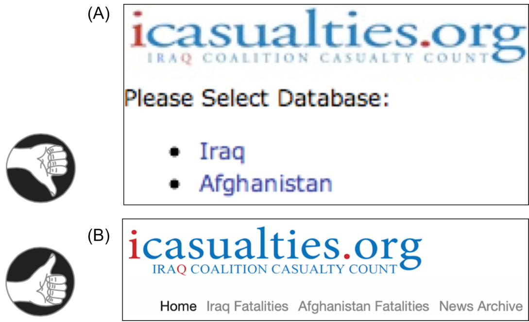
FIGURE 11.3iCasualties.org in 2009 (A) used a non-task-focused term: “database.” In 2020 (B), that was fixed.
图 11.3 iCasualties.org 在 2009 年(A)使用了一个非任务导向的术语:“数据库”。在 2020 年(B),这个问题得到了修正。
Terminology should be familiar
术语应通俗易懂
To reduce the time it takes for people to master your application, website, or appliance so that using it becomes automatic or nearly so; don’t force them to learn a whole new vocabulary. Chapter 4 explained that familiar words are easier to read and understand because they can be recognized automatically. Unfamiliar words cause people to use more conscious decoding methods, which consumes scarce short-term memory resources and thereby lowers comprehension.
为了减少人们掌握您的应用程序、网站或设备所需的时间,以便使用它变得自动化或接近自动化;不要强迫他们学习一个全新的词汇。第 4 章解释了熟悉单词更容易阅读和理解,因为它们可以被自动识别。不熟悉的单词会导致人们使用更自觉的解码方法,这会消耗稀缺的短期记忆资源,从而降低理解能力。
Unfortunately, many computer-based products and services present users with unfamiliar terms from computer engineering— often called “geek speak”—and require them to master those terms (see Fig. 11.4). Why? Operating a stove does not require us to master terminology about the pressure and chemical composition of natural gas or terminology about the production and delivery of electricity. Why should shopping on the Web, sharing photographs, or checking email require us to learn “geek speak” such as “USB,” “TIFF,” or “broadband”? But in many cases, it does.
不幸的是,许多基于计算机的产品和服务向用户展示了来自计算机工程的陌生术语——通常被称为“技术行话”——并要求他们掌握这些术语(见图 11.4)。为什么?操作炉子并不需要我们掌握关于天然气压力和化学成分的术语,或者关于电力生产和交付的术语。为什么在网上购物、分享照片或检查电子邮件应该要求我们学习“技术行话”,例如“USB”、“TIFF”或“宽带”?但在许多情况下,确实如此。
The following are examples of interactive software systems using unfamiliar terminology:
以下是一些使用陌生术语的交互式软件系统的例子:
• A development team was designing a video-on-demand system for schoolteachers to use in classrooms. The purpose of the system was to allow teachers to find videos offered by their school district, download them, and show them in their classrooms. The developers’ initial plan was to organize the videos into a hierarchy of “categories” and “subcategories.” Interviews with teachers showed, however, that they use the terms “subject” and “unit” to organize instructional content, including videos. If the system used the developers’ terminology, teachers who used it would have to learn that “category” meant “subject” and “subcategory” meant “unit,” making the system harder to master.
• 一个开发团队正在为学校教师设计一个视频点播系统,供他们在教室中使用。该系统的目的是允许教师查找他们所在学区的视频,下载它们,并在课堂上播放。开发人员的初始计划是将视频组织成一个“类别”和“子类别”的层次结构。然而,对教师的采访表明,他们使用“科目”和“单元”来组织包括视频在内的教学内容。如果系统使用开发人员的术语,那么使用该系统的教师将不得不学习“类别”意味着“科目”和“子类别”意味着“单元”,这使得系统更难掌握。
FIGURE 11.4 Unfamiliar computer jargon (aka “geek speak”) slows learning and frustrates users.
图 11.4 不熟悉的计算机术语(即“行话”)会减缓学习速度并使用户感到沮丧。
• SPRINT, a mobile-phone service provider, sends announcements of software updates to customers’ phones.
• SPRINT 是一家移动电话服务提供商,它向客户的手机发送软件更新通知。
These announcements often indicate new features that the update includes. One SPRINT update announcement offered “the option to select between Light and Dark UI themes from the Settings menu” (see Fig. 11.5). Most consumers won’t know that UI is an abbreviation for “user interface.” Even if they know that, they probably won’t know what a user-interface theme is, as that is a technical term used mainly by software designers and developers.
这些公告通常表明更新包含的新功能。一个 SPRINT 更新公告提供了“从设置菜单中选择浅色和深色 UI 主题的选项”(见图 11.5)。大多数消费者不会知道 UI 是“用户界面”的缩写。即使他们知道,他们可能也不会知道用户界面主题是什么,因为这是一个主要由软件设计师和开发者使用的技术术语。
• Google’s Android operating system for mobile devices sometimes displays warnings using obscure technical jargon or acronyms, such as the one shown in Fig. 11.6. Very few people who have Android phones would understand that message.
• Google 的安卓移动设备操作系统有时会使用晦涩的技术术语或缩写来显示警告,如图 11.6 所示。拥有安卓手机的人中,很少有人能理解那条消息。
• An example from American Airlines’ AAdvantage website shows that unless designers carefully review and approve all text displayed by consumer-facing apps and websites, technical jargon can slip in. Each product category has a pop-up tool tip that explains what clicking on the category does (see Fig. 11.7). But “dialogue” is a software design jargon term. To most English speakers, it means a conversation between two people.
• 美国航空公司 AAdvantage 网站的例子表明,除非设计师仔细审查和批准所有面向消费者的应用程序和网站显示的文本,否则技术术语可能会渗入其中。每个产品类别都有一个弹出工具提示,解释点击该类别的作用(见图 11.7)。但“对话”是一个软件设计术语。对大多数英语使用者来说,它意味着两个人之间的对话。
Voicemail Inbox(4)
语音信箱(4)
0 Check for update
0 检查更新
FIGURE 11.5An update message from the SPRINT mobile-phone service uses the computer-jargon
图 11.5 SPRINT 移动电话服务的一个更新消息使用了计算机术语
term “UI themes.”
“UI 主题。”
Attention
注意力
Your device has been unlocked to support any inserted UICC
您的设备已被解锁以支持任何插入的 UICC
FIGURE 11.6An informational message that sometimes appears on Android mobile phones will not be understood by the majority of phone users.
图 11.6 在安卓手机上有时会出现的信息消息,大多数手机用户无法理解。
FIGURE 11.7AdvantageShopping.com displays a pop-up tool-tip message that includes the technical jargon term “dialogue.”
图 11.7 AdvantageShopping.com 显示一个弹出工具提示消息,其中包含技术术语“对话。”
Terminology should be consistent
术语应该保持一致
People want to focus their cognitive resources on their own goals and tasks, not on the software they are using. They just want to accomplish their goal, whatever it is. They are not interested in the software. They interpret what the system presents only superficially and very literally. Their limited attentional resources are so focused on their goal that if they are looking for a Search function but it is labeled “Query” on the current screen or page, they may miss it. Therefore, the terminology in an interactive system should be designed for maximum consistency.
人们希望将他们的认知资源集中在自己的目标和任务上,而不是他们正在使用的软件上。他们只是想完成他们的目标,无论是什么。他们对软件不感兴趣。他们只是肤浅且字面地解释系统呈现的内容。他们的注意力资源非常集中在他们的目标上,以至于如果他们在寻找搜索功能,但当前屏幕或页面上标为“查询”,他们可能会错过它。因此,交互式系统中的术语应该设计得尽可能一致。
The terminology used in an interactive system is consistent when each concept has one and only one name. Caroline Jarrett, an authority on user-interface and forms design, provides this rule:
交互式系统中使用的术语是一致的时候,每个概念只有一个名称。用户界面和表单设计权威人物卡罗琳·贾雷特提供了这个规则:
Same name, same thing; different name, different thing— FormsThatWork.com.
同名同物,不同名不同物—FormsThatWork.com。
This means that terms and concepts should map strictly 1:1. Never use different terms for the same concept, or the same term for different concepts. Even terms that are ambiguous in the real world should mean only one thing in the system. Otherwise, the system will be harder to learn and remember.
这意味着术语和概念应该严格 1:1 映射。不要用不同的术语表示同一个概念,或者用同一个术语表示不同的概念。即使是现实世界中具有歧义的术语,在系统中也应该只表示一个意思。否则,系统将更难学习和记忆。
An example of different terms for the same concepts is provided by O’Reilly’s online form for reporting errata in books O’Reilly has published. If a reader submits the form without selecting a product format (“Printed,” “PDF,” or “ePub”), an error message appears telling the user that the “Version” field is required. The form labels the field “Format of product where you found the error,” but the error message labels it “Version” (see Fig. 11.8). This will surely confuse users.
一个用不同术语表示相同概念的例子是由奥莱利为已出版的书籍提供的在线勘误表单。如果读者未选择产品格式(“印刷版”、“PDF”或“ePub”),则会显示一条错误消息,告诉用户“版本”字段是必填的。表单将该字段标记为“您发现错误的产品的格式”,但错误消息将其标记为“版本”(见图 11.8)。这肯定会让用户感到困惑。
WordPress.com provides an example of the opposite sort of ambiguity: the same term for different concepts—also called overloading a term—and how to fix it. WordPress.com’s 2009 site for administering a blog had a Dashboard consisting of monitoring and administrative functions organized into several pages. The problem was that the first administrative function page in the Dashboard was also called the “Dashboard,” so the same name referred to both the whole Dashboard and one page of it (see Fig. 11.9A). This surely confused many new bloggers just learning to use WordPress.com; they had to discover and remember that sometimes “Dashboard” meant the entire administrative area, and sometimes it meant the Dashboard page of the administrative area. This overloading of “Dashboard” no doubt happened as follows—early versions of WordPress had only one Dashboard page containing a few features; later versions added Dashboard features until there were too many for one page, so it was split into several and the whole set of pages was called the “Dashboard.” Their design mistake was keeping the same name for the first page—the original Dashboard. To avoid the overloaded term, all they had to do was devise a new name for the first page in the new multipage Dashboard. In WordPress’s 2020 blog-admin site, they did exactly that—they named the first page “Home” (see Fig. 11.9B).
WordPress.com 举例说明了另一种歧义:同一个术语用于不同的概念——也称为术语重载——以及如何解决它。WordPress.com 的 2009 年博客管理网站有一个仪表盘,其中包含按几个页面组织的监控和管理功能。问题是,仪表盘中的第一个管理功能页面也被称为“仪表盘”,所以同一个名称既指整个仪表盘,也指其中的一页(见图 11.9A)。这无疑让许多刚开始学习使用 WordPress.com 的新博主感到困惑;他们必须发现并记住“仪表盘”有时指整个管理区域,有时指管理区域中的仪表盘页面。对“仪表盘”的重载无疑如下发生——早期的 WordPress 版本只有一个包含少量功能的仪表盘页面;后来的版本添加了仪表盘功能,直到功能太多无法放在一个页面上,所以它被拆分成几个页面,这一整套页面被称为“仪表盘”。他们的设计错误是保留第一个页面的相同名称——原始的仪表盘。 为了避免使用过载的术语,他们只需要为新的多页 Dashboard 中的第一页想一个新的名字。在 WordPress 2020 年的博客管理界面中,他们确实这样做了——他们将第一页命名为“主页”(见图 11.9B)。
FIGURE 11.8 Online form at OReilly.com for reporting errors in books uses two different names for the same field: on the form it is “Format …,” but in the error message it is “Version.”
图 11.8 显示了 OReilly.com 上用于报告书籍错误的在线表单,其中同一个字段使用了两个不同的名称:在表单中是“格式……”,但在错误消息中是“版本”。
Developing task-focused, familiar, consistent terminology is easier with a good conceptual model
好的概念模型有助于开发以任务为中心、熟悉且一致的术语
The good news is that when you perform a task analysis and develop a task-focused conceptual model, you also get the vocabulary your target user population uses to talk about the tasks.
好消息是,当你进行任务分析和开发以任务为中心的概念模型时,你也会得到目标用户群体用来讨论任务的词汇。
You don’t have to make up new terms for the user-visible concepts in your application—you can use the terms that people who do the task already use. In fact, you shouldn’t assign new names for those concepts, because any names you assign will likely be computer technology concepts foreign to the task domain. 2
你不必为应用程序中用户可见的概念编造新术语——你可以使用执行任务的人已经使用的术语。事实上,你不应该为这些概念分配新名称,因为任何你分配的名称都可能对任务领域来说是计算机技术概念外来的。

FIGURE 11.9WordPress.com. (A) 2009 site uses “Dashboard” for all the blogging controls and the first page of them. (B) 2020 site avoids overloading by naming the first page “Home.”
图 11.9 WordPress.com。 (A) 2009 网站使用“仪表盘”来命名所有博客控制功能及其首页。(B) 2020 网站通过命名首页“主页”来避免信息过载。
From the conceptual model, a software development team should create a product lexicon. The lexicon gives a name and definition for each object, action, and attribute that the product—including its documentation—exposes to users. The lexicon should map terms onto concepts 1:1. It should not assign multiple terms to a single concept or a single term to multiple concepts.
从概念模型来看,软件开发团队应该创建一个产品词汇表。词汇表为产品(包括其文档)向用户公开的每个对象、动作和属性命名并定义。词汇表应该将术语与概念一一对应。它不应将多个术语分配给一个概念,或将一个术语分配给多个概念。
Terms in the lexicon should come from the software’s supported tasks, not its implementation. Terms should fit well into the users’ normal task vocabulary, even those that are new. Typically, technical writers, user-interface designers, developers, managers, and users all help create the lexicon.
词汇表中的术语应来自软件支持的任务,而不是其实现。术语应与用户的正常任务词汇很好地匹配,即使这些术语是新的。通常,技术文档编写人员、用户界面设计师、开发人员、管理人员和用户都参与创建词汇表。
Certain concepts in GUIs have industry-standard names. These are the GUI equivalents of “reserved words” in programming languages. If you rename such concepts or assign new meanings to the standard names, you will confuse users. One such reserved term is “select.” It means clicking on an object to highlight it, marking it as the object for future actions. The word “select” should not be used for any other purpose in a GUI (e.g., adding an item to a list or a collection). Other reserved GUI terms are “click,” “press,” “drag,” “button,” and “link.”
某些 GUI 中的概念具有行业标准的名称。这些是 GUI 中相当于编程语言中“保留字”的概念。如果你重命名这些概念或将标准名称赋予新的含义,你将会让用户感到困惑。其中一个保留术语是“选择”。它指的是点击一个对象以突出显示它,将其标记为未来操作的当前对象。在 GUI 中不应将“选择”用于任何其他目的(例如,向列表或集合中添加项目)。其他保留的 GUI 术语包括“点击”、“按下”、“拖动”、“按钮”和“链接”。
Follow the product lexicon consistently throughout the software, user manuals, and marketing literature. Treat it as a living document: as the product evolves, the lexicon changes based on new design insights, changes in functionality, usability test results, and market feedback.
在整个软件、用户手册和营销文献中始终如一地遵循产品词汇表。将其视为一个活文档:随着产品的演变,词汇表会根据新的设计见解、功能变化、可用性测试结果和市场反馈而变化。
When Risk Is Low, We Explore More and Learn More
当风险较低时,我们探索更多,学习更多
Imagine you are visiting a foreign city on business for a week or two. You have spare time after your work duties are finished in the evenings and on weekends. Compare two possible cities:
想象一下,你出差到一个外国城市,在那里工作一周或两周。你的工作职责完成后,在晚上和周末你有空闲时间。比较两个可能的城市:
• You have been told that this city is easy to get around in. It is laid out in a consistent grid of streets and avenues with clear street and subway signs written in a language you understand, and the residents and police speak your language and are friendly and eager to help tourists. • You have been warned that this city has a convoluted, confusing layout with winding, poorly marked streets; the few street and subway signs are in a language you cannot read, and residents don’t speak your language and are generally contemptuous of tourists.
• 你被告知这座城市很容易通行。它以一致的街道和大道网格布局,街道和地铁标志清晰,用你能理解的语言书写,居民和警察都说你的语言,并且友好,乐于助人游客。 • 你被告知这座城市布局复杂、令人困惑,街道蜿蜒,标志不清;少数街道和地铁标志是用你无法阅读的语言书写的,居民不说你的语言,通常对游客不屑一顾。
In which city are you more likely to go out exploring?
在哪个城市你更有可能出去探索?
Most interactive systems—desktop software, web services, electronic appliances—have far more functionality than most of their users ever try. Often people don’t even know about most of the functionality provided by software or gadgets they use every day. One reason for this is fear of being “burned.”
大多数交互式系统——桌面软件、网络服务、电子设备——的功能远比大多数用户尝试的功能要多得多。人们甚至不知道他们每天使用的软件或小工具提供的许多功能。有一个原因是害怕“被烧”。
People make mistakes (see Chapter 15). Many interactive systems make it too easy for users to make mistakes, do not allow users to correct mistakes, or make it costly or time-consuming to correct mistakes. People won’t be very productive in using such systems: they will waste too much time correcting or recovering from mistakes.
人们会犯错误(参见第 15 章)。许多交互式系统让用户犯错过于容易,不允许用户纠正错误,或者让纠正错误变得代价高昂或耗时。在这样的系统中使用时,人们不会很有生产力:他们会浪费太多时间来纠正或从错误中恢复。
Even more important than the impact on time is the impact on practice and exploration. A high-risk system, in which mistakes are easy to make and costly, discourages both: people who are anxious and afraid of making mistakes will avoid using the system, and when they do use it, they will tend to stick to familiar, safe paths and functions.
比时间影响更重要的是对实践和探索的影响。在一个高风险系统中,犯错既容易又代价高昂,这会抑制两者:那些焦虑并害怕犯错的人会避免使用该系统,而他们使用它时,往往会倾向于熟悉、安全的路径和功能。
Imagine a violin or trumpet that gave mild electric shocks to its players when they made a mistake. Musicians would avoid practicing with it and would never use it to play new, unfamiliar tunes.
想象一下,当演奏者犯错时,小提琴或长号会给他们轻微的电击。音乐家会避免用它来练习,也永远不会用它来演奏新的、不熟悉的曲子。
When practice and exploration are discouraged, learning suffers. 3 In contrast, a low-risk system—in which mistakes are hard to make, low in cost, and easy to correct—reduces stress and encourages practice and exploration, and therefore supports learning. With such systems, users are more willing to try new paths: “Hmmm, I wonder what that does?” Creating a low-risk environment means doing the following:
当实践和探索受到阻碍时,学习就会受到损害。相反,一个低风险系统——其中错误难以犯下,成本低廉且易于纠正——减少了压力,鼓励实践和探索,从而支持学习。在这样的系统中,用户更愿意尝试新路径:“嗯,我想知道这个会做什么?”创造一个低风险的环境意味着要这样做:
• Prevent errors where possible.
• 尽可能防止错误。
• Deactivate invalid commands.
• 停用无效命令。
• Make errors easy to detect by showing users clearly what they have done (e.g., deleting a paragraph by mistake). • Allow users to undo, reverse, or correct errors easily.
• 通过向用户清楚地展示他们所做的事情(例如,误删一段文字),使错误易于检测。 • 允许用户轻松撤销、反转或纠正错误。
For more on the different types of errors people make and how to help people avoid them and recover from them, please see Chapter 15.
关于人们所犯的不同类型错误以及如何帮助人们避免它们和从中恢复,请参阅第 15 章。
Progressive disclosure and metaphor can support learning
逐步披露和隐喻可以支持学习
Progressive disclosure is a design technique that fosters learning by hiding features until the user knows enough to need them (Johnson, 2007). It is a bit like putting training wheels on a bicycle while a child is learning to keep balanced.
渐进式披露是一种设计技巧,通过隐藏功能直到用户了解足够需要它们来促进学习(约翰逊,2007 年)。这有点像在儿童学习保持平衡时给自行车装训练轮。
In some cases, hidden controls and settings appear when users click a “Details” or “More” button, as in Microsoft Word’s print controls (see Fig. 11.10).
在某些情况下,隐藏的控制和设置会在用户点击“详细信息”或“更多”按钮时出现,例如 Microsoft Word 的打印控制(见图 11.10)。
In other cases, controls and settings stay hidden or inactive (grayed out) until user actions or choices make them relevant, as in the fictional map app shown in Fig. 11.11.
在其他情况下,控制和设置会保持隐藏或非活动状态(灰色显示),直到用户的操作或选择使它们变得相关,例如图 11.11 中所示的那个虚构地图应用。
Another design technique that supports learning is the use of metaphor: designing a user interface to be similar to something users already know how to use, so they can transfer what they know from the other thing to the new user interface (Johnson, 2007). Examples of metaphors used in digital systems are the desktop, the trash can for deleting, file folders, and on-screen copies of handheld calculators. Interactive robots and voice-controlled assistants employ another sort of metaphor: by looking or sounding similar to a person, they prompt users to interact with them similarly to how they would interact with other people.
另一种支持学习的设计技术是使用隐喻:将用户界面设计得类似于用户已经熟悉的东西,这样他们可以将已知的知识从其他事物转移到新的用户界面(约翰逊,2007 年)。数字系统中使用的隐喻例子有桌面、用于删除的废纸篓、文件文件夹以及在屏幕上的手持计算器副本。交互式机器人和语音控制助手使用另一种隐喻:通过看起来或听起来像人,它们提示用户以与人互动的方式与他们互动。
FIGURE 11.10 Microsoft Word print controls use progressive disclosure. (A) Basic controls. (B) Detailed controls.
图 11.10 微软 Word 打印控件使用渐进式披露。(A)基本控件。(B)详细控件。

FIGURE 11.11Map app keeps History controls inactive until relevant. (A) Showing current location. (B) Showing location history.
图 11.11 地图应用在相关时才保持历史控件非活动状态。(A)显示当前位置。(B)显示位置历史。
Important Takeaways
重要要点
• Learning mainly consists of shifting activities from controlled to automatic processing. The brain encodes new knowledge and experience by constantly rewiring its neural circuits.
• 学习主要包含将活动从受控处理转移到自动处理。大脑通过不断重新连接其神经回路来编码新知识和经验。
• People learn faster when they practice frequently, regularly, and precisely.
• 人们在学习时,如果练习频繁、规律且精确,学习速度会更快。
• People learn faster when the operation of a system is task focused and simple. That requires minimizing the gap between users’ goals and the actions required to achieve them. Task analysis and conceptual modeling can help reduce that gap.
• 当系统的操作以任务为中心且简单时,人们学习速度会更快。这需要尽量缩小用户目标与实现目标所需行动之间的差距。任务分析和概念建模有助于缩小这个差距。
• Consistency and predictability in digital products and services also help people learn faster. Consistency is important both at a conceptual level and at the level of keystrokes. Predictability allows users to develop a mental model of how to operate an app or website. In order to be learnable, products and services based on AI technology must be predictable.
• 数字产品和服务的一致性和可预测性也有助于人们更快地学习。一致性在概念层面和按键层面都很重要。可预测性使用户能够形成对如何操作应用程序或网站的心理模型。基于人工智能技术的产品和服务必须具有可预测性,才能易于学习。
• People learn faster when vocabulary is task focused, familiar, and consistent. Designers should avoid exposing users to tech jargon terminology. The vocabulary of an app, a website, or an appliance should match the task domain, not the digital domain. Terms should map 1:1 to concepts. Follow this slogan: “Same word, same thing. Different word, different thing.”
• 当词汇以任务为中心、熟悉且一致时,人们学习速度会更快。设计师应避免向用户展示技术术语。应用程序、网站或电器的词汇应与任务领域相匹配,而不是数字领域。术语应与概念一一对应。请遵循这个口号:“一词一义。不同词,不同事。”
• People learn faster in low-risk environments. Help users avoid errors, and help them recover from errors.
• 在低风险环境中,人们学习得更快。帮助用户避免错误,并帮助他们从错误中恢复。
• Design to support new users by using progressive disclosure and metaphor. Using progressive disclosure means hiding or deactivating advanced functionality until users need it. Using metaphor is designing a UI to be similar to something users already know how to use.
• 通过使用渐进式披露和隐喻来支持新用户。使用渐进式披露意味着在用户需要之前隐藏或停用高级功能。使用隐喻是指设计一个与用户已经知道如何使用的类似的东西的界面。
1As this was being written, the current version of MacOS X was
1 在撰写本文时,当前的 MacOS X 版本是
10.15 (Catalina).
10.15(猫头鹰)。
Chapter 12: Human DecisionMaking is Rarely Rational
第 12 章:人类决策很少理性
Abstract
摘要
Economists often assume that decision-making is rational and stable, but research indicates that human decision-making is rarely so. This chapter explains this and explains how interactive systems can support more rational decision-making when that is the goal as well as undermine it when that is the goal.
经济学家通常假设决策是理性的和稳定的,但研究表明人类的决策很少如此。本章解释了这一点,并解释了当目标是理性决策时,交互式系统如何支持它,而当目标不是理性决策时,又如何破坏它。
Keywords
关键词
Anchoring; Bias; Data visualization; Decision-making; Decision support; Fourfold pattern; Framing; Information visualization; Kahneman and Tversky; Loss averse; Loss seeking; Persuasive systems; Rational; Risk averse; Risk seeking; System one; System two
锚定效应;偏见;数据可视化;决策;决策支持;四象限模式;框架效应;信息可视化;卡尼曼和特沃斯基;损失厌恶;损失寻求;说服系统;理性;风险厌恶;风险寻求;系统一;系统二
Theories of decision-making and economics were historically based on the assumption that decision-making is rational, selfish, and stable over time. However, research in cognitive science has shown that at least two of those attributes—rationality and stability—are not attributes of human decision-making (Kahneman, 2011; Eagleman, 2012, 2015). These findings have had a strong impact on economic and decision theories.
决策和经济学理论在历史上一直基于决策是理性的、自私的,并且在时间上是稳定的这一假设。然而,认知科学的研究表明,至少有两个属性——理性和稳定性——并不是人类决策的属性(卡尼曼,2011 年;伊格尔曼,2012 年,2015 年)。这些发现对经济和决策理论产生了重大影响。
Chapter 10 explained that we have two separate minds, which psychologists call system one (automatic, unconscious, unmonitored, highly parallel, irrational, approximate, fast) and system two (controlled, conscious, monitored, single-process, rational, precise, slow). Although system two believes that it governs our thoughts and actions, it only rarely does. Its main roles are:
第 10 章解释说,我们有两个独立的大脑,心理学家称之为系统一(自动、无意识、不受监控、高度并行、非理性、近似、快速)和系统二(受控、有意识、受监控、单过程、理性、精确、慢速)。尽管系统二认为它控制着我们的思想和行为,但它很少这样做。它的主要作用是:
• override the quick-and-dirty and often faulty judgments of system one,
• 覆盖系统一快速且常常有缺陷的判断,
• resolve conflicts when different automatic processes in system one produce conflicting results,
• 解决系统一中不同自动过程产生冲突结果时的冲突,
• figure out how to respond in novel situations where system one has no automatic response.
• 弄清楚在系统一没有自动反应的情况下如何应对新情况。
However, system two is lazy 1 and intervenes only when necessary (Eagleman, 2015).
然而,系统二懒惰,只在必要时介入(Eagleman,2015)。
People are Often Irrational
人们常常非理性
Classic decision and economic theories are based on studies of people’s choices between simple gambles. Economists and decision scientists do this to simplify their research just as some biologists study fruit flies, flatworms, and white rats to help them understand more general biological processes. A basic axiom of rational decision-making is this—if you prefer an
经典的决策和经济理论基于对人们之间简单赌博选择的研究。经济学家和决策科学家这样做是为了简化他们的研究,就像一些生物学家研究果蝇、扁形虫和白鼠一样,以帮助他们理解更一般的生物过程。理性决策的一个基本公理是:如果你更喜欢 X 而不是 Y,那么你将更喜欢有 1/2 的机会赢得 X,而不是有 1/3 的机会赢得 Y。从这一点和类似的基本公理出发,加上人类是理性的、自私的、并且他们的偏好是稳定的这一假设,经济学家和决策理论家推导出了复杂的经济和决策理论。这些理论对于计算人们和组织应该如何做决策是有用的,但当我们谈到预测人类实际上是如何做决策时,它们根本就是错误的。
Losses Mean More to Us Than Gains
失去比获得对我们来说更重要
If you ask people if they would prefer (1) a
如果你问人们是否愿意选择(1)一个
Not convinced? Consider this example: A friend offers you a bet based on a coin toss: heads, he pays you \150
还不 convinced?考虑这个例子:一个朋友向你提出一个基于抛硬币的赌注:如果是正面,他付你 \150
Also, according to Kahneman (2011), the pain people feel from a loss is not linear with the size of the loss. For example, for a cattle rancher, the pain of losing 900 cows is more than
此外,根据卡尼曼(2011)的研究,人们因损失而感受到的痛苦与损失的大小不成线性关系。例如,对于一个牛场主来说,失去 900 头牛的痛苦超过
Based on years of research on how people actually make decisions on gambles and other risky conditions, such as whether to settle a lawsuit out of court, Daniel Kahneman and his colleague Amos Tversky developed a
基于对人们在赌博和其他风险条件下(例如是否庭外和解诉讼)实际做决策多年的研究,丹尼尔·卡尼曼和他的同事阿莫斯·特沃斯基开发了一个
Table 12.1
表 12.1
| Gain获益 | |
| High probability高概率 | Gamble: High chance to win 10,ooo(butslightchanceofwinningnothing)No−gambleoption:Gain8ooo (which is less than long-term gain of gamble) ·fear to lose gain · people are risk-averse冒险:高概率赢得 10,ooo(butslightchanceofwinningnothing)No−gambleoption:Gain 8ooo(这低于长期冒险收益)·害怕失去收益 · 人们是规避风险的 |
| Low probability低概率 | Gamble: Slight chance to win 10,o0o(buthighchanceofwinningGamble:Slightchancetolose10,ooo (but high chance of losing nothing) nothing) No-gamble option: Gain 2ooo(whichismorethanlong−termgainofNo−gambleoption:Lose20oo (which is more than long-term loss of gamble) gamble) · hope for large gain ·fear of large loss ·people are risk-seeking ·people are risk-averse · most prefer to gamble ·most prefer “safe”definite loss冒险:有轻微获胜的机会 10,o0o(buthighchanceofwinningGamble:Slightchancetolose 10,000(但几乎没有损失的机会)不冒险选项:获得 2ooo(whichismorethanlong−termgainofNo−gambleoption:Lose 20,000(这比长期冒险的损失要多)冒险)·希望获得巨大收益 ·害怕巨大损失 ·人们是风险追求者 ·人们是风险规避者 ·大多数人喜欢冒险 ·大多数人更喜欢“安全”的确定损失 |
Adapted from: Kahneman, 2011. Thinking Fast and Slow. Farrar Straus and Giroux, New York.
改编自:卡尼曼,2011 年。《思考,快与慢》。Farrar Straus and Giroux,纽约。
The fourfold pattern predicts human behavior in risky situations —for example, our willingness to:
四重模式预测人们在风险情况下的行为——例如,我们的:
accept settlements in lawsuits;
接受诉讼和解;
buy insurance (when not required);
购买保险(当不需要时);
play lotteries;
玩彩票;
gamble in casinos.
去赌场赌博。
We are Biased by How Choices are Worded
我们的选择受措辞影响
Imagine that your doctor informs you that you have a terminal disease. She tells you there is a treatment that has a
想象一下,你的医生告诉你,你患有一种绝症。她告诉你,有一种治疗方法,其生存率为
The two statements about the treatment’s effectiveness are equivalent. A rational agent’s decision would not be affected by how the doctor phrases it. But people’s decisions are. That is system one at work, with system two rarely bothering to intervene.
关于治疗方法有效性的两个陈述是等价的。一个理性代理人的决定不会受到医生措辞的影响。但人们的选择会受到影响。这就是系统一在起作用,而系统二很少干预。
Here is another nice example of biasing by choice of words, adapted from Kahneman (2011). An outbreak of a dangerous flu is about to hit your country. Health officials predict that if the population is not vaccinated against it, about 600 people will die. Two vaccines are available:
这里是另一个关于措辞选择导致偏见的例子,改编自卡尼曼(2011 年)。一种危险的流感即将袭击你的国家。卫生官员预测,如果人口不接种流感疫苗,大约会有 600 人死亡。有两种疫苗可用:
• Vaccine A has been used before; an estimated 200 (of the 600) people would be saved. • Vaccine B is experimental, with a one-third chance of saving all 600 people and a two-thirds chance of saving no one.
• 疫苗 A 以前使用过;估计会拯救 200 人(600 人中的 200 人)。• 疫苗 B 是实验性的,有三分之一的机会拯救所有 600 人,有三分之二的机会拯救没有人。
Most people presented with this choice choose vaccine A. They like the certainty. Now look at these slightly differently worded options for the same choice:
大多数人面对这个选择时会选择疫苗 A。他们喜欢确定性。现在看看这些措辞略有不同的相同选择:
• Vaccine A has been used before; an estimated 400 (of the 600) people would die. • Vaccine B is experimental, with a one-third chance of nobody dying and a two-thirds chance of all 600 people dying.
• 疫苗 A 已经使用过;估计有 400(600 人中的)人会死亡。• 疫苗 B 是实验性的,有三分之一的机会没有人死亡,三分之二的机会所有 600 人都会死亡。
With this alternative wording, most people choose vaccine B. In this case, the certainty is unappealing because it is about deaths. According to Kahneman, system one not only treats losses as more important than gains, it also is risk-averse for gains and risk-seeking for losses. Therefore, people usually prefer a sure thing over a gamble when options are worded as gains, and gambles over sure things when the identical options are worded as losses.
用这种替代措辞,大多数人会选择疫苗 B。在这种情况下,确定性变得不吸引人,因为它与死亡有关。根据卡尼曼的说法,系统一不仅将损失视为比收益更重要,而且在收益方面是风险规避的,在损失方面是风险寻求的。因此,当选项以收益方式措辞时,人们通常更喜欢确定的事情而不是赌博,而当相同的选项以损失方式措辞时,人们更喜欢赌博而不是确定的事情。
Psychologists call this the framing effect: how choices are framed affects people’s decisions.
心理学家称这种现象为框架效应:选择是如何被框架化的,这会影响人们的决定。
Framing can also bias our decisions by setting—researchers call it anchoring—our mental accounting to a certain level, after which we perceive gains and losses from that new level. For example, imagine you are on a TV game show and have just won \1000$. Before you leave, the game show host offers you a choice: (1)
框架效应也会通过设定——研究人员称之为锚定效应——将我们的心理账户固定在某个水平上,之后我们从新的水平感知收益和损失。例如,想象一下你在电视游戏节目中刚刚赢得 1000 美元,50%的概率是 1000 美元,0%的概率是 0 美元,50%的概率是 500 美元,25%的概率是 1500 美元,25%的概率是 2000 美元,50%的概率是 1000 美元,25%的概率是 1000 美元,看起来更好——可能已经足够了。尽管系统一做出了决定,但系统二通过思考“为什么要贪婪?”来合理化这个决定。
But now let’s start over. Assume you initially won \2000$, and now your choice is: (1) a
但现在让我们重新开始。假设你最初赢得了 2000 美元,50%的概率是 1000 美元,0%的概率是 0 美元,50%的概率是 2000 美元,25%的概率是 500 美元,25%的概率是 2000 美元,50%的概率是 1000 美元,25%的概率是 2000 美元,看起来更糟。同样,系统一做出了决定,但系统二通过思考“我希望能保住所有东西”来合理化。
Companies use anchoring to sell products in several ways (Stefanovic, 2018):
公司使用锚定效应来销售产品有几种方式(Stefanovic,2018):
• List the most expensive version of a product first, causing shoppers to anchor the price in their minds at that level, making other versions of the product seem like a bargain.
• 首先列出最昂贵的版本,使购物者将价格锚定在某个水平上,使其他版本的产品看起来像便宜货。
• Offer discounts for buying more than one of the product— e.g., three for the price of two—thereby anchoring that number in shoppers’ minds as the “right” number to buy.
• 优惠购买多个产品,例如买三赠一,以此将这个数字锚定在购物者心中,作为“正确的”购买数量。
• Set a time limit on a discount—anchoring the sale price in customers’ minds—and urge customers to “buy now” or lose the discount.
• 对折扣设置时间限制,将折扣价锚定在顾客心中,并敦促顾客“立即购买”以免错过折扣。
• Set a limit on how many units shoppers can purchase, thereby pushing customers to buy more units than they otherwise would.
• 限制顾客可以购买的单位数量,从而促使顾客购买比平时更多的单位。
Framing effects are one reason people’s judgments and preferences are unstable over time: phrase a choice one way, people decide one way; phrase it differently, people decide differently.
框架效应是人们判断和偏好随时间不稳定的原因之一:以某种方式措辞选择,人们会做出一种决定;以不同的方式措辞,人们会做出不同的决定。
We are Biased by Our Vivid Imaginations and Memories
我们被生动的想象和记忆所偏见
In addition to being biased by gain versus loss and by how choices are framed, people tend to overestimate the probability of improbable events, especially when we can picture or easily recall those events. Furthermore, we tend to give more weight to such events in our decisions.
除了受到收益与损失偏见以及选择框架的影响外,人们还倾向于高估小概率事件的可能性,尤其是在我们能够想象或容易回忆起这些事件时。此外,我们在做决策时往往会更加重视这类事件。
As an example, if people are asked to estimate the number of murders in the US state of Michigan last year, those who remember that Detroit is in Michigan give a larger number than those who don’t—but many don’t remember that. Many people even estimate the number of murders per year as higher for Detroit than for Michigan. The explanation is that system one gives quick answers based on heuristics, such as how easily relevant information comes to mind. Murders in Detroit are often mentioned in news reports, thereby associating Detroit with murder in people’s memories, but news reports about “murders in Michigan” are rare, so “murder” and “Michigan” are not strongly associated in memory. If system one does not recall that Michigan includes Detroit, its estimate is low, and system two rarely intervenes (Kahneman, 2011).
例如,如果要求人们估计美国密歇根州去年的谋杀案数量,那些记得底特律在密歇根州的人给出的数字会更大,而许多人不记得这一点。许多人甚至估计底特律每年的谋杀案数量高于密歇根州。解释是系统一基于启发式方法给出快速答案,例如相关信息是否容易回想起来。底特律的谋杀案经常出现在新闻报道中,从而在人们的记忆中将底特律与谋杀案联系起来,但关于“密歇根州的谋杀案”的新闻报道很少,所以“谋杀”和“密歇根州”在记忆中并没有强关联。如果系统一没有回忆起密歇根州包括底特律,其估计就会很低,而系统二很少介入(卡尼曼,2011 年)。
Similarly, if asked whether politicians or pediatricians are more likely to be rich, most people immediately say “politicians, of course.” This answer comes from system one, which can easily recall news stories about politicians’ wealth due to all the press coverage such stories receive. Unless the person happens to know pediatricians who are rich, system one can’t recall any examples because they seldom are reported in the news.
同样地,如果问人们政治家还是儿科医生更有可能富有,大多数人会立刻回答“当然是政治家”。这个答案来自系统一,由于新闻媒体对这类故事的大量报道,人们很容易回忆起政治家的财富。除非这个人恰好认识富有的儿科医生,否则系统一无法回忆起任何例子,因为这类情况很少被报道。
System one is also easily biased by the vividness of imagery and the brain’s automatic responses to events. This is why people use vague or euphemistic terms in polite company: it avoids causing strong reactions to terms associated with unpleasant topics. For example, at a dinner party we would say that our spouse was absent because he or she was ill; we wouldn’t say that our spouse was vomiting or had diarrhea.
系统一也容易被生动形象和大脑对事件的自动反应所影响。这就是为什么人们在礼貌场合使用模糊或委婉的词语:这样可以避免对与不愉快话题相关的词语引起强烈反应。例如,在晚宴上我们会说我们的伴侣因为生病而缺席;我们不会说我们的伴侣在呕吐或腹泻。
A related bias is that people give more weight to coherent, compelling stories than to statistical evidence. In Chapter 10, the “Uncle Charlie” effect was explained: a person may have seen plenty of statistics showing that a Nissan Leaf is a great car, but if that person’s Uncle Charlie (or other relative or friend) had a bad experience with one, the person’s system one will consider the car a “lemon,” which will bias their opinion of the car unless system two overrides it.
一种相关的偏见是,人们更重视连贯、有说服力的故事,而不是统计证据。在第 10 章中解释了“查理叔叔”效应:一个人可能看到了大量表明日产聆风是一辆好车的统计数据,但如果这个人的一位查理叔叔(或其他亲戚或朋友)有过一次不好的使用经历,这个人的一阶思维系统会认为这辆车是“柠檬”,除非二阶思维系统干预并改变他们的看法。
Similarly, system one does not care about sample sizes. If you read that a door-to-door survey of potential voters found
类似地,一阶思维系统不在乎样本量。如果你读到一份对潜在选民进行挨家挨户调查发现
Finally, system one bases decisions on what is immediately before it: current perceptions and strong, easy-to-recall memories. System one does not—cannot—consider other, possibly contrary evidence and experiences. Since what is immediately available to system one changes over time, its responses and choices are subject to change.
最后,系统一根据它眼前的事物做决定:当前的感知和容易回忆起来的强烈记忆。系统一不会——也不可能——考虑其他可能相反的证据和经历。由于系统一眼前的事物会随时间变化,它的反应和选择也会随之改变。
We are Biased by Our (Recent) Past Behavior
我们受到我们(近期)过去行为的影响
Most people try to be consistent. When we make a promise, we feel obligated to keep it. When we make a decision, have an opinion, or act in a particular way, most of us try to make our future behaviors match it. We tend to justify these commitments by seeking confirmation and providing reasons for supporting them. This tendency manifests itself in several ways (Stefanovic, 2018):
大多数人试图保持一致。当我们做出承诺时,我们会感到有义务去遵守。当我们做出决定、持有观点或以某种特定方式行事时,我们大多数人试图让未来的行为与之一致。我们倾向于通过寻求确认和提供支持它们的理由来证明这些承诺。(Stefanovic,2018):
• Stated commitment bias: People who state publicly that they want to lose weight are significantly more successful. Once you bid on an item, you’re likely to keep bidding. Internet users who click “yes” to a small request are more likely to click “yes” to larger requests (e.g., buy). Shopping carts and wish lists increase commitment and therefore the chances of buying. People are more likely to provide sensitive information if they have consented to give you innocuous information first. Once you’ve declared your intention to get a basic product, upselling add-on options to you is easier.
• 公开声明承诺偏见:公开表示想要减肥的人成功几率会显著提高。一旦你出价,你可能会继续出价。点击“是”回应小请求的用户更有可能点击“是”回应更大的请求(例如购买)。购物车和愿望清单增加了承诺,从而提高了购买的可能性。如果你先同意提供无害信息,人们更有可能提供敏感信息。一旦你表明了购买基本产品的意图,向你要求数加选项就更容易了。
• Sunk cost fallacy (escalation of commitment): This is our tendency to stick with a decision and even put more resources into a losing cause. We don’t want to lose resources already invested and don’t want to seem inconsistent: “I will stay on the line, listening to elevator music, waiting for a ticket agent to answer, even though it’s been 15 minutes.” Learning an app makes it likely you will stay with that app.
• 沉没成本谬误(承诺升级):这是我们坚持一个决定,甚至向一个失败的事业投入更多资源的倾向。我们不想失去已经投入的资源,也不想显得不一致:“我会继续在线,听着电梯音乐,等待售票员回答,即使已经过了 15 分钟。”学习一个应用程序可能会让你继续使用那个应用程序。
• Ikea effect: We value things more once we have put effort into them. Letting people try a product—and put effort into learning it—makes them more likely to buy it.
• 宜家效应:一旦我们付出了努力,就会更加重视事物。让人们尝试产品——并付出努力去学习它——会让他们更有可能购买它。
• Status quo bias: We prefer familiarity and tend to resist change. We use the current situation as an anchor, so we perceive downward changes as losses and upward changes as gains.
• 状态 quo 偏好:我们倾向于熟悉并抵制改变。我们以当前情况为基准,因此我们认为向下变化是损失,向上变化是收益。
Emotions are Crucial to Decision-Making
情绪对决策至关重要
Making decisions rationally does not mean eliminating emotions from the equation. To evaluate and compare alternatives effectively, people need some sort of emotional response.
理性地做决定并不意味着消除情感因素。为了有效地评估和比较替代方案,人们需要某种情感反应。
For example, when you choose a driving route to a friend’s wedding, making a rational choice means that you choose the best route based on some objective metric—e.g., shortest, safest, most familiar, least nerve-wracking, or least use of fuel. Why? Because choosing the best route—whatever your criteria are—makes you feel good, and choosing a bad route makes you feel bad. Similarly, when you choose between alternative products, you may compare the products on several objective criteria: cost, features, quality, reliability, ratings. You do that to buy the product that benefits you most, because that feels good.
例如,当你选择去朋友婚礼的驾驶路线时,理性选择意味着你根据某些客观指标选择最佳路线——例如,最短、最安全、最熟悉、最不紧张或燃料消耗最少。为什么?因为选择最佳路线——无论你的标准是什么——会让你感觉良好,选择糟糕的路线会让你感觉不好。类似地,当你选择替代产品时,你可能会根据几个客观标准比较产品:成本、功能、质量、可靠性、评分。你这样做是为了购买对你最有利的产品,因为那会让你感觉良好。
Research shows that people who experience few or no emotions— perhaps due to brain injuries or illnesses—have great difficulty making decisions (Hudlicka, 2021). If there is no difference in your emotional response to two alternatives, you will have difficulty choosing between them. Emotional response is essential to decisionmaking (Eagleman, 2015).
研究表明,那些很少或完全没有情绪体验的人——可能由于脑损伤或疾病——在做出决定方面会遇到极大困难(Hudlicka,2021 年)。如果你对两个选择没有不同的情绪反应,你将很难在它们之间做出选择。情绪反应对决策至关重要(Eagleman,2015 年)。
Exploiting Strengths and Weaknesses of Human Cognition
利用人类认知的优势和劣势
How can designers use knowledge of the previously described characteristics of human decision-making to achieve their goals? Here are some ways.
设计师如何利用之前描述的人类决策的特征来实现他们的目标?这里有一些方法。
Support rational decision-making: help system two override or co-opt system one
支持理性决策:帮助系统二覆盖或同化系统一
People invented computers for the same reason we invented arithmetic, calculators, Rolodexes, and checklists: to augment our weak and unreliable rational thought processes. Early computers performed numerical calculations that were too complex or lengthy for people to perform reliably and quickly, but they now perform for us—or help us perform—a wide variety of information-processing tasks. Computers are good—reliable, fast, and accurate—at precisely what we are bad at: remembering, calculating, deducing, monitoring, searching, enumerating, comparing, and communicating, so people use computers to support those activities. Decision-making is another such activity.
人们发明计算机的原因与我们发明算术、计算器、 Rolodex 和清单的原因相同:为了增强我们薄弱且不可靠的理性思维过程。早期的计算机执行了对于人类来说过于复杂或冗长的数值计算,但现在它们为我们——或者帮助我们——执行了各种信息处理任务。计算机在恰恰是我们不擅长的事情上表现良好——记忆、计算、推理、监控、搜索、列举、比较和交流,因此人们使用计算机来支持这些活动。决策是另一项这样的活动。
For example, many people won’t sign a new home mortgage without first using a mortgage calculator to compare different loan options and compute their monthly payments and the total amount they will pay (see Fig. 12.1). The calculator supports our decisionmaking.
例如,许多人不会在没有先使用房贷计算器来比较不同的贷款选项并计算他们的月还款额和总还款额的情况下签署新的房贷(见图 12.1)。计算器支持我们的决策。
An example of problems that arise when people don’t use computer systems to augment their all-too-human capabilities is provided by a recent airliner crash at San Francisco International Airport. The crash was allegedly caused at least in part 3 by the pilots trying to land the plane manually rather than with the autopilot (Weber, 2013).
当人们不使用计算机系统来增强他们过于人性的能力时出现的问题的一个例子是旧金山国际机场最近的一起空难。据称,这起空难至少部分是由飞行员试图手动着陆而不是使用自动驾驶系统造成的(Weber,2013 年)。
FIGURE 12.1 Sorted.org.nz’s mortgage calculator helps people understand and choose a loan.
图 12.1:Sorted.org.nz 的房贷计算器帮助人们理解和选择贷款。
It could be argued that a great many software applications and commercial websites exist to help people make decisions. Usually the decisions supported are mundane, as in apps and websites that help people choose which product to buy (see Fig. 12.2). Such websites support rational choice (system two) by displaying products side by side and allowing people to compare prices, features, and reliability, as well as customer satisfaction based on product ratings and reviews.
有人可能会认为,存在许多软件应用程序和商业网站是为了帮助人们做决策。通常,这些决策是平凡的,例如帮助人们选择购买哪个产品的应用程序和网站(见图 12.2)。这些网站通过并排显示产品并允许人们比较价格、功能、可靠性和基于产品评分和评论的客户满意度来支持理性选择(系统二)。
However, many software applications support decision-making that is anything but mundane, such as where to drill for oil, how much water to store in a reservoir, what the suggested retail price of a new car should be, how many endangered rhinos and elephants a game reserve can hold, or what the most efficient route for a snowplow is (see Fig. 12.3). In fact, software for supporting complex decision-making is such an important and well-studied category that it has a title and acronym (decision support systems, or DSS), a scientific journal (Decision Support Systems), textbooks, regular conferences, and even a Wikipedia page.
然而,许多软件应用程序支持非常不平凡的决策,例如在哪里钻探石油、在水库中储存多少水、新汽车的建议零售价应该是多少、一个自然保护区可以容纳多少濒危犀牛和大象,或者推雪车最有效的路线是什么(见图 12.3)。事实上,支持复杂决策的软件是一个如此重要且研究深入的门类,以至于它有自己的名称和缩写(决策支持系统,或 DSS)、一个科学期刊(决策支持系统)、教科书、定期会议,甚至还有一个维基百科页面。
Whether the supported decisions are mundane or of monumental importance, the primary goal of decision support software (and websites) is to help people engage their system two, see all their options, evaluate them rationally and fairly, and make an unbiased decision. Achieving that goal isn’t easy, because as explained earlier and in Chapter 1, human perception and cognition are usually biased. But it is possible, if decision support software follows these guidelines:
无论所支持的决定是日常琐事还是重大事项,决策支持软件(和网站)的主要目标都是帮助人们运用他们的系统二,查看所有选项,理性且公平地评估它们,并做出无偏见的决定。实现这一目标并不容易,因为正如前面解释的和第一章所述,人类的感知和认知通常是存在偏见的。但如果决策支持软件遵循这些指南,这是可能的。

digital camera
数码相机
Sony a7 Ill Full-Frame Mirrorless
Sony a7 Ill 全画幅无反相机
Interchangeable-Lens Camera Optical with
可换镜头相机光学
3" LCD,Black (ILCE7M3/B)
3 英寸 LCD,黑色(ILCE7M3/B)
$1607.97
Compare Prices
比较价格
AbergBest 21 Mega Pixels 2.7" LCD Rechargeable HD Digital Camera,Video camera Digital Students cameras,lndoor Outdoor for Adult/Seniors/Kids (Black) $40.99
AbergBest 21 兆像素 2.7 英寸 LCD 可充电高清数码相机,摄像机数码学生相机,室内外成人/老年人/儿童用(黑色)$40.99
Compare Prices
比较价格
Nikon D750 FX-format Digital SLR Camera
尼康 D750 FX 格式数码单反相机
(Body Only)
(机身仅售)
$889.99
Compare Prices
比较价格
Sony DSC-W830 20.1MP Digital Camera
索尼 DSC-W830 20.1MP 数码相机
(Silver)
(银色)
$128.00
Compare Prices
比较价格
Sony DSCW800/B 20.1 MPDigital Camera
索尼 DSCW800/B 20.1 MP 数码相机
(Black)
(黑色)
$99.99
Compare Prices
比较价格
• Provide all options . If there are too many to simply list, they can be organized or abstracted into categories and subcategories with summary information provided for those so people can evaluate, compare, and possibly eliminate entire categories of options at once.
• 提供所有选项。如果选项太多无法简单列出,可以将它们组织或抽象成类别和子类别,并为这些类别提供摘要信息,以便人们可以评估、比较,并可能一次性消除整个类别的选项。
• Help people find alternatives . Some solutions may be so counterintuitive that people don’t consider them. Decision support systems can expose options users might miss and generate variants on user solutions that are minor or even major improvements.
• 帮助人们寻找替代方案。某些解决方案可能非常反直觉,以至于人们不会考虑它们。决策支持系统可以揭示人们可能忽略的选项,并生成基于用户解决方案的变体,这些变体可能是微小的甚至重大的改进。
• Provide unbiased data . That is, data should be created or collected in an objective, reproducible manner.
• 提供无偏见的数据。也就是说,数据应该以客观、可重复的方式创建或收集。
• Don’t make people calculate . Perform calculations, inferences, and deductions for users where possible. Computers are good at that; people aren’t.
• 不要让人们计算。尽可能为用户执行计算、推理和演绎。计算机擅长这些;而人们不擅长。
• Check assertions and assumptions . Decisions are based on not only data but also assumptions and assertions. Decision support systems—especially those supporting critical or complex decisions—should let users declare any assumptions and assertions that will be used for decisionmaking and “sanity check” them for users.
• 检查断言和假设。决策不仅基于数据,也基于假设和断言。决策支持系统——尤其是支持关键或复杂决策的系统——应允许用户声明将用于决策的任何假设和断言,并对其进行“合理性检查”。
• Explain the system’s reasoning . If users of a decision support system don’t understand its results or recommendations, they may not trust the system and therefore will be less likely to follow its suggestions. Therefore, decision support systems should show—if not normally then at least on demand—the rationale for their recommendations.
• 解释系统的推理过程。如果决策支持系统的用户不理解其结果或建议,他们可能不会信任该系统,因此不太可能遵循其建议。因此,决策支持系统应显示——如果不是通常情况,至少在用户要求时——其建议的推理过程。
FIGURE 12.2 GoSale.com is a comparisonshopping website.
图 12.2 GoSale.com 是一个比价购物网站。
FIGURE 12.3 Decision support system for choosing efficient snowplow routes.
图 12.3 用于选择高效铲雪路线的决策支持系统。
Make AI-based systems more transparent
使基于人工智能的系统更加透明
The last guideline poses a problem for decision support systems based on artificial intelligence technology, such as machine learning or neural networks. AI-based systems often present themselves to us as black boxes: we see the data that go into the system and the results or recommendations that come out, but we cannot see which inputs affected the results or how the inputs affected the results (Budiu, 2018; Budiu and Laubheimer, 2018). Because we lack a clear, predictive mental model of how AI-based apps and services work, 4 their advice or recommendations often seem mysterious, off-base, or just plain creepy. For example, most of us have received “You may also like” suggestions or advertisements that cause us to say “Huh!? Where did that come from?”
最后一条准则对基于人工智能技术的决策支持系统提出了问题,例如机器学习或神经网络。基于人工智能的系统通常以黑盒的形式呈现给我们:我们看到输入系统的数据以及输出的结果或建议,但我们无法看到哪些输入影响了结果,也无法看到输入是如何影响结果的(Budiu,2018;Budiu 和 Laubheimer,2018)。由于我们对基于人工智能的应用和服务的工作方式缺乏清晰的、预测性的心理模型,因此它们给出的建议或建议常常显得神秘、不切实际,甚至有点吓人。例如,我们大多数人都有过收到“您可能还喜欢”的建议或广告的经历,让我们不禁说“啊!这从哪里来的?”
To lose their reputation as being unpredictable and creepy, and to gain widespread acceptance, AI-based apps and services must become more transparent. They must be designed so users can see how the results were derived from inputs (Budiu, 2018). Perhaps they even need to become capable of explaining the reasoning behind their decisions and suggestions.
为了失去其不可预测和令人毛骨悚然的声誉,并获得广泛的接受,基于人工智能的应用和服务必须变得更加透明。它们必须被设计得让用户能够看到结果是如何从输入中得出的(Budiu,2018)。也许它们甚至需要能够解释其决策和建议背后的推理。
Data visualization: harnessing system one to support system two
数据可视化:利用系统一支持系统二
One might assume that a secondary goal of decision support systems is to shut system one—with all its biases, satisficing, and approximating—out of the decision-making loop. In some decision support systems that may indeed be a design goal. However, there is another way.
人们可能会认为,决策支持系统的另一个目标是让系统一——连同它的偏见、满足感和近似处理——退出决策循环。在一些决策支持系统中,这确实可能是一个设计目标。然而,还有另一种方式。
To understand the other way, one must realize that system one is not an inner “evil twin” trying to bias and mess up our decisions. It doesn’t have any goal to thwart or undermine system two. In fact, it doesn’t have any goals at all. Strictly speaking, it isn’t even a single thing. System one is a large collection of semi-independent automatic “robotic” or “zombie” processes, each of which handles a specific situation (Eagleman, 2012). As described earlier, some of those automatic processes have characteristics detrimental to rational decision-making, but overall the brain’s collection of automatic processes helps us react, survive, and thrive. Many of those automatic processes are skills that can be harnessed—one could say “hijacked” or “co-opted”—by system two to support its analysis. That is the basis of the “other way.”
要理解另一种方式,人们必须认识到系统一并不是一个试图影响和破坏我们决策的内在“邪恶双胞胎”。它没有任何目标来阻挠或破坏系统二。事实上,它根本没有目标。严格来说,它甚至不是一个单一的东西。系统一是大量半独立的自动“机器人”或“僵尸”过程,每个过程处理一个特定的情况(Eagleman,2012 年)。如前所述,其中一些自动过程对理性决策有不利影响,但总的来说,大脑的自动过程集合帮助我们反应、生存和繁荣。其中许多自动过程是技能,可以被系统二利用——可以说“劫持”或“接管”——来支持它的分析。这就是“另一种方式”的基础。
An approach that utilizes this other way is called data visualization, or “data viz” for short. Think of it as business graphics on steroids. Data visualization exploits the strengths of the human visual system —which consists mainly of automatic processes—to allow people to perceive relationships in complex data. Some of those strengths were described earlier in this book: perception of structure (Chapter 2), analysis of complex scenes (Chapter 2), edge detection (Chapter 4), motion detection (Chapter 5), and face recognition (Chapter 9). Another strength is three-dimensional vision. Like decision support, data visualization is a large (and growing) field with a name, 5 regular conferences, journals, textbooks, and a Wikipedia page.
一种利用这种方式的方法称为数据可视化,简称“数据视化”。你可以将其视为商业图形的强化版。数据可视化利用人类视觉系统的优势——主要由自动过程组成——使人们能够感知复杂数据中的关系。这些优势在本书的前面章节中有描述:结构感知(第 2 章)、复杂场景分析(第 2 章)、边缘检测(第 4 章)、运动检测(第 5 章)和面部识别(第 9 章)。另一个优势是三维视觉。与决策支持一样,数据可视化是一个庞大(且不断增长)的领域,拥有自己的名称、5 个定期会议、期刊、教科书和维基百科页面。
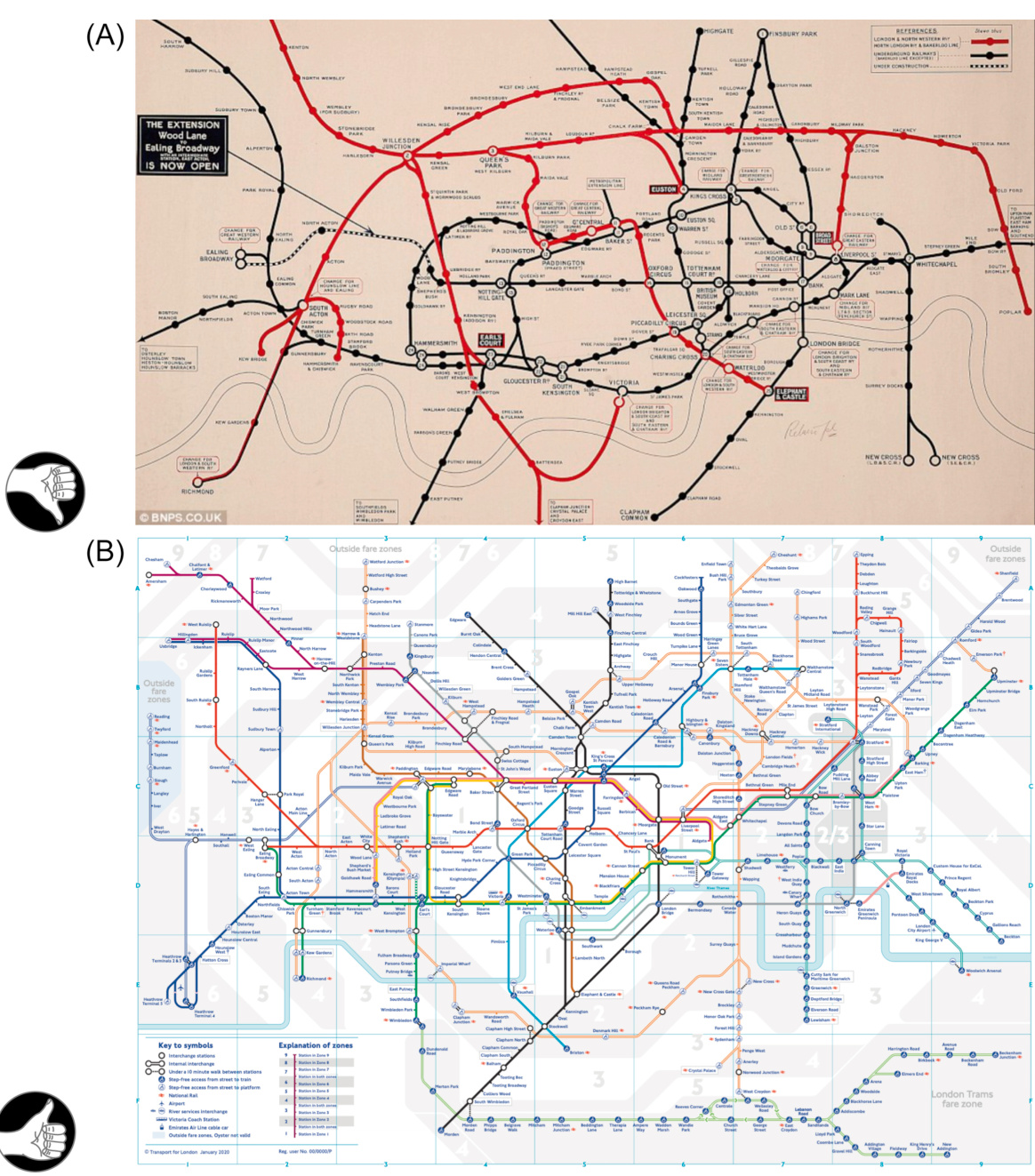
FIGURE 12.4Maps of the London underground: (A) geographic map, 1919, and (B) schematic map, 2020.
图 12.4 伦敦地铁图:(A) 地理地图,1919 年,(B) 示意图,2020 年。
A relatively simple but familiar example of data visualization is provided by schematic (i.e., nongeographic) maps of urban subway systems (see Fig. 12.4), which have largely replaced geographic subway maps over the past 100 years. Geographic location, landmarks, and even distances are of little importance on subway maps. All that people usually want to see from these maps is which subway lines go to which stations, where lines connect, and whether a given destination is near or far. Geographic maps confuse the issue by providing unnecessary information. Schematic maps make it easy to see what people want to know.
提供了一个相对简单但熟悉的例子,即城市地铁系统的示意图(即非地理图),如图 12.4 所示,在过去 100 年中,这种示意图已经基本上取代了地理地铁图。在地铁图上,地理位置、地标甚至距离都无关紧要。人们通常希望从这些地图上看到的只是哪些地铁线路通往哪些车站,线路如何连接,以及某个目的地是近还是远。地理地图通过提供不必要的信息而使问题复杂化。示意图使人们容易看到他们想要知道的内容。
FIGURE 12.5 Evolution of the web (2012). Source: Hyperakt, Vizzuality, Google Chrome team (http://www.evolutionoftheweb.com).
图 12.5 互联网的演变(2012 年)。来源:Hyperakt、Vizzuality、Google Chrome 团队(http://www.evolutionoftheweb.com)。
A more complex and interactive example of data visualization is the Gapminder application described in Chapter 2 (see Fig. 2.21). It exploits human perception of motion and several Gestalt principles to show changes in the socioeconomic status of the world’s nations and relationships between nations. It shows how nations and groups of nations have “moved” over the years along the dimensions of average life expectancy, per capita income, gross national product, etc. Another example of interactive data visualization of timevarying data is a graph depicting the evolution of the Web from 2003 to 2012 (see Fig. 12.5). It uses horizontal scrolling along a timeline rather than the animated motion of objects.
一个更复杂和交互式的数据可视化示例是第二章中描述的 Gapminder 应用程序(见图 2.21)。它利用人类对运动的感知和多种格式塔原理来展示世界各国的社会经济地位变化以及国家之间的关系。它展示了各国和各国集团在多年来的平均预期寿命、人均收入、国民生产总值等维度上的“移动”。另一个时间变化数据的交互式数据可视化的例子是从 2003 年到 2012 年展示互联网演变的图表(见图 12.5)。它使用沿时间轴的水平滚动而不是对象的动画运动。
Some of the same graphical techniques, except motion, are used in a graph showing important data visualization publications, their relative number of citations, and how they are related to each other, such as in cross-citations (see Fig. 12.6). 6 Motion isn’t needed in this visualization because the data depicts a moment in time rather than a time period.
一些相同的图形技术,除了运动,用于显示重要数据可视化出版物、它们的相对引用次数以及它们之间的关系,例如交叉引用(见图 12.6)。6 在这种可视化中不需要运动,因为数据描绘的是某个时间点而不是时间段。
FIGURE 12.6 Visualization of data viz publications, their citations, and their relationships.
图 12.6 数据可视化出版物的可视化、它们的引用次数及其关系。
An imaginative example of data visualization goes by the name of Chernoff faces, named after Herman Chernoff, who invented the idea (Tufte, 2001). Scientists, engineers, and even administrators often must analyze and categorize data in which each data point has many dimensions. A simple example: a person in a police database can be represented by his name, address, phone number, date of birth, height, weight, eye color, hair color, number of traffic citations, number of convictions, and other variables. Bank accounts can be represented by their owner’s name, a debit card number, a bank branch number, a balance, an interest rate, a minimum allowed balance, a required term of deposit, date of opening, etc. Displaying data in anything more than three dimensions is difficult, especially if scientists need to be able to see when data points form clusters or follow predictable patterns.
一个富有想象力的数据可视化例子叫做 Chernoff 脸,它以 Herman Chernoff 的名字命名,后者发明了这个想法(Tufte,2001)。科学家、工程师甚至行政人员通常必须分析和分类每个数据点具有许多维度的数据。一个简单的例子:警察数据库中的人可以由他的名字、地址、电话号码、出生日期、身高、体重、眼睛颜色、头发颜色、交通罚单数量、定罪数量和其他变量来表示。银行账户可以由其所有者的名字、借记卡号码、银行分行号码、余额、利率、最低允许余额、要求的存款期限、开户日期等来表示。在三维以上显示数据是困难的,尤其是当科学家需要能够看到数据点形成集群或遵循可预测模式时。
Chernoff realized that human faces are multidimensional: they vary in overall height, width, cheekbone height, nose length, nose width, chin width, eye distance, mouth width, ear height, ear width, ear vertical position, etc. He decided that 18 dimensions could characterize most human faces. He also knew that people are very good at recognizing human faces and differences, even slight differences, between faces. As mentioned in Chapter 9, our ability to recognize faces is hardwired; we don’t need to learn it.
切尔诺夫意识到人类面部是多维度的:它们在整体高度、宽度、颧骨高度、鼻子长度、鼻子宽度、下巴宽度、眼睛距离、嘴巴宽度、耳朵高度、耳朵宽度、耳朵垂直位置等方面都有所不同。他决定 18 个维度可以描述大多数人类面部。他还知道人们非常擅长识别人类面部和面部之间的差异,即使是微小的差异。正如第 9 章所述,我们识别面部的能力是先天形成的;我们不需要学习它。
FIGURE 12.7 Chernoff faces are a way to display multidimensional data.
图 12.7 切尔诺夫面部是一种展示多维数据的方法。
Chernoff reasoned that because human faces are multidimensional, any multidimensional data can be represented as schematic faces, thereby exploiting our built-in face-recognition ability to allow people to recognize similarities, relationships, and patterns. Chernoff faces (see Fig. 12.7) have been used to represent a wide variety of data, from planets in the solar system to financial transactions.
切尔诺夫认为,因为人类面部是多维度的,所以任何多维数据都可以表示为示意图面部,从而利用我们固有的面部识别能力,让人们能够识别相似性、关系和模式。切尔诺夫面部(见图 12.7)已被用于表示各种数据,从太阳系中的行星到金融交易。
Data visualization is a way to employ automatic visual perception processes built into system one to help system two understand complex data. For a visualization to succeed, it must present data in a way consistent with human visual capabilities and not trigger any of the visual system’s flaws (Robertson et al., 1993; Ware, 2012).
数据可视化是一种利用系统一内置的自动视觉感知过程来帮助系统二理解复杂数据的方式。为了使可视化成功,它必须以与人类视觉能力一致的方式呈现数据,并且不触发视觉系统的任何缺陷(Robertson 等人,1993 年;Ware,2012 年)。
Recent research on information visualization provides additional support for Chernoff’s use of human faces. Researchers at MIT and Harvard found that data visualizations are much more memorable if they include “human-recognizable objects,” such as pictures of people (Borkin et al., 2013).
关于信息可视化的最新研究表明,Chernoff 使用人脸的做法得到了进一步的支持。麻省理工学院和哈佛大学的研究人员发现,如果数据可视化包含“人类可识别的对象”,例如人物图片,那么这些可视化将更容易被记住(Borkin 等人,2013 年)。
Convincing and persuading: educing system one and bypassing system two
说服与劝导:利用系统一绕过系统二
Given how easily system one can be biased and even fooled, it goes almost without saying that how an interactive system presents information influences the decisions and behavior of users at least as strongly as what information it presents. If designers want to influence or persuade people to respond in a specific way—for example, buy a product, join an organization, subscribe to a service, donate to a charity, form a certain political opinion, vote a certain way—they can “exploit” the characteristics of system one to achieve that (Weinschenk, 2009; Kahneman, 2011).
鉴于系统一很容易产生偏见甚至被欺骗,几乎可以肯定的是,交互式系统如何呈现信息至少与它呈现的信息一样强烈地影响着用户的决策和行为。如果设计师想要影响或说服人们以特定方式做出反应——例如购买产品、加入组织、订阅服务、向慈善机构捐款、形成某种政治观点、以某种方式投票——他们可以“利用”系统一的特征来实现这一目标(Weinschenk,2009 年;Kahneman,2011 年)。

Advertisers and political action committees are well aware of this, and so they often design their messages to communicate with their audience’s system one (and undermine system two). One can easily distinguish amateur advertisers and neophyte political copywriters from professionals. Amateurs present rational arguments and statistics supporting their point of view, hoping to convince our system two to agree. The pros skip the statistics; they design messages based on powerful stories evoking fear, hope, satisfaction, enjoyment, sex, money, prestige, food, and more fear, thereby bypassing our system two and aiming straight at our system one (see Fig. 12.8).
广告商和政治行动委员会都清楚地知道这一点,因此他们经常设计他们的信息来与受众的系统一(并破坏系统二)沟通。人们很容易区分业余广告商和初出茅庐的政治文案撰稿人,以及专业人士。业余者提出理性的论点和统计数据来支持他们的观点,希望说服我们的系统二同意。专业人士则跳过统计数据;他们根据能够唤起恐惧、希望、满足感、愉悦感、性、金钱、声望、食物等等恐惧感的故事来设计信息,从而绕过我们的系统二,直指系统一(见图 12.8)。
Software and web designers can do the same if convincing and persuading people is their intent (Weinschenk, 2009). That has given rise to persuasive systems (Fogg, 2002), the opposite side of the coin from decision support systems. And, of course, persuasive software is a growing field of study with a name, conferences, textbooks, and —you guessed it—a Wikipedia page.
软件和网页设计师如果意图是说服和影响人们,也可以这样做(Weinschenk,2009)。这催生了说服系统(Fogg,2002),这是决策支持系统的反面。当然,说服性软件是一个正在发展的研究领域,有名字、会议、教科书,以及——你猜到了——一个维基百科页面。
Contrasting decision support and persuasive systems
对比决策支持系统与说服系统
To better see the difference between decision support systems and persuasive systems, let’s compare one of each, both of which concern charitable donations. One is CharityNavigator.org (see Fig. 12.9), which assesses and compares charitable organizations. The other is Feed My Starving Children (FMSC), one of the charities listed at CharityNavigator.org (see Fig. 12.10).
为了更好地区分决策支持系统和说服系统,让我们比较一个决策支持系统和一个说服系统,它们都与慈善捐赠有关。一个是 CharityNavigator.org(见图 12.9),它评估和比较慈善机构。另一个是喂养饥饿儿童的组织(FMSC),它是 CharityNavigator.org 列出的慈善机构之一(见图 12.10)。
CharityNavigator.org is a decision support site: it helps people decide, free of bias, which charities to support. To do this, it evaluates charities according to several criteria, such as the percentage of donations used for overhead costs, and assigns each organization an overall score, allowing people to compare the organizations.
CharityNavigator.org 是一个决策支持网站:它帮助人们无偏见地决定支持哪些慈善机构。为此,它根据几个标准评估慈善机构,例如捐赠中有多少用于管理费用,并为每个组织分配一个总分,使人们能够比较这些组织。

10 Highly Rated Charities Relying on Private Contributions
10 家高度评价的慈善机构依赖私人捐赠
打印
Mostcharitiesderivelargechunks ofrevenuefromearnedincome,membershipfees,andgovernmentcontracts and grants.Ranked by overallscore,these 10 excellent charities draw revenue solelyfrom directandindirect public support.Theyreportno governmentfunding,no membershipfees,andnorevenuefromearnedincome.Asaresult,more than
大多数慈善机构从营业收入、会员费和政府合同及拨款中获得大部分收入。按总分排名,这 10 家优秀的慈善机构仅从直接和间接的公众支持中获取收入。它们没有政府资金,没有会员费,也没有营业收入。因此,它们总收入中超过
| Overall总体 | |
| Rank Charity Score排名慈善评分 | |
| 1 Grand Teton National Park Foundation The Lustgarten Foundation for Pancreatic Cancer Research1 大提顿国家公园基金会 拉斯特加滕胰腺癌研究基金会 | 100.00 |
| 2 3 | 100.00 |
| Amigos for Christ天使基督之友 | 100.00 |
| 4 Acadia Center4 阿卡迪亚中心 | 100.00 |
| 5 Operation Second Chance二次机会行动 | 100.00 |
| 6 Sewa International, Inc塞韦国际公司 | 100.00 |
| 7 Seeds of Hope Charitable Trust希望之种慈善信托 | 100.00 |
| 8 Hope for Haiti's Children海地儿童希望 | 100.00 |
| 9 Rainforest Trust 109 雨林信托 10 | 100.00 |
| All Hands and Hearts Smart Response全手全心智能响应 | 100.00 |
FIGURE 12.9 CharityNavigator.org is a decision support website comparing charities.
图 12.9 CharityNavigator.org 是一个比较慈善机构的决策支持网站
| Top Ten Lists前十名列表 |
| CharitieswithPerfectScores获满分慈善机构 |
| 10MostFollowed Charities最受关注的十大慈善机构 |
| 10 Charities Expanding in a Hurry快速扩张的十大慈善机构 |
| 10MostFrequentlyViewed Charities最常浏览的十大慈善机构 |
| 10Celebrity-Related Charities10 与名人相关的慈善机构 |
| 10Super-Sized Charities10 超级规模的慈善机构 |
| 10Charities Overpaying their For-ProfitFundraisers10 向营利性筹款人过度支付费用的慈善机构 |
| 10Charitieswith the Most Consecutive 4-Star Ratings10 连续获得四星评级的慈善机构 |
| 10 HighlyRated Charities Relying on Private Contributions10 高分慈善机构依赖私人捐赠 |
| 10of the BestCharities Everyone's Heard Of10 个家喻户晓的最好慈善机构 |
| 10 Charities Worth Watching10 个值得关注的慈善机构 |
FIGURE 12.10 Feed my starving children (FMSC.org) is a charitable relief organization.
图 12.10 “喂饱饥饿的孩子们”(FMSC.org)是一个慈善救济组织。
In contrast, the clear goal of FMSC’s website is to persuade visitors to donate to the organization so they can provide food-aid to families around the world. Everything on the site—photographs, logos, link labels, textual descriptions, even the organization’s name —serves that goal (see Fig. 12.10). Their website is not about helping site visitors make a rational decision about whether to support FMSC versus other food-aid organizations. Decision support is neither their goal nor their responsibility. Their site exists to persuade.
相比之下,FMSC 网站的明确目标是说服访客向该组织捐款,以便他们可以向世界各地的家庭提供食品援助。网站上的所有内容——照片、标志、链接标签、文本描述,甚至该组织的名称——都是为了这个目标服务(见图 12.10)。他们的网站不是关于帮助网站访客就支持 FMSC 还是其他食品援助组织做出理性决策。决策支持既不是他们的目标,也不是他们的责任。他们的网站存在的目的是为了说服。
I am not saying decision support is good and persuasion is bad, or that CharityNavigator.org is good and FMSC.org is bad. Both organizations have worthy missions and do good work. Persuasion can be good and often is necessary. Someone might decide to donate to FMSC because their friend recommended it and they trust their friend. Furthermore, engaging system two to methodically enumerate all options and rationally compare them can be a waste of time if system one can produce an acceptable decision quickly. My only purpose in comparing the two sites is to illustrate the difference between decision support and persuasive systems.
我并不是说决策支持是好的而说服是坏的,或者 CharityNavigator.org 是好的而 FMSC.org 是坏的。这两个组织都有值得尊敬的使命,并且都在做好的工作。说服可以是好的,而且往往是必要的。有人可能会因为朋友推荐而决定向 FMSC 捐款,并且他们信任他们的朋友。此外,如果系统一可以快速做出可接受的决策,那么让系统二系统地列举所有选项并理性地比较它们可能会浪费时间。我比较这两个网站的唯一目的是说明决策支持和说服性系统的区别。
Computer security: worth the cost?
计算机安全:值得花费吗?
Setting up security (e.g., data backup and virus protection) on computers and smartphones costs time, effort, and money. Using the terms of decision theorists, the setup costs constitute a small to medium loss. People compare that small sure loss to a small chance of a large loss: losing all their data or having unauthorized people access their data. Some people buy the protection, while others decide to take the risk.
在电脑和智能手机上设置安全(例如数据备份和病毒防护)需要花费时间、精力和金钱。根据决策理论家的术语,这些设置成本构成了一小到中等的损失。人们将这个小确定的损失与一次大损失的小概率进行比较:丢失所有数据或未经授权的人访问他们的数据。有些人购买了保护措施,而其他人则决定冒险。
This situation seems to fall into the bottom-right cell of Kahneman and Tversky’s fourfold pattern: low chance of large loss. The pattern predicts that most people would take the risk-averse path and purchase backup and virus protection systems. In fact, however, many people practice denial and don’t bother purchasing protection, and as a result occasionally suffer big losses. Recent surveys found that:
这种情况似乎属于卡尼曼和特沃斯基的四重模式中的右下角:低概率的大损失。该模式预测大多数人会选择风险规避的路径,购买备份和病毒防护系统。然而事实上,许多人采取了否认的态度,没有购买保护措施,结果偶尔遭受重大损失。最近的调查发现:
• Between
• 在美国消费者中,有
• Of personal computer users,
• 在个人电脑用户中,有
• Of PCs worldwide,
在全球的个人电脑中,
These findings prompt two sets of questions, one for researchers and one for designers. The question for researchers concerns the apparent deviation from Kahneman and Tversky’s prediction that people are risk-averse and pay extra for protection when they face a small chance of a large loss. The relatively low percentage of PCs with no virus protection
这些发现引出了两个问题,一个针对研究人员,一个针对设计人员。研究人员的问题涉及卡尼曼和特沃斯基的预测,即人们是风险规避的,并在面对小概率的大损失时愿意支付额外的保护费用。没有病毒防护的电脑相对较低百分比
Why do so many people not back up their data when the fourfold pattern seems to predict that most people will? How reliable are the surveys that have been conducted? Is the variability in this case related to variability in people’s willingness to gamble in casinos, buy lottery tickets (bottom left cell in Table 12.1), ride motorcycles without helmets, install smoke alarms, or fail to purchase insurance or extended product warranties? Knowing the answers to these questions would provide guidance for designers seeking to increase the use of computer security.
为什么这么多人不备份他们的数据,而四重模式似乎预示着大多数人会这样做呢?进行过的调查的可靠性如何?这种情况下的可变性是否与人们在赌场赌博、购买彩票(表 12.1 左下角单元格)、不戴头盔骑摩托车、安装烟雾报警器或购买保险或延长产品保修的意愿的可变性有关?了解这些问题的答案将为寻求提高计算机安全使用率的设计师提供指导。
For designers, the question is, “How can we design computer and smartphone security (data backup, virus protection, etc.) to get more people to use it?” One way is obvious: reduce the costs of money, time, and effort. Make computer security inexpensive, simple and quick to set up, and easy to use, and more people will use it. For nearly everyone to use it, it would need to be as inexpensive and easy to set up and use as a toaster.
对于设计师来说,问题是如何设计计算机和智能手机安全(数据备份、病毒防护等),以让更多人使用它?一个明显的方法是降低金钱、时间和精力的成本。使计算机安全变得便宜、设置简单快捷、易于使用,这样就会有更多的人使用它。要让几乎每个人都使用它,它需要像烤面包机一样便宜、易于设置和使用。
Many companies have tried to simplify backup, and most claim that their backup products and services are easy to set up and use. But the
许多公司都试图简化备份,并且大多数声称他们的备份产品和服务易于设置和使用。但是这里提到的
Another answer for designers is less obvious: since people are influenced more by coherent stories than by statistics, companies offering backup and antivirus software should focus less on quoting statistics and instead share stories about how people lost their data or had their computers infected by viruses, or better—how they recovered their data and avoided viruses.
另一个对设计者的答案是:由于人们更容易受到连贯故事的影响而不是统计数据的影响,提供备份和杀毒软件的公司应该少引用统计数据,而是分享人们如何丢失数据或电脑如何感染病毒的故事,或者更好的——如何恢复数据并避免病毒。
Important Takeaways • Human decision-making is strongly biased by unconscious mental processes (system one) that sometimes produce good outcomes quickly but sometimes cause us to make irrational choices. Our rational mind (system two) rarely intervenes. • Fear of loss influences human decisions more than expectation of gains. This bias affects people’s choices in risky situations, like whether to buy insurance, accept lawsuit settlements, gamble, or skydive. Psychologists Kahneman and Tversky conducted experiments demonstrating the pervasiveness and strength of this bias. • Framing—how a choice is worded—affects how people choose. People prefer a sure thing over a gamble when options are worded as gains, and gambles over sure things when the identical options are worded as losses. This bias makes people susceptible to anchoring: a mind trick where someone sets your expectations to a certain level, then shows you either how to improve your outcome or how to avoid a worse outcome. • People are biased toward options that are easier to recall or envision. A close relative’s experience with a product influences our willingness to buy it much more than reading statistics or online reviews about the product. • Our past decisions bias our future ones, because people try to behave consistently. Therefore, people tend to stay with what is familiar, stick with losing causes longer than they should, and like things better if they put more effort into getting them. • Emotions are critical to decision-making. Without an emotional response of some sort, it is difficult to make decisions. • Designing to exploit strengths and weaknesses of human decision-making:
重要启示 • 人类决策深受无意识心理过程(系统一)的强烈影响,这些过程有时能快速带来良好结果,但有时会导致我们做出非理性选择。我们的理性思维(系统二)很少介入。 • 对损失的恐惧比期望收益更能影响人类决策。这种偏见影响人们在风险情境中的选择,例如是否购买保险、接受诉讼和解、赌博或跳伞。心理学家卡尼曼和特沃斯基通过实验证明了这种偏见的普遍性和强度。 • 框架效应——即选择的措辞方式——会影响人们的决策。当选项以收益方式措辞时,人们更倾向于选择确定的事物;而当相同的选项以损失方式措辞时,人们更倾向于选择赌博。这种偏见使人们容易受到锚定效应的影响:有人将你的期望设定在某个水平,然后向你展示如何改善结果或如何避免更坏的结果。 • 人们倾向于更容易回忆或想象到的选项。 亲人使用产品的经历比阅读关于产品的统计数据或在线评论更能影响我们购买的意愿。 • 我们过去的决定会影响未来的决定,因为人们试图保持一致性。因此,人们倾向于坚持熟悉的事物,比应该的更长时间坚持失败的事业,并且如果他们为得到某物付出了更多努力,就会更喜欢它。 • 情绪对决策至关重要。如果没有某种情绪反应,就很难做出决定。 • 利用人类决策的优缺点进行设计:
• Support rational decision-making: Help system two override or co-opt system one by providing all options, showing alternatives, providing unbiased data, performing calculations for users rather than forcing them to calculate, and checking the assumptions underlying the reasoning.
• 支持理性决策:通过提供所有选项、展示替代方案、提供无偏数据、为用户执行计算而不是强迫他们计算,以及检查推理所依据的假设,帮助系统二覆盖或同化系统一。
• Make AI-based systems more transparent.
• 使基于 AI 的系统更加透明。
• Use data visualization to harness system one to support system two.
• 使用数据可视化来利用系统一支持系统二。
• Use persuasion ethically. Don’t influence people to do what is contrary to their own interests.
• 要合乎道德地运用说服力。不要影响人们去做违背他们自身利益的事情。
1System Two is also a source of individual differences. Some people have a more proactive System Two than others (Kahneman, 2011; Eagleman, 2012, 2015).
2 系统二也是个体差异的一个来源。有些人比其他人拥有更主动的系统二(卡尼曼,2011 年;伊格尔曼,2012 年,2015 年)。
2The expected value of a bet is the amount you can win multiplied by the probability of winning—in this case \100\times0.5=950.$ . It is what you can expect to win each time, on average, if you bet many times.
2 投注的期望值是你能赢的钱乘以获胜的概率——在这种情况下 100×0.5=950.$。这是如果你多次下注,每次平均可以期望赢的钱。
3According to preliminary assessments by National Transportation Safety Board (NTSB) officials.
3 根据国家运输安全委员会(NTSB)官员的初步评估。
4See Chapter 11, section on conceptual models.
4参见第 11 章关于概念模型的部分。
5Some researchers prefer the term “information visualization” or “info viz” for short.
5一些研究人员更喜欢使用“信息可视化”或简称“info viz”。
6More data-viz examples at:
6 更多数据可视化示例请访问:
http://www.webdesignerdepot.com/2009/06/50-great-examples-ofdata-visualization.
Chapter 13: Our Hand–Eye CoordinationFollows Laws
第 13 章:我们的手眼协调遵循规律
Abstract
摘要
This chapter describes Fitts’ law and the steering law, which govern human pointing behavior for all known types of pointing devices, including fingers on touch screens. It also discusses the implications of these two laws for user-interface design.
本章介绍了菲茨定律和转向定律,它们支配着所有已知类型的指点设备(包括触摸屏上的手指)的人指点行为。它还讨论了这两个定律对用户界面设计的意义。
Keywords
关键词
Buttons; Fine motor control; Fitts’ law; Links; Pie menu; Pointing; Pointing devices; Pop-up menu; Pull-down menu; Pull-right menu; Steering law; Walking menu
按钮和链接;精细运动控制;菲茨定律;链接;饼状菜单;指向;指向设备;弹出菜单;下拉菜单;右拉菜单;转向定律;步行菜单
Have you ever had trouble hitting a tiny button or link on a computer screen or smartphone, or trouble keeping a screen-pointer inside a narrow path required to reach a menu item or link?
你是否曾经因为电脑屏幕或智能手机上的按钮或链接太小而难以点击,或者因为需要保持在狭窄的路径中以到达菜单项或链接而难以控制屏幕指针?
Perhaps your hand was jittery because you had recently consumed too much coffee or taken a medication. Maybe it was shaking due to high anxiety, anger, or fear. Maybe you have Parkinson’s disease, which makes your hands shake, or arthritis in your hands and arms that restricts your hand movement. Maybe your arm was restricted because it was temporarily in a cast or sling. Maybe you were trying to text someone while riding on a bumpy bus, train, or horse. Maybe you were using an unfamiliar pointing device. Or maybe the target was simply too small or the allowed path too narrow.
也许你的手在颤抖是因为你最近喝太多咖啡或服用了药物。也许是因为高度焦虑、愤怒或恐惧而颤抖。也许你患有帕金森病,这会使你的手颤抖,或者你的手和手臂患有关节炎,这会限制你的手部运动。也许你的手臂被暂时固定在石膏或吊带上。也许你在颠簸的公共汽车、火车或马背上尝试发短信。也许你正在使用一个不熟悉的指向设备。或者目标太小或允许的路径太窄。
It turns out that pointing at objects on a display and moving pointers along constrained paths follow consistent, quantitative laws.
结果表明,在显示器上指向物体和沿着约束路径移动指针遵循一致、定量的定律。
Fitts’ Law: Pointing at Displayed Targets
菲茨定律:指向显示目标
The law for pointing at targets is called Fitts’ law, named after the man who discovered it, Paul Fitts 1 (Fitts, 1954; Card etal., 1983). This law says that the larger your target on a screen and the nearer it is to your starting point, the faster you can point to it, the less mental effort required, and the more likely you are to hit the target. The formula for Fitts’ law allows you to predict the time for a person to move a pointer—including a finger—to a target a specified size and distance from the pointer’s starting point.
指向目标的定律称为菲茨定律,以发现该定律的保罗·菲茨命名(菲茨,1954 年;卡德等人,1983 年)。该定律指出,屏幕上的目标越大,离起始点越近,指向它的速度就越快,需要的心理努力就越少,击中目标的可能性就越大。菲茨定律的公式允许你预测一个人将指针(包括手指)移动到距离指针起始点特定大小和距离的目标所需的时间。
Fitts’ law is quite general. It applies to any type of pointing: mouse, trackball, track pad, joystick, even fingers on touch screens. It also applies to everyone regardless of age, physical abilities, or mental state. But people vary in how fast they can move, and devices vary in how fast they can be moved, so the formula includes the parameters
Fitts 定律相当普遍。它适用于任何类型的指向:鼠标、轨迹球、轨迹板、操纵杆,甚至触摸屏上的手指。它也适用于所有人,无论年龄、身体能力或精神状态如何。但人们的移动速度不同,设备的移动速度也不同,因此公式包括参数
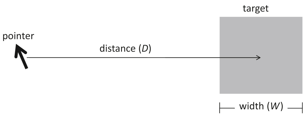
FIGURE 13.1Fitts’ law: pointing time depends on distance (
图 13.1 Fitts 定律:指向时间取决于距离(
The dependency of pointing time on target size and distance codified in Fitts’ law can be understood by considering how screenpointers move. A person sees a target on a screen and decides to hit it. Hands and pointing devices have inertia, so movement toward the target starts slowly but rapidly accelerates until reaching some maximum speed. This initial movement is fairly gross; it is essentially a shot in the general direction of the target without much control. We call the initial shot ballistic, like a shell fired from a cannon. As the pointer nears the target, the movement speed slows as the person’s hand–eye feedback loops take control. The movement ends slowly, with finer and finer corrections, until the pointer is on the target (see Fig. 13.2).
Fitts 定律中指向时间对目标大小和距离的依赖性可以通过考虑屏幕指针的移动来理解。一个人看到屏幕上的目标并决定击中它。手和指向设备具有惯性,所以向目标移动开始时缓慢,但迅速加速直到达到某个最大速度。这种初始移动相当粗略;它基本上是朝着目标方向的一般射击,几乎没有控制。我们称这种初始射击为弹道式,就像从大炮发射的炮弹。当指针接近目标时,运动速度减慢,因为人的手眼反馈回路开始起作用。运动以越来越精细的修正缓慢结束,直到指针位于目标上(见图 13.2)。
Although the basic prediction of Fitts’ law—people hit on-screen targets faster the closer and larger they are—seems pretty intuitive, the law also predicts something less intuitive: the more the distance decreases or the target grows, the less the decrease in pointing time. If a target is tiny and you double its size, the time people take to hit it decreases, but if you double the size again, the pointing time doesn’t improve quite as much. So beyond a certain size, making a target even larger provides little added benefit (see Fig. 13.3), and below a certain distance, moving a target even closer doesn’t help much.
尽管菲茨定律的基本预测——人们点击屏幕上的目标速度越快,目标越近越大——看起来很直观,但该定律还预测了一些不太直观的东西:距离减少得越多或目标越大,指向时间的减少就越少。如果一个目标非常小,将其尺寸加倍,人们点击它所需的时间会减少,但如果再次将其尺寸加倍,指向时间并不会得到那么大的改善。因此,超过一定尺寸后,使目标更大几乎不会带来额外的益处(见图 13.3),而在一定距离以下,即使将目标移得更近也几乎没什么帮助。
A final noteworthy prediction of Fitts’ law is that if the pointer or finger is blocked from moving past the edge of the screen, targets at the edge will be very easy to hit. People can just yank the pointer toward the target until the edge stops it with no need for slow, fine adjustments at the end of the movement. Thus, from the point of view of Fitts’ law, targets at the screen’s edge behave as if they were much larger than they actually are. However, this edge-pointing detail of the law applies mainly to desktop and laptop computers, because modern smartphones and tablet computers don’t have raised edges that physically stop fingers.
Fitts 定律的一个最终值得注意的预测是,如果指针或手指被阻止移过屏幕边缘,边缘处的目标将非常容易击中。人们只需将指针猛地推向目标,直到边缘阻止它,无需在运动结束时进行缓慢、精细的调整。因此,从 Fitts 定律的角度来看,屏幕边缘的目标表现得好像比它们实际的大小要大得多。然而,这条定律的边缘指向细节主要适用于台式机和笔记本电脑,因为现代智能手机和平板电脑没有物理上阻止手指的凸起边缘。
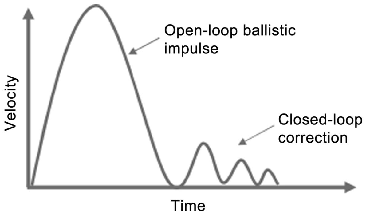
FIGURE 13.2Graph of velocity over time as pointer moves to target. Courtesy of Andy Cockburn.
图 13.2 指针移动到目标时的速度随时间变化的图。版权所有:Andy Cockburn。
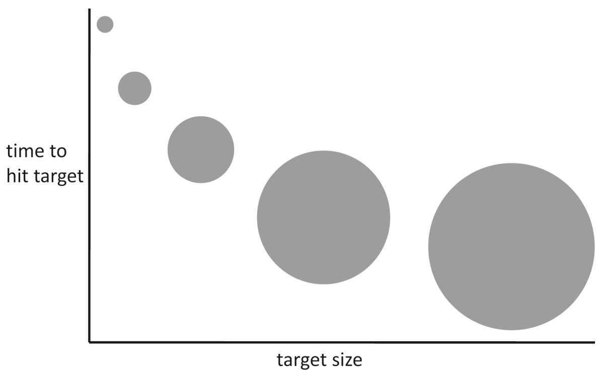
FIGURE 13.3 Diminishing marginal benefit of increasing click-target size (if
图 13.3 增加点击目标大小所带来的边际效益递减(如果
Design implications of Fitts’ law
菲茨定律的设计启示
Fitts’ law is the basis of several common user-interface design guidelines:
Fitts 定律是几个常见的用户界面设计指南的基础:
• Make click-targets—graphical buttons, menu items, links— big enough that they are quick and easy for people to hit. Don’t make people tap or click on tiny targets. That will slow everyone down and cause some to miss their target. An example of click-targets that are too small is provided by United.com’s boarding pass delivery option page (see Fig. 13.4). To choose an option, users must click directly on the tiny checkboxes in United.com’s boarding pass delivery option page. The circled symbols and text labels near the checkboxes do not accept clicks. Making them accept clicks would not be difficult and would greatly increase the effective size of the click-targets. See Johnson and Finn (2017) for guidelines on how large a click-target or tap-target must be to be reliably clickable by people of all ages and in all situations.
• 制作点击目标——图形按钮、菜单项、链接——要足够大,以便人们可以快速轻松地点击。不要让人们点击微小的目标。这会减慢每个人的速度,并导致一些人错过目标。联合航空公司的登机牌交付选项页面就是一个点击目标过小的例子(见图 13.4)。要选择一个选项,用户必须直接点击联合航空公司登机牌交付选项页面上的微小的复选框。复选框附近的圆圈符号和文本标签不接受点击。让它们接受点击不会太难,并且可以大大增加点击目标的实际大小。有关点击目标或触摸目标必须有多大才能被所有年龄段和所有情况下的人们可靠点击的指南,请参见约翰逊和芬恩(2017)。

FIGURE 13.4Users must click on tiny checkboxes on United.com’s boarding pass delivery option page; the symbols and text labels near the checkboxes do not accept clicks.
图 13.4 用户必须在联合航空公司的登机牌交付选项页面上点击微小的复选框;复选框附近的符号和文本标签不接受点击。
• Make the actual click-target at least as large as the visible clicktarget. Above all, don’t frustrate users by presenting big buttons that only accept clicks on a small area (e.g., the text label), as the Federal Reserve Bank did in the navigation buttons on its 2016 website (see Fig. 13.5A). Accept clicks over at least the entire area of the visible click-target, as the improved 2019 Federal Reserve Bank website did (see Fig. 13.5B). If the visible target must be small (e.g., a small word embedded in text), design the user interface to treat clicks near the link as if they were on it.
• 确保实际的点击目标至少与可见的点击目标一样大。最重要的是,不要通过提供仅接受点击在小区域(例如,文本标签)上的大按钮来让用户感到沮丧,就像联邦储备银行在其 2016 年网站上的导航按钮那样(见图 13.5A)。应接受至少覆盖可见点击目标整个区域的点击,就像改进后的 2019 年联邦储备银行网站那样(见图 13.5B)。如果可见目标必须很小(例如,嵌入在文本中的小字),请设计用户界面,将靠近链接的点击视为点击在链接上。
• Checkboxes, radio buttons, and toggle switches should accept clicks on their labels as well as on the buttons, thereby increasing the clickable area.
• 复选框、单选按钮和切换开关应接受点击在其标签上,以及点击在按钮上,从而增加可点击区域。
• Leave plenty of space between buttons and links so people don’t have trouble hitting the intended one.
• 在按钮和链接之间留出足够的空间,以便人们不会难以点击到预期的目标。
• Place important targets near the edge of the screen to make them very easy to hit.
• 将重要的目标放置在屏幕边缘附近,使其非常容易点击。
• Display choices in pop-up and pie menus if possible (see Fig. 13.6). They are faster to use than pull-down menus, on
• 如果可能,在弹出菜单和饼形菜单中显示选项(见图 13.6)。它们比下拉菜单更快使用,
average, because they open “around” the screen pointer rather than below it, so users need to move the pointer less to reach most of the items. However, even pull-down menus are faster than pull-right (“walking”) menus. • For smartphone apps, consider using menus that people can reach easily with a thumb when holding the phone normally (see Fig. 13.7).
平均,因为它们在屏幕指针“周围”打开而不是在它下面,所以用户需要移动指针更少才能到达大多数项目。然而,即使是下拉菜单也比右拉(“行走”)菜单更快。• 对于智能手机应用程序,请考虑使用在正常握持手机时拇指可以轻松到达的菜单(见图 13.7)。
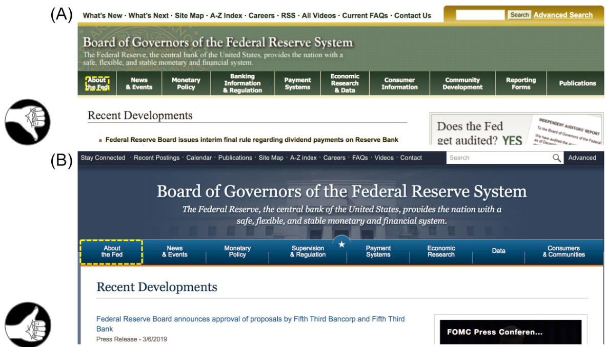
FIGURE 13.5 (A) In 2016, the FederalReserve.gov website’s navigation-bar “buttons” accepted clicks only on the label. (B) In 2019, its updated website accepted clicks anywhere in each link’s rectangle.
图 13.5 (A) 2016 年,FederalReserve.gov 网站的导航栏“按钮”仅在标签上接受点击。(B) 2019 年,其更新后的网站在每个链接的矩形区域内接受点击。
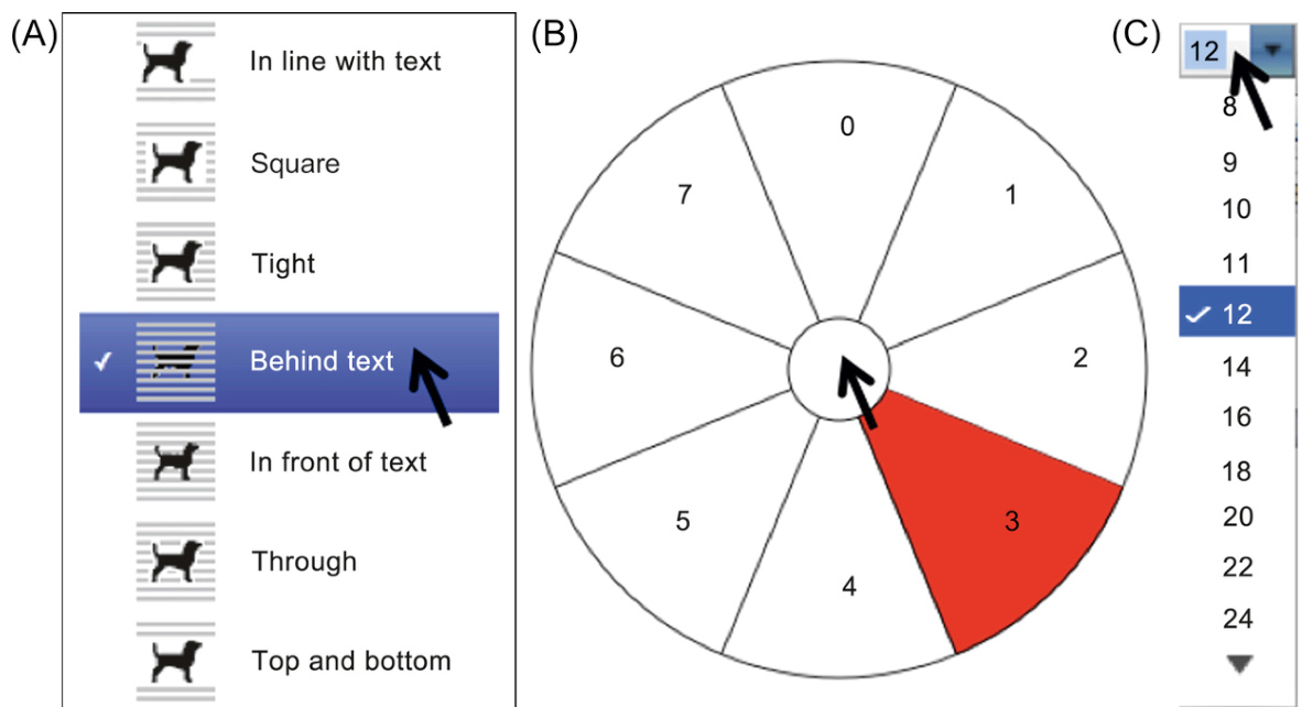
FIGURE 13.6 Types of menus for desktop/laptop computers: (A) pop-up menu, (B) pie menu, and (C) pull-down menu.
图 13.6 台式机/笔记本电脑的菜单类型:(A) 弹出菜单,(B) 饼状菜单,(C) 下拉菜单。
FIGURE 13.7For mobile phones, menus can be designed so the options are easily reachable with the thumb.
图 13.7 对于手机,菜单可以设计得便于用拇指轻松操作。
Source: Bob Burrough; used with permission.
Bob Burrough; 已获授权使用。
Steering Law: Moving Pointers Along Constrained Paths
驾驶定律:沿约束路径移动指针
A law derived from Fitts’ law governs the time it takes to steer a screen-pointer along a constrained path to a target. Appropriately, it is named the steering law (Accot and Zhai, 1997). It says that if you must keep a pointer within a certain confined path while moving it to a target, then the wider the path, the faster you can move the pointer to the target (see Fig. 13.8). Its formula is simpler than that of Fitts’ law:
一条源于菲茨定律的法则决定了沿着约束路径将屏幕指针引导至目标所需的时间。相应地,它被称为转向定律(Accot 和 Zhai,1997 年)。该定律指出,如果你在将指针移动到目标时必须将其保持在一定的受限路径内,那么路径越宽,你就可以越快地将指针移动到目标(见图 13.8)。它的公式比菲茨定律的公式更简单:
Like Fitts’ law, the steering law seems like common sense: a wider path means you need not move the pointer carefully; you can move it ballistically—that is, fast.
像菲茨定律一样,转向定律似乎很符合常识:路径更宽意味着你不需要小心移动指针;你可以以弹道方式移动它——也就是说,快速。
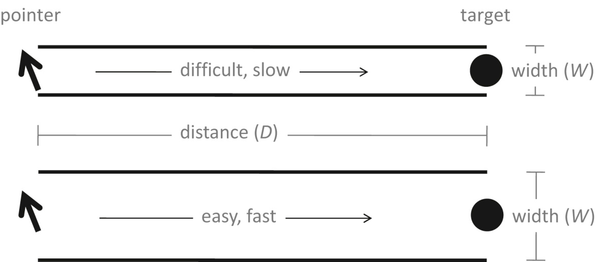
FIGURE 13.8 Steering law: pointing time depends on distance
图 13.8 转向法则:指向时间取决于路径的距离
Design implications of the steering law
转向法的启示
Anyone who has used devices that have point-and-click or touchscreen user interfaces can probably think of situations where they had to steer the screen-pointer or their finger along a constrained path. Those are situations in which the steering law applies. The following are two examples:
任何使用过具有点击或触摸屏用户界面的设备的人可能都能想到一些必须沿着约束路径引导屏幕指针或手指的情况。这些就是转向法则适用的情形。以下是两个例子:
• Pull-right menus (also called “walking” menus) where you must keep the pointer within a menu item as you move it sideways to a submenu; otherwise, the menu switches to the item above or below. The narrower each menu item is, the slower the menu will be to use.
• 向右拉菜单(也称为“行走”菜单),在其中你必须保持指针在菜单项内,同时将其水平移动到子菜单;否则,菜单会切换到上面的项目或下面的项目。每个菜单项越窄,使用菜单就越慢。
• Page rulers (e.g., for setting tabs) where you must keep the pointer within the ruler as you drag a tab to a new location; otherwise, the tab doesn’t move (as in recent versions of Microsoft Word). The narrower the ruler, the slower your movement.
• 页面标尺(例如,用于设置制表符),在其中你必须保持指针在标尺内,同时将制表符拖动到新位置;否则,制表符不会移动(如在 Microsoft Word 的较新版本中)。标尺越窄,移动就越慢。
Pull-right menus are fairly common in software applications. For example, Apple’s Safari browser uses them (see Fig. 13.9). Some software applications, such as DataTaker’s DataLogger product (see Fig. 13.10), have pull-right menus going out to several levels.
右拉菜单在软件应用程序中相当常见。例如,苹果的 Safari 浏览器就使用它们(见图 13.9)。一些软件应用程序,如 DataTaker 的 DataLogger 产品(见图 13.10),有扩展到多个级别的右拉菜单。
To see how widening pointer-movement paths can speed the use of pull-right menus, compare the former and current websites of RoadScholar.org, a travel website aimed at older adult travelers. In mid-2012, a usability test of the website showed that people in the site’s target age group had trouble choosing travel destinations using the site’s pull-right menus (Finn and Johnson, 2013). By early 2013, the site’s designers had widened the menu items significantly, making it easier and faster for users to choose travel destinations that interested them (see Fig. 13.11). That’s the steering law at work.
要了解如何通过加宽指针移动路径来加快右拉菜单的使用,可以比较旅游网站 RoadScholar.org 的前网站和当前网站。2012 年年中,一项关于该网站的可用性测试显示,该网站目标年龄组的人们在使用右拉菜单选择旅行目的地时遇到了困难(芬恩和约翰逊,2013 年)。到 2013 年初,该网站的设计师显著加宽了菜单项,使用户更容易、更快地选择他们感兴趣的旅行目的地(见图 13.11)。这就是转向定律在起作用。
Once upon a time, scrollbars in graphical user interfaces (GUIs) were constrained paths—you had to keep the pointer within the narrow vertical or horizontal scrollbar as you dragged the “elevator” along; otherwise, you lost control of the scrollbar. GUI designers soon realized that this made scrollbars slow, tedious, and errorprone to use, so they eliminated the constraint. Modern scrollbars allow you to move the pointer outside of the bar while you drag the “elevator.” They track motion in the direction of the scrollbar only and ignore any perpendicular motion. This change effectively made the constrained path as wide as the entire screen, greatly speeding scrollbar operation and eliminating a source of errors. Another case of the steering law at work.
从前,图形用户界面(GUI)中的滚动条是受限的路径——你必须将指针保持在狭窄的垂直或水平滚动条内,同时拖动“电梯”;否则,你会失去对滚动条的控制。GUI 设计师很快意识到这使滚动条变得缓慢、繁琐且容易出错,因此他们消除了这种限制。现代滚动条允许你在拖动“电梯”时将指针移出条外。它们仅跟踪滚动条方向的运动,而忽略任何垂直方向的运动。这一改变使受限路径的宽度变为整个屏幕,大大提高了滚动条的操作速度,并消除了一个错误来源。这是转向定律的另一个应用案例。
FIGURE 13.9 Pull-right menus in Apple’s Safari browser.
图 13.9 苹果 Safari 浏览器中的右拉菜单。
FIGURE 13.10 Pull-right menus in DataTaker’s DataLogger application.
图 13.10 DataTaker DataLogger 应用程序中的右拉菜单。
FIGURE 13.11 RoadScholar.org travel website: (A) in 2012, narrow menu items, and (B) in 2013, wider items.
图 13.11 RoadScholar.org 旅行网站:(A)2012 年,狭窄的菜单项,以及(B)2013 年,更宽的项。
Important Takeaways
重要结论
• The time it takes for a person to move any type of pointer to a specified target can be predicted by a formula called Fitts’ law:
• 一个人移动任何类型的指针到指定目标所需的时间可以通过一个称为菲茨定律的公式来预测:
•
•
•
•
•
•
• Design implications of Fitts’ law: • Make click-targets big. • Make the actual click-target at least as large as the visible click-target.
• Fitts 定律的设计启示: • 使点击目标足够大。 • 实际点击目标的大小至少应与可见点击目标一样大。
• UI controls should accept clicks on their labels as well as on the visible controls.
• UI 控件应接受在标签上的点击,以及在接受在可见控件上的点击。
• Leave plenty of space between controls so people don’t hit the wrong one.
• 在控件之间留出足够的空间,以免人们误击。
• Place important targets near the edge of the screen.
• 将重要目标放置在屏幕的边缘附近。
• On smartphones, design menus so people can easily choose items with their thumb.
• 在智能手机上,设计菜单以便人们可以用拇指轻松选择项目。
• The time it takes to move a pointer along a constrained path can be predicted by a formula called the steering law:
• 指针沿约束路径移动所需的时间可以通过一个称为转向定律的公式来预测:
• Design implications of the steering law: • UI controls that require the user to keep the pointer in a narrow path while moving it will be slow and errorprone to use. Don’t require users to move a pointer within a narrow area toward a target.
• 转向定律的设计启示:• 要求用户在移动指针时将其保持在狭窄路径中的 UI 控件将使用缓慢且容易出错。不要要求用户在狭窄区域内移动指针以指向目标。
Chapter 14: We Have Time Requirements
第 14 章:我们有时间要求
Abstract
摘要
This chapter describes the many time constants of human perception and behavior. Based on those time constants, it also provides guidelines and real-time deadlines that interactive systems must meet to synchronize well with human users as well as examples of user-interface designs that do and don't match those time constants and deadlines.
本章描述了人类感知和行为中的许多时间常数。基于这些时间常数,它还提供了交互式系统必须满足的指南和实时截止时间,以便与人类用户良好同步,以及符合和不符合这些时间常数和截止时间的用户界面设计示例。
Keywords
关键词
Auditory fusion; Deadlines; Duration; Flinch reflex; Perception; Perceptual locking; Responsiveness; Subsidizing; Time; Time constants; Unit task; Visual fusion
听觉融合;截止时间;持续时间;惊跳反射;感知;感知锁定;反应性;补贴;时间;时间常数;单位任务;视觉融合
Events in the world take time to play out. Perceiving objects and events also takes time, as does remembering perceived events, thinking about past and future events, learning from events, acting on plans, and reacting to perceived and remembered events. How much time? And how does knowing the duration of perceptual and cognitive processes help us design interactive systems?
世界上发生的事件需要时间来展开。感知物体和事件也需要时间,记住感知到的事件、思考过去和未来的事件、从事件中学习、根据计划行动以及对这些感知和记忆的事件做出反应也是如此。需要多少时间?以及了解感知和认知过程的持续时间如何帮助我们设计交互式系统?
This chapter answers those questions. It presents the durations of perceptual and cognitive processes and based on those provides real-time deadlines that interactive systems must meet to synchronize well with human users. Interactive systems that don’t synchronize well with users’ time requirements are (1) less effective and (2) perceived by users as unresponsive.
本章将回答这些问题。它介绍了感知和认知过程的持续时间,并基于这些持续时间提供了交互式系统必须满足的实时截止时间,以与人类用户良好同步。与用户时间要求同步不佳的交互式系统会(1)效率较低,并且(2)被用户感知为无响应。
Issue (2), perceived responsiveness, may seem less important than effectiveness, but in fact it is more important. Over the past 5 decades, researchers have found consistently that an interactive system’s responsiveness—its ability to keep up with users, keep them informed about its status, and not make them wait unexpectedly—is a very important factor in determining user satisfaction. 1 This has been repeatedly confirmed by research conducted over many decades (Miller, 1968; Thadhani, 1981; Barber and Lucas, 1983; Carroll and Rosson, 1984; Shneiderman, 1984; Lambert, 1984; Rushinek and Rushinek, 1986; Hoxmeier and DiCesare, 2000; Nah, 2004). Prominent software design experts also recommend ensuring that apps and websites respond quickly enough to meet human time requirements (Nielsen, 1993, 1997, 2010, 2014; Isakson, 2013; Heusser, 2019).
问题(2),感知响应性,可能看起来不如有效性重要,但实际上它更为重要。在过去的半个世纪里,研究人员一直发现交互系统的响应性——即其跟上用户、告知用户状态、不让他们意外等待的能力——是决定用户满意度的一个非常重要的因素。1 这已被几十年来进行的研究反复证实(Miller,1968;Thadhani,1981;Barber 和 Lucas,1983;Carroll 和 Rosson,1984;Shneiderman,1984;Lambert,1984;Rushinek 和 Rushinek,1986;Hoxmeier 和 DiCesare,2000;Nah,2004)。著名的软件设计专家也建议确保应用程序和网站能够快速响应以满足人类的时间要求(Nielsen,1993,1997,2010,2014;Isakson,2013;Heusser,2019)。
This chapter first defines responsiveness. It then enumerates important time constants of human perception and cognition. It ends with real-time guidelines for interactive system design, including examples.
本章首先定义了响应性。然后列举了人类感知和认知的重要时间常数。最后提供了交互系统设计的实时指南,包括示例。
Responsiveness Defined
响应性定义
Responsiveness is related to performance but is different. Performance is measured in terms of computations per unit of time. Responsiveness is measured in terms of compliance with human time requirements and user satisfaction.
响应性与性能相关,但有所不同。性能是以单位时间内完成的计算量来衡量的。响应性则是以符合人类时间要求和用户满意度来衡量的。
Interactive systems can be responsive despite low performance. If you call a friend to ask a question, she can be responsive even if she can’t answer your question immediately: she can acknowledge the question and promise to call back. She can be even more responsive by saying when she will call back.
交互式系统即使性能较低也可以是响应式的。如果你打电话给朋友问问题,即使她不能立即回答,她也可以是响应式的:她可以确认收到问题并承诺回电。她甚至可以通过说何时回电来更加响应式。
Responsive systems keep a user informed even if they cannot fulfill the user’s requests immediately. They provide feedback about what the user has done and what is happening, and they prioritize the feedback based on human perceptual, motor, and cognitive deadlines (Duis and Johnson, 1990). Specifically, they:
响应式系统即使不能立即满足用户请求,也会让用户保持知情。它们提供关于用户已做操作和正在发生的事情的反馈,并根据人类的感知、运动和认知截止时间来优先处理反馈(Duis 和 Johnson,1990)。具体来说,它们:
• let you know immediately that your input was received;
• 立即通知你输入已被收到;
• provide some indication of how long operations will take (see Fig. 14.1);
• 提供一些关于操作将花费多长时间的指示(见图 14.1);
• free you to do other things while waiting;
• 在等待时让你可以去做其他事情;
• manage queued events intelligently;
• 智能地管理排队事件;
perform housekeeping and low-priority tasks in the background;
在后台执行维护和低优先级任务;
anticipate your most common requests.
预见你最常见的需求。
Software can have poor responsiveness even if it is fast. Even if a camera repairman is very fast at fixing cameras, he is unresponsive if you walk into his shop and he ignores you until he finishes working on another camera. He is unresponsive if you hand him your camera and he silently walks away without saying whether he is going to fix it now or go to lunch. Even if he starts working on your camera immediately, he is unresponsive if he doesn’t tell you whether fixing it will take 5 minutes, 5 hours, 5 days, or 5 weeks.
即使软件运行速度快,也可能响应不佳。即使相机修理师修理相机非常快,如果你走进他的店铺,他直到完成另一台相机的修理才理睬你,他就是不响应。如果你把相机交给他,他默默地走开,不告诉你是否现在要修理它还是去吃午饭,他也是不响应。即使他立即开始修理你的相机,如果他不告诉你修理它需要 5 分钟、5 小时、5 天还是 5 周,他也是不响应。
Systems that display poor responsiveness do not meet human time deadlines. They don’t keep up with users. They don’t provide timely feedback for user actions, so users are unsure of what they have done or what the system is doing. They make users wait at unpredictable times and for unpredictable periods. They limit users’ work pace—sometimes severely. Here are some specific examples of poor responsiveness:
响应性差的系统无法满足人类的时限要求。它们跟不上用户。它们不为用户操作提供及时的反馈,因此用户不确定他们已经做了什么或系统正在做什么。它们让用户在不确定的时间和时间段内等待。它们限制用户的工作速度——有时非常严重。这里有一些响应性差的特定例子:

FIGURE 14.1MacOS X file transfer: good progress indicator, useful time estimate, and cancel button.
图 14.1 MacOS X 文件传输:良好的进度指示器、有用的时间估计和取消按钮。
FIGURE 14.2No progress bar (just a busy bar) and no cancel for (A) macOS X and (B) iMovie.
图 14.2 没有进度条(只有忙碌条)并且没有取消按钮 (A) macOS X 和 (B) iMovie。
• delayed feedback for button presses, scrollbar movement, or object manipulations
• 按钮点击、滚动条移动或对象操作延迟反馈
• time-consuming operations that block other activity and cannot be aborted (see Fig. 14.2A)
• 耗时操作会阻塞其他活动且无法中止(见图 14.2A)
• providing no clue how long lengthy operations will take (see Fig. 14.2B)
• 不提供长时间操作需要多长时间完成的线索(见图 14.2B)
jerky, hard-to-follow animations
肉干,难以理解的动画
• ignoring user input while performing “housekeeping” tasks users did not request
• 忽略用户在执行“维护”任务时未请求的用户输入
These problems impede users’ productivity and frustrate and annoy them. Unfortunately, despite all the research showing that responsiveness is critical to user satisfaction and productivity, many of today’s interactive systems have poor responsiveness (Johnson, 2007).
这些问题阻碍了用户的效率,并使他们感到沮丧和烦恼。不幸的是,尽管所有的研究都表明响应能力对用户满意度和效率至关重要,但当今的许多交互式系统响应能力差(Johnson,2007)。
The Many Time Constants of the Human Brain
人脑的多种时间常数
To understand the time requirements of human users of interactive systems, we will start with neurophysiology.
为了了解交互式系统的人类用户的时间需求,我们将从神经生理学开始。
The human brain and nervous system are not really a single organ; rather, they are made up of a collection of neuron-based organs that appeared at vastly different points in evolution (see Chapter 10). This collection provides a large variety of sensory, regulatory, motor, and cognitive functions. Not surprisingly, these functions operate at different speeds. Some work very fast, executing functions in small fractions of a second, while others are many, many times slower, executing over many seconds, minutes, hours, or even longer time spans.
人类的大脑和神经系统并非一个单一的器官;实际上,它们是由在进化过程中以神经元为基础的多个器官组成的,这些器官出现的时间差异很大(参见第 10 章)。这个集合提供了多种感觉、调节、运动和认知功能。毫不奇怪,这些功能以不同的速度运行。有些非常快,在几分之一秒内就能执行功能,而另一些则慢得多,需要数秒、数分钟、数小时甚至更长时间才能执行。
Our different sensory systems operate at different speeds. For example, the brain processes auditory and tactile input faster than visual input. But when we clap our hands, we perceive the sound, touch, and sight of the clap as simultaneous. The brain waits for input from all our senses, then edits the timeline to synchronize input from our ears, hands, and eyes (Eagleman, 2015). If that suggests to you that your conscious self lives a fraction of a second in the past, you are right; it does.
我们不同的感觉系统以不同的速度运行。例如,大脑处理听觉和触觉输入的速度比视觉输入快。但是,当我们拍手时,我们会同时感知到拍手的声音、触感和视觉。大脑等待所有感觉输入,然后编辑时间线以同步来自我们耳朵、双手和眼睛的输入(Eagleman,2015 年)。如果这让你觉得你的意识生活在过去几分之一秒,那么你是对的;它确实如此。
A second example of the brain’s multiple operating speeds is the difference between automatic processing (system one) and controlled processing (system two). 2 Automatic processing, such as playing a memorized musical piece, operates on a “clock” at least 10 times faster than the one governing highly monitored, controlled processing, such as composing a musical piece.
大脑的多种运行速度的第二个例子是自动处理(系统一)和控制处理(系统二)之间的区别。2 自动处理,例如演奏一首记忆中的乐曲,其运行速度至少比控制高度监控的、受控处理(如创作一首乐曲)所依据的“时钟”快 10 倍。
A third example is the flinch reflex. A region of the brain called the superior colliculus—part of the evolutionarily ancient old brain— can “see” a rapidly approaching object and make you flinch or raise your arms to protect yourself long before your cerebral cortex—part of the new brain—has perceived and identified the object. Unlike the cortex, the superior colliculus cannot identify objects. But it does not need to; it just has to activate your body’s reflexes to defend itself against rapidly approaching objects.
第三个例子是缩回反射。大脑中一个称为顶盖的部位——是进化上古老的旧脑的一部分——可以“看到”快速接近的物体,并在你的大脑皮层——新脑的一部分——感知并识别该物体之前,就使你缩回或抬起手臂来保护自己。与皮层不同,顶盖不能识别物体。但它不需要识别;它只需要激活身体的反射来防御快速接近的物体。
The sidebar “How long does the brain take to … ?” gives the durations of some important perceptual and cognitive brain functions. Most are self-explanatory, but a few require additional explanation.
侧边栏“大脑需要多长时间……?”给出了某些重要感知和认知大脑功能的持续时间。大多数都是自明的,但少数需要额外解释。
How Long Does the Brain Take to … ?
大脑需要多长时间……?
Table 14.1 shows durations of perceptual and cognitive functions that affect our perceptions of system responsiveness, from shortest to longest (Card etal., 1991; Johnson, 2007; Sousa, 2005; Stafford and Webb, 2005). Those that are not self-explanatory are explained more fully later.
表 14.1 显示了影响我们对系统响应感知的感知和认知功能的持续时间,从最短到最长(Card 等人,1991 年;Johnson,2007 年;Sousa,2005 年;Stafford 和 Webb,2005 年)。那些不自我解释的内容将在后面更详细地解释。
Table 14.1
表 14.1
| Perceptual and Cognitive Functions感知和认知功能 | Duration持续时间 |
| Shortest gap of silence that we can detect in a sound我们在声音中可以检测到的最短静音间隙 | 1 millisecond (0.001 second)1 毫秒(0.001 秒) |
| Minimum time between spikes in auditory neurons, the fastest neurons in the brain听觉神经元中 spikes 之间的最短时间,大脑中最快的神经元 | 2 milliseconds (0.002 second)2 毫秒(0.002 秒) |
| Shortest time a visual stimulus can be shown and still affect us (perhaps unconsciously)视觉刺激能够显示的最短时间,仍然能够影响我们(可能无意识地) | 5 milliseconds (0.005 second)5 毫秒(0.005 秒) |
| Minimum noticeable lag in ink as someone draws with a stylus使用笔绘画时,墨水最不易察觉的延迟 | 10 milliseconds (0.01 second)10 毫秒(0.01 秒) |
| Maximum interval for auditory fusion of successive sound pulses into a pitched tone连续声脉冲融合成一个音调的最大间隔 | 20 milliseconds (0.02 second)20 毫秒(0.02 秒) |
| Maximum interval for visual fusion of successive images视觉融合连续图像的最大间隔 | 50 milliseconds (0.05 second)50 毫秒(0.05 秒) |
| Speed of flinch reflex (involuntary motor response to possible danger)瞬膜反射速度(对可能危险的自主运动反应) | 80 milliseconds (0.08 second)80 毫秒(0.08 秒) |
| Time lag between a visual event and our full perception of it (or perceptual cycle time)视觉事件和我们对它的完整感知之间的时间延迟(或感知周期时间) | 100 milliseconds (0.1 second)100 毫秒(0.1 秒) |
| Threshold for perceptual “locking" of events and sounds事件和声音感知“锁定”的阈值 | 100 milliseconds (0.1 second)100 毫秒(0.1 秒) |
| Duration of saccade (involuntary eye movement), during which vision is suppressed眼跳持续时间(非自愿的眼运动),在此期间视觉被抑制 | 100 milliseconds (0.1 second)100 毫秒(0.1 秒) |
| Perceptual and Cognitive Functions感知和认知功能 | Duration持续时间 |
| Maximum interval between events for perception that one event caused another event事件之间能够感知一个事件导致另一个事件的最大间隔时间 | 140 milliseconds (0.14 second)140 毫秒(0.14 秒) |
| Time for a skilled reader's brain to comprehend a printed word熟练的读者的大脑理解一个印刷单词所需的时间 | 150 milliseconds(0.15 second)150 毫秒(0.15 秒) |
| Time to subitize (determine the number of) four to five items in our visual field)在我们的视野中快速识别(确定数量)四到五个项目的时间 | 200 milliseconds (0.2 second; 50 milliseconds/item)200 毫秒(0.2 秒;每个项目 50 毫秒) |
| Editorial“window" within which the brain edits the presence and order of events大脑编辑事件存在和顺序的“窗口” | 200 milliseconds (0.2 second)200 毫秒(0.2 秒) |
| Time to identify (i.e., name) a visually presented object识别一个视觉呈现的物体所需的时间(即命名) | 250 milliseconds (0.25 second)250 毫秒(0.25 秒) |
| Time to mentally count each item in a scene when there are more than four items当场景中的物品超过四个时,在脑海中逐个数这些物品所需的时间 | 300 milliseconds (0.3 second)300 毫秒(0.3 秒) |
| Attentional “blink" (inattentiveness to other input)following recognition of an object注意力“闪避”现象(在识别物体后对其他输入的不注意) | 500 milliseconds (0.5 second)500 毫秒(0.5 秒) |
| Visual-motor reaction time (intentional response to unexpected event)视觉-运动反应时间(对意外事件的故意反应) | 700 milliseconds (0.7 second)700 毫秒(0.7 秒) |
| Maximum duration of silent gap between turns in person-to-person conversation人与人交谈中沉默间隔的最大时长 | About1 second约 1 秒 |
| Duration of unbroken attention to a single task (unit task)对单一任务不间断的注意力持续时间(单元任务) | 6-30 seconds6-30 秒 |
| Time to make critical decisions in emergency situations (e.g., medical triage)紧急情况下做出关键决策的时间(例如,医疗分诊) | 1-5 minutes1-5 分钟 |
| Duration of important purchase decision (e.g., buying a car)重要购买决策的持续时间(例如,购买汽车) | 1-10 days1-10 天 |
| Time to choose a lifetime career选择终身职业的时间 | 20 years20 年 |
Shortest gap of silence that we can detect in a sound: 1 millisecond (0.001 second)
我们能检测到的声音中最短的静默间隔:1 毫秒(0.001 秒)
Our hearing is much more sensitive to short events and small differences than our vision is. Our ears operate using mechanical sound transducers, not electrochemical neural circuitry. The eardrum transmits vibration to the ossicles (middle-ear bones), which in turn transmit vibration to the cochlea’s hair cells, which when vibrated trigger electrical pulses that go to the brain. Because the connection is mechanical, our ears respond to sound much faster than the rods and cones in our retina respond to light. This speed allows our auditory system to detect very small differences in the time when a sound arrives at our two different ears, from which the brain calculates the direction of the sound’s source.
我们的听觉对短暂事件和小差异比我们的视觉敏感得多。我们的耳朵使用机械声换能器,而不是电化学神经回路。鼓膜将振动传递给听小骨(中耳骨头),听小骨再传递振动给耳蜗的毛细胞,当毛细胞振动时会触发电脉冲,这些脉冲传送到大脑。由于连接是机械的,我们的耳朵对声音的反应比我们视网膜中的视杆和视锥对光的反应快得多。这种速度使我们的听觉系统能够检测到声音到达我们两只不同耳朵时的时间非常小的差异,大脑根据这个差异计算出声音的来源方向。
Shortest time a visual stimulus can be shown and still affect us (perhaps unconsciously): 5 milliseconds (0.005 second)
视觉刺激显示的最短时间,仍然能影响我们(可能无意识地):5 毫秒(0.005 秒)
This is the basis of so-called subliminal perception. If you are shown an image for 5–10 milliseconds, you won’t be aware of seeing it, but low-level parts of your visual system will register it. One effect of such exposure to an image is that your familiarity with it will increase; if you see it again later, it will seem familiar. Brief exposure to an image or a looming object can also trigger responses from your old brain—avoidance, fear, anger, sadness, joy—even if the image disappears before the conscious mind identifies it. However, contrary to popular myth, subliminal perception is not a strong determinant of behavior. It cannot make you do things you wouldn’t otherwise do or want things you wouldn’t otherwise want (Stafford and Webb, 2005).
这是所谓潜意识感知的基础。如果你看到一张图像的时间为 5-10 毫秒,你不会意识到自己看到了它,但你的视觉系统的低级部分会记录下来。图像这种暴露的效果之一是会增加你对它的熟悉度;如果你之后再次看到它,它会显得很熟悉。短暂地看到图像或一个迫近的物体也可能触发你旧脑的反应——躲避、恐惧、愤怒、悲伤、快乐——即使图像在意识识别它之前就消失了。然而,与普遍的神话相反,潜意识感知并不是行为的一个强有力决定因素。它不能让你做你原本不会做的事情,或者想要你原本不想要的东西(Stafford 和 Webb,2005)。
Speed of flinch reflex (involuntary motor response to possible danger): 80 milliseconds (0.08 second)
弯腰反射的速度(对潜在危险的非自愿运动反应):80 毫秒(0.08 秒)
When an object—even a shadow—approaches you rapidly, you hear a loud sound nearby, or something suddenly pushes, jabs, or grabs you, your reflex is to flinch: pull away, close your eyes, throw up your hands in defense, etc. This is the flinch reflex. It is very fast compared with intentional reaction to a perceived event—about 10 times faster. Evidence of the speed of the flinch reflex has been seen not only experimentally but also in examining the injuries that occur when people are attacked or involved in vehicle accidents; often their arms and hands are injured in ways that indicate that they managed to get their hands up in a split second (Blauer, 2007).
当物体——即使是影子——快速靠近你时,你听到附近传来巨大的声音,或者突然被推、戳或抓住,你的反射动作是缩回:移开,闭上眼睛,举起双手进行防御等等。这就是缩回反射。与对感知事件的意图反应相比,它非常快——大约快 10 倍。缩回反射的速度的证据不仅在实验中观察到,而且在检查人们被攻击或卷入车辆事故时发生的伤害时也能看到;通常他们的手臂和手受伤的方式表明他们设法在眨眼之间举起了双手(Blauer,2007)。
Time lag between a visual event and our full perception of it (or perceptual cycle time): 100 milliseconds (0.1 second)
视觉事件与我们对它的完整感知之间的时间延迟(或感知周期时间):100 毫秒(0.1 秒)
From the time that light from an external event hits your retina to the time that neural impulses from that event reach your cerebral cortex, about 0.1 second elapses. Suppose our conscious awareness of the world lagged behind the real world by 1/10th of a second. That lag would not be conducive to our survival: 1/10th of a second is a long time when a rabbit you are hunting darts across a meadow. The brain compensates by extrapolating the position of moving objects by 0.1 second. Therefore, as a rabbit runs across your visual field, you see it where your brain estimates it is now, not where it was 0.1 second ago (Stafford and Webb, 2005). However, your brain also edits the order of events before you are aware of them (see explanation of editorial window, below), so if the running rabbit suddenly turns left, your extrapolating brain doesn’t falsely make you see it continuing straight ahead and then have to backtrack.
从外部事件的光线照射到你的视网膜,到该事件的神经冲动到达你的大脑皮层,大约经过 0.1 秒的时间。假设我们对世界的意识落后于现实世界 1/10 秒。这种滞后不利于我们的生存:当你要追捕的兔子突然窜过草地时,1/10 秒已经是很长的时间。大脑通过将运动物体的位置外推 0.1 秒来进行补偿。因此,当兔子跑过你的视野时,你看到它在你大脑估计它现在的位置,而不是 0.1 秒前的位置(Stafford 和 Webb,2005)。然而,你的大脑在你意识到事件之前也会编辑事件的顺序(见下文编辑窗口的解释),所以如果跑动的兔子突然向左转,你的外推大脑不会错误地让你看到它继续直行,然后又不得不回头。
Threshold for perceptual “locking” of events and sounds: 100 milliseconds (0.1 second)
事件和声音感知“锁定”的阈值:100 毫秒(0.1 秒)
The brain “locks” a visual event to a corresponding sound if the delay between them is less than 0.1 second. If you watch a man beat a drum from several hundred meters away, you first see him hit the drum and then hear the sound. The closer you are to the drummer, the shorter the delay. However, if the delay goes under 100 milliseconds (which it does at a distance of about 33.5
大脑会将一个视觉事件与相应的声音“锁定”,如果它们之间的延迟小于 0.1 秒。如果你从几百米外看着一个人打鼓,你会先看到他敲鼓,然后听到声音。你离鼓手越近,延迟就越短。然而,如果延迟低于 100 毫秒(在距离大约 33.5 米或 100 英尺时就会发生这种情况),大脑会将视觉感知与听觉感知“锁定”,你就不再注意到延迟。这一事实意味着电视节目、电影、电子游戏和其他视觉媒体的编辑可以在同步视觉和音频时允许高达 100 毫秒的“余量”,而人们才不会注意到(Bilger,2011;Eagleman,2015)。
Duration of saccade (involuntary eye movement), during which vision is suppressed: 100 milliseconds (0.1 second)
眼睛无意识运动(扫视)的持续时间,在此期间视觉被抑制:100 毫秒(0.1 秒)
As described in Chapter 6, our eyes move frequently, and to a great extent involuntarily, about three times per second. These are called saccadic eye movements, or saccades. Each saccade takes about 1/10th of a second, during which vision is suppressed (i.e., turned off). This brief shutdown of vision is called saccadic masking. However, we don’t notice these blank intervals. The brain edits out the blank intervals and stitches together the visual clips before they reach our awareness, making it seem to us as if they didn’t exist. You can demonstrate this to yourself by facing a mirror and looking at your left eye, then your right eye, and so on. You don’t see blank intervals while your eyes move, and you also never see your eyes move. It’s as if the movement took no time. However, someone else watching you will see your eyes moving back and forth, taking a noticeable amount of time to move from left to right (Bilger, 2011; Eagleman, 2012).
如第六章所述,我们的眼睛频繁移动,在很大程度上是自动的,每秒约三次。这被称为眼球跳跃运动,或跳跃。每次跳跃大约需要 1/10 秒,在此期间视觉被抑制(即关闭)。这种短暂的视觉关闭称为跳跃性掩蔽。然而,我们不会注意到这些空白间隔。大脑会删除空白间隔,将视觉片段在到达我们意识之前拼接在一起,让我们感觉它们似乎不存在。你可以通过面对镜子,看着你的左眼,然后右眼,等等来证明这一点。当你的眼睛移动时,你不会看到空白间隔,你也永远不会看到你的眼睛移动。就好像运动没有花费时间。然而,看着你的人会看到你的眼睛来回移动,从左到右移动需要明显的时间(Bilger,2011;Eagleman,2012)。
Maximum interval between events for perception that one event caused another event: 140 milliseconds (0.14 second)
感知一个事件导致另一个事件的最大间隔:140 毫秒(0.14 秒)
This interval is the deadline for perception of cause and effect. If an interactive system takes longer than 0.14 second to respond to your action, you won’t perceive your action as having caused the response. For example, if the echoing of characters you type lags more than 140 milliseconds behind your typing, then you will lose the perception that you are typing those characters. Your attention will be diverted away from the meaning of the text and toward the act of typing, which slows you down, pulls typing out of automatic processing and into conscious processing, and increases your chances of making an error.
这个时间间隔是感知因果关系的截止时间。如果一个交互系统对您的操作响应时间超过 0.14 秒,您就不会感知到您的操作导致了响应。例如,如果您输入的字符回显滞后超过 140 毫秒,那么您就会失去感知自己在输入这些字符的感觉。您的注意力会从文本的意义转移到输入的行为上,这会减慢您输入的速度,将输入从自动处理拉入有意识处理,并增加您出错的几率。
Time to subitize (determine the number of) four to five items in our visual field: 200 milliseconds (0.2 second; 50 milliseconds/item)
快速识别(确定数量)我们视野中四到五个项目的时间:200 毫秒(0.2 秒;每个项目 50 毫秒)
If someone tosses two coins onto the table and asks how many coins there are, it takes only a glance for you to see that there are two. You don’t have to explicitly count them. You can do the same with three coins, or four. Some people can do it with five. This function is called subitizing. Beyond four or five, it gets harder. Now you are starting to have to count, or if the coins happen to fall into separate groups on the table, you can subitize each subgroup and add the results. This phenomenon is why when we count objects using tick-marks, we write the tick-marks in groups of four, then draw the fifth tickmark across the group, like this:
如果有人把两枚硬币扔在桌子上,并问有多少枚硬币,你只需一眼就能看到有两枚。你不必明确地数它们。你同样可以数三枚硬币,或者四枚硬币。有些人甚至可以数到五枚硬币。这种能力被称为快速估数。超过四枚或五枚后,就变得困难了。这时你开始需要数数,或者如果硬币恰好落在桌子的不同组中,你可以快速估数每个小组,然后将结果相加。这就是为什么当我们用刻度来数物体时,我们通常将刻度分成四组,然后在第五个刻度上画一条横线,就像这样:

Subitizing feels instantaneous, but it isn’t. It takes about 50 milliseconds per item (Card etal., 1983; Stafford and Webb, 2005). However, that is much less time per item than explicit counting, which takes about 300 milliseconds per item.
快速估数感觉是瞬间的,但它不是。每项大约需要 50 毫秒(Card 等人,1983 年;Stafford 和 Webb,2005 年)。然而,这比明确地数数所需的时间要少得多,数数每项大约需要 300 毫秒。
Editorial “window” within which the brain edits the presence and order of events: 200 milliseconds (0.2 second)
大脑编辑事件存在和顺序的“窗口”:200 毫秒(0.2 秒)
The order in which we perceive events is not necessarily the order in which they occur. The brain has a moving “editorial window” of about 200 milliseconds during which perceived and recalled items vie for promotion to consciousness. Within that time window, events and objects that might otherwise have made it to consciousness may be superseded by others—even ones that occurred later in time (within the window). Within the window, events can also be resequenced on the way to consciousness. An example: We see a dot that disappears and immediately reappears in a new position as moving. Why? Our brain certainly does not do it by “guessing” the second dot’s position and showing us “phantom” motion in that direction, because we see motion in the correct direction regardless of where the new object appears. The answer is that we don’t actually perceive motion until the dot appears in the new position, but the brain resequences things so that we seem to see the motion before the dot reappears. The second dot must appear less than 0.2 second after the first dot disappears for the brain to be able to resequence the events (Stafford and Webb, 2005; Eagleman, 2012, 2015).
我们感知事件发生的顺序并不一定是它们实际发生的顺序。大脑有一个大约 200 毫秒的动态“编辑窗口”,在这个窗口内,感知和回忆中的项目会争夺进入意识的机会。在这个时间窗口内,那些原本可能进入意识的事件和物体可能会被其他事件取代——即使这些事件在时间上发生在窗口之后。在这个窗口内,事件在进入意识的过程中也可以被重新排序。例如:我们看到一个点消失,然后立即在新的位置重新出现,看起来在移动。为什么?我们的大脑并不是通过“猜测”第二个点的位置,然后向我们展示“幻觉”的运动,因为我们无论新物体出现在哪里,都能看到正确方向的运动。答案是,我们实际上直到点出现在新位置时才感知到运动,但大脑重新排序事件,使得我们看起来像是点重新出现之前就看到了运动。第二个点必须在第一个点消失后不到 0.2 秒内出现,大脑才能重新排序事件(Stafford 和 Webb,2005;Eagleman,2012,2015)。
Attentional “blink” (inattentiveness to other objects) following recognition of an object: 500 milliseconds (0.5 second)
识别物体后的注意“闪失”(对其他物体的不注意):500 毫秒(0.5 秒)
As described in Chapter 1, this is one way in which our perception is biased. Briefly, if you spot or hear something or someone that captures your attention, you are essentially deaf and blind to other events for about a half-second. Your brain is in “busy” mode.
如第一章所述,这是我们感知偏见的其中一种方式。简而言之,如果你注意到或听到某事或某人吸引了你的注意力,你基本上对其他事件会失聪和失明约半秒钟。你的大脑处于“忙碌”模式。
With a colleague’s help, you can demonstrate the “blink.” Choose two words. Tell the colleague the two words. Then explain that you will read a list of words and at the end you want to know if either of the two words was in the list. Quickly read a long list of words at a rate of three words per second. Somewhere in the list, include one target word. If the second target word is presented right after the first—within one or two items—your colleague probably won’t hear it.
在同事的帮助下,你可以演示“眨眼”现象。选择两个单词。告诉同事这两个单词。然后解释你会读出一串单词,并在最后想知道这两个单词中是否有一个出现在列表中。以每秒三个单词的速度快速读出一长串单词。在列表中的某个地方,包含一个目标单词。如果第二个目标单词紧跟在第一个单词之后——在一到两个项目之内——你的同事可能不会听到它。
Visual–motor reaction time (intentional response to unexpected event): 700 milliseconds (0.7 second)
视觉-运动反应时间(对意外事件的故意反应):700 毫秒(0.7 秒)
This interval is the combined time for your visual system to notice something in the environment and initiate a conscious motor action and for the motor system to execute that action. If you are driving your car toward an intersection and the light turns red, this is the time required for you to notice the red light, decide to stop, and put your foot on the brake pedal. How long it takes your car to actually stop is not included in the 700 milliseconds. The vehicle stopping time depends on how fast the car is going, the condition of the pavement under the wheels, etc.
这个时间间隔是指你的视觉系统注意到环境中的事物并启动有意识的动作,以及动作系统执行该动作所需的总时间。如果你开车朝向一个十字路口,而灯变成了红色,这就是你注意到红灯、决定停车并将脚放在刹车踏板上的时间。你的车实际停下来所需的时间不包括在 700 毫秒内。车辆停止时间取决于车速、车轮下路面的状况等。
This reaction time is different from the flinch reflex—the old brain responding to rapidly approaching objects, making you automatically close your eyes, dodge, or throw up your hands to protect yourself. That reflex operates about 10 times faster (see earlier).
这种反应时间与惊跳反射不同——旧脑对快速接近的物体做出反应,使你自动闭上眼睛、躲避或举手保护自己。这种反射快约 10 倍(见前文)。
The visual–motor intentional reaction time is approximate. It varies a bit among people. It also increases with distractions, drowsiness, blood-alcohol level, and possibly age.
视觉-运动有意反应时间是大约的。它在不同的人之间略有差异。它还会因分心、困倦、血液酒精浓度以及可能年龄的增加而增加。
Maximum duration of silent gap between turns in person-to-person conversation: about 1 second
人与人交谈中,沉默间隔的最大时长:大约 1 秒
This is the approximate normal length of gaps in a conversation. When gaps exceed this limit, participants—either speakers or listeners—often say something to keep the conversation going: they interject “uh” or “uh-huh” or take over as speaker. Listeners respond to such pauses by turning their attention to the speaker to see what caused it. The precise length of such gaps varies by culture, but it is always in the range of 0.5–2 seconds.
这是对话中间隙的大致正常长度。当间隙超过这个限制时,参与者——无论是说话者还是听话者——通常会说些什么来继续对话:他们会插话“呃”或“嗯哼”或接替说话者的角色。听话者通过将注意力转向说话者来回应这样的停顿,看看是什么原因造成的。这种间隙的精确长度因文化而异,但总是在 0.5-2 秒的范围内。
Duration of unbroken attention to a single task (“unit task”): 6–30 seconds
对单一任务(“单元任务”)的不间断注意力持续时间:6-30 秒
When people perform a task, they break it down into little pieces: subtasks. For example, buying airline tickets online consists of: (1) going to a travel or airline website, (2) entering the trip details, (3) scanning the results, (4) selecting a set of flights, (5) providing credit card information, (6) reviewing the purchase, and (7) finalizing the purchase. Some subtasks are broken down further, for example, entering the trip details consists of entering the trip origin, destination, dates, time, etc., piece by piece. This breaking down of tasks into subtasks ends with small subtasks that can be completed without a break in concentration, with the subgoal and all necessary information either held in working memory or directly perceivable in the environment. These bottom-level subtasks are called unit tasks (Card et al., 1983). Between unit tasks, people typically look up from their work, check to see if anything else requires attention, perhaps look out the window or take a sip of coffee, etc. Unit tasks have been observed in activities as diverse as editing documents, entering checkbook transactions, designing electronic circuits, and maneuvering fighter jet planes in dogfights, and they always last somewhere in the range of 6 to 30 seconds.
当人们执行一项任务时,他们会将其分解成小部分:子任务。例如,在线购买航空机票包括:(1) 前往旅游或航空公司网站,(2) 输入旅行详情,(3) 扫描结果,(4) 选择一组航班,(5) 提供信用卡信息,(6) 审查购买,(7) 完成购买。一些子任务会被进一步分解,例如,输入旅行详情包括逐个输入旅行出发地、目的地、日期、时间等。这种将任务分解为子任务的过程最终会得到可以无需中断注意力即可完成的小子任务,子目标和所有必要信息要么储存在工作记忆中,要么可以直接从环境中感知。这些底层子任务被称为单元任务(Card 等人,1983)。在单元任务之间,人们通常会抬起头,检查是否有其他事情需要关注,可能看看窗外或喝口水等。 在编辑文档、登记支票交易、设计电子电路以及驾驶战斗机进行空战等活动中,已经观察到单元任务,它们总是持续大约 6 到 30 秒。
Engineering Approximations of Time Constants: Orders of Magnitude
工程学中对时间常数的近似:数量级
Interactive systems should be designed to meet the temporal requirements of their human users. However, trying to design interactive systems for the wide variety of perceptual and cognitive time constants would be nearly impossible.
交互式系统应该设计以满足其用户的时间要求。然而,试图为各种感知和认知时间常数设计交互式系统几乎是不可能的。
But people who design interactive systems are engineers, not scientists. We don’t have to account for the full variety of brainrelated time constants and clock-cycle times. We just have to design interactive systems that work for human beings. This more approximate requirement gives us the freedom to consolidate the many perceptual and cognitive time constants into a smaller set that is easier to teach, remember, and use in design.
但是设计交互式系统的人是工程师,而不是科学家。我们不必考虑所有与大脑相关的时间常数和时钟周期时间。我们只需要设计适合人类使用的交互式系统。这种更近似的要求给了我们自由,将许多感知和认知时间常数合并成一个更小、更容易教授、记忆和用于设计的集合。
Examining the list of critical durations presented in Table 14.1 yields some useful groupings. Times related to sound perception are all on the order of a millisecond, so we can consolidate them all into that value. Whether they are really 1 millisecond, or 2, or 3—we don’t care. We only care about factors of 10.
检查表 14.1 中列出的关键持续时间,可以得到一些有用的分组。与声音感知相关的持续时间都在毫秒量级,因此我们可以将它们全部归为该值。它们是否真的是 1 毫秒、2 毫秒或 3 毫秒——我们并不关心。我们只关心 10 的倍数。
Similarly, there are groups of durations around 1, 10, 100 milliseconds, 1, 10, and 100 seconds. Above 100 seconds, we are beyond durations that most interaction designers care about. Thus, for designing interactive systems, these consolidated deadlines provide the required accuracy.
类似地,还有围绕 1、10、100 毫秒,以及 1、10 和 100 秒的持续时间组。超过 100 秒后,我们就不在大多数交互设计师关心的持续时间范围内。因此,对于设计交互系统,这些整合后的截止时间提供了所需的精度。
Notice that these deadlines form a convenient series: each successive deadline is 10 times—one order of magnitude—greater than the previous one. That makes the series fairly easy for designers to remember, although remembering what each deadline represents may be challenging.
注意,这些截止时间形成了一个方便的序列:每个后续的截止时间都是前一个的 10 倍——一个数量级。这使得系列对设计师来说相对容易记忆,尽管记住每个截止时间代表什么可能具有挑战性。
Designing to Meet Real-Time HumanInteraction Deadlines
设计以满足实时人机交互截止时间
To be perceived by users as responsive, interactive software must follow these guidelines:
为了让用户感知为响应式,交互式软件必须遵循这些指南:
• Acknowledge user actions instantly even if returning the answer will take time; preserve users’ perceptions of cause and effect.
• 即使返回答案需要时间,也要即时确认用户操作;保持用户对因果关系的认知。
• Let users know when the software is busy and when it is not.
• 让用户知道软件何时在忙碌,何时不忙碌。
• Free users to do other things while waiting for a function to finish.
• 在等待功能完成时,让用户可以自由做其他事情。
• Animate movement smoothly and clearly.
• 平滑清晰地动画化运动。
• Allow users to abort (cancel) lengthy operations they don’t want.
允许用户取消他们不想要的长时间操作。
• Allow users to judge how much time lengthy operations will take.
允许用户判断长时间操作需要多长时间。
• The software should do its best to let users set their own work pace.
软件应尽力让用户设置自己的工作节奏。
In these guidelines, instantly means within about 0.1 second. Much longer than that, and the user interface will have moved out of the realm of cause and effect, reflexes, perceptual–motor feedback, and automatic behavior into the realm of conversational gaps and intentional behavior (see sidebar: “How long does the brain take to … ?”). After 2 seconds, a system has exceeded the expected time for turn-taking in dialogue and has moved into the time range of unit tasks, decision-making, and planning.
在这些指南中,即时意味着大约 0.1 秒内。如果比这更长,用户界面将超出因果关系、反射、知觉-运动反馈和自动行为的范畴,进入对话间隙和有意行为的领域(参见边栏:“大脑需要多长时间……”)。2 秒后,系统已经超出了对话中轮到的预期时间,进入了单元任务、决策和计划的时域。
Now that we have listed time constants of human perception and cognition and consolidated them into a simplified set, we can quantify terms such as instantly, take time, smoothly, and lengthy in the preceding guidelines (see also Table 14.2).
现在我们已经列出了人类感知和认知的时间常数,并将它们简化成一套,我们可以在前面的指南中量化诸如瞬间、花费时间、平滑和漫长等术语(另见表 14.2)。
Table 14.2
表 14.2
| Deadline (Seconds)截止时间(秒) | Perceptual and Cognitive Functions Deadlines for Interactive System Design感知和认知功能 交互式系统设计的截止时间 | |
| 0.001 | ·minimum detectable silent audio gap·最小可检测的静音音频间隙 | ·maximum tolerable delay or dropout time for audio feedback (e.g.,tones, “earcons," music)音频反馈的最大可容忍延迟或掉线时间(例如,提示音,“耳音”,音乐) |
| 0.01 | ·preconscious perception ·shortest noticeable pen-ink lag无意识感知 · 最短可察觉的笔迹延迟 | ·inducing unconscious familiarity of images or symbols generating tones of various pitches ·electronic ink maximum lag time无意识熟悉图像或符号诱导生成各种音调的音符 · 电子墨水最大延迟时间 |
| 0.1 | ·subitizing (perceiving the number of) one to four items ·involuntary eye movement (saccade) ·audiovisual“lock" threshold ·flinch reflex ·perception of cause and effect ·perceptual-motor feedback ·visual fusion ·object identification ·editorial window of consciousness ·the perceptual“moment"整体感知(感知数量)一到四项 · 自发眼动(扫视) · 音视频“锁定”阈值 · 瞬间反射 · 因果感知 · 感知觉动反馈 · 视觉融合 · 物体识别 · 意识编辑窗口 · 感知觉的“瞬间” | ·assume users can“count"one to four screen items in ~100 millseconds,but more than four takes 300 milliseconds/item ·feedback for sucesful handeye cordination (e.g., pointer movement, object movement, or resizing, scrolling, drawing with mouse) ·tolerable“slop"in synching sound with visual events ·feedback for click on button or link ·displaying“busy" indicators ·allowable overlap between speech utterances ·max interval between animation frames假设用户能在 100 毫秒内“数”出 1 到 4 个屏幕上的项目,但超过 4 个则需要 300 毫秒/项目;对成功的眼手协调提供反馈(例如,指针移动、物体移动或使用鼠标调整大小、滚动、绘画);声音与视觉事件同步的“容差”;对按钮或链接点击提供反馈;显示“忙碌”指示器;允许语音语句之间的重叠;动画帧之间的最大间隔 |
| 1 | ·max delay for continuity of thought ·max delay for effective navigation · max conversational gaps ·visual-motor reaction time for unexpected events ·attentional “blink"思维连续性的最大延迟;有效导航的最大延迟;最大对话间隙;意外事件的视觉-运动反应时间;注意力“闪烁” | ·displaying progress indicators for long operations ·finishing user-requested operations (e.g., open window) ·finishing unrequested operations (e.g., autosave) ·time after information presentation that can be used for other computations (e.g.,to make inactive objects active) ·required wait time after presenting important information before presenting more对长时间操作显示进度指示器;完成用户请求的操作(例如,打开窗口);完成非请求的操作(例如,自动保存);信息呈现后可用于其他计算的时间(例如,使不活动的对象变为活动);在呈现更多信息之前,呈现重要信息后所需的等待时间 |
| 10 | ·unbroken concentration on a task ·unit task: one part of a larger task对一项任务保持不间断的专注;单元任务:一个较大任务的一部分 | ·completing one step of a multistep task (e.g., one edit in a text editor) ·completing user input to an operation ·completing one step in a wizard (multistep dialogue box)·完成多步任务中的一步(例如,文本编辑器中的一个编辑) ·完成对操作的用户输入 ·完成向导(多步对话框)中的一步 |
| 100 | ·critical decision in emergency situation·紧急情况下做出的关键决策 | ·assure that all information required for a decision is provided or can be found within this time·确保在规定时间内提供或可以找到所有决策所需的信息 |
0.001 second (1 millisecond)
0.001 秒(1 毫秒)
As described earlier, the human auditory system is sensitive to very brief intervals between sounds. If an interactive system provides audible feedback or content, its audio-generation software should be engineered to avoid network bottlenecks, getting swapped out, deadlocks, and other interruptions. Otherwise, it may produce noticeable gaps, clicks, or lack of synchrony between audio tracks. Audio feedback and content should be provided by well-timed processes running with high priority and sufficient resources.
如前所述,人类听觉系统对声音之间的非常短暂的时间间隔很敏感。如果交互式系统提供可听反馈或内容,其音频生成软件应设计为避免网络瓶颈、被替换、死锁和其他中断。否则,它可能会产生可察觉的间隙、咔哒声或音频轨道之间的不同步。音频反馈和内容应由具有高优先级、足够资源和及时运行的过程提供。
0.01 second (10 milliseconds)
0.01 秒(10 毫秒)
Subliminal perception is rarely if ever used in interactive systems, so we needn’t concern ourselves with that issue. Suffice it to say that if designers wanted to boost the familiarity of certain visual symbols or images without user awareness, they could do so by presenting the images or symbols repeatedly for 10 milliseconds at a time. It is also worth mentioning that while extremely brief exposure to an image can increase its familiarity, the effect is weak—certainly not strong enough to make people like or dislike specific products.
潜意识感知在交互系统中很少使用,因此我们不必担心这个问题。简单来说,如果设计师想在不让用户意识到的情况下提高某些视觉符号或图像的熟悉度,他们可以通过重复展示图像或符号,每次展示 10 毫秒来实现。还值得一提的是,虽然对图像进行极短时间的曝光可以增加其熟悉度,但这种效果很弱——肯定不足以让人们喜欢或不喜欢特定的产品。
One way for software to generate tones is by sounding clicks at various rates. If the clicks are less than 10 milliseconds apart, they will be heard as a single sustained buzz in which the pitch is determined in part by click frequency. Users will hear clicks as distinct if they are separated by intervals of more than 10 milliseconds.
软件产生音调的一种方式是通过以不同频率发出点击声。如果点击声间隔小于 10 毫秒,它们会被听到为一种持续的嗡嗡声,其音调部分由点击频率决定。如果点击声间隔超过 10 毫秒,用户会听到它们为独立的点击声。
Systems in which users write with a finger or stylus should ensure that the electronic “ink” does not lag behind by more than 10 milliseconds; otherwise, users will notice the lag and be annoyed.
用户用手指或笔触书写的系统应确保电子“墨水”的延迟不超过 10 毫秒;否则,用户会注意到延迟并感到烦恼。
0.1 second (100 milliseconds)
0.1 秒(100 毫秒)
If software waits longer than 0.1 second to show a response to a user’s action, the perception of cause and effect is broken; the software’s reaction will not seem to be a result of the user’s action. Meeting the 0.1 second deadline is essential to support users’ perceptions that they are directly manipulating objects on the display (Nielsen, 2010). Therefore, onscreen buttons have 0.1 second to show they’ve been clicked; otherwise, users will assume they missed and click again. This does not mean that buttons have to complete their function in 0.1 second—only that they must show that they have been pressed by that deadline.
如果软件在用户操作后等待超过 0.1 秒才显示响应,因果关系的感觉就会断裂;软件的反应将不会被视为用户操作的结果。满足 0.1 秒的截止时间对于支持用户感知他们正在直接操作显示上的对象至关重要(Nielsen,2010)。因此,屏幕上的按钮有 0.1 秒的时间来显示它们已被点击;否则,用户会认为他们错过了,并再次点击。这不意味着按钮必须在 0.1 秒内完成其功能——只是必须在截止时间前显示它们已被按下。
The main design point about the flinch reflex is that interactive systems should not startle users and cause flinching. Other than that, the flinch reflex and its duration don’t seem very relevant to interactive system design. It is difficult to imagine beneficial uses of the flinch reflex in human–computer interaction, but one can imagine games with loud noises, joysticks with sudden tactile jolts, or three-dimensional virtual environments that cause their users to flinch under some circumstances, perhaps purposefully. For example, if a vehicle detects a pending collision, it could do something to make riders flinch to help protect them upon impact.
弹跳反射的主要设计要点是交互系统不应惊吓用户并导致弹跳。除此之外,弹跳反射及其持续时间似乎与交互系统设计不太相关。很难想象弹跳反射在人机交互中有多少有益的应用,但可以想象带有响亮噪音的游戏、带有突然触觉震动的操纵杆,或三维虚拟环境在某些情况下可能导致用户弹跳,也许是有意为之的。例如,如果一辆车检测到即将发生的碰撞,它可以做些什么让乘客弹跳,以在撞击时帮助他们保护自己。
If an object the user is dragging or resizing lags more than 0.1 second behind users’ pointer movements, they will have trouble placing or resizing the object as desired. Therefore, interactive systems should prioritize feedback for hand–eye coordination tasks so that the feedback never lags past this deadline. If meeting that deadline is unachievable, the system should be designed so the task does not require close hand–eye coordination.
如果用户正在拖动或调整大小的对象比用户的指针移动滞后 0.1 秒以上,他们将会在放置或调整对象大小时遇到困难。因此,交互系统应优先考虑手眼协调任务的反馈,以确保反馈永远不会超过这个截止日期。如果无法满足这个截止日期,系统应设计为任务不需要密切的手眼协调。
If an operation will take more than a perceptual “moment” (0.1 second) to complete, it should display a busy indicator. If a busy indicator can be displayed within 0.1 second, it can double as the action acknowledgment. If not, the software’s response should come in two parts: a quick acknowledgment within 0.1 second, followed by a busy (or progress) indicator within 1 second. More guidance for displaying busy indicators is given later.
如果一个操作需要超过感知上的“瞬间”(0.1 秒)才能完成,则应显示忙指示器。如果忙指示器可以在 0.1 秒内显示,则它可以兼作操作确认。否则,软件的响应应分为两部分:在 0.1 秒内快速确认,然后在 1 秒内显示忙(或进度)指示器。有关显示忙指示器的更多指导将在后面提供。
The brain can reorder events within this approximate time window before the events reach consciousness. Human speech is highly prone to such reordering if it occurs out of order. If you listen to several people talking and some people start talking just before the person before them has finished talking (within the time window), your brain automatically “untangles” the utterances so that you seem to hear them sequentially without perceived overlap. Television and movies sometimes take advantage of this phenomenon to speed up conversations that normally would take too long.
大脑可以在事件到达意识之前在这个大致的时间窗口内重新排序事件。如果人类语言发生顺序错乱,就很容易出现这种情况。如果你同时听几个人说话,其中一些人刚刚开始说话,而他们前面的人还没有说完(在时间窗口内),你的大脑会自动“理顺”话语,让你感觉它们是按顺序听到的,没有感知到的重叠。电视和电影有时会利用这种现象来加快通常需要太长时间的对话。
We also regard 10 frames per second as an approximate minimum frame rate for perception of smooth animation, even though smooth animation really requires a rate more like 20 frames per second.
我们也认为每秒 10 帧是一个大致的流畅动画感知最低帧率,尽管流畅动画实际上需要每秒 20 帧的速率。
1 second
1 秒
Computer systems that respond within 1 second allow users to maintain a seamless, continuous thought process as they work or navigate toward a goal (Nielsen, 2010).
响应在 1 秒内的计算机系统允许用户在工作和向目标导航时保持无缝、连续的思维过程(尼尔森,2010 年)。
Because 1 second is the maximum gap expected in conversation, and because operating an interactive system is a form of conversation, interactive systems should avoid lengthy gaps in their side of the conversation. Otherwise, the human user will wonder what is happening. Systems have about 1 second to either do what the user asked or indicate how long it will take. Otherwise, users get impatient.
因为 1 秒是对话中预期的最大间隙,并且操作交互式系统是一种对话形式,所以交互式系统应避免在其对话中存在长时间的间隙。否则,人类用户会想知道发生了什么。系统大约有 1 秒的时间来执行用户的要求或指示需要多长时间。否则,用户会变得不耐烦。
If an operation will take more than a few seconds, a progress indicator is needed. Progress indicators are an interactive system’s way of keeping its side of the expected conversational protocol: “I’m working on the problem. Here is how much progress I have made and an indication of how much more time it will take.” More guidelines for progress indicators are provided later.
如果一个操作将花费超过几秒钟的时间,就需要一个进度指示器。进度指示器是交互式系统保持其预期对话协议的一种方式:“我正在处理这个问题。这是我已经完成的进度以及剩余时间的指示。”稍后提供了更多关于进度指示器的指南。
One second is also the approximate minimum time a user needs to respond intentionally to an unanticipated event. Therefore, when information suddenly appears on the screen, designers can assume that users will take at least 1 second to react to it (unless it causes a flinch response; see earlier discussion). That lag time can be useful in cases when the system needs to display an interactive object but cannot both render the object and make it interactive within 0.1 second. Instead, the system can display a “fake,” inactive version of the object, and then take its time (1 second) to fill in details and make the object fully interactive. Computers can do a lot in 1 second.
一秒也是用户有意回应未预料事件所需的近似最短时间。因此,当屏幕上突然出现信息时,设计师可以假设用户至少需要 1 秒来反应(除非它引起惊跳反应;参见之前的讨论)。这个延迟时间在系统需要在 0.1 秒内既渲染对象又使其可交互的情况下很有用。相反,系统可以显示一个“假的”、“非活动的”对象版本,然后花时间(1 秒)来填充细节并使对象完全可交互。电脑在 1 秒内能做很多事情。
10 seconds
10 秒
Ten seconds is the approximate time limit of human attention—i.e., short-term memory—unless something happens to refresh the thought. Therefore, it is the approximate duration of a “unit task”— the unit of time people usually use to break down their planning and execution of larger tasks. Interruptions of more than 10 seconds cause users’ minds to wander, and when the computer eventually does respond, users must somehow bring their thoughts back to what they were doing (Nielsen, 2010).
十秒是人类注意力的近似时间限制——即短期记忆——除非发生某种事情来刷新想法。因此,它是“单元任务”的近似持续时间——人们通常用来分解更大任务的计划和执行的单位时间。超过 10 秒的打扰会导致用户走神,当计算机最终做出反应时,用户必须以某种方式将他们的想法带回他们正在做的事情(尼尔森,2010 年)。
Examples of unit tasks are completing a single edit in a textediting application, entering a transaction into a bank account program, and executing a maneuver in an airplane dogfight. Software should support segmentation of tasks into these 10-second pieces.
单元任务的例子包括在文本编辑应用程序中完成单个编辑、在银行账户程序中输入交易以及在飞机空战中执行机动。软件应支持将任务分割成这些 10 秒的片段。
Ten seconds is also roughly the amount of time users are willing to spend setting up “heavyweight” operations like file transfers or searches—if it takes any longer, users start to lose patience. Computing the result can then take longer if the system provides progress feedback.
10 秒也大致是用户愿意花费在设置“重型”操作(如文件传输或搜索)上的时间量——如果时间更长,用户就会开始失去耐心。如果系统提供进度反馈,计算结果可以稍长一些。
Similarly, each step in a multipage “wizard” dialogue box should have at most about 10 seconds of work for a user to do. If one step of the wizard takes significantly longer than 10 seconds to complete, it probably should be broken up into multiple smaller steps.
类似地,多页“向导”对话框中的每一步最多应有大约 10 秒的工作量供用户完成。如果向导的一步完成时间明显超过 10 秒,它可能应该被拆分成多个更小的步骤。
100 seconds (∼1.5 minutes)
100 秒(约 1.5 分钟)
Interactive systems that support rapid critical decision-making should be designed so that all necessary information either is already in front of the decision-maker or can be easily obtained with minimal browsing or searching. The best user interface for this type of situation is one in which users can obtain all crucial information simply by moving their eyes to where it is displayed 3 (Isaacs and Walendowski, 2001).
支持快速关键决策的交互系统应设计为所有必要信息要么已经显示在决策者面前,要么可以通过最小的浏览或搜索轻松获取。在这种情况下,最佳用户界面是用户只需将眼睛移到信息显示位置即可获取所有关键信息(Isaacs and Walendowski, 2001)。
Additional Guidelines for Achieving Responsive Interactive Systems
实现响应式交互系统的附加指南
In addition to design guidelines specific to each consolidated human–computer interaction deadline, there are general guidelines for achieving responsiveness in interactive systems.
除了针对每个整合的人机交互截止日期的特定设计指南外,还有实现交互系统响应性的通用指南。
Use busy indicators
使用忙碌指示器
Busy indicators vary in sophistication. At the low end, we have simple static wait-cursors (e.g., an hourglass). They provide very little information, only that the software is temporarily occupied and unavailable to the user for other operations.
忙碌指示器的复杂程度各不相同。在低端,我们有简单的静态等待光标(例如,沙漏)。它们提供的信息很少,仅表明软件暂时占用且无法为用户提供其他操作。
Next, we have wait-animations. Some of these are animated waitcursors, such as the macOS rotating color wheel. Some waitanimations are not cursors but rather larger graphics elsewhere on the screen, such as the “downloading data” animations displayed by some web browsers. Wait-animations are more user-friendly than static wait-cursors because they show that the system is working, not crashed or hung up waiting for a network connection to open or data to unlock. Of course, busy animations should cycle in response to the actual computations they represent. Busy animations that are simply started by a function but run independently of it are not really busy animations—they keep running even when the process they represent has hung or crashed and thereby potentially mislead users.
接下来我们有等待动画。其中一些是动画等待光标,例如 macOS 旋转的颜色轮。一些等待动画不是光标,而是屏幕上其他地方的较大图形,例如一些网络浏览器显示的“正在下载数据”动画。与静态等待光标相比,等待动画更用户友好,因为它们表明系统正在工作,而不是崩溃或挂起等待网络连接打开或数据解锁。当然,忙碌动画应根据它们所代表的实际计算进行循环。仅仅由函数启动但独立于它运行的忙碌动画并不是真正的忙碌动画——即使它们所代表的进程挂起或崩溃,它们仍然会继续运行,从而可能误导用户。
A common excuse for not displaying a busy indicator is that the function is supposed to execute quickly and so does not need to display one. But how quickly is “quickly”? What if the function does not always execute quickly? What if the user has a slower computer than the developer or one that is not optimally configured? What if the function tries to access data that is temporarily locked? What if the function uses network services and the network is hung or overloaded?
不显示忙碌指示器的一个常见借口是,该函数应该执行得很快,因此不需要显示。但“快”到底有多快?如果该函数并不总是执行得快怎么办?如果用户的计算机比开发者慢,或者配置不佳怎么办?如果该函数尝试访问暂时被锁定的数据怎么办?如果该函数使用网络服务,而网络卡顿或过载怎么办?
Software should display a busy indicator for any function that blocks further user actions while it is executing, even if the function normally executes quickly (e.g., in less than 0.1 second). This indicator can be very helpful to a user if for some reason the function gets bogged down or hung up. Furthermore, it harms nothing: when the function executes at normal speed, the busy indicator appears and disappears so quickly that users barely see it.
软件应该在任何会阻塞用户操作的函数执行时显示忙碌指示器,即使该函数通常执行得很快(例如,在 0.1 秒以内)。如果由于某种原因该函数卡住或挂起,这个指示器对用户非常有帮助。此外,它没有任何坏处:当该函数以正常速度执行时,忙碌指示器出现和消失得非常快,用户几乎看不到它。
Use progress indicators
使用进度指示器
Progress indicators are better than busy indicators because they let users see how much time remains. Again, the deadline for displaying a progress indicator is 1 second.
进度指示器比忙碌指示器更好,因为它们让用户可以看到剩余的时间。同样,显示进度指示器的截止时间是 1 秒。
Progress indicators can be graphical (e.g., a progress bar), textual (e.g., a count of files yet to be copied), or a combination of graphical and textual. They greatly increase the perceived responsiveness of an application even though they don’t shorten the time to complete operations.
进度指示器可以是图形的(例如,进度条),文本的(例如,尚未复制的文件数量),或图形和文本的组合。它们虽然不会缩短完成操作的时间,但可以大大提高应用程序的感知响应能力。
Progress indicators should be displayed for any operation that will take longer than a few seconds. The longer the operation, the more important they are. Many noncomputer devices provide progress indicators, so we often take them for granted. Elevators that don’t show the elevator’s progress toward your floor are annoying. Most people would not like a microwave oven that didn’t show the remaining cooking time.
对于任何需要超过几秒钟的操作,都应显示进度指示器。操作时间越长,它们就越重要。许多非计算机设备都提供进度指示器,所以我们常常认为它们是理所当然的。不显示电梯向你的楼层进度的电梯很烦人。大多数人都不喜欢没有显示剩余烹饪时间的微波炉。
Here are some guidelines for designing effective progress indicators (McInerney and Li, 2002):
以下是设计有效进度指示器的一些指南(McInerney 和 Li,2002):
• Show work remaining, not work completed. Bad:
• 显示剩余工作,而不是已完成的工作。不好:
• Show total progress, not progress on the current step. Bad: “5 seconds left on this step.” Good:
• 显示总进度,而不是当前步骤的进度。差: “这个步骤还剩 5 秒。”好:
• To show the percentage of an operation that is complete, start at
• 显示操作完成的百分比时,应从
• Similarly, display
• 类似地,在操作结束时仅短暂显示
• Show smooth, linear progress, not erratic bursts of progress.
• 显示平滑、线性的进度,而不是突兀的进度跳跃。
• Use human-scale precision, not computer precision. Bad: “240 seconds.” Good: “About 4 minutes.”
• 使用人类尺度的精确度,而不是计算机的精确度。不好:“240 秒。”好:“大约 4 分钟。”
Delays between unit tasks are less bothersome than delays within unit tasks
单元任务之间的延迟比单元任务内部的延迟更令人烦恼
Unit tasks are useful not only as a way of understanding how (and why) users break down large tasks. They also provide insight into when system response delays are most and least harmful or annoying.
单元任务不仅是一种理解用户如何(以及为什么)将大任务分解的方式,还提供了洞察系统响应延迟最和最不有害或烦人的时候的途径。
During execution of a unit task, users keep their goal and necessary information in working memory or within their perceptual field. After they complete one unit task, before moving onto the next one, they relax a bit and then pull the information needed for the next unit task into memory or view.
在执行单元任务期间,用户将他们的目标和必要信息保持在工作记忆或感知范围内。完成一个单元任务后,在转向下一个任务之前,他们会稍微放松一下,然后将要为下一个单元任务所需的信息拉入记忆或视图中。
Because unit tasks are intervals during which the content of working memory and the perceptual field must remain fairly stable, unexpected system delays during a unit task are particularly harmful and annoying. They can cause users to lose track of some or all of what they were doing. By contrast, system delays between unit tasks are not as harmful or annoying even though they may slow the user’s overall work rate.
由于单元任务是工作记忆和感知范围内容必须保持相对稳定的时间间隔,因此在此期间出现的意外系统延迟特别有害和烦人。它们可能导致用户忘记他们正在做什么的一部分或全部。相比之下,单元任务之间的系统延迟虽然可能会减慢用户的整体工作速度,但并不那么有害或烦人。
This difference between the impact of system response delays during and between unit tasks is sometimes expressed in userinterface design guidelines in terms of task closure, as in the classic user-interface design handbook Human-Computer Interface Design Guidelines (Brown, 1988):
系统响应延迟在单元任务之间和单元任务期间的影响差异有时会在用户界面设计指南中用任务完成性来表述,正如经典用户界面设计手册《人机界面设计指南》(Brown,1988)中所指出的那样:
A key factor determining acceptable response delays is level of closure.… A delay after completing a major unit of work may not bother a user or adversely affect performance. Delays between minor steps in a larger unit of work, however, may cause the user to forget the next planned steps. In general, actions with high levels of closure, such as saving a completed document to a file, are less sensitive to response time delays. Actions at the lowest levels of closure, such as typing a character and seeing it echoed on the display, are most sensitive to response time delays.
决定可接受响应延迟的一个关键因素是完成性水平……完成一个主要工作单元后的延迟可能不会困扰用户或影响性能。然而,在一个较大的工作单元中,步骤之间的延迟可能会使用户忘记下一步计划。一般来说,具有高完成性水平的操作,例如将完成的文档保存到文件中,对响应时间延迟不太敏感。处于最低完成性水平的操作,例如键入一个字符并在显示器上看到它,对响应时间延迟最敏感。
Bottom line: If a system has to impose delays, it should do so between unit tasks, not during tasks.
毫无疑问:如果一个系统必须引入延迟,它应该在单元任务之间而不是在任务期间这样做。
Display important information first
优先显示重要信息
Interactive systems can appear to be operating fast by displaying important information first, then details and auxiliary information later. Don’t wait until a display is fully rendered before letting users see it. Give users something to think about and act on as soon as possible.
交互式系统可以通过先显示重要信息,然后显示细节和辅助信息来显得运行速度快。不要等到显示完全渲染完成才让用户看到。尽快给用户一些可以思考和行动的内容。
This approach has several benefits. It distracts users from the absence of the rest of the information and fools them into believing that the computer did what they asked quickly. Research indicates that users prefer progressive results to progress indicators (Geelhoed et al., 1995). Displaying results progressively lets users start planning their next unit task. Finally, because of the aforementioned minimum reaction time for users to respond intentionally to what they see, this approach buys at least one more second for the system to catch up before the user tries to do anything. Here are some examples:
这种方法有多个好处。它可以让用户忽略其他信息的缺失,并让他们误以为计算机快速完成了他们的请求。研究表明,用户更喜欢逐步的结果而不是进度指示器(Geelhoed 等人,1995 年)。逐步显示结果可以让用户开始计划他们的下一个单元任务。最后,由于上述用户有意回应所看到内容的最小反应时间,这种方法至少为系统在用户尝试做任何事之前争取了一秒钟的时间来赶上。这里有一些例子:
• Document-editing software . When you open a document, the software shows the first page as soon as it has it, rather than waiting until it has loaded the entire document. • Web or database search function . When you do a search, the application displays items as soon as it finds them while continuing to search for more.
• 文档编辑软件。当你打开一个文档时,该软件在获取到第一页后立即显示,而不是等到整个文档加载完毕。• 网络或数据库搜索功能。当你进行搜索时,应用程序在找到项目的同时继续搜索更多内容。
High-resolution images sometimes render slowly, especially in web browsers. To decrease the perceived time for an image to render, the system can display the image quickly at low resolution and then rerender it at a higher resolution. Because the visual system processes images holistically, this appears faster than revealing a full-resolution image slowly from top to bottom (see Fig. 14.3). Exception: For text, rendering a page at low resolution first and then substituting a higher-resolution version is not recommended—it annoys users (Geelhoed et al., 1995).
高分辨率图像有时渲染速度较慢,尤其是在网络浏览器中。为了减少图像渲染的感知时间,系统可以快速以低分辨率显示图像,然后重新以高分辨率渲染它。由于视觉系统整体处理图像,这种方式看起来比从上到下缓慢地显示全分辨率图像更快(见图 14.3)。例外:对于文本,首先以低分辨率渲染页面然后替换为高分辨率版本是不推荐的——这会烦扰用户(Geelhoed 等人,1995 年)。
Fake heavyweight computations during hand–eye coordination tasks
在手眼协调任务中进行虚假的重型计算
In interactive systems, some user actions require rapid successive adjustments—with hand–eye coordination—until the goal is achieved. Examples include scrolling through a document, moving a game character through a landscape, resizing a window, or dragging an object to a new position. If feedback lags behind user actions by more than 0.1 second, users will have trouble hitting their goal. When your system cannot update its display fast enough to meet this hand–eye coordination deadline, provide lightweight simulated feedback until the goal is clear and then apply the real operation.
在交互式系统中,某些用户操作需要快速连续的调整——需要手眼协调——直到目标达成。例如,滚动文档、在景观中移动游戏角色、调整窗口大小或将对象拖动到新位置。如果反馈比用户操作滞后超过 0.1 秒,用户将难以达到目标。当您的系统无法足够快地更新显示以满足手眼协调的最后期限时,请在目标清晰之前提供轻量级的模拟反馈,然后应用实际操作。
Graphics editors fake feedback when they provide rubber band outlines of objects that a user is trying to move or resize. Some document-editing applications make quick-and-dirty changes to internal document data structures to represent the effect of user actions and then straighten things out later.
图形编辑器在提供用户试图移动或调整大小的对象的橡皮筋轮廓时模拟反馈。一些文档编辑应用程序快速且粗糙地更改内部文档数据结构以表示用户操作的效果,然后稍后再进行修正。
Work ahead
提前工作
Work ahead of users when possible. Software can use periods of low load to precompute responses to high-probability requests. There will be periods of low load because users are human. Interactive software typically spends a lot of time waiting for input from the user. Don’t waste that time! Use it to prepare something the user will probably want. If the user never wants it, so what? The software did it in “free” time; it didn’t take time away from anything else. Here are some examples of using background processing to work ahead of users:
当可能时,要领先于用户。软件可以利用低负载时段预先计算高概率请求的响应。因为用户是人类的,所以会有低负载时段。交互式软件通常花费大量时间等待用户的输入。不要浪费那段时间!利用它来准备用户可能需要的东西。如果用户根本不需要,那又怎样?软件在“空闲”时间完成了它;它没有占用其他时间。这里有一些使用后台处理来领先于用户的例子:
FIGURE 14.3 If displaying images takes more than
图 14.3 如果显示图像超过
2 seconds, display the whole image first at low resolution (A), not at full resolution from the top down (B).
2 秒,请先以低分辨率显示整个图像(A),而不是从上到下以全分辨率显示(B)。
• A text search function looks for the next occurrence of the target word while you look at the current one. When you tell the function to find the next occurrence of the word, it already has it and so it seems very fast. • A document viewer renders the next page while you view the current page. When you ask to see the next page, it is
• 文本搜索功能在您查看当前单词时查找目标单词的下一个出现。当您告诉该功能查找单词的下一个出现时,它已经找到了,所以它看起来非常快。 • 文档查看器在您查看当前页面时渲染下一页。当您要求查看下一页时,它已经
already ready.
已经准备好了。
Process user input according to priority, not the order in which it was received
根据优先级处理用户输入,而不是接收的顺序
The order in which tasks are done often matters. Blindly doing tasks in the order in which they were requested may waste time and resources or even create extra work. Interactive systems should look for opportunities to reorder tasks in their queue. Sometimes reordering tasks can make completing the entire set more efficient.
任务执行的顺序往往很重要。盲目按照请求的顺序执行任务可能会浪费时间和资源,甚至增加额外的工作量。交互式系统应该寻找重新排序任务队列的机会。有时重新排序任务可以使完成整个任务集更有效率。
Airline personnel use nonsequential input processing when they walk up and down long check-in lines looking for people whose flights are leaving very soon so they can pull them out of line and get them checked in. In Web browsers, clicking the “Back” or “Stop” buttons or on a link immediately aborts the process of loading and displaying the current page. Given how long it can take to load and display a Web page, the ability to abort a page load is critical to user acceptance.
航空公司工作人员在长长的登机口上来回走动时使用非顺序输入处理,寻找那些即将起飞航班的人,以便将他们从队伍中叫出来并办理登机手续。在网页浏览器中,点击“后退”或“停止”按钮或链接会立即中止加载和显示当前页面的过程。考虑到加载和显示网页可能需要很长时间,中止页面加载的能力对用户接受度至关重要。
Monitor time compliance; decrease the quality of work to keep up
监控时间遵守情况;降低工作质量以保持进度
An interactive system can measure how well it is meeting real-time deadlines. If it is missing deadlines or determines that it is at risk of missing a pending deadline, it can adopt simpler, faster methods, usually resulting in a temporary reduction in the quality of its output. This approach must be based on real time, not processor cycles, so that it yields the same responsiveness on different computers.
一个交互式系统可以测量它满足实时截止日期的程度。如果它错过了截止日期或确定它有错过即将到来的截止日期的风险,它可以采用更简单、更快的方法,通常会导致其输出质量的暂时降低。这种方法必须基于实时,而不是处理器周期,以便在不同的计算机上产生相同的响应性。
Some interactive animation uses this technique. As described earlier, animation requires a frame rate of about 20 frames per second to be seen as smooth. In the late 1980s, researchers at Xerox Palo Alto Research Center developed a software engine for presenting interactive animations that treated the frame rate as the most important aspect of the animation (Robertson et al., 1989, 1993).
一些交互式动画使用这种技术。如前所述,动画需要大约每秒 20 帧的帧率才能被视为流畅。在 20 世纪 80 年代末,Xerox 帕洛阿尔托研究中心的研究人员开发了一个用于展示交互式动画的软件引擎,该引擎将帧率视为动画最重要的方面(Robertson 等人,1989 年,1993 年)。
If the graphics engine had trouble maintaining the minimum frame rate because the images were complex or the user was interacting with them, it simplified its rendering, sacrificing details such as text labels, three-dimensional effects, highlighting and shading, and color. The researchers considered it better to reduce an animated three-dimensional image temporarily to a line drawing than let the frame rate drop below 20/seconds.
如果图形引擎因为图像复杂或用户与之交互而难以维持最低帧率,它会简化其渲染,牺牲诸如文本标签、三维效果、高亮和阴影以及颜色等细节。研究人员认为,暂时将动画三维图像简化为线稿,而不是让帧率低于每秒 20 帧,是更好的选择。
Provide timely feedback even on the Web
及时提供反馈,即使在网络上
Meeting the aforementioned deadlines on the Web can be difficult. However, those deadlines are psychological time constants, wired into us by evolution, that govern our perception of responsiveness. They are not arbitrary targets we can adjust at will to match the limitations of the Web or any other technology platform. Furthermore, they will not change during any timescale in which this book will be in circulation. If an interactive system does not meet those deadlines, even if it is browser based, users will consider its responsiveness—and therefore its quality—poor.
在网上满足上述截止日期可能很困难。然而,这些截止日期是进化赋予我们的心理时间常数,它们控制着我们对响应性的感知。它们不是我们可以随意调整以匹配网络或任何其他技术平台限制的任意目标。此外,在本书流通的任何时间尺度内,它们都不会改变。如果交互式系统不满足这些截止日期,即使它是基于浏览器的,用户也会认为它的响应性——因此也是它的质量——很差。
For example, Hoxmeier and DiCesare (2000) found that users of discretionary websites and Web apps—i.e., ones that their job does not require them to use—will not tolerate delays of more than about
例如,Hoxmeier 和 DiCesare(2000)发现,用户不会容忍非强制使用的网站和 Web 应用程序——即他们的工作不需要使用的——超过大约 10 秒的延迟。更长的延迟会使人们不愿意继续使用应用程序或网站。网络设计专家 Jakob Nielsen(2010)也表达了同样的观点:
10 s. Longer delays make people unwilling to continue using an app or website. Echoing that deadline is Web design expert Jakob Nielsen (2010):
10 秒的延迟往往会使用户立即离开网站。即使几秒钟的延迟也足以造成糟糕的用户体验。如果用户不非常致力于完成任务,重复的短延迟会使他们放弃。
A 10-second delay will often make users leave a site immediately.… Even a few seconds’ delay is enough to create an unpleasant user experience.… [W]ith repeated short delays, users will give up unless they’re extremely committed to completing the task.
10 秒的延迟往往会使用户立即离开网站。即使几秒钟的延迟也足以造成糟糕的用户体验。如果用户不非常致力于完成任务,重复的短延迟会使他们放弃。
However, other researchers and design experts suggest that 10 seconds is too generous. Some found that software response times greater than 2 seconds cause users to become dissatisfied (Shneiderman, 1984; Nah, 2004). Others found that satisfaction with Web page loads decreases with increased delay, but above about 4 seconds stops decreasing, suggesting that 4 seconds is the threshold. Why the differences? Some studies tested delays in responding to clicks, while others tested Web page-load time. Some provided feedback—busy indicators, progress bars, time-remaining displays—during delays, while others did not. In addition, some studies measured satisfaction/dissatisfaction via postexperiment questionnaires, while others measured the point in time when users gave up on waiting.
然而,其他研究人员和设计专家认为 10 秒太宽容了。一些研究发现,软件响应时间超过 2 秒会导致用户不满(Shneiderman,1984 年;Nah,2004 年)。另一些研究发现,随着延迟的增加,用户对网页加载的满意度会下降,但大约超过 4 秒后不再下降,这表明 4 秒是一个阈值。为什么会有差异?一些研究测试了点击响应的延迟,而另一些研究测试了网页加载时间。一些研究在延迟期间提供了反馈——忙碌指示器、进度条、剩余时间显示——而另一些研究则没有。此外,一些研究通过实验后的问卷调查来衡量满意/不满意,而另一些研究则测量了用户放弃等待的时间点。
Although researchers have not converged on exactly what delays users will and will not tolerate, the most important takeaway is that users won’t wait forever. Developers of discretionary software apps and websites cannot simply assume that users will accept whatever response time the software delivers.
尽管研究人员尚未就用户能容忍和不能容忍的延迟达成一致,但最重要的启示是用户不会永远等待。自主软件应用程序和网站的开发者不能简单地假设用户会接受软件提供的任何响应时间。
A second important takeaway is that feedback indicating that a website is working on responding increases the length of time users are willing to wait for the response (Nah, 2004).
第二个重要的启示是,表明网站正在努力响应的反馈会增加用户愿意等待响应的时间(Nah,2004)。
How can designers and developers maximize responsiveness on the Web? Here are several methods:
设计师和开发者如何才能在 Web 上最大化响应性?这里有一些方法:
• Minimize the number and size of images. Images for display on the Web can have lower resolution than images intended for printing.
• 最小化图像的数量和大小。用于网络显示的图像可以比用于印刷的图像具有较低的分辨率。
• Provide height and width dimensions for all images so the browser can lay out the page even before it loads and displays the images. Also provide ALT text for all images so the browser can show an image’s purpose before the image itself is rendered.
• 为所有图像提供高度和宽度尺寸,以便浏览器可以在图像加载和显示之前布局页面。还提供所有图像的 ALT 文本,以便浏览器在图像本身渲染之前可以显示图像的目的。
• Provide quick-to-display thumbnail images or overviews with ways to show details only as needed.
• 提供快速显示的缩略图或概览,仅在需要时显示详细信息。
• When the amount of data is too large or time-consuming to display all at once, design the system to give an overview of
• 当数据量过大或一次性显示耗时过长时,设计系统以提供数据的概览,并允许用户深入到他们需要的详细程度。
all the data, and allow users to drill down into specific parts of the data to the level of detail they need.
所有数据,并允许用户深入到他们需要的详细程度。
• Style and lay out pages using cascading style sheets instead of presentational HTML, frames, or tables so browsers can display them faster.
• 使用层叠样式表而不是呈现性 HTML、框架或表格来样式化和布局页面,以便浏览器可以更快地显示它们。
• Use built-in browser components (e.g., error dialogue boxes) instead of constructing them in HTML, for the same reason.
• 使用内置的浏览器组件(例如错误对话框),而不是在 HTML 中构建它们,原因相同。
• Use client-side scripts so user interactions require less Internet traffic.
• 使用客户端脚本,以便用户交互需要更少的互联网流量。
• If your website or app consistently manifests noticeable delays, use performance-monitoring tools to find out where the delays are occurring—browser, Wi-Fi, user-device’s Internet connection, Internet service provider, server’s connection to the Internet, server-side (back-end) systems— and correct the problem if possible.
• 如果您的网站或应用程序始终表现出明显的延迟,请使用性能监控工具来确定延迟发生的位置——浏览器、Wi-Fi、用户设备的互联网连接、互联网服务提供商、服务器到互联网的连接、服务器端(后端)系统——如果可能,请解决问题。
Make sure mobile apps meet human time requirements
确保移动应用程序符合人类时间要求
Like Web users, mobile-phone users usually won’t tolerate delays in the apps they use. Mobile design expert Craig Isakson (2013) comments: “One of the biggest downfalls of many mobile applications is their … response time.” This may seem ironic given the massive amounts of time many people waste staring at their mobile phones, but it is true. If tapping on a function button doesn’t produce results within a second or two and meanwhile does not provide feedback that it detected the tap, many users will tap it again on the assumption that they missed the first time. If an app won’t let users scroll smoothly through their newsfeed, won’t show information they requested within a few seconds, or takes too long to upload images or videos, they will quickly abandon it.
与网页用户一样,手机用户通常也不会容忍他们使用的应用程序中的延迟。移动设计专家克雷格·伊萨克森(2013 年)评论说:“许多移动应用程序最大的弊端之一就是它们的……响应时间。”考虑到许多人浪费大量时间盯着手机看,这看起来可能有些讽刺,但这是事实。如果点击功能按钮在一秒或两秒内没有产生结果,同时也没有提供它检测到点击的反馈,许多用户会再次点击,以为他们第一次没点中。如果应用程序不允许用户顺畅地浏览他们的新闻动态,不能在几秒钟内显示他们请求的信息,或者上传图片或视频的时间过长,他们很快就会放弃它。
Fortunately, the guidelines for achieving satisfactory responsiveness in mobile apps are essentially the same as those for achieving it in desktop applications and websites (see above). Most importantly, as with websites, if your app consistently manifests delays, diagnose where they are occurring and fix them.
幸运的是,实现移动应用程序令人满意的响应性的指南与实现桌面应用程序和网站令人满意的响应性的指南基本上是相同的(见上文)。最重要的是,与网站一样,如果你的应用程序持续表现出延迟,请诊断它们发生的位置并修复它们。
Conclusion: Achieving Responsiveness is Important
结论:实现响应性很重要
By following the responsiveness guidelines described in this chapter and the references cited here, interaction designers and developers can create apps and websites that meet human real-time deadlines and that users therefore perceive as responsive and of high quality.
通过遵循本章所述的响应性指南以及此处引用的参考文献,交互设计师和开发人员可以创建满足人类实时截止日期的应用程序和网站,因此用户会认为这些应用程序和网站具有响应性和高质量。
However, software developers must first recognize these facts about responsiveness:
然而,软件开发人员必须首先认识到关于响应性的这些事实:
• It is of great importance to users.
• 对用户来说非常重要。
• It is different from performance; responsiveness problems are not solvable merely by tuning performance or by making processors or networks faster.
• 它与性能不同;响应性问题不能仅仅通过调整性能或使处理器或网络更快来解决。
• It is a design issue, not just an implementation issue.
• 这是一个设计问题,而不仅仅是实现问题。
History shows that faster CPUs and faster networks will not solve the problem. Today’s personal computers and smartphones are as fast as supercomputers were 30 years ago, yet people still wait for their computers, tablets, and phones and grumble about a lack of responsiveness. Twenty years from now when personal computers and electronic appliances are as powerful as today’s most powerful supercomputers, responsiveness will still be an issue because the software then will demand much more from the machines and the networks connecting them.
历史表明,更快的 CPU 和更快的网络并不能解决问题。如今的个人电脑和智能手机的速度与 30 年前超级计算机相当,但人们仍然等待他们的电脑、平板和手机,并对缺乏响应性抱怨不已。20 年后,当个人电脑和电子设备像今天最强大的超级计算机一样强大时,响应性仍然会是一个问题,因为那时的软件将需要从机器及其连接的网络中获取更多资源。
For example, whereas today’s applications do spell-checking and grammar-checking in the background, future versions will do Internet-based fact-checking in the background. Today’s apps do word completion and autocorrect; tomorrow’s will do idea completion and correction. Today’s smartphones and smart speakers do speech recognition and generation; tomorrow’s equivalents will be capable of speech understanding and conversational dialogue, perhaps even argumentation. In addition, applications 20 years from now will be based on these technologies:
例如,虽然如今的应用程序在后台进行拼写检查和语法检查,但未来的版本将在后台进行基于互联网的事实核查。如今的应用程序进行单词补全和自动更正;明天的应用程序将进行想法补全和更正。如今的智能手机和智能音箱进行语音识别和生成;明天的同类产品将能够进行语音理解和对话,甚至辩论。此外,20 年后的应用程序将基于以下技术:
• artificial intelligence, neural networks, and machine learning
• 人工智能、神经网络和机器学习
• deductive reasoning
• 演绎推理
• direct brain–computer interaction
• 直接脑机交互
• image and video analysis and recognition
• 图像和视频分析及识别
• downloading and processing terabyte-sized files
• 下载和处理太字节的文件
• wireless communication among dozens of household appliances
• 数十台家用电器之间的无线通信
• collation of data from thousands of remote databases
• 从数千个远程数据库整理数据
• complex searches of the entire Web
• 对整个互联网进行复杂搜索
The result will be systems that place a much heavier load on computers and networks than today’s systems do. As computers grow more powerful, much of that power is eaten up by applications that demand ever more processing power. Therefore, despite everincreasing performance, responsiveness will never disappear as an issue.
结果将是比当今系统更沉重地负担计算机和网络。随着计算机变得越来越强大,其中大部分力量都被那些要求更多处理能力的应用所消耗。因此,尽管性能不断提高,响应性永远不会消失作为一个问题。
For common design flaws (bloopers) that hurt responsiveness, principles for designing responsive systems, and more techniques for achieving responsiveness, see Johnson (2007).
关于常见的导致响应性问题的设计缺陷(错误),设计响应性系统的原则,以及更多实现响应性的技术,请参阅约翰逊(2007)。
Important Takeaways
重要要点
• A user interface for an interactive system is a real-time interface—it must meet several real-time deadlines for users to perceive the system as responsive. • Perceived responsiveness is an important factor in determining user satisfaction with interactive systems. It is not the same thing as performance. An interactive system can have poor responsiveness even if it has high
• 交互式系统的用户界面是一个实时界面——它必须满足多个实时截止日期,用户才能感知系统是响应的。 • 感知响应性是决定用户对交互式系统满意度的重要因素。它不是性能本身。即使性能很高,交互式系统的响应性也可能很差,即使性能很低,响应性也可能很高。
performance, and it can have high responsiveness even if it has low performance.
性能高,响应性也可能很差,即使性能很低,响应性也可能很高。
• The main thing that makes a system responsive is whether it keeps users informed of its status and progress.
• 使系统具有响应性的主要因素是它能否让用户了解其状态和进度。
• The deadlines that interactive systems must meet to be perceived as responsive are determined by the durations of human perceptual and cognitive processes. There are dozens of time constants of human perception and cognition, but for design purposes they can be boiled down to six: 1, 10, 100 milliseconds, 1, 10, and 100 seconds.
• 交互式系统必须满足的响应性截止日期是由人类感知和认知过程的时间决定的。人类感知和认知有几十个时间常数,但在设计目的上可以简化为六个:1、10、100 毫秒,1、10 和 100 秒。
• Responsiveness will remain an issue even as computer performance increases, because we will expect them to do more.
• 即使计算机性能提高,响应性仍将是一个问题,因为我们期望它们能做更多。
• Guidelines for achieving responsiveness: • Acknowledge user actions instantly, within 1–10 milliseconds. • Animate movement smoothly, with a frame rate of 10–20 frames/second. • Operations taking longer than 1 second should free users to do other things while waiting for a function to finish, display busy or progress indicators, and allow users to abort (cancel). • Avoid delays within unit tasks. Delays between unit tasks are acceptable. • Display important information first. • Work ahead of users if possible; anticipate likely requests.
• 实现响应性的指南:• 立即确认用户操作,在 1-10 毫秒内。• 平滑动画移动,帧率为 10-20 帧/秒。• 超过 1 秒的操作应让用户在等待功能完成时做其他事情,显示忙或进度指示器,并允许用户中止(取消)。• 避免单元任务内的延迟。单元任务之间的延迟是可以接受的。• 优先显示重要信息。• 如果可能,提前工作;预见可能的请求。
1Some researchers have suggested that for users’ perception of the loading speed of websites, the causality may go the other way: the more success people have at a site, the faster they think it is, even when their ratings don’t correlate with the sites’ actual speed (Perfetti and Landesman, 2001).
一些研究人员建议,对于用户对网站加载速度的感知,因果关系可能是相反的:人们在网站上越成功,他们就越觉得速度快,即使他们的评分与网站的实际速度没有相关性(Perfetti 和 Landesman,2001 年)。
Chapter 15: We Make Errors
第 15 章:我们犯错
Abstract
摘要
This chapter describes the types of errors people make and provides guidelines for designing interactive systems that help users avoid errors and recover from those they make. It also provides examples of user-interface designs that follow those guidelines, and ones that don't.
本章描述了人们犯的错误类型,并提供了设计帮助用户避免错误和从所犯错误中恢复的交互式系统的指南。它还提供了遵循这些指南的用户界面设计示例,以及不遵循这些指南的示例。
Keywords
关键词
Conscious; Errors; Intended; Intention; Mistakes; Modes; Slips; Unconscious; Unintended
意识的;错误;预期的;意图;错误;模式;失误;无意识的;非故意的
People make mistakes and commit errors; it’s a fact of life. Nobody is perfect. Designers of digital technology have to live with that fact. Actually, good designers do more than live with it; their designs take it into account. They avoid designs that make it likely for users to make errors (Norman, 2014). They create digital products and services that help people avoid and recover from errors.
人们会犯错误并犯错误;这是生活的事实。没有人是完美的。数字技术的开发者必须接受这一事实。实际上,好的设计师不仅仅是接受它;他们的设计考虑到了这一点。他们避免那些可能导致用户犯错误的设计(Norman,2014 年)。他们创建数字产品和服务,帮助人们避免和从错误中恢复。
Mistakes Versus Slips
错误与失误
When categorizing the types of errors people make, the first distinction is between mistakes and slips (Norman, 1983a; Reeves, 2010).
在对人们犯的错误进行分类时,第一个区分是错误和失误(Norman,1983a;Reeves,2010)。
Mistakes are errors of conscious decision. A choice presents itself and a person considers the alternatives, weighs the pros and cons of the alternatives … and chooses the wrong one. Don Norman calls mistakes “errors of intention”: the person intentionally decides to do something that turns out to be incorrect or to have an undesirable result. Examples of mistakes:
错误是有意识的决策错误。一个选择出现,一个人考虑了各种选择,权衡了各种选择的利弊……然后选择了错误的一个。唐纳德·诺曼将错误称为“意图错误”:这个人有意决定做某事,结果却是不正确或有不良后果。错误的例子:
• You shop online for a flash memory card for your camera, but the one you order turns out to be incompatible with your camera.
• 你在网上购买了一个闪存卡用于你的相机,但你订购的那个与你的相机不兼容。
• You take the freeway route to a concert, expecting traffic to be OK, but encounter a huge traffic jam.
• 你走高速公路去参加音乐会,预计交通状况会好,但遇到了巨大的交通堵塞。
• You vote for someone because you believe the policies they propose will help you, but after they are elected, you learn that those policies actually harm you.
你投票给某人是因为你相信他们提出的政策会帮助你,但在他们当选后,你发现这些政策实际上伤害了你。
People make mistakes either because they have an incorrect understanding of the choices or because they have inaccurate or incomplete information. Don Norman calls this “having a faulty mental model” (Norman, 1983a). Since mistakes are the result of intentional choices and actions, we detect them only afterward, when their ramifications become apparent. In engineering terms, we say mistakes can be detected only with feedback.
人们犯错,要么是因为他们对选择的错误理解,要么是因为他们拥有不准确或不完整的信息。唐纳德·诺曼称之为“拥有有缺陷的心理模型”(诺曼,1983a)。由于错误是故意选择和行动的结果,我们只有在事后,当其后果变得明显时才能检测到它们。从工程的角度来说,我们说只有在有反馈的情况下才能检测到错误。
Slips, the other main type of error, are unintended. A person does something they did not mean to do. Think of a person slipping and falling on a wet floor and you will understand where the term “slip” comes from. Examples of slips:
滑倒是另一种主要的错误类型,它是无意的。一个人做了他们没有打算做的事情。想想一个人在湿地上滑倒,你就会明白“滑倒”这个词的来源。滑倒的例子:
• You turn your oven ON to let it heat up before baking something but forget to check first to see whether there is anything already in the oven.
你把烤箱打开让它加热,以便烤东西,但忘记先检查烤箱里是否已经有什么东西了。
• You try to say “she sells seashells by the seashore” quickly, but your mouth won’t say the right words.
你试图快速地说“她在海边卖贝壳”,但你的嘴却说不清这些词。
• You send a text to the wrong person.
你把短信发给了错误的人。
The same action can be either a mistake or a slip depending on whether it was done on purpose. For example, if you receive a company email that was sent to a group of people, you may decide that everyone on the list should get your reply, so you click “Reply All.” Later you learn that replying to everyone was a mistake—e.g., because your reply contained company proprietary information, and some recipients of the first email don’t work at your company. In a different scenario, you receive a group email and intend to click “Reply,” but don’t look carefully and accidently click “Reply All,” which is right next to “Reply.” That’s a slip.
同一个行为,可能是错误也可能是失误,这取决于它是否是故意的。例如,如果你收到一封公司发到群组中的邮件,你可能会决定群组中的每个人都应该收到你的回复,于是你点击了“全部回复”。后来你发现回复所有人是一个错误——比如,因为你的回复包含了公司专有信息,而第一封邮件的某些收件人不在你的公司。在另一个场景中,你收到一封群组邮件,本意是点击“回复”,但没仔细看不小心点击了旁边的“全部回复”,这就是一个失误。
Slip or Mistake?
滑倒还是失误?
On January 13, 2018, at 8:07 a.m., an emergency alert went out over television, radio, and cellphones in the US state of Hawaii. According to the alert, a ballistic missile was headed for Hawaii and expected to arrive within minutes. The alert urged residents to “seek immediate shelter” and ended with “This is not a drill” (see Fig. 15.1).
2018 年 1 月 13 日上午 8 点 07 分,美国夏威夷州通过电视、广播和手机发布了紧急警报。警报称,一枚弹道导弹正飞向夏威夷,预计几分钟内到达。警报敦促居民“立即寻找避难处”,并以“这不是演习”(见图 15.1)结束。

FIGURE 15.1False alert sent to mobile phones in Hawaii on January 13, 2018, due to an error.
图 15.1 2018 年 1 月 13 日,由于错误,夏威夷向手机发送了虚假警报。
On television, the alert, displayed in a scrolling band across the bottom of the screen, was more detailed:
在电视上,警报在屏幕底部滚动条中显示得更加详细:
The US Pacific Command has detected a missile threat to Hawaii. A missile may impact on land or sea within minutes. THIS IS NOT A DRILL. If you are indoors, stay indoors. If you are outdoors, seek immediate shelter in a building. Remain indoors well away from windows. If you are driving, pull safely to the side of the road and seek shelter in a building or lay on the floor. We will announce when the threat has ended. THIS IS NOT A DRILL. Take immediate action measures.
美国太平洋司令部已检测到夏威夷的导弹威胁。导弹可能在几分钟内击中陆地或海洋。这不是演习。如果你在室内,请留在室内。如果你在室外,请立即寻找建筑物内的避难所。远离窗户保持室内。如果你在开车,请安全地驶离道路并寻找建筑物内的避难所或趴在地上。我们将宣布威胁结束。这不是演习。立即采取行动措施。
Hawaii’s outdoor civil defense sirens remained silent, but the alert nonetheless alarmed many Hawaii residents because North Korea was known to be developing nuclear-armed ballistic missiles, the leader of North Korea had recently boasted that those missiles would soon be able to reach the US, and threats had recently been exchanged between the US president and North Korea’s leader. Some people in Hawaii panicked and tried to find shelter; others tried to confirm the truth of the alert (Wikipedia, 2019).
夏威夷的户外民防警报器保持沉默,但警报仍然使许多夏威夷居民感到恐慌,因为朝鲜已知正在开发核弹头弹道导弹,朝鲜领导人最近吹嘘这些导弹很快就能达到美国,并且美国总统和朝鲜领导人最近进行了威胁交换。夏威夷的一些人惊慌失措地寻找避难所;其他人则试图确认警报的真实性(维基百科,2019 年)。
In fact, there was no incoming missile. About a half-hour later, a second alert was issued, describing the first alert as a “false alarm.”
事实上,并没有 incoming missile。大约半小时后,又发布了一个警报,将第一个警报描述为“误报。”
Was this incident a mistake or a slip? That is unclear. What is clear is that state emergency officials planned to conduct a drill, so from their perspective, what happened was a slip—an unintended action. However, an investigation found that the employee whose job it was to “push the button” did not realize it was a drill and so intentionally clicked the on-screen button to issue a real missile alert, then intentionally clicked “Yes” on the confirmation screen. The employee was subsequently fired. From his perspective, sending the alert was a mistake.
这次事件是失误还是疏忽?这一点尚不清楚。明确的是,州紧急事务官员计划进行一次演习,所以从他们的角度来看,发生的事情是疏忽——一个无意的行动。然而,调查发现,负责“按下按钮”的员工并没有意识到这是一个演习,因此故意点击了屏幕上的按钮来发布真实的导弹警报,然后故意在确认屏幕上点击“是”。该员工随后被解雇。从他的角度来看,发送警报是一个失误。
It is also noteworthy that the US Federal Communications Commission criticized Hawaii’s alert software for (1) not distinguishing between drills and actual alerts—both had the same user interface and confirmation sequence and language— and (2) being designed so that a single employee could both issue and confirm the posting of a real alert. So even if the January 2018 incident was a mistake, the design of the software was such that it could easily lead to slips. The alert software and procedures for issuing alerts have since been revised (Park, 2018).
值得注意的是,美国联邦通信委员会批评了夏威夷的警报软件,因为它(1)不能区分演习和实际警报——两者具有相同的用户界面和确认序列和语言——以及(2)设计得如此之好,以至于一个员工可以同时发布和确认实际警报的发布。所以即使 2018 年 1 月的 incident 是一个错误,软件的设计使得它很容易导致失误。自那以后,警报软件和发布警报的程序已经进行了修订(Park,2018)。
Types of Slips
滑倒的类型
Slips are categorized based on what causes them (Norman, 1983a).
失误根据其成因进行分类(Norman,1983a)。
Capture slip: the sequence being executed is similar to another more frequent or better-learned sequence; the person absentmindedly switches to the other sequence. Examples:
捕获失误:正在执行的序列与另一个更频繁或更好学习的序列相似;人走神地切换到另一个序列。例子:
• The first day going to a new job, you find yourself halfway to your old workplace. • You click the CLOSE button on a document you’ve been editing for an hour. A confirmation dialogue box pops up asking if you want to close without saving. Without thinking, you click “yes.” Description slip: right action on the wrong object. Examples: • You do a two-finger swipe to scroll the screen on your laptop, but you’re in Google Maps, so it zooms in (see Fig. 15.2). • You absent-mindedly say “Hey Siri” to your Amazon Echo (“Alexa”) device. • You intend to open the calendar app on your phone but unintentionally open the calculator app because its icon looks similar.
• 刚去新公司上班的第一天,你就发现自己不知不觉走到了旧工作单位的半路上。 • 你花了一个小时编辑的文档,点击了“关闭”按钮。一个确认对话框弹出来,询问你是否要关闭而不保存。你毫不犹豫地点击了“是”。描述错误:对错误的对象采取了正确的行动。例子: • 你用两根手指在笔记本电脑上滑动屏幕来滚动,但你正在使用谷歌地图,所以它放大了(见图 15.2)。 • 你不经意地说了“嘿 Siri”给你的亚马逊回声(“Alexa”)设备。 • 你打算打开手机上的日历应用,但无意中打开了计算器应用,因为它们的图标看起来很相似。
Data-driven slip: external data interferes with attention.
数据驱动错误:外部数据干扰了注意力。
Examples:
例子:
• You are trying to read an online news article, but flashing ads next to the article keep distracting you.
• 你正在尝试阅读一篇在线新闻文章,但文章旁边的闪烁广告一直在分散你的注意力。
FIGURE 15.2Panning and zooming in Google Maps’ map-area uses different gestures than everywhere else, causing users often to zoom when they meant to pan and vice versa.
图 15.2 在谷歌地图的地图区域中,平移和缩放使用的手势与其他地方不同,导致用户经常缩放时本意是平移,反之亦然。
• You try to quickly name the colors of the words in Fig. 15.3 but find yourself reciting the words instead. 1
• 你试图快速说出图 15.3 中单词的颜色,但发现自己只是在背诵单词。 1
Loss-of-activation slip: goal lost from short-term memory. Examples:
激活丢失滑移:短期记忆中的目标丢失。例子:
• You go into your kitchen to get something, but when you get there, you can’t remember what you came for. • You open Facebook to post vacation photos but spot an interesting post from a friend and spend several minutes reading and responding to the comments, then close Facebook without remembering to post your vacation photos.
• 你走进厨房想拿点东西,但到了那里,却记不起你为什么来了。 • 你打开 Facebook 想发度假照片,但看到朋友的一个有趣帖子,就花了几分钟阅读和回复评论,然后关闭了 Facebook,却忘记发度假照片。
Closure slip: final steps of task prematurely dropped from working memory when goal is achieved. Examples:
任务目标达成时,工作记忆中任务最终步骤被过早地遗忘。例如:
• You use a public computer to check your bank account and walk away without logging out, unintentionally allowing the next user to access your account.
• 你使用公共电脑查看银行账户后离开而没有注销,无意中允许下一个用户访问你的账户。
• You copy your resumé using an office copier, take the copy, and leave the original on the copier.
• 你使用办公室复印机复印你的简历,取走复印件,而把原件留在复印机上。
• You finish filling out a long online form and close the browser without submitting the form.
• 你完成填写一个很长的在线表单后关闭浏览器而没有提交表单。
FIGURE 15.3Stroop effect. Quickly recite the words in the left column. Quickly state the colors in the center column. Quickly state the colors (don’t recite the words) in the right column.
图 15.3 斯罗普效应。快速朗读左列的单词。快速说出中列的颜色。快速说出右列的颜色(不要朗读单词)。
FIGURE 15.4The macOS Image Capture app’s scan controls retain the filename used for the previous scan; users often forget to change the filename, resulting in frequent errors.
图 15.4 macOS 图像捕捉应用的扫描控制保留了用于上次扫描的文件名;用户经常忘记更改文件名,导致频繁出错。
Mode slip: right action but wrong system status (Norman, 2014). Examples:
模式滑移:右操作但系统状态错误(诺曼,2014)。例子:
• You press the accelerator on your car to go forward, not noticing that the transmission is set to reverse. • You set a copier to magnify a document, then forget to reset it to normal for the next document, so it magnifies a document you didn’t want magnified. • You scan a document using the macOS Image Capture app but discover afterward that it saved the scanned image with the filename used for the previous scan (see Fig. 15.4).
• 你踩下汽车油门向前行驶,没有注意到变速箱设置为倒车。 • 你将复印机设置为放大文档,然后忘记将其重置为正常状态以供下一个文档使用,因此放大了你不想放大的文档。 • 你使用 macOS 图像捕捉应用扫描文档,但后来发现它将扫描的图像保存为上次扫描使用的文件名(见图 15.4)。
Attention slip: missing an important feature of the information presented. Examples:
注意疏忽:遗漏了信息中一个重要的特征。例如:
• You go online to reserve a hotel room for yourself and your spouse but don’t notice until after you’ve completed the booking that the quoted price is per person, not per room. • Making online flight reservations for a trip, you select May 29 for your outbound flight, but when you choose your return date, you don’t notice that the date-chooser is still set to May, so you accidently set your return date to May 25, and the website scolds you for setting a return date before your departure date (see Fig. 15.5).
• 你上网预订酒店房间给自己和配偶,但在完成预订后才注意到报价是每人而不是每间房。• 在网上预订旅行机票时,你选择 5 月 29 日作为你的出发日期,但在选择返回日期时没有注意到日期选择器仍然设置为 5 月,因此你错误地将返回日期设置为 5 月 25 日,网站因此责备你设置了一个在出发日期之前的返回日期(见图 15.5)。
Motor slip: fingers, mouth, legs, etc. don’t do what was intended. Examples:
运动疏忽:手指、嘴、腿等没有做预期的动作。例如:
• You intend to type “the”, but your fingers actually type “hte”.
• 你打算输入“the”,但你的手指实际上输入了“hte”。
• You drag a document on your computer’s screen to the trash but accidently “drop” it, and it disappears into a nearby folder.
• 你把电脑屏幕上的文件拖到废纸篓,但不小心“放下”了,它就消失到了附近的文件夹里。
• You accidently click a link next to the link you meant to click.
• 你不小心点击了你本想点击的链接旁边的链接。
FIGURE 15.5The South African Airlines website allows users to set their return date earlier than their departure date, then scolds them for making the error. Twice!
图 15.5南非航空公司的网站允许用户将返回日期设置得早于出发日期,然后又责备他们犯了错误。两次!
Design to Prevent Mistakes: Provide Clear, Correct Information
防止错误的设计:提供清晰、准确的信息
The main way to help people avoid making mistakes—errors of intention—is to provide accurate information in a form they can easily understand. The decision support systems mentioned in Chapter 12 are examples of software applications that give people accurate information and help them avoid mistakes, whether buying a house, planning a vacation, or planning the most efficient route for a snowplow through a city. Flight booking websites are another sort of decision support system: you enter your requirements—origin, destination, dates, times, and desired class of service—and they show you flights matching those requirements, with information about how the flights differ to help you choose the one that best meets your needs (see Fig. 15.6).
帮助人们避免犯错误(意图性错误)的主要方法是在他们容易理解的形式中提供准确的信息。第 12 章中提到的决策支持系统是给予人们准确信息并帮助他们避免犯错的软件应用程序的例子,无论是买房、计划假期,还是规划城市中推雪车最有效的路线。航班预订网站是另一种决策支持系统:你输入你的需求——出发地、目的地、日期、时间和期望的服务等级——它们会显示符合这些需求的航班,并提供有关航班差异的信息,以帮助你选择最符合你需求的航班(见图 15.6)。
How do you ensure that information is presented in a form that people can easily understand? Follow the design guidelines presented in previous chapters—e.g., provide visual structure and hierarchy, use color carefully and sparingly, support reading (both legibility and comprehension), respect the limitations of human attention and memory, support learning and the development of habits, respect human time requirements, etc.
你如何确保信息以人们易于理解的形式呈现?遵循前面章节中介绍的设计指南——例如,提供视觉结构和层次,谨慎和适度地使用颜色,支持阅读(包括可读性和理解性),尊重人类的注意力和记忆限制,支持学习和习惯的养成,尊重人类的时间需求等。
Data visualization methods, described in Chapter 12, are especially useful for ensuring that people understand the information presented. Such methods harness the automatic processes of the human perceptual system (part of system one) to provide information to support rational decision-making (system two).
第 12 章中描述的数据可视化方法对于确保人们理解呈现的信息特别有用。这些方法利用人类感知系统(系统一的一部分)的自动过程来提供支持理性决策(系统二)的信息。
Design to Help People Avoid Slips
设计帮助人们避免滑倒
Poor user-interface design—that is, design mistakes—can cause users to make slips. An example is text autocorrect. It is intended to help people avoid typing errors, but if designed poorly it can increase the chances that users will send texts or emails containing unintended words. Similarly, many of the examples of slips listed earlier in this chapter are made more likely by poor design decisions.
差劲的用户界面设计——也就是说设计错误——可能导致用户出现失误。一个例子是文本自动更正。它的目的是帮助人们避免输入错误,但如果设计不当,可能会增加用户发送包含意外词语的短信或电子邮件的机会。类似地,本章前面列出的许多失误例子都是由糟糕的设计决策导致的。
Fortunately, there are design guidelines for preventing or reducing the likelihood of each type of slip mentioned in the previous section. The guidelines presented below are adapted from work by Norman (1983a). When a designer of a digital product or service does not follow these guidelines, they are making a mistake that increases the chance that users will make the corresponding type of slip.
幸运的是,针对上一节中提到的每种错误,都有设计指南来预防或减少其发生的可能性。下面提出的指南改编自 Norman(1983a)的研究。当数字产品或服务的设计者不遵循这些指南时,他们就会犯错误,从而增加了用户犯相应类型错误的几率。
Capture slips: sequence being performed is similar to another more frequent or better-learned sequence; person absentmindedly switches to the latter sequence. Guidelines for avoiding:
捕捉性错误:执行的序列与另一个更频繁或更容易学习的序列相似;人 absentmindedly 切换到后者序列。避免指南:
• Make steps for different tasks noticeably different so no one is confused about which action sequence they are executing (see earlier sidebar on Hawaii alert emergency).
• 使不同任务的步骤明显不同,以免人们混淆他们正在执行哪个操作序列(参见之前的夏威夷警报紧急情况侧边栏)。

FIGURE 15.6Kayak.com: flight reservation sites help people avoid mistakes when booking a flight.
图 15.6 Kayak.com:航班预订网站帮助人们在预订航班时避免错误。
• Avoid overlapping paths: design so different operations have no steps in common.
• 避免路径重叠:设计不同操作时,确保步骤不重复。
• Prompt users to confirm actions.
• 提示用户确认操作。
Description slips: right action on wrong object. Guidelines for avoiding:
描述错误:对错对象采取正确操作。避免指南:
• Consistency: same operations apply to all objects. • Clearly distinguish objects or areas having different actions or gestures.
• 一致性:相同操作适用于所有对象。• 清晰区分具有不同操作或手势的对象或区域。
Data-driven slips: external data interferes with attention.
数据驱动型错误:外部数据干扰注意力。
Guidelines for avoiding:
避免:指南
• Guide users toward their (and your) goal. Provide a “process funnel” (van Duyne et al., 2002): once you know the user’s goal, keep them on a straight and narrow path to that goal; don’t distract them from it.
• 指导用户(以及你)的目标。提供“流程漏斗”(van Duyne 等人,2002 年):一旦你知道用户的目标,就让他们沿着一条笔直狭窄的道路到达该目标;不要让他们分心。
Loss-of-activation slips: goal lost from short-term memory.
激活丢失型错误:目标从短期记忆中丢失。
Guidelines for avoiding:
避免指南:
• Provide memory aids and a clear display of system progress and status.
• 提供记忆辅助工具和清晰显示系统进度和状态。
Closure slips: final steps of task prematurely dropped from working memory when goal is achieved. Guidelines for avoiding:
结束提示:当目标达成时,任务最终步骤从工作记忆中过早地被忽略。避免指南:
• Warn users of incompleteness—e.g., engine left running or document left on copier.
• 警告用户不完整性——例如,引擎仍在运行或文件留在复印机上。
• Complete tasks automatically—e.g., modern cars turn headlights OFF automatically when user exits vehicle; people don’t have to remember to do it.
• 自动完成任务——例如,现代汽车在用户下车时自动关闭车灯;人们不必记住去做这件事。
Mode slips: right action but wrong system status. Guidelines for avoiding (Johnson, 1990):
模式滑脱:正确的操作但系统状态错误。避免指南(约翰逊,1990 年):
• Indicate system status (mode) clearly and strongly.
• 清晰且强烈地指示系统状态(模式)。
• Revert to “normal” mode after a timeout of more than 10 seconds, the average “unit task” duration (see Chapter 14), or when the user quits and later reenters the app or website.
• 在超过 10 秒的超时、平均“单元任务”持续时间(见第 14 章)或用户退出并稍后重新进入应用程序或网站后恢复到“正常”模式。
• Make modes “spring-loaded”: users have to physically hold the system in the exceptional mode; letting go reverts to normal mode—e.g., keyboard shift key.
• 使模式“弹射式”:用户必须物理上保持系统在异常模式下;松手恢复到正常模式——例如,键盘上的 Shift 键。
• Avoid moded designs—some controls or gestures have different effects depending on the system mode—by having separate controls or gestures for every function, but realize that doing that may increase the likelihood of description slips: using the wrong control or gesture for an intended action (Norman, 1983a).
• 避免模态设计——某些控制或手势根据系统模式具有不同效果——通过为每个功能提供单独的控制或手势,但要意识到那样可能会增加描述错误的可能性:使用错误控制或手势执行预期操作(Norman,1983a)。
Attention slips: missing an important feature of the information presented. Guidelines for avoiding:
注意力失误:遗漏呈现信息中的重要特征。避免指南:
• Direct the user’s attention to important details using visual hierarchy, perceptual pop, movement, vibration, or sound. • Design interactions to prevent nonsensical commands or requests.
• 使用视觉层次结构、感知弹出、运动、振动或声音引导用户的注意力到重要细节上。• 设计交互以防止无意义的命令或请求。
Motor slips: fingers, mouth, legs, etc. don’t do what was intended. Guidelines for avoiding (Johnson and Finn, 2017):
电机打滑:手指、嘴、腿等无法按预期动作。避免电机打滑的指南(约翰逊和芬恩,2017 年):
• Make click, tap, and swipe targets large. When buttons or links have graphics as well as labels, make both clickable to maximize the clickable area.
• 使点击、轻击和滑动目标足够大。当按钮或链接同时具有图形和标签时,使两者都可点击以最大化可点击区域。
• Put space between click and tap targets so users are able to click the intended target.
• 在点击和轻击目标之间留出空间,以便用户能够点击预期的目标。
• In user interfaces that make use of complex gestures like click-drag, pinch-spread, double-tap, tap-and-hold, etc., provide simpler alternative gestures for users who have trouble executing complex gestures reliably (see Fig. 15.7).
• 在使用复杂手势(如点击拖动、捏合展开、双击、轻击并保持等)的用户界面中,为那些难以可靠执行复杂手势的用户提供更简单的替代手势(见图 15.7)。
• Avoid multilevel menus (sometimes called pull-right menus).
• 避免使用多级菜单(有时也称为右侧菜单)。
FIGURE 15.7The Google Maps mobile version (A) requires two-finger spread/pinch gestures for zoom, but the desktop version (B) allows zoom by two fingers or ± buttons.
图 15.7谷歌地图的移动版本(A)需要用两根手指的展开/捏合手势进行缩放,但桌面版本(B)允许用两根手指或±按钮进行缩放。
Design to Help People Recover From Errors
设计帮助人们从错误中恢复
Regardless of how well designed a digital product or service is, it won’t be perfect. Even if it were perfect, people are not. They will make errors, both mistakes and slips. To be successful, digital products and services should help their users recover from errors. The following are design guidelines for doing that. They apply to any digital product or service regardless of whether users interact with it via keyboard and pointer, touch screen, voice, or anything else.
无论数字产品或服务设计得多好,它都不会完美。即使它完美无缺,人也不会。他们会犯错误,包括错误和失误。为了成功,数字产品和服务应该帮助用户从错误中恢复。以下是一些设计指南,用于实现这一点。它们适用于任何数字产品或服务,无论用户是通过键盘和指针、触摸屏、语音还是其他任何方式与之交互。
Make actions reversible by making them twoway rather than one-way
通过将动作设计成双向而非单向,使动作可逆
An example is apps or devices that provide a trash can or trash folder where deleted items are stored temporarily until either they are moved back out of the trash (reversing the original delete operation) or the user explicitly empties the trash (see Fig. 15.8), which should require confirmation (see below). Similarly, the Apple Photos app and the Voila screen-capture app provide trash folders where deleted images and videos go until retrieved or finally deleted.
一个例子是提供垃圾桶或临时存储已删除项目的垃圾文件夹的应用程序或设备,直到它们被移出垃圾桶(撤销原始删除操作)或用户明确清空垃圾桶(见下文),清空时应需要确认(见下文)。类似地,苹果照片应用程序和 Voila 屏幕截图应用程序提供垃圾文件夹,已删除的图像和视频会暂时存储在其中,直到被恢复或最终删除。
Airlines and hotels often allow customers to cancel reservations with no penalty up to a specified number of days before the booked date, and some e-commerce sites allow customers to cancel purchases before the product ships. This allows people to reverse transactions that they did not intend (slips) or after further consideration decide they don’t really want (mistakes).
航空公司和酒店通常允许顾客在预订日期之前的一定天数内取消预订而不受罚,一些电子商务网站也允许顾客在商品发货前取消购买。这允许人们撤销他们无意中(失误)或经过进一步考虑决定不再需要的交易(错误)。
FIGURE 15.8Moving deleted files temporarily to trash cans or folders allows users to recover files if necessary. (A) macOS trash folder. (B) Voila trash folder.
图 15.8 将已删除的文件暂时移动到废纸篓或文件夹中,允许用户在必要时恢复文件。(A)macOS 废纸篓文件夹。(B)Voila 废纸篓文件夹。
This design guideline—making operations reversible whenever possible—also applies to digital products and services that have voice-operated user interfaces (VUIs). Obviously, if you tell Alexa to play a song, you should be able to tell Alexa to stop playing the song or play a different song. Perhaps less obviously but just as important, if you order movie tickets or a shirt online using a VUI, you should be able to cancel the order within some reasonable time limit.
这一设计指南——尽可能使操作可逆——也适用于具有语音操作用户界面(VUI)的数字产品和服务的。显然,如果你告诉 Alexa 播放一首歌,你应该能够告诉 Alexa 停止播放歌曲或播放另一首歌曲。也许不那么明显但同样重要,如果你使用 VUI 在线订购电影票或衬衫,你应该能够在合理的时间限制内取消订单。
Make actions reversible with UNDO
使用 UNDO 使操作可撤销
Beyond providing reversible operations, apps and websites can provide UNDO for many or most operations. This allows users to undo actions even in cases when they may not even be sure exactly what they did or how to reverse it. For example, while dragging a file from one folder to another folder in a list of folders, you may experience a motor slip and drop the file. If it disappears into another folder, you may not know where it went. For such situations, macOS provides UNDO Move of a file (see Fig. 15.9A). Without UNDO, you would have to open nearby folders one by one, scan their contents, find the file, and drag it back out. Similarly, most text editors—e.g., Microsoft Word—provide UNDO for reversing recent editing actions (see Fig. 15.9B). That allows you to edit the text, see if you like the result, and if not, easily revert to what you had before without having to reverse all the separate edits. Finally, some email apps—e.g., Gmail—provide UNDO for restoring justdeleted emails (see Fig. 15.9C).
除了提供可逆操作外,应用程序和网站还可以为许多或大多数操作提供撤消功能。这允许用户在甚至不确定他们做了什么或如何撤销的情况下撤消操作。例如,在文件夹列表中从一个文件夹拖动文件到另一个文件夹时,您可能会出现肌肉滑脱并掉落文件。如果它消失到另一个文件夹中,您可能不知道它去了哪里。对于这种情况,macOS 提供了撤消文件移动功能(见图 15.9A)。如果没有撤消功能,您将不得不逐一打开附近的文件夹,扫描其内容,找到文件,并将其拖回。类似地,大多数文本编辑器——例如 Microsoft Word——都提供撤消功能以撤销最近的编辑操作(见图 15.9B)。这允许您编辑文本,看看结果是否满意,如果不满意,则可以轻松恢复到之前的状态,而无需撤销所有单独的编辑。最后,一些电子邮件应用程序——例如 Gmail——提供撤消功能以恢复刚刚删除的电子邮件(见图 15.9C)。
Voice-operated systems can keep track of recent user commands and allow users to simply say their wake-up word followed by “undo” to undo the last command, probably after confirming that that is what they want to do. Alternatively, they can respond with “What should I undo?” followed by a short list of recent commands from which the user chooses one.
声控系统可以跟踪最近的用户指令,并允许用户只需说出唤醒词后跟“撤销”来撤销最后一个命令,可能是在确认他们确实想这样做之后。或者,它们可以回应“我应该撤销什么?”然后是一个最近的命令的简短列表,用户从中选择一个。
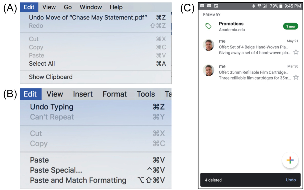
FIGURE 15.9 (A) MacOS users can undo file operations. (B) Microsoft Word lets users undo edits. (C) Gmail allows users to undo message deletions.
图 15.9 (A) MacOS 用户可以撤销文件操作。(B) Microsoft Word 允许用户撤销编辑。(C) Gmail 允许用户撤销删除消息。
Make risky, error-prone operations hard to do
使高风险、易出错的操作难以执行
The likelihood of errors during potentially dangerous operations can be reduced by requiring confirmation (see Fig. 15.10) or even requiring multiple steps. Before executing a user’s request for a transaction, most e-commerce websites show a summary of the transaction and allow the user to cancel it or confirm it.
通过要求确认(见图 15.10)甚至要求多个步骤,可以减少在潜在危险操作期间出错的几率。在执行用户的交易请求之前,大多数电子商务网站会显示交易摘要,并允许用户取消或确认。
However, a simple one-keystroke confirmation may not be enough. Most of the time the action will be OK and users will confirm it. The confirmation will soon be “burned” into system one as an automatic process, increasing the probability that users will confirm without thinking (Norman, 1983a). That is a capture slip, and it defeats the purpose of the confirmation.
然而,简单的单键确认可能不够。大多数情况下,操作将是“好的”,用户会确认它。确认很快就会被“烧录”到系统一中作为自动过程,增加用户未经思考就确认的可能性(Norman,1983a)。这是一个捕捉滑倒,它违背了确认的目的。
A common way to avoid that problem is to design the confirmation dialogue box so Cancel is the default choice (the one invoked by clicking Enter) and OK (or Continue) requires an extra keystroke. On Samsung pocket digital cameras (see Fig. 15.11), to delete all photos, users have to (1) click the Menu button, (2) select the Delete item, (3) move the selection to Delete All and press OK, (4) click the pop-up confirmation and press the UP key (DISP) to change the confirmation choice from “No” to “Yes,” and (5) press OK. The extra keystrokes make it unlikely that a user will accidently confirm the deletion of all photos.
避免这个问题的常见方法是将确认对话框设计为“取消”是默认选项(点击 Enter 将调用的选项),而“确定”(或“继续”)则需要额外的按键操作。在三星便携式数码相机(见图 15.11)上,要删除所有照片,用户必须(1)点击菜单按钮,(2)选择删除项,(3)将选择移动到删除所有并按确定,(4)点击弹出确认框并按向上键(显示)将确认选择从“否”更改为“是”,(5)按确定。额外的按键操作使得用户不太可能意外确认删除所有照片。
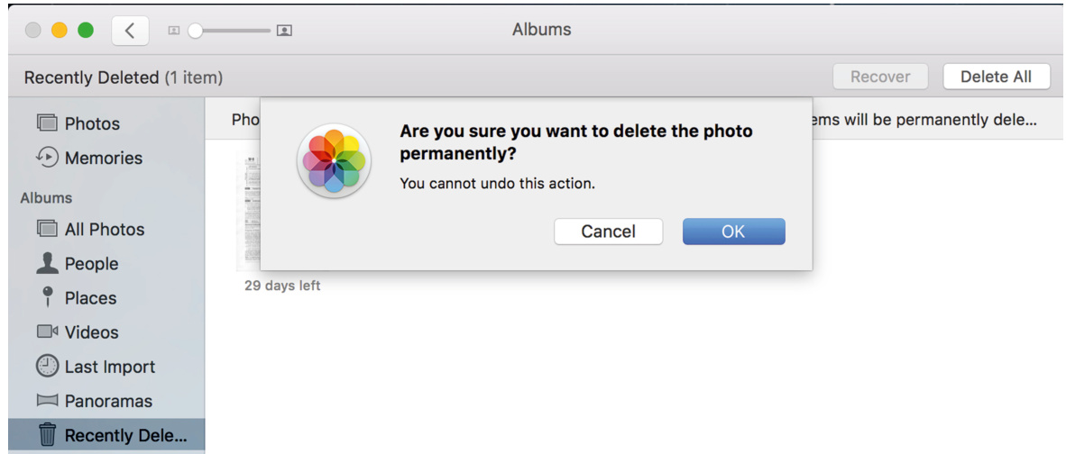
FIGURE 15.10 Apple’s photos app requires confirmation to delete a photo permanently.
图 15.10 苹果的照片应用在永久删除照片时需要确认。
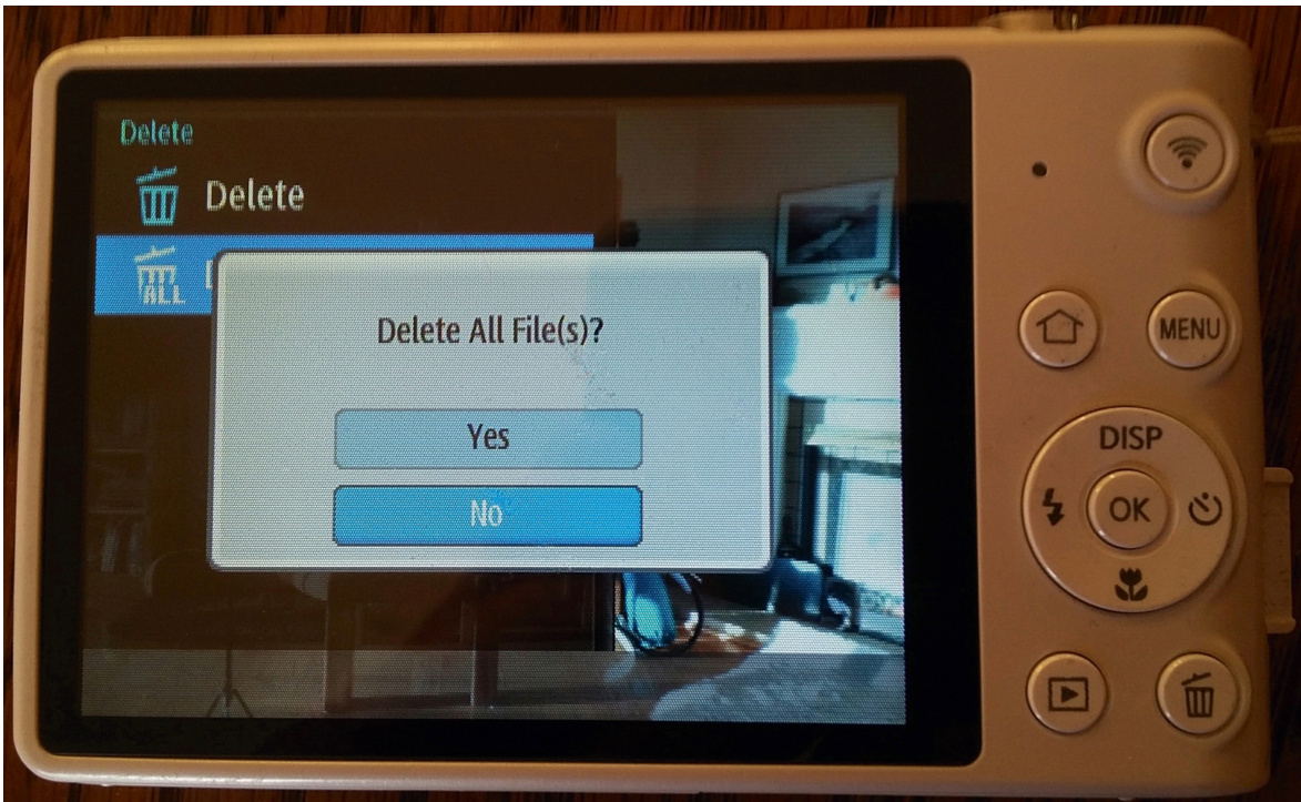
FIGURE 15.11 Deleting all photos from a Samsung pocket camera requires confirmation, and the confirmation defaults to “No” (don’t delete), so two more keystrokes are required: change choice to “Yes” (delete), click OK.
图 15.11 从三星便携式相机删除所有照片需要确认,并且确认默认为“否”(不删除),因此需要额外的两个按键操作:更改选择为“是”(删除),点击确定。
In mission-critical applications, where errors would be very costly, even multistep confirmation may not provide enough safety. One solution is to design important operations so one person initiates them and a different person approves or confirms them. Large purchases in many organizations are designed that way, as are grade changes in universities.
在需要高度关键的应用中,错误可能会造成巨大的损失,即使多步骤确认可能也不够安全。一种解决方案是设计重要操作,由一个人发起,而由另一个人批准或确认。许多组织中的大额采购以及大学的成绩更改都是这样设计的。
Another way to guard against errors in mission-critical applications is to require potentially dangerous operations to be executed by two or more people acting in concert—maybe even in separate locations. For example, in the sidebar “Slip or Mistake?” earlier in this chapter, the US Federal Communications Commission suggested that Hawaii’s Emergency Alert System should require that two separate staff members must coordinate to issue a real alert.
另一种防止关键应用中错误的方法是要求潜在危险的操作由两个人或更多人协同执行——甚至可能位于不同的地点。例如,在本章前面提到的侧边栏“失误还是错误?”中,美国联邦通信委员会建议夏威夷的紧急警报系统应该要求两名不同的工作人员协调才能发布真正的警报。
Voice-Recognition Failure and Misrecognition are Not User Errors
语音识别失败和误识别不是用户错误
When a voice-controlled system does not understand or misunderstands what a user says, the user has neither slipped nor made a mistake. The user did not make an error. The system made the error, and it is the system’s responsibility to correct or work around the error (Pearl, 2018a,b).
当语音控制系统不理解或误解用户所说的话时,用户既没有失误也没有犯错。用户没有犯错误。是系统犯了错误,这是系统的责任来纠正或绕过错误(Pearl,2018a,b)。
What should happen is more or less what happens when people talk and one does not understand what the other says. If you and I are talking and I say something and you don’t understand me, you tell me you don’t understand or give me a quizzical look, and I repeat or rephrase what I said. If I say something and you misunderstand me, the conversation may continue until the misunderstanding is exposed, then both of us work to correct the misunderstanding.
发生的事情大致就是人们交谈时,其中一方不明白另一方所说的话。如果你和我交谈,我说了些什么而你听不懂,你会告诉我你听不懂,或者给我一个疑惑的表情,我会重复或重新表述我说的话。如果我说了些什么而你误解了我,对话可能会继续,直到误解被揭露,然后我们双方都会努力纠正误解。
Most voice-controlled systems nowadays rate the confidence that they understood a user utterance. If the system’s confidence that it understood a user command is below a certain threshold, the system should say something like “I’m sorry; I didn’t get that. Could you repeat it?”
如今大多数语音控制系统都会评估它们理解用户话语的置信度。如果系统对其理解用户命令的置信度低于某个阈值,系统应该说一些类似“对不起;我没听懂。你能再说一遍吗?”的话。
Even if the system estimates with high confidence that it understood a user, it can repeat what it understood before continuing. That allows misunderstandings to be caught and corrected quickly.
即使系统以很高的置信度估计它理解了用户,它也可以在继续之前重复它所理解的内容。这允许快速发现和纠正误解。
Important Takeaways
重要要点
• Errors can be classified as mistakes or slips. Mistakes are conscious errors—you make an intentional choice that turns out to be wrong. Slips are unconscious errors—you do something you didn’t intend to do.
• 错误可以分为错误或失误。错误是意识到的错误——你做出了一个错误的选择。失误是无意识的错误——你做了你没打算做的事情。
• Slips are categorized into several types depending on what causes them: • Capture: while doing one thing, you absent-mindedly switch to doing another. • Description: your action is appropriate for an object different from the one you are working with. • Data-driven: while doing a task, something else distracts you. • Loss of activation: you forget what you were doing or why. • Closure: you forget the last step of a task. • Mode: your actions have a different effect than intended because the system you are using is in a different mode than you thought it was. • Attention: failing to notice important information and so doing the wrong thing. • Motor: your fingers, mouth, legs, etc. don’t do what you intended.
• 滑动错误根据其成因可分为几种类型:• 捕捉:在执行某项任务时,你心不在焉地切换到另一项任务。• 描述:你的操作适合于与你正在处理的对象不同的对象。• 数据驱动:在执行任务时,其他事情分散了你的注意力。• 激活丢失:你忘记了自己正在做什么或为什么。• 封闭:你忘记了任务的最后一步。• 模式:由于你使用的系统处于你意想不到的模式,你的操作产生了不同的效果。• 注意力:未能注意到重要信息,因此做了错误的事情。• 运动:你的手指、嘴、腿等没有做你打算做的事情。
• Design to prevent mistakes by providing clear, complete, accurate information.
• 通过提供清晰、完整、准确的信息来设计防止错误。
• Design guidelines to prevent slips depend on the type of slip. For example: • Capture slips: make paths for different actions noticeably different. • Data-driven slips: guide users toward their goal with a “process funnel.” • Loss-of-activation slips: provide memory aids and progress indicators. • Mode slips: clearly indicate the current system mode. • Attention slips: direct the user’s attention to important details. • Motor slips: make click/tap/swipe targets large with space between them.
• 防止滑倒的设计指南取决于滑倒的类型。例如:• 捕捉滑倒:为不同操作创建明显不同的路径。• 数据驱动滑倒:用“过程漏斗”引导用户实现目标。• 激活丢失滑倒:提供记忆辅助和进度指示。• 模式滑倒:明确指示当前系统模式。• 注意力滑倒:引导用户注意重要细节。• 运动滑倒:使点击/轻点/滑动目标足够大,并保持它们之间的空间。
• Design guidelines to help people recover from errors: • Make actions reversible by providing UNDO or by making all actions two-way. • Make risky, error-prone operations hard to do.
• 设计指南帮助人们从错误中恢复:• 通过提供撤销功能或使所有操作双向进行,使操作可逆。• 使高风险、易出错的操作难以执行。
• Don’t treat voice-recognition failures as user errors. They are system errors.
• 不要将语音识别失败视为用户错误。它们是系统错误。
Bibliography
参考文献
Accot J, Zhai S. Beyond Fitts’ law: models for trajectory-based HCI tasks. In:Proceedings of ACM CHI 1997 Conference on Human Factors in Computing Systems . 1997:295–302.
Accot J, Zhai S. 超越费茨定律:基于轨迹的人机交互任务模型。在:ACM CHI 1997 人机交互系统会议论文集。1997:295–302。
Alvarez G, Cavanagh P. The capacity of visual short-term memory is set both by visual information load and by number of objects.Psychol. Sci.2004;15(2):106–111.
Alvarez G, Cavanagh P. 视觉短期记忆的容量既由视觉信息负载决定,也由物体数量决定。心理学科学。2004;15(2):106–111。
Angier N. Blind to change, even as it stares us in the face.New York Times . April 1, 2008 Retrieved from:. www.nytimes.com/2008/04/01/science/01angi.html.
Angier N. 对变化的盲目,即使它就在我们眼前。纽约时报。2008 年 4 月 1 日。从:www.nytimes.com/2008/04/01/science/01angi.html。
Arons B. A review of the cocktail party effect.J. Am. Voice I/O Soc.1992;12:35–50.
Arons B. 对鸡尾酒会效应的综述。美国语音输入输出协会杂志。1992;12:35–50。
Apple Computer. Human Interface Guidelines: MacOS Design Themes. 2020 Retrieved from:. https://developer.apple.com/design/human-interfaceguidelines/macos/overview/themes/.
苹果公司。人机界面指南:MacOS 设计主题。2020 年。来源:https://developer.apple.com/design/human-interfaceguidelines/macos/overview/themes/。
Apple Computer. Human Interface Guidelines: iOS Design Themes. 2020 Retrieved from:. https://developer.apple.com/design/human-interfaceguidelines/ios/overview/themes/.
苹果公司。人机界面指南:iOS 设计主题。2020 年。来源:https://developer.apple.com/design/human-interfaceguidelines/ios/overview/themes/。
Baddeley A. Working memory: theories, models, and controversies.Annu. Rev. Psychol. 2012;63:1–29.
巴德利 A. 工作记忆:理论、模型和争议。年度心理学评论。2012 年;63:1–29。
Barber R, Lucas H. System response time, operator productivity, and job satisfaction. Commun. ACM . 1983;26(11):972–986.
巴伯 R,卢卡斯 H。系统响应时间、操作员生产力和工作满意度。ACM 通信。1983 年;26(11):972–986。
Bays P.M, Husain M. Dynamic shifts of limited working memory resources in human vision.Science . 2008;321:851–854.
Bays P.M, Husain M, 人类视觉中工作记忆资源的动态变化。科学。2008;321:851–854。
Beyer H, Holtzblatt K.Contextual Design: A Customer-Centered Approach to Systems Design . San Francisco, CA: Morgan Kaufmann; 1997.
Beyer H, Holtzblatt K, 上下文设计:以客户为中心的系统设计方法。旧金山,CA:Morgan Kaufmann;1997。
Bilger B. The possibilian: David Eagleman and the mysteries of the brain.New Yorker . April 25, 2011 Retrieved from:. www.newyorker.com/reporting/2011/04/25/110425fa_fact_bilger.
Bilger B, 可能主义者:大卫·艾格曼和大脑的奥秘。纽约客。2011 年 4 月 25 日,从:www.newyorker.com/reporting/2011/04/25/110425fa_fact_bilger。
Blauer T. On the startle/flinch response.Blauer Tactical Intro to the Spear System: Flinching and the First Two Seconds of an Ambush YouTube Video . 2007 Retrieved from:. www.youtube.com/watch?v5jk_Ai8qT2s4.
Blauer T, 关于惊吓/缩回反应。Blauer 战术介绍刺系统:缩回和伏击前两秒 YouTube 视频。2007 年,从:www.youtube.com/watch?v5jk_Ai8qT2s4。
Borkin M.A, Vo A.A, Bylinskii Z, Isola P, Sunkavalli S, Oliva A, Pfister H. What makes a visualization memorable?IEEE Trans. Visual. Comput. Graph.December 2013;19(12):2306–2315 Retrieved from:. http://www.ncbi.nlm.nih.gov/pubmed/2405179710.1109/TVCG.2013.234.
Borkin M.A, Vo A.A, Bylinskii Z, Isola P, Sunkavalli S, Oliva A, Pfister H. 什么是使可视化记忆犹新的?IEEE Transactions on Visualization and Computer Graphics. 2013 年 12 月; 第 19 卷第 12 期: 2306–2315. 获取自: http://www.ncbi.nlm.nih.gov/pubmed/2405179710.1109/TVCG.2013.234.
Boulton D. Cognitive science: the conceptual components of reading and what reading does for the mind. In:Interview of Dr. Keith Stanovich, Children of the Code Website . 2009 Retrieved from:. www.childrenofthecode.org/interviews/stanovich.htm.
Boulton D. 认知科学:阅读的概念组成部分以及阅读对心智的影响。在:Dr. Keith Stanovich 的访谈,儿童代码网站。2009 年. 获取自: www.childrenofthecode.org/interviews/stanovich.htm.
Bower J.M, Parsons J.M. Rethinking the lesser brain.Sci. Am.2003;289:50–57.
Bower J.M, Parsons J.M. 重新思考小脑。科学美国人。2003 年; 第 289 期: 50–57.
Broadbent D.E. The magical number seven after fifteen years. In: Kennedy A, Wilkes A, eds.Studies in Long-Term Memory . London: Wiley; 1975:3–18.
Broadbent D.E. 15 年后的“神奇数字七”。在:Kennedy A, Wilkes A 编辑。长期记忆研究。伦敦:威利出版社; 1975 年: 3–18.
Brown C.M.Human-Computer Interface Design Guidelines . Norwood, NJ: Ablex Publishing Corporation; 1988.
Brown C.M. 人类-计算机界面设计指南。新泽西州诺伍德:Ablex 出版公司;1988 年。
Budiu R. Can Users Control and Understand a UI Driven by Machine Learning? Nielsen Norman Group; December 16, 2018 Retrieved from:. https://www.nngroup.com/articles/machine-learning-ux/. .
Budiu R. 用户能否控制和理解由机器学习驱动的 UI?尼尔森诺曼集团;2018 年 12 月 16 日。来源:https://www.nngroup.com/articles/machine-learning-ux/。
Budiu R, Laubheimer P. Intelligent Assistants Have Poor Usability: A User Study of Alexa, Google Assistant, and Siri. Nielsen Norman Group et al; July 22, 2018. https://www.nngroup.com/articles/intelligent-assistant-usability/.
Budiu R, Laubheimer P. 智能助手可用性差:对 Alexa、Google 助手和 Siri 的用户研究。尼尔森诺曼集团等;2018 年 7 月 22 日。https://www.nngroup.com/articles/intelligent-assistant-usability/。
Budman G.
Budman G. 仍有
Card S, Moran T, Newell A.The Psychology of Human-Computer Interaction . Hillsdale, NJ: Lawrence Erlbaum Associates; 1983.
卡德 S, 莫兰 T, 新厄尔 A. 人机交互心理学 . 新泽西州希尔兹代尔:劳伦斯厄尔巴姆联合公司; 1983 年.
Card S, Robertson G, Mackinlay J. The information visualizer, an information workspace. In:Proceedings of the Conference on Human Factors in Computing Systems: Reaching Through Technology . New York, NY: ACM Press; 1991:181–188.
卡德 S, 罗伯逊 G, 麦金莱 J. 信息可视化器,一个信息工作空间。在:人机系统人因工程会议:通过技术实现 . 纽约,纽约:ACM 出版社; 1991 年:181–188.
Carroll J, Rosson M. Beyond MIPS: performance is not quality.Byte . 1984:168–172.
卡罗尔 J, 罗森 M. 超越 MIPS:性能不是质量。字节 . 1984 年:168–172.
Cheriton D.R. Man-machine interface design for time-sharing systems. In:Proceedings of ACM National Conference . 1976:362–380.
切里顿 D.R. 分时系统的人机界面设计。在:ACM 全国会议 . 1976 年:362–380.
Chi E.H, Pirolli P, Chen K, Pitkow J. Using information scent to model user information needs and actions on the web. In:Proceedings of ACM SIGCHI 2011 Conference on Computer-Human Interactions . 2001:490–497.
Chi E.H, Pirolli P, Chen K, Pitkow J. 使用信息气味来模拟用户在网上的信息需求和行动。在:ACM SIGCHI 2011 人机交互会议论文集。2001:490–497。
Clark A.Being There: Putting Brain, Body, and World Together Again . Cambridge, MA: MIT Press; 1998.
Clark A. 《在那里:将大脑、身体和世界重新结合起来》。马萨诸塞州剑桥:麻省理工学院出版社;1998。
Cooper A.The Inmates are Running the Asylum . Indianapolis: SAMS; 1999.
Cooper A. 《监狱里的囚犯在管理 asylum》。印第安纳波利斯:SAMS;1999。
Cowan N, Chen Z, Rouder J. Constant capacity in an immediate serial-recall task: a logical sequel to Miller (1956).Psychol. Sci.2004;15(9):634–640.
Cowan N, Chen Z, Rouder J. 立即序列回忆任务中的恒定容量:米勒(1956)的一个逻辑续篇。心理学科学。2004;15(9):634–640。
Doidge N.The Brain that Changes Itself . New York, NY: Penguin Group; 2007.
多吉 N. 改变自我的大脑。纽约,纽约:企鹅集团;2007 年。
Dubuc B. The Brain from Top to Bottom. McGill University; 2012 (Online book). Retrieved from:. http://www.thebrain.mcgill.ca.
杜布克 B. 从顶到底的大脑。麦吉尔大学;2012 年(在线书籍)。从以下网址获取:http://www.thebrain.mcgill.ca。
Duis D, Johnson J. Improving user-interface responsiveness despite performance limitations. In:Proceedings of the IEEE CompCon ‘90 . 1990:383–386.
杜伊斯 D,约翰逊 J。尽管性能限制,提高用户界面响应能力。在:IEEE CompCon ‘90 会议论文集。1990 年:383-386。
Eagleman D.Incognito: The Secret Lives of the Brain . New York, NY: Vintage Books; 2012.
埃格曼 D. 无意识:大脑的秘密生活。纽约,纽约:维京出版社;2012 年。
Eagleman D.The Brain: The Story of You . New York, NY: Vintage Press; 2015.
埃格曼 D. 大脑:你的故事。纽约,纽约:Vintage 出版社;2015 年。
Finn K, Johnson J. A usability study of websites for older travelers. In:Proceedings of HCI International 2013 . Las Vegas: Springer-Verlag; 2013.
芬恩 K,约翰逊 J. 老年旅行者网站的可用性研究。HCI 国际 2013 年会议论文集。拉斯维加斯:Springer-Verlag;2013 年。
Fitts P.M. The information capacity of the human motor system in controlling the amplitud of movement.J. Exp. Psychol.1954;47(6):381–391.
菲茨 P.M. 人类运动系统控制运动幅度的信息容量。实验心理学杂志,1954 年;47(6):381–391。
Fogg B.J.Persuasive Technology: Using Computers to Change What We Think and Do . Morgan Kaufmann; 2002.
福格 B.J. 说服技术:使用计算机改变我们的想法和行为。Morgan Kaufmann;2002 年。
Gazzaley A. The aging brain: at the crossroads of attention and memory.User
加扎莱 A. 老年大脑:注意力和记忆的十字路口。用户
Geelhoed E, Toft P, Roberts S, Hyland P. To influence time perception. In:Proceedings of ACM CHI’95 . 5. 1995:272–273.
吉尔胡德 E,托夫特 P,罗伯特 S,海兰德 P。影响时间感知。在:ACM CHI’95 会议论文集。 1995:272–273。
Google. Android Design. December 2019 Retrieved from:. https://developer.android.com/design.
谷歌。安卓设计。2019 年 12 月 从:. https://developer.android.com/design。
Grudin J. The case against user interface consistency.Commun. ACM . 1989;32(10):1164– 1173.
格鲁丁 J。反对用户界面一致性。ACM 通讯。 1989;32(10):1164– 1173。
Hackos J, Redish J.User and Task Analysis for Interface Design . New York, NY: Wiley; 1998.
Hackos J, Redish J. 用户和任务分析界面设计. 纽约, NY: Wiley; 1998.
Herculano-Houzel S. The human brain in numbers: a linearly scaled-up primate brain. Front. Hum. Neurosci.2009;3(31) Retrieved from:. http://www.ncbi.nlm.nih.gov/pmc/articles/PMC2776484.
Herculano-Houzel S. 人类大脑的数字:一个线性放大的灵长类大脑. Front. Hum. Neurosci. 2009;3(31) 来自:. http://www.ncbi.nlm.nih.gov/pmc/articles/PMC2776484.
Herrmann R. How Do We Read Words and How Should We Set Them? OpenType.info blog; June 14, 2011 Retrieved from:. http://opentype.info/blog/2011/06/14/how-do-weread-words-and-how-should-we-set-them
Herrmann R. 我们如何阅读单词以及应该如何设置它们?OpenType.info 博客; 2011 年 6 月 14 日 来自:. http://opentype.info/blog/2011/06/14/how-do-weread-words-and-how-should-we-set-them
Heusser M. How to Achieve Speedy Application Response Times, Blog Post. SearchSoftwareQuality.TechTarget.com; September 6, 2019 Retrieved from:. https://searchsoftwarequality.techtarget.com/tip/Acceptable-application-responsetimes-vs-industry-standard.
Heusser M. 如何实现快速应用程序响应时间,博客文章. SearchSoftwareQuality.TechTarget.com; 2019 年 9 月 6 日 来自:. https://searchsoftwarequality.techtarget.com/tip/Acceptable-application-responsetimes-vs-industry-standard.
Hoxmeier J, DiCesare C. System response time and user satisfaction: an experimental study. In:Proceedings of Americas Conference on Information Systems (AMCIS 2000) . 2000:140–145.
Hoxmeier J, DiCesare C. 系统响应时间与用户满意度:一项实验研究。发表于:美洲信息系统会议(AMCIS 2000). 2000:140–145.
Hudlicka, E., 2021. “Overview of emotions research”, Chapter 3. In: Hudlicka, E. (Ed.), Affective Computing:Theory, Methods and Applications. Chapman and Hall/CRC Press.
Hudlicka, E., 2021. “情感研究概述”,第三章。收录于:Hudlicka, E.(编),情感计算:理论、方法与应用。查普曼与霍尔/CRC 出版社。
Husted B. Backup your data, then backup your backup.Ventura County Star . September 8, 2012 Retrieved from:. http://www.vcstar.com/news/2012/sep/08/back-up-your-data-thenback-up-your-backup.
Husted B. 备份你的数据,然后备份你的备份。文摘:文图拉县之星。2012 年 9 月 8 日。从:http://www.vcstar.com/news/2012/sep/08/back-up-your-data-thenback-up-your-backup.
Isaacs E, Walendowski A.Designing From Both Sides of the Screen: How Designers and Engineers Can Collaborate to Build Cooperative Technology . Indianapolis: SAMS; 2001.
Isaacs E, Walendowski A. 双屏设计:设计师和工程师如何合作构建协同技术。印第安纳波利斯:SAMS;2001.
Isakson C. Importance of Response Time in Mobile Applications. Sundog Blog; September 30, 2013 Retrieved from:. https://www.sundoginteractive.com/blog/importance-ofresponse-time-in-mobile-applications.
Isakson C. 移动应用程序响应时间的重要性。Sundog 博客;2013 年 9 月 30 日。来源:https://www.sundoginteractive.com/blog/importance-ofresponse-time-in-mobile-applications.
Johnson J. How faithfully should the electronic office simulate the real one?SIGCHI Bull. 1987;19(2):21–25.
Johnson J. 电子办公室应该多大程度上模拟真实办公室?SIGCHI 通讯。1987;19(2):21–25。
Johnson J. Modes in non-computer devices.Int. J. Man-Mach. Stud.1990;32:423–438.
Johnson J. 非计算机设备中的模式。国际人机研究杂志。1990;32:423–438。
Johnson J.GUI Bloopers 2.0: Common User Interface Design Don’ts and Dos . San Francisco: Morgan Kaufmann; 2007.
Johnson J. GUI 错误 2.0:常见用户界面设计禁忌和做法。旧金山:Morgan Kaufmann;2007。
Johnson J, Finn K.Designing User Interfaces for an Aging Population: Towards Universal Design . Waltham, MA: Morgan Kaufmann Publishers; 2017.
约翰逊 J, 芬恩 K. 为老年人口设计用户界面:迈向通用设计. 马萨诸塞州沃瑟姆:莫根考夫曼出版社;2017.
Johnson J, Henderson D.A. Conceptual models: begin by designing what to design. Interactions . 2002;9(1):25–32.
约翰逊 J, 汉德森 D.A. 概念模型:从设计要设计什么开始. 互动. 2002;9(1):25–32.
Johnson J, Henderson D.A.Conceptual Models: Core to Good Design . San Rafael, CA: Morgan and Claypool; 2011.
约翰逊 J, 汉德森 D.A. 概念模型:良好设计的核心. 加利福尼亚州圣拉斐尔:莫根和克莱普尔;2011.
Johnson J, Henderson D.A. Conceptual Models in a Nutshell. Boxes and Arrows. January 22, 2013 (Online magazine). Retrieved from:. http://boxesandarrows.com/conceptualmodels-in-a-nutshell.
约翰逊 J, 汉德森 D.A. 概念模型简明教程. 盒子和箭头. 2013 年 1 月 22 日(在线杂志). 获取自:http://boxesandarrows.com/conceptualmodels-in-a-nutshell.
Johnson J, Roberts T, Verplank W, Smith D.C, Irby C, Beard M, Mackey K. The xerox star: a retrospective.IEEE Comput.1989;22(9):11–29.
约翰逊 J, 罗伯茨 T, 维尔普拉克 W, 史密斯 D.C, 伊尔比 C, 比尔德 M, 麦基 K. Xerox 星:回顾. IEEE 计算机杂志. 1989;22(9):11–29.
Jonides J, Lewis R.L, Nee D.E, Lustig C.A, Berman M.G, Moore K.S. The mind and brain of short-term memory.Annu. Rev. Psychol.2008;59:193–224.
乔尼德斯 J, 刘易斯 R.L, 尼 D.E, 拉斯特 C.A, 伯曼 M.G, 摩尔 K.S. 短时记忆的心灵和大脑. 年度心理学评论. 2008;59:193–224.
Kahneman D.Thinking Fast and Slow . New York, NY: Farrar Straus and Giroux; 2011.
卡尼曼 D. 快思与慢思. 纽约, NY: 法拉·斯特劳斯和格鲁奥; 2011.
Koyani S.J, Bailey R.W, Nall J.R. Research-based Web Design and Usability Guidelines. U.S. Department of Health and Human Service; 2006 Retrieved from:. usability.gov/pdfs/guidelines.html.
科亚尼 S.J, 贝利 R.W, 纳尔 J.R. 基于研究的网页设计和可用性指南. 美国卫生与人类服务部; 2006 从:. usability.gov/pdfs/guidelines.html.
Krug S.Don’t Make Me Think, Revisited: A Common Sense Approach to Web and Mobile Usabilit . third ed. Indianapolis: New Riders Press; 2014.
Krug S. 《重访“别让我思考”:网络和移动可用性的常识方法》第三版。印第安纳波利斯:新骑手出版社;2014。
Lally
Lally
Lambert G. A comparative study of system response time on program developer productivity.IBM Syst. J.1984;23(1):407–423.
Lambert G. 系统响应时间对程序开发者生产力的比较研究。IBM 系统杂志 1984;23(1):407–423。
Landauer T.K. How much do people remember? Some estimates of the quantity of learned information in long-term memory.Cognit. Sci.1986;10:477–493. .
Landauer T.K. 人们记得多少?长期记忆中学习信息的数量估计。认知科学 1986;10:477–493。
Larson K. The Science of Word Recognition. Microsoft.com; July 2004. http://www.microsoft.com/typography/ctfonts/WordRecognition.aspx.
Larson K. 《文字识别的科学》. Microsoft.com; 2004 年 7 月. http://www.microsoft.com/typography/ctfonts/WordRecognition.aspx.
Liang P, Zhong N, Lu S, Liu J, Yau Y, Li K, Yang Y.The Neural Mechanism of Human Numerical Inductive Reasoning Process: A Combined ERP and fMRI Study . Berlin: SpringerVerlag; 2007.
Liang P, Zhong N, Lu S, Liu J, Yau Y, Li K, Yang Y. 《人类数字归纳推理过程的神经机制:一项结合脑电和功能磁共振成像的研究》. 柏林:SpringerVerlag;2007 年.
Lindsay P, Norman D.A.Human Information Processing . New York and London: Academic Press; 1972.
Lindsay P, Norman D.A. 《人类信息处理》. 纽约和伦敦:学术出版社;1972 年.
Macdonald F. Scientists have found a woman whose eyes have a whole new type of colour receptor.Science Alert . July 25, 2016 Retrieved from:. https://www.sciencealert.com/scientists-have-found-a-woman-whose-eyes-havea-whole-new-type-of-colour-receptor.
Macdonald F. 科学家发现一位女性,她的眼睛有一种全新的颜色感受器。Science Alert. 2016 年 7 月 25 日,从 https://www.sciencealert.com/scientists-have-found-a-woman-whose-eyes-havea-whole-new-type-of-colour-receptor.
Marcus A.Graphic Design for Electronic Documents and User Interfaces . Reading, MA: Addison-Wesley; 1992.
马库斯 A. 图形设计电子文档和用户界面。马萨诸塞州雷丁:阿迪森-韦斯利;1992 年。
Mastin L. Short-term (Working) Memory. The Human Memory: What it is, How it Works, and How it Can Go Wrong. 2010 Retrieved from:. http://www.humanmemory.net/types_short.html.
马斯特恩 L. 短期(工作)记忆。人类记忆:它是什么,它是如何运作的,以及它是如何出错的。2010 年,从 http://www.humanmemory.net/types\_short.html 获取。
McAfee. Consumer Alert: McAfee Releases Results of Global Unprotected Rates Study. McAfee blog; May 29, 2012 Retrieved from:. https://blogs.mcafee.com/consumer/family-safety/mcafee-releases-results-ofglobal-unprotected-rates.
梅卡菲。消费者警报:梅卡菲发布全球未受保护比率研究的结果。梅卡菲博客;2012 年 5 月 29 日,从 https://blogs.mcafee.com/consumer/family-safety/mcafee-releases-results-ofglobal-unprotected-rates 获取。
McInerney P, Li J. Progress Indication: Concepts, Design, and Implementation. IBM. Developer Works; 2002 Retrieved from:. www128.ibm.com/developerworks/web/library/us-progind.
麦金尼尼 P,李 J。进度指示:概念、设计和实现。IBM。开发者工作;2002 年,从 www128.ibm.com/developerworks/web/library/us-progind 获取。
Microsoft Corporation. User Interface Principles. 2018 Retrieved from:. https://docs.microsoft.com/en-us/windows/win32/appuistart/-user-interfaceprinciples.
微软公司。用户界面原则。2018 年,从 https://docs.microsoft.com/en-us/windows/win32/appuistart/-user-interfaceprinciples 获取。
Miller G.A. The magical number seven, plus or minus two: some limits on our capacity for processing information.Psychol. Rev.1956;63:81–97.
米勒 G.A. 幸运数字七,加减二:我们处理信息的某些限制。心理学评论。1956 年;63:81-97。
Miller R. Response time in man-computer conversational transactions. In:Proceedings of IBM Fall Joint Computer Conference . vol. 33. 1968:267–277.
米勒 R. 人机对话事务中的响应时间。在:IBM 秋季联合计算机会议论文集。第 33 卷。1968 年:267-277。
Minnery B, Fine M. Neuroscience and the future of human-computer interaction. Interactions . 2009;16(2):70–75.
明尼里 B,费恩 M。神经科学与人机交互的未来。交互。2009 年;16(2):70-75。
Monti M.M, Osherson D.N, Martinez M.J, Parsons L.M. Functional neuroanatomy of deductive inference: a language-independent distributed network.NeuroImage . 2007;37(3):1005–1016.
Monti M.M, Osherson D.N, Martinez M.J, Parsons L.M. 归纳推理的功能神经解剖学:一个语言无关的分布式网络。NeuroImage . 2007;37(3):1005–1016.
Moran K. How Chunking Helps Content Processing. Nielsen-Norman Group; March 20, 2016 Retrieved from:. https://www.nngroup.com/articles/chunking/.
Moran K. 如何通过分块帮助内容处理。Nielsen-Norman Group; 2016 年 3 月 20 日。来源:https://www.nngroup.com/articles/chunking/.
Mullet K, Sano D.Designing Visual Interfaces: Communications Oriented Techniques . Englewood Cliffs, NJ: Prentice-Hall; 1994.
Mullet K, Sano D. 设计视觉界面:面向通信的技术。Englewood Cliffs, NJ: Prentice-Hall; 1994.
Nah F. A study on tolerable waiting time: how long are Web users willing to wait?Behav. Inf. Technol.2004;23(3):153–163 Retrieved from:. http://sighci.org/uploads/published_papers/bit04/BIT_Nah.pdf.
Nah F. 对可接受等待时间的研究:网络用户愿意等待多长时间?Behav. Inf. Technol. 2004;23(3):153–163。来源:http://sighci.org/uploads/published\_papers/bit04/BIT\_Nah.pdf.
Nielsen J.Usability Engineering . San Francisco: Morgan Kaufmann; 1993.
尼尔森 J. 用户体验工程 . 旧金山: 摩根考夫曼; 1993.
Nielsen J. The Need for Speed, Blog Post. Nielsen-Norman Group; January 28, 1997 Retrieved from:. https://www.nngroup.com/articles/the-need-for-speed/.
尼尔森 J. 对速度的需求,博客文章。尼尔森-诺曼集团; 1997 年 1 月 28 日,从:. https://www.nngroup.com/articles/the-need-for-speed/.
Nielsen J.Designing Web Usability: The Practice of Simplicity . Indianapolis: New Riders Publishing; 1999.
尼尔森 J. 设计网络可用性:简单实践 . 印第安纳波利斯: 新骑手出版; 1999.
Nielsen J. Information Foraging: Why Google Makes People Leave Your Site Faster. NielsenNorman Group; June 30, 2003 Retrieved from:. http://www.nngroup.com/articles/information-scent/2003. .
尼尔森 J. 信息觅食:为什么谷歌让你的网站更快地被离开。尼尔森诺曼集团; 2003 年 6 月 30 日,从:. http://www.nngroup.com/articles/information-scent/2003.
Nielsen J. How Little Do Users Read? Nielsen-Norman Group; May 5, 2008 Retrieved from:. https://www.nngroup.com/articles/how-little-do-users-read.
奈尔森 J. 用户阅读量有多小?尼尔森-诺曼集团;2008 年 5 月 5 日,从:https://www.nngroup.com/articles/how-little-do-users-read.
Nielsen J. Right-justified Navigation Menus Impede Scanability. Nielsen-Norman Group; April 27, 2008 Retrieved from:. https://www.nngroup.com/articles/right-justifiednavigation-menus.
奈尔森 J. 右对齐的导航菜单阻碍扫描性。尼尔森-诺曼集团;2008 年 4 月 27 日,从:https://www.nngroup.com/articles/right-justifiednavigation-menus.
Nielsen J. Website Response Times, Blog Post. Nielsen-Norman Group; June 20, 2010 Retrieved from:. https://www.nngroup.com/articles/website-response-times/.
奈尔森 J. 网站响应时间,博客文章。尼尔森-诺曼集团;2010 年 6 月 20 日,从:https://www.nngroup.com/articles/website-response-times/.
Nielsen J.Web-Based Application Response Time, Blog Post . Nielsen-Norman Group; 2014.
奈尔森 J. 基于网络的 应用程序响应时间,博客文章。尼尔森-诺曼集团;2014 年。
Nielsen J, Molich R. Heuristic evaluation of user interfaces. In:Proceedings of ACM CHI’90 Conference, Seattle . 1990:249–256.
尼尔森 J, 莫利奇 R. 用户界面的启发式评估. 在: ACM CHI’90 会议论文集, 西雅图. 1990:249–256.
Nielsen J, Mack R.L.Usability Inspection Methods . New York, NY: John Wiley & Sons, Inc.; 1994.
尼尔森 J, 麦克 R.L. 可用性检查方法. 纽约, NY: 约翰威利父子公司; 1994.
Nichols S. Social Network Burnout Affecting Six in Ten Facebook Users. February 6, 2013 Retrieved from:. http://www.v3.co.uk/v3-uk/news/2241746/social-network-burnoutaffecting-six-in-ten-facebook-users.
尼科尔斯 S. 社交网络倦怠影响六成 Facebook 用户. 2013 年 2 月 6 日,来源:. http://www.v3.co.uk/v3-uk/news/2241746/social-network-burnoutaffecting-six-in-ten-facebook-users.
Norman D.A. Design rules based on analysis of human error.Commun. ACM . 1983;26(4):254–258.
诺曼 D.A. 基于人类错误分析的设计规则. ACM 通讯. 1983;26(4):254–258.
Norman D.A. Design principles for human-computer interfaces. In: Janda A, ed.Proceedings of the CHI-83 Conference on Human Factors in Computing Systems, Boston . New York, NY: ACM Press; 1983 Reprinted in Baecker, R.M., Buxton, W.A.A. (Eds.), Readings in human-computer interaction. Morgan Kaufmann (1987), San Mateo, CA.
诺曼 D.A. 人类计算机界面设计原则。载于:Janda A 编。人机系统人因工程学会议论文集,波士顿。纽约,纽约:ACM 出版社;1983 年。转载于 Baecker, R.M., Buxton, W.A.A.(编)人机交互阅读。Morgan Kaufmann(1987 年),加利福尼亚州圣马特奥。
Norman D.A.The Design of Everyday Things . New York, NY: Basic Books; 1988.
诺曼 D.A. 每日用品的设计。纽约,纽约:基础书籍;1988 年。
Norman D.A. Human Error? No, Bad Design. JND Blog-post; April 13, 2014 Retrieved from:. https://jnd.org/stop_blaming_people_blame_inept_design/.
诺曼 D.A. 人类错误?不,是糟糕的设计。JND 博客文章;2014 年 4 月 13 日。从 https://jnd.org/stop\_blaming\_people\_blame\_inept\_design/ 获取。
Norman D.A, Draper S.W.User-centered System Design: New Perspectives on Human-Comput Interaction . Hillsdale, NJ: CRC Press; 1986.
诺曼 D.A, 德普尔 S.W. 以用户为中心的系统设计:人机交互的新视角。新泽西州希尔兹代尔:CRC 出版社;1986 年。
Oracle Corporation. Alta Mobile UI: A Design System for Native Mobile Apps. 2017 Retrieved from:. https://www.oracle.com/webfolder/ux/mobile/index.html.
Oracle Corporation. Alta Mobile UI: 一个用于原生移动应用的设计系统。2017 年,从 https://www.oracle.com/webfolder/ux/mobile/index.html 获取。
Park M. Here’s what Went Wrong with the Hawaii False Alarm. CNN.com; 2018 January 31 2018, retrieved from:. https://www.cnn.com/2018/01/31/us/hawaii-false-alarminvestigation-findings/index.html.
Park M. 夏威夷虚假警报事件回顾。CNN.com;2018 年 1 月 31 日,从 https://www.cnn.com/2018/01/31/us/hawaii-false-alarminvestigation-findings/index.html 获取。
Pearl C.Designing Voice UIs . O’Reilly Press; 2018.
Pearl C. 设计语音用户界面。O’Reilly 出版社;2018 年。
Pearl C. Making the Shift From Designing GUIs to Designing VUIs, UX Matters. May 28, 2018 Retrieved from:. https://www.uxmatters.com/mt/archives/2018/05/making-the-shif from-designing-guis-to-designing-vuis.php.
Pearl C. 从设计 GUI 到设计 VUI 的转变,UX Matters。2018 年 5 月 28 日,从 https://www.uxmatters.com/mt/archives/2018/05/making-the-shif from-designing-guis-to-designing-vuis.php 获取。
Perfetti C, Landesman L. The Truth about Download Time. User Interface Engineering; January 31, 2001 Retrieved from:. http://uie.com/articles/download_time.
Perfetti C, Landesman L. 关于下载时间的真相。用户界面工程;2001 年 1 月 31 日。来源:http://uie.com/articles/download\_time.
Rainie L, Smith A, Duggan M. Coming and Going on Facebook. Feb 5, 2013 Report from Pew Internet and American Life Project. Retrieved from:. http://www.pewinternet.org/ ∼/media//Files/Reports/2013/PIP_Coming_and_going_on_facebook.pdf.
Rainie L, Smith A, Duggan M. Facebook 上的来来去去。皮尤互联网与美国生活项目报告。2013 年 2 月 5 日。来源:http://www.pewinternet.org/ ∼/media//Files/Reports/2013/PIP_Coming_and_going_on_facebook.pdf.
Raymond J.E, Shapiro K.L, Arnell K.M. Temporary suppression of visual processing in an RSVP task: an attentional blink?J. Exp. Psychol. Hum. Percept. Perform.1992;18(3):849– 860.
Raymond J.E, Shapiro K.L, Arnell K.M. RSVP 任务中视觉处理的暂时抑制:是一种注意力盲点吗?实验心理学人类感知与表现杂志。1992;18(3):849– 860.
Redish G.Letting Go of the Words: Writing Web Content that Works . San Francisco: Morgan Kaufmann; 2007.
Redish G. 放弃文字:编写有效的网页内容。旧金山:莫林·考夫曼;2007 年.
Reeves T. The Psychology of Human Error. HumanFactorsMD Blog; 2010 Retrieved from:. http://www.humanfactorsmd.com/psychology-of-human-error/. .
雷维斯 T. 人类错误的心理学。HumanFactorsMD 博客;2010 年。检索自:http://www.humanfactorsmd.com/psychology-of-human-error/。
Robertson G, Card S, Mackinlay J. The cognitive co-processor architecture for interactive user interfaces. In:Proceedings of the ACM Conference on User Interface Software and Technology (UIST’89) . ACM Press; 1989:10–18.
罗伯逊 G, 卡德 S, 麦金莱 J. 交互式用户界面的认知协处理器架构。在:ACM 用户界面软件和技术会议论文集(UIST’89)。ACM 出版社;1989:10–18。
Robertson G, Card S, Mackinlay J. Information visualization using 3D interactive animation.Commun. ACM . 1993;36(4):56–71.
罗伯逊 G, 卡德 S, 麦金莱 J. 使用 3D 交互式动画的信息可视化。ACM 通讯;1993;36(4):56–71。
Rosenberg D.UX Magic . Interaction-Design Foundation; 2020.
罗森伯格 D. UX 魔法。交互设计基金会;2020。
Rushinek A, Rushinek S. What makes users happy?Commun. ACM . 1986;29:584–598.
Rushinek A, Rushinek S. 什么让用户感到快乐?ACM 通信 . 1986;29:584–598.
Sapolsky R.M.A Primate’s Memoir: A Neuroscientist’s Unconventional Life Among the Baboons . New York, NY: Scribner; 2002.
Sapolsky R.M. 灵长类回忆录:一位神经科学家的非传统生活与狒狒 . 纽约,纽约:斯克里布纳;2002.
Schneider W, Shiffrin R.M. Controlled and automatic human information processing: 1. Detection, search, and attention.Psychol. Rev.1977;84:1–66.
Schneider W, Shiffrin R.M. 受控和自动人类信息处理:1. 检测、搜索和注意力。心理学评论 . 1977;84:1–66.
Schrage M. The password is fayleyure.Technol. Rev . 2005 Retrieved from:. http://www.technologyreview.com/read_article.aspx? ch5specialsectionsandsc5securityandid516350.
Schrage M. 密码是 fayleyure。技术评论 . 2005 从:. http://www.technologyreview.com/read\_article.aspx? ch5specialsectionsandsc5securityandid516350.
Shneiderman B. Response time and display rate in human performance with computers. ACM Comput. Surveys . 1984;16(4):265–285.
Shneiderman B. 响应时间与显示速率在人机交互中的表现. ACM 计算机调查 . 1984;16(4):265–285.
Shneiderman B.Designing the User Interface: Strategies for Effective Human-Computer Interaction . first ed. Reading, MA: Addison-Wesley; 1987.
Shneiderman B. 设计用户界面:有效人机交互的策略 . 首版. 马萨诸塞州雷丁:阿迪森-韦斯利; 1987.
Shneiderman B, Plaisant C.Designing the User Interface: Strategies for Effective HumanComputer Interaction . fifth ed. Reading, MA: Addison-Wesley; 2009.
Shneiderman B, Plaisant C. 设计用户界面:有效人机交互的策略 . 第五版. 马萨诸塞州雷丁:阿迪森-韦斯利; 2009.
Simon H.A.The Sciences of the Artificial . Cambridge, MA: MIT Press; 1969.
Simon H.A. 人工科学 . 马萨诸塞州剑桥:麻省理工学院出版社; 1969.
Simons D.J. Inattentional blindness.Scholarpedia . 2007;2(5):3244 Retrieved from:. http://www.scholarpedia.org/article/Inattentional_blindness.
Simons D.J. 注意力盲点. Scholarpedia . 2007;2(5):3244 来自:. http://www.scholarpedia.org/article/Inattentional\_blindness.
Simons D.J, Levin D.T. Failure to detect changes in people during a real-world interaction. Psychon. Bull. Rev.1998;5:644–669.
Simons D.J, Levin D.T. 在现实世界互动中未能察觉到人们的变化. Psychon. Bull. Rev. 1998;5:644–669.
Simons D.J, Chabris C.F. Gorillas in our midst: sustained inattentional blindness for dynamic events.Perception . 1999;28:1059–1074.
Simons D.J, Chabris C.F. 我们身边的猩猩:对动态事件的持续注意力盲点. Perception . 1999;28:1059–1074.
Smith S.L, Mosier J.N.Guidelines for Designing User Interface Software(Technical Report ESD-TR-86-278). Springfield, VA: National Technical Information Service; 1986.
Smith S.L, Mosier J.N. 设计用户界面软件的指南(技术报告 ESD-TR-86-278). 春田,VA:国家技术信息服务中心; 1986.
Soegaard M. Gestalt Principles of Form Perception. Interaction-Design.org; 2007 Retrieved from:. http://www.interactiondesign.org/encyclopedia/gestalt_principles_of_form_perception.html.
Soegaard M. 格式塔形式感知原理。Interaction-Design.org; 2007 从:. http://www.interactiondesign.org/encyclopedia/gestalt\_principles\_of\_form\_perception.html.
Sohn E. It’s a math world for animals.Science News for Kids . October 8, 2003 Retrieved from:. http://www.sciencenewsforkids.org/articles/20031008/Feature1.asp.
Sohn E. 对动物来说,这是一个数学世界。Science News for Kids . 2003 年 10 月 8 日 从:. http://www.sciencenewsforkids.org/articles/20031008/Feature1.asp.
Sousa D.A.How the Brain Learns to Read . Thousand Oaks, CA: Corwin Press; 2005.
Sousa D.A. 大脑如何学习阅读。千橡市,CA:Corwin Press;2005。
Stafford T, Webb M.Mind Hacks: Tips and Tools for Using Your Brain . Sebastapol, CA: O’Reilly; 2005.
Stafford T, Webb M. 脑筋急转弯:使用大脑的技巧和工具。圣何塞,CA:O’Reilly;2005.
Stefanovic D. Digital Psychology: Principles and Examples. 2018 Retrieved from:. digitalpsychology.io.
Stefanovic D. 数字心理学:原则与实例。2018 从 digitalpsychology.io 获取。
Stone D, Jarrett C, Woodroffe M, Minocha S.User Interface Design and Evaluation . San Francisco: Morgan Kaufmann; 2005.
Stone D, Jarrett C, Woodroffe M, Minocha S. 用户界面设计与评估。旧金山:Morgan Kaufmann;2005。
Stroop J.R. Studies of interference in serial verbal reactions.J. Exp. Psychol.1935;18(6):643– 662.
Stroop J.R. 串行语言反应干扰的研究。实验心理学杂志 1935;18(6):643–662。
Strunk W, White E.B.The Elements of Style . fourth ed. New York, NY: Macmillan Publishing Co.; 1999.
Strunk W, White E.B. 《风格要素》。第四版。纽约,纽约:Macmillan Publishing Co.;1999。
Thadhani A. Interactive user productivity.IBM Syst. J.1981;20(4):407–423. .
Thadhani A. 交互式用户生产力。IBM 系统杂志 1981;20(4):407–423。.
Trevellyan S. Centered Text vs. Flush Left, Blog-Post. Trevellyan.biz; November 28, 2017 Retrieved from:. https://trevellyan.biz/centered-text-vs-flush-left.
Trevellyan S. 居中文本与左对齐,博客文章。Trevellyan.biz; 2017 年 11 月 28 日,从:https://trevellyan.biz/centered-text-vs-flush-left。
Treisman A.M, Gelade G. A feature-integration theory of attention.Cognit. Psychol. 1980;12(1):97–136.
Treisman A.M, Gelade G. 注意力的特征整合理论。认知心理学 1980;12(1):97–136。
Tufte E.The Visual Display of Quantitative Information . second ed. Cheshire, Connecticut: Graphics Press; 2001.
Tufte E. 定量信息的视觉展示。第二版。康涅狄格州切尔斯:图形出版社;2001 年。
van Duyne D.K, Landay J.A, Hong J.I.The Design of Sites: Patterns, Principles, and Processes for Crafting a Customer-Centered Web Experience . Reading, MA: Addison-Wesley; 2002.
van Duyne D.K, Landay J.A, Hong J.I. 《站点设计:构建以客户为中心的网页体验的模式、原则和过程》. 马萨诸塞州雷丁:阿迪森-韦斯利;2002 年。
W3C. Web Content Accessibility Guidelines (WCAG) 2.0. Worldwide Web Consortium; December, 2008 Retrieved from:. https://www.w3.org/TR/WCAG20/.
W3C. 《万维网内容无障碍指南(WCAG)2.0》. 万维网联盟;2008 年 12 月,从:https://www.w3.org/TR/WCAG20/。
W3C. H42: Using h1-h6 to Identify Headings. Worldwide Web Consortium; December, 2008 Retrieved from:. https://www.w3.org/TR/WCAG20-TECHS/H42.html.
W3C. 《使用 h1-h6 标识标题》. 万维网联盟;2008 年 12 月,从:https://www.w3.org/TR/WCAG20-TECHS/H42.html。
Ware C.Visual Thinking for Design . San Francisco: Morgan Kaufmann; 2008.
Ware C. 《视觉化设计思维》. 旧金山:莫尔根·考夫曼;2008 年。
Ware C.Information Visualization: Perception for Design . third ed. San Francisco: Morgan Kaufmann; 2012.
Ware C. 信息可视化:设计中的感知 . 第三版 . 旧金山:Morgan Kaufmann;2012.
Weber P. Why Asiana flight 214 crashed at San Francisco International Airport.The Week . July 8, 2013 Retrieved from:. http://theweek.com/article/index/246523/why-asiana-fligh 214-crashed-at-san-francisco-international-airport.
Weber P. 为什么亚洲航空 214 号班机在旧金山国际机场坠毁。The Week . 2013 年 7 月 8 日。来源:http://theweek.com/article/index/246523/why-asiana-fligh 214-crashed-at-san-francisco-international-airport.
Weinschenk S.M.Neuro Web Design: What Makes Them Click?Berkeley, CA: New Riders; 2009.
Weinschenk S.M. 神经网页设计:是什么让他们点击?伯克利,CA:New Riders;2009.
Wharton C, Rieman J, Lewis C, Polson P.The Cognitive Walkthrough: A practitioner’s guide . In: Jakob Nielsen and Robert L. Mack (eds.). John Wiley and Sons, Inc. 1994: Usability Inspection Methods.; 1994.
Wharton C, Rieman J, Lewis C, Polson P. 认知漫游:实践者的指南。在:Jakob Nielsen 和 Robert L. Mack(编)。John Wiley and Sons, Inc. 1994:可用性检查方法;1994.
Wikipedia. 2018 Hawaii False Missile Alert. Wikipedia.org; 2019 Retrieved from:. https://en.wikipedia.org/wiki/2018_Hawaii_false_missile_alert.
维基百科。2018 夏威夷虚假导弹警报。维基百科网; 2019 年检索自:. https://zh.wikipedia.org/wiki/2018 年夏威夷虚假导弹警报。
Wolfe J.M. Guided search 2.0 a revised model of visual search.Psychon. Bull. Rev. 1994;1(2):202–238.
沃尔夫 J.M. 指导搜索 2.0 视觉搜索的修正模型。心理科学通报。1994;1(2):202–238。
Wolfe J.M, Gray W.Guided Search 4.0. Integrated Models of Cognitive Systems . 2007:99–119.
沃尔夫 J.M, 格雷 W. 指导搜索 4.0 认知系统综合模型。2007:99–119。
Wolfmaier T. Designing for the Color-Challenged: A Challenge. ITG Publication; 1999 Retrieved from:. http://www.internettg.org/newsletter/mar99/accessibility_color_challenged.html.
沃尔夫迈尔 T. 为色觉障碍者设计:一项挑战。ITG 出版物; 1999 年检索自:. http://www.internettg.org/newsletter/mar99/accessibility\_color\_challenged.html。
W3C. Accessibility, Usability, and Inclusion. 2016 Retrieved from:. https://www.w3.org/WAI/fundamentals/accessibility-usability-inclusion/.
W3C. 无障碍性、可用性和包容性。2016 年,从 https://www.w3.org/WAI/fundamentals/accessibility-usability-inclusion/获取。
Yale University. Usability and Web Accessibility. 2020. https://usability.yale.edu/usabilitybest-practices.
耶鲁大学。可用性和网络无障碍性。2020 年,https://usability.yale.edu/usabilitybest-practices。
Index
索引
Note: Page numbers followed by “f” and “t” and “b” indicate figures and tables and boxes respectively.
注意:后跟“f”、“t”和“b”的页码分别表示图、表和框。
A
Air traffic control systems, 75f
空中交通管制系统,75f
Ambiguity, perception, 11 , 12f
模糊性,感知,11 ,12f
Amygdala, 156
杏仁核,156
Apple’s i Cloud, 70 , 71f
苹果的 i 云,70 ,71f
Application-modal pop-ups, 68
应用模态弹出窗口,68
Attention, 103 closure slips, 140 design guidelines, 126 external memory aids, 130–131 , 131f familiar paths, 130 goals brain functions, 130 change blindness, 127–130 , 128f inattentional blindness, 126 , 127f human action cycle, 135 goal-execute-evaluate cycle, 138
注意,103 闭合滑脱,140 设计指南,126 外部记忆辅助,130-131,131f 熟悉路径,130 目标脑功能,130 变化盲点,127-130,128f 注意力盲点,126,127f 人类动作周期,135 目标-执行-评估周期,138
higher-level task, 136 password strength indicators, 139 , 139f primary goal, 136 progress indicators, 138–139 , 139f subgoal, 137 sub-subgoal, 137 information scent ATM screen, 133 , 133f flight reservation, 132 goal-seeking strategy, 133 Marriott’s reservation cancellation confirmation, 133 , 134f lawn mower, 125–126 limited capacity, 125 resources, 140 short-term memory, 140 ttentional blink, 5 , 12 ttention slip, 265 , 265f , 268 uthentication methods, 152 utomated teller machines (ATMs), 179 utomatic vs. controlled task, 164
高级任务,136 密码强度指示器,139,139f 主要目标,136 进度指示器,138-139,139f 子目标,137 子子目标,137 信息气味 ATM 屏幕,133,133f 航班预订,132 目标寻求策略,133 万豪酒店预订取消确认,133,134f 割草机,125-126 有限容量,125 资源,140 短期记忆,140 注意力眨眼,5,12 注意力滑脱,265,265f,268 认证方法,152 自动提款机(ATM),179 自动与控制任务,164
B
Background noise, reading disruption, 89 , 90f Basal ganglia, 157
背景噪音,阅读干扰,89,90f 基底神经节,157
Bias, See Biased perception , Decision-making
偏见,参见有偏见的感知,决策
Biased perception current context, 5–8 design implications ambiguity avoidance, 11 , 12f consistent controls and data displays, 11 experience attentional blink, 5 familiar patterns/frames, 3–4 habituation, 4–5 priming, 1–3 goals, 8–11 , 9f–10f
偏见感知当前语境,5-8 设计启示避免模糊性,11,12f 一致的控制和数据显示,11 经验性注意力盲点,5 熟悉的模式/框架,3-4 习惯化,4-5 启发,1-3 目标,8-11,9f-10f
Biometric authentication, 152
生物识别认证,152
Birthdate control, 39 , 40f
出生日期控制,39,40f
Bottom-up reading, 83–86
自下而上阅读,83-86
Brain new brain, 156–157 , 166b old brain, 155–156 responsiveness, See Responsiveness
新脑,156–157,166b 旧脑,155–156 反应性,参见反应性
Brain stem, 155–156
脑干,155–156
Broca’s area, 86–87 , 86f
布罗卡区,86–87,86f
Busy indicators, 248–249
忙碌指示器,248–249
C
Captcha, 89
验证码,89
Capture slip, 262 , 266–267
捕获条,262,266–267
Centered text, reading disruption, 92 , 92f–9
居中文字,阅读干扰,92,92f–9
Cerebellum, 156
小脑,156
Cerebral cortex, 156–157
大脑皮层,156–157
Change blindness, 128f researcher-tourist, 127–130 RoadScholar.org, 129f , 130 user-interface design guideline, 130
视觉盲点,128f 研究者-游客,127–130 RoadScholar.org,129f , 130 用户界面设计指南,130
CharityNavigator.org, 219 , 219f
CharityNavigator.org,219 , 219f
Chernoff faces, 216 , 217f
切尔诺夫脸,216 , 217f
Closure principle, 22 , 22f
闭包原则,22,22f
Closure slip, 263 , 268
闭包滑移,263,268
Cocktail party effect, 9
cocktail party effect,9
Cognitive load, 184–186
认知负荷,184–186
Color blindness Google log, 51f Moneydance’s graph, 49–51 , 50f red-green color-blind, 49 , 49f
色盲 Google 日志,51f Moneydance 的图表,49–51 , 50f 红绿色色盲,49 , 49f
Color display variations, 51
色彩显示变化,51
Color-opponent channels, 45
色对立通道,45
Color vision color presentation vs. discrimination, 49f ambient illumination, 52 color display variations, 51 color patch size, 46–47 daytime/nighttime adjustments and da display angle, 52 external factors influencing, 51–52 grayscale displays, 51 , 52f paleness, 46 separation, 47 color use guidelines color contrast, 53 color pairs avoidance, 53–54 colors with cues, 54 , 54f distinctive colors, 53 , 53f MinneapolisFed.org’s graph, 54f , 55 opponent colors, 53 , 53f edge detection, 45–46 , 45f–46f mechanism, 43–45 retinal cones, 44 retinal rods, 43 subtractive processes, 45
色觉颜色呈现与辨别,49f 环境照明,52 色彩显示变化,51 色块大小,46–47 白天/夜间调整和 da 显示角度,52 外部影响因素,51–52 灰度显示,51 , 52f 苍白,46 分离,47 色彩使用指南 色彩对比,53 色彩对避免,53–54 带提示的色彩,54 , 54f 独特色彩,53 , 53f MinneapolisFed.org 的图表,54f , 55 对立色彩,53 , 53f 边缘检测,45–46 , 45f–46f 机制,43–45 视网膜锥体,44 视网膜视杆,43 减色法,45
Command-line user interfaces (CLIs), 147
命令行用户界面(CLI),147
Common Fate principle, 26 , 27f–28f
共命运原理,26 ,27f–28f
Computer security, 220–222
计算机安全,220–222
Conceptual consistency, 186–188 , 186t cognitive load, 187 digital system, 186 drawing app, 186–187 , 186t–187t past conceptual inconsistency, 187–188
概念一致性,186–188 ,186t 认知负荷,187 数字系统,186 绘图应用,186–187 ,186t–187t 过去的概念不一致,187–188
Cones high frequency, 44 low frequency, 44 medium frequency, 44 sensitivity, 44 , 44f
高频 44,低频 44,中频 44,灵敏度 44,44,44f
Consciousness, 157–158
意识,157–158
Consistency, 184
一致性,184
Context biases perception, 6 , 6f
语境偏见影响感知,6 , 6f
Context-free reading, 83–86
自由阅读,83–86
Continuity principle human vision, 20–21 , 20f IBM company logo, 21 , 21f slider controls, 21 , 21f
连续性原则人类视觉,20–21 , 20f IBM 公司标志,21 , 21f 滑块控件,21 , 21f
Corpus callosum, 157
胼胝体,157
Current context, perception bias, 5
当前语境,感知偏差,5
D
Data compression, 57 slip, 262–263 , 268 specific controls, 39 , 39f–40f
数据压缩,57 滑动,262–263 ,268 具体控制,39 , 39f–40f
Decision-making AI-based systems, 213 biases anchoring, 206 framing effect, 206 Ikea effect, 208 past behavior, 208 stated commitment bias, 208 status quo bias, 208 sunk cost fallacy, 208 vivid imaginations and memories, 207–208 word choices, 205–207
基于人工智能的决策系统,213 偏见 锚定效应,206 框架效应,206 宜家效应,208 过去行为,208 陈述承诺偏见,208 现状偏见,208 沉没成本谬误,208 生动的想象和记忆,207–208 用词选择,205–207
computer security, 220–222
计算机安全,220–222
convincing and persuading, 217–219 , 218f
说服和劝说,217–219 , 218f
data visualization automatic processes, 213 Chernoff faces, 216 , 217f Gapminder application, 215 human visual system, 213–214 publications and citations, 215 , 216f urban subway systems map, 214–215 , 214f
数据可视化自动过程,213 切尔诺夫脸,216 , 217f Gapminder 应用,215 人类视觉系统,213–214 出版物和引用,215 , 216f 城市地铁系统地图,214–215 , 214f
decision support and persuasive systems, 219–220 , 219f–220f
决策支持和说服系统,219–220 , 219f–220f
emotional response, 209
情感反应,209
fourfold pattern, 205 , 205t
四重模式,205 , 205t
irrational, 203–204
非理性,203–204
losses vs. gains, 204–205 , 205t
损失与收益,204–205 ,205t
mind system roles, 203
心理系统角色,203
rational, 203–204 computers, 209
理性,203–204 计算机,209
decision support software guidelines, 210–211 GoSale.com, 210 , 211f mortgage calculator, 209 , 210f snowplow routes, 210 , 212f Description slip, 262 , 267 Deuteranopia, 51f
决策支持软件指南,210–211 GoSale.com,210 , 211f 抵押贷款计算器,209 , 210f 铲雪车路线,210 , 212f 描述标签,262 , 267 蓝色色盲,51f
E
Emotional response, decision-making, 209
情感反应,决策,209
Episodic long-term memory, 106
情景长期记忆,106
Errors design guidelines risky error-prone operations, 271–273 , 272f two-way reversible operations, 269–270 undo file operations, 270–271 , 271f misrecognition, 273 mistakes avoidance, 266 , 267f vs. slips, 259–260 , 262f slips attention slip, 265 capture slip, 262 closure slip, 263 data-driven, 262–263 description, 262
错误设计指南风险易出错操作,271–273 , 272f 双向可逆操作,269–270 撤销文件操作,270–271 , 271f 误识别,273 避免错误,266 , 267f 与滑倒,259–260 , 262f 滑倒 注意力滑倒,265 捕获滑倒,262 封闭滑倒,263 数据驱动,262–263 描述,262
loss-of-activation slip, 263 mode slip, 265 motor slip, 265 prevention, design guidelines, 266–269 voice-recognition failure, 273 Evaluation, thought cycle, 136 Execute, thought cycle, 135–139 Experience learning casino game, 160 evolutionary history, 162 limitation, 161 overgeneralization, 161 perception bias attentional blink, 5 familiar patterns/frames, 3–4 habituation, 4–5 priming, 1–3 External memory aids, 130–131 , 131f
激活丢失滑移,263 模式滑移,265 电机滑移,265 预防,设计指南,266–269 语音识别故障,273 评估,思维循环,136 执行,思维循环,135–139 经验学习赌场游戏,160 进化历史,162 限制,161 过度泛化,161 感知偏差 注意力盲点,5 熟悉模式/框架,3–4 习惯化,4–5 前提,1–3 外部记忆辅助,130–131 , 131f
F
Facial recognition, 144–145 , 144f
人脸识别,144–145 , 144f
Familiar patterns/frames, 3–4
熟悉模式/框架,3–4
Feed My Starving Children (FMSC), 220 , 220f
喂饱饥饿的儿童 (FMSC),220 , 220f
Figure/ground principle, 24–26 , 24f–26f
图底关系原则,24–26 ,24f–26f
Fitts’ law design implications, 227–228 , 228f–230f edge-pointing detail, 226 formula, 225 pointing time, 225 , 226f screen-pointers movement, 226 , 227f target size, 226 , 227f
菲茨定律设计启示,227–228 ,228f–230f 边缘指向细节,226 公式,225 指向时间,225 ,226f 屏幕指针运动,226 ,227f 目标大小,226 ,227f
Flinch reflex, 238 , 240
弹跳反射,238 ,240
Fonts, reading disruption, 88 , 89f
字体,阅读干扰,88 ,89f
Fourfold pattern, decision-making, 205 , 205t
四重模式,决策,205 , 205t
Framing effect, 206
框架效应,206
Frequency, learning practice, 179
频率,学习实践,179
Frontal lobe, 156–157
前额叶,156–157
G
Gains vs. losses, decision-making, 204–205 ,
盈利与亏损,决策,204–205
Galvanic skin response (GSR), 160
皮肤电反应(GSR),160
Gestalt theory of perception closure principle, 22 , 22f combination of principles, 28f Common Fate principle, 26 , 27f–28f continuity principle human vision, 20–21 , 20f IBM company logo, 21 , 21f slider controls, 21 , 21f
格式塔感知理论闭合原则,22 , 22f 原则组合,28f 共命运原则,26 , 27f–28f 连续性原则 人眼视觉,20–21 , 20f IBM 公司标志,21 , 21f 滑块控件,21 , 21f
figure/ground principle, 24–26 , 24f–26f proximity
图形/背景原则,24–26 , 24f–26f 接近性
Firefox’s keyboard text preferences dial organized objects, 15–16 , 16f Outlook’s Distribution List Membership 17f radio button labels, 17 , 18f similarity, 19f Gmail, 19f Lyft’s smartphone app, 18 , 19f Mac OS page setup, 20 , 20f symmetry principle, 23–24 data presentation, 24 , 24t human visual system, 23 , 23f overlapping rings, 23 , 23f Graphical user interface (GUI) command-line user interfaces (CLIs), 147 design rule, 148f desktop icons, 149f Microsoft PowerPoint and slides, 150f Mozilla Firefox and logos, 150f pictures, 147–148 Wordpress.com and symbols, 148f Grayscale displays, 51 , 52f
Firefox 的键盘文本首选项对话框组织对象,15-16,16f Outlook 的分布列表成员资格 17f 单选按钮标签,17,18f 相似性,19f Gmail,19f Lyft 的智能手机应用程序,18,19f Mac OS 页面设置,20,20f 对称原理,23-24 数据展示,24,24t 人类视觉系统,23,23f 重叠圆环,23,23f 图形用户界面(GUI) 命令行用户界面(CLI),147 设计规则,148f 桌面图标,149f 微软 PowerPoint 和幻灯片,150f 莫兹 ila Firefox 和标志,150f 图片,147-148 Wordpress.com 和符号,148f 灰度显示器,51,52f
H
and–eye coordination fake heavyweight computations, 251 Fitts’ law design implications, 227–228 , 228f–230f edge-pointing detail, 226 formula, 225 pointing time, 225 , 226f screen-pointers movement, 226 , 227f target size, 226 , 227f
和-眼协调 假重权重计算,251 Fitts 定律设计影响,227-228,228f-230f 边缘指向细节,226 公式,225 指点时间,225,226f 屏幕指针移动,226,227f 目标大小,226,227f
steering law design implications, 231–232 , 232f–233f formula, 230 pointing time, 231f
转向定律设计影响,231-232,232f-233f 公式,230 指点时间,231f
Hearing biasing vision, 8
听觉偏置视觉,8
ighly consistent conceptual model, 187t
高度一致的概念模型,187t
Hippocampus, 156
海马体,156
ypothalamus, 156
下丘脑,156
I
Ikea effect, 208 Impulsive behavior, 166b Inattentional blindness, 126 , 127f Inconsistent conceptual model, 186t Information hierarchy, 35–37 , 35f–36f
宜家效应,208 冲动行为,166b 无意注意盲点,126 , 127f 不一致的概念模型,186t 信息层次,35–37 , 35f–36f
Irrational decision-making, 203–204
非理性决策,203–204
K
Keystroke consistency cut and paste keyboard shortcuts, 188 Google Maps, 190f hand–eye coordination activities, 189 keyboard-shortcut design, 188 , 189t look-and-feel standards, 189–190 muscle memory, 188 physical actions and activities, 188
键盘一致性剪切粘贴键盘快捷键,188 Google 地图,190f 手眼协调活动,189 键盘快捷键设计,188 , 189t 外观标准,189–190 肌肉记忆,188 物理动作和活动,188
Keystrokes, 135
键盘输入,135
L
Learning conceptual consistency, 186–188 , 186t conceptual model design, 183 software applications, 184b , 185f task analysis, 183 users goals and tasks, 183 consistency, 184 experience casino game, 160 evolutionary history, 162
学习概念一致性,186–188 , 186t 概念模型设计,183 软件应用,184b , 185f 任务分析,183 用户目标和任务,183 一致性,184 体验赌场游戏,160 进化历史,162
limitation, 161 overgeneralization, 161
限制,161 过度泛化,161
high-risk system, 198–199
高风险系统,198–199
keystroke consistency, 188–190
按键一致性,188–190
learned actions, 162–163
学会了的行为,162–163
low-risk environment, 199
低风险环境,199
metaphor, 199
比喻,199
novel actions automatic and controlled task, 164 car driving, 163 conscious attention, 164 music teachers, 164
新颖动作自动和受控任务,164 汽车驾驶,163 有意识的注意力,164 音乐教师,164
practice session frequency, 179 precision, 180 regularity, 179–180
练习频率,179 精度,180 规律性,179–180
predictability, 190–191
可预测性,190–191
problem-solving and calculation cerebral cortex, 165 controlled processing, 166 environment, 165 external memory aids, 168 long-term memory, 167 modern human brain, 166 new brain, 166
问题解决和计算大脑皮层,165 受控处理,166 环境,165 外部记忆辅助工具,168 长期记忆,167 现代人类大脑,166 新大脑,166
short-term memory limits, 167 technical problems, 169b–171b progressive disclosure, 200f , 202 task analysis, 182 tools, 180 tools design, 181 user-interface design implications, 171–174 vocabulary factors conceptual model, 196–198 consistent terminology, 195–196 , 196f–197f familiar terminology, 192–193 , 193f task focused terminology, 191–192 , 192f , 194f–195f Long-term memory, 103–104 in brain, 117 characteristics, 117–119 error-prone, 118 human, 117 long-term memory test, 119b old memories, 118 retroactively alterable, 119 user-interface design authentication, 120 consistency, 122–123 NetworkSolutions.com, 122 , 122f technologies, 120
短期记忆限制,167 技术问题,169b–171b 逐步披露,200f , 202 任务分析,182 工具,180 工具设计,181 用户界面设计影响,171–174 词汇因素 概念模型,196–198 一致术语,195–196 , 196f–197f 熟悉术语,192–193 , 193f 任务导向术语,191–192 , 192f , 194f–195f 长期记忆,103–104 在大脑中,117 特征,117–119 容易出错,118 人类,117 长期记忆测试,119b 旧记忆,118 可以事后改变,119 用户界面设计 身份验证,120 一致性,122–123 NetworkSolutions.com,122 , 122f 技术,120
United.com’s registration, 120–121 , 121f Loss-of-activation slip, 263 , 268
United.com 的注册,120–121 , 121f 激活丢失滑脱,263 , 268
M
McGurk effect, 7
麦克鲁格效应,7
Memory
记忆
attention, 109
注意力,109
long-term memory brain, sensory modality-specific area, 104 characteristics, 117–119 context, 104–105 episodic, 106 hippocampus, 106 memory formation, 105 neural activity pattern, 105 procedural, 106 reactivations, 105 recognition, 105 semantic, 106 user-interface design, 120–123
长时记忆大脑,感觉模态特定区域,104 特征,117–119 上下文,104–105 情景性,106 海马体,106 记忆形成,105 神经活动模式,105 程序性,106 再激活,105 识别,105 语义,106 用户界面设计,120–123
short-term memory attention mechanisms, 107 perceptual senses, 106 warehouse analogy, 107–108 , 108f
短时记忆注意力机制,107 感知感官,106 仓库类比,107–108 , 108f
short-term vs. long-term memory, 103–104 ,
短时记忆与长时记忆,103–104 ,
working-memory, 107 calls to action, 115 chunks, 110–111 forgetting/losing track, 111 Miller’s characterization, 110 modes, 114 navigation depth, 115 search results, 114–115 Slate.com search results, 115 , 116f voice user interfaces (VUIs), 113–114 volatility, 111 working memory test, 112b , 113f Mental model, 183 Mental priming effect, 2 , 2f Microblogging, 5 Mind system characteristics, 159 conscious, monitored mind, 157 operating system, 159 perceptions and judgments, 159 perceptual biases, 158–159 , 158f unconscious, automatic mind, 157–158 Misrecognition, 145–146 Moded user interfaces, 114 Mode slip, 264f , 265 , 268
工作记忆,107 行动号召,115 信息块,110–111 遗忘/失去跟踪,111 米勒的特征,110 模式,114 导航深度,115 搜索结果,114–115 Slate.com 搜索结果,115 , 116f 语音用户界面(VUIs),113–114 不稳定性,111 工作记忆测试,112b , 113f 心智模型,183 心智启动效应,2 , 2f 微博客,5 心智系统特征,159 意识,监控心智,157 操作系统,159 感知和判断,159 感知偏差,158–159 , 158f 无意识,自动心智,157–158 误认,145–146 模式化用户界面,114 模式滑脱,264f , 265 , 268
Müller–Lyer illusion, 6 , 6f Muscle memory, 188
莫勒-莱尔错觉,6 , 6f 肌肉记忆,188
N Neural memory patterns, 105 Ninio’s extinction illusion, 60 , 60f Nonmodal pop-ups, 68
N 神经记忆模式,105 Ninio 的消退错觉,60 , 60f 非模态弹出,68
O Occipital lobe, 156–157 Old brain, 155–156 Overgeneralization, 161
O 视顶叶,156–157 旧脑,155–156 过度泛化,161
P
Paesslers monitoring tool, 75f
Paesslers 监控工具,75f
Parallel processing, 144–145
并行处理,144–145
Parietal lobe, 156–157
顶叶,156–157
Password strength indicators, 139 , 139f
密码强度指示器,139 , 139f
Perceptual and cognitive function duration, 238b
感知和认知功能持续时间,238b
Perceptual filtering, 9–10 , 10f
感知过滤,9–10 , 10f
Perceptual priming, 1–3
感知启动,1-3
Perifovea, 81
旁中央区,81
Peripheral vision computer interface and error message beep sound, 69–70 Delta.com, 63 , 64f error message visibility, 66 invalid login, 65 , 65f pop-up message, 68 Salesforce.com’s mobile site, 67f , 68 Taylor & Francis Informaworld website, 63 , 64f , 67f user’s visual field simulation, 65f , 66 wiggling/blinking, 70–71 , 71f
周边视觉计算机界面和错误提示音,69-70 Delta.com,63 ,64f 错误提示可见性,66 无效登录,65 ,65f 弹出提示,68 Salesforce.com 的移动网站,67f ,68 Taylor & Francis Informaworld 网站,63 ,64f ,67f 用户视觉场模拟,65f ,66 摇晃/闪烁,70-71 ,71f
functions fovea guidance, 61–62 low-light conditions, 63 motion detection, 62
中心凹引导功能,61-62 低光照条件,63 运动检测,62
linear visual search bold letter finding, 72 , 73f color pops, 72 , 73f letter Z finding, 72 , 72f neural networks, 72 peripheral pops, 74–75 , 74f–75f potential targets, 76–77 , 76f
线性视觉搜索粗体字母查找,72 , 73f 色彩突出,72 , 73f 字母 Z 查找,72 , 72f 神经网络,72 周边色彩突出,74–75 , 74f–75f 潜在目标,76–77 , 76f
spatial resolution blind spot, 60–61 data compression, 57 Ninio’s extinction illusion, 60 , 60f normal vision, 58 peripheral vision, 58–59 pixel density, 57 , 58f processing resources, 58 retinal gap, 60–61 , 61f
空间分辨率盲点,60–61 数据压缩,57 Ninio 消极错觉,60 , 60f 正常视力,58 周边视觉,58–59 像素密度,57 , 58f 处理资源,58 视网膜缺口,60–61 , 61f
Personal identification number (PIN), 120 , 120f
个人身份号码(PIN),120,120f
Photoreceptor cell distribution, 58f
光感受器细胞分布,58f
Pop-up message, 68 application-modal pop-ups, 68 Microsoft Excel and Adobe InDesign, 69f nonmodal pop-ups, 68 REI.com’s pop-up dialogue box signals, 68 , 69f system-modal pop-ups, 68
弹出消息,68 应用模态弹出,68 Microsoft Excel 和 Adobe InDesign,69f 非模态弹出,68 REI.com 的弹出对话框信号,68,69f 系统模态弹出,68
Prefrontal cortex, 156–157
前额叶皮层,156–157
Priming, perception, 1–3
前期准备,感知,1–3
Procedural long-term memory, 106
程序性长期记忆,106
Process funnel, 115
流程漏斗,115
Progress indicators, 249–250
进度指示器,249–250
Progressive disclosure, 200f , 202
渐进式披露,200f ,202
Proximity Firefox’s keyboard text preferences dialogue box, organized objects, 15–16 , 16f Outlook’s Distribution List Membership dialogu radio button labels, 17 , 18f
亲近性 Firefox 的键盘文本首选项对话框,组织对象,15–16 ,16f Outlook 的分布列表成员对话框单选按钮标签,17 ,18f
R
Rational decision-making, 203–204 computers, 209 decision support software guidelines, 210 GoSale.com, 210 , 211f mortgage calculator, 209 , 210f snowplow routes, 212f
理性决策,203–204 计算机,209 决策支持软件指南,210 GoSale.com,210 ,211f 抵押计算器,209 ,210f 铲雪车路线,212f
Reactivation, 145
重新激活,145
Reading
阅读
bottom-up reading, 6 , 6f context-driven, 83 disruption centered text, 92 , 92f–93f design implications, 92–94 difficult scripts and typefaces, 88 , 89f low-contrast text, 90 noisy background, 89 , 90f nonpatterned background, 90 repetition, 91 tiny fonts, 88 , 89f unfamiliar vocabulary, 87–88 feature-driven reading, 83 foreign script, 80f
自下而上阅读,6,6f 情境驱动,83 以干扰为中心的文本,92,92f–93f 设计启示,92–94 难以辨认的脚本和字体,88,89f 低对比度文本,90 嘈杂的背景,89,90f 无图案背景,90 重复,91 小号字体,88,89f 不熟悉的词汇,87–88 特征驱动阅读,83 外文脚本,80f
mechanism, 81–83 , 82f
机制,81–83 , 82f
origin, 79 recognition patterns, 80–81 skilled and unskilled reading, 86–87 , 86f software dialog boxes, 94 , 95f–96f
起源,79 识别模式,80–81 熟练和不熟练阅读,86–87 , 86f 软件对话框,94 , 95f–96f
unnecessary text, 95–99 , 97f–99f Recall, 105 external and internal recall aids, 147 method of loci, 147 reactivation, 146 vs. recognition, 147–152
不必要的文本,95–99 , 97f–99f 回忆,105 外部和内部回忆辅助工具,147 位置记忆法,147 再激活,146 与识别的比较,147–152
Recognition animal prey/predator, 144 , 144f complex patterns, 146 , 146f facial recognition, 144–145 , 144f misrecognition, 145–146 neural patterns, 143 parallel processing, 144–145 reactivation, 145 vs. recall, 147–152 authentication information, 152 cues, 151 functionality, 150–151 thumbnail images, 149–150 , 150f EI.com’s pop-up dialogue box signals, 68 , 69f epetition, reading disruption, 91 esidual perception, 106
识别动物猎物/捕食者,144 , 144f 复杂模式,146 , 146f 人脸识别,144–145 , 144f 误识别,145–146 神经模式,143 并行处理,144–145 再激活,145 与回忆的比较,147–152 认证信息,152 信号,151 功能,150–151 缩略图,149–150 , 150f EI.com 的弹出对话框信号,68 , 69f 重复,阅读干扰,91 残余感知,106
Responsiveness busy indicators, 248–249 camera software, 236
反应性 忙碌指示器,248–249 摄像头软件,236
definition, 236
定义,236
fake heavyweight computations, 251
模拟重型计算,251
important information display, 250–251
重要信息显示,250–251
interactive systems, 236
交互式系统,236
mobile apps, 255
移动应用,255
poor responsiveness, 236–237 , 237f
响应性差,236–237 ,237f
progress indicators, 249–250
进度指示器,249–250
response delays, 250
响应延迟,250
software developers, 255–256
软件开发者,255–256
time compliance, 253
时间符合性,253
time constants, human brain attentional blink, 242 automatic processing, 238 editorial window, 242 engineering approximations, 243–244 flinch reflex, 238 , 240 maximum event interval, 241 neuron-based organs, 237 perceptual and cognitive function duration, 238b perceptual locking threshold, 240–241 saccadic masking, 241 sensory systems, 237 shortest gap silence detection, 239 subitizing time, 241 subliminal perception, 239–240
时间常数,人类大脑注意力闪失,242 自动处理,238 编辑窗口,242 工程近似,243–244 瞬间反射,238 , 240 最大事件间隔,241 基于神经的器官,237 感知和认知功能持续时间,238b 感知锁定阈值,240–241 眨眼遮蔽,241 感官系统,237 最短间隙静音检测,239 瞬时时间,241 突显感知,239–240
time lag, 240 unit tasks, 250 visual-motor reaction time, 242–243 time deadlines, human-computer interaction guidelines, 244 0.1 second, 246–247 0.01 second, 246 0.001 second, 245–246 1 second, 247 10 second, 247–248 100 second, 248 timely feedback, 253–255 unit tasks, 243 user input process, 253 work ahead, 251–252
时间滞后,240 单元任务,250 视觉运动反应时间,242–243 时间截止日期,人机交互指南,244 0.1 秒,246–247 0.01 秒,246 0.001 秒,245–246 1 秒,247 10 秒,247–248 100 秒,248 及时反馈,253–255 单元任务,243 用户输入过程,253 提前工作,251–252
S
Saccadic masking, 241
眨眼遮蔽,241
Scotopic vision, 63
视网膜视觉,63
Self-awareness, 157–158
自我意识,157–158
Semantic long-term memory, 106
语义长期记忆,106
Semirandom process, 6
半随机过程,6
Sensory-specific residual perception, 106
特定感觉残留感知,106
Short-term memory, 103–104
短时记忆,103–104
attention, 140
注意力,140
attention mechanisms, 107 vs. long-term memory, 103–104 , 104f perceptual senses, 106 warehouse analogy, 107–108 , 108f Similarity principle, 19f Gmail, 19f Lyft’s smartphone app, 18 , 19f Mac OS page setup, 20 , 20f Spatial resolution, fovea and peripheral vision blind spot, 60–61 data compression, 57 Ninio’s extinction illusion, 60 , 60f normal vision, 58 peripheral vision, 58–59 pixel density, 57 , 58f processing resources, 58 retinal gap, 60–61 , 61f Special-purpose organizational chart-editing application, 181 SPRINT mobile-phone service, 193 , 194f Stated commitment bias, 208 Steering law design implications, 231–232 , 232f–233f formula, 230 pointing time, 231f Stroop effect, 263f
注意力机制,107 与长期记忆,103–104 , 104f 感官,106 仓库类比,107–108 , 108f 相似性原则,19f Gmail,19f Lyft 的智能手机应用,18 , 19f Mac OS 页面设置,20 , 20f 空间分辨率,fovea 和周边视觉 盲点,60–61 数据压缩,57 Ninio 的消退错觉,60 , 60f 正常视觉,58 周边视觉,58–59 像素密度,57 , 58f 处理资源,58 视网膜间隙,60–61 , 61f 特定用途的组织结构图编辑应用,181 SPRINT 手机服务,193 , 194f 陈述承诺偏差,208 方向定律设计启示,231–232 , 232f–233f 公式,230 指点时间,231f 斯特鲁普效应,263f
Structure information airline reservation information, 31 , 31f chunking data, 40 chunks, 37 credit card numbers, 38 , 38f dates and phone numbers, 38 , 38f data-specific controls, 39 , 39f–40f driver license renewals, 32 , 32f–33f HP.com’s site search results, 33 , 34f information hierarchy, 35–37 , 35f–36f mortgage summary, 33 , 34f visual hierarchy creation, 35 , 35f–36f
结构信息航空预订信息,31,31f 数据分块,40 块,37 张信用卡号,38,38f 日期和电话号码,38,38f 特定数据控制,39,39f–40f 驾驶执照续期,32,32f–33f HP.com 网站搜索结果,33,34f 信息层次结构,35–37,35f–36f 抵押贷款摘要,33,34f 视觉层次结构创建,35,35f–36f
Subliminal perception, 239–240
下意识感知,239–240
Symmetry principle, 23–24 data presentation, 24 , 24t human visual system, 23 , 23f overlapping rings, 23 , 23f
对称原理,23–24 数据展示,24,24t 人类视觉系统,23,23f 重叠圆环,23,23f
System-modal pop-ups, 68
系统模态弹出窗口,68
T
Task analysis, 182
任务分析,182
Telephone voice-response systems, 113
电话语音应答系统,113
Telescope’s control system, 181
望远镜控制系统,181
Temporal lobe, 156–157
颞叶,156–157
Thalamus, 156
丘脑, 156
Thought cycle, 135–139 Thumbnail images, 149–150 , 150f Top-down reading, 83–86 , 84f
思维循环, 135–139 缩略图像, 149–150 , 150f 自上而下阅读, 83–86 , 84f
U
Uncle Charlie effect, 207–208
查理叔叔效应, 207–208
Unit tasks, 243 , 250
单元任务, 243 , 250
User-interface design change blindness, 130 Fitts’ law, 227 graphical user interface, See Graphical user interface (GUI) learning, 171–174 long-term memory, 120–123
用户界面设计改变盲点,130 Fitts 定律,227 图形用户界面,参见图形用户界面(GUI)学习,171–174 长时记忆,120–123
V
Ventriloquism, 8
假声,8
Visual hierarchy creation, 35 , 35f–36f
视觉层次创建,35 , 35f–36f
Visual-motor reaction time, 242–243
视觉运动反应时间,242–243
Visual perception, 6 , 6f McGurk effect, 7 Müller–Lyer illusion, 6 , 6f semirandom process, 6 ventriloquism, 8
视觉感知,6,6f 麦克卢尔效应,7 米勒-莱尔错觉,6,6f 半随机过程,6 耳语术,8
Vocabulary learning
词汇学习
conceptual model, 196–198 consistent terminology, 195–196 , 196f–197f familiar terminology, 192–193 , 193f task focused terminology, 191–192 , 192f , 194f–195f reading disruption, 87–88 Voice user interfaces (VUIs) design guideline, 114 devices, 114 long instructions, 113–114 telephone voice-response systems, 113
概念模型,196–198 一致术语,195–196 , 196f–197f 熟悉术语,192–193 , 193f 任务导向术语,191–192 , 192f , 194f–195f 阅读干扰,87–88 语音用户界面(VUI)设计指南,114 设备,114 长指令,113–114 电话语音响应系统,113
W
Web Content Accessibility Guidelines, 37
网页内容无障碍指南,37
Wernicke’s area, 86–87 , 86f
韦尼克区, 86–87 , 86f
Working-memory, 107 calls to action, 115 chunks, 110–111 forgetting/losing track, 111 Miller’s characterization, 110 modes, 114 navigation depth, 115 search results, 114–115 Slate.com search results, 115 , 116f voice user interfaces (VUIs), 113–114 volatility, 111
工作记忆, 107 行动号召, 115 段落, 110–111 遗忘/失去跟踪, 111 米勒的特征, 110 模式, 114 导航深度, 115 搜索结果, 114–115 Slate.com 搜索结果, 115 , 116f 语音用户界面 (VUIs), 113–114 不稳定性, 111
working memory test, 112b , 113f
工作记忆测试, 112b , 113f